a { color: rgb(32, 63, 172) !important; } .menu .menu-item.current-menu-ancestor > a { color: rgb(32, 63, 172) !important; } .menusearch .menu-item-has-children:hover .sub-menu { display: flex; position: absolute; top: 100%; z-index: 5000; } .menusearch .menu-item-has-children:hover > a::after { transform: rotate(-180deg) translateY(-5px); -webkit-transform: rotate(-180deg) translateY(-5px); transition: 0.3s ease-in; } .menusearch .menu-item:last-child:hover .sub-menu { display: grid; grid-template-columns: 1fr 1fr; right: 0; } .sub-menu { display: none; flex-direction: column; justify-content: start; align-items: start; overflow: hidden; transition: max-height ease-in 0.7s, opacity ease 0.5s, padding ease 0.5s; border-bottom-left-radius: 4px; border-bottom-right-radius: 4px; border: 1px solid #f7f7f7; border-top: none; padding: 0; background: #fff; z-index: 998; box-shadow: 0px 3px 4px 0px rgba(0, 0, 0, 0.1490196078); } .sub-menu .menu-item { margin: 7px 0 7px 0; position: relative; } .sub-menu .menu-item a { color: #5b6471 !important; position: relative; padding: 7px 60px 7px 16px; display: block; cursor: pointer; } .sub-menu .menu-item a:hover { color: #5b6471 !important; } .sub-menu .menu-item:last-child { margin-bottom: 0; } .sub-menu .menu-item:hover { background: #f4f6ff; } .sub-menu .menu-item.current-menu-item > a { color: #5b6471 !important; } .sub-menu--init { width: initial; } .sub-menu--shown { width: initial; opacity: 1; max-height: 1000px; padding: 0 0 4px 0; } .menu-item-has-children > a::after { content: url('data:image/svg+xml,%3Csvg width="12" height="6" viewBox="0 0 12 6" fill="none" xmlns="http://www.w3.org/2000/svg"%3E%3Cpath d="M6.00011 5.24999C5.85011 5.24999 5.65011 5.19999 5.55011 5.09999L1.05011 1.59999C0.750109 1.34999 0.700109 0.849987 0.950109 0.549987C1.20011 0.249987 1.70011 0.199986 2.00011 0.449986L6.00011 3.54999L10.0001 0.449986C10.3001 0.199986 10.8001 0.249987 11.0501 0.549987C11.3001 0.849987 11.2501 1.34999 10.9501 1.59999L6.45011 5.09999C6.35011 5.19999 6.15011 5.24999 6.00011 5.24999Z" fill="%23B6C1C7"/%3E%3C/svg%3E%0A'); margin-left: 5px; transition: 0.3s ease-out; display: inline-block; transform: translateY(-1px); } .menu--hidden { display: none; } @media (max-width: 1720px) { .menu .menu-item a { font-size: 1rem; } .menu-item-has-children > a::after { top: 27px; } .menu .menu-item-has-children:hover > a::after { transform: rotate(-180deg) translateY(-4px); -webkit-transform: rotate(-180deg) translateY(-4px); } .sub-menu .menu-item { margin-right: 0; display: block; width: 100%; } } @media (max-width: 1200px) { .menu .menu-item { margin-right: 15px; } .menu .menu-item:last-child { margin-right: 0; } } @media (max-width: 1200px) { .sub-menu .menu-item { margin-right: 0; } } @media (max-width: 1000px) { .menu { display: none; } .burger .menu { display: block; } } .burger { visibility: hidden; position: fixed; top: 0; left: 0; bottom: 0; right: 0; width: 80%; background: #fff; z-index: 999; overflow: scroll; height: 100vh; transform: translateX(-100%); transition: all 0.3s ease-in; } .burger .sub-menu { display: none; width: initial; height: initial; opacity: 1; max-height: none; border-radius: 0; background: none; color: #fff; border: none; box-shadow: none; } .burger .sub-menu .menu-item a { padding-left: 40px; } .burger .sub-menu .menu-item a:hover { padding-left: 35px; } .burger .sub-menu .menu-item::after { content: none; } .burger .sub-menu .menu-item:hover { background: none; } .burger .user__wrapper { display: flex; align-items: center; flex-direction: row-reverse; justify-content: space-between; width: 100%; } .burger .user__wrapper.user--hidden { display: none; } .burger .user { width: 70px; height: 70px; } .burger .login__button { padding: 0; background: none; color: #000; } .burger-open { visibility: visible; transform: translateX(0%); transition: all 0.3s ease-in; } .burger__menu { background: #fff; color: #5b6471; } .burger__menu .menu-item a { padding: 12px 20px; font-size: 1.125rem; } .burger__menu .menu-item a:hover { background: #e5ebff; border-left: 5px solid #3f63df; padding-left: 15px; } .burger__menu .menu-item a:visited { color: #5b6471; } .burger__usermenu { list-style-type: none; } .burger__usermenu-item { padding: 5px 0; } .burger__usermenu-item a { color: #000; font-weight: 600; } .burger__title { padding: 0.875rem 3rem; border-bottom: 1px solid #b6c1c7; background: #fff; display: flex; justify-content: center; align-items: center; position: relative; margin-bottom: 0.5rem; } .burger__title figure { position: absolute; left: 20px; top: 18px; } .burger__title--h3 { font-size: 18px; line-height: 21px; color: #000d20; font-weight: 400; } .login__button--mobile { display: none; } @media (max-width: 1000px) { .login__button--desktop { display: none !important; } .login__button--mobile { display: block; cursor: pointer; } .login__button--mobile figure { height: 25px; } .login__button--mobile figure img { height: 25px; width: 25px; } } @media (min-width: 500px) { .burger__profile { padding: 50px 100px 10px 100px; } } #searchform { width: 100%; align-items: flex-end; display: flex; flex-direction: row-reverse; gap: 0.5rem; } .search__input { width: 100%; border: none; border-bottom: 1px solid #5b6471; padding: 0.25rem; } .search__input:focus { box-shadow: none; border-bottom: 1px solid #203fac; } .search__button { border: none; background: none; cursor: pointer; height: 24px; } .search__button img { width: 100%; } .menusearch { width: 100%; } .search-wrapper { display: flex; flex-direction: column; gap: 1.5rem; } .search-post { display: flex; flex-direction: column; gap: 0.5rem; padding: 10px; } .search-post:hover { background-color: #f4f6ff; } .search-link:hover > h2 { color: #203fac; } .search-link { display: flex; align-items: center; color: #203fac; } .search-link p { font-size: 1.125rem; } .search-link:visited { color: #203fac; } .search-text { color: #555555; } .search-section .divider:last-child { display: none; } @media (max-width: 1720px) { .search-link p { font-size: 1rem; } .search__button { height: 22px; } } .branding { position: relative; } .branding__poster { max-width: 1920px; margin: 0 auto; padding-top: 320px; } .branding__link { display: block; position: absolute; top: 60px; left: 0; width: 100%; height: 260px; background-position-y: 60px; background-position-x: center; background-repeat: no-repeat; background-attachment: fixed; } .branding__link:hover { filter: contrast(0.8); } .lazy { opacity: 0; transition: opacity 0.5s ease; } .lazy.entered.loaded { opacity: 1 !important; } .branding__link { opacity: 1; transition: opacity 0.5s ease; } .branding__link.entered.loaded { opacity: 1 !important; } .branbranding__poster--mobile { display: none !important; } @media (max-width: 1440px) { .branding__poster { padding-top: 285px; } .branding__link { background-size: 1700px auto; height: 225px; } } @media (max-width: 1300px) { .branding__link { background-size: 1500px auto; height: 200px; } .branding__poster { padding-top: 260px; } } @media (max-width: 1100px) { /* .branding__poster { padding-top: 220px; } .branding__link { height: 100% !important; }*/ } @media (max-width: 1023px) { .branbranding__poster--desktop { display: none; } .branbranding__poster--mobile { display: block !important; margin: 50px 0 0 0; } .branding__link--mobile { display: block; } .branbranding__poster--mobile-wrap { position: relative; /*background: whitesmoke;*/ max-height: 80px; overflow: hidden; } .branbranding__poster--mobile-wrap:before { content: ""; display: block; padding-top: 30%; } .branding__link--mobile { display: block; position: absolute; width: 100%; top: 0; right: 0; bottom: 0; left: 0; background-position-y: 50px; background-position-x: center; background-repeat: no-repeat; background-attachment: fixed; background-size: 100vw auto; } } @media (min-width: 768px) and (max-width: 1023px) { .branbranding__poster--mobile-wrap { max-height: 300px; } } * { box-sizing: border-box; margin: 0; padding: 0; } a { text-decoration: none; } img { max-width: 100%; height: auto; } input, select, textarea, a, button { outline: none; transition: all 0.3s ease; font-family: "SF Pro", "Segoe UI", Tahoma, Geneva, Verdana, sans-serif !important; } input, select, textarea { color: #000d20; } input:focus, select:focus, textarea:focus, a:focus, button:focus { outline: none; box-shadow: 0 0 2px #203fac; } p, a, div, button, select { font-size: 1.125rem; } .page__text { line-height: 140.5%; color: #5b6471; margin: 0.625rem 0 1.875rem 0; } .page__text h3 { margin-bottom: 25px; } .page__text p { margin-bottom: 15px; } img:not([src]):not([srcset]) { visibility: hidden; } body { font-family: "SF Pro", "Segoe UI", Tahoma, Geneva, Verdana, sans-serif; font-weight: 400; background: #fff; } input, textarea { font-size: 1.125rem; } input::placeholder { font-size: 1.25rem; } html, body { width: 100%; height: 100%; margin: 0px; padding: 0px; scroll-behavior: smooth; } .very__long__stuff { height: 3000px; } .main { background: #fff; transition: 0.3s ease-in-out; border-radius: 20px; padding: 3.25rem; position: relative; /* box-shadow: 0px 0px 15px 0px rgba(0, 0, 0, 0.15);*/ } .main__content { margin: 0 auto; } .swiper-slide { height: auto !important; } .searchmobi { display: none; } .searchmobi .search { margin-top: 1rem; } .select { position: relative; display: block; width: 100%; max-width: 195px; } .select__head { width: 100%; max-width: 195px; height: 34px; border: 1px solid #b6c1c7; border-radius: 4px; padding: 6px 10px; color: #000d20; cursor: pointer; position: relative; } .select__head::after { content: url('data:image/svg+xml,%3Csvg width="12" height="6" viewBox="0 0 12 6" fill="none" xmlns="http://www.w3.org/2000/svg"%3E%3Cpath d="M6.00011 5.24999C5.85011 5.24999 5.65011 5.19999 5.55011 5.09999L1.05011 1.59999C0.750109 1.34999 0.700109 0.849987 0.950109 0.549987C1.20011 0.249987 1.70011 0.199986 2.00011 0.449986L6.00011 3.54999L10.0001 0.449986C10.3001 0.199986 10.8001 0.249987 11.0501 0.549987C11.3001 0.849987 11.2501 1.34999 10.9501 1.59999L6.45011 5.09999C6.35011 5.19999 6.15011 5.24999 6.00011 5.24999Z" fill="%23B6C1C7"/%3E%3C/svg%3E%0A'); position: absolute; right: 13px; top: 4px; transition: 0.3s ease-out; display: inline-block; transform: translateY(-1px); } .select__head.open::after { transform: rotate(180deg) translateY(-5px); -webkit-transform: rotate(-180deg) translateY(-5px); } .select__list { position: absolute; top: 100%; left: 0; right: 0; background: #fff; max-width: 195px; border: 1px solid #b6c1c7; border-radius: 0 0 4px 4px; margin-top: -1px; z-index: 100; font-size: 14px; color: #424348; flex-direction: column; gap: 5px; } .select__list::-webkit-scrollbar { width: 7px; background-color: #f8f9fa; padding: 5px; } .select__list::-webkit-scrollbar-thumb { border-radius: 10px; background-color: #d9d9d9; } .select__list .select__item { position: relative; padding: 8px 9px; color: #5b6471; list-style: none; } .select__list .select__item:first-child { margin-top: 5px; } .select__list .select__item:last-child { margin-bottom: 5px; } .select__list .select__item:visited { color: #5b6471; } .select__list .select__item:hover { background: #f4f6ff; } .open { border-radius: 4px 4px 0 0; } .select__title { font-weight: 400; color: #5b6471; line-height: 18px; margin-bottom: 9px; } .rules { padding-top: 5rem !important; } .rules__text { line-height: 140.5%; color: #000d20; margin-top: 2rem; } .rules__text h2 { margin-bottom: 1.5rem; } .rules__text h3 { margin-bottom: 1rem; } .rules__text p { margin-bottom: 1rem; } .rules__text dl, .rules__text ol, .rules__text ul { padding-left: 20px; margin-bottom: 1rem; } .rules__text li { color: #000d20; line-height: 150%; } @media (max-width: 1720px) { .main { max-width: 1100px; padding: 2.5rem; } p, a, div, button, select { font-size: 1rem; } .page__text { margin: 0.625rem 0 1.5625rem 0; } input, textarea { font-size: 1rem; } input::placeholder { font-size: 1rem; } } @media (max-width: 1600px) { .main { max-width: 1050px; padding: 1.625rem; } } @media (max-width: 1400px) { .main { max-width: initial; width: 100%; padding: 1.25rem; } } @media (max-width: 1000px) { .page__text { font-size: 1.125rem; margin: 0.625rem 0 1.25rem 0; } .searchmobi { display: initial; } .searchmobi .search--hidden { display: flex; } .main { border-radius: 0; padding: 1.25rem; box-shadow: none; margin: 0 auto; } } @media (max-width: 700px) { .hide-on-mobile { display: none; } .no-scrolling { overflow: hidden; } } .checkbox { display: grid; place-items: center; width: 24px !important; height: 24px !important; padding: 0; margin: 0; color: #0040ff; position: relative; cursor: pointer; appearance: none; } .checkbox:before { content: ""; width: 100%; height: 100%; line-height: 1; color: inherit; border-width: 2px; border-style: solid; border-color: #b6c1c7; border-radius: 4px; transition: all 0.2s ease; } .checkbox:after { content: ""; width: calc(100% - 12px); height: calc(100% - 19px); border-width: 0px 0px 2px 2px; border-style: solid; border-color: #fff; transform: rotate(-45deg); position: absolute; top: 6px; left: 5px; transition: all 0.2s ease; } .checkbox:checked:before { background: #0040ff; border-color: #0040ff; } .checkbox:checked::after { border-color: #fff; } .checkbox:disabled { cursor: not-allowed; } .checkbox:disabled:before { border-color: darkgray; } .checkbox:disabled:after { border-color: transparent; } .checkbox:disabled:checked { color: #0040ff; opacity: 0.65; } .checkbox:disabled:checked:before { border-color: #0040ff; } .checkbox:disabled:checked::after { border-color: #fff; } .checkbox.focus, .checkbox:focus { outline: none; box-shadow: none; } .checkbox__field { display: grid; grid-template-columns: repeat(2, max-content); gap: 0.3rem; align-items: center; } .checkbox__label { color: rgb(91, 100, 113); font-size: "1.25rem"; } .title__h1 { font-size: 1.875rem; font-style: normal; font-weight: 600; line-height: 36px; letter-spacing: 0em; text-align: left; } h1 { line-height: 36px; font-size: 1.875rem; font-weight: 600; color: #000d20; } .title__h2 { font-size: 1.375rem; font-weight: 600; } .title__h2 a { color: #000d20; font-size: 1.375rem; } h2 { font-size: 1.375rem; font-weight: 600; color: #000d20; } h3 { font-size: 1.25rem; font-weight: 600; color: #000d20; } .title { display: flex; justify-content: space-between; align-items: center; margin-bottom: 1.875rem; width: 100%; } .title__group { display: grid; grid-auto-flow: column; align-items: center; gap: 20px; } .title--middlemargin { margin-bottom: 1.5625rem; } .title--smallmargin { margin-bottom: 0.9375rem; } .title--nomargin { margin: 0 !important; } .title--margintop { margin-top: 1.875rem; } .title__link { text-decoration: none; color: #203fac; } .title__button-link { max-height: 30px; display: flex; justify-content: center; border-radius: 10px; align-items: center; color: #fff; padding: 4.5px 16px; font-size: 18px; white-space: nowrap; } .title__button-link:hover { filter: brightness(1.2); } .sponsor__button-link { max-height: 30px; display: flex; justify-content: center; border-radius: 10px; align-items: center; color: #fff; padding: 4.5px 26px 4.5px 18px; font-size: 18px; white-space: nowrap; gap: 10px; background-color: #1f1e26; text-transform: uppercase; } @media (max-width: 1720px) { .title__h1 { font-size: 1.6875rem; } h1 { font-size: 1.6875rem; } .title__h2 { font-size: 1.125rem; } h2 { font-size: 1.25rem; } .title { margin-bottom: 1.5625rem; } h3 { font-size: 1.125rem; } } @media (max-width: 1000px) { .title__h1 { font-size: 1.5rem; line-height: 26px; } h1 { font-size: 1.5rem; } .title__h2 { font-size: 1.25rem; } h2 { font-size: 1.25rem; } .title { margin-bottom: 1.25rem; } h3 { font-size: 1rem; } } @media (max-width: 480px) { .title { margin-bottom: 1rem; flex-wrap: wrap; gap: 10px; align-items: flex-start; } .title__group { display: flex; } .title__h1 { font-size: 1.375rem; line-height: 1.2; } h1 { font-size: 1.375rem; } .title__link { font-size: 1rem; } .title--nomargin { margin: 0; } .title--margintop { margin: 2rem 0; } .title--mobile { flex-direction: column-reverse; gap: 2rem; align-items: flex-start; } .title__button-link { font-size: 12px; padding: 8px 10px; } } .button { border-radius: 10px; color: #fff; display: block; padding: 3px 15px; font-family: "SF Pro", "Segoe UI", Tahoma, Geneva, Verdana, sans-serif; background-color: #203fac; cursor: pointer; text-align: center; } .fix .button { background-color: #fff; color: #000; } .button__show-all { background-color: #203fac; color: #fff; padding: 10px 37px; border-radius: 10px; font-weight: 600; margin: 22px auto 0; display: block; width: fit-content; } .button--primary { border: none; border-radius: 10px; background: #203fac; color: #fff; padding: 4px 16px 5px 16px; width: fit-content; text-align: center; display: flex; align-items: center; justify-content: center; gap: 8px; } .button--primary:hover { background: #3f63df; } .button--secondary { padding: 10px 16px; display: block; border-radius: 5px; border: 1px solid #5b6471; color: #5b6471; background: #fff; text-align: center; max-width: 130px; width: 100%; } .button--secondary:hover { background: #b6c1c7; border: 1px solid #b6c1c7; color: #fff; } .button--hidden { display: none !important; } .button--gray { background: #b6c1c7; } .btn__show-all { color: #5b6471; border: 1px solid #758194; text-align: center; width: fit-content; display: block; padding: 3px 16px; outline: none; cursor: pointer; border-radius: 10px; } .btn__show-all:hover { color: #000d20; border: 1px solid #000d20; } .button-respond { color: #5b6471; border: 1px solid #758194; text-align: center; width: fit-content; display: block; padding: 3px 16px; outline: none; cursor: pointer; border-radius: 10px; } .button-respond:hover { color: #000d20; border: 1px solid #000d20; } .link--hover { color: #203fac !important; width: fit-content; } .link--hover::after { content: ""; display: block; width: 0; height: 1px; margin-top: -2px; background: #203fac; } .link--hover:hover::after { width: 100%; } .tag { border: 1px solid #b6c1c7; color: #b6c1c7; border-radius: 20px; padding: 1px 10px; display: block; width: fit-content; } .tag:hover { border: 1px solid #3f63df; color: #3f63df; } .button-submit { display: flex; align-items: center; align-content: center; justify-content: center; font-family: "SF Pro", "Segoe UI", Tahoma, Geneva, Verdana, sans-serif; white-space: nowrap; border: 1px solid #203fac; box-sizing: border-box; border-radius: 10px; background: none; padding: 16px 15px; width: fit-content; color: #203fac; cursor: pointer; } .button-submit:disabled { background: #b6c1c7 !important; border: 1px solid #b6c1c7 !important; color: #fff !important; } .button-submit:disabled svg path { fill: #fff; } .button-submit a { color: #203fac; } .button-submit:hover a { color: #fff; } .button-submit--disabled { background: #b6c1c7 !important; border: 1px solid #b6c1c7 !important; color: #fff !important; } .button-submit--small { padding: 2px 16px; border-radius: 10px; } .button-submit:hover { border: 1px solid #3f63df; background: #3f63df; color: #fff; } .button-submit:hover svg path { fill: #fff; } .button-submit--gray { border: 1px solid #5b6471; color: #5b6471; display: flex; gap: 5px; justify-content: center; } .button-submit--gray:hover { border: 1px solid #b6c1c7; background: #b6c1c7; color: #fff; } .button--restore { width: 100% !important; margin-top: 20px; height: 40px; line-height: 38px; padding: 0; border: 1px solid #3f63df; } .button--restore:hover { background: #fff; color: #3f63df; } .button--decline { padding: 10px 16px; display: block; border-radius: 5px; border: 1px solid #203fac; color: #203fac; background: #fff; text-align: center; max-width: 130px; width: 100%; } .button--decline:hover { background: #3f63df; border: 1px solid #3f63df; color: #fff; } @media (max-width: 1720px) { .button__show-all { margin-top: 15px; } .link--hover::after { margin-top: 0px; } .link--hover { height: 23px; } .btn__show-all { padding: 4px 16px; } .button-respond { padding: 4px 16px; } .button--primary { padding: 6px 16px 5px 16px; } } @media (max-width: 1000px) { .button { border-radius: 10px; } .btn__show-all { position: absolute; bottom: 3px; left: 50%; transform: translate(-50%, -50%); width: 100%; padding: 6px 16px; } } .tooltip-button { margin-right: 10px; position: relative; border: 0; outline: none; background: transparent; } .tooltip-button:hover .tooltip { opacity: 1; visibility: visible; height: auto; } .tooltip-button .tooltip { background: #000d20; border-radius: 5px; color: #fff; position: absolute; transition: visibility 0s linear 0.3s, opacity 0.3s linear 0s; opacity: 0; visibility: hidden; z-index: 2000; top: 20px; right: -9px; padding: 10px; width: max-content; } .tooltip-button .tooltip:after { content: ""; position: absolute; right: 9px; left: initial; top: -9px; width: 0; height: 0; border-style: solid; border-width: 0 8px 10px 8px; border-color: transparent transparent #000d20 transparent; } .sponsor__outer { border-radius: 7px; -webkit-border-radius: 7px; display: block; overflow: hidden; } .sponsor__video { display: block; width: 100%; } .sponsor__video:hover { filter: contrast(0.8); } .sponsor__wrapper { padding: 15px; } .sponsor__vertical { border: 1px solid #b6c1c7; border-radius: 7px; display: block; position: relative; overflow: hidden; height: 100%; max-height: 550px; } .sponsor__vertical-image { object-fit: cover; width: 100%; height: 100%; min-height: 500px; margin: 0 auto; display: block; } .sponsor__vertical-image:hover { filter: contrast(0.8); } .sponsor--no-padding-bottom { padding: 3rem 0 0 0; } @media (max-width: 1000px) { .sponsor__outer { border-radius: 5px; } .sponsor__vertical { max-width: inherit; max-height: inherit; } .sponsor__wrapper { padding-left: 0; } } @media (max-width: 700px) { .sponsor__wrapper { padding-left: 0; padding-right: 0; } } @media (max-width: 480px) { .sponsor__outer { max-height: 60px; } } .breadcrumbs { display: flex; align-items: baseline; grid-gap: 5px; gap: 5px; white-space: wrap; flex-wrap: wrap; -ms-overflow-style: none; margin-bottom: 10px; } .breadcrumbs .breadcrumbs__separator { color: #b6c1c7; } .breadcrumbs a { color: #203fac; } .breadcrumbs a:visited { color: #b6c1c7; } .blogs-education__section { display: flex; justify-content: space-between; align-items: start; } .blogs-education__wrapper { display: flex; flex-direction: column; gap: 30px; width: 100%; } .blogs-education__title { display: flex; align-items: center; justify-content: flex-start; gap: 0.625rem; margin-bottom: 0.625rem; } .blogs-education__title figure { height: 24px; margin: 0 !important; } .blogs-education__list { padding-left: 20px; line-height: 40px; color: #5b6471; position: relative; z-index: 100; } .blogs-education__list li a { color: #5b6471; } .blogs-education__list li:hover, .blogs-education__list li:hover > a { color: #3f63df !important; } .blogs-education__list li a:visited { color: #5b6471; } .blogs-education__sidebar-list { max-width: 400px; min-width: 350px; width: 100%; list-style: none; border: 1px solid #3f63df; border-radius: 7px; font-size: 1.25rem; padding: 10px 0; display: flex; flex-direction: column; margin-bottom: 35px; } .blogs-education__sidebar-list-item { padding: 10px 20px 10px 20px; color: #000d20; font-size: 1.25rem; transition: color 0.3s ease, background 0.3s ease; } .blogs-education__sidebar-list-item:visited { color: #000d20; } .blogs-education__sidebar-list-item:hover { background: #f4f6ff; border-left: 5px solid #3f63df; padding-left: 15px; color: #3f63df; } .blogs-education__anchor { margin-top: -80px; padding-top: 80px; } .blogs--education .title, .blogs--education .breadcrumbs { position: relative; z-index: 100; } .page-template-tmp-blog-education .main__content div:last-child { margin-bottom: 35px; } @media (max-width: 1720px) { .blogs-education__sidebar-list-item { font-size: 1.125rem; } .blogs-education__section .sidebar { top: 5rem; } } @media (max-width: 1400px) { .blogs-education__wrapper { max-width: 650px; } } @media (max-width: 1000px) { .blogs-education__section .sidebar { display: none; } .blogs-education__wrapper { max-width: inherit; } } .single__wrapper { display: flex; justify-content: space-between; align-items: start; margin-bottom: 6rem; } .no-container .single__content { max-width: none; } .single-detail__content .sidebar { min-width: 315px; width: 24%; margin-left: 0; } .single-detail__content .sidebar .sponsor__vertical-image { min-width: initial; } .no-container .single__wrapper { margin-bottom: 0; } .single__content { width: 100%; } .single-detail__content { display: flex; justify-content: space-between; align-items: start; margin-bottom: 25px; } .single-detail__text { max-width: 679px; width: 100%; display: flex; flex-direction: column; gap: 1.875rem; line-height: 145.5%; color: #000d20; } .single-detail__text ul, .single-detail__text dl, .single-detail__text ol { padding-left: 20px; } .single-detail__text li { color: #000d20; line-height: 150%; } .single-detail__text a { color: #203fac !important; word-break: break-word; font-size: inherit; } .single-detail__text a:visited { color: #203fac !important; } .single-detail__text a:hover { border-bottom: 1px solid #203fac; } .single-detail__content .sponsor__wrapper { padding: 0; } blockquote { border-left: 3px solid #203fac; color: #1a1a1a; font-size: 1.25em; font-style: italic; line-height: 145%; padding: 1em 2em; position: relative; transition: 0.2s border ease-in-out; z-index: 0; } blockquote:before { content: ""; position: absolute; top: 50%; left: -4px; height: 2em; background-color: #fff; width: 5px; margin-top: -1em; } blockquote:after { content: "❞"; position: absolute; top: 50%; left: -0.5em; color: #203fac; font-style: normal; line-height: 1em; text-align: center; text-indent: -2px; width: 1em; margin-top: -0.5em; transition: 0.2s all ease-in-out, 0.4s transform ease-in-out; } blockquote:active:after { transform: rotateY(360deg); } cite { display: block; font-size: 0.75em; line-height: 1.8em; margin-top: 1em; font-style: normal; } .single-detail__quote { display: flex; flex-direction: column; position: relative; } .single-detail__quote::after { content: url("/wp-content/themes/diasp__v2/static/img/misc/quote.svg"); position: absolute; top: -6px; left: calc(50% - 112px); } .single-detail__quote blockquote { display: flex; flex-direction: column-reverse; padding: 0; border-left: none; } .single-detail__quote blockquote p { padding: 0 2em; border-left: 2px solid #203fac; } .single-detail__quote blockquote cite strong { color: #000d20; font-size: 22px; line-height: 27px; } .single-detail__quote blockquote cite { color: #5b6471; text-align: center; margin-top: 0; margin-bottom: 1em; } .single-detail__quote blockquote::after { content: none; } .single-detail__quote blockquote:before { content: none; } .single-detail__quote figure { border-radius: 50%; max-width: 128px; max-height: 128px; align-self: center; } .single-detail__quote figure img { overflow: hidden; object-fit: cover; width: 100%; min-width: 128px; height: 128px; } .single-detail__quote .link-decoration-none { border-radius: 50%; } .single-detail__text img { width: 100%; height: 100%; object-fit: cover; } .single-detail__fig { width: 100%; max-width: 680px; height: 100%; } .single-detail__img { width: 100%; height: 100%; border-radius: 7px; border: 1px solid #b6c1c7; overflow: hidden; } .link-decoration-none { display: flex; } .link-decoration-none:hover { border-bottom: none !important; } #ez-toc-container { padding: 20px 40px !important; border-radius: 7px; } .ez-toc-title-container { margin-bottom: 20px !important; } #ez-toc-container p.ez-toc-title { font-weight: 600 !important; } #ez-toc-container a:hover { text-decoration: none; } .ez-toc-link { word-break: normal !important; } .single-related { margin-top: 25px; } .single-related__post { position: relative; border: 1px solid #b6c1c7; border-radius: 15px; padding: 25px; display: flex; align-items: center; justify-content: space-between; transition: all 0.3s ease; } .single-related__post div { color: #000d20; transition: all 0.3s ease; word-break: normal; } .single-related__post:hover { border: 1px solid #203fac; } .single-related__post:hover > div { color: #203fac; } .single-related__post > svg path { transition: all 0.3s ease; } .single-related__post:hover > svg path { fill: #203fac; } .single-detail__text table { width: 100% !important; height: 100% !important; border-spacing: 0; border-radius: 7px; } .single-detail__text table tr th, .single-detail__text table tr td { border-color: #b6c1c7 !important; } .single-detail__text table.partner-table tr td:first-child { width: 14%; } .single-detail__text table.partner-table tr td:nth-child(2) { width: 55%; } .single-detail__text table.partner-table tr td:nth-child(3) { width: 20%; word-break: break-word; } .single-detail__text table.partner-table tr td:last-child { word-break: break-word; width: 15%; } .single-detail__text table td { vertical-align: top; } @media screen and (max-width: 1023px) { table.partner-table thead { display: none; } table.partner-table td { display: flex; flex-direction: column; } table.partner-table td::before { content: attr(label); font-weight: bold; min-width: 120px; } } .single-detail__text table td a img { width: 28px; height: 28px; margin-right: 10px; aspect-ratio: 1/1; } .single-detail__text table td a { display: inline; } .single-detail__text table tbody tr:nth-child(2n) { background: #fff; } .single-detail__text table tbody tr:nth-child(2n+1) { background: #f3f6ff; } .single-detail__text table tbody tr:last-child td:first-child { border-bottom-left-radius: 7px; } .single-detail__text table tbody tr:last-child td:last-child { border-bottom-right-radius: 7px; } @media (max-width: 1720px) { .single-detail__text { gap: 1.5625rem; } } @media (max-width: 1000px) { .single-detail__text { gap: 1.5625rem; } .single-detail__content .sponsor__vertical { max-height: 450px; max-width: 345px; } .single-detail__text table thead { font-size: 14px; } .single-detail__text table tbody tr td:first-child { padding-left: 20px; } } @media (max-width: 650px) { .single-detail__content { flex-direction: column; } .single-detail__content .sponsor__wrapper { padding: 0; } .single-detail__content .sponsor__wrapper { padding: 1.25rem 0 0 0; } .single-detail__content .sponsor__vertical { max-width: inherit; } .single-detail__content .sponsor__vertical-image { width: 100%; } } @media (max-width: 400px) { .single-detail__text table thead { font-size: 12px; } .single-detail__text table tbody tr td:first-child { padding-left: 10px; } } .single-article p { margin: 2rem 0; font-style: normal; font-weight: 400; line-height: 21px; color: #555555; } .single-article .wp-block-image { overflow: hidden; border-radius: 7px; } .single-article p:first-child { margin-top: 0; } .single-article p:last-child { margin-bottom: 0; } .single-meta { display: flex; flex-direction: column; align-items: start; margin-top: 0.625rem; } .single-meta__group { display: flex; align-items: center; gap: 1rem; margin-bottom: 12px; } .single-meta__group-row { display: flex; align-items: center; gap: 1rem; } .single-meta__item { display: flex; align-items: center; gap: 5px; font-size: 1.125rem; color: #b6c1c7; } .single-meta__item figure { margin-bottom: 0; } .meta__tags { margin-bottom: 1.5625rem; } @media (max-width: 600px) { .single-meta__group { flex-wrap: wrap; align-items: flex-start; gap: 10px; } .single-meta__group-row { gap: 10px; } } .related-more-button__wrapper { display: flex; align-items: center; justify-content: center; margin-top: 30px; } #related-more-button { color: #5b6471; border: 1px solid #758194; text-align: center; width: fit-content; display: block; padding: 3px 16px; outline: none; cursor: pointer; border-radius: 10px; margin-bottom: 0; } #related-more-button svg { display: none; } .trainings-detail__content { display: flex; } .trainings__left-side { margin-right: 70px; } .trainings__description { display: flex; align-items: center; } .trainings__description .review__item:first-child { margin-right: 100px; } .trainings-detail__fig { width: 345px; height: 500px; border: 1px solid #b6c1c7; border-radius: 20px; overflow: hidden; } .trainings-detail__img { width: 100%; height: 100%; object-fit: cover; } .trainings__info { display: flex; align-items: center; margin-top: 15px; } .trainings__list { list-style: none; } .trainings__list:first-child { margin-right: 20px; } .trainings__list:nth-child(2) { color: #5b6471; } .trainings__list li { margin-bottom: 15px; } .trainings__list a { color: #203fac; } .trainings__social { display: flex; align-items: center; color: #5b6471; margin-bottom: 10px; } .trainings__social:last-child { margin-bottom: 0; } .trainings__social svg { margin-right: 15px; } .trainings-mt { margin-top: 30px; } .trainings-statistic__title { font-size: 20px; line-height: 24px; margin-bottom: 10px; } .trainings-statistic__list { list-style: none; display: flex; } .trainings-statistic__list li { margin-right: 40px; } .trainings-statistic__list li:last-child { margin-right: 0; } .review__arcticle { display: flex; flex-direction: column; } .review__title { display: flex; gap: 5px 16px; align-items: center; flex-wrap: wrap; } .review__fig { width: 100%; height: 550px; border-radius: 7px 7px 0px 0px; overflow: hidden; border: 1px solid #b6c1c7; } .review__img { width: 100%; object-fit: cover; height: 100%; } .review__description { display: flex; align-items: center; justify-content: space-between; width: 100%; } .review__description--affiliate { justify-content: start; gap: 100px; } .review__item { display: flex; flex-direction: column; gap: 10px; } .review__item-text { color: #758194; } .review__rating-stars { display: flex; align-items: center; gap: 5px; } .review__rating-stars p { color: #5b6471; } .review__price { color: #1fb866; font-weight: 400; } .review__promocode-field { display: flex; color: #758194; } .review__item a:hover { border-bottom: none; } .review__link span { color: #203fac; display: flex; gap: 4px; } .review__link span figure { height: 20px; } .review__link span figure img { height: 10px; width: 11px; } .review__promocode-link { color: #203fac; border-bottom: #203fac 1px solid; } .review__promocode-link:visited { color: #203fac; } .review__arcticle .button { font-weight: 400; white-space: nowrap; padding: 5px 17px; position: absolute; right: 0; top: 0; } .review__text--hidden { display: none; } .review__comments--hidden { display: none; } .review-stars { display: flex; cursor: pointer; align-items: center; } .review-star { stroke: #b6c1c7; cursor: pointer; } .review-comments__button { padding: 0 0.15rem; background: none; border: none; cursor: pointer; height: 16px; } .review-comments__button:first-child { padding-left: 0; margin-left: 0.3rem; } .review-comments__button--hover .review-star { stroke: #203fac; fill: #203fac; } .review-comments__button--current .review-star { stroke: #203fac; fill: #203fac; } .review-form { border: 1px solid #b6c1c7; border-radius: 7px; display: flex; padding: 20px 35px 20px 35px; position: relative; } .review-comments__item { position: relative; display: flex; flex-direction: column; gap: 10px; padding: 5px 0px 0px 40px; width: 100%; justify-content: space-between; } .review-comments__item--flexdir { flex-direction: row; } .review__rating-group { display: flex; flex-direction: column; justify-content: space-between; } .review__ratelike { display: flex; justify-content: space-between; align-items: center; } .review-likes { display: flex; align-items: center; margin-right: 20px; color: #758194; } .review-likes svg { margin-right: 7px; } .review-dislikes { display: flex; align-items: center; color: #758194; } .review-dislikes svg { transform: rotate(180deg); margin-right: 7px; } .review__button { background: none; border: none; color: #b6c1c7; cursor: pointer; position: relative; } .review__button::after { content: url("data:image/svg+xml,%3Csvg width='11' height='5' viewBox='0 0 11 5' fill='none' xmlns='http://www.w3.org/2000/svg'%3E%3Cpath d='M5.21007 4.98009C5.06007 4.98009 4.86007 4.93009 4.76007 4.83009L0.260069 1.33009C-0.0399306 1.08009 -0.0899304 0.580089 0.16007 0.280089C0.41007 -0.0199107 0.91007 -0.0699111 1.21007 0.180089L5.21007 3.28009L9.21007 0.180089C9.51007 -0.0699111 10.0101 -0.0199107 10.2601 0.280089C10.5101 0.580089 10.4601 1.08009 10.1601 1.33009L5.66007 4.83009C5.56007 4.93009 5.36007 4.98009 5.21007 4.98009Z' fill='%23B6C1C7'/%3E%3C/svg%3E%0A"); position: absolute; right: -20px; top: -2px; } .review__button--reverse::after { transform: rotate(180deg); top: 5px; } .review__button svg { margin-left: 10px; } .review-comments__content { padding: 5px 0px 0px 40px; width: 100%; } .review-comments__info { position: relative; display: flex; flex-direction: column; padding: 5px 60px 5px 0px; border-right: 1px solid #b6c1c7; } .review-comments__author-info { display: flex; align-items: center; gap: 12px; margin-bottom: 10px; } .review-comments__author { display: flex; flex-direction: column; gap: 5px; } .review-comments__author span { display: flex; align-items: center; } .review-comments__author span svg { margin-right: 5px; } .review-comments__date { font-style: normal; font-weight: normal; font-size: 1.125rem; line-height: 21px; color: #b6c1c7; } .review-comments__item-group { display: flex; flex-direction: column; gap: 10px; align-items: flex-start; } .review__title { line-height: 24px; color: #5b6471; min-width: 125px; } .review-comments__input { display: flex; flex-direction: column; gap: 10px; max-width: initial; margin-bottom: 20px; } .review-comments-sbm { display: block; margin-left: auto; } .review__comments-text { border: 1px solid #b6c1c7; border-radius: 4px; padding: 5px; max-width: initial; width: 100%; min-height: 34px; max-height: 120px; } .review-comments__item .button { margin-left: auto; } .single-comments .title .button figure { height: 20px; } .review-comments__text { line-height: 24px; color: #5b6471; max-height: 122px; overflow: hidden; } .review-comments__text--open { max-height: 100%; } .review-status { position: absolute; left: 0; height: 100%; width: 20px; border-radius: 7px 0 0 7px; } .review-status--good { background: #1fb866; } .review-status--bad { background: #ff5f7b; } .review-status--neutral { background: #ffd600; } .rate-general-count { color: #5b6471; height: 20px; margin-left: 5px; } .review__description--affiliate .review-stars .rate-general-count { height: 24px; } @media (max-width: 1720px) { .review__description .review-comments__button { margin-top: 2px; } .review-comments__date { font-size: 1rem; } .review__description--affiliate .review-stars .rate-general-count { height: 20px; } .rate-general-count { height: 15px; } } @media (max-width: 1400px) { .review__fig { height: 560px; } } @media (max-width: 1000px) { .review__fig { height: 100%; } .review__img { height: 100%; } } @media (max-width: 800px) { .review__description { display: grid; grid-template-columns: repeat(2, 1fr); gap: 20px 0px; } .review-comments, #review-form, #edit-review-form { flex-direction: column; } .review-comments { padding: 15px; } .review-comments__content { padding: 10px; } .review-status { top: 0; height: 20px; width: 100%; border-radius: 7px 7px 0 0px; } .review-comments__info { padding: 30px 15px; border-bottom: 1px solid #b6c1c7; border-right: none; } .review-comments__item { padding: 21px 30px 60px 26px; } } @media (max-width: 500px) { .review__description { grid-template-columns: repeat(1, 2fr); } .review-comments__item { padding: 20px 30px 60px 20px; } } .page-content { min-height: 350px; } .ul-bg-grey { background: #f9f9f9; padding: 10px 10px 10px 30px !important; border-radius: 5px; } .review-comments { border: 1px solid #b6c1c7; border-radius: 7px; display: flex; padding: 20px 35px 20px 35px; position: relative; } #review-form, #edit-review-form { display: flex; width: 100%; box-sizing: border-box; } .star[data-click=true]:before { color: #203fac; content: "\f155"; } .star-rating { display: flex; } .screen-reader-text { position: absolute; margin: -1px; padding: 0; height: 1px; width: 1px; overflow: hidden; clip: rect(0 0 0 0); border: 0; word-wrap: normal !important; } .star-rating .star-full:before { content: "\f155"; } .star-rating .star-half:before { content: "\f459"; color: #203fac; } .star:before { content: "\f154"; width: 15px; padding-right: 5px; } .star-rating .star { color: #b6c1c7; display: flex; font-family: dashicons; font-size: 20px; font-style: normal; font-weight: 400; height: 20px; line-height: 1; text-align: center; text-decoration: inherit; vertical-align: top; min-width: 20px; } .star-rating .star:after { content: ""; display: block; width: 5px; min-width: 5px; height: 20px; } .star-full:before { color: #203fac; fill: #203fac; } .star-rating .star-full-click:before { color: #b6c1c7; content: "\f154"; } .single-comments-item { margin-bottom: 25px; } .review-likes:hover, .review-dislikes:hover { cursor: pointer; } .review-likes svg path, .review-dislikes svg path { stroke: #b6c1c7; } .review-likes svg:hover path, .review-likes.voted path { stroke: #1FB866; } .review-dislikes svg:hover path, .review-dislikes.voted path { stroke: #FF5263; } .review-comments { margin-bottom: 25px; } .review-comments-top, .review__rating-bottom { display: flex; justify-content: space-between; align-items: center; } .review-comments__text { flex-grow: 1; } .review-comments-actions-btns, .review-comments-actions { display: flex; align-items: center; align-content: center; } .review-comments-actions-btns { margin-right: 25px; } .review-comments__status { font-weight: 400; padding: 4px 11px; margin: 0; border: 1px solid; box-sizing: border-box; border-radius: 5px; font-size: 18px; line-height: 23px; } .review-comments__status--check { border-color: #ff9900 !important; color: #ff9900 !important; } .review-comments__status--published { border-color: #28c06e !important; color: #28c06e !important; } .review-comments__status--reject { border-color: #ff5263 !important; color: #ff5263 !important; } .review-comments__trash { margin-left: 15px; border: 0; background: transparent; padding: 0; height: 35px; cursor: pointer; } .review-comments-actions-btns a { display: block; width: 35px; height: 35px; } .vertical-review { flex-direction: column; padding: 15px !important; } .vertical-review .review-comments__info { padding: 0 0 15px 0; margin-bottom: 15px; border-right: 0; border-bottom: 1px solid #b6c1c7; display: flex; flex-direction: row; align-content: center; align-items: center; flex-grow: 1; } .vertical-review .review-stars-col { display: flex; flex-grow: 1; justify-content: space-between; } .vertical-review .review-stars-row { width: fit-content; } .vertical-review .review-stars-col .review-stars-row:nth-child(1) .review__title { min-width: 90px; } .vertical-review .review-comments__item { padding: 0; } .vertical-review .review-comments__author-info { gap: 0; min-width: 205px; margin-right: 10px; } .vertical-review .review-stars { margin-bottom: 10px; } .vertical-review .review-comments__author { margin-left: 10px; } .vertical-review .star-rating .star:after { width: 2px; min-width: 2px; } @media (max-width: 1023px) { table.partner-table tr td { width: 100% !important; } table.partner-table tr td br { display: none; } } .is-provider-youtube iframe { width: 100%; min-height: 500px; } .sidebar { position: sticky; top: 5rem; } @media (max-width: 1720px) { .sidebar { top: 3rem; } } @media (max-width: 650px) { .sidebar { position: static; } } .share { display: flex; justify-content: flex-start; flex-direction: column; } .share__item { display: flex; justify-content: flex-start; align-items: center; gap: 0.5rem; cursor: pointer; width: 100%; } .share__item svg path { fill: #fff; } .share__caption { color: #fff; } .sidebar-actions .popup--shown { transform: translatey(-150px); position: absolute; } .sidebar-actions .popup--shown::after { content: ""; position: absolute; width: 10px; height: 10px; background: #000d20; transform: rotate(-45deg); left: 15px; bottom: -5px; } .share__link { display: none; width: 100%; padding: 0.625rem 1.25rem; } .sidebar-actions .popup--shown .share__link { display: block; } .share__link:hover { background: #333f51; } .popup--shown[data-popper-placement^=top]:after { bottom: -5px; } .popup--shown[data-popper-placement^=bottom]:after { top: -5px; } .sidebar-actions { display: flex; flex-direction: column; padding: 0 20px; margin-top: 1.25rem; position: relative; } .sidebar-actions__item { display: flex; gap: 0.5rem; align-items: center; cursor: pointer; height: 27px; margin-bottom: 20px; } .sidebar-actions__icon { fill: #b6c1c7; transition: 0.3s ease; } .sidebar-actions__icon--misc { fill: transparent; } .sidebar-actions__icon--active { fill: #000d20; } .sidebar-actions__text { margin-top: 5px; color: #b6c1c7; transition: 0.3s ease; } .sidebar-actions__text--active { color: #000d20; } @media (max-width: 650px) { .sidebar-actions { flex-direction: row; padding: 0; } .sidebar-actions__item svg { transform: scale(0.8); } } .sidebar-top-three { display: flex; flex-direction: column; gap: 15px; padding: 15px 0 0 15px; margin-top: 10px; } .sidebar-top-three__group { display: flex; flex-direction: column; border: 1px solid #b6c1c7; border-radius: 7px; } .sidebar-top-three__item { display: flex; align-items: center; justify-content: space-between; padding: 12px 15px; border-bottom: 1px solid #b6c1c7; } .sidebar-top-three__content { display: flex; flex-direction: column; gap: 7px; white-space: nowrap; overflow: hidden; max-width: 280px; } .sidebar-top-three__item:last-child { border-bottom: none; } .sidebar-top-three__text { display: flex; align-items: center; gap: 5px; color: #5b6471; } .sidebar-top-three__text a { color: #5b6471; } .sidebar-top-three__content span { color: #1fb866; } .sidebar-top-three__link:hover > svg path { fill: #000d20; } @media (max-width: 480px) { .sidebar-top-three { padding: 15px 0 0 0; } .sidebar-top-three__item { padding: 12px 5px; } } .weektop { position: relative; } .card-popular__wrapper { display: grid; grid-template-columns: repeat(3, 1fr); gap: 15px; } .card-popular__wrapper-small { display: grid; grid-template-columns: repeat(2, 1fr); gap: 15px; } .weektop h3 { font-weight: 400; color: #5b6471; } .weektop-more-button__wrapper { display: flex; flex-direction: column; align-items: center; justify-content: center; margin-top: 15px; margin-bottom: 30px; } #weektop-more-button { background: none; color: #5b6471; cursor: pointer; border: 1px solid #758194; text-align: center; width: fit-content; display: block; padding: 3px 16px; outline: none; border-radius: 10px; } @media (max-width: 1000px) { .weektop { padding-bottom: 2.875rem; } .card-popular__wrapper { grid-template-columns: repeat(2, 1fr); } .weektop-more-button__wrapper { display: none; } } @media (max-width: 700px) { .card-popular__wrapper { grid-template-columns: repeat(1, 2fr); } } .home section { padding: 35px 0; } .main { max-width: 100%; margin: 0; padding: 0; border-radius: 0; } .main__content { padding-top: 35px; } .weektop-front, .services-section { background: rgb(255, 255, 255); background: linear-gradient(0, rgb(255, 255, 255) 0%, rgb(248, 249, 253) 35%); } .home .title__h1 a { font-size: 1.6875rem; font-style: normal; font-weight: 600; line-height: 36px; letter-spacing: 0em; text-align: left; color: #000; } .home .title__h1 a:hover { color: #203fac; } .card-popular, .btn__show-all { background: #fff; } .new-articles { display: flex; } .new-articles .card-popular__figure { max-height: 295px !important; } .sponsor { margin-bottom: 35px; display: flex; justify-content: center; } .front-links-nav { display: flex; justify-content: space-between; margin-bottom: 35px; gap: 15px; } .front-links-nav a { width: 20%; font-size: 1rem; } .card-popular__wrapper { display: grid; grid-template-columns: 1fr 1fr 1fr; gap: 15px; } .category_wrapper { grid-template-columns: 1fr 1fr 1fr 1fr; } .sponsor__wrapper { padding: 0; } .news-section__wrapper { padding: 0; } .news-wrap1 { width: 25%; min-width: 25%; margin-left: 15px; } news-wrap1 .news-slider__card h2 { margin-bottom: 10px; } .news-wrap1 h2 a { font-size: 1.6875rem; font-style: normal; font-weight: 600; line-height: 36px; letter-spacing: 0em; text-align: left; color: #000; } .news-wrap1 h2 a:hover { color: #203fac; border-bottom: 0 !important; } .news-wrap1 .news-slider__card { padding-top: 15px; padding-bottom: 15px; overflow: hidden; background: #fff; } .news-wrap1 .btn__show-all { margin-left: auto; margin-bottom: 7px; } .news-wrap1 .news-section__wrapper { padding: 0 !important; } .news-wrap1 .news-slider__card p { overflow: hidden; display: -webkit-box; -webkit-line-clamp: 4; -webkit-box-orient: vertical; } .card-popular__item-horizont-content { background: #f8f9fd; } .news-wrap .news-slider__card { height: 215px; min-height: 215px; } .news-wrap { display: grid; grid-template-columns: 1fr 1fr 1fr; gap: 15px; } .card-services__description { background: #fff; } .news-section .news-slider__card { background: #f8f9fd !important; } .videos { background: #f8f9fd; } .new-articles { background: rgb(248, 249, 253); background: linear-gradient(0, rgb(255, 255, 255) 0%, rgb(248, 249, 253) 100%); } .new-articles-inner { display: flex; } .new-articles-wrap { overflow: hidden; padding-bottom: 26px; } .new-articles .sponsor__wrapper { max-height: initial; height: auto; min-width: 330px; } .new-articles-inner .card-popular__item { margin-right: 30px !important; } .new-articles .sponsor__vertical { max-height: initial; } .new-articles-slide { display: flex; gap: 15px; } .video-slider__card { background: #fff; padding: 15px !important; border-radius: 7px; } .video-wrapper { display: grid; grid-template-columns: 1fr 1fr 1fr !important; gap: 15px; } .video-slier__preview, .video-slider__prev { border-radius: 0 !important; } .card-popular__content { min-height: 225px; } .card-popular__item-horizont, .card-popular, .sponsor__vertical, .card-services { border-radius: 4px !important; } .card-popular__figure { border-top-left-radius: 4px !important; border-top-right-radius: 4px !important; } .video-slider__prev { border-radius: 4px !important; overflow: hidden; } .card-popular__content { padding: 10px 20px 20px 20px; flex-grow: 1; box-sizing: border-box; display: flex; flex-direction: column; justify-content: space-between; } .front-banner { min-width: 280px; margin-left: 15px; } .front-banner .sponsor__wrapper { padding: 0; } .weektop-flex { display: flex; } .card-popular__item-horizont { display: flex !important; border-radius: 20px; border: 1px solid #b6c1c7; overflow: hidden; } .card-popular__item-horizont-thumb { width: 595px; height: 280px; min-width: 595px; } .card-popular__item-horizont-thumb figure { height: 280px; } .card-popular__item-horizont-content { padding: 15px 25px 15px 45px; display: flex; flex-direction: column; justify-content: space-between; box-sizing: border-box; } .card-popular__item-horizont-content-title { font-weight: 600; font-size: 26px; line-height: 24px; /* black */ color: #000D20; } .card-popular__item-horizont-content-text { font-weight: 400; font-size: 18px; line-height: 25px; /* or 139% */ overflow: hidden; display: -webkit-box; -webkit-line-clamp: 5; -webkit-box-orient: vertical; /* grey */ margin: 25px 0; color: #5B6471; } .card-popular__desc { overflow: hidden; display: -webkit-box; -webkit-line-clamp: 4; -webkit-box-orient: vertical; } .news-slider__card-content { overflow: hidden; display: -webkit-box; -webkit-line-clamp: 6; -webkit-box-orient: vertical; } .single-detail__text, .single-detail__fig, .single-detail__img { max-width: initial; } .container { width: 100%; margin-right: auto; margin-left: auto; } @media (min-width: 1199px) { .container { max-width: 1170px; } } @media (min-width: 1365px) { .container { max-width: 1230px; } } @media (min-width: 1439px) { .container { max-width: 1310px; } } @media (min-width: 1600px) { .container { max-width: 1470px; } } @media (max-width: 1400px) { .home .card-popular__desc { -webkit-line-clamp: 6; } } .slick-dots { display: flex; align-content: center; align-items: center; justify-content: center; list-style: none; gap: 30px; position: absolute; bottom: -25px; left: 0; right: 0; } .slick-dots li { width: 9px; height: 9px; border-radius: 50%; /* light grey */ cursor: pointer; border: 1px solid #B6C1C7; } .slick-dots li.slick-active { background: #3F63DF; border-color: #3F63DF; } .slick-dots li button { display: none; } /* Slider */ .slick-slider { position: relative; display: block; box-sizing: border-box; -webkit-user-select: none; -moz-user-select: none; -ms-user-select: none; user-select: none; -webkit-touch-callout: none; -khtml-user-select: none; -ms-touch-action: pan-y; touch-action: pan-y; -webkit-tap-highlight-color: transparent; } .slick-list { position: relative; display: block; overflow: hidden; margin: 0; padding: 0; } .slick-list:focus { outline: none; } .slick-list.dragging { cursor: pointer; cursor: hand; } .slick-slider .slick-track, .slick-slider .slick-list { -webkit-transform: translate3d(0, 0, 0); -moz-transform: translate3d(0, 0, 0); -ms-transform: translate3d(0, 0, 0); -o-transform: translate3d(0, 0, 0); transform: translate3d(0, 0, 0); } .slick-track { position: relative; top: 0; left: 0; display: block; margin-left: auto; margin-right: auto; } .slick-track:before, .slick-track:after { display: table; content: ""; } .slick-track:after { clear: both; } .slick-loading .slick-track { visibility: hidden; } .slick-slide { display: none; float: left; height: 100%; min-height: 1px; } [dir=rtl] .slick-slide { float: right; } .slick-slide img { display: block; } .slick-slide.slick-loading img { display: none; } .slick-slide.dragging img { pointer-events: none; } .slick-initialized .slick-slide { display: block; } .slick-loading .slick-slide { visibility: hidden; } .slick-vertical .slick-slide { display: block; height: auto; border: 1px solid transparent; } .slick-arrow.slick-hidden { display: none; } .seo-text { margin-bottom: 30px; padding-bottom: 30px; margin-top: 30px; } .seo-text h3, .seo-text h2, .seo-text p { margin-bottom: 1.5625rem; } .seo-text ul, .seo-text ol { padding-left: 40px; margin-bottom: 1.5625rem; } .seo-text img { display: block; max-width: 70%; } .news-slider__card p { overflow: hidden; display: -webkit-box; -webkit-line-clamp: 4; -webkit-box-orient: vertical; } .news-wrap-column { max-height: 877px; overflow-y: scroll; scrollbar-width: thin; scrollbar-color: #3F63DF #f8f9fd; } @media (max-width: 1440px) { .news-wrap-column { max-height: 844px; } } @media (max-width: 1360px) { .news-wrap-column { max-height: 807px; } } /* W3C standard сейчас только для Firefox */ /* для Chrome/Edge/Safari */ .news-wrap-column::-webkit-scrollbar { height: 12px; width: 12px; } .news-wrap-column::-webkit-scrollbar-track { background: #f8f9fd; } .news-wrap-column::-webkit-scrollbar-thumb { background-color: #3F63DF; border-radius: 5px; border: 3px solid #f8f9fd; } .news-section { margin-bottom: 25px; } .news-wraps .news-slider__card { height: 225px; min-height: 225px; } .news-slider__card h2 { overflow: hidden; display: -webkit-box; -webkit-line-clamp: 3; -webkit-box-orient: vertical; } @media (max-width: 1023px) { .article-progress { display: none; } .single-detail__content .sidebar { width: 100%; } .container { padding: 0 10px; } .new-articles-inner, .weektop-flex { flex-direction: column; } .card-popular__wrapper, .video-wrapper { grid-template-columns: 1fr !important; } .new-articles-inner .card-popular__item { margin-right: 0 !important; } .front-links-nav { flex-wrap: wrap; justify-content: center; } .front-links-nav a { width: fit-content; cursor: pointer; border: 1px solid #3f63df; color: #3f63df; border-radius: 20px; padding: 3px 16px; display: inline-block; transition: 0.3s ease; } .card-popular__item { padding: 0 !important; } .new-articles .sponsor__wrapper { margin-top: 20px; } .news-wrap1 { width: auto; margin-left: 0; margin-top: 15px; } .news-wrap .news-slider__card { height: auto; } .btn__show-all { width: 95%; } .sponsor { margin-bottom: 15px; } .news-section__wrapper { padding: 0 !important; } .home section { padding: 5px 0; } } #article-content { max-width: 1070px; position: relative; } .article-progress { position: sticky; top: 60px; background: #f9f9f9; margin: 0 75px; width: 5px; min-width: 5px; min-height: calc(100vh - 70px); } .article-progress .loading { background: #3663e0; height: 35px; min-height: 35px; z-index: 99; width: 5px; position: absolute; } @media (min-width: 1550px) { .single-related .category_wrapper .card-popular { height: 450px; } } .load-more-btn { color: #5b6471; border: 1px solid #758194; text-align: center; width: fit-content; display: block; padding: 3px 16px; outline: none; cursor: pointer; border-radius: 10px; margin-bottom: 0; } .vacancy-wrap { display: flex; } .vacancy-sidebar-filter { min-width: 300px; margin-right: 25px; } .vacancy-inner, .resume-inner { display: flex; flex-wrap: wrap; gap: 25px; margin-bottom: 30px; flex-grow: 1; } .vacancy-inner .no-post, .resume-inner .no-post { flex-grow: 1; } .card-vacancy { background: #FFFFFF; border-radius: 20px; padding: 20px 25px; border: 1px solid #B6C1C7; width: 48.699%; box-sizing: border-box; position: relative; max-height: 321px; } .card-vacancy.vacancy-payed .premium-icon { left: -20px; top: -20px; } .card-vacancy .card-vacancy-title a { display: block; font-style: normal; font-weight: 600; font-size: 20px; line-height: 24px; /* identical to box height */ /* black */ color: #000D20; margin-bottom: 20px; } .card-vacancy-meta-top { justify-content: space-between; align-content: center; align-items: center; margin-bottom: 15px; } .card-vacancy-meta-top .vacancy-category { height: 30px; color: #B6C1C7; font-size: 16px; border: 1px solid #B6C1C7; border-radius: 10px; padding: 0 15px; line-height: 30px; } .card-vacancy-meta-top .vacancy-price { color: #1FB866; font-size: 16px; line-height: 15px; } .card-vacancy-meta { gap: 20px; font-weight: 600; font-size: 18px; line-height: 25px; color: #203FAC; margin-bottom: 15px; } .card-vacancy-content { font-style: normal; font-weight: 400; font-size: 16px; line-height: 24px; /* or 147% */ /* grey */ color: #5B6471; margin-bottom: 15px; overflow: hidden; display: -webkit-box; -webkit-line-clamp: 4; -webkit-box-orient: vertical; } .card-vacancy-link { display: flex; justify-content: flex-end; align-content: center; align-items: center; } .card-vacancy-link p { font-weight: 400; font-size: 18px; line-height: 15px; /* main bl203FAC */ color: #203FAC; } .card-vacancy-link figure { height: 12px; line-height: 12px; margin-left: 5px !important; } .vacancy-filter { margin-bottom: 25px; } .vacancy-filter select { width: 100%; } .vacancy-filter fieldset { margin-bottom: 15px; display: flex; align-items: center; align-content: center; } .vacancy-filter input[type=radio], .vacancy-filter input[type=checkbox] { width: 20px; height: 20px; margin-right: 5px; } .vacancy-filter select { height: 45px; line-height: 45px; outline: none; } .vacancy-filter label { font-weight: 400; font-size: 16px; line-height: 19px; /* identical to box height */ /* Grey */ color: #4E4E4E; } .vacancy-filter h3 { font-weight: 400; font-size: 18px; line-height: 150.02%; /* identical to box height, or 27px */ /* black */ color: #000D20; margin-bottom: 10px; } .single_header { display: flex; justify-content: space-between; padding-bottom: 25px; margin-bottom: 25px; border-bottom: 1px solid #B6C1C7; } .single_header-item-option { font-style: normal; font-weight: 600; font-size: 22px; line-height: 26px; color: #000D20; margin-bottom: 5px; } .single_header-item-value { font-style: normal; font-weight: 400; font-size: 18px; line-height: 21px; /* grey */ color: #5B6471; } .single_header-item-value.company { color: #203FAC; } .single_header-item-value.salary { color: #1FB866; } @media (max-width: 1023px) { .vacancy-wrap { flex-direction: column; } .vacancy-sidebar-filter { margin-right: 0; } .card-vacancy { width: 100%; } } #new-vacancy, #new-resume { margin-bottom: 25px; } #new-vacancy .button-submit, #new-resume .button-submit { width: 100%; } #new-vacancy .tagify, #new-resume .tagify { width: 100%; } #new-vacancy .article-row input[type=text], #new-resume .article-row input[type=text] { padding: 5px 20px; background: #ffffff; border-radius: 4px; color: #555; width: 100%; border: 1px solid #b6c1c7; font-size: 24px; outline: none; font-weight: 400; } #new-vacancy .article-row-inner, #new-resume .article-row-inner { flex-grow: 1; gap: 25px; } #new-vacancy .article-row-inner.employment-type-flex, #new-resume .article-row-inner.employment-type-flex { align-items: center; align-content: center; } #new-vacancy .article-row-inner .employment-type-city, #new-resume .article-row-inner .employment-type-city { gap: 15px; align-items: center; align-content: center; } #new-vacancy .article-row-inner .row-checkbox, #new-resume .article-row-inner .row-checkbox { align-content: center; align-items: center; gap: 15px; padding-top: 28px; } #new-vacancy .article-row-inner .row-checkbox input[type=checkbox], #new-resume .article-row-inner .row-checkbox input[type=checkbox] { width: 25px; height: 25px; } #new-vacancy .radio-input, #new-resume .radio-input { cursor: pointer; } #new-vacancy .radio-input:before, #new-resume .radio-input:before { content: ""; display: block; width: 17px; height: 17px; flex-shrink: 0; flex-grow: 0; background-color: #fff; border: 1px solid #b6c1c7; border-radius: 50%; margin-right: 5px; background-repeat: no-repeat; background-position: center center; background-size: 50% 50%; transition: all 0.2s ease-in; cursor: pointer; } #new-vacancy .radio-input.active:before, #new-resume .radio-input.active:before { width: 5px; height: 5px; border: 7px solid #3f63df; background-color: #fff; } #vacancies .card-vacancy { display: flex; flex-direction: column; } #vacancies .card-vacancy-content { -webkit-line-clamp: 3; } .vacancy-btns { gap: 15px; margin-top: auto; align-content: center; align-items: center; } .vacancy-btns .card-popular__status { font-weight: 400; padding: 4px 11px; margin: 0; border: 1px solid; box-sizing: border-box; border-radius: 5px; font-size: 18px; } .card-vacancy__group-btn { display: flex; gap: 15px; } /****************************** Resume ****************************/ #new-resume .article-row-inner { justify-content: space-between; } #new-resume .article-row-inner .article-row-col.parent-row { min-width: 33%; } #new-resume .article-row-inner .article-row-col.parent-row .article-row-inner { justify-content: initial; } #new-resume .article-row-inner .article-row-col .article-row-inner { min-height: 40px; align-items: center; align-content: center; } #upload-files { width: 100%; gap: 25px; } #upload-files .col-2 { width: 50%; } #upload-files #user-resume-img-prev, #upload-files .user-resume-img-file-delete { display: none; } #user-resume-img .loaded-image .user-resume-img-file-delete { display: flex; width: 45px; min-width: 45px; height: 45px; min-height: 45px; border: 1px solid #b6c1c7; border-radius: 7px; padding: 14px; align-content: center; align-items: center; justify-content: center; background: none; cursor: pointer; margin-left: 15px; z-index: 1000; position: absolute; right: 25px; top: 25px; } #user-resume-img .profile-input { max-width: initial; } #user-resume-img .user-blog-img-wrapper.loaded-image { max-height: 300px; min-height: 250px; position: relative; } #user-resume-img .user-blog-img-wrapper.loaded-image img { display: block; object-fit: contain; position: absolute; width: 100%; height: 100%; } #user-resume-img .loaded-image #user-resume-img-prev { display: block; } #resume-files .user-blog-img-wrapper { flex-direction: column-reverse; } #resume-files .loaded.result-prev-wrap-img { margin-bottom: 15px; } .card-vacancy-title .card-thumb { display: flex; width: 40px; height: 40px; border-radius: 50%; background: #203fac; justify-content: center; align-items: center; cursor: default; overflow: hidden; } .card-resume { display: flex; flex-direction: column; background: #FFFFFF; border-radius: 20px; padding: 20px 25px; border: 1px solid #B6C1C7; width: 48.699%; box-sizing: border-box; position: relative; max-height: 321px; } .card-resume .card-resume-top { justify-content: space-between; align-content: center; align-items: center; margin-bottom: 5px; } .card-resume .card-resume-top .card-resume-title { text-align: right; } .card-resume .card-resume-top .card-resume-title a { display: block; font-style: normal; font-weight: 600; font-size: 20px; line-height: 24px; color: #000D20; margin-bottom: 5px; } .card-resume .card-resume-top .card-resume-job { font-size: 16px; font-weight: 600; line-height: 18px; color: #5b6471; } .card-resume .card-resume-top .card-thumb { display: flex; width: 55px; height: 55px; border-radius: 50%; background: #203FAB; justify-content: center; align-items: center; cursor: default; overflow: hidden; } .card-resume .card-resume-meta-top { justify-content: space-between; align-content: center; align-items: center; margin: 15px 0; } .card-resume .resume-category { height: 30px; color: #B6C1C7; font-size: 16px; border: 1px solid #B6C1C7; border-radius: 10px; padding: 0 15px; line-height: 30px; } .card-resume .card-resume-content { font-style: normal; font-weight: 400; font-size: 16px; line-height: 24px; color: #5B6471; margin-bottom: 15px; overflow: hidden; display: -webkit-box; -webkit-line-clamp: 4; -webkit-box-orient: vertical; } .card-resume .resume-price { color: #1FB866; font-size: 16px; line-height: 15px; } .card-resume .resume-employment-type { font-weight: 600; font-size: 16px; line-height: 20px; color: #203FAC; } .card-resume .resume-btns { gap: 15px; margin-top: auto; align-content: center; align-items: center; } .card-resume .resume-btns .card-popular__status { font-weight: 400; padding: 4px 11px; margin: 0; border: 1px solid; box-sizing: border-box; border-radius: 5px; font-size: 18px; } .card-resume .resume-btns .card-resume__group-btn { display: flex; gap: 15px; } .resume-info { gap: 25px; } .resume-info .resume-thumb { min-width: 150px; max-width: 150px; } .resume-info .resume-thumb.no-foto { background: #3F63DF; } .resume-info .resume-meta-row { display: flex; gap: 15px; margin-bottom: 10px; padding-bottom: 10px; } .resume-info .resume-meta-row .resume-param { min-width: 150px; font-size: 16px; line-height: 20px; } .resume-info .resume-meta-row .resume-value { flex-grow: 1; font-size: 16px; line-height: 20px; font-weight: 600; } .resume-info .resume-files { display: flex; gap: 15px; } .resume-info .resume-files .prev-img-wrap { width: 45px; height: 45px; } .resume-info .resume-files .prev-img-wrap .prev-img { min-width: 45px; padding: 0; border: 0; } .loader-vacancy { margin-left: 325px; display: flex; justify-content: center; } .vacancy-wrapper-more-btn { margin-left: 325px; margin-bottom: 50px; } #related-more-button-vacancy { color: #5b6471; border: 1px solid #758194; text-align: center; width: fit-content; display: block; padding: 3px 16px; outline: none; cursor: pointer; border-radius: 10px; margin-bottom: 0; } .card-popular { border: 1px solid #b6c1c7; border-radius: 7px; min-width: 345px; display: flex; flex-direction: column; justify-content: space-between; position: relative; min-height: 430px; } @media (max-width: 1440px) { .card-popular { min-height: 410px; } } .card-popular__figure { max-height: 210px; height: 100%; border-top-left-radius: 7px; border-top-right-radius: 7px; overflow: hidden; margin: 0; padding: 0; position: relative; } .card-popular__image { width: 100%; height: 100%; object-fit: cover; transition: 0.3s; cursor: pointer; } .card-popular:hover .card-popular__image { transform: scale(1.05); filter: brightness(40%); } .card-popular__desc { padding: 10px 20px 60px 20px; border-top: 1px solid #b6c1c7; } .card-popular__link { text-decoration: none; color: #000; } .card-popular__title { margin: 0; line-height: 30px; margin-bottom: 15px !important; overflow: hidden; display: -webkit-box; -webkit-line-clamp: 3; -webkit-box-orient: vertical; } .new-articles .card-popular__title { margin-bottom: 15px; } .card-popular__excerpt { overflow: hidden; display: -webkit-box; -webkit-line-clamp: 4; -webkit-box-orient: vertical; } .card-popular__title:hover { color: #203fac; } .card-popular__tags a { list-style-type: none; font-size: 0.9375rem; background: #3f63df; border-radius: 5px; color: white; padding: 3px 9px; } .card-popular__tags a:hover { background: #5e81ff; } .card-popular__tags ul { display: flex; flex-wrap: wrap; gap: 10px; } .card-popular__tags ul li { display: flex; flex-wrap: wrap; } .card-popular__desc p { color: #5b6471; word-break: break-word; font-style: normal; font-weight: normal; line-height: 25px; width: fit-content; overflow: hidden; max-height: 130px; overflow: hidden; display: -webkit-box; -webkit-line-clamp: 4; -webkit-box-orient: vertical; } .card-popular__more { margin-top: 10px; color: rgb(32, 63, 172); width: fit-content; } .card-popular__more p { font-size: 1.125rem; } .card-popular__misc { margin-top: 15px; display: flex; justify-content: space-between; align-items: center; } .card-popular__views { display: flex; align-items: center; } .card-popular__views-icon { height: 20px; margin-right: 5px; } p.card-popular__views-count { font-size: 1rem; line-height: 21px; color: #b6c1c7; margin-bottom: 0; } .card-popular__author { font-size: 1.125rem; line-height: 21px; text-align: right; color: #b6c1c7; display: flex; align-items: center; } .card-popular__author figure { height: 16.5px; margin-right: 5px !important; } .card-popular__group-btn { position: absolute; display: flex; flex-direction: column; gap: 10px; top: 9px; right: 12px; z-index: 10; } .card-popular__trash { outline: none; background: none; border: none; cursor: pointer; } .card-popular__date { position: absolute; background: #ffffff; box-shadow: 0px 0px 4px rgba(0, 0, 0, 0.15), 0px 0px 15px rgba(0, 0, 0, 0.15); border-radius: 7px; top: 20px; left: 20px; display: flex; align-items: center; color: #5b6471; padding: 4px 10px; font-size: 14px; transition: opacity 0.3s ease; opacity: 0; } .card-popular__date figure { height: 18px; margin-right: 5px !important; } .card-popular:hover .card-popular__date { opacity: 1; } @media (max-width: 1720px) { .card-popular__tags a { font-size: 1rem; } .card-popular__desc p { line-height: 23px; } .card-popular__more p { font-size: 1rem; } .card-popular__author { font-size: 1rem; } .card-popular__views-icon { height: 19px; } .card-popular__views-icon img { width: 23px; } .card-popular { min-width: 312px; } .card-popular__title { margin-bottom: 3px; line-height: 24px; } .card-popular__tags { margin-bottom: 6px; } .card-popular__image { height: 100%; } .card-popular__tags ul li::after { margin-top: -1px; } .card-popular__figure { max-height: 200px; } } @media (max-width: 1400px) { .card-popular { min-width: 280px; } } @media (max-width: 1000px) { .card-popular__item:nth-child(3n+1) { padding-left: 15px; } .card-popular__item:nth-child(3n+3) { padding-right: 15px; } .card-popular__item:nth-child(2n+1) { padding-left: 0px; } .card-popular__item:nth-child(2n) { padding-right: 0px; } .card-popular__item:nth-child(3) { padding-top: 15px; } .card-popular__tags a { font-size: 0.9375rem; } .card-popular__more p { font-size: 0.9375rem; } } @media (max-width: 1599px) { .new-articles .card-popular__figure { max-height: 265px !important; } } @media (max-width: 700px) { .card-popular__item:nth-child(2), .card-popular__item:nth-child(3) { padding-top: 15px; } .card-popular__item:nth-child(3n+1) { padding-left: 0px; } .card-popular__item:nth-child(3n+3) { padding-right: 0px; } .card-popular__item { padding: 15px 0px; } .card-popular__item:nth-child(1) { padding-top: 0px; } .card-popular__desc { padding: 10px 15px 52px; } } .category_wrapper .card-popular { height: 430px; } .category_wrapper .sponsor__wrapper { max-height: 430px; } .index-news { position: relative; } .news-wrap { display: grid; grid-template-columns: repeat(3, 1fr); } .news-section__wrapper { padding: 15px; } /*.news-section__wrapper:nth-child(3n + 1) { padding-left: 0px; } .news-section__wrapper:nth-child(3n + 3) { padding-right: 0px; }*/ .news-slider__card { background-color: #fff; transition: all 0.3s ease; } .news-slider__card:hover { background-color: #f4f6ff; } .news-slider__card { display: flex; flex-direction: column; gap: 8px; padding: 1.5625rem; } .news-slider__link { color: #000; } .news-slider__link:visited { color: #000; } .news-slider__card p { color: #5b6471; } .news-slider__card__subtitle { color: #5b6471; display: flex; align-items: center; justify-content: flex-start; gap: 5px; font-size: 1rem; } .news-slider__card__subtitle figure { margin: 0 !important; } .news-slider__link h2:hover { color: #203fac; } .news-slider__card__subtitle figure { height: 20px; } @media (max-width: 1720px) { .news-slider__card { padding: 1.25rem; } /* .news-section__wrapper:nth-child(1), .news-section__wrapper:nth-child(2), .news-section__wrapper:nth-child(3) { padding-top: 0px; }*/ .news-slider__card__subtitle { font-size: 1rem; } } .news-section { position: relative; } @media (max-width: 1000px) { .home .news-section { padding-bottom: 95px; margin-bottom: 25px; } .home .news-section .slick-dots { bottom: -35px; } .news-section .btn__show-all { bottom: 0; width: initial; left: 10px; right: 10px; transform: translate(0, 0); box-sizing: border-box; } .news-wrap { grid-template-columns: repeat(2, 1fr); } .news-section__wrapper:nth-child(3) { padding-top: 15px; } .news-section__wrapper:nth-child(3n+1) { padding-left: 15px; } .news-section__wrapper:nth-child(3n+3) { padding-right: 15px; } .news-section__wrapper:nth-child(2n) { padding-right: 0px; } .news-section__wrapper:nth-child(2n+1) { padding-left: 0px; } .index-news { padding-bottom: 2.625rem; } .index-news .btn__show-all { bottom: -17px; } } @media (max-width: 700px) { .news-wrap { grid-template-columns: repeat(1, 2fr); } .news-section__wrapper:nth-child(2), .news-section__wrapper:nth-child(3) { padding-top: 15px; } .news-section__wrapper:nth-child(3n+1) { padding-left: 0px; } .news-section__wrapper:nth-child(3n+3) { padding-right: 0px; } .news-section__wrapper { padding: 15px 0px; } .news-section__wrapper:nth-child(1) { padding-top: 0px; } } @media (max-width: 360px) { .news-slider__card { padding: 0; } .news-section__wrapper:nth-child(1) { padding-top: 15px; } } .services-section { position: relative; } .services__title { font-weight: 600; line-height: 43px; text-align: left; margin-bottom: 37px; } .services__mobitags-input { display: none; border-radius: 7px; padding: 10px 20px; --tag-pad: 0; --tags-focus-border-color: none; width: 100%; } .services__mobitags-input .tagify__input { margin: 0; } .services__mobitags-input.tagify--focus { border-color: #ddd; } .services__tags-dropdown .tagify__dropdown__item { padding: 10px 20px; color: #555; box-sizing: border-box; margin: 0; } .services__tags-dropdown .tagify__dropdown__wrapper { border-bottom-left-radius: 20px; border-bottom-right-radius: 20px; border-color: #ddd; overflow-y: auto; } .services__notfound { color: #555555; } .services_page .divider:last-of-type { display: none; } .services__wrapper { display: flex; flex-direction: column; } .index-networks { margin-bottom: 50px; } .card-services { display: flex; background: #ffffff; border: 1px solid #b6c1c7; border-radius: 7px; transition: 0.3s ease-in-out; height: 161px; position: relative; margin-bottom: 25px; } .card-services__title { display: flex; align-items: center; white-space: nowrap; grid-gap: 10px; gap: 10px; } .card-services__title a:hover h2 { color: #203fac; } .card-services__figure { width: 100%; max-width: 269px; overflow: hidden; height: auto; border-radius: 7px 0 0 7px; } .card-services__photo { width: 100%; max-width: 312px; height: 100%; object-fit: cover; transition: 0.3s; } .card-services__description { width: 100%; display: flex; justify-content: space-between; align-items: center; border-left: 1px solid #b6c1c7; border-radius: 0 7px 7px 0; } .card-services__description--premium { background: #f4f6ff; } .card-services__group { display: flex; align-items: center; white-space: nowrap; grid-gap: 10px; gap: 10px; } .card-services__main { display: flex; flex-direction: column; gap: 6px; justify-content: start; height: 100%; max-width: 480px; } .card-services__link figure:hover .partners__link-svg { fill: #000d20; } .card-services__link svg { transition: all 0.3s ease; } .card-services__ref span { color: #203fac; display: flex; align-items: center; width: 163px; gap: 4px; justify-content: flex-end; } .card-services__ref span figure { height: 20px; } .card-services__ref span figure img { height: 10px; width: 11px; } .card-services__text { color: #555555; line-height: 20px; overflow: hidden; display: -webkit-box; -webkit-line-clamp: 2; -webkit-box-orient: vertical; } .card-services__price { display: flex; flex-direction: column; width: 20%; } .card-services__priceitem { color: #20ac71; } .card-services__discount { display: flex; flex-direction: column; width: 14%; height: fit-content; } .card-services__review { display: flex; flex-direction: column; justify-content: center; align-items: flex-end; height: 100%; } .card-services__review .review-icon { margin-bottom: 10px !important; } .card-services__promocode { color: #203fac; display: flex; align-items: center; cursor: pointer; } .card-services__promo-link { border-bottom: 1px solid #56aeff; } .card-services__promo-link { color: #56aeff; } .card-services__promo-link:visited { color: #56aeff; } .card-services__copy-promo .icon__path { fill: #56aeff; } .card-services__group-promo { display: flex; align-items: flex-end; gap: 5px; } .card-services__copy-promo { cursor: pointer; } .premium-icon { position: absolute; top: -15px; left: -15px; z-index: 20; } @media (max-width: 1720px) { .card-services__ref span figure { height: 23px; } .card-services { height: 128px; } .card-services__btn { margin-top: 1rem; } .card-services__main { min-height: initial; max-width: inherit; } .card-services__figure { max-width: 224px; } .card-services__link svg { width: 25px; height: 25px; } } .card-services__description { padding: 15px 25px 5px 25px; } @media (max-width: 1000px) { .home .services-section { padding-bottom: 75px; margin-top: 20px; } .services-section .btn__show-all { bottom: 0; } .card-services { height: 145px; } .card-services__text { max-height: 43px; overflow: hidden; } .card-services__figure { display: none; } .card-services__main { width: 70%; min-height: fit-content; } .card-services__description { border-left: none; border-radius: 7px; } .premium-icon { left: 0; } } @media (max-width: 600px) { .card-services__title { flex-wrap: wrap; gap: 6px; } .card-services__text { max-height: inherit; } .card-services__figure { display: block; } .card-services { flex-direction: column; max-height: 600px; height: 100%; width: 100%; border-radius: 7px; } .card-services__figure { max-width: inherit; border-radius: 7px 7px 0 0; height: 180px; border-bottom: 1px solid #b6c1c7; } .card-services__photo { max-width: inherit; height: 100%; } .card-services__description { flex-direction: column; padding: 20px; line-height: 17px; border-radius: 0 0 7px 7px; } .card-services__main { width: inherit; } .card-services__price { width: inherit; } .card-services__discount { width: inherit; min-height: 65px; height: 100%; } .card-services__review { width: inherit; } .card-services__review { margin-top: 60px; flex-direction: row; align-items: center; } .card-services__btn { padding: 0 10px; margin-bottom: 12px; } } .tooltip { background: #000d20; position: absolute; border-radius: 5px; z-index: 100; color: #fff; display: none; top: 100%; margin-top: 10px; height: 0; opacity: 0; padding: 0; } .tooltip::before { content: ""; position: absolute; left: 0; right: 0; height: 15px; top: -15px; display: block; } .tooltip::after { content: ""; position: absolute; left: 50%; margin-left: -8px; top: -9px; width: 0; height: 0; border-style: solid; border-width: 0 8px 10px 8px; border-color: transparent transparent #000d20 transparent; } .tooltip__ref:hover .tooltip { height: initial; opacity: 1; padding: 10px 0; transition: all 0.3s ease-in; display: block; } .tooltip[data-popper-placement^=top]:after { bottom: -5px; } .tooltip[data-popper-placement^=bottom]:after { top: -5px; } .tooltip__inner { padding: 0 10px; } .tooltip__ref { cursor: pointer; display: flex; position: relative; } .tooltip__ref::after { content: url('data:image/svg+xml,%3Csvg width="12" height="6" viewBox="0 0 12 6" fill="none" xmlns="http://www.w3.org/2000/svg"%3E%3Cpath d="M6.00011 5.24999C5.85011 5.24999 5.65011 5.19999 5.55011 5.09999L1.05011 1.59999C0.750109 1.34999 0.700109 0.849987 0.950109 0.549987C1.20011 0.249987 1.70011 0.199986 2.00011 0.449986L6.00011 3.54999L10.0001 0.449986C10.3001 0.199986 10.8001 0.249987 11.0501 0.549987C11.3001 0.849987 11.2501 1.34999 10.9501 1.59999L6.45011 5.09999C6.35011 5.19999 6.15011 5.24999 6.00011 5.24999Z" fill="%23B6C1C7"/%3E%3C/svg%3E%0A'); margin-left: 3px; transition: 0.3s ease-out; display: inline-block; transform: translateY(-1px); } .tooltip__ref--nopopup::after { content: none; } .tooltip__ref:hover::after, .tooltip:hover + .tooltip__ref::after { transform: rotate(-180deg) translateY(-5px); -webkit-transform: rotate(-180deg) translateY(-5px); transition: 0.3s ease-in; } .categories-title-wrap { display: flex; justify-content: start; flex-wrap: wrap; gap: 10px; margin: 25px 0; } .categories__tag { cursor: pointer; border: 1px solid #b6c1c7; color: #b6c1c7; border-radius: 20px; padding: 3px 16px; display: inline-block; transition: 0.3s ease; } .categories--centered { justify-content: center; align-items: center; } .categories__tag:hover { border-color: #3f63df; color: #3f63df; } .categories__tag--selected { border-color: #3f63df; color: #3f63df; } .categories__mobitags-input { display: none; } @media (max-width: 1000px) { .categories__mobitags-input { display: flex; } .categories { display: none; } .categories--blogs { display: flex; } } @media (max-width: 480px) { .categories--blogs .categories__tag { width: 100%; text-align: center; } .categories--blogs { gap: 15px; } } @media (max-width: 1000px) { .affiliate__wrapper { display: grid; grid-template-columns: repeat(2, 1fr); } .affiliate__wrapper .partners__card-wrapper { padding: 0 10px 20px 10px !important; } .affiliate__wrapper > .divider { display: none; } } @media (max-width: 700px) { .affiliate__wrapper { display: grid; grid-template-columns: repeat(1, 2fr); } .affiliate__wrapper .partners__card-wrapper { padding: 0 0px 20px 0px !important; } } .partners__card { display: flex; background: #fff; border-radius: 7px; border: 1px solid #b6c1c7; max-height: 130px; height: 100%; margin-bottom: 25px; position: relative; } .partners__card--index { margin: 30px 0; } .partners__card--premium { background: #f4f6ff; } .partners__article { width: 100%; padding: 20px 30px 30px; display: flex; align-items: center; align-content: center; justify-content: space-between; } .partners__article-description { line-height: 20px; overflow: hidden; display: -webkit-box; -webkit-line-clamp: 2; -webkit-box-orient: vertical; } .partners__article-wrapper { margin-bottom: 10px; } .partners__article-inner { display: flex; justify-content: space-between; align-items: center; } .partners__card p { color: #5b6471; } .partners__subtitle a { display: flex; align-items: center; grid-gap: 10px; gap: 10px; font-weight: 600; color: #000d20; font-size: 1.25rem; } .partners__subtitle-group a:hover h2 { color: #203fac; } .partners__link p { color: #203fac; } .partners__links { display: flex; justify-content: center; align-items: flex-end; align-content: flex-end; height: 100%; flex-direction: column; } .partners__links .review-icon { display: block; width: 30px; height: 30px; margin-bottom: 20px !important; } .partners__link span { color: #203fac; display: flex; align-items: center; width: 163px; grid-gap: 4px; gap: 4px; justify-content: flex-end; height: 15px; } .partners__link span figure img { width: 11px; height: 10px; } .partners__link > figure { height: 28px; } .partners__aroundbtn { display: flex; justify-content: center; max-width: 1048px; } .partners__link--hover { color: #203fac !important; } .partners__link figure:hover .partners__link-svg { fill: #000d20; } .partners__link-svg { transition: all 0.3s ease; } .partners__btn { padding: 10px 18px; background-color: #203fac; color: #fff; border-radius: 7px; text-align: center; max-width: 240px; } .partners__figure { max-width: 310px; width: 100%; min-width: 310px; max-height: 200px; height: 100%; border-top-left-radius: 7px; border-bottom-left-radius: 7px; border-right: 1px solid #b6c1c7; overflow: hidden; background: #fff; } .partners__image { height: 100%; width: 310px; -o-object-fit: cover; object-fit: cover; -o-object-position: center; object-position: center; transition: 0.3s; } .partners__article__tag { border: 1px solid #b6c1c7; border-radius: 7px; padding: 2px 10px; color: #b6c1c7; display: block; text-align: center; width: -webkit-fit-content; width: -moz-fit-content; width: fit-content; } .partners__subtitle-group { display: flex; align-items: center; grid-gap: 5px 10px; gap: 5px 10px; } .partners__tags { display: flex; grid-gap: 10px; gap: 10px; } @media (max-width: 1720px) { .partners__article { padding: 15px 20px 20px; } .partners__card { max-height: 140px; } .partners__link span figure img { width: 11px; height: 10px; } .partners__article-wrapper { max-width: 445px; } } .partners__card.id-20148 .partners__figure { padding: 15px; box-sizing: border-box; } @media (max-width: 1000px) { .index-networks { padding-bottom: 3.875rem; } .partners { display: grid; grid-template-columns: repeat(1, 2fr); } .partners__card--index { margin: 0; } .partners__card { max-height: inherit; flex-direction: column; border-radius: 7px; min-width: 280px; width: 100%; } .partners__article { flex-direction: column; align-items: flex-start; height: 100%; } .partners__figure { max-width: inherit; max-height: 180px; border-top-left-radius: 7px; border-top-right-radius: 7px; border-bottom-left-radius: 0; border-right: none; border-bottom: 1px solid #b6c1c7; } .partners__image { width: 100%; min-height: 180px; } .partners__card-wrapper { padding: 15px; } .partners__card-wrapper:nth-child(odd) { padding-left: 0; } .partners__card-wrapper:nth-child(2n) { padding-right: 0; } .partners__card-wrapper:first-child, .partners__card-wrapper:nth-child(2) { padding-top: 0; } .partners__links { flex-direction: row; width: 100%; margin-top: 60px; } .partners__subtitle { white-space: normal; flex-wrap: wrap; grid-gap: 7px 10px; gap: 7px 10px; } .partners__subtitle-group { flex-direction: column; align-items: flex-start; } .partners__tags { margin-left: -2px; } } @media (max-width: 700px) { .partners__card-wrapper:nth-child(2), .partners__card-wrapper:nth-child(3) { padding-top: 15px; } .partners__card-wrapper:nth-child(3n+1) { padding-left: 0; } .partners__card-wrapper:nth-child(3n+3) { padding-right: 0; } .partners__card-wrapper { padding: 15px 0; } .partners__card-wrapper:first-child { padding-top: 0; } } .partners__card-wrapper .partners__link .review-icon { width: 30px; height: 30px; display: block; } .offers-fullpage { max-width: 1350px; margin: 0 auto 94px; background: #fff; border-radius: 7px; padding: 59px 154px; position: relative; padding: 53px 152px 115px 154px; box-shadow: 0px 0px 15px rgba(0, 0, 0, 0.15); border-radius: 7px; } .offers__title { font-weight: 600; line-height: 43px; text-align: left; margin-bottom: 37px; } .offers__wrapper { display: flex; flex-direction: column; } .offers-filter { gap: 25px; margin-bottom: 50px; } .offers-filter .offers-filter-item { flex-grow: 1; } .offers-filter .offers-filter-item-title { margin-bottom: 15px; } #offers-more-button { margin-bottom: 25px; } @media (max-width: 1000px) { .offers__wrapper { display: grid; grid-template-columns: repeat(2, 1fr); } .offers__wrapper .page-offers__wrapper { padding: 0 10px 20px 10px !important; } .offers__wrapper > .divider { display: none; } } @media (max-width: 700px) { .offers-filter { flex-direction: column; } } @media (max-width: 700px) { .offers__wrapper { display: grid; grid-template-columns: repeat(1, 2fr); } .offers__wrapper .page-offers__wrapper { padding: 0 0px 20px 0px !important; } } .offers-bet { max-width: 715px; width: 100%; } .offers-bet__card { display: flex; justify-content: space-between; align-items: center; border: 1px solid #b6c1c7; border-radius: 7px; padding: 12px 26px; } .offers-bet__column { display: flex; flex-direction: column; margin-right: 30px; } .offers-bet__title { margin-bottom: 15px; font-weight: 700; text-align: center; } .offers-bet__text { color: #5b6471; text-align: center; } .offers-bet__text--green { color: #28c06e; } .button--bet { height: 30px; } .offers-sources { max-width: 715px; width: 100%; } .offers-sources__table { border: 1px solid #b6c1c7; display: flex; flex-direction: column; border-radius: 7px; } .offers-sources__row { display: flex; justify-content: space-between; width: 100%; } .offers-sources__title { font-weight: 700; } .offers-sources__row div:first-child { width: 70%; } .offers-sources__row div:last-child { width: 30%; } .offers-sources__row div { padding: 20px 30px; display: flex; justify-content: center; align-items: center; border-bottom: 1px solid #b6c1c7; border-right: 1px solid #b6c1c7; } .offers-sources__row div:last-child { border-right: none; } .offers-sources__row:last-child div { border-bottom: none; } .page-offers { background: #fff; border-radius: 7px; display: flex; justify-content: space-between; align-items: center; padding: 20px 30px; line-height: 140.5%; border: 1px solid #b6c1c7; margin-bottom: 25px; position: relative; } .page-offers--index { margin-bottom: 25px; } .page-offers__section { display: flex; flex-direction: column; } .page-offers__section--title { width: 40%; } .page-offers__section--geo { width: 27%; } .page-offers__section--network { width: 20%; } .page-offers__section--btn { width: 17%; } .page-offers__title { display: flex; align-items: center; white-space: nowrap; grid-gap: 0.5rem; gap: 0.5rem; margin-bottom: 8px; position: relative; } .page-offers__title a { font-weight: 400; } .card-offers__allgeo { overflow: hidden; display: -webkit-box; -webkit-line-clamp: 3; -webkit-box-orient: vertical; } .page-offers__content { color: #555; display: flex; align-items: baseline; flex-wrap: wrap; min-width: 170px; grid-gap: 5px; gap: 5px; line-height: 25px; } .page-offers__content a, .page-offers__content a:visited { color: #5b6471; } .page-offers__price { color: #56e096; white-space: nowrap; } .page-offers__tag { border: 1px solid #b6c1c7; color: #b6c1c7; border-radius: 7px; padding: 2px 10px; display: block; width: -webkit-fit-content; width: -moz-fit-content; width: fit-content; } .page-offers__href { color: #203fac; text-decoration: none; display: flex; align-items: center; grid-gap: 5px; gap: 5px; } .page-offers__href figure { height: 22px; } .page-offers__more { color: #203fac; display: flex; align-items: center; width: 163px; grid-gap: 4px; gap: 4px; justify-content: flex-end; } .page-offers__more figure img { width: 11px; height: 10px; } .page-offers__geo { color: #5b6471; max-width: 85%; } .page-offers__title h2 { max-width: 200px; overflow: hidden; } .offers-index__wrapper { display: flex; flex-direction: column; } .page-offers--premium { background-color: #f4f6ff; } .page-offers__href figure img { height: 15px; width: 15px; } @media (max-width: 1720px) { .page-offers__href figure { height: 20px; } .page-offers__title h2 { max-width: 170px; } } @media (max-width: 1400px) { .page-offers { max-width: none; } .page-offers__title h2 { max-width: 138px; } } @media (max-width: 1000px) { .offers-index__wrapper { display: grid; grid-template-columns: repeat(2, 1fr); } .page-offers--index { margin: 0; } .page-offers { flex-direction: column; align-items: flex-start; padding: 25px 20px; height: 100%; } .page-offers__title { white-space: normal; flex-wrap: wrap; } .page-offers__title h2 { max-width: inherit; } .page-offers__wrapper { padding: 15px; } .page-offers__wrapper:nth-child(odd) { padding-left: 0; } .page-offers__wrapper:nth-child(2n) { padding-right: 0; } .page-offers__wrapper:first-child, .page-offers__wrapper:nth-child(2) { padding-top: 0; } .page-offers__section--geo, .page-offers__section--network, .page-offers__section--title { width: 100%; } .page-offers__section--btn { width: 100%; align-items: flex-end; } .page-offers__section { grid-gap: 5px; gap: 5px; margin-bottom: 10px; } .page-offers__section:last-child { margin-bottom: 0; } .index-offers { padding-bottom: 3.875rem; } .page-offers__geo { display: flex; } } @media (max-width: 700px) { .offers-index__wrapper { grid-template-columns: repeat(1, 2fr); } .page-offers__wrapper:nth-child(2), .page-offers__wrapper:nth-child(3) { padding-top: 15px; } .page-offers__wrapper:nth-child(3n+1) { padding-left: 0; } .page-offers__wrapper:nth-child(3n+3) { padding-right: 0; } .page-offers__wrapper { padding: 15px 0; } .page-offers__wrapper:first-child { padding-top: 0; } } .conferences__subtitle { font-weight: 600; line-height: 140.5%; color: #b6c1c7; margin-bottom: 1.875rem; } .conferences__subtitle-past { color: #000d20; } .conferences-finished .divider:last-child { display: none; } @media (max-width: 1720px) { .conferences__subtitle { margin-bottom: 1.5625rem; } } @media (max-width: 1000px) { .conferences__subtitle { margin-bottom: 1.25rem; } } .conferences-finished .card-conferences { background: #f8f9fd; } .conferences-finished .card-conferences__figure img { filter: grayscale(80%); } .card-conferences { height: 161px; width: 100%; display: flex; justify-content: space-between; border-radius: 7px; border: 1px solid #b6c1c7; margin-bottom: 25px; } .card-conferences__figure { border-radius: 7px 0px 0px 7px; overflow: hidden; max-width: 312px; width: 100%; margin-bottom: 0; height: 161px; } .card-conferences__image { width: 100%; height: 100%; object-fit: cover; } .card-conferences__figure--grayscale-version { filter: grayscale(100%); } .card-conferences__wrapper { display: flex; justify-content: space-between; width: 100%; padding: 20px 28px 24px 28px; border-left: 1px solid #b6c1c7; } .card-conferences__content { display: flex; gap: 6px; flex-direction: column; max-width: 440px; width: 100%; } .card-conferences__info { display: flex; align-items: baseline; gap: 20px; } .card-conferences__date { display: flex; align-items: center; color: #b6c1c7; font-size: 1.125rem; gap: 5px; } .card-conferences__geo { display: flex; align-items: center; color: #b6c1c7; font-size: 1.125rem; gap: 5px; } .card-conferences__date figure { height: 19px; } .card-conferences__geo figure { height: 19px; } .card-conferences__subtitle { color: #000d20; } .card-conferences__subtitle:visited { color: #000d20; } .card-conferences__subtitle:hover > h2 { color: #203fac; } .card-conferences__subtitle h2 { font-style: normal; font-weight: 600; line-height: 30px; } .card-conferences__content p { line-height: 25px; max-height: 50px; overflow: hidden; color: #5b6471; } .card-conferences__statusLink { max-width: 110px; max-height: 201px; width: 100%; display: flex; flex-direction: column; justify-content: space-between; align-items: flex-end; } .card-conferences__status { line-height: 24px; color: #b6c1c7; } .card-conferences__link { text-decoration: none; color: #203fac; display: flex; align-items: center; gap: 3px; } .card-conferences__link figure { height: 20px; } .card-conferences__more { position: relative; } @media (max-width: 1720px) { .card-conferences__img { max-width: 170px; } .card-conferences__number { font-size: 1.875rem; } .card-conferences__date { font-size: 1rem; } .card-conferences__geo { font-size: 1rem; } .card-conferences__more::after { right: -13px; top: 7px; } .card-conferences__date figure { height: 18px; } .card-conferences__date figure svg { width: 16px; height: 17px; } .card-conferences__geo figure { height: 18px; } .card-conferences__geo figure img { height: 18px; width: 18px; } .card-conferences__link figure img { width: 11px; height: 10px; } .card-conferences__link figure { height: 22px; } } @media (max-width: 1000px) { .card-conferences__figure { display: none; } .card-conferences__wrapper { border-left: none; } } @media (max-width: 600px) { .card-conferences { flex-direction: column; height: 100%; border-radius: 7px; } .card-conferences__wrapper { flex-direction: column; padding: 20px; } .card-conferences__figure { display: block; border-bottom: 1px solid #b6c1c7; max-width: inherit; border-radius: 7px 7px 0 0; max-height: 180px; } .card-conferences__image { min-height: 180px; width: 100%; height: 100%; } .card-conferences__statusLink { flex-direction: row; max-height: inherit; max-width: inherit; margin-top: 60px; } .card-conferences__content p { overflow: auto; max-height: inherit; } .card-conferences__info { flex-direction: column; gap: 7px; } } .conferences-detail__wrapper { display: flex; flex-direction: column; } .conferences-detail__info { display: flex; align-items: center; justify-content: space-between; margin-bottom: 25px; } .conferences-detail__info-item { display: flex; flex-direction: column; gap: 5px; } .conferences-detail__info-item p { line-height: 145.5%; color: #5b6471; } .conferences-detail__link span { color: #203fac; display: flex; align-items: center; gap: 4px; } .conferences-detail__link span figure { height: 20px; } .conferences-detail__link span figure img { height: 10px; width: 11px; } .conferences-detail__content { display: flex; justify-content: space-between; align-items: start; } .conferences-detail__figure { width: 100%; overflow: hidden; } .conferences-detail__figure--grayscale-version { filter: grayscale(100%); } .conferences-detail__image { width: 100%; object-fit: cover; border: 1px solid #b6c1c7; border-radius: 7px; } @media (max-width: 1720px) { .conferences-detail__figure { height: 380px; } .conferences-detail__image { height: 380px; } } @media (max-width: 1400px) { .conferences-detail__figure { height: 360px; } .conferences-detail__image { height: 360px; } } @media (max-width: 1000px) { .conferences-detail__figure { max-height: 360px; height: 100%; } .conferences-detail__image { max-height: 360px; height: 100%; } } @media (max-width: 768px) { .conferences-detail__info { display: grid; grid-template-columns: repeat(2, 1fr); gap: 20px; } } @media (max-width: 500px) { .conferences-detail__info { display: flex; flex-direction: column; align-items: flex-start; gap: 20px; } } .vacancy-wrap { padding-bottom: 35px; } .vacancy-card { background: #fff; border-radius: 7px; display: flex; justify-content: space-between; align-items: center; padding: 20px 30px; line-height: 140.5%; border: 1px solid #b6c1c7; margin-bottom: 25px; } .vacancy-card-title { margin-bottom: 15px; } .vacancy-card-thumb { width: 240px; min-width: 240px; margin-right: 35px; } .vacancy-card-btns { display: flex; align-content: center; align-items: center; margin-left: 25px; } .vacancy-card-btns a { display: flex; align-items: center; align-items: center; height: 20px; } .vacancy-card-btns a span { margin-right: 5px; } .vacancy-card-btns a img { height: 10px; width: 11px; min-width: 11px; min-height: 10px; } .vacancy-card-excerpt { color: #555555; line-height: 20px; overflow: hidden; display: -webkit-box; -webkit-line-clamp: 4; -webkit-box-orient: vertical; } .vacancy-card-excerpt ul { padding-left: 40px; margin: 10px 0; } .vacancy-card-inner { flex-grow: 1; } .instruments-container { display: flex; justify-content: center; margin: 25px 0; gap: 20px; flex-wrap: wrap; } @media (max-width: 1023px) { .instruments-container { flex-wrap: wrap; justify-content: center; gap: 10px; } .instruments-container .button-submit { padding: 5px; } } .instruments__grid { display: grid; grid-template-columns: 1fr 1fr 1fr; gap: 15px; margin-bottom: 35px; } .instruments__card { display: block; position: relative; padding: 2rem; display: flex; align-items: center; justify-content: start; border: 1px solid rgb(182, 193, 199); border-radius: 0.5rem; overflow: hidden; height: 18.75rem; } .instruments__card.site-copy .instruments__image { min-width: 65%; } .instruments__card.unic-foto .instruments__image { min-width: 65%; } .instruments__card:nth-child(odd) { background: #F4F6FF; } .instruments__title { color: rgb(0, 13, 32); font-size: 1.9rem; z-index: 2; } .instruments__image { position: absolute; height: 100%; object-fit: cover; top: 0; right: 0; z-index: 1; min-width: 55%; max-width: 55%; } @media (max-width: 1720px) { .instruments__card { height: 16rem; } } @media (max-width: 1400px) { .instruments__card { height: 14rem; } } @media (max-width: 1000px) { .instruments__card { height: 12rem; } .instruments__image { right: -2rem; } .instruments__grid { gap: 2rem; } } @media (max-width: 767px) { .instruments__grid { grid-template-columns: repeat(1, 1fr); } .instruments__image { right: 0; } .instruments__card { height: 14rem; } } @media (max-width: 480px) { .instruments__grid .title__h1 { font-size: 1.2rem; } .instruments__card { padding: 1rem; height: 10rem; } } .article-feed { position: sticky; bottom: 0; width: 100%; height: 85px; background: #3f63df; color: #fff; box-shadow: 0px 0px 4px rgba(0, 0, 0, 0.15), 0px 0px 15px rgba(0, 0, 0, 0.15); border-radius: 20px 20px 0px 0px; z-index: 1000; padding: 10px 280px 10px 160px; display: flex; align-items: center; justify-content: flex-start; } .article-feed--mini { margin-left: auto; padding: 28px; max-width: 228px; overflow: hidden; } .article-feed__title { font-weight: 600; font-size: 24px; line-height: 29px; color: #fff; margin-right: 90px; width: 170px; } .article-feed__list { display: flex; justify-content: space-between; align-items: center; width: 100%; list-style: none; } .article-feed__link { display: flex; align-items: center; } .article-feed__link a { color: #e6e6e6; } .article-feed__link a:visited { color: #e6e6e6; } .article-feed__link a:hover { color: #fff; } .article-feed__link::before { content: url("data:image/svg+xml,%3Csvg width='30' height='30' viewBox='0 0 30 30' fill='none' xmlns='http://www.w3.org/2000/svg'%3E%3Cg filter='url(%23filter0_dd_5350_10471)'%3E%3Ccircle cx='15' cy='15' r='5' fill='white'/%3E%3C/g%3E%3Cdefs%3E%3Cfilter id='filter0_dd_5350_10471' x='0' y='0' width='30' height='30' filterUnits='userSpaceOnUse' color-interpolation-filters='sRGB'%3E%3CfeFlood flood-opacity='0' result='BackgroundImageFix'/%3E%3CfeColorMatrix in='SourceAlpha' type='matrix' values='0 0 0 0 0 0 0 0 0 0 0 0 0 0 0 0 0 0 127 0' result='hardAlpha'/%3E%3CfeOffset/%3E%3CfeGaussianBlur stdDeviation='5'/%3E%3CfeColorMatrix type='matrix' values='0 0 0 0 1 0 0 0 0 1 0 0 0 0 1 0 0 0 0.5 0'/%3E%3CfeBlend mode='normal' in2='BackgroundImageFix' result='effect1_dropShadow_5350_10471'/%3E%3CfeColorMatrix in='SourceAlpha' type='matrix' values='0 0 0 0 0 0 0 0 0 0 0 0 0 0 0 0 0 0 127 0' result='hardAlpha'/%3E%3CfeOffset/%3E%3CfeGaussianBlur stdDeviation='2'/%3E%3CfeColorMatrix type='matrix' values='0 0 0 0 1 0 0 0 0 1 0 0 0 0 1 0 0 0 0.5 0'/%3E%3CfeBlend mode='normal' in2='effect1_dropShadow_5350_10471' result='effect2_dropShadow_5350_10471'/%3E%3CfeBlend mode='normal' in='SourceGraphic' in2='effect2_dropShadow_5350_10471' result='shape'/%3E%3C/filter%3E%3C/defs%3E%3C/svg%3E%0A"); height: 28px; margin-right: 5px; } .article-feed__button { position: absolute; background: none; border: none; width: 17px; height: 17px; cursor: pointer; transition: all 0.2s ease; right: 165px; top: 31px; } .article-feed--mini .article-feed__button { right: 27px; top: 38px; transform: rotate(270deg); } @media (max-width: 1720px) { .article-feed__title { font-size: 20px; } .article-feed { padding: 10px 200px; } .article-feed--mini { padding: 28px; max-width: 228px; } .article-feed__button { right: 135px; } } @media (max-width: 1200px) { .article-feed { display: none; } } .html-editor-wrapper { display: flex; gap: 25px; margin: 25px auto; } .instrument-html-editor { flex-grow: 1; min-width: 50%; } .code-editor { border: 2px solid #eee; border-radius: 10px; padding: 5px 0; max-height: 550px; box-sizing: border-box; } .instrument-html-editor-btns { display: flex; gap: 15px; padding-left: 70px; height: 80px; border-bottom: 2px solid #eee; } .instrument-html-editor-btns .editor-btn { width: 45px; height: 80px; display: flex; align-content: center; align-items: center; justify-content: center; cursor: pointer; } .instrument-html-editor-btns .redo-btn img { transform: scale(-1, 1); } .html-editor-overlay { position: fixed; top: 0; right: 0; bottom: 0; left: 0; width: 100%; height: 100%; background: rgba(255, 255, 255, 0.5); display: none; justify-content: center; align-items: center; align-content: center; z-index: 9999; } #find-replace-popup_form { padding: 25px; background: #fff; border-radius: 10px; } .find-replace-popup-row { margin-bottom: 15px; } .text-font-size-btn { display: flex; align-content: center; align-items: center; } #instrument-html-editor { box-sizing: border-box; flex-grow: 1; min-height: 470px; outline: none; width: calc(100% - 60px) !important; } .scroll-btn { display: none; } @media (max-width: 1023px) { .html-editor-wrapper { flex-direction: column; } } .utm-gen__maintitle { margin-bottom: 2rem; } .utm-gen__adress { margin-bottom: 2rem; } .utm-gen__title { margin: 1.875rem 0; } .utm-gen__title--weight { font-weight: 400; margin-bottom: 0.625rem; } .utm-gen-wrap { display: flex; justify-content: space-between; } .utm-gen-wrap-col { width: 48%; } .utm-gen__adress-field { display: flex; justify-content: flex-start; margin-bottom: 2rem; } .utm-gen__adress-field .select, .utm-gen__settings-group .select { max-width: 10.5rem; } .utm-gen__adress-field .select__head, .utm-gen__settings-group .select__head { color: #5b6471; border-top-right-radius: 0; border-bottom-right-radius: 0; } .utm-gen__adress-input { height: 2.125rem; width: 100%; outline: none; padding: 0.5rem 1rem; border: 1px solid #b6c1c7; box-sizing: border-box; border-radius: 0 4px 4px 0; margin-left: -1px; text-align: center; } .utm-gen__section { margin-bottom: 2rem; } .utm-gen__section-form { display: flex; flex-wrap: wrap; justify-content: space-between; align-items: center; } .utm-gen__section-item { max-width: 153px; } .utm-gen__section-radio { position: absolute; z-index: -1; opacity: 0; } .utm-gen__section-label { color: #000d20; cursor: pointer; } .utm-gen__section-radio + .utm-gen__section-label { display: flex; align-items: center; user-select: none; width: max-content; } .utm-gen__section-radio + .utm-gen__section-label::before { content: ""; display: block; width: 17px; height: 17px; flex-shrink: 0; flex-grow: 0; background-color: #fff; border: 1px solid #b6c1c7; border-radius: 50%; margin-right: 5px; background-repeat: no-repeat; background-position: center center; background-size: 50% 50%; transition: all 0.2s ease-in; } .utm-gen__section-radio:not(:disabled):active + .utm-gen__section-label::before { width: 5px; height: 5px; border: 7px solid #3f63df; background-color: #fff; } .utm-gen__section-radio:checked + .utm-gen__section-label::before { width: 5px; height: 5px; border: 7px solid #3f63df; background-color: #fff; } .utm-gen__section-radio:disabled + .utm-gen__section-label::before { background-color: #b6c1c7; } .utm-gen__parameters-switch { position: relative; display: block; width: 48px; height: 28px; margin-left: 10px; } .utm-gen__parameters-switch input { display: none; } .utm-gen__parameters-slider { position: absolute; cursor: pointer; top: 0; left: 0; right: 0; bottom: 0; background: #e6e6e6; -webkit-transition: 0.4s; transition: 0.4s; border: 1px solid #b6c1c7; } .utm-gen__parameters-slider:before { position: absolute; content: ""; top: 3px; left: 4px; background-color: white; -webkit-transition: 0.4s; transition: 0.4s; } .utm-gen__parameters-addon-checkbox:checked + .utm-gen__parameters-slider { background-color: #3f63df; border: 1px solid #3f63df; } .utm-gen__parameters-addon-checkbox:checked + .utm-gen__parameters-slider:before { -webkit-transform: translateX(18px); -ms-transform: translateX(18px); transform: translateX(18px); } .utm-gen__parameters-slider.utm-gen__parameters-round { border-radius: 14px; width: 48px; height: 28px; } .utm-gen__parameters-slider.utm-gen__parameters-round:before { border-radius: 50%; width: 20px; height: 20px; } .utm-gen__parameters-item { margin-bottom: 2rem; } .utm-gen__parameters-additional { display: flex; margin-bottom: 1.5rem; align-items: center; } .utm-gen__parameters-additional .utm-gen__title { margin-bottom: 0; } .utm-gen__parameters-subtitle { color: #000000; margin-bottom: 9px; } .utm-gen__parameters-item-subtitle { color: #b6c1c7; display: none; margin-bottom: 0.5rem; } .utm-gen__parameters-field { display: flex; } .utm-gen__parameters-addon { display: flex; justify-content: space-between; align-items: center; max-width: 10.5rem; height: 2.125rem; width: 100%; color: #5b6471; border-top-left-radius: 4px; border-bottom-left-radius: 4px; border: 1px solid #b6c1c7; padding: 0.5rem 0.4375rem 0.5rem 0.625rem; } .utm-gen__parameters-addon-button { display: block; width: 16px; height: 20px; border-radius: 3px; border: 0; padding: 0; background: none; cursor: pointer; position: relative; } .utm-gen__parameters-addon-button figure { height: 17px; } .utm-gen__parameters-addon-input { height: 2.125rem; width: 100%; outline: none; padding: 0.5rem 1rem; border: 1px solid #b6c1c7; box-sizing: border-box; border-radius: 0 4px 4px 0; margin-left: -1px; } .utm-gen__result-group { display: flex; } .utm-gen__result-button { max-width: 10.5rem; height: 2.125rem; width: 100%; color: #5b6471; border-top-left-radius: 4px; border-bottom-left-radius: 4px; border: 1px solid #b6c1c7; padding: 0 0.5rem 0 0.625rem; cursor: pointer; outline: none; background: #fff; display: flex; align-items: center; justify-content: space-between; } .utm-gen__result-button figure { height: 19px; } .utm-gen__result-input { height: 2.125rem; width: 100%; outline: none; padding: 0.5rem 1rem; border: 1px solid #b6c1c7; box-sizing: border-box; border-radius: 0 4px 4px 0; margin-left: -1px; } .utm-gen__settings-additional { display: flex; margin-bottom: 1.5rem; align-items: center; } .utm-gen__settings-additional .utm-gen__title { margin-bottom: 0; } .utm-gen__settings-group { display: flex; } .utm-gen__settings-select { max-width: 10.5rem; height: 2.125rem; width: 100%; color: #5b6471; border-top-left-radius: 4px; border-bottom-left-radius: 4px; border: 1px solid #b6c1c7; padding: 0 4.5rem 0 0.625rem; cursor: pointer; outline: none; background: #fff; } .utm-gen__settings-input { height: 2.125rem; width: 100%; outline: none; padding: 0.5rem 1rem; border: 1px solid #b6c1c7; box-sizing: border-box; border-radius: 0 4px 4px 0; color: #5b6471; margin-left: -1px; } .utm-gen__parameters-item-subtitle { font-size: 1.125rem; margin-top: 0.625rem; } .utm-gen__nav { display: flex; width: 100%; border-bottom: 1px solid #b6c1c7; } .utm-gen__nav li { list-style: none; color: #5b6471; padding: 6px 16px; cursor: pointer; border: 1px solid transparent; border-bottom: none; border-top-left-radius: 0.25rem; border-top-right-radius: 0.25rem; transition: all 0.3s ease-out; } .utm-gen__nav li:hover { border: 1px solid #b6c1c7; border-bottom: none; color: #203fac; } .utm__general p { margin-bottom: 1rem; color: #5b6471; } .utm__general p:first-child { margin-top: 1rem; } .utm__general p:last-child { margin-bottom: 0; } .utm-active { border: 1px solid #b6c1c7 !important; border-bottom: none !important; color: #203fac !important; } .utm-table { border: 1px solid #b6c1c7; box-sizing: border-box; border-radius: 10px; } .utm-table__th { padding: 15px; border-bottom: 1px solid #b6c1c7; font-weight: 400; vertical-align: top; } .utm-table__th:first-child { border-right: 1px solid #b6c1c7; } .utm-table__tr > .utm-table__th { color: #5b6471; } .utm-table__tr:last-child > .utm-table__th { border-bottom: none; } .utm-gen__subtitle { color: #000d20; margin-top: 30px; margin-bottom: 30px; } .utm-gen__mistakes { margin-bottom: 25px; } .utm-gen__mistakes-list { color: #5b6471; line-height: 141.5%; padding-left: 20px; } .utm-gen__mistakes-list li span { color: #203fac; } @media (max-width: 1000px) { .utm-gen__section-form { display: grid; grid-template-columns: repeat(2, 1fr); gap: 15px; } .utm-gen__parameters-item-subtitle { font-size: 1rem; } } @media (max-width: 600px) { .utm-gen__nav { display: grid; grid-template-columns: repeat(2, 1fr); } .utm-gen__nav li { text-align: center; } .utm-gen__nav li:first-child, .utm-gen__nav li:nth-child(2) { border-bottom: 1px solid #b6c1c7 !important; margin-bottom: 1rem; } } @media (max-width: 480px) { .utm-gen__section-form { display: grid; grid-template-columns: repeat(1, 2fr); } .utm-table { font-size: 15px; } .utm-table__th { padding: 5px; } } .tooltip-utm { background: #000d20; border-radius: 5px; color: #fff; position: absolute; transition: visibility 0s linear 0.3s, opacity 0.3s linear 0s; opacity: 0; visibility: hidden; z-index: 2000; top: 30px; left: -20px; padding: 10px; min-width: 400px; width: fit-content; word-break: break-all; hyphens: manual; } .utm-gen__parameters-addon-button:hover .tooltip-utm { display: flex; flex-direction: column; opacity: 1; visibility: visible; text-align: left; } .utm-gen__parameters-addon-button:hover .tooltip-utm:before { content: ""; height: 45px; min-width: 470px; position: absolute; top: -35px; } .utm-gen__parameters-addon-button:hover .tooltip-utm:after { content: ""; position: absolute; left: 20px; top: -9px; width: 0; height: 0; border-style: solid; border-width: 0 8px 10px 8px; border-color: transparent transparent #000d20 transparent; } .tooltip-utm p { margin-bottom: 15px; } @media (max-width: 1023px) { .utm-gen-wrap { flex-direction: column; } .utm-gen-wrap-col { width: 100%; } .tooltip-utm { min-width: 300px; left: -150px; } } .url-detective-form { display: flex; flex-direction: column; margin: 25px 0; padding: 50px 25px; border-radius: 10px; border: 1px solid #b6c1c7; background: #f3f6ff; } .url-detective__subtitle { margin-bottom: 0.625rem; font-weight: 600; text-align: center; } .url-detective__input-wrapper { width: 100%; position: relative; display: flex; margin-bottom: 35px; } #url-detective { display: flex; flex-grow: 1; max-width: 80%; margin: 0 auto; position: relative; z-index: 1000; } .url-detective__input { height: 53px; width: 100%; outline: none; border-radius: 4px; padding: 0.5rem 1rem; border: 1px solid #b6c1c7; font-size: 1.25rem; color: #5b6471; margin-right: 15px; position: relative; z-index: 100; } .url-detective__button { border: 1px solid #3F63DF; background: #3F63DF; box-sizing: border-box; border-radius: 10px; padding: 16px 25px; width: fit-content; color: #fff; cursor: pointer; } .url-detective__arrow { display: flex; justify-content: center; color: #b6c1c7; margin: 1.875rem 0 1.875rem 0; } .url-detective__link { height: 2.125rem; width: 100%; border-radius: 4px; border: 1px solid #b6c1c7; text-align: center; display: flex; justify-content: center; align-items: center; } .url-detective__link--blue { background: #e6ebff; } .url-detective__link--green { background: #e7ffe3; } .url-detective__paragraph { color: #5b6471; overflow: hidden; white-space: nowrap; padding: 8px 16px; } @media (max-width: 1720px) { .url-detective__arrow { margin: 1.5625rem 0 1.5625rem 0; } } @media (max-width: 1000px) { .url-detective__arrow { margin: 1.25rem 0 1.25rem 0; } } @media (max-width: 700px) { .url-detective__input { text-align: left; } } .rd-gen__form { display: grid; grid-template-columns: repeat(3, 1fr); } .rd-gen__parameters-switch { position: relative; display: block; width: 48px; height: 28px; margin-left: 10px; } .rd-gen__parameters-switch input { display: none; } .rd-gen__parameters-addon-checkbox:checked + .rd-gen__parameters-slider:before { -webkit-transform: translateX(26px); -ms-transform: translateX(26px); transform: translateX(26px); } .rd-gen__parameters-slider { position: absolute; cursor: pointer; top: 0; left: 0; right: 0; bottom: 0; background: #e6e6e6; -webkit-transition: 0.4s; transition: 0.4s; border: 1px solid #b6c1c7; } .rd-gen__parameters-slider:before { position: absolute; content: ""; top: 3px; left: 4px; background-color: white; -webkit-transition: 0.4s; transition: 0.4s; border-radius: 50%; width: 20px; height: 20px; } .rd-gen__parameters-addon-checkbox:checked + .rd-gen__parameters-slider { background-color: #3f63df; border: 1px solid #3f63df; } .rd-gen__parameters-addon-checkbox:checked + .rd-gen__parameters-slider:before { -webkit-transform: translateX(18px); -ms-transform: translateX(18px); transform: translateX(18px); } .rd-gen__parameters-slider { border-radius: 14px; width: 48px; height: 28px; } .rd-gen__parameters-switch--mini { margin-left: 0; } .rd-gen__parameters-slider--mini { width: 31px; height: 18px; display: block; margin: auto; border-radius: 12px; } .rd-gen__parameters-slider--mini::before { width: 12px; height: 12px; top: 2px; left: 3px; } .rd-gen__parameters-addon-checkbox:checked + .rd-gen__parameters-slider--mini:before { -webkit-transform: translateX(11px); -ms-transform: translateX(11px); transform: translateX(11px); } .rd-gen__title { margin-bottom: 0.5rem; } .rd-gen__description { margin-bottom: 2rem; } .rd-gen__form-item { display: flex; flex-direction: column; width: 100%; padding: 0.9375rem; } .rd-gen__form-item:nth-child(1), .rd-gen__form-item:nth-child(2), .rd-gen__form-item:nth-child(3) { padding-top: 0; } .rd-gen__form-item:nth-child(3n+1) { padding-left: 0; } .rd-gen__form-item:nth-child(3n+3) { padding-right: 0px; } .rd-gen__form-title { margin-bottom: 0.625rem; font-weight: 400; } .rd-gen__field { display: flex; } .rd-gen__form-input { max-height: 2.125rem; height: 100%; width: 100%; border: 1px solid #b6c1c7; outline: none; padding: 0.5rem 1rem; border-radius: 4px; } .rd-gen__random { display: none; } .rd-gen__file { position: relative; height: 2.125rem; width: 100%; border: 1px solid #203fac; border-radius: 4px; outline: none; padding: 0.5rem 1rem; display: flex; align-items: center; } .rd-gen__file-input { position: absolute; top: 0; left: 0; width: 100%; height: 100%; opacity: 0; z-index: 10; cursor: pointer; font-size: 0; } .rd-gen__file-button { display: flex; align-items: center; justify-content: center; width: 100%; cursor: pointer; color: #203fac; gap: 0.5rem; } .rd-gen__file-button-icon { fill: #203fac; } .rd-gen__upload-icon { display: inline; } .rd-gen__accept-icon { display: none; } .rd-gen__file-button figure { height: 21px; } .rd-gen__file-button-text--loaded { color: #1fb866; } .rd-gen__options { display: flex; align-items: center; margin: 0.9375rem 0 1.875rem 0; } .rd-gen__settings { display: flex; align-items: center; justify-content: space-between; margin-bottom: 1.875rem; } .rd-gen__settings-item { display: flex; align-items: center; } .rd-gen__settings-text { color: #000d20; } .rd-gen__countCards { margin-top: 0.9375rem; color: #5b6471; margin-bottom: 35px; } .docgen__image { margin-top: 10px; width: 100%; max-width: 600px; } .rd-gen__version { color: #999; font-weight: 600; margin-left: 6px; } @media (max-width: 1000px) { .rd-gen__form { grid-template-columns: repeat(2, 1fr); } .rd-gen__form-item:nth-child(3) { padding-top: 0.9375rem; } .rd-gen__form-item:nth-child(3n+1) { padding-left: 0.9375rem; } .rd-gen__form-item:nth-child(3n+3) { padding-right: 0.9375rem; } .rd-gen__form-item:nth-child(2n) { padding-right: 0; } .rd-gen__form-item:nth-child(2n+1) { padding-left: 0; } .rd-gen__settings { display: grid; grid-template-columns: repeat(2, 1fr); gap: 0.9375rem; } } @media (max-width: 600px) { .rd-gen__form { grid-template-columns: repeat(1, 2fr); } .rd-gen__settings { grid-template-columns: repeat(1, 2fr); } .rd-gen__form-item { padding-left: 0; padding-right: 0; } .rd-gen__form-item:nth-child(2) { padding-top: 0.9375rem; } .rd-gen__form-item:nth-child(3n+1) { padding-left: 0; } .rd-gen__form-item:nth-child(3n+3) { padding-right: 0; } } .rd-gen__version { font-size: 21px; cursor: pointer; } .rd-gen__version.active { color: #203fac; } .doc-gen-form-item-wrap { min-height: 65px; } .doc-gen-form-rand-font-wrap { gap: 15px; margin-top: 10px; } .doc-gen-form-rand-font-wrap-item { display: flex; gap: 5px; } .doc-gen-form-rand-font-wrap-item input { display: block; width: 18px; height: 18px; } .doc-gen-settings .doc-gen-form-settings-item { margin-bottom: 15px; } .doc-gen-form-settings-label input { display: none; } .doc-gen-form-settings-slider { width: 31px; height: 18px; display: block; margin: auto; border-radius: 12px; } .doc-gen-form-settings-slider::before { position: absolute; content: ""; top: 2px; left: 3px; background-color: white; -webkit-transition: 0.4s; transition: 0.4s; border-radius: 50%; width: 12px; height: 12px; } .doc-gen-form-settings-checkbox:checked + .doc-gen-form-settings-slider:before { -webkit-transform: translateX(11px); -ms-transform: translateX(11px); transform: translateX(11px); } .doc-gen-form-settings-checkbox:checked + .doc-gen-form-settings-slider { background-color: #3f63df; border: 1px solid #3f63df; } .doc-gen-form-settings-label { position: relative; display: block; width: 48px; height: 28px; } .doc-gen-settings { gap: 15px; } .doc-gen-form-settings-item { display: flex; gap: 15px; align-items: center; align-content: center; } .doc-gen-form-title { margin-bottom: 10px; } #card-generator-user { position: absolute; top: 0; left: 0; width: 100%; height: 100%; opacity: 0; z-index: 10; cursor: pointer; font-size: 0; } .doc-gen-form-file { position: relative; height: 2.125rem; width: 100%; border: 1px solid #203fac; border-radius: 4px; outline: none; padding: 0.5rem 1rem; display: flex; align-items: center; } .doc-gen-form-button { display: flex; align-items: center; justify-content: center; width: 100%; cursor: pointer; color: #203fac; gap: 0.5rem; } .doc-gen-form-button figure { height: 21px; } .doc-gen-form-file.upload { border: 1px solid rgb(31, 184, 102); } .doc-gen-form-file.upload .doc-gen-form-field-button-text { color: rgb(31, 184, 102); } .doc-gen-form-row { display: flex; align-content: center; align-items: center; gap: 15px; margin-bottom: 25px; } .doc-gen-form-item { width: 33%; } .doc-gen-form-item input[type=text] { width: 100%; height: 34px; line-height: 31px; border: 1px solid #b6c1c7; outline: none; padding: 0.5rem 1rem; border-radius: 4px; } .sex { gap: 25px; align-items: center; align-content: center; height: 34px; } .sex-item { height: 34px; line-height: 34px; } .sex-item.radio-item { margin-bottom: 0; } #rd-version { height: 34px; line-height: 34px; margin-left: 15px; padding: 0 15px; } @media (max-width: 1023px) { .doc-gen-form-row { flex-direction: column; } .doc-gen-form-item { width: 100%; } } .rcrop-wrapper { position: relative; display: inline-block; max-width: inherit; } .rcrop-wrapper img { display: block; } .rcrop-wrapper .rcrop-croparea { position: absolute; top: 0; left: 0; z-index: 1000; /* .rcrop-handler{ position: absolute; width: $handlerSize; height: $handlerSize; z-index:1001; &:after{ content: ""; background: rgba(0,0,0,.5); border : 1px solid rgba(255,255,255,.5); position:absolute; width: $handlerAfterSize; height : $handlerAfterSize; top: 50%; margin-top: -$handlerAfterSize/2; left: 50%; margin-left: -$handlerAfterSize/2; @include box-sizing(border-box); } &.rcrop-handler-top{ top: -$handlerSize/2; left: 50%; margin-left: -$handlerSize/2; cursor : n-resize; } &.rcrop-handler-top-left{ top: -$handlerSize/2; left: -$handlerSize/2; cursor : nw-resize; } &.rcrop-handler-top-right{ top: -$handlerSize/2; right: -$handlerSize/2; cursor : ne-resize; } &.rcrop-handler-left{ margin-top: -$handlerSize/2; top:50%; left: -$handlerSize/2; cursor : w-resize; } &.rcrop-handler-right{ margin-top: -$handlerSize/2; top:50%; right: -$handlerSize/2; cursor : e-resize; } &.rcrop-handler-bottom{ bottom: -$handlerSize/2; left: 50%; margin-left: -$handlerSize/2; cursor : s-resize; } &.rcrop-handler-bottom-left{ bottom: -$handlerSize/2; left: -$handlerSize/2; cursor : sw-resize; } &.rcrop-handler-bottom-right{ bottom: -$handlerSize/2; right: -$handlerSize/2; cursor : se-resize; &:after{ @media screen and (max-width: $break-small) { height : $handlerAfterSize * 2; width : $handlerAfterSize * 2; margin-left: -$handlerAfterSize; margin-top : -$handlerAfterSize; } } } } */ } .rcrop-wrapper .rcrop-croparea .rcrop-croparea-inner { position: absolute; top: 0; left: 0; width: 100%; height: 100%; border: 1px solid white; -moz-box-sizing: border-box; -webkit-box-sizing: border-box; box-sizing: border-box; } .rcrop-wrapper .rcrop-outer-wrapper { filter: progid:DXImageTransform.Microsoft.Alpha(Opacity=50); opacity: 0.5; position: absolute; top: 0; left: 0; width: 100%; height: 100%; } .rcrop-wrapper .rcrop-outer { background: #fff; position: absolute; } .rcrop-wrapper .rcrop-outer.rcrop-outer-left { height: 100%; left: 0; top: 0; } .rcrop-wrapper .rcrop-outer.rcrop-outer-right { height: 100%; right: 0; top: 0; } .rcrop-wrapper .rcrop-outer.rcrop-outer-top { top: 0; width: 100%; } .rcrop-wrapper .rcrop-outer.rcrop-outer-bottom { bottom: 0; width: 100%; } .rcrop-wrapper .rcrop-grid { position: absolute; top: 0; left: 0; width: 100%; height: 100%; } .rcrop-wrapper .rcrop-grid-line { position: absolute; } .rcrop-wrapper .rcrop-grid-line:nth-child(1) { width: 100%; height: 33%; top: 33%; left: 0; border-top: 1px dashed #fff; border-bottom: 1px dashed #fff; } .rcrop-wrapper .rcrop-grid-line:nth-child(2) { height: 100%; width: 33%; left: 33%; top: 0; border-left: 1px dashed #fff; border-right: 1px dashed #fff; } .rcrop-wrapper .rcrop-handler-wrapper { position: absolute; top: 0; left: 0; width: 100%; height: 100%; } .rcrop-wrapper .rcrop-handler-wrapper .rcrop-handler-corner { position: absolute; width: 6px; height: 6px; background: #fff; border: 1px solid #000; } .rcrop-wrapper .rcrop-handler-wrapper .rcrop-handler-top-left { top: -3px; left: -3px; } .rcrop-wrapper .rcrop-handler-wrapper .rcrop-handler-top-right { top: -3px; right: -3px; } .rcrop-wrapper .rcrop-handler-wrapper .rcrop-handler-bottom-left { bottom: -3px; left: -3px; } .rcrop-wrapper .rcrop-handler-wrapper .rcrop-handler-bottom-right { bottom: -3px; right: -3px; } .rcrop-wrapper .rcrop-handler-wrapper .rcrop-handler-border { position: absolute; width: 6px; height: 6px; background: #fff; border: 1px solid #000; } .rcrop-wrapper .rcrop-handler-wrapper .rcrop-handler-top { top: -3px; left: 50%; margin-left: -3px; } .rcrop-wrapper .rcrop-handler-wrapper .rcrop-handler-right { right: -3px; top: 50%; margin-top: -3px; } .rcrop-wrapper .rcrop-handler-wrapper .rcrop-handler-bottom { bottom: -3px; left: 50%; margin-left: -3px; } .rcrop-wrapper .rcrop-handler-wrapper .rcrop-handler-left { left: -3px; top: 50%; margin-top: -3px; } .rcrop-wrapper .clayfy-touch-device .rcrop-handler-bottom-right { display: none; width: 18px; height: 18px; bottom: -5px; right: -5px; } .clayfy-box:not(.clayfy-not-move) { cursor: move; } .clayfy-ghost { z-index: 1000; } .clayfy-ghost-opacity { opacity: 0.5; } .clayfy-handler { z-index: 1001; } .clayfy-handler.clayfy-top { cursor: n-resize; } .clayfy-handler.clayfy-top.left { cursor: nw-resize; /* &:before{ content: ''; position: absolute; top:0; left:0; height: 100%; width: 100%; border-top: 1px solid #000; border-left: 1px solid #000; } */ } .clayfy-handler.clayfy-top.right { cursor: ne-resize; } .clayfy-handler.clayfy-bottom { cursor: n-resize; } .clayfy-handler.clayfy-bottom.left { cursor: sw-resize; } .clayfy-handler.clayfy-bottom.right { cursor: se-resize; } .clayfy-handler.clayfy-left { cursor: w-resize; } .clayfy-handler.clayfy-right { cursor: w-resize; } .clayfy-handler.clayfy-touch-device { background: #fff; border: 1px solid #000; border-radius: 3px; } .clayfy-sort-droparea { border: 2px solid #ccc; } .img-wrap { position: fixed; top: 0; right: 0; bottom: 0; left: 0; display: none; flex-direction: column; justify-content: center; align-content: center; align-items: center; background: rgba(0, 0, 0, 0.87); z-index: 99999; } .img-wrap .img-container { padding: 35px; background: rgb(255, 255, 255); max-width: 460px; position: relative; border-radius: 4px; } .img-wrap .img-container .loader__wrapper { position: absolute; top: 0; right: 0; bottom: 0; left: 0; display: flex; flex-direction: column; justify-content: center; align-items: center; align-content: center; z-index: 1000; } .img-wrap .img-container .img-container-inner { position: relative; display: flex; flex-direction: column; justify-content: center; align-items: center; align-content: center; min-height: 350px; max-height: 400px; background: rgba(20, 0, 0, 0.6); min-width: 360px; overflow: hidden; } .img-wrap .img-container .img-container-inner img { display: block; margin: 0 auto; max-height: 400px; object-fit: contain; } .img-wrap .img-container .bg-prev { display: none; position: absolute; top: 0; right: 0; bottom: 0; left: 0; background: rgba(255, 255, 255, 0.3); z-index: 9999; } .img-wrap .img-container #ready-prev { align-items: center; align-content: center; justify-content: center; font-family: "SF Pro", "Segoe UI", Tahoma, Geneva, Verdana, sans-serif; white-space: nowrap; border: 1px solid #203fac; min-width: 200px; box-sizing: border-box; border-radius: 10px; background: none; padding: 16px 15px; width: fit-content; color: #203fac; cursor: pointer; margin: 15px auto 0 auto; } .img-wrap #remove-bg { margin-bottom: 10px; margin-top: 15px; } .img-wrap #use-bg-clear { margin-bottom: 10px; margin-top: 15px; } .img-wrap .button-submit--small { display: flex; align-items: center; align-content: center; justify-content: center; font-family: "SF Pro", "Segoe UI", Tahoma, Geneva, Verdana, sans-serif; white-space: nowrap; border: 1px solid #203fac; box-sizing: border-box; border-radius: 10px; background: #fff; height: 25px; line-height: 23px; margin: 0 auto; color: #203fac; cursor: pointer; } .rcrop-wrapper { margin: 0 auto; } .rcrop-preview-wrapper { display: none !important; } #image-docgen { max-width: 100%; } .proxychecker-form { display: flex; justify-content: center; flex-direction: column; background: #f4f6ff; border-radius: 10px; padding: 24px 30px 30px 30px; margin-bottom: 30px; } table { width: 100%; border-spacing: 0; } .proxychecker > thead, .proxychecker > tbody, .proxychecker > tr, .proxychecker > th, .proxychecker > td { display: block; } .proxychecker thead tr { /* fallback */ width: 97%; /* minus scroll bar width */ width: -webkit-calc(100% - 16px); width: -moz-calc(100% - 16px); width: calc(100% - 16px); } .proxychecker tr:after { /* clearing float */ content: " "; display: block; visibility: hidden; clear: both; } .proxychecker tbody { max-height: 28.2rem; overflow-y: auto; overflow-x: hidden; } .proxychecker tbody td, .proxychecker thead th { width: 24%; /* 19% is less than (100% / 5 cols) = 20% */ float: left; } .proxychecker-title { font-style: normal; font-weight: normal; font-size: 1.25rem; line-height: 18px; color: #5b6471; margin-bottom: 15px; } .proxychecker-textarea { max-width: initial; min-height: 208px; padding: 10px; background: #ffffff; border: 1px solid #b6c1c7; box-sizing: border-box; border-radius: 4px; margin-bottom: 20px; resize: none; } .proxychecker__checklist { flex-wrap: wrap; display: flex; gap: 2rem; } .proxychecker__checkboxes { margin: 2rem 0; display: flex; justify-content: space-between; } .proxychecker__table { width: 100%; border-spacing: 0; border-radius: 7px; } .proxychecker__thead { background: #3f63df; color: #fff; } .proxychecker__th { padding: 26px; text-align: left; } .proxychecker__td { padding: 26px; text-align: left; } .proxychecker__tr:nth-child(2n+1) { background: #f4f6ff; } .proxychecker__tr:nth-child(2n) { background: #e6ebff; } .proxychecker__td-accept span { color: #28c06e; display: flex; align-items: center; justify-content: flex-end; gap: 5px; } .proxychecker__td-decline span { color: #ff5f7b; display: flex; align-items: center; justify-content: flex-end; gap: 5px; } .proxychecker__table th:first-child { border-top-left-radius: 7px; text-align: left; } .proxychecker__table th:last-child { border-top-right-radius: 7px; text-align: right; } .proxychecker__table tr:last-child td:first-child { border-bottom-left-radius: 7px; } .proxychecker__table tr:last-child td:last-child { border-bottom-right-radius: 7px; } .proxychecker__save { margin: 1rem 0; display: flex !important; justify-content: center; align-items: center; gap: 0.7rem; } .proxychecker__save:hover { background: #fff !important; color: #203fac !important; } .proxychecker__center { display: flex; justify-content: center; align-items: center; } @media (max-width: 1000px) { .proxychecker-title { font-size: 1.125rem; } .proxychecker-row-checkboxes { flex-direction: column; gap: 15px; } } @media (max-width: 600px) { .proxychecker-row-checkboxes { gap: 20px; } .proxychecker-row-checkboxes__group { flex-direction: column; gap: 20px; } .proxychecker__td span p { display: none; } .proxychecker__th { padding: 20px; } .proxychecker__td { padding: 20px; } .proxychecker__td-accept span { justify-content: center; } .proxychecker__td-decline span { justify-content: center; } .proxychecker__table { border-radius: 10px; } .proxychecker__table th:first-child { border-top-left-radius: 7px; } .proxychecker__table th:last-child { border-top-right-radius: 7px; text-align: center; } .proxychecker__table tr:last-child td:first-child { border-bottom-left-radius: 7px; } .proxychecker__table tr:last-child td:last-child { border-bottom-right-radius: 7px; } .proxychecker__checklist .checkbox__field { width: 100px; } .proxychecker__checkboxes { justify-content: flex-start; align-items: baseline; } } @media (max-width: 480px) { .proxychecker__th { padding: 20px 10px; font-size: 1rem; } .proxychecker__td { padding: 20px 10px; font-size: 1rem; } } .roi__fields { display: grid; grid-template-columns: repeat(7, 3fr) 1fr; gap: 1.875rem; } .roi__field { width: 100%; display: flex; flex-direction: column; } .roi-field-div { display: flex; align-items: center; justify-content: center; } .roi-field-btn { outline: none; border: none; background: none; cursor: pointer; margin-top: 20px; } .roi__input { max-width: 7.5rem; background: #ffffff; width: 100%; padding: 6px 10px; border: 1px solid #b6c1c7; box-sizing: border-box; border-radius: 4px; flex: none; order: 1; flex-grow: 0; margin: 10px 0px; color: #5b6471; height: 2.125rem; } .roi__attributes { display: grid; grid-template-columns: repeat(3, 3fr); grid-gap: 1.5rem 3rem; margin-bottom: 25px; margin-top: 15px; } .roi__attribute { display: flex; flex-direction: column; gap: 3px; } .roi__flex { display: flex; justify-content: start; align-items: center; } .roi__title { margin-right: 0.2rem; } .roi__title--description { color: #5b6471; } .roi__value { color: #3f63df; font-weight: 600; margin-right: 0.2rem; } .roi-description { color: #5b6471; max-width: 51rem; } .roi-description__title { margin-bottom: 0.625rem; } .roi-description__text { margin-bottom: 2.5rem; } .roi__button { display: block; width: 16px; height: 20px; border-radius: 3px; border: 0; padding: 0; background: none; cursor: pointer; position: relative; } .roi__button:hover .tooltip-roi { opacity: 1; visibility: visible; transition: visibility 0s linear 0.3s, opacity 0.3s linear 0s; } .roi__button .tooltip-roi { background: #000d20; border-radius: 5px; color: #fff; box-shadow: rgba(0, 0, 0, 0.2) 2px 2px 3px; position: absolute; transition: visibility 0s linear 0.3s, opacity 0.3s linear 0s; opacity: 0; visibility: hidden; z-index: 2000; top: 30px; right: -30px; padding: 10px; white-space: pre; word-break: unset; width: fit-content; } .roi__button .tooltip-roi:after { content: ""; position: absolute; right: 30px; top: -9px; width: 0; height: 0; border-style: solid; border-width: 0 8px 10px 8px; border-color: transparent transparent #000d20 transparent; } .roi__button figure { height: 17px; } @media (max-width: 1720px) { .roi-description__text { margin-bottom: 2rem; } } @media (max-width: 1000px) { .roi__fields { grid-template-columns: repeat(3, 3fr) 1fr; gap: 0.9375rem 1.875rem; } .roi__attributes { grid-template-columns: repeat(2, 3fr); grid-gap: 1.5rem 3rem; } } @media (max-width: 650px) { .roi__fields { grid-template-columns: repeat(1, 3fr) 1fr; } .roi__attributes { grid-template-columns: repeat(1, 3fr); } } @media (max-width: 350px) { .roi__fields { grid-template-columns: repeat(2, 1fr); } } .faker-flags__grid { display: grid; grid-template-rows: repeat(2, 1fr); grid-template-columns: repeat(18, 1fr); gap: 20px; padding: 0 63px; margin: 25px 0; } .faker-flags__button { background: none; border: none; outline: none; width: 35px; height: 35px; cursor: pointer; } [data-tooltip-faker] { position: relative; } [data-tooltip-faker]:hover:after { content: attr(data-tooltip-faker); position: absolute; left: 0; top: -30px; background-color: #000d20; color: #fff; width: max-content; padding: 5px; border-radius: 5px; z-index: 99; font-size: 14px; } [data-tooltip-faker]:hover::before { content: ""; position: absolute; width: 10px; height: 10px; background: #000d20; transform: rotate(-45deg); left: 13px; top: -10px; } .active--flag svg { outline: 3px solid #203fac; border-radius: 50%; } @media (max-width: 1720px) { .faker-flags__grid { padding: 0 25px; } } @media (max-width: 1600px) { .faker-flags__grid { padding: 0 14px; } } @media (max-width: 1400px) { .faker-flags__grid { gap: 19px; padding: 0; } } @media (max-width: 1000px) { .faker-flags__grid { grid-template-rows: repeat(3, 1fr); grid-template-columns: repeat(12, 1fr); gap: 15px; } } @media (max-width: 650px) { .faker-flags__grid { grid-template-rows: repeat(4, 1fr); grid-template-columns: repeat(9, 1fr); } } @media (max-width: 480px) { .faker-flags__grid { grid-template-rows: repeat(6, 1fr); grid-template-columns: repeat(6, 1fr); } } .faker-personal__wrapper { position: relative; margin-bottom: 25px; } .faker-personal { display: flex; flex-direction: column; border-radius: 10px; border: 1px solid #b6c1c7; overflow: hidden; } .faker-personal__row { display: flex; justify-content: space-between; border-bottom: 1px solid #b6c1c7; padding: 0 88px 0 118px; } .faker-personal__row:nth-child(2n) { background: #f9f9f9; } .faker-personal__row:last-child { border-bottom: none; } .faker-personal__group { display: flex; width: 100%; padding: 20px; } .faker-personal__title { width: 150px; margin-right: 50px; } .faker-personal__main-title { margin-right: 265px; } .faker-personal__name { color: #5b6471; } .faker-personal__button { background: none; border: none; outline: none; width: 24px; height: 24px; cursor: pointer; } .loader__wrapper--faker { position: absolute; right: 0; top: 7px; } .loader--faker { display: inline-block; width: 80px; height: 80px; position: relative; } .loader--faker div { box-sizing: border-box; display: block; position: absolute; width: 32px; height: 32px; margin: 8px; border: 4px solid #b6c1c7; border-radius: 50%; animation: loader--faker 1.2s cubic-bezier(0.5, 0, 0.5, 1) infinite; border-color: #b6c1c7 transparent transparent transparent; } .loader--faker div:nth-child(1) { animation-delay: -0.45s; } .loader--faker div:nth-child(2) { animation-delay: -0.3s; } .loader--faker div:nth-child(3) { animation-delay: -0.15s; } @keyframes loader--faker { 0% { transform: rotate(0deg); } 100% { transform: rotate(360deg); } } @media (max-width: 1720px) { .faker-personal__main-title { margin-right: 245px; } } @media (max-width: 1600px) { .faker-personal__main-title { margin-right: 235px; } } @media (max-width: 1400px) { .faker-personal__main-title { margin-right: 215px; } } @media (max-width: 1000px) { .faker-personal__row { padding: 0 50px; } .faker-personal__main-title { margin-right: 30px; } } @media (max-width: 700px) { .faker-personal__row { padding: 0; border-bottom: none; } .faker-personal__group { border-bottom: 1px solid #b6c1c7; } .faker-personal__title { width: 123px; margin-right: 15px; } .faker-personal__row { flex-direction: column; } .faker-personal__row:nth-child(2n) { background: #fff; } } @media (max-width: 480px) { .faker-personal__main-title { margin-right: 15px; } } .down-load { width: 345px; height: 54px; background: #FFFFFF; font-family: "SF Pro Display"; font-style: normal; font-weight: 400; font-size: 20px; line-height: 18px; color: #203FAC; border: 1px solid #3F63DF; border-radius: 4px; display: flex; align-content: center; align-items: center; justify-content: center; position: relative; margin: 25px auto; } .down-load-i { margin-right: 5px; } .creative-unifier-result-text { font-style: normal; font-weight: 600; font-size: 22px; line-height: 18px; color: #000000; } .creative-unifier-result { display: none; flex-direction: column; justify-content: center; align-content: center; align-items: center; } .creative-unifier-result .loader { display: inline-block; width: 80px; height: 80px; position: relative; } .creative-unifier-result .loader div { box-sizing: border-box; display: block; position: absolute; width: 32px; height: 32px; margin: 8px; border: 4px solid #b6c1c7; border-radius: 50%; animation: loader--faker 1.2s cubic-bezier(0.5, 0, 0.5, 1) infinite; border-color: #b6c1c7 transparent transparent transparent; } .creative-unifier-result .loader div:nth-child(1) { animation-delay: -0.45s; } .creative-unifier-result .loader div:nth-child(2) { animation-delay: -0.3s; } .creative-unifier-result .loader div:nth-child(3) { animation-delay: -0.15s; } @keyframes loader--faker { 0% { transform: rotate(0deg); } 100% { transform: rotate(360deg); } } .flex { display: flex; } .result-prev-wrap { width: 45%; margin: 0 auto; } .result-prev-wrap-img { display: flex; gap: 10px; justify-content: center; } .creative-unifier { margin: 50px 0; } fieldset { border: 0; outline: none; padding: 0; margin: 0; } .params-wrap { justify-content: space-between; gap: 100px; } .prev-img-wrap { position: relative; } .prev-img-wrap .remove { width: 45px; height: 45px; right: 10px; top: 10px; display: flex; align-items: center; align-content: center; justify-content: center; border: 1px solid #203FAC; position: absolute; color: #203FAC; z-index: 200; border-radius: 4px; background: #fff; cursor: pointer; } .prev-img { width: 180px; min-width: 180px; height: 180px; display: block; object-fit: contain; padding: 5px; box-sizing: border-box; border: 1px solid #3F63DF; border-radius: 4px; } .result-prev-wrap-text { text-align: center; margin-top: 10px; } .param-col { flex-grow: 1; } .param-input-field { display: none; margin-bottom: 15px; } #creative-unifier .button-submit { margin-top: 30px; } .param-input-field-name { display: flex; justify-content: space-between; align-items: center; max-width: 250px; height: 2.125rem; width: 100%; color: #5b6471; border-top-left-radius: 4px; border-bottom-left-radius: 4px; border: 1px solid #b6c1c7; padding: 0.5rem 0.4375rem 0.5rem 0.625rem; } .param-input-field-value { height: 2.125rem; width: 100%; outline: none; padding: 0.5rem 1rem; border: 1px solid #b6c1c7; box-sizing: border-box; border-radius: 0 4px 4px 0; margin-left: -1px; } select.param-input-field-value { padding: 0 1rem; } .color-filed { cursor: pointer; padding: 0; outline: none; -webkit-appearance: none; } .color-filed::-webkit-color-swatch-wrapper { padding: 0; } .color-filed::-webkit-color-swatch { border: none; } .file-upload { padding: 25px; background: #f3f6ff; font-style: normal; font-weight: 400; font-size: 20px; line-height: 18px; color: #203FAC; border: 1px solid #b6c1c7; border-radius: 4px; display: flex; align-content: center; align-items: center; justify-content: center; position: relative; margin: 25px auto; } .file-upload-i { margin-right: 15px; } .file-upload-text { height: 45px; line-height: 45px; border-radius: 4px; padding: 0 25px; background: #203FAC; color: #fff; width: fit-content; margin: 20px auto 0 auto; } .file-upload-title { font-weight: bold; font-size: 22px; color: #000000; } .creative-file { opacity: 0; position: absolute; top: 0; right: 0; bottom: 0; left: 0; cursor: pointer; } .main-params { display: flex; margin-bottom: 30px; } .main-params .radio-item:first-child { margin-right: 50px; } .radio-item { position: relative; cursor: pointer; margin-bottom: 15px; } .radio-item .radio-input { position: absolute; z-index: -1; opacity: 0; } .radio-item .radio-label { display: flex; align-items: center; cursor: pointer; width: max-content; } .radio-item .radio-label:before { content: ""; display: block; width: 17px; height: 17px; flex-shrink: 0; flex-grow: 0; background-color: #fff; border: 1px solid #b6c1c7; border-radius: 50%; margin-right: 5px; background-repeat: no-repeat; background-position: center center; background-size: 50% 50%; transition: all 0.2s ease-in; } .sub-params { display: none; } .sub-params .radio-item { margin-right: 15px; } .fieldset.checked .param-input-field, .fieldset.checked .sub-params { display: flex; } .radio-item .radio-input:checked + .radio-label:before { width: 5px; height: 5px; border: 7px solid #3f63df; background-color: #fff; } .creative-unifier h3 { font-family: "SF Pro Display"; font-style: normal; font-weight: 600; font-size: 22px; line-height: 18px; /* identical to box height, or 82% */ color: #000000; margin-bottom: 30px; } .unic-creo-count { margin-top: 0.9375rem; color: #5b6471; margin-bottom: 35px; } @media (max-width: 1023px) { .instruments-container { flex-wrap: wrap; } .main-params, .params-wrap { flex-direction: column; gap: 0; } .radio-item .radio-label { width: initial; } .param-input-field-name { font-size: 12px; } } .url-site-copy-result { display: none; flex-direction: column; justify-content: center; align-content: center; align-items: center; margin-bottom: 25px; } .site-copy-form { margin: 25px 0; padding: 50px 25px; border-radius: 10px; border: 1px solid #b6c1c7; background: #f3f6ff; position: relative; } .search-icon-svg { position: absolute; top: -55px; left: -70px; } .site-copy__subtitle { margin-bottom: 0.625rem; font-weight: 600; text-align: center; } #site-copy { display: flex; max-width: 90%; margin: 0 auto; position: relative; z-index: 100; } #site-copy-url_input { height: 53px; width: 100%; outline: none; border-radius: 4px 0 0 4px; padding: 0.5rem 1rem; border: 1px solid #b6c1c7; font-size: 1.25rem; margin-right: 15px; box-sizing: border-box; position: relative; z-index: 100; } .site-copy-btn { border: 1px solid #3F63DF; background: #3F63DF; box-sizing: border-box; border-radius: 10px; padding: 16px 25px; width: fit-content; color: #fff; cursor: pointer; } .search-top-sites { margin-bottom: 30px; } .search-top-sites-keywords { margin: 30px 0; padding: 50px 40px; background: #F4F6FF; border-radius: 10px; } .search-top-sites-keywords h3 { font-weight: 400; font-size: 20px; line-height: 18px; /* or 90% */ /* grey */ color: #5B6471; margin-bottom: 15px; } #search-keywords { width: 100%; height: 350px; padding: 15px 25px; border: 1px solid #B6C1C7; border-radius: 4px; color: #B6C1C7; } .search-top-sites-select { display: flex; align-items: flex-start; gap: 60px; } .search-top-sites-select h3 { font-weight: 600; font-size: 24px; line-height: 29px; /* identical to box height */ color: #000000; margin-bottom: 30px; } .search-system-wrap { width: 50%; } #search-system { height: 35px; line-height: 35px; width: 100%; /* light grey */ padding: 0 15px; border: 1px solid #B6C1C7; border-radius: 4px; -webkit-appearance: none; -moz-appearance: none; display: flex; position: relative; background-image: linear-gradient(var(--baseFg), var(--baseFg)), linear-gradient(-135deg, transparent 50%, var(--accentBg) 50%), linear-gradient(-225deg, transparent 50%, var(--accentBg) 50%), linear-gradient(var(--accentBg) 42%, var(--accentFg) 42%); background-repeat: no-repeat, no-repeat, no-repeat, no-repeat; background-size: 1px 100%, 20px 22px, 20px 22px, 20px 100%; cursor: pointer; } #search-system:after { content: ""; background: #f8f8f8; border-left: 1px solid #ccc; -webkit-border-radius: 0 3px 3px 0; -moz-border-radius: 0 3px 3px 0; border-radius: 0 3px 3px 0; top: 0; bottom: 0; width: 33px; position: absolute; right: 0; } #search-system:before { content: ""; border-color: #888 transparent transparent transparent; border-style: solid; border-width: 5px 4px 0 4px; height: 0; right: 13px; margin-left: -4px; margin-top: -2px; position: absolute; top: 50%; width: 0; z-index: 10; } #search-system.system-open:before { transform: rotate(180deg); } #search-system .search-system-select { position: absolute; left: -1px; right: -1px; top: 100%; background: #fff; border-top: 1px solid #B6C1C7; border-left: 1px solid #B6C1C7; border-right: 1px solid #B6C1C7; border-bottom: 1px solid #B6C1C7; border-radius: 0 0 4px 4px; padding-left: 15px; display: none; z-index: 10; } #search-system.system-open .search-system-select { display: block; } .region-wrap { width: 50%; } .form-control { border: 1px solid #ccc; border-radius: 3px; box-shadow: none !important; margin-bottom: 15px; } .form-control:focus { border: 1px solid #34495e; } .select2.select2-container { width: 100% !important; } .select2.select2-container .select2-selection { border: 1px solid #B6C1C7; -webkit-border-radius: 4px; -moz-border-radius: 4px; border-radius: 4px; height: 35px; min-height: 35px; outline: none !important; padding-left: 10px; transition: all 0.15s ease-in-out; } .select2.select2-container .select2-selection .select2-selection__rendered { color: #333; line-height: 32px; padding-right: 33px; } .select2.select2-container .select2-selection .select2-selection__arrow { background: #f8f8f8; border-left: 1px solid #ccc; -webkit-border-radius: 0 3px 3px 0; -moz-border-radius: 0 3px 3px 0; border-radius: 0 3px 3px 0; height: 32px; width: 33px; } .select2.select2-container.select2-container--open .select2-selection.select2-selection--single { background: #f8f8f8; } .select2.select2-container.select2-container--open .select2-selection.select2-selection--single .select2-selection__arrow { -webkit-border-radius: 0 3px 0 0; -moz-border-radius: 0 3px 0 0; border-radius: 0 3px 0 0; } .search-top-sites-radio { margin: 30px 0; } .search-top-sites-radio h3 { font-weight: 600; font-size: 24px; line-height: 29px; /* identical to box height */ color: #000000; margin-bottom: 30px; } .search-loader-wrap { display: none; justify-content: center; flex-direction: column; align-content: center; align-items: center; margin-top: 30px; } .search-loader-wrap .progress-bar { height: 5px; width: 100%; border-radius: 20px; background: #E6ECEF; position: relative; margin-bottom: 15px; } .search-loader-wrap .progress-bar .progress-line { height: 5px; background: #3F63DF; border-radius: 100px; width: 0; position: absolute; left: 0; top: 0; bottom: 0; } .search-loader-wrap .progress-bar-text { display: flex; align-items: center; align-content: center; } .search-loader-wrap .progress-bar-text .progress-bar-value { font-weight: 600; margin-left: 10px; } #search-result-sbmt { width: 250px; height: 55px; background: #3F63DF; border: 1px solid #3F63DF; box-shadow: 0px 4px 26px rgba(63, 99, 223, 0.42); border-radius: 10px; line-height: 53px; box-sizing: border-box; text-align: center; font-weight: 600; font-size: 18px; /* white */ color: #FFFFFF; } #search-result-sbmt:hover { background: #fff; color: #203FAC; } .radio-top-wrap { display: flex; gap: 20px; } .radio-top-value { display: flex; align-items: center; align-content: center; justify-content: center; white-space: nowrap; border: 1px solid #203fac; height: 45px; line-height: 45px; box-sizing: border-box; border-radius: 10px; background: none; padding: 0 15px; width: fit-content; color: #203fac; cursor: pointer; } .radio-top-value label { margin-left: 10px; } .search-result-response-wrap { display: none; margin: 30px 0; } .search-result-response-wrap h3 { font-weight: 600; font-size: 24px; line-height: 29px; color: #000000; margin-bottom: 30px; } #search-result-response { display: flex; gap: 2%; flex-wrap: wrap; } .search_wrapper { margin-bottom: 50px; } .search-results .search-title { font-weight: 600; font-size: 18px; line-height: 21px; color: #5B6471; margin-bottom: 30px; text-transform: lowercase; } .search-results .search-title::first-letter { text-transform: uppercase; } .search-results-item { display: flex; align-items: center; align-content: center; height: 40px; } .search-results-position { width: 25px; min-width: 25px; text-align: center; line-height: 40px; } .search-results-favicon { width: 30px; min-width: 30px; text-align: center; line-height: 40px; display: flex; align-content: center; align-items: center; justify-content: center; } .search-results-url { max-width: 280px; text-overflow: ellipsis; overflow: hidden; white-space: nowrap; } .user-search-result { margin: 30px auto; } .user-search-result h3 { font-weight: 600; font-size: 24px; line-height: 29px; /* identical to box height */ color: #000000; margin-bottom: 30px; } .user-search-result-item { height: 35px; line-height: 35px; display: flex; align-items: center; align-content: center; } .user-search-result-item .user-search-result-item-i { width: 24px; height: 24px; margin-right: 10px !important; } .user-search-result-item a { display: block; padding: 0 10px 0 0; color: #203fac; } .user-search-result-item span { display: block; margin-right: 10px; } .user-search-result-wrap { display: flex; } .user-search-result-col { width: 50%; } .switch-show-results { display: flex; justify-content: center; gap: 15px; flex-wrap: wrap; } .switch-show-results .switch-radio-item .switch-radio-item-input { position: absolute; z-index: -1; opacity: 0; } .switch-show-results .switch-radio-item .switch-radio-item-input + .switch-radio-item-label:before { content: ""; display: block; width: 17px; height: 17px; flex-shrink: 0; flex-grow: 0; background-color: #fff; border: 1px solid #b6c1c7; border-radius: 50%; margin-right: 5px; background-repeat: no-repeat; background-position: center center; background-size: 50% 50%; transition: all 0.2s ease-in; } .switch-show-results .switch-radio-item .switch-radio-item-input:checked + .switch-radio-item-label:before { width: 5px; height: 5px; border: 7px solid #3f63df; background-color: #fff; } .switch-show-results .switch-radio-item .switch-radio-item-label { display: flex; align-items: center; user-select: none; width: max-content; color: #000d20; cursor: pointer; } .popup-overlay { position: fixed; top: 0; right: 0; bottom: 0; left: 0; width: 100%; height: 100%; background: rgba(255, 255, 255, 0.5); display: none; justify-content: center; align-items: center; align-content: center; z-index: 9999; } .user-own-list { padding: 50px 40px; background: #F4F6FF; border-radius: 10px; max-width: 70%; min-width: 65%; display: none; } .user-own-list h3 { font-weight: 400; font-size: 20px; line-height: 18px; color: #5B6471; margin-bottom: 10px; } .user-own-list h4 { font-weight: 400; font-size: 18px; line-height: 18px; color: #5B6471; margin-bottom: 15px; } .user-own-list #user-own-list { width: 100%; height: 350px; padding: 15px 25px; border: 1px solid #B6C1C7; border-radius: 4px; color: #B6C1C7; } .user-own-list .user-own-list-btns { display: flex; justify-content: flex-end; margin-top: 15px; } .user-own-list .user-own-list-btns button { cursor: pointer; width: 200px; height: 45px; line-height: 43px; border-radius: 5px; text-align: center; color: #3F63DF; border: 1px solid #3F63DF; } .user-own-list .user-own-list-btns button:hover { background: #3F63DF; color: #fff; } .user-own-list .user-own-list-btns button[type=submit] { background: #3F63DF; color: #fff; margin-left: 15px; } .user-own-list .user-own-list-btns button[type=submit]:hover { color: #3F63DF; background: #fff; } .minusator-wrap { background: #f4f6ff; border-radius: 10px; padding: 24px 30px 30px 30px; margin: 50px 0; } .minusator-wrap textarea { margin-top: 15px; } #minusator-form { margin-bottom: 50px; position: relative; } #minusator-form #minusator-keywords { width: 100%; height: 400px; padding: 15px 25px; border: none; border-radius: 10px; } #minusator-form #minusator-keywords-view { width: 100%; height: 400px; border: none; border-radius: 10px; display: none; background: #fff; margin-top: 15px; } #minusator-form .title-wrap { justify-content: space-between; } .minusator-btns-wrap { margin-top: 25px; justify-content: space-between; } .minusator-btns-wrap .minusator-btn-edit { margin-right: 15px; } .minusator-result-wrap { gap: 50px; } .minus-phrases { width: 30%; } .clear-list { flex-grow: 1; } #minus-phrases-keys, #clear-list-keys { height: 240px; width: 100%; } .word-line { height: 30px; line-height: 30px; margin-bottom: 5px; padding: 0 20px; position: relative; } .word-line:hover { background: whitesmoke; } .word-line:hover .delete-row { opacity: 1; } .word-line .word-wrap { padding: 0 10px; } .word-line .word-wrap:hover { cursor: pointer; background: coral; } .word-line .word-wrap.active-word { background: red; } .word-line .delete-row { position: absolute; right: 15px; top: 50%; margin-top: -15px; width: 30px; height: 30px; display: flex; align-content: center; align-items: center; justify-content: center; opacity: 0; cursor: pointer; } .title-wrap { align-content: center; align-items: center; } .title-wrap .copy-btn { width: 30px; height: 30px; display: flex; align-items: center; justify-content: center; background: #fff; border-radius: 4px; margin-left: 10px; cursor: pointer; } .minusator-btn-delete { display: flex; align-items: center; align-content: center; justify-content: center; color: #ff5263; border-color: #ff5263; } .minusator-btn-delete svg { display: block; margin-right: 10px; fill: #ff5263; } .minusator-btn-edit { display: flex; align-items: center; align-content: center; justify-content: center; } .minusator-btn-edit svg { display: block; margin-right: 10px; } @media (max-width: 1023px) { .minusator-btns-wrap { flex-direction: column; align-items: center; align-content: center; gap: 15px; } .minusator-result-wrap { flex-direction: column; } .minus-phrases { width: 100%; } } .proxy_gen__wrapper { margin-bottom: 50px; } .proxy-gen { width: 100%; } .proxy-gen thead { background: #3f63df; color: #fff; } .proxy-gen tbody tr:nth-child(2n) { background: #e6ebff; } .proxy-gen tbody tr:nth-child(2n+1) { background: #f4f6ff; } .proxy-gen td, .proxy-gen th { width: 20%; padding: 25px; box-sizing: border-box; text-align: center; } .proxy-server thead { background: #3f63df; color: #fff; } .proxy-server tbody tr:nth-child(2n) { background: #e6ebff; } .proxy-server tbody tr:nth-child(2n+1) { background: #f4f6ff; } .proxy-server td, .proxy-server th { width: 20%; padding: 25px; box-sizing: border-box; text-align: center; } .proxy-server .radio-check { position: relative; display: flex; } .proxy-server .radio-check:before { content: ""; display: block; width: 17px; height: 17px; background-color: #fff; border: 1px solid #b6c1c7; border-radius: 50%; margin-right: 5px; background-repeat: no-repeat; background-position: center center; background-size: 50% 50%; transition: all 0.2s ease-in; } .proxy-server .server-table-row { cursor: pointer; } .proxy-server .active-row .radio-check:before { content: ""; width: 5px; height: 5px; border: 7px solid #3f63df; background-color: #fff; } #proxy-gen-btn { margin: 50px 0; } .no-proxy { background: #f4f6ff; height: 69px; line-height: 69px; text-align: center; } .add-user-server-wrap h3 { margin-bottom: 15px; } #add-user-server { margin-bottom: 25px; background: #f4f6ff; border-radius: 10px; padding: 24px 30px 30px 30px; } #add-user-server .form-row { gap: 15px; } #add-user-server fieldset { display: block; margin-bottom: 15px; width: 50%; } #add-user-server label { display: block; margin-bottom: 0.625rem; font-weight: 400; color: #000d20; } #add-user-server input { display: block; height: 35px; line-height: 33px; width: 100%; outline: none; border-radius: 4px; padding: 0 1rem; border: 1px solid #b6c1c7; font-size: 1.25rem; box-sizing: border-box; position: relative; z-index: 100; } #add-user-server .button-submit { height: 35px; line-height: 33px; margin-top: 29px; } .list-servers { margin-bottom: 25px; } .list-servers h3 { margin-bottom: 15px; } .list-proxy { margin-bottom: 25px; } .list-proxy h3 { margin-bottom: 15px; } .proxy-loader { justify-content: space-between; } .proxy-loader .loader__wrapper { flex-grow: 1; } .list-proxy-title-wrap { margin-bottom: 15px; gap: 15px; } .list-proxy-tabs-content { display: none; } .list-proxy-tabs-content.active { display: block; } .list-proxy-tabs-title.active { background: #203fac; color: #fff; } .download-proxy-list { padding-top: 25px; border-top: 1px solid silver; justify-content: center; gap: 15px; align-items: center; align-content: center; } .download-proxy-list-type { gap: 15px; } .proxy-gen-form { align-content: center; align-items: center; gap: 15px; } .proxy-gen-form-type { gap: 15px; } .proxy-type { position: relative; } .proxy-type:before { content: ""; display: block; width: 17px; height: 17px; flex-shrink: 0; flex-grow: 0; background-color: #fff; border: 1px solid #b6c1c7; border-radius: 50%; margin-right: 5px; background-repeat: no-repeat; background-position: center center; background-size: 50% 50%; transition: all 0.2s ease-in; } .proxy-type.active:before { width: 5px; height: 5px; border: 7px solid #3f63df; background-color: #fff; } .download-proxy-list-type input { position: absolute; z-index: -1; opacity: 0; } .download-proxy-list-type label { display: flex; align-items: center; user-select: none; width: max-content; cursor: pointer; } .download-proxy-list-type label:before { content: ""; display: block; width: 17px; height: 17px; flex-shrink: 0; flex-grow: 0; background-color: #fff; border: 1px solid #b6c1c7; border-radius: 50%; margin-right: 5px; background-repeat: no-repeat; background-position: center center; background-size: 50% 50%; transition: all 0.2s ease-in; } .download-proxy-list-type input:checked + label:before { width: 5px; height: 5px; border: 7px solid #3f63df; background-color: #fff; } .delete-server { position: relative; display: flex; justify-content: center; align-items: center; align-content: center; height: 69px; } .delete-server svg { position: absolute; display: block; width: 13px; height: 13px; z-index: 1000; } .media-tabs-title { filter: drop-shadow(0px 0px 10px rgba(1, 88, 255, 0.2)); height: 70px; border-radius: 10px; background: #fff; font-weight: 600; font-size: 22px; line-height: 22px; padding-left: 25px; /* identical to box height */ display: flex; align-items: center; align-content: center; /* main bl203FAC */ position: relative; color: #203FAC; cursor: pointer; } .media-tabs-title:before { content: "+"; color: #E6E6E6; font-weight: 400; font-size: 42px; line-height: 20px; margin-right: 30px; } .media-tabs-content { display: none; padding: 20px; background: #fff; } .media-tabs-item.active-tab { border-radius: 10px; filter: drop-shadow(0px 0px 16px rgba(1, 88, 255, 0.2)); background: #fff; overflow: hidden; } .media-tabs-item.active-tab .media-tabs-title { filter: initial; border-bottom: 1px solid #E6E6E6; border-radius: 0; } .media-tabs-item.active-tab .media-tabs-title:before { content: "-"; } .media-tabs-item.active-tab .media-tabs-content { display: block; } .media-tabs-item { margin-bottom: 40px; } .media-actions { position: relative; margin: 25px auto; background: #F4F6FF; /* very light grey */ border: 1px solid #E6E6E6; border-radius: 20px; padding: 35px 0; text-align: center; } .media-actions .media-actions-title { font-weight: 600; font-size: 22px; line-height: 26px; /* main bl203FAC */ color: #203FAC; margin-bottom: 15px; } .media-actions .media-actions-subtitle { font-weight: 400; font-size: 22px; line-height: 25px; /* identical to box height, or 114% */ /* black */ color: #000D20; margin-bottom: 15px; } .media-actions .media-actions-btn { display: block; width: 308px; height: 56px; line-height: 54px; text-align: center; color: #fff; /* secondary blue */ font-style: normal; font-weight: 600; font-size: 18px; background: #3F63DF; /* secondary blue */ border: 1px solid #3F63DF; box-shadow: 0px 4px 26px rgba(63, 99, 223, 0.42); border-radius: 10px; margin: 0 auto; z-index: 99999; position: relative; } .media-actions .media-actions-btn:hover { background: transparent; color: #3F63DF; } .tg-icon-big { position: absolute; width: 201px; height: 167px; left: 20%; top: 18px; z-index: 10; } .tg-icon-small { position: absolute; width: 89px; height: 74px; right: 50px; top: 20px; } .tab-inner-title { display: flex; width: fit-content; padding-right: 15px; font-weight: 600; font-size: 20px; line-height: 26px; align-content: center; align-items: center; margin-bottom: 25px; /* secondary blue */ color: #5B6471; cursor: pointer; } .tab-inner-title:after { content: ""; width: 12px; height: 6px; margin-left: 15px; background-image: url("/wp-content/themes/diasp/build/src/img/media-arrow-grey.png"); } .tab-inner-content { display: none; } .tabs-inner-item.open-tab .tab-inner-content { font-weight: 400; font-size: 16px; line-height: 25px; /* or 156% */ /* grey */ color: #5B6471; display: block; margin-bottom: 25px; padding-bottom: 25px; border-bottom: 1px solid #E6E6E6; } .tabs-inner-item.open-tab .tab-inner-content p { margin-bottom: 15px; } .tabs-inner-item.open-tab .tab-inner-content ul { padding-left: 30px; margin-bottom: 15px; } .tabs-inner-item.open-tab .tab-inner-title { color: #3F63DF; } .tabs-inner-item.open-tab .tab-inner-title:after { background-image: url("/wp-content/themes/diasp/build/src/img/media-arrow-blue.png"); } .ads-type-meta .param { display: flex; } .ads-type-meta .param .param-title { font-weight: 600; font-size: 18px; line-height: 25px; /* or 139% */ /* grey */ color: #5B6471; width: 120px; } .ads-type-meta .param .param-value { font-weight: 500; font-size: 18px; line-height: 25px; /* or 139% */ /* grey */ color: #3F63DF; } .media-tabs-item:nth-child(4) .param-title, .media-tabs-item:nth-child(5) .param-title, .media-tabs-item:nth-child(6) .param-title { width: 175px; } #ads-offers .tabs-inner-item:first-child .ads-type-meta { display: none; } a.stat { display: flex; width: 308px; height: 56px; /* secondary blue */ background: #3F63DF; /* secondary blue */ border: 1px solid #3F63DF; box-shadow: 0px 4px 26px rgba(63, 99, 223, 0.42); border-radius: 10px; color: #fff; justify-content: center; align-items: center; align-content: center; } a.stat:before { content: ""; width: 25px; height: 24px; margin-right: 10px; background-image: url("/wp-content/themes/diasp/build/src/img/Sheet_Icon_UIA.png"); } .media-tabs-content ul { padding-left: 40px; } .media-tabs-content ol { padding-left: 40px; margin-bottom: 15px; } .media-tabs-content p { font-weight: 400; font-size: 16px; line-height: 25px; /* or 156% */ /* grey */ color: #5B6471; display: block; margin-bottom: 15px; } .date-price { color: #203FAC; margin-left: -40%; height: 40px; font-weight: 600; border: 1px solid #203FAC; line-height: 40px; padding: 0 20px; border-radius: 4px; } .media-wrap { display: flex; gap: 50px; } .media-tabs { flex-grow: 1; } .sidebars { position: relative; } .media-sidebar { position: sticky; top: 5em; max-width: 450px; min-width: 400px; width: 100%; list-style: none; border: 1px solid #3f63df; border-radius: 7px; font-size: 1.25rem; padding: 10px 0; display: flex; flex-direction: column; margin-bottom: 35px; } .media-sidebar ul { padding: 0; list-style: none; } .media-sidebar li { display: flex; } .media-sidebar a { display: block; padding: 10px 20px 10px 20px; color: #000d20; font-size: 1.25rem; transition: color 0.3s ease, background 0.3s ease; } @media (max-width: 1024px) { .page-template-tmp-media-kit .title { align-items: center; } .date-price { margin-left: 0; } .media-wrap { flex-direction: column-reverse; gap: 0; } .media-sidebar { min-width: 100%; box-sizing: border-box; } .media-tabs-title { height: initial; padding: 22.5px 10px 22.5px 10px; line-height: 24px; box-sizing: border-box; } } .neural-networks-wrap { display: flex; flex-wrap: wrap; gap: 2%; } .neural-networks-wrap .loader__wrapper { margin: 0 auto; } .neural-networks-wrap .card-neural-networks { width: 23.5%; box-sizing: border-box; border: 1px solid #B6C1C7; border-radius: 5px; margin-bottom: 2%; } .neural-networks-wrap .card-neural-networks-thumb { text-align: center; } .neural-networks-wrap .card-neural-networks-thumb figure { max-height: 200px; position: relative; } .neural-networks-wrap .card-neural-networks-thumb figure img { display: block; width: 100%; height: 100%; object-fit: cover; transition: 0.3s; cursor: pointer; } .neural-networks-wrap .card-neural-networks-inner { padding: 10px 20px; border-top: 1px solid #B6C1C7; } .neural-networks-wrap .card-neural-networks-inner-title { margin-bottom: 10px; } .neural-networks-wrap .card-neural-networks-inner-title a { font-style: normal; font-weight: 600; font-size: 22px; line-height: 26px; /* black */ color: #000D20; } .neural-networks-wrap .neural-networks-meta { padding: 5px 16px; width: fit-content; height: 30px; color: #203fac; border: 1px solid #203fac; border-radius: 10px; margin-bottom: 10px; overflow: hidden; white-space: nowrap; } .neural-networks-wrap .card-neural-networks-inner-content { font-weight: 400; font-size: 16px; line-height: 25px; /* or 156% */ /* grey */ color: #5B6471; overflow: hidden; display: -webkit-box; -webkit-line-clamp: 4; -webkit-box-orient: vertical; } .neural-networks-main-tax { justify-content: space-between; margin-bottom: 35px; text-align: center; gap: 2%; } .neural-networks-main-tax a { display: block; width: 19%; } #neural-networks-search { display: flex; gap: 25px; margin-bottom: 35px; } #neural-networks-search input { display: block; height: 50px; line-height: 48px; flex-grow: 1; border: 1px solid #B6C1C7; border-radius: 10px; padding-left: 18px; } #neural-networks-search button { background: #3F63DF; /* secondary blue */ width: 285px; height: 50px; line-height: 48px; border: 1px solid #3F63DF; box-shadow: 0px 4px 26px rgba(63, 99, 223, 0.42); border-radius: 10px; color: #fff; } #neural-networks-search button:hover { background: transparent; color: #3F63DF; } .neural-networks-filter-payment { justify-content: space-between; align-items: flex-end; align-content: center; height: 34px; margin-top: 26px; } .neural-networks-filter-wrap { justify-content: space-between; align-content: center; align-items: center; gap: 20px; margin-bottom: 35px; } .neural-networks-filter { width: 35%; min-width: 35%; } .neural-networks-filter h3 { margin-bottom: 10px; } .neural-networks-filter select { height: 34px; border: 1px solid #B6C1C7; border-radius: 4px; width: 100%; padding-left: 18px; } .neural-networks-filter-payment { width: 30%; align-items: center; align-content: center; gap: 20px; } .neural-networks-filter-payment-radio-input { position: absolute; z-index: -1; opacity: 0; } .neural-networks-filter-payment-radio-input:checked + .neural-networks-filter-payment-radio-label:before { width: 5px; height: 5px; border: 7px solid #3f63df; background-color: #fff; } .neural-networks-filter-payment-radio-label { display: flex; align-items: center; user-select: none; width: max-content; cursor: pointer; color: #000; } .neural-networks-filter-payment-radio-label:before { content: ""; display: block; width: 17px; height: 17px; flex-shrink: 0; flex-grow: 0; background-color: #fff; border: 1px solid #b6c1c7; border-radius: 50%; margin-right: 5px; background-repeat: no-repeat; background-position: center center; background-size: 50% 50%; transition: all 0.2s ease-in; } /** single */ .neural-networks-header { gap: 25px; } .neural-networks-header h3 { margin-bottom: 10px; } .neural-networks-header .single-neural-networks-main-excerpt { font-weight: 400; font-size: 16px; line-height: 25px; /* or 156% */ /* grey */ color: #5B6471; margin-bottom: 20px; } .neural-networks-header .neural-networks-meta-wrap { gap: 10px; flex-wrap: wrap; margin-bottom: 15px; } .neural-networks-header .neural-networks-meta { padding: 5px 16px; width: fit-content; height: 30px; color: #B6C1C7; border: 1px solid #B6C1C7; border-radius: 10px; } .neural-networks-header .neural-networks-type-payment { font-weight: 400; font-size: 18px; line-height: 21px; /* green */ color: #1FB866; } .single-neural-networks-thum { width: 45%; min-width: 45%; text-align: center; } .single-neural-networks-thum img { display: block; border: 0.85907px solid #B6C1C7; border-radius: 8.5907px; min-height: 270px; } .neural-networks-btn { display: block; width: 153px; height: 32px; border: 1px solid #203FAC; /* main bl203FAC */ line-height: 30px; color: #fff; text-align: center; background: #203FAC; border-radius: 10px; margin-top: 20px; } .neural-networks-btn:hover { background: #fff; color: #203FAC; } .related-neural-networks-wrap { margin-top: 25px; } .related-neural-networks-wrap h3 { margin-bottom: 15px; } #neural-networks-search { position: relative; } .neural-networks-search-result { display: none; position: absolute; left: 0; right: 0; top: 100%; border: 1px solid #b6c1c7; padding: 25px; background: #fff; z-index: 1000; } .neural-networks-search-result a { display: block; height: 35px; line-height: 35px; } .neural-networks-main-tax .current { background: #203fac; color: #fff; } .neural-networks-type-payment-wrap { flex-grow: 1; margin-bottom: 15px; } .neural-networks-type-payment-wrap .neural-networks-btn { margin-left: 20px; } @media (max-width: 1440px) { .article-progress { margin: 0 15px; } .single-neural-networks-thum { min-width: 50%; } } #neuro-more-button { margin-bottom: 50px; } @media (max-width: 1023px) { .neural-networks-main-tax { flex-wrap: wrap; justify-content: center; } .neural-networks-main-tax a { width: fit-content; margin-bottom: 2%; } .neural-networks-filter-wrap { flex-direction: column; } .neural-networks-filter-wrap .neural-networks-filter { width: 100%; } .neural-networks-filter-wrap .neural-networks-filter-payment { width: 100%; } .neural-networks-wrap { flex-direction: column; } .neural-networks-wrap .card-neural-networks { width: 100%; } .neural-networks-header { flex-direction: column; } .single-neural-networks-thum { width: 100%; } .article-progress { display: none; } .single-detail__content .sidebar { width: 100% !important; } } .meta-payment { color: #1FB866 !important; border-color: #1FB866 !important; } .hidden { display: none !important; } figure { margin: 0 !important; } /*# sourceMappingURL=first_screen.css.map */
back

Diasp.pro — Арбитраж Трафика и Заработок в Интернете

Что такое VPS-сервер и как получить его бесплатно 

user
Diasp
news
6 ноября 2023 г.
view
comments
0
comments
Что такое VPS-сервер

В эпоху технического прогресса VPS (виртуальный выделенный сервер) стал неотъемлемой частью в разработке приложений, хостингов и т.д. VPS предоставляет разработчикам возможность создать и настроить собственный сервер, которым можно управлять удаленно. Однако, его разработка требует больших затрат и занимает много времени. В этой статье команда diasp.pro рассмотрит, что такое VPS-сервер, выделит его преимущества и особенности, а также расскажет можно ли получить VPS-сервер бесплатно.

Что такое VPS-сервер

VPS (Virtual Private Server) — это виртуальный сервер, который запускается и функционирует на физическом носителе. VPS предоставляют пользователям доступ к сетевым настройкам программного обеспечения, права на выполнение любых действий и изменений в корневом каталоге и др. Таким образом, вебмастер может контролировать и управлять своим приватным сервером удаленно из любой точки. 

Советуем прочитать: Soft-skills и Hard-skills: какие навыки нужны арбитражнику 

Преимущества и особенности VPS

Рассмотрим, какими важными отличительными чертами обладают виртуальные выделенные серверы:

  • Изоляция. 

Каждый VPS на физическом железе функционирует обособленно и независимо от других. Такой способ работы гарантирует, что изменения или проблемы на одном VPS не повлияют на остальные.

  • Операционная система.

Вы можете самостоятельно выбрать операционную систему, которую хотите установить на своем виртуальном приватном сервере. Это может быть ОС на Linux, Windows или MacOS.

  • Онлайн-доступ

Вы получаете удаленный доступ к своему VPS-серверу и можете управлять им без ограничений из любой точки мира.  Например, управление на Linux обеспечивается через защищенный сетевой протокол SSH, а для Windows — через RDP.

  • Масштабируемость адаптивность. 

Такие ресурсы как: RAM (оперативная память), CPU (процессор), дисковое пространство, пропускная способность сети и др. могут быть настроены в соответствии с вашими требованиями. Это позволяет масштабировать VPS-сервер или адаптировать его под разные устройства в зависимости от нагрузки и технических характеристик вашего железа.

Тем не менее, следить за работой VPS придется самостоятельно. Без определенных навыков программирования и сетевого администрирования это довольно сложно — можно допустить ошибки, которые приведут к негативным последствиям.

Где применяются виртуальные выделенные серверы

VPS используется для разных целей и применяется во многих сферах. Рассмотрим некоторые из наиболее распространенных способов использования виртуальных серверов.

  • Создание хостингов для сайтов

VPS можно использовать при создания хостинга сайта. Они обеспечивают надежный и изолированный сервис для вашего ресурса, а также позволяют менять настройки и конфигурации сервера.

  • Разработка вебприложений.

На виртуальных серверах можно развернуть собственные приложения, включая онлайн-маркеты, игры, сервисы и др. Разработчики могут использовать VPS для тестирования и отладки приложений перед их размещением на более крупных источниках.

  • Хранение данных и резервное копирование.

VPS можно использовать для создания облачных хранилищ, а также для резервного копирования важных файлов и данных. Они предоставляют пользователям выделенное дисковое пространство, которое они могут контролировать удаленно. 

  • Игровые серверы.

VPS активно применяется для развертывания игровых комнат. Они помогают поддерживать установленное соединение между игроками и обеспечивают плавную и бесперебойную игру.

  • VPN (виртуальные частные сети).

VPS может быть полезен при создании собственных VPN, которые обеспечивают быстрое, безопасное и анонимное соединение в Интернете.

Советуем прочитать: Что такое фрод в арбитраже трафика "

Можно ли получить VPS-сервер бесплатно

Получить VPS-сервер бесплатно возможно, но такие предложения обычно имеют ограничения и предлагают пробный тестовый период для ознакомления или тестирования. Однако, некоторые компании предоставляют бесплатные VPS-серверы с длительным бесплатным периодом, которого хватит для выполнения небольших задач. Одна из таких компаний — Google. 

Google Cloud

Компания Google разрешает получить пользователям полностью бесплатный VPS на срок до 90 дней и с ограничением по бюджету в 300$. Рассмотрим, пошаговую инструкцию по получению бесплатного виртуального сервера от Google:

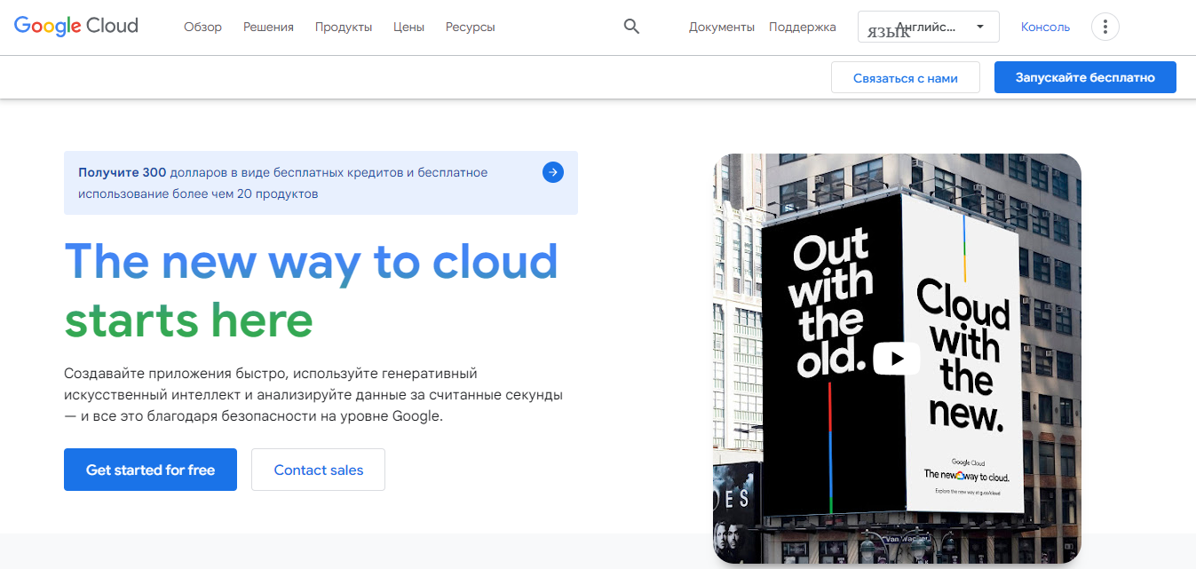
  1. Переходим по ссылке https://cloud.google.com/free/ и нажимаем на кнопку «Get started for free»:
Google Cloud: получить бесплатно vps-сервер
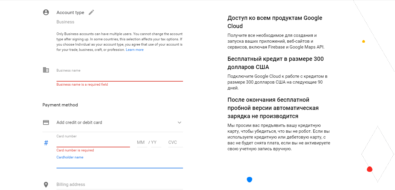
  1. Пройдите регистрацию, введите личные данные и добавьте платежную карту для подтверждения аккаунта. Стоит учитывать, что для российских пользователей действуют ограничения, поэтому для создания учетной записи, необходимо использовать различные сервисы по аренде виртуальных номеров и банковских карт, а также использовать VPN или прокси:
пройти регистрацию на Google Cloud
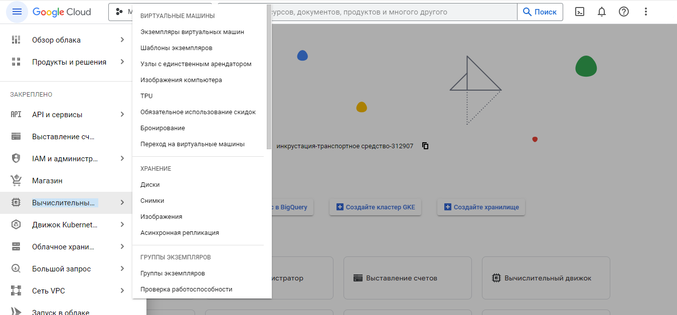
  1. После регистрации заходим в панель Google Cloud, выбираем категорию «Compute Engine», затем раздел «Экземпляры виртуальных машин»:
"Экземпляры виртуальных машин" в Google Cloud
  1. Далее, нужно создать экземпляр ВМ и задать определенные параметры, которые подходят под бесплатный тарифный план:
создать экземпляр ВМ и задать определенные параметры
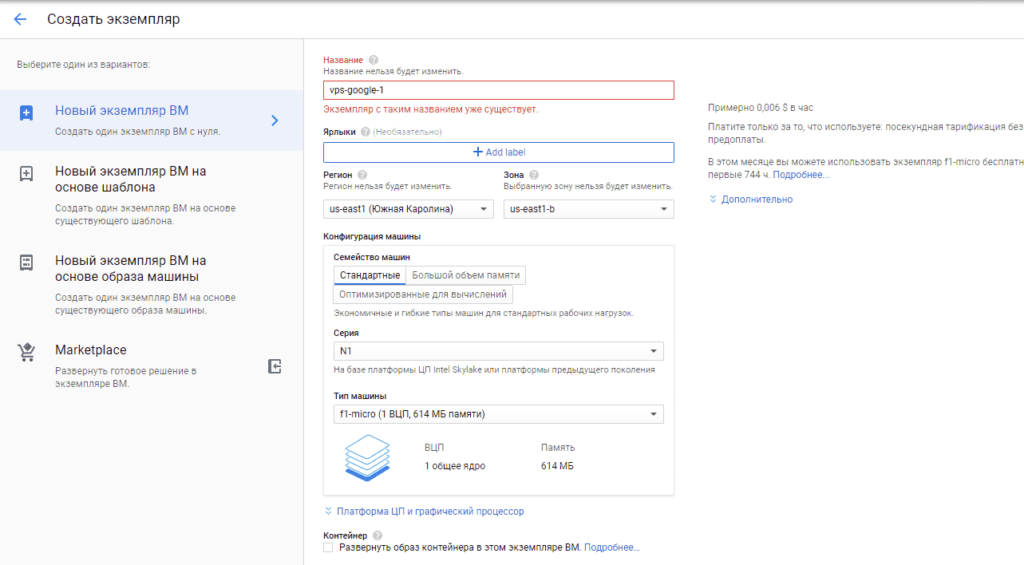
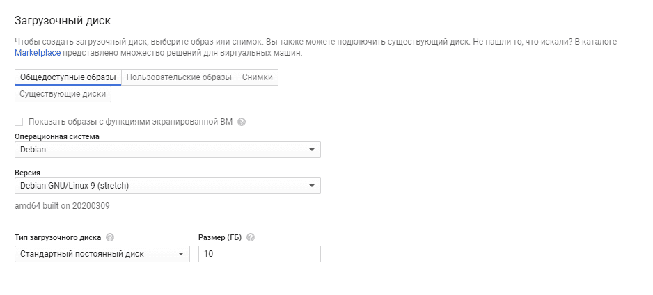
  1. Создайте загрузочный диск, выбрав одну из бесплатных операционных систем (Ubuntu, Debian, CentOS) и установив максимальные размеры диска (10 ГБ):
Создать загрузочный диск
  1. После этого, вы можете запустить полученный VPS-сервер через протокол SSH и использовать его бесплатно в течение трех месяцев.

Несмотря на преимущества бесплатного тарифа от Google, пользователям будет доступен не весь функционал платформы, поэтому если вам нужен виртуальный сервер с более продвинутыми настройками и характеристиками, то можно арендовать VPS на проверенных сайтах. 

Как выбрать VPS: советы и рекомендации

Выбор VPS-сервера — важный пункт для успешной работы вашего сайта или приложения. Наша редакция подготовила несколько советов, которые помогут вам правильно выбрать VPS-сервер и не стать жертвой мошенников:

  1. Определите цели и задачи.

Определите какие параметры и характеристики вам нужны. Обратите внимание на мощность процессора, объем оперативной памяти, хранилище, пропускную способность сети. Важно выбрать VPS, который будет соответствовать требованиям вашего проекта и обеспечивать непрерывную работу. 

  1. Проверьте надежность поставщика.

Проанализируйте репутацию поставщика VPS-услуг. Прочитайте отзывы клиентов, проверьте истории заказов и др. Важно выбирать поставщиков с хорошей репутацией и стабильностью.

  1. Сравните цены и тарифные планы. 

Просмотрите, сколько стоит аренда VPS у разных поставщиков. Убедитесь в хорошем соотношение цены и качества продукта. Помните, что не всегда дешевый вариант будет лучшим выбором.

  1. Обратитесь в поддержку.

Уделяйте внимание качеству технической поддержки. Важно, чтобы площадка предоставляла хороший уровень обслуживания и быстро реагировала на проблемы клиентов.

  1. Используйте триал доступы или акции.

Некоторые поставщики предоставляют пробные версии или скидки для новых клиентов. Используйте эту возможность, чтобы опробовать и оценить услуги перед окончательным выбором.

  1. Изучите способы управления.

Проверьте, какие инструменты предоставляются для управления вашим VPS, включая доступ через SSH, мониторинг обновлений и др.

ТОП-3 VPS-серверов в аренду в 2023

Арендовать проверенный VPS в 2023 может любой желающий. Для этого, необходимо перейти на сайт, который предоставляет виртуальные серверы, выбрать один из подходящих тарифов и оплатить услугу. Наша редакция составила список лучших VPS-серверов с арендной платой, которые подойдут как новичкам, так и опытным вебмастерам.

Vultr

Vultr - VPS-сервер в аренду

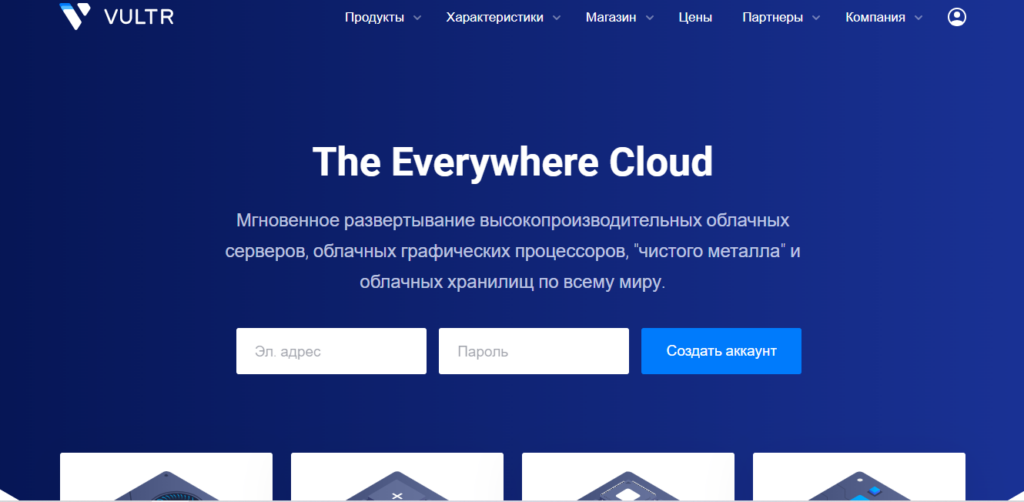
Vultr — это сервис по аренде простых и сложных виртуальных машин, который предоставляет пользователям удобный интерфейс и различные тарифные планы. Среди преимуществ Vultr:

  • Развертывание VPS в один клик;
  • Мощный API для интеграции в приложения и программы;
  • Просто управление;
  • 32 местоположения для быстрого запуска и управления виртуальными серверами.

На сайте присутствует как почасовая оплата серверов, так и ежемесячные подписки от $0.03 за час, до$120 в месяц. 

Hostwinds

Hostwinds - VPS-сервер в аренду

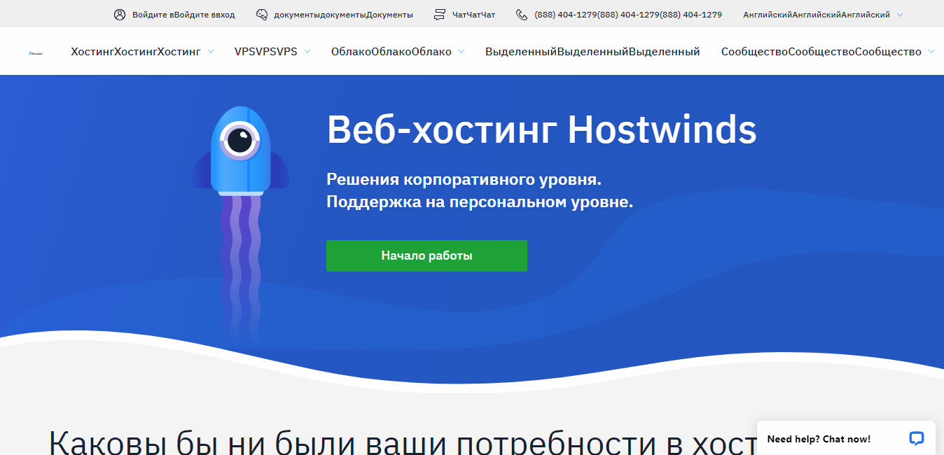
Hostwinds — сервис по предоставлению веб-хостингов, VPS, облачных серверов и др. Сайт предлагает большое количество виртуальных машин с высокой производительностью и надежностью на Linux и Windows, а также разнообразные тарифы. 

Преимущества Hostwinds:

  • Быстрые серверы;
  • Удобная навигация по сайту;
  • Защита данных;
  • Высокая производительность хостингов;
  • Техническая поддержка 24/7.

Стоимость аренды VPS на Windows составляет: от 12.74 до 431.24 долларов в месяц, в зависимости от пропускной способности, объема памяти и мощности процессора. Стоимость аренды VPS на Linux: от 8.24 до 395.24 долларов, в зависимости от характеристик вашего ПК и качества предоставляемого сервера. 

AdminVPS

AdminVPS - VPS-сервер в аренду

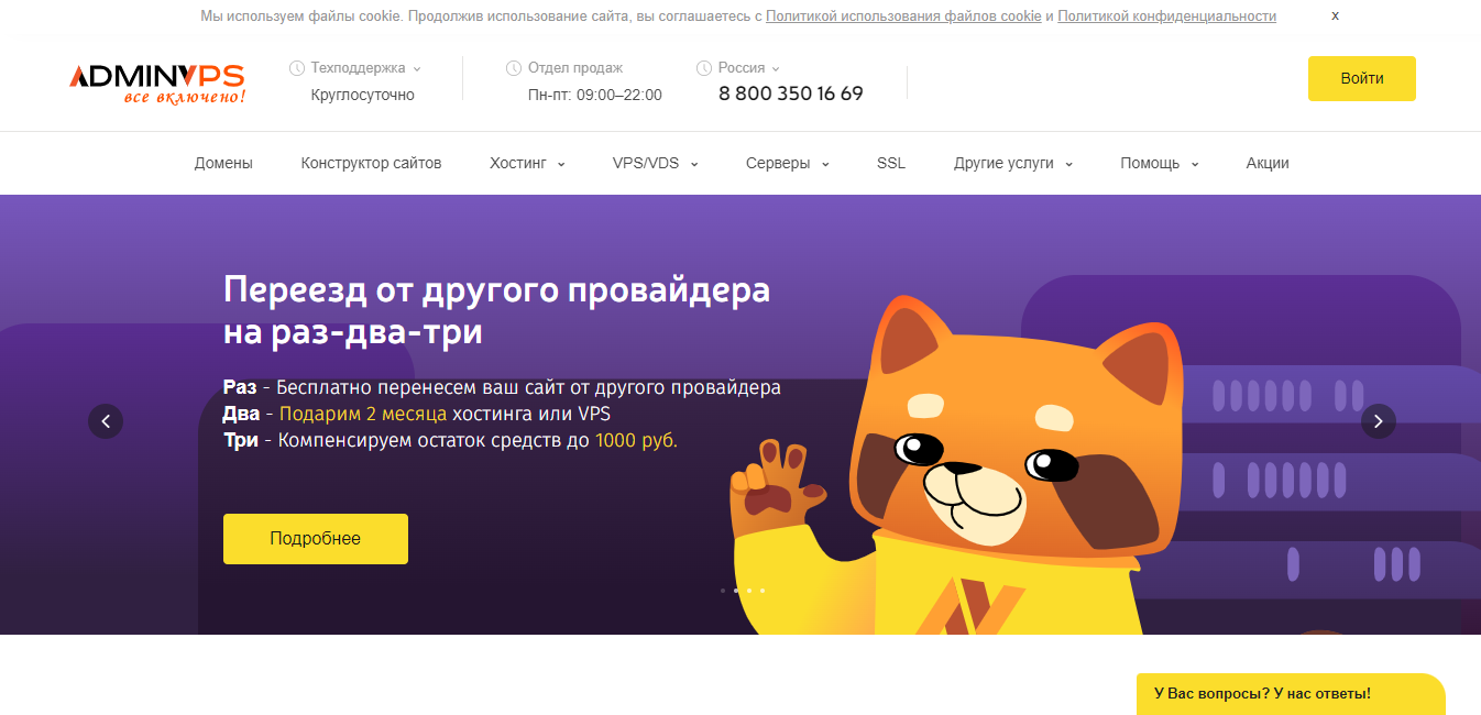
AdminVPS — сервис по аренде и покупке хостингов, VPS/VDS и серверов для личных целей или работы. Среди плюсов сервиса можно выделить:

  • Бесплатное администрирование серверов;
  • Высокая производительность;
  • Маленький риск сбоев;
  • Мгновенная активация сервера через 1 минуту;
  • Предоставление собственных SSL-сертификатов для доменов;
  • Быстрая техподдержка.

Сайт AdminVPS предлагает следующие тарифы:

  • Lite — 179 руб.
  • Promo — 314 руб.
  • Micro — 584 руб.
  • Start — 944 руб.
Советуем прочитать: Арбитраж трафика с нуля: все о популярном способе заработка в Интернете 

Заключение

Таким образом, VPS предоставляет большие возможности для решения различных задач. Они обеспечивают гибкость, контроль и масштабируемость серверов, что делает их привлекательными для многих вебмастеров. 

Virtual Private Server можно получить бесплатно, а также арендовать на различных сайтах. Однако, важно учитывать, что бесплатные VPS-серверы, как правило, имеют ограничения по ресурсам и функциональности, поэтому они подойдут для решения небольших и кратковременных задач. Для более сложных и масштабных процессов, лучше арендовать сервер у проверенного поставщика.

Удачи и профита!

Ответы на популярные вопросы
Что такое VPS-сервер?
Плюсы и минусы VPS?
Как получить виртуальный сервер бесплатно?
Какие VPS-серверы можно взять в аренду?

Комментарии отсутствуют. Будьте первым!

в ответ kakdelakisa

user avatar