a { color: rgb(32, 63, 172) !important; } .menu .menu-item.current-menu-ancestor > a { color: rgb(32, 63, 172) !important; } .menusearch .menu-item-has-children:hover .sub-menu { display: flex; position: absolute; top: 100%; z-index: 5000; } .menusearch .menu-item-has-children:hover > a::after { transform: rotate(-180deg) translateY(-5px); -webkit-transform: rotate(-180deg) translateY(-5px); transition: 0.3s ease-in; } .menusearch .menu-item:last-child:hover .sub-menu { display: grid; grid-template-columns: 1fr 1fr; right: 0; } .sub-menu { display: none; flex-direction: column; justify-content: start; align-items: start; overflow: hidden; transition: max-height ease-in 0.7s, opacity ease 0.5s, padding ease 0.5s; border-bottom-left-radius: 4px; border-bottom-right-radius: 4px; border: 1px solid #f7f7f7; border-top: none; padding: 0; background: #fff; z-index: 998; box-shadow: 0px 3px 4px 0px rgba(0, 0, 0, 0.1490196078); } .sub-menu .menu-item { margin: 7px 0 7px 0; position: relative; } .sub-menu .menu-item a { color: #5b6471 !important; position: relative; padding: 7px 60px 7px 16px; display: block; cursor: pointer; } .sub-menu .menu-item a:hover { color: #5b6471 !important; } .sub-menu .menu-item:last-child { margin-bottom: 0; } .sub-menu .menu-item:hover { background: #f4f6ff; } .sub-menu .menu-item.current-menu-item > a { color: #5b6471 !important; } .sub-menu--init { width: initial; } .sub-menu--shown { width: initial; opacity: 1; max-height: 1000px; padding: 0 0 4px 0; } .menu-item-has-children > a::after { content: url('data:image/svg+xml,%3Csvg width="12" height="6" viewBox="0 0 12 6" fill="none" xmlns="http://www.w3.org/2000/svg"%3E%3Cpath d="M6.00011 5.24999C5.85011 5.24999 5.65011 5.19999 5.55011 5.09999L1.05011 1.59999C0.750109 1.34999 0.700109 0.849987 0.950109 0.549987C1.20011 0.249987 1.70011 0.199986 2.00011 0.449986L6.00011 3.54999L10.0001 0.449986C10.3001 0.199986 10.8001 0.249987 11.0501 0.549987C11.3001 0.849987 11.2501 1.34999 10.9501 1.59999L6.45011 5.09999C6.35011 5.19999 6.15011 5.24999 6.00011 5.24999Z" fill="%23B6C1C7"/%3E%3C/svg%3E%0A'); margin-left: 5px; transition: 0.3s ease-out; display: inline-block; transform: translateY(-1px); } .menu--hidden { display: none; } @media (max-width: 1720px) { .menu .menu-item a { font-size: 1rem; } .menu-item-has-children > a::after { top: 27px; } .menu .menu-item-has-children:hover > a::after { transform: rotate(-180deg) translateY(-4px); -webkit-transform: rotate(-180deg) translateY(-4px); } .sub-menu .menu-item { margin-right: 0; display: block; width: 100%; } } @media (max-width: 1200px) { .menu .menu-item { margin-right: 15px; } .menu .menu-item:last-child { margin-right: 0; } } @media (max-width: 1200px) { .sub-menu .menu-item { margin-right: 0; } } @media (max-width: 1000px) { .menu { display: none; } .burger .menu { display: block; } } .burger { visibility: hidden; position: fixed; top: 0; left: 0; bottom: 0; right: 0; width: 80%; background: #fff; z-index: 999; overflow: scroll; height: 100vh; transform: translateX(-100%); transition: all 0.3s ease-in; } .burger .sub-menu { display: none; width: initial; height: initial; opacity: 1; max-height: none; border-radius: 0; background: none; color: #fff; border: none; box-shadow: none; } .burger .sub-menu .menu-item a { padding-left: 40px; } .burger .sub-menu .menu-item a:hover { padding-left: 35px; } .burger .sub-menu .menu-item::after { content: none; } .burger .sub-menu .menu-item:hover { background: none; } .burger .user__wrapper { display: flex; align-items: center; flex-direction: row-reverse; justify-content: space-between; width: 100%; } .burger .user__wrapper.user--hidden { display: none; } .burger .user { width: 70px; height: 70px; } .burger .login__button { padding: 0; background: none; color: #000; } .burger-open { visibility: visible; transform: translateX(0%); transition: all 0.3s ease-in; } .burger__menu { background: #fff; color: #5b6471; } .burger__menu .menu-item a { padding: 12px 20px; font-size: 1.125rem; } .burger__menu .menu-item a:hover { background: #e5ebff; border-left: 5px solid #3f63df; padding-left: 15px; } .burger__menu .menu-item a:visited { color: #5b6471; } .burger__usermenu { list-style-type: none; } .burger__usermenu-item { padding: 5px 0; } .burger__usermenu-item a { color: #000; font-weight: 600; } .burger__title { padding: 0.875rem 3rem; border-bottom: 1px solid #b6c1c7; background: #fff; display: flex; justify-content: center; align-items: center; position: relative; margin-bottom: 0.5rem; } .burger__title figure { position: absolute; left: 20px; top: 18px; } .burger__title--h3 { font-size: 18px; line-height: 21px; color: #000d20; font-weight: 400; } .login__button--mobile { display: none; } @media (max-width: 1000px) { .login__button--desktop { display: none !important; } .login__button--mobile { display: block; cursor: pointer; } .login__button--mobile figure { height: 25px; } .login__button--mobile figure img { height: 25px; width: 25px; } } @media (min-width: 500px) { .burger__profile { padding: 50px 100px 10px 100px; } } #searchform { width: 100%; align-items: flex-end; display: flex; flex-direction: row-reverse; gap: 0.5rem; } .search__input { width: 100%; border: none; border-bottom: 1px solid #5b6471; padding: 0.25rem; } .search__input:focus { box-shadow: none; border-bottom: 1px solid #203fac; } .search__button { border: none; background: none; cursor: pointer; height: 24px; } .search__button img { width: 100%; } .menusearch { width: 100%; } .search-wrapper { display: flex; flex-direction: column; gap: 1.5rem; } .search-post { display: flex; flex-direction: column; gap: 0.5rem; padding: 10px; } .search-post:hover { background-color: #f4f6ff; } .search-link:hover > h2 { color: #203fac; } .search-link { display: flex; align-items: center; color: #203fac; } .search-link p { font-size: 1.125rem; } .search-link:visited { color: #203fac; } .search-text { color: #555555; } .search-section .divider:last-child { display: none; } @media (max-width: 1720px) { .search-link p { font-size: 1rem; } .search__button { height: 22px; } } .branding { position: relative; } .branding__poster { max-width: 1920px; margin: 0 auto; padding-top: 320px; } .branding__link { display: block; position: absolute; top: 60px; left: 0; width: 100%; height: 260px; background-position-y: 60px; background-position-x: center; background-repeat: no-repeat; background-attachment: fixed; } .branding__link:hover { filter: contrast(0.8); } .lazy { opacity: 0; transition: opacity 0.5s ease; } .lazy.entered.loaded { opacity: 1 !important; } .branding__link { opacity: 1; transition: opacity 0.5s ease; } .branding__link.entered.loaded { opacity: 1 !important; } .branbranding__poster--mobile { display: none !important; } @media (max-width: 1440px) { .branding__poster { padding-top: 285px; } .branding__link { background-size: 1700px auto; height: 225px; } } @media (max-width: 1300px) { .branding__link { background-size: 1500px auto; height: 200px; } .branding__poster { padding-top: 260px; } } @media (max-width: 1100px) { /* .branding__poster { padding-top: 220px; } .branding__link { height: 100% !important; }*/ } @media (max-width: 1023px) { .branbranding__poster--desktop { display: none; } .branbranding__poster--mobile { display: block !important; margin: 50px 0 0 0; } .branding__link--mobile { display: block; } .branbranding__poster--mobile-wrap { position: relative; /*background: whitesmoke;*/ max-height: 80px; overflow: hidden; } .branbranding__poster--mobile-wrap:before { content: ""; display: block; padding-top: 30%; } .branding__link--mobile { display: block; position: absolute; width: 100%; top: 0; right: 0; bottom: 0; left: 0; background-position-y: 50px; background-position-x: center; background-repeat: no-repeat; background-attachment: fixed; background-size: 100vw auto; } } @media (min-width: 768px) and (max-width: 1023px) { .branbranding__poster--mobile-wrap { max-height: 300px; } } * { box-sizing: border-box; margin: 0; padding: 0; } a { text-decoration: none; } img { max-width: 100%; height: auto; } input, select, textarea, a, button { outline: none; transition: all 0.3s ease; font-family: "SF Pro", "Segoe UI", Tahoma, Geneva, Verdana, sans-serif !important; } input, select, textarea { color: #000d20; } input:focus, select:focus, textarea:focus, a:focus, button:focus { outline: none; box-shadow: 0 0 2px #203fac; } p, a, div, button, select { font-size: 1.125rem; } .page__text { line-height: 140.5%; color: #5b6471; margin: 0.625rem 0 1.875rem 0; } .page__text h3 { margin-bottom: 25px; } .page__text p { margin-bottom: 15px; } img:not([src]):not([srcset]) { visibility: hidden; } body { font-family: "SF Pro", "Segoe UI", Tahoma, Geneva, Verdana, sans-serif; font-weight: 400; background: #fff; } input, textarea { font-size: 1.125rem; } input::placeholder { font-size: 1.25rem; } html, body { width: 100%; height: 100%; margin: 0px; padding: 0px; scroll-behavior: smooth; } .very__long__stuff { height: 3000px; } .main { background: #fff; transition: 0.3s ease-in-out; border-radius: 20px; padding: 3.25rem; position: relative; /* box-shadow: 0px 0px 15px 0px rgba(0, 0, 0, 0.15);*/ } .main__content { margin: 0 auto; } .swiper-slide { height: auto !important; } .searchmobi { display: none; } .searchmobi .search { margin-top: 1rem; } .select { position: relative; display: block; width: 100%; max-width: 195px; } .select__head { width: 100%; max-width: 195px; height: 34px; border: 1px solid #b6c1c7; border-radius: 4px; padding: 6px 10px; color: #000d20; cursor: pointer; position: relative; } .select__head::after { content: url('data:image/svg+xml,%3Csvg width="12" height="6" viewBox="0 0 12 6" fill="none" xmlns="http://www.w3.org/2000/svg"%3E%3Cpath d="M6.00011 5.24999C5.85011 5.24999 5.65011 5.19999 5.55011 5.09999L1.05011 1.59999C0.750109 1.34999 0.700109 0.849987 0.950109 0.549987C1.20011 0.249987 1.70011 0.199986 2.00011 0.449986L6.00011 3.54999L10.0001 0.449986C10.3001 0.199986 10.8001 0.249987 11.0501 0.549987C11.3001 0.849987 11.2501 1.34999 10.9501 1.59999L6.45011 5.09999C6.35011 5.19999 6.15011 5.24999 6.00011 5.24999Z" fill="%23B6C1C7"/%3E%3C/svg%3E%0A'); position: absolute; right: 13px; top: 4px; transition: 0.3s ease-out; display: inline-block; transform: translateY(-1px); } .select__head.open::after { transform: rotate(180deg) translateY(-5px); -webkit-transform: rotate(-180deg) translateY(-5px); } .select__list { position: absolute; top: 100%; left: 0; right: 0; background: #fff; max-width: 195px; border: 1px solid #b6c1c7; border-radius: 0 0 4px 4px; margin-top: -1px; z-index: 100; font-size: 14px; color: #424348; flex-direction: column; gap: 5px; } .select__list::-webkit-scrollbar { width: 7px; background-color: #f8f9fa; padding: 5px; } .select__list::-webkit-scrollbar-thumb { border-radius: 10px; background-color: #d9d9d9; } .select__list .select__item { position: relative; padding: 8px 9px; color: #5b6471; list-style: none; } .select__list .select__item:first-child { margin-top: 5px; } .select__list .select__item:last-child { margin-bottom: 5px; } .select__list .select__item:visited { color: #5b6471; } .select__list .select__item:hover { background: #f4f6ff; } .open { border-radius: 4px 4px 0 0; } .select__title { font-weight: 400; color: #5b6471; line-height: 18px; margin-bottom: 9px; } .rules { padding-top: 5rem !important; } .rules__text { line-height: 140.5%; color: #000d20; margin-top: 2rem; } .rules__text h2 { margin-bottom: 1.5rem; } .rules__text h3 { margin-bottom: 1rem; } .rules__text p { margin-bottom: 1rem; } .rules__text dl, .rules__text ol, .rules__text ul { padding-left: 20px; margin-bottom: 1rem; } .rules__text li { color: #000d20; line-height: 150%; } @media (max-width: 1720px) { .main { max-width: 1100px; padding: 2.5rem; } p, a, div, button, select { font-size: 1rem; } .page__text { margin: 0.625rem 0 1.5625rem 0; } input, textarea { font-size: 1rem; } input::placeholder { font-size: 1rem; } } @media (max-width: 1600px) { .main { max-width: 1050px; padding: 1.625rem; } } @media (max-width: 1400px) { .main { max-width: initial; width: 100%; padding: 1.25rem; } } @media (max-width: 1000px) { .page__text { font-size: 1.125rem; margin: 0.625rem 0 1.25rem 0; } .searchmobi { display: initial; } .searchmobi .search--hidden { display: flex; } .main { border-radius: 0; padding: 1.25rem; box-shadow: none; margin: 0 auto; } } @media (max-width: 700px) { .hide-on-mobile { display: none; } .no-scrolling { overflow: hidden; } } .checkbox { display: grid; place-items: center; width: 24px !important; height: 24px !important; padding: 0; margin: 0; color: #0040ff; position: relative; cursor: pointer; appearance: none; } .checkbox:before { content: ""; width: 100%; height: 100%; line-height: 1; color: inherit; border-width: 2px; border-style: solid; border-color: #b6c1c7; border-radius: 4px; transition: all 0.2s ease; } .checkbox:after { content: ""; width: calc(100% - 12px); height: calc(100% - 19px); border-width: 0px 0px 2px 2px; border-style: solid; border-color: #fff; transform: rotate(-45deg); position: absolute; top: 6px; left: 5px; transition: all 0.2s ease; } .checkbox:checked:before { background: #0040ff; border-color: #0040ff; } .checkbox:checked::after { border-color: #fff; } .checkbox:disabled { cursor: not-allowed; } .checkbox:disabled:before { border-color: darkgray; } .checkbox:disabled:after { border-color: transparent; } .checkbox:disabled:checked { color: #0040ff; opacity: 0.65; } .checkbox:disabled:checked:before { border-color: #0040ff; } .checkbox:disabled:checked::after { border-color: #fff; } .checkbox.focus, .checkbox:focus { outline: none; box-shadow: none; } .checkbox__field { display: grid; grid-template-columns: repeat(2, max-content); gap: 0.3rem; align-items: center; } .checkbox__label { color: rgb(91, 100, 113); font-size: "1.25rem"; } .title__h1 { font-size: 1.875rem; font-style: normal; font-weight: 600; line-height: 36px; letter-spacing: 0em; text-align: left; } h1 { line-height: 36px; font-size: 1.875rem; font-weight: 600; color: #000d20; } .title__h2 { font-size: 1.375rem; font-weight: 600; } .title__h2 a { color: #000d20; font-size: 1.375rem; } h2 { font-size: 1.375rem; font-weight: 600; color: #000d20; } h3 { font-size: 1.25rem; font-weight: 600; color: #000d20; } .title { display: flex; justify-content: space-between; align-items: center; margin-bottom: 1.875rem; width: 100%; } .title__group { display: grid; grid-auto-flow: column; align-items: center; gap: 20px; } .title--middlemargin { margin-bottom: 1.5625rem; } .title--smallmargin { margin-bottom: 0.9375rem; } .title--nomargin { margin: 0 !important; } .title--margintop { margin-top: 1.875rem; } .title__link { text-decoration: none; color: #203fac; } .title__button-link { max-height: 30px; display: flex; justify-content: center; border-radius: 10px; align-items: center; color: #fff; padding: 4.5px 16px; font-size: 18px; white-space: nowrap; } .title__button-link:hover { filter: brightness(1.2); } .sponsor__button-link { max-height: 30px; display: flex; justify-content: center; border-radius: 10px; align-items: center; color: #fff; padding: 4.5px 26px 4.5px 18px; font-size: 18px; white-space: nowrap; gap: 10px; background-color: #1f1e26; text-transform: uppercase; } @media (max-width: 1720px) { .title__h1 { font-size: 1.6875rem; } h1 { font-size: 1.6875rem; } .title__h2 { font-size: 1.125rem; } h2 { font-size: 1.25rem; } .title { margin-bottom: 1.5625rem; } h3 { font-size: 1.125rem; } } @media (max-width: 1000px) { .title__h1 { font-size: 1.5rem; line-height: 26px; } h1 { font-size: 1.5rem; } .title__h2 { font-size: 1.25rem; } h2 { font-size: 1.25rem; } .title { margin-bottom: 1.25rem; } h3 { font-size: 1rem; } } @media (max-width: 480px) { .title { margin-bottom: 1rem; flex-wrap: wrap; gap: 10px; align-items: flex-start; } .title__group { display: flex; } .title__h1 { font-size: 1.375rem; line-height: 1.2; } h1 { font-size: 1.375rem; } .title__link { font-size: 1rem; } .title--nomargin { margin: 0; } .title--margintop { margin: 2rem 0; } .title--mobile { flex-direction: column-reverse; gap: 2rem; align-items: flex-start; } .title__button-link { font-size: 12px; padding: 8px 10px; } } .button { border-radius: 10px; color: #fff; display: block; padding: 3px 15px; font-family: "SF Pro", "Segoe UI", Tahoma, Geneva, Verdana, sans-serif; background-color: #203fac; cursor: pointer; text-align: center; } .fix .button { background-color: #fff; color: #000; } .button__show-all { background-color: #203fac; color: #fff; padding: 10px 37px; border-radius: 10px; font-weight: 600; margin: 22px auto 0; display: block; width: fit-content; } .button--primary { border: none; border-radius: 10px; background: #203fac; color: #fff; padding: 4px 16px 5px 16px; width: fit-content; text-align: center; display: flex; align-items: center; justify-content: center; gap: 8px; } .button--primary:hover { background: #3f63df; } .button--secondary { padding: 10px 16px; display: block; border-radius: 5px; border: 1px solid #5b6471; color: #5b6471; background: #fff; text-align: center; max-width: 130px; width: 100%; } .button--secondary:hover { background: #b6c1c7; border: 1px solid #b6c1c7; color: #fff; } .button--hidden { display: none !important; } .button--gray { background: #b6c1c7; } .btn__show-all { color: #5b6471; border: 1px solid #758194; text-align: center; width: fit-content; display: block; padding: 3px 16px; outline: none; cursor: pointer; border-radius: 10px; } .btn__show-all:hover { color: #000d20; border: 1px solid #000d20; } .button-respond { color: #5b6471; border: 1px solid #758194; text-align: center; width: fit-content; display: block; padding: 3px 16px; outline: none; cursor: pointer; border-radius: 10px; } .button-respond:hover { color: #000d20; border: 1px solid #000d20; } .link--hover { color: #203fac !important; width: fit-content; } .link--hover::after { content: ""; display: block; width: 0; height: 1px; margin-top: -2px; background: #203fac; } .link--hover:hover::after { width: 100%; } .tag { border: 1px solid #b6c1c7; color: #b6c1c7; border-radius: 20px; padding: 1px 10px; display: block; width: fit-content; } .tag:hover { border: 1px solid #3f63df; color: #3f63df; } .button-submit { display: flex; align-items: center; align-content: center; justify-content: center; font-family: "SF Pro", "Segoe UI", Tahoma, Geneva, Verdana, sans-serif; white-space: nowrap; border: 1px solid #203fac; box-sizing: border-box; border-radius: 10px; background: none; padding: 16px 15px; width: fit-content; color: #203fac; cursor: pointer; } .button-submit:disabled { background: #b6c1c7 !important; border: 1px solid #b6c1c7 !important; color: #fff !important; } .button-submit:disabled svg path { fill: #fff; } .button-submit a { color: #203fac; } .button-submit:hover a { color: #fff; } .button-submit--disabled { background: #b6c1c7 !important; border: 1px solid #b6c1c7 !important; color: #fff !important; } .button-submit--small { padding: 2px 16px; border-radius: 10px; } .button-submit:hover { border: 1px solid #3f63df; background: #3f63df; color: #fff; } .button-submit:hover svg path { fill: #fff; } .button-submit--gray { border: 1px solid #5b6471; color: #5b6471; display: flex; gap: 5px; justify-content: center; } .button-submit--gray:hover { border: 1px solid #b6c1c7; background: #b6c1c7; color: #fff; } .button--restore { width: 100% !important; margin-top: 20px; height: 40px; line-height: 38px; padding: 0; border: 1px solid #3f63df; } .button--restore:hover { background: #fff; color: #3f63df; } .button--decline { padding: 10px 16px; display: block; border-radius: 5px; border: 1px solid #203fac; color: #203fac; background: #fff; text-align: center; max-width: 130px; width: 100%; } .button--decline:hover { background: #3f63df; border: 1px solid #3f63df; color: #fff; } @media (max-width: 1720px) { .button__show-all { margin-top: 15px; } .link--hover::after { margin-top: 0px; } .link--hover { height: 23px; } .btn__show-all { padding: 4px 16px; } .button-respond { padding: 4px 16px; } .button--primary { padding: 6px 16px 5px 16px; } } @media (max-width: 1000px) { .button { border-radius: 10px; } .btn__show-all { position: absolute; bottom: 3px; left: 50%; transform: translate(-50%, -50%); width: 100%; padding: 6px 16px; } } .tooltip-button { margin-right: 10px; position: relative; border: 0; outline: none; background: transparent; } .tooltip-button:hover .tooltip { opacity: 1; visibility: visible; height: auto; } .tooltip-button .tooltip { background: #000d20; border-radius: 5px; color: #fff; position: absolute; transition: visibility 0s linear 0.3s, opacity 0.3s linear 0s; opacity: 0; visibility: hidden; z-index: 2000; top: 20px; right: -9px; padding: 10px; width: max-content; } .tooltip-button .tooltip:after { content: ""; position: absolute; right: 9px; left: initial; top: -9px; width: 0; height: 0; border-style: solid; border-width: 0 8px 10px 8px; border-color: transparent transparent #000d20 transparent; } .sponsor__outer { border-radius: 7px; -webkit-border-radius: 7px; display: block; overflow: hidden; } .sponsor__video { display: block; width: 100%; } .sponsor__video:hover { filter: contrast(0.8); } .sponsor__wrapper { padding: 15px; } .sponsor__vertical { border: 1px solid #b6c1c7; border-radius: 7px; display: block; position: relative; overflow: hidden; height: 100%; max-height: 550px; } .sponsor__vertical-image { object-fit: cover; width: 100%; height: 100%; min-height: 500px; margin: 0 auto; display: block; } .sponsor__vertical-image:hover { filter: contrast(0.8); } .sponsor--no-padding-bottom { padding: 3rem 0 0 0; } @media (max-width: 1000px) { .sponsor__outer { border-radius: 5px; } .sponsor__vertical { max-width: inherit; max-height: inherit; } .sponsor__wrapper { padding-left: 0; } } @media (max-width: 700px) { .sponsor__wrapper { padding-left: 0; padding-right: 0; } } @media (max-width: 480px) { .sponsor__outer { max-height: 60px; } } .breadcrumbs { display: flex; align-items: baseline; grid-gap: 5px; gap: 5px; white-space: wrap; flex-wrap: wrap; -ms-overflow-style: none; margin-bottom: 10px; } .breadcrumbs .breadcrumbs__separator { color: #b6c1c7; } .breadcrumbs a { color: #203fac; } .breadcrumbs a:visited { color: #b6c1c7; } .blogs-education__section { display: flex; justify-content: space-between; align-items: start; } .blogs-education__wrapper { display: flex; flex-direction: column; gap: 30px; width: 100%; } .blogs-education__title { display: flex; align-items: center; justify-content: flex-start; gap: 0.625rem; margin-bottom: 0.625rem; } .blogs-education__title figure { height: 24px; margin: 0 !important; } .blogs-education__list { padding-left: 20px; line-height: 40px; color: #5b6471; position: relative; z-index: 100; } .blogs-education__list li a { color: #5b6471; } .blogs-education__list li:hover, .blogs-education__list li:hover > a { color: #3f63df !important; } .blogs-education__list li a:visited { color: #5b6471; } .blogs-education__sidebar-list { max-width: 400px; min-width: 350px; width: 100%; list-style: none; border: 1px solid #3f63df; border-radius: 7px; font-size: 1.25rem; padding: 10px 0; display: flex; flex-direction: column; margin-bottom: 35px; } .blogs-education__sidebar-list-item { padding: 10px 20px 10px 20px; color: #000d20; font-size: 1.25rem; transition: color 0.3s ease, background 0.3s ease; } .blogs-education__sidebar-list-item:visited { color: #000d20; } .blogs-education__sidebar-list-item:hover { background: #f4f6ff; border-left: 5px solid #3f63df; padding-left: 15px; color: #3f63df; } .blogs-education__anchor { margin-top: -80px; padding-top: 80px; } .blogs--education .title, .blogs--education .breadcrumbs { position: relative; z-index: 100; } .page-template-tmp-blog-education .main__content div:last-child { margin-bottom: 35px; } @media (max-width: 1720px) { .blogs-education__sidebar-list-item { font-size: 1.125rem; } .blogs-education__section .sidebar { top: 5rem; } } @media (max-width: 1400px) { .blogs-education__wrapper { max-width: 650px; } } @media (max-width: 1000px) { .blogs-education__section .sidebar { display: none; } .blogs-education__wrapper { max-width: inherit; } } .single__wrapper { display: flex; justify-content: space-between; align-items: start; margin-bottom: 6rem; } .no-container .single__content { max-width: none; } .single-detail__content .sidebar { min-width: 315px; width: 24%; margin-left: 0; } .single-detail__content .sidebar .sponsor__vertical-image { min-width: initial; } .no-container .single__wrapper { margin-bottom: 0; } .single__content { width: 100%; } .single-detail__content { display: flex; justify-content: space-between; align-items: start; margin-bottom: 25px; } .single-detail__text { max-width: 679px; width: 100%; display: flex; flex-direction: column; gap: 1.875rem; line-height: 145.5%; color: #000d20; } .single-detail__text ul, .single-detail__text dl, .single-detail__text ol { padding-left: 20px; } .single-detail__text li { color: #000d20; line-height: 150%; } .single-detail__text a { color: #203fac !important; word-break: break-word; font-size: inherit; } .single-detail__text a:visited { color: #203fac !important; } .single-detail__text a:hover { border-bottom: 1px solid #203fac; } .single-detail__content .sponsor__wrapper { padding: 0; } blockquote { border-left: 3px solid #203fac; color: #1a1a1a; font-size: 1.25em; font-style: italic; line-height: 145%; padding: 1em 2em; position: relative; transition: 0.2s border ease-in-out; z-index: 0; } blockquote:before { content: ""; position: absolute; top: 50%; left: -4px; height: 2em; background-color: #fff; width: 5px; margin-top: -1em; } blockquote:after { content: "❞"; position: absolute; top: 50%; left: -0.5em; color: #203fac; font-style: normal; line-height: 1em; text-align: center; text-indent: -2px; width: 1em; margin-top: -0.5em; transition: 0.2s all ease-in-out, 0.4s transform ease-in-out; } blockquote:active:after { transform: rotateY(360deg); } cite { display: block; font-size: 0.75em; line-height: 1.8em; margin-top: 1em; font-style: normal; } .single-detail__quote { display: flex; flex-direction: column; position: relative; } .single-detail__quote::after { content: url("/wp-content/themes/diasp__v2/static/img/misc/quote.svg"); position: absolute; top: -6px; left: calc(50% - 112px); } .single-detail__quote blockquote { display: flex; flex-direction: column-reverse; padding: 0; border-left: none; } .single-detail__quote blockquote p { padding: 0 2em; border-left: 2px solid #203fac; } .single-detail__quote blockquote cite strong { color: #000d20; font-size: 22px; line-height: 27px; } .single-detail__quote blockquote cite { color: #5b6471; text-align: center; margin-top: 0; margin-bottom: 1em; } .single-detail__quote blockquote::after { content: none; } .single-detail__quote blockquote:before { content: none; } .single-detail__quote figure { border-radius: 50%; max-width: 128px; max-height: 128px; align-self: center; } .single-detail__quote figure img { overflow: hidden; object-fit: cover; width: 100%; min-width: 128px; height: 128px; } .single-detail__quote .link-decoration-none { border-radius: 50%; } .single-detail__text img { width: 100%; height: 100%; object-fit: cover; } .single-detail__fig { width: 100%; max-width: 680px; height: 100%; } .single-detail__img { width: 100%; height: 100%; border-radius: 7px; border: 1px solid #b6c1c7; overflow: hidden; } .link-decoration-none { display: flex; } .link-decoration-none:hover { border-bottom: none !important; } #ez-toc-container { padding: 20px 40px !important; border-radius: 7px; } .ez-toc-title-container { margin-bottom: 20px !important; } #ez-toc-container p.ez-toc-title { font-weight: 600 !important; } #ez-toc-container a:hover { text-decoration: none; } .ez-toc-link { word-break: normal !important; } .single-related { margin-top: 25px; } .single-related__post { position: relative; border: 1px solid #b6c1c7; border-radius: 15px; padding: 25px; display: flex; align-items: center; justify-content: space-between; transition: all 0.3s ease; } .single-related__post div { color: #000d20; transition: all 0.3s ease; word-break: normal; } .single-related__post:hover { border: 1px solid #203fac; } .single-related__post:hover > div { color: #203fac; } .single-related__post > svg path { transition: all 0.3s ease; } .single-related__post:hover > svg path { fill: #203fac; } .single-detail__text table { width: 100% !important; height: 100% !important; border-spacing: 0; border-radius: 7px; } .single-detail__text table tr th, .single-detail__text table tr td { border-color: #b6c1c7 !important; } .single-detail__text table.partner-table tr td:first-child { width: 14%; } .single-detail__text table.partner-table tr td:nth-child(2) { width: 55%; } .single-detail__text table.partner-table tr td:nth-child(3) { width: 20%; word-break: break-word; } .single-detail__text table.partner-table tr td:last-child { word-break: break-word; width: 15%; } .single-detail__text table td { vertical-align: top; } @media screen and (max-width: 1023px) { table.partner-table thead { display: none; } table.partner-table td { display: flex; flex-direction: column; } table.partner-table td::before { content: attr(label); font-weight: bold; min-width: 120px; } } .single-detail__text table td a img { width: 28px; height: 28px; margin-right: 10px; aspect-ratio: 1/1; } .single-detail__text table td a { display: inline; } .single-detail__text table tbody tr:nth-child(2n) { background: #fff; } .single-detail__text table tbody tr:nth-child(2n+1) { background: #f3f6ff; } .single-detail__text table tbody tr:last-child td:first-child { border-bottom-left-radius: 7px; } .single-detail__text table tbody tr:last-child td:last-child { border-bottom-right-radius: 7px; } @media (max-width: 1720px) { .single-detail__text { gap: 1.5625rem; } } @media (max-width: 1000px) { .single-detail__text { gap: 1.5625rem; } .single-detail__content .sponsor__vertical { max-height: 450px; max-width: 345px; } .single-detail__text table thead { font-size: 14px; } .single-detail__text table tbody tr td:first-child { padding-left: 20px; } } @media (max-width: 650px) { .single-detail__content { flex-direction: column; } .single-detail__content .sponsor__wrapper { padding: 0; } .single-detail__content .sponsor__wrapper { padding: 1.25rem 0 0 0; } .single-detail__content .sponsor__vertical { max-width: inherit; } .single-detail__content .sponsor__vertical-image { width: 100%; } } @media (max-width: 400px) { .single-detail__text table thead { font-size: 12px; } .single-detail__text table tbody tr td:first-child { padding-left: 10px; } } .single-article p { margin: 2rem 0; font-style: normal; font-weight: 400; line-height: 21px; color: #555555; } .single-article .wp-block-image { overflow: hidden; border-radius: 7px; } .single-article p:first-child { margin-top: 0; } .single-article p:last-child { margin-bottom: 0; } .single-meta { display: flex; flex-direction: column; align-items: start; margin-top: 0.625rem; } .single-meta__group { display: flex; align-items: center; gap: 1rem; margin-bottom: 12px; } .single-meta__group-row { display: flex; align-items: center; gap: 1rem; } .single-meta__item { display: flex; align-items: center; gap: 5px; font-size: 1.125rem; color: #b6c1c7; } .single-meta__item figure { margin-bottom: 0; } .meta__tags { margin-bottom: 1.5625rem; } @media (max-width: 600px) { .single-meta__group { flex-wrap: wrap; align-items: flex-start; gap: 10px; } .single-meta__group-row { gap: 10px; } } .related-more-button__wrapper { display: flex; align-items: center; justify-content: center; margin-top: 30px; } #related-more-button { color: #5b6471; border: 1px solid #758194; text-align: center; width: fit-content; display: block; padding: 3px 16px; outline: none; cursor: pointer; border-radius: 10px; margin-bottom: 0; } #related-more-button svg { display: none; } .trainings-detail__content { display: flex; } .trainings__left-side { margin-right: 70px; } .trainings__description { display: flex; align-items: center; } .trainings__description .review__item:first-child { margin-right: 100px; } .trainings-detail__fig { width: 345px; height: 500px; border: 1px solid #b6c1c7; border-radius: 20px; overflow: hidden; } .trainings-detail__img { width: 100%; height: 100%; object-fit: cover; } .trainings__info { display: flex; align-items: center; margin-top: 15px; } .trainings__list { list-style: none; } .trainings__list:first-child { margin-right: 20px; } .trainings__list:nth-child(2) { color: #5b6471; } .trainings__list li { margin-bottom: 15px; } .trainings__list a { color: #203fac; } .trainings__social { display: flex; align-items: center; color: #5b6471; margin-bottom: 10px; } .trainings__social:last-child { margin-bottom: 0; } .trainings__social svg { margin-right: 15px; } .trainings-mt { margin-top: 30px; } .trainings-statistic__title { font-size: 20px; line-height: 24px; margin-bottom: 10px; } .trainings-statistic__list { list-style: none; display: flex; } .trainings-statistic__list li { margin-right: 40px; } .trainings-statistic__list li:last-child { margin-right: 0; } .review__arcticle { display: flex; flex-direction: column; } .review__title { display: flex; gap: 5px 16px; align-items: center; flex-wrap: wrap; } .review__fig { width: 100%; height: 550px; border-radius: 7px 7px 0px 0px; overflow: hidden; border: 1px solid #b6c1c7; } .review__img { width: 100%; object-fit: cover; height: 100%; } .review__description { display: flex; align-items: center; justify-content: space-between; width: 100%; } .review__description--affiliate { justify-content: start; gap: 100px; } .review__item { display: flex; flex-direction: column; gap: 10px; } .review__item-text { color: #758194; } .review__rating-stars { display: flex; align-items: center; gap: 5px; } .review__rating-stars p { color: #5b6471; } .review__price { color: #1fb866; font-weight: 400; } .review__promocode-field { display: flex; color: #758194; } .review__item a:hover { border-bottom: none; } .review__link span { color: #203fac; display: flex; gap: 4px; } .review__link span figure { height: 20px; } .review__link span figure img { height: 10px; width: 11px; } .review__promocode-link { color: #203fac; border-bottom: #203fac 1px solid; } .review__promocode-link:visited { color: #203fac; } .review__arcticle .button { font-weight: 400; white-space: nowrap; padding: 5px 17px; position: absolute; right: 0; top: 0; } .review__text--hidden { display: none; } .review__comments--hidden { display: none; } .review-stars { display: flex; cursor: pointer; align-items: center; } .review-star { stroke: #b6c1c7; cursor: pointer; } .review-comments__button { padding: 0 0.15rem; background: none; border: none; cursor: pointer; height: 16px; } .review-comments__button:first-child { padding-left: 0; margin-left: 0.3rem; } .review-comments__button--hover .review-star { stroke: #203fac; fill: #203fac; } .review-comments__button--current .review-star { stroke: #203fac; fill: #203fac; } .review-form { border: 1px solid #b6c1c7; border-radius: 7px; display: flex; padding: 20px 35px 20px 35px; position: relative; } .review-comments__item { position: relative; display: flex; flex-direction: column; gap: 10px; padding: 5px 0px 0px 40px; width: 100%; justify-content: space-between; } .review-comments__item--flexdir { flex-direction: row; } .review__rating-group { display: flex; flex-direction: column; justify-content: space-between; } .review__ratelike { display: flex; justify-content: space-between; align-items: center; } .review-likes { display: flex; align-items: center; margin-right: 20px; color: #758194; } .review-likes svg { margin-right: 7px; } .review-dislikes { display: flex; align-items: center; color: #758194; } .review-dislikes svg { transform: rotate(180deg); margin-right: 7px; } .review__button { background: none; border: none; color: #b6c1c7; cursor: pointer; position: relative; } .review__button::after { content: url("data:image/svg+xml,%3Csvg width='11' height='5' viewBox='0 0 11 5' fill='none' xmlns='http://www.w3.org/2000/svg'%3E%3Cpath d='M5.21007 4.98009C5.06007 4.98009 4.86007 4.93009 4.76007 4.83009L0.260069 1.33009C-0.0399306 1.08009 -0.0899304 0.580089 0.16007 0.280089C0.41007 -0.0199107 0.91007 -0.0699111 1.21007 0.180089L5.21007 3.28009L9.21007 0.180089C9.51007 -0.0699111 10.0101 -0.0199107 10.2601 0.280089C10.5101 0.580089 10.4601 1.08009 10.1601 1.33009L5.66007 4.83009C5.56007 4.93009 5.36007 4.98009 5.21007 4.98009Z' fill='%23B6C1C7'/%3E%3C/svg%3E%0A"); position: absolute; right: -20px; top: -2px; } .review__button--reverse::after { transform: rotate(180deg); top: 5px; } .review__button svg { margin-left: 10px; } .review-comments__content { padding: 5px 0px 0px 40px; width: 100%; } .review-comments__info { position: relative; display: flex; flex-direction: column; padding: 5px 60px 5px 0px; border-right: 1px solid #b6c1c7; } .review-comments__author-info { display: flex; align-items: center; gap: 12px; margin-bottom: 10px; } .review-comments__author { display: flex; flex-direction: column; gap: 5px; } .review-comments__author span { display: flex; align-items: center; } .review-comments__author span svg { margin-right: 5px; } .review-comments__date { font-style: normal; font-weight: normal; font-size: 1.125rem; line-height: 21px; color: #b6c1c7; } .review-comments__item-group { display: flex; flex-direction: column; gap: 10px; align-items: flex-start; } .review__title { line-height: 24px; color: #5b6471; min-width: 125px; } .review-comments__input { display: flex; flex-direction: column; gap: 10px; max-width: initial; margin-bottom: 20px; } .review-comments-sbm { display: block; margin-left: auto; } .review__comments-text { border: 1px solid #b6c1c7; border-radius: 4px; padding: 5px; max-width: initial; width: 100%; min-height: 34px; max-height: 120px; } .review-comments__item .button { margin-left: auto; } .single-comments .title .button figure { height: 20px; } .review-comments__text { line-height: 24px; color: #5b6471; max-height: 122px; overflow: hidden; } .review-comments__text--open { max-height: 100%; } .review-status { position: absolute; left: 0; height: 100%; width: 20px; border-radius: 7px 0 0 7px; } .review-status--good { background: #1fb866; } .review-status--bad { background: #ff5f7b; } .review-status--neutral { background: #ffd600; } .rate-general-count { color: #5b6471; height: 20px; margin-left: 5px; } .review__description--affiliate .review-stars .rate-general-count { height: 24px; } @media (max-width: 1720px) { .review__description .review-comments__button { margin-top: 2px; } .review-comments__date { font-size: 1rem; } .review__description--affiliate .review-stars .rate-general-count { height: 20px; } .rate-general-count { height: 15px; } } @media (max-width: 1400px) { .review__fig { height: 560px; } } @media (max-width: 1000px) { .review__fig { height: 100%; } .review__img { height: 100%; } } @media (max-width: 800px) { .review__description { display: grid; grid-template-columns: repeat(2, 1fr); gap: 20px 0px; } .review-comments, #review-form, #edit-review-form { flex-direction: column; } .review-comments { padding: 15px; } .review-comments__content { padding: 10px; } .review-status { top: 0; height: 20px; width: 100%; border-radius: 7px 7px 0 0px; } .review-comments__info { padding: 30px 15px; border-bottom: 1px solid #b6c1c7; border-right: none; } .review-comments__item { padding: 21px 30px 60px 26px; } } @media (max-width: 500px) { .review__description { grid-template-columns: repeat(1, 2fr); } .review-comments__item { padding: 20px 30px 60px 20px; } } .page-content { min-height: 350px; } .ul-bg-grey { background: #f9f9f9; padding: 10px 10px 10px 30px !important; border-radius: 5px; } .review-comments { border: 1px solid #b6c1c7; border-radius: 7px; display: flex; padding: 20px 35px 20px 35px; position: relative; } #review-form, #edit-review-form { display: flex; width: 100%; box-sizing: border-box; } .star[data-click=true]:before { color: #203fac; content: "\f155"; } .star-rating { display: flex; } .screen-reader-text { position: absolute; margin: -1px; padding: 0; height: 1px; width: 1px; overflow: hidden; clip: rect(0 0 0 0); border: 0; word-wrap: normal !important; } .star-rating .star-full:before { content: "\f155"; } .star-rating .star-half:before { content: "\f459"; color: #203fac; } .star:before { content: "\f154"; width: 15px; padding-right: 5px; } .star-rating .star { color: #b6c1c7; display: flex; font-family: dashicons; font-size: 20px; font-style: normal; font-weight: 400; height: 20px; line-height: 1; text-align: center; text-decoration: inherit; vertical-align: top; min-width: 20px; } .star-rating .star:after { content: ""; display: block; width: 5px; min-width: 5px; height: 20px; } .star-full:before { color: #203fac; fill: #203fac; } .star-rating .star-full-click:before { color: #b6c1c7; content: "\f154"; } .single-comments-item { margin-bottom: 25px; } .review-likes:hover, .review-dislikes:hover { cursor: pointer; } .review-likes svg path, .review-dislikes svg path { stroke: #b6c1c7; } .review-likes svg:hover path, .review-likes.voted path { stroke: #1FB866; } .review-dislikes svg:hover path, .review-dislikes.voted path { stroke: #FF5263; } .review-comments { margin-bottom: 25px; } .review-comments-top, .review__rating-bottom { display: flex; justify-content: space-between; align-items: center; } .review-comments__text { flex-grow: 1; } .review-comments-actions-btns, .review-comments-actions { display: flex; align-items: center; align-content: center; } .review-comments-actions-btns { margin-right: 25px; } .review-comments__status { font-weight: 400; padding: 4px 11px; margin: 0; border: 1px solid; box-sizing: border-box; border-radius: 5px; font-size: 18px; line-height: 23px; } .review-comments__status--check { border-color: #ff9900 !important; color: #ff9900 !important; } .review-comments__status--published { border-color: #28c06e !important; color: #28c06e !important; } .review-comments__status--reject { border-color: #ff5263 !important; color: #ff5263 !important; } .review-comments__trash { margin-left: 15px; border: 0; background: transparent; padding: 0; height: 35px; cursor: pointer; } .review-comments-actions-btns a { display: block; width: 35px; height: 35px; } .vertical-review { flex-direction: column; padding: 15px !important; } .vertical-review .review-comments__info { padding: 0 0 15px 0; margin-bottom: 15px; border-right: 0; border-bottom: 1px solid #b6c1c7; display: flex; flex-direction: row; align-content: center; align-items: center; flex-grow: 1; } .vertical-review .review-stars-col { display: flex; flex-grow: 1; justify-content: space-between; } .vertical-review .review-stars-row { width: fit-content; } .vertical-review .review-stars-col .review-stars-row:nth-child(1) .review__title { min-width: 90px; } .vertical-review .review-comments__item { padding: 0; } .vertical-review .review-comments__author-info { gap: 0; min-width: 205px; margin-right: 10px; } .vertical-review .review-stars { margin-bottom: 10px; } .vertical-review .review-comments__author { margin-left: 10px; } .vertical-review .star-rating .star:after { width: 2px; min-width: 2px; } @media (max-width: 1023px) { table.partner-table tr td { width: 100% !important; } table.partner-table tr td br { display: none; } } .is-provider-youtube iframe { width: 100%; min-height: 500px; } .sidebar { position: sticky; top: 5rem; } @media (max-width: 1720px) { .sidebar { top: 3rem; } } @media (max-width: 650px) { .sidebar { position: static; } } .share { display: flex; justify-content: flex-start; flex-direction: column; } .share__item { display: flex; justify-content: flex-start; align-items: center; gap: 0.5rem; cursor: pointer; width: 100%; } .share__item svg path { fill: #fff; } .share__caption { color: #fff; } .sidebar-actions .popup--shown { transform: translatey(-150px); position: absolute; } .sidebar-actions .popup--shown::after { content: ""; position: absolute; width: 10px; height: 10px; background: #000d20; transform: rotate(-45deg); left: 15px; bottom: -5px; } .share__link { display: none; width: 100%; padding: 0.625rem 1.25rem; } .sidebar-actions .popup--shown .share__link { display: block; } .share__link:hover { background: #333f51; } .popup--shown[data-popper-placement^=top]:after { bottom: -5px; } .popup--shown[data-popper-placement^=bottom]:after { top: -5px; } .sidebar-actions { display: flex; flex-direction: column; padding: 0 20px; margin-top: 1.25rem; position: relative; } .sidebar-actions__item { display: flex; gap: 0.5rem; align-items: center; cursor: pointer; height: 27px; margin-bottom: 20px; } .sidebar-actions__icon { fill: #b6c1c7; transition: 0.3s ease; } .sidebar-actions__icon--misc { fill: transparent; } .sidebar-actions__icon--active { fill: #000d20; } .sidebar-actions__text { margin-top: 5px; color: #b6c1c7; transition: 0.3s ease; } .sidebar-actions__text--active { color: #000d20; } @media (max-width: 650px) { .sidebar-actions { flex-direction: row; padding: 0; } .sidebar-actions__item svg { transform: scale(0.8); } } .sidebar-top-three { display: flex; flex-direction: column; gap: 15px; padding: 15px 0 0 15px; margin-top: 10px; } .sidebar-top-three__group { display: flex; flex-direction: column; border: 1px solid #b6c1c7; border-radius: 7px; } .sidebar-top-three__item { display: flex; align-items: center; justify-content: space-between; padding: 12px 15px; border-bottom: 1px solid #b6c1c7; } .sidebar-top-three__content { display: flex; flex-direction: column; gap: 7px; white-space: nowrap; overflow: hidden; max-width: 280px; } .sidebar-top-three__item:last-child { border-bottom: none; } .sidebar-top-three__text { display: flex; align-items: center; gap: 5px; color: #5b6471; } .sidebar-top-three__text a { color: #5b6471; } .sidebar-top-three__content span { color: #1fb866; } .sidebar-top-three__link:hover > svg path { fill: #000d20; } @media (max-width: 480px) { .sidebar-top-three { padding: 15px 0 0 0; } .sidebar-top-three__item { padding: 12px 5px; } } .weektop { position: relative; } .card-popular__wrapper { display: grid; grid-template-columns: repeat(3, 1fr); gap: 15px; } .card-popular__wrapper-small { display: grid; grid-template-columns: repeat(2, 1fr); gap: 15px; } .weektop h3 { font-weight: 400; color: #5b6471; } .weektop-more-button__wrapper { display: flex; flex-direction: column; align-items: center; justify-content: center; margin-top: 15px; margin-bottom: 30px; } #weektop-more-button { background: none; color: #5b6471; cursor: pointer; border: 1px solid #758194; text-align: center; width: fit-content; display: block; padding: 3px 16px; outline: none; border-radius: 10px; } @media (max-width: 1000px) { .weektop { padding-bottom: 2.875rem; } .card-popular__wrapper { grid-template-columns: repeat(2, 1fr); } .weektop-more-button__wrapper { display: none; } } @media (max-width: 700px) { .card-popular__wrapper { grid-template-columns: repeat(1, 2fr); } } .home section { padding: 35px 0; } .main { max-width: 100%; margin: 0; padding: 0; border-radius: 0; } .main__content { padding-top: 35px; } .weektop-front, .services-section { background: rgb(255, 255, 255); background: linear-gradient(0, rgb(255, 255, 255) 0%, rgb(248, 249, 253) 35%); } .home .title__h1 a { font-size: 1.6875rem; font-style: normal; font-weight: 600; line-height: 36px; letter-spacing: 0em; text-align: left; color: #000; } .home .title__h1 a:hover { color: #203fac; } .card-popular, .btn__show-all { background: #fff; } .new-articles { display: flex; } .new-articles .card-popular__figure { max-height: 295px !important; } .sponsor { margin-bottom: 35px; display: flex; justify-content: center; } .front-links-nav { display: flex; justify-content: space-between; margin-bottom: 35px; gap: 15px; } .front-links-nav a { width: 20%; font-size: 1rem; } .card-popular__wrapper { display: grid; grid-template-columns: 1fr 1fr 1fr; gap: 15px; } .category_wrapper { grid-template-columns: 1fr 1fr 1fr 1fr; } .sponsor__wrapper { padding: 0; } .news-section__wrapper { padding: 0; } .news-wrap1 { width: 25%; min-width: 25%; margin-left: 15px; } news-wrap1 .news-slider__card h2 { margin-bottom: 10px; } .news-wrap1 h2 a { font-size: 1.6875rem; font-style: normal; font-weight: 600; line-height: 36px; letter-spacing: 0em; text-align: left; color: #000; } .news-wrap1 h2 a:hover { color: #203fac; border-bottom: 0 !important; } .news-wrap1 .news-slider__card { padding-top: 15px; padding-bottom: 15px; overflow: hidden; background: #fff; } .news-wrap1 .btn__show-all { margin-left: auto; margin-bottom: 7px; } .news-wrap1 .news-section__wrapper { padding: 0 !important; } .news-wrap1 .news-slider__card p { overflow: hidden; display: -webkit-box; -webkit-line-clamp: 4; -webkit-box-orient: vertical; } .card-popular__item-horizont-content { background: #f8f9fd; } .news-wrap .news-slider__card { height: 215px; min-height: 215px; } .news-wrap { display: grid; grid-template-columns: 1fr 1fr 1fr; gap: 15px; } .card-services__description { background: #fff; } .news-section .news-slider__card { background: #f8f9fd !important; } .videos { background: #f8f9fd; } .new-articles { background: rgb(248, 249, 253); background: linear-gradient(0, rgb(255, 255, 255) 0%, rgb(248, 249, 253) 100%); } .new-articles-inner { display: flex; } .new-articles-wrap { overflow: hidden; padding-bottom: 26px; } .new-articles .sponsor__wrapper { max-height: initial; height: auto; min-width: 330px; } .new-articles-inner .card-popular__item { margin-right: 30px !important; } .new-articles .sponsor__vertical { max-height: initial; } .new-articles-slide { display: flex; gap: 15px; } .video-slider__card { background: #fff; padding: 15px !important; border-radius: 7px; } .video-wrapper { display: grid; grid-template-columns: 1fr 1fr 1fr !important; gap: 15px; } .video-slier__preview, .video-slider__prev { border-radius: 0 !important; } .card-popular__content { min-height: 225px; } .card-popular__item-horizont, .card-popular, .sponsor__vertical, .card-services { border-radius: 4px !important; } .card-popular__figure { border-top-left-radius: 4px !important; border-top-right-radius: 4px !important; } .video-slider__prev { border-radius: 4px !important; overflow: hidden; } .card-popular__content { padding: 10px 20px 20px 20px; flex-grow: 1; box-sizing: border-box; display: flex; flex-direction: column; justify-content: space-between; } .front-banner { min-width: 280px; margin-left: 15px; } .front-banner .sponsor__wrapper { padding: 0; } .weektop-flex { display: flex; } .card-popular__item-horizont { display: flex !important; border-radius: 20px; border: 1px solid #b6c1c7; overflow: hidden; } .card-popular__item-horizont-thumb { width: 595px; height: 280px; min-width: 595px; } .card-popular__item-horizont-thumb figure { height: 280px; } .card-popular__item-horizont-content { padding: 15px 25px 15px 45px; display: flex; flex-direction: column; justify-content: space-between; box-sizing: border-box; } .card-popular__item-horizont-content-title { font-weight: 600; font-size: 26px; line-height: 24px; /* black */ color: #000D20; } .card-popular__item-horizont-content-text { font-weight: 400; font-size: 18px; line-height: 25px; /* or 139% */ overflow: hidden; display: -webkit-box; -webkit-line-clamp: 5; -webkit-box-orient: vertical; /* grey */ margin: 25px 0; color: #5B6471; } .card-popular__desc { overflow: hidden; display: -webkit-box; -webkit-line-clamp: 4; -webkit-box-orient: vertical; } .news-slider__card-content { overflow: hidden; display: -webkit-box; -webkit-line-clamp: 6; -webkit-box-orient: vertical; } .single-detail__text, .single-detail__fig, .single-detail__img { max-width: initial; } .container { width: 100%; margin-right: auto; margin-left: auto; } @media (min-width: 1199px) { .container { max-width: 1170px; } } @media (min-width: 1365px) { .container { max-width: 1230px; } } @media (min-width: 1439px) { .container { max-width: 1310px; } } @media (min-width: 1600px) { .container { max-width: 1470px; } } @media (max-width: 1400px) { .home .card-popular__desc { -webkit-line-clamp: 6; } } .slick-dots { display: flex; align-content: center; align-items: center; justify-content: center; list-style: none; gap: 30px; position: absolute; bottom: -25px; left: 0; right: 0; } .slick-dots li { width: 9px; height: 9px; border-radius: 50%; /* light grey */ cursor: pointer; border: 1px solid #B6C1C7; } .slick-dots li.slick-active { background: #3F63DF; border-color: #3F63DF; } .slick-dots li button { display: none; } /* Slider */ .slick-slider { position: relative; display: block; box-sizing: border-box; -webkit-user-select: none; -moz-user-select: none; -ms-user-select: none; user-select: none; -webkit-touch-callout: none; -khtml-user-select: none; -ms-touch-action: pan-y; touch-action: pan-y; -webkit-tap-highlight-color: transparent; } .slick-list { position: relative; display: block; overflow: hidden; margin: 0; padding: 0; } .slick-list:focus { outline: none; } .slick-list.dragging { cursor: pointer; cursor: hand; } .slick-slider .slick-track, .slick-slider .slick-list { -webkit-transform: translate3d(0, 0, 0); -moz-transform: translate3d(0, 0, 0); -ms-transform: translate3d(0, 0, 0); -o-transform: translate3d(0, 0, 0); transform: translate3d(0, 0, 0); } .slick-track { position: relative; top: 0; left: 0; display: block; margin-left: auto; margin-right: auto; } .slick-track:before, .slick-track:after { display: table; content: ""; } .slick-track:after { clear: both; } .slick-loading .slick-track { visibility: hidden; } .slick-slide { display: none; float: left; height: 100%; min-height: 1px; } [dir=rtl] .slick-slide { float: right; } .slick-slide img { display: block; } .slick-slide.slick-loading img { display: none; } .slick-slide.dragging img { pointer-events: none; } .slick-initialized .slick-slide { display: block; } .slick-loading .slick-slide { visibility: hidden; } .slick-vertical .slick-slide { display: block; height: auto; border: 1px solid transparent; } .slick-arrow.slick-hidden { display: none; } .seo-text { margin-bottom: 30px; padding-bottom: 30px; margin-top: 30px; } .seo-text h3, .seo-text h2, .seo-text p { margin-bottom: 1.5625rem; } .seo-text ul, .seo-text ol { padding-left: 40px; margin-bottom: 1.5625rem; } .seo-text img { display: block; max-width: 70%; } .news-slider__card p { overflow: hidden; display: -webkit-box; -webkit-line-clamp: 4; -webkit-box-orient: vertical; } .news-wrap-column { max-height: 877px; overflow-y: scroll; scrollbar-width: thin; scrollbar-color: #3F63DF #f8f9fd; } @media (max-width: 1440px) { .news-wrap-column { max-height: 844px; } } @media (max-width: 1360px) { .news-wrap-column { max-height: 807px; } } /* W3C standard сейчас только для Firefox */ /* для Chrome/Edge/Safari */ .news-wrap-column::-webkit-scrollbar { height: 12px; width: 12px; } .news-wrap-column::-webkit-scrollbar-track { background: #f8f9fd; } .news-wrap-column::-webkit-scrollbar-thumb { background-color: #3F63DF; border-radius: 5px; border: 3px solid #f8f9fd; } .news-section { margin-bottom: 25px; } .news-wraps .news-slider__card { height: 225px; min-height: 225px; } .news-slider__card h2 { overflow: hidden; display: -webkit-box; -webkit-line-clamp: 3; -webkit-box-orient: vertical; } @media (max-width: 1023px) { .article-progress { display: none; } .single-detail__content .sidebar { width: 100%; } .container { padding: 0 10px; } .new-articles-inner, .weektop-flex { flex-direction: column; } .card-popular__wrapper, .video-wrapper { grid-template-columns: 1fr !important; } .new-articles-inner .card-popular__item { margin-right: 0 !important; } .front-links-nav { flex-wrap: wrap; justify-content: center; } .front-links-nav a { width: fit-content; cursor: pointer; border: 1px solid #3f63df; color: #3f63df; border-radius: 20px; padding: 3px 16px; display: inline-block; transition: 0.3s ease; } .card-popular__item { padding: 0 !important; } .new-articles .sponsor__wrapper { margin-top: 20px; } .news-wrap1 { width: auto; margin-left: 0; margin-top: 15px; } .news-wrap .news-slider__card { height: auto; } .btn__show-all { width: 95%; } .sponsor { margin-bottom: 15px; } .news-section__wrapper { padding: 0 !important; } .home section { padding: 5px 0; } } #article-content { max-width: 1070px; position: relative; } .article-progress { position: sticky; top: 60px; background: #f9f9f9; margin: 0 75px; width: 5px; min-width: 5px; min-height: calc(100vh - 70px); } .article-progress .loading { background: #3663e0; height: 35px; min-height: 35px; z-index: 99; width: 5px; position: absolute; } @media (min-width: 1550px) { .single-related .category_wrapper .card-popular { height: 450px; } } .load-more-btn { color: #5b6471; border: 1px solid #758194; text-align: center; width: fit-content; display: block; padding: 3px 16px; outline: none; cursor: pointer; border-radius: 10px; margin-bottom: 0; } .vacancy-wrap { display: flex; } .vacancy-sidebar-filter { min-width: 300px; margin-right: 25px; } .vacancy-inner, .resume-inner { display: flex; flex-wrap: wrap; gap: 25px; margin-bottom: 30px; flex-grow: 1; } .vacancy-inner .no-post, .resume-inner .no-post { flex-grow: 1; } .card-vacancy { background: #FFFFFF; border-radius: 20px; padding: 20px 25px; border: 1px solid #B6C1C7; width: 48.699%; box-sizing: border-box; position: relative; max-height: 321px; } .card-vacancy.vacancy-payed .premium-icon { left: -20px; top: -20px; } .card-vacancy .card-vacancy-title a { display: block; font-style: normal; font-weight: 600; font-size: 20px; line-height: 24px; /* identical to box height */ /* black */ color: #000D20; margin-bottom: 20px; } .card-vacancy-meta-top { justify-content: space-between; align-content: center; align-items: center; margin-bottom: 15px; } .card-vacancy-meta-top .vacancy-category { height: 30px; color: #B6C1C7; font-size: 16px; border: 1px solid #B6C1C7; border-radius: 10px; padding: 0 15px; line-height: 30px; } .card-vacancy-meta-top .vacancy-price { color: #1FB866; font-size: 16px; line-height: 15px; } .card-vacancy-meta { gap: 20px; font-weight: 600; font-size: 18px; line-height: 25px; color: #203FAC; margin-bottom: 15px; } .card-vacancy-content { font-style: normal; font-weight: 400; font-size: 16px; line-height: 24px; /* or 147% */ /* grey */ color: #5B6471; margin-bottom: 15px; overflow: hidden; display: -webkit-box; -webkit-line-clamp: 4; -webkit-box-orient: vertical; } .card-vacancy-link { display: flex; justify-content: flex-end; align-content: center; align-items: center; } .card-vacancy-link p { font-weight: 400; font-size: 18px; line-height: 15px; /* main bl203FAC */ color: #203FAC; } .card-vacancy-link figure { height: 12px; line-height: 12px; margin-left: 5px !important; } .vacancy-filter { margin-bottom: 25px; } .vacancy-filter select { width: 100%; } .vacancy-filter fieldset { margin-bottom: 15px; display: flex; align-items: center; align-content: center; } .vacancy-filter input[type=radio], .vacancy-filter input[type=checkbox] { width: 20px; height: 20px; margin-right: 5px; } .vacancy-filter select { height: 45px; line-height: 45px; outline: none; } .vacancy-filter label { font-weight: 400; font-size: 16px; line-height: 19px; /* identical to box height */ /* Grey */ color: #4E4E4E; } .vacancy-filter h3 { font-weight: 400; font-size: 18px; line-height: 150.02%; /* identical to box height, or 27px */ /* black */ color: #000D20; margin-bottom: 10px; } .single_header { display: flex; justify-content: space-between; padding-bottom: 25px; margin-bottom: 25px; border-bottom: 1px solid #B6C1C7; } .single_header-item-option { font-style: normal; font-weight: 600; font-size: 22px; line-height: 26px; color: #000D20; margin-bottom: 5px; } .single_header-item-value { font-style: normal; font-weight: 400; font-size: 18px; line-height: 21px; /* grey */ color: #5B6471; } .single_header-item-value.company { color: #203FAC; } .single_header-item-value.salary { color: #1FB866; } @media (max-width: 1023px) { .vacancy-wrap { flex-direction: column; } .vacancy-sidebar-filter { margin-right: 0; } .card-vacancy { width: 100%; } } #new-vacancy, #new-resume { margin-bottom: 25px; } #new-vacancy .button-submit, #new-resume .button-submit { width: 100%; } #new-vacancy .tagify, #new-resume .tagify { width: 100%; } #new-vacancy .article-row input[type=text], #new-resume .article-row input[type=text] { padding: 5px 20px; background: #ffffff; border-radius: 4px; color: #555; width: 100%; border: 1px solid #b6c1c7; font-size: 24px; outline: none; font-weight: 400; } #new-vacancy .article-row-inner, #new-resume .article-row-inner { flex-grow: 1; gap: 25px; } #new-vacancy .article-row-inner.employment-type-flex, #new-resume .article-row-inner.employment-type-flex { align-items: center; align-content: center; } #new-vacancy .article-row-inner .employment-type-city, #new-resume .article-row-inner .employment-type-city { gap: 15px; align-items: center; align-content: center; } #new-vacancy .article-row-inner .row-checkbox, #new-resume .article-row-inner .row-checkbox { align-content: center; align-items: center; gap: 15px; padding-top: 28px; } #new-vacancy .article-row-inner .row-checkbox input[type=checkbox], #new-resume .article-row-inner .row-checkbox input[type=checkbox] { width: 25px; height: 25px; } #new-vacancy .radio-input, #new-resume .radio-input { cursor: pointer; } #new-vacancy .radio-input:before, #new-resume .radio-input:before { content: ""; display: block; width: 17px; height: 17px; flex-shrink: 0; flex-grow: 0; background-color: #fff; border: 1px solid #b6c1c7; border-radius: 50%; margin-right: 5px; background-repeat: no-repeat; background-position: center center; background-size: 50% 50%; transition: all 0.2s ease-in; cursor: pointer; } #new-vacancy .radio-input.active:before, #new-resume .radio-input.active:before { width: 5px; height: 5px; border: 7px solid #3f63df; background-color: #fff; } #vacancies .card-vacancy { display: flex; flex-direction: column; } #vacancies .card-vacancy-content { -webkit-line-clamp: 3; } .vacancy-btns { gap: 15px; margin-top: auto; align-content: center; align-items: center; } .vacancy-btns .card-popular__status { font-weight: 400; padding: 4px 11px; margin: 0; border: 1px solid; box-sizing: border-box; border-radius: 5px; font-size: 18px; } .card-vacancy__group-btn { display: flex; gap: 15px; } /****************************** Resume ****************************/ #new-resume .article-row-inner { justify-content: space-between; } #new-resume .article-row-inner .article-row-col.parent-row { min-width: 33%; } #new-resume .article-row-inner .article-row-col.parent-row .article-row-inner { justify-content: initial; } #new-resume .article-row-inner .article-row-col .article-row-inner { min-height: 40px; align-items: center; align-content: center; } #upload-files { width: 100%; gap: 25px; } #upload-files .col-2 { width: 50%; } #upload-files #user-resume-img-prev, #upload-files .user-resume-img-file-delete { display: none; } #user-resume-img .loaded-image .user-resume-img-file-delete { display: flex; width: 45px; min-width: 45px; height: 45px; min-height: 45px; border: 1px solid #b6c1c7; border-radius: 7px; padding: 14px; align-content: center; align-items: center; justify-content: center; background: none; cursor: pointer; margin-left: 15px; z-index: 1000; position: absolute; right: 25px; top: 25px; } #user-resume-img .profile-input { max-width: initial; } #user-resume-img .user-blog-img-wrapper.loaded-image { max-height: 300px; min-height: 250px; position: relative; } #user-resume-img .user-blog-img-wrapper.loaded-image img { display: block; object-fit: contain; position: absolute; width: 100%; height: 100%; } #user-resume-img .loaded-image #user-resume-img-prev { display: block; } #resume-files .user-blog-img-wrapper { flex-direction: column-reverse; } #resume-files .loaded.result-prev-wrap-img { margin-bottom: 15px; } .card-vacancy-title .card-thumb { display: flex; width: 40px; height: 40px; border-radius: 50%; background: #203fac; justify-content: center; align-items: center; cursor: default; overflow: hidden; } .card-resume { display: flex; flex-direction: column; background: #FFFFFF; border-radius: 20px; padding: 20px 25px; border: 1px solid #B6C1C7; width: 48.699%; box-sizing: border-box; position: relative; max-height: 321px; } .card-resume .card-resume-top { justify-content: space-between; align-content: center; align-items: center; margin-bottom: 5px; } .card-resume .card-resume-top .card-resume-title { text-align: right; } .card-resume .card-resume-top .card-resume-title a { display: block; font-style: normal; font-weight: 600; font-size: 20px; line-height: 24px; color: #000D20; margin-bottom: 5px; } .card-resume .card-resume-top .card-resume-job { font-size: 16px; font-weight: 600; line-height: 18px; color: #5b6471; } .card-resume .card-resume-top .card-thumb { display: flex; width: 55px; height: 55px; border-radius: 50%; background: #203FAB; justify-content: center; align-items: center; cursor: default; overflow: hidden; } .card-resume .card-resume-meta-top { justify-content: space-between; align-content: center; align-items: center; margin: 15px 0; } .card-resume .resume-category { height: 30px; color: #B6C1C7; font-size: 16px; border: 1px solid #B6C1C7; border-radius: 10px; padding: 0 15px; line-height: 30px; } .card-resume .card-resume-content { font-style: normal; font-weight: 400; font-size: 16px; line-height: 24px; color: #5B6471; margin-bottom: 15px; overflow: hidden; display: -webkit-box; -webkit-line-clamp: 4; -webkit-box-orient: vertical; } .card-resume .resume-price { color: #1FB866; font-size: 16px; line-height: 15px; } .card-resume .resume-employment-type { font-weight: 600; font-size: 16px; line-height: 20px; color: #203FAC; } .card-resume .resume-btns { gap: 15px; margin-top: auto; align-content: center; align-items: center; } .card-resume .resume-btns .card-popular__status { font-weight: 400; padding: 4px 11px; margin: 0; border: 1px solid; box-sizing: border-box; border-radius: 5px; font-size: 18px; } .card-resume .resume-btns .card-resume__group-btn { display: flex; gap: 15px; } .resume-info { gap: 25px; } .resume-info .resume-thumb { min-width: 150px; max-width: 150px; } .resume-info .resume-thumb.no-foto { background: #3F63DF; } .resume-info .resume-meta-row { display: flex; gap: 15px; margin-bottom: 10px; padding-bottom: 10px; } .resume-info .resume-meta-row .resume-param { min-width: 150px; font-size: 16px; line-height: 20px; } .resume-info .resume-meta-row .resume-value { flex-grow: 1; font-size: 16px; line-height: 20px; font-weight: 600; } .resume-info .resume-files { display: flex; gap: 15px; } .resume-info .resume-files .prev-img-wrap { width: 45px; height: 45px; } .resume-info .resume-files .prev-img-wrap .prev-img { min-width: 45px; padding: 0; border: 0; } .loader-vacancy { margin-left: 325px; display: flex; justify-content: center; } .vacancy-wrapper-more-btn { margin-left: 325px; margin-bottom: 50px; } #related-more-button-vacancy { color: #5b6471; border: 1px solid #758194; text-align: center; width: fit-content; display: block; padding: 3px 16px; outline: none; cursor: pointer; border-radius: 10px; margin-bottom: 0; } .card-popular { border: 1px solid #b6c1c7; border-radius: 7px; min-width: 345px; display: flex; flex-direction: column; justify-content: space-between; position: relative; min-height: 430px; } @media (max-width: 1440px) { .card-popular { min-height: 410px; } } .card-popular__figure { max-height: 210px; height: 100%; border-top-left-radius: 7px; border-top-right-radius: 7px; overflow: hidden; margin: 0; padding: 0; position: relative; } .card-popular__image { width: 100%; height: 100%; object-fit: cover; transition: 0.3s; cursor: pointer; } .card-popular:hover .card-popular__image { transform: scale(1.05); filter: brightness(40%); } .card-popular__desc { padding: 10px 20px 60px 20px; border-top: 1px solid #b6c1c7; } .card-popular__link { text-decoration: none; color: #000; } .card-popular__title { margin: 0; line-height: 30px; margin-bottom: 15px !important; overflow: hidden; display: -webkit-box; -webkit-line-clamp: 3; -webkit-box-orient: vertical; } .new-articles .card-popular__title { margin-bottom: 15px; } .card-popular__excerpt { overflow: hidden; display: -webkit-box; -webkit-line-clamp: 4; -webkit-box-orient: vertical; } .card-popular__title:hover { color: #203fac; } .card-popular__tags a { list-style-type: none; font-size: 0.9375rem; background: #3f63df; border-radius: 5px; color: white; padding: 3px 9px; } .card-popular__tags a:hover { background: #5e81ff; } .card-popular__tags ul { display: flex; flex-wrap: wrap; gap: 10px; } .card-popular__tags ul li { display: flex; flex-wrap: wrap; } .card-popular__desc p { color: #5b6471; word-break: break-word; font-style: normal; font-weight: normal; line-height: 25px; width: fit-content; overflow: hidden; max-height: 130px; overflow: hidden; display: -webkit-box; -webkit-line-clamp: 4; -webkit-box-orient: vertical; } .card-popular__more { margin-top: 10px; color: rgb(32, 63, 172); width: fit-content; } .card-popular__more p { font-size: 1.125rem; } .card-popular__misc { margin-top: 15px; display: flex; justify-content: space-between; align-items: center; } .card-popular__views { display: flex; align-items: center; } .card-popular__views-icon { height: 20px; margin-right: 5px; } p.card-popular__views-count { font-size: 1rem; line-height: 21px; color: #b6c1c7; margin-bottom: 0; } .card-popular__author { font-size: 1.125rem; line-height: 21px; text-align: right; color: #b6c1c7; display: flex; align-items: center; } .card-popular__author figure { height: 16.5px; margin-right: 5px !important; } .card-popular__group-btn { position: absolute; display: flex; flex-direction: column; gap: 10px; top: 9px; right: 12px; z-index: 10; } .card-popular__trash { outline: none; background: none; border: none; cursor: pointer; } .card-popular__date { position: absolute; background: #ffffff; box-shadow: 0px 0px 4px rgba(0, 0, 0, 0.15), 0px 0px 15px rgba(0, 0, 0, 0.15); border-radius: 7px; top: 20px; left: 20px; display: flex; align-items: center; color: #5b6471; padding: 4px 10px; font-size: 14px; transition: opacity 0.3s ease; opacity: 0; } .card-popular__date figure { height: 18px; margin-right: 5px !important; } .card-popular:hover .card-popular__date { opacity: 1; } @media (max-width: 1720px) { .card-popular__tags a { font-size: 1rem; } .card-popular__desc p { line-height: 23px; } .card-popular__more p { font-size: 1rem; } .card-popular__author { font-size: 1rem; } .card-popular__views-icon { height: 19px; } .card-popular__views-icon img { width: 23px; } .card-popular { min-width: 312px; } .card-popular__title { margin-bottom: 3px; line-height: 24px; } .card-popular__tags { margin-bottom: 6px; } .card-popular__image { height: 100%; } .card-popular__tags ul li::after { margin-top: -1px; } .card-popular__figure { max-height: 200px; } } @media (max-width: 1400px) { .card-popular { min-width: 280px; } } @media (max-width: 1000px) { .card-popular__item:nth-child(3n+1) { padding-left: 15px; } .card-popular__item:nth-child(3n+3) { padding-right: 15px; } .card-popular__item:nth-child(2n+1) { padding-left: 0px; } .card-popular__item:nth-child(2n) { padding-right: 0px; } .card-popular__item:nth-child(3) { padding-top: 15px; } .card-popular__tags a { font-size: 0.9375rem; } .card-popular__more p { font-size: 0.9375rem; } } @media (max-width: 1599px) { .new-articles .card-popular__figure { max-height: 265px !important; } } @media (max-width: 700px) { .card-popular__item:nth-child(2), .card-popular__item:nth-child(3) { padding-top: 15px; } .card-popular__item:nth-child(3n+1) { padding-left: 0px; } .card-popular__item:nth-child(3n+3) { padding-right: 0px; } .card-popular__item { padding: 15px 0px; } .card-popular__item:nth-child(1) { padding-top: 0px; } .card-popular__desc { padding: 10px 15px 52px; } } .category_wrapper .card-popular { height: 430px; } .category_wrapper .sponsor__wrapper { max-height: 430px; } .index-news { position: relative; } .news-wrap { display: grid; grid-template-columns: repeat(3, 1fr); } .news-section__wrapper { padding: 15px; } /*.news-section__wrapper:nth-child(3n + 1) { padding-left: 0px; } .news-section__wrapper:nth-child(3n + 3) { padding-right: 0px; }*/ .news-slider__card { background-color: #fff; transition: all 0.3s ease; } .news-slider__card:hover { background-color: #f4f6ff; } .news-slider__card { display: flex; flex-direction: column; gap: 8px; padding: 1.5625rem; } .news-slider__link { color: #000; } .news-slider__link:visited { color: #000; } .news-slider__card p { color: #5b6471; } .news-slider__card__subtitle { color: #5b6471; display: flex; align-items: center; justify-content: flex-start; gap: 5px; font-size: 1rem; } .news-slider__card__subtitle figure { margin: 0 !important; } .news-slider__link h2:hover { color: #203fac; } .news-slider__card__subtitle figure { height: 20px; } @media (max-width: 1720px) { .news-slider__card { padding: 1.25rem; } /* .news-section__wrapper:nth-child(1), .news-section__wrapper:nth-child(2), .news-section__wrapper:nth-child(3) { padding-top: 0px; }*/ .news-slider__card__subtitle { font-size: 1rem; } } .news-section { position: relative; } @media (max-width: 1000px) { .home .news-section { padding-bottom: 95px; margin-bottom: 25px; } .home .news-section .slick-dots { bottom: -35px; } .news-section .btn__show-all { bottom: 0; width: initial; left: 10px; right: 10px; transform: translate(0, 0); box-sizing: border-box; } .news-wrap { grid-template-columns: repeat(2, 1fr); } .news-section__wrapper:nth-child(3) { padding-top: 15px; } .news-section__wrapper:nth-child(3n+1) { padding-left: 15px; } .news-section__wrapper:nth-child(3n+3) { padding-right: 15px; } .news-section__wrapper:nth-child(2n) { padding-right: 0px; } .news-section__wrapper:nth-child(2n+1) { padding-left: 0px; } .index-news { padding-bottom: 2.625rem; } .index-news .btn__show-all { bottom: -17px; } } @media (max-width: 700px) { .news-wrap { grid-template-columns: repeat(1, 2fr); } .news-section__wrapper:nth-child(2), .news-section__wrapper:nth-child(3) { padding-top: 15px; } .news-section__wrapper:nth-child(3n+1) { padding-left: 0px; } .news-section__wrapper:nth-child(3n+3) { padding-right: 0px; } .news-section__wrapper { padding: 15px 0px; } .news-section__wrapper:nth-child(1) { padding-top: 0px; } } @media (max-width: 360px) { .news-slider__card { padding: 0; } .news-section__wrapper:nth-child(1) { padding-top: 15px; } } .services-section { position: relative; } .services__title { font-weight: 600; line-height: 43px; text-align: left; margin-bottom: 37px; } .services__mobitags-input { display: none; border-radius: 7px; padding: 10px 20px; --tag-pad: 0; --tags-focus-border-color: none; width: 100%; } .services__mobitags-input .tagify__input { margin: 0; } .services__mobitags-input.tagify--focus { border-color: #ddd; } .services__tags-dropdown .tagify__dropdown__item { padding: 10px 20px; color: #555; box-sizing: border-box; margin: 0; } .services__tags-dropdown .tagify__dropdown__wrapper { border-bottom-left-radius: 20px; border-bottom-right-radius: 20px; border-color: #ddd; overflow-y: auto; } .services__notfound { color: #555555; } .services_page .divider:last-of-type { display: none; } .services__wrapper { display: flex; flex-direction: column; } .index-networks { margin-bottom: 50px; } .card-services { display: flex; background: #ffffff; border: 1px solid #b6c1c7; border-radius: 7px; transition: 0.3s ease-in-out; height: 161px; position: relative; margin-bottom: 25px; } .card-services__title { display: flex; align-items: center; white-space: nowrap; grid-gap: 10px; gap: 10px; } .card-services__title a:hover h2 { color: #203fac; } .card-services__figure { width: 100%; max-width: 269px; overflow: hidden; height: auto; border-radius: 7px 0 0 7px; } .card-services__photo { width: 100%; max-width: 312px; height: 100%; object-fit: cover; transition: 0.3s; } .card-services__description { width: 100%; display: flex; justify-content: space-between; align-items: center; border-left: 1px solid #b6c1c7; border-radius: 0 7px 7px 0; } .card-services__description--premium { background: #f4f6ff; } .card-services__group { display: flex; align-items: center; white-space: nowrap; grid-gap: 10px; gap: 10px; } .card-services__main { display: flex; flex-direction: column; gap: 6px; justify-content: start; height: 100%; max-width: 480px; } .card-services__link figure:hover .partners__link-svg { fill: #000d20; } .card-services__link svg { transition: all 0.3s ease; } .card-services__ref span { color: #203fac; display: flex; align-items: center; width: 163px; gap: 4px; justify-content: flex-end; } .card-services__ref span figure { height: 20px; } .card-services__ref span figure img { height: 10px; width: 11px; } .card-services__text { color: #555555; line-height: 20px; overflow: hidden; display: -webkit-box; -webkit-line-clamp: 2; -webkit-box-orient: vertical; } .card-services__price { display: flex; flex-direction: column; width: 20%; } .card-services__priceitem { color: #20ac71; } .card-services__discount { display: flex; flex-direction: column; width: 14%; height: fit-content; } .card-services__review { display: flex; flex-direction: column; justify-content: center; align-items: flex-end; height: 100%; } .card-services__review .review-icon { margin-bottom: 10px !important; } .card-services__promocode { color: #203fac; display: flex; align-items: center; cursor: pointer; } .card-services__promo-link { border-bottom: 1px solid #56aeff; } .card-services__promo-link { color: #56aeff; } .card-services__promo-link:visited { color: #56aeff; } .card-services__copy-promo .icon__path { fill: #56aeff; } .card-services__group-promo { display: flex; align-items: flex-end; gap: 5px; } .card-services__copy-promo { cursor: pointer; } .premium-icon { position: absolute; top: -15px; left: -15px; z-index: 20; } @media (max-width: 1720px) { .card-services__ref span figure { height: 23px; } .card-services { height: 128px; } .card-services__btn { margin-top: 1rem; } .card-services__main { min-height: initial; max-width: inherit; } .card-services__figure { max-width: 224px; } .card-services__link svg { width: 25px; height: 25px; } } .card-services__description { padding: 15px 25px 5px 25px; } @media (max-width: 1000px) { .home .services-section { padding-bottom: 75px; margin-top: 20px; } .services-section .btn__show-all { bottom: 0; } .card-services { height: 145px; } .card-services__text { max-height: 43px; overflow: hidden; } .card-services__figure { display: none; } .card-services__main { width: 70%; min-height: fit-content; } .card-services__description { border-left: none; border-radius: 7px; } .premium-icon { left: 0; } } @media (max-width: 600px) { .card-services__title { flex-wrap: wrap; gap: 6px; } .card-services__text { max-height: inherit; } .card-services__figure { display: block; } .card-services { flex-direction: column; max-height: 600px; height: 100%; width: 100%; border-radius: 7px; } .card-services__figure { max-width: inherit; border-radius: 7px 7px 0 0; height: 180px; border-bottom: 1px solid #b6c1c7; } .card-services__photo { max-width: inherit; height: 100%; } .card-services__description { flex-direction: column; padding: 20px; line-height: 17px; border-radius: 0 0 7px 7px; } .card-services__main { width: inherit; } .card-services__price { width: inherit; } .card-services__discount { width: inherit; min-height: 65px; height: 100%; } .card-services__review { width: inherit; } .card-services__review { margin-top: 60px; flex-direction: row; align-items: center; } .card-services__btn { padding: 0 10px; margin-bottom: 12px; } } .tooltip { background: #000d20; position: absolute; border-radius: 5px; z-index: 100; color: #fff; display: none; top: 100%; margin-top: 10px; height: 0; opacity: 0; padding: 0; } .tooltip::before { content: ""; position: absolute; left: 0; right: 0; height: 15px; top: -15px; display: block; } .tooltip::after { content: ""; position: absolute; left: 50%; margin-left: -8px; top: -9px; width: 0; height: 0; border-style: solid; border-width: 0 8px 10px 8px; border-color: transparent transparent #000d20 transparent; } .tooltip__ref:hover .tooltip { height: initial; opacity: 1; padding: 10px 0; transition: all 0.3s ease-in; display: block; } .tooltip[data-popper-placement^=top]:after { bottom: -5px; } .tooltip[data-popper-placement^=bottom]:after { top: -5px; } .tooltip__inner { padding: 0 10px; } .tooltip__ref { cursor: pointer; display: flex; position: relative; } .tooltip__ref::after { content: url('data:image/svg+xml,%3Csvg width="12" height="6" viewBox="0 0 12 6" fill="none" xmlns="http://www.w3.org/2000/svg"%3E%3Cpath d="M6.00011 5.24999C5.85011 5.24999 5.65011 5.19999 5.55011 5.09999L1.05011 1.59999C0.750109 1.34999 0.700109 0.849987 0.950109 0.549987C1.20011 0.249987 1.70011 0.199986 2.00011 0.449986L6.00011 3.54999L10.0001 0.449986C10.3001 0.199986 10.8001 0.249987 11.0501 0.549987C11.3001 0.849987 11.2501 1.34999 10.9501 1.59999L6.45011 5.09999C6.35011 5.19999 6.15011 5.24999 6.00011 5.24999Z" fill="%23B6C1C7"/%3E%3C/svg%3E%0A'); margin-left: 3px; transition: 0.3s ease-out; display: inline-block; transform: translateY(-1px); } .tooltip__ref--nopopup::after { content: none; } .tooltip__ref:hover::after, .tooltip:hover + .tooltip__ref::after { transform: rotate(-180deg) translateY(-5px); -webkit-transform: rotate(-180deg) translateY(-5px); transition: 0.3s ease-in; } .categories-title-wrap { display: flex; justify-content: start; flex-wrap: wrap; gap: 10px; margin: 25px 0; } .categories__tag { cursor: pointer; border: 1px solid #b6c1c7; color: #b6c1c7; border-radius: 20px; padding: 3px 16px; display: inline-block; transition: 0.3s ease; } .categories--centered { justify-content: center; align-items: center; } .categories__tag:hover { border-color: #3f63df; color: #3f63df; } .categories__tag--selected { border-color: #3f63df; color: #3f63df; } .categories__mobitags-input { display: none; } @media (max-width: 1000px) { .categories__mobitags-input { display: flex; } .categories { display: none; } .categories--blogs { display: flex; } } @media (max-width: 480px) { .categories--blogs .categories__tag { width: 100%; text-align: center; } .categories--blogs { gap: 15px; } } @media (max-width: 1000px) { .affiliate__wrapper { display: grid; grid-template-columns: repeat(2, 1fr); } .affiliate__wrapper .partners__card-wrapper { padding: 0 10px 20px 10px !important; } .affiliate__wrapper > .divider { display: none; } } @media (max-width: 700px) { .affiliate__wrapper { display: grid; grid-template-columns: repeat(1, 2fr); } .affiliate__wrapper .partners__card-wrapper { padding: 0 0px 20px 0px !important; } } .partners__card { display: flex; background: #fff; border-radius: 7px; border: 1px solid #b6c1c7; max-height: 130px; height: 100%; margin-bottom: 25px; position: relative; } .partners__card--index { margin: 30px 0; } .partners__card--premium { background: #f4f6ff; } .partners__article { width: 100%; padding: 20px 30px 30px; display: flex; align-items: center; align-content: center; justify-content: space-between; } .partners__article-description { line-height: 20px; overflow: hidden; display: -webkit-box; -webkit-line-clamp: 2; -webkit-box-orient: vertical; } .partners__article-wrapper { margin-bottom: 10px; } .partners__article-inner { display: flex; justify-content: space-between; align-items: center; } .partners__card p { color: #5b6471; } .partners__subtitle a { display: flex; align-items: center; grid-gap: 10px; gap: 10px; font-weight: 600; color: #000d20; font-size: 1.25rem; } .partners__subtitle-group a:hover h2 { color: #203fac; } .partners__link p { color: #203fac; } .partners__links { display: flex; justify-content: center; align-items: flex-end; align-content: flex-end; height: 100%; flex-direction: column; } .partners__links .review-icon { display: block; width: 30px; height: 30px; margin-bottom: 20px !important; } .partners__link span { color: #203fac; display: flex; align-items: center; width: 163px; grid-gap: 4px; gap: 4px; justify-content: flex-end; height: 15px; } .partners__link span figure img { width: 11px; height: 10px; } .partners__link > figure { height: 28px; } .partners__aroundbtn { display: flex; justify-content: center; max-width: 1048px; } .partners__link--hover { color: #203fac !important; } .partners__link figure:hover .partners__link-svg { fill: #000d20; } .partners__link-svg { transition: all 0.3s ease; } .partners__btn { padding: 10px 18px; background-color: #203fac; color: #fff; border-radius: 7px; text-align: center; max-width: 240px; } .partners__figure { max-width: 310px; width: 100%; min-width: 310px; max-height: 200px; height: 100%; border-top-left-radius: 7px; border-bottom-left-radius: 7px; border-right: 1px solid #b6c1c7; overflow: hidden; background: #fff; } .partners__image { height: 100%; width: 310px; -o-object-fit: cover; object-fit: cover; -o-object-position: center; object-position: center; transition: 0.3s; } .partners__article__tag { border: 1px solid #b6c1c7; border-radius: 7px; padding: 2px 10px; color: #b6c1c7; display: block; text-align: center; width: -webkit-fit-content; width: -moz-fit-content; width: fit-content; } .partners__subtitle-group { display: flex; align-items: center; grid-gap: 5px 10px; gap: 5px 10px; } .partners__tags { display: flex; grid-gap: 10px; gap: 10px; } @media (max-width: 1720px) { .partners__article { padding: 15px 20px 20px; } .partners__card { max-height: 140px; } .partners__link span figure img { width: 11px; height: 10px; } .partners__article-wrapper { max-width: 445px; } } .partners__card.id-20148 .partners__figure { padding: 15px; box-sizing: border-box; } @media (max-width: 1000px) { .index-networks { padding-bottom: 3.875rem; } .partners { display: grid; grid-template-columns: repeat(1, 2fr); } .partners__card--index { margin: 0; } .partners__card { max-height: inherit; flex-direction: column; border-radius: 7px; min-width: 280px; width: 100%; } .partners__article { flex-direction: column; align-items: flex-start; height: 100%; } .partners__figure { max-width: inherit; max-height: 180px; border-top-left-radius: 7px; border-top-right-radius: 7px; border-bottom-left-radius: 0; border-right: none; border-bottom: 1px solid #b6c1c7; } .partners__image { width: 100%; min-height: 180px; } .partners__card-wrapper { padding: 15px; } .partners__card-wrapper:nth-child(odd) { padding-left: 0; } .partners__card-wrapper:nth-child(2n) { padding-right: 0; } .partners__card-wrapper:first-child, .partners__card-wrapper:nth-child(2) { padding-top: 0; } .partners__links { flex-direction: row; width: 100%; margin-top: 60px; } .partners__subtitle { white-space: normal; flex-wrap: wrap; grid-gap: 7px 10px; gap: 7px 10px; } .partners__subtitle-group { flex-direction: column; align-items: flex-start; } .partners__tags { margin-left: -2px; } } @media (max-width: 700px) { .partners__card-wrapper:nth-child(2), .partners__card-wrapper:nth-child(3) { padding-top: 15px; } .partners__card-wrapper:nth-child(3n+1) { padding-left: 0; } .partners__card-wrapper:nth-child(3n+3) { padding-right: 0; } .partners__card-wrapper { padding: 15px 0; } .partners__card-wrapper:first-child { padding-top: 0; } } .partners__card-wrapper .partners__link .review-icon { width: 30px; height: 30px; display: block; } .offers-fullpage { max-width: 1350px; margin: 0 auto 94px; background: #fff; border-radius: 7px; padding: 59px 154px; position: relative; padding: 53px 152px 115px 154px; box-shadow: 0px 0px 15px rgba(0, 0, 0, 0.15); border-radius: 7px; } .offers__title { font-weight: 600; line-height: 43px; text-align: left; margin-bottom: 37px; } .offers__wrapper { display: flex; flex-direction: column; } .offers-filter { gap: 25px; margin-bottom: 50px; } .offers-filter .offers-filter-item { flex-grow: 1; } .offers-filter .offers-filter-item-title { margin-bottom: 15px; } #offers-more-button { margin-bottom: 25px; } @media (max-width: 1000px) { .offers__wrapper { display: grid; grid-template-columns: repeat(2, 1fr); } .offers__wrapper .page-offers__wrapper { padding: 0 10px 20px 10px !important; } .offers__wrapper > .divider { display: none; } } @media (max-width: 700px) { .offers-filter { flex-direction: column; } } @media (max-width: 700px) { .offers__wrapper { display: grid; grid-template-columns: repeat(1, 2fr); } .offers__wrapper .page-offers__wrapper { padding: 0 0px 20px 0px !important; } } .offers-bet { max-width: 715px; width: 100%; } .offers-bet__card { display: flex; justify-content: space-between; align-items: center; border: 1px solid #b6c1c7; border-radius: 7px; padding: 12px 26px; } .offers-bet__column { display: flex; flex-direction: column; margin-right: 30px; } .offers-bet__title { margin-bottom: 15px; font-weight: 700; text-align: center; } .offers-bet__text { color: #5b6471; text-align: center; } .offers-bet__text--green { color: #28c06e; } .button--bet { height: 30px; } .offers-sources { max-width: 715px; width: 100%; } .offers-sources__table { border: 1px solid #b6c1c7; display: flex; flex-direction: column; border-radius: 7px; } .offers-sources__row { display: flex; justify-content: space-between; width: 100%; } .offers-sources__title { font-weight: 700; } .offers-sources__row div:first-child { width: 70%; } .offers-sources__row div:last-child { width: 30%; } .offers-sources__row div { padding: 20px 30px; display: flex; justify-content: center; align-items: center; border-bottom: 1px solid #b6c1c7; border-right: 1px solid #b6c1c7; } .offers-sources__row div:last-child { border-right: none; } .offers-sources__row:last-child div { border-bottom: none; } .page-offers { background: #fff; border-radius: 7px; display: flex; justify-content: space-between; align-items: center; padding: 20px 30px; line-height: 140.5%; border: 1px solid #b6c1c7; margin-bottom: 25px; position: relative; } .page-offers--index { margin-bottom: 25px; } .page-offers__section { display: flex; flex-direction: column; } .page-offers__section--title { width: 40%; } .page-offers__section--geo { width: 27%; } .page-offers__section--network { width: 20%; } .page-offers__section--btn { width: 17%; } .page-offers__title { display: flex; align-items: center; white-space: nowrap; grid-gap: 0.5rem; gap: 0.5rem; margin-bottom: 8px; position: relative; } .page-offers__title a { font-weight: 400; } .card-offers__allgeo { overflow: hidden; display: -webkit-box; -webkit-line-clamp: 3; -webkit-box-orient: vertical; } .page-offers__content { color: #555; display: flex; align-items: baseline; flex-wrap: wrap; min-width: 170px; grid-gap: 5px; gap: 5px; line-height: 25px; } .page-offers__content a, .page-offers__content a:visited { color: #5b6471; } .page-offers__price { color: #56e096; white-space: nowrap; } .page-offers__tag { border: 1px solid #b6c1c7; color: #b6c1c7; border-radius: 7px; padding: 2px 10px; display: block; width: -webkit-fit-content; width: -moz-fit-content; width: fit-content; } .page-offers__href { color: #203fac; text-decoration: none; display: flex; align-items: center; grid-gap: 5px; gap: 5px; } .page-offers__href figure { height: 22px; } .page-offers__more { color: #203fac; display: flex; align-items: center; width: 163px; grid-gap: 4px; gap: 4px; justify-content: flex-end; } .page-offers__more figure img { width: 11px; height: 10px; } .page-offers__geo { color: #5b6471; max-width: 85%; } .page-offers__title h2 { max-width: 200px; overflow: hidden; } .offers-index__wrapper { display: flex; flex-direction: column; } .page-offers--premium { background-color: #f4f6ff; } .page-offers__href figure img { height: 15px; width: 15px; } @media (max-width: 1720px) { .page-offers__href figure { height: 20px; } .page-offers__title h2 { max-width: 170px; } } @media (max-width: 1400px) { .page-offers { max-width: none; } .page-offers__title h2 { max-width: 138px; } } @media (max-width: 1000px) { .offers-index__wrapper { display: grid; grid-template-columns: repeat(2, 1fr); } .page-offers--index { margin: 0; } .page-offers { flex-direction: column; align-items: flex-start; padding: 25px 20px; height: 100%; } .page-offers__title { white-space: normal; flex-wrap: wrap; } .page-offers__title h2 { max-width: inherit; } .page-offers__wrapper { padding: 15px; } .page-offers__wrapper:nth-child(odd) { padding-left: 0; } .page-offers__wrapper:nth-child(2n) { padding-right: 0; } .page-offers__wrapper:first-child, .page-offers__wrapper:nth-child(2) { padding-top: 0; } .page-offers__section--geo, .page-offers__section--network, .page-offers__section--title { width: 100%; } .page-offers__section--btn { width: 100%; align-items: flex-end; } .page-offers__section { grid-gap: 5px; gap: 5px; margin-bottom: 10px; } .page-offers__section:last-child { margin-bottom: 0; } .index-offers { padding-bottom: 3.875rem; } .page-offers__geo { display: flex; } } @media (max-width: 700px) { .offers-index__wrapper { grid-template-columns: repeat(1, 2fr); } .page-offers__wrapper:nth-child(2), .page-offers__wrapper:nth-child(3) { padding-top: 15px; } .page-offers__wrapper:nth-child(3n+1) { padding-left: 0; } .page-offers__wrapper:nth-child(3n+3) { padding-right: 0; } .page-offers__wrapper { padding: 15px 0; } .page-offers__wrapper:first-child { padding-top: 0; } } .conferences__subtitle { font-weight: 600; line-height: 140.5%; color: #b6c1c7; margin-bottom: 1.875rem; } .conferences__subtitle-past { color: #000d20; } .conferences-finished .divider:last-child { display: none; } @media (max-width: 1720px) { .conferences__subtitle { margin-bottom: 1.5625rem; } } @media (max-width: 1000px) { .conferences__subtitle { margin-bottom: 1.25rem; } } .conferences-finished .card-conferences { background: #f8f9fd; } .conferences-finished .card-conferences__figure img { filter: grayscale(80%); } .card-conferences { height: 161px; width: 100%; display: flex; justify-content: space-between; border-radius: 7px; border: 1px solid #b6c1c7; margin-bottom: 25px; } .card-conferences__figure { border-radius: 7px 0px 0px 7px; overflow: hidden; max-width: 312px; width: 100%; margin-bottom: 0; height: 161px; } .card-conferences__image { width: 100%; height: 100%; object-fit: cover; } .card-conferences__figure--grayscale-version { filter: grayscale(100%); } .card-conferences__wrapper { display: flex; justify-content: space-between; width: 100%; padding: 20px 28px 24px 28px; border-left: 1px solid #b6c1c7; } .card-conferences__content { display: flex; gap: 6px; flex-direction: column; max-width: 440px; width: 100%; } .card-conferences__info { display: flex; align-items: baseline; gap: 20px; } .card-conferences__date { display: flex; align-items: center; color: #b6c1c7; font-size: 1.125rem; gap: 5px; } .card-conferences__geo { display: flex; align-items: center; color: #b6c1c7; font-size: 1.125rem; gap: 5px; } .card-conferences__date figure { height: 19px; } .card-conferences__geo figure { height: 19px; } .card-conferences__subtitle { color: #000d20; } .card-conferences__subtitle:visited { color: #000d20; } .card-conferences__subtitle:hover > h2 { color: #203fac; } .card-conferences__subtitle h2 { font-style: normal; font-weight: 600; line-height: 30px; } .card-conferences__content p { line-height: 25px; max-height: 50px; overflow: hidden; color: #5b6471; } .card-conferences__statusLink { max-width: 110px; max-height: 201px; width: 100%; display: flex; flex-direction: column; justify-content: space-between; align-items: flex-end; } .card-conferences__status { line-height: 24px; color: #b6c1c7; } .card-conferences__link { text-decoration: none; color: #203fac; display: flex; align-items: center; gap: 3px; } .card-conferences__link figure { height: 20px; } .card-conferences__more { position: relative; } @media (max-width: 1720px) { .card-conferences__img { max-width: 170px; } .card-conferences__number { font-size: 1.875rem; } .card-conferences__date { font-size: 1rem; } .card-conferences__geo { font-size: 1rem; } .card-conferences__more::after { right: -13px; top: 7px; } .card-conferences__date figure { height: 18px; } .card-conferences__date figure svg { width: 16px; height: 17px; } .card-conferences__geo figure { height: 18px; } .card-conferences__geo figure img { height: 18px; width: 18px; } .card-conferences__link figure img { width: 11px; height: 10px; } .card-conferences__link figure { height: 22px; } } @media (max-width: 1000px) { .card-conferences__figure { display: none; } .card-conferences__wrapper { border-left: none; } } @media (max-width: 600px) { .card-conferences { flex-direction: column; height: 100%; border-radius: 7px; } .card-conferences__wrapper { flex-direction: column; padding: 20px; } .card-conferences__figure { display: block; border-bottom: 1px solid #b6c1c7; max-width: inherit; border-radius: 7px 7px 0 0; max-height: 180px; } .card-conferences__image { min-height: 180px; width: 100%; height: 100%; } .card-conferences__statusLink { flex-direction: row; max-height: inherit; max-width: inherit; margin-top: 60px; } .card-conferences__content p { overflow: auto; max-height: inherit; } .card-conferences__info { flex-direction: column; gap: 7px; } } .conferences-detail__wrapper { display: flex; flex-direction: column; } .conferences-detail__info { display: flex; align-items: center; justify-content: space-between; margin-bottom: 25px; } .conferences-detail__info-item { display: flex; flex-direction: column; gap: 5px; } .conferences-detail__info-item p { line-height: 145.5%; color: #5b6471; } .conferences-detail__link span { color: #203fac; display: flex; align-items: center; gap: 4px; } .conferences-detail__link span figure { height: 20px; } .conferences-detail__link span figure img { height: 10px; width: 11px; } .conferences-detail__content { display: flex; justify-content: space-between; align-items: start; } .conferences-detail__figure { width: 100%; overflow: hidden; } .conferences-detail__figure--grayscale-version { filter: grayscale(100%); } .conferences-detail__image { width: 100%; object-fit: cover; border: 1px solid #b6c1c7; border-radius: 7px; } @media (max-width: 1720px) { .conferences-detail__figure { height: 380px; } .conferences-detail__image { height: 380px; } } @media (max-width: 1400px) { .conferences-detail__figure { height: 360px; } .conferences-detail__image { height: 360px; } } @media (max-width: 1000px) { .conferences-detail__figure { max-height: 360px; height: 100%; } .conferences-detail__image { max-height: 360px; height: 100%; } } @media (max-width: 768px) { .conferences-detail__info { display: grid; grid-template-columns: repeat(2, 1fr); gap: 20px; } } @media (max-width: 500px) { .conferences-detail__info { display: flex; flex-direction: column; align-items: flex-start; gap: 20px; } } .vacancy-wrap { padding-bottom: 35px; } .vacancy-card { background: #fff; border-radius: 7px; display: flex; justify-content: space-between; align-items: center; padding: 20px 30px; line-height: 140.5%; border: 1px solid #b6c1c7; margin-bottom: 25px; } .vacancy-card-title { margin-bottom: 15px; } .vacancy-card-thumb { width: 240px; min-width: 240px; margin-right: 35px; } .vacancy-card-btns { display: flex; align-content: center; align-items: center; margin-left: 25px; } .vacancy-card-btns a { display: flex; align-items: center; align-items: center; height: 20px; } .vacancy-card-btns a span { margin-right: 5px; } .vacancy-card-btns a img { height: 10px; width: 11px; min-width: 11px; min-height: 10px; } .vacancy-card-excerpt { color: #555555; line-height: 20px; overflow: hidden; display: -webkit-box; -webkit-line-clamp: 4; -webkit-box-orient: vertical; } .vacancy-card-excerpt ul { padding-left: 40px; margin: 10px 0; } .vacancy-card-inner { flex-grow: 1; } .instruments-container { display: flex; justify-content: center; margin: 25px 0; gap: 20px; flex-wrap: wrap; } @media (max-width: 1023px) { .instruments-container { flex-wrap: wrap; justify-content: center; gap: 10px; } .instruments-container .button-submit { padding: 5px; } } .instruments__grid { display: grid; grid-template-columns: 1fr 1fr 1fr; gap: 15px; margin-bottom: 35px; } .instruments__card { display: block; position: relative; padding: 2rem; display: flex; align-items: center; justify-content: start; border: 1px solid rgb(182, 193, 199); border-radius: 0.5rem; overflow: hidden; height: 18.75rem; } .instruments__card.site-copy .instruments__image { min-width: 65%; } .instruments__card.unic-foto .instruments__image { min-width: 65%; } .instruments__card:nth-child(odd) { background: #F4F6FF; } .instruments__title { color: rgb(0, 13, 32); font-size: 1.9rem; z-index: 2; } .instruments__image { position: absolute; height: 100%; object-fit: cover; top: 0; right: 0; z-index: 1; min-width: 55%; max-width: 55%; } @media (max-width: 1720px) { .instruments__card { height: 16rem; } } @media (max-width: 1400px) { .instruments__card { height: 14rem; } } @media (max-width: 1000px) { .instruments__card { height: 12rem; } .instruments__image { right: -2rem; } .instruments__grid { gap: 2rem; } } @media (max-width: 767px) { .instruments__grid { grid-template-columns: repeat(1, 1fr); } .instruments__image { right: 0; } .instruments__card { height: 14rem; } } @media (max-width: 480px) { .instruments__grid .title__h1 { font-size: 1.2rem; } .instruments__card { padding: 1rem; height: 10rem; } } .article-feed { position: sticky; bottom: 0; width: 100%; height: 85px; background: #3f63df; color: #fff; box-shadow: 0px 0px 4px rgba(0, 0, 0, 0.15), 0px 0px 15px rgba(0, 0, 0, 0.15); border-radius: 20px 20px 0px 0px; z-index: 1000; padding: 10px 280px 10px 160px; display: flex; align-items: center; justify-content: flex-start; } .article-feed--mini { margin-left: auto; padding: 28px; max-width: 228px; overflow: hidden; } .article-feed__title { font-weight: 600; font-size: 24px; line-height: 29px; color: #fff; margin-right: 90px; width: 170px; } .article-feed__list { display: flex; justify-content: space-between; align-items: center; width: 100%; list-style: none; } .article-feed__link { display: flex; align-items: center; } .article-feed__link a { color: #e6e6e6; } .article-feed__link a:visited { color: #e6e6e6; } .article-feed__link a:hover { color: #fff; } .article-feed__link::before { content: url("data:image/svg+xml,%3Csvg width='30' height='30' viewBox='0 0 30 30' fill='none' xmlns='http://www.w3.org/2000/svg'%3E%3Cg filter='url(%23filter0_dd_5350_10471)'%3E%3Ccircle cx='15' cy='15' r='5' fill='white'/%3E%3C/g%3E%3Cdefs%3E%3Cfilter id='filter0_dd_5350_10471' x='0' y='0' width='30' height='30' filterUnits='userSpaceOnUse' color-interpolation-filters='sRGB'%3E%3CfeFlood flood-opacity='0' result='BackgroundImageFix'/%3E%3CfeColorMatrix in='SourceAlpha' type='matrix' values='0 0 0 0 0 0 0 0 0 0 0 0 0 0 0 0 0 0 127 0' result='hardAlpha'/%3E%3CfeOffset/%3E%3CfeGaussianBlur stdDeviation='5'/%3E%3CfeColorMatrix type='matrix' values='0 0 0 0 1 0 0 0 0 1 0 0 0 0 1 0 0 0 0.5 0'/%3E%3CfeBlend mode='normal' in2='BackgroundImageFix' result='effect1_dropShadow_5350_10471'/%3E%3CfeColorMatrix in='SourceAlpha' type='matrix' values='0 0 0 0 0 0 0 0 0 0 0 0 0 0 0 0 0 0 127 0' result='hardAlpha'/%3E%3CfeOffset/%3E%3CfeGaussianBlur stdDeviation='2'/%3E%3CfeColorMatrix type='matrix' values='0 0 0 0 1 0 0 0 0 1 0 0 0 0 1 0 0 0 0.5 0'/%3E%3CfeBlend mode='normal' in2='effect1_dropShadow_5350_10471' result='effect2_dropShadow_5350_10471'/%3E%3CfeBlend mode='normal' in='SourceGraphic' in2='effect2_dropShadow_5350_10471' result='shape'/%3E%3C/filter%3E%3C/defs%3E%3C/svg%3E%0A"); height: 28px; margin-right: 5px; } .article-feed__button { position: absolute; background: none; border: none; width: 17px; height: 17px; cursor: pointer; transition: all 0.2s ease; right: 165px; top: 31px; } .article-feed--mini .article-feed__button { right: 27px; top: 38px; transform: rotate(270deg); } @media (max-width: 1720px) { .article-feed__title { font-size: 20px; } .article-feed { padding: 10px 200px; } .article-feed--mini { padding: 28px; max-width: 228px; } .article-feed__button { right: 135px; } } @media (max-width: 1200px) { .article-feed { display: none; } } .html-editor-wrapper { display: flex; gap: 25px; margin: 25px auto; } .instrument-html-editor { flex-grow: 1; min-width: 50%; } .code-editor { border: 2px solid #eee; border-radius: 10px; padding: 5px 0; max-height: 550px; box-sizing: border-box; } .instrument-html-editor-btns { display: flex; gap: 15px; padding-left: 70px; height: 80px; border-bottom: 2px solid #eee; } .instrument-html-editor-btns .editor-btn { width: 45px; height: 80px; display: flex; align-content: center; align-items: center; justify-content: center; cursor: pointer; } .instrument-html-editor-btns .redo-btn img { transform: scale(-1, 1); } .html-editor-overlay { position: fixed; top: 0; right: 0; bottom: 0; left: 0; width: 100%; height: 100%; background: rgba(255, 255, 255, 0.5); display: none; justify-content: center; align-items: center; align-content: center; z-index: 9999; } #find-replace-popup_form { padding: 25px; background: #fff; border-radius: 10px; } .find-replace-popup-row { margin-bottom: 15px; } .text-font-size-btn { display: flex; align-content: center; align-items: center; } #instrument-html-editor { box-sizing: border-box; flex-grow: 1; min-height: 470px; outline: none; width: calc(100% - 60px) !important; } .scroll-btn { display: none; } @media (max-width: 1023px) { .html-editor-wrapper { flex-direction: column; } } .utm-gen__maintitle { margin-bottom: 2rem; } .utm-gen__adress { margin-bottom: 2rem; } .utm-gen__title { margin: 1.875rem 0; } .utm-gen__title--weight { font-weight: 400; margin-bottom: 0.625rem; } .utm-gen-wrap { display: flex; justify-content: space-between; } .utm-gen-wrap-col { width: 48%; } .utm-gen__adress-field { display: flex; justify-content: flex-start; margin-bottom: 2rem; } .utm-gen__adress-field .select, .utm-gen__settings-group .select { max-width: 10.5rem; } .utm-gen__adress-field .select__head, .utm-gen__settings-group .select__head { color: #5b6471; border-top-right-radius: 0; border-bottom-right-radius: 0; } .utm-gen__adress-input { height: 2.125rem; width: 100%; outline: none; padding: 0.5rem 1rem; border: 1px solid #b6c1c7; box-sizing: border-box; border-radius: 0 4px 4px 0; margin-left: -1px; text-align: center; } .utm-gen__section { margin-bottom: 2rem; } .utm-gen__section-form { display: flex; flex-wrap: wrap; justify-content: space-between; align-items: center; } .utm-gen__section-item { max-width: 153px; } .utm-gen__section-radio { position: absolute; z-index: -1; opacity: 0; } .utm-gen__section-label { color: #000d20; cursor: pointer; } .utm-gen__section-radio + .utm-gen__section-label { display: flex; align-items: center; user-select: none; width: max-content; } .utm-gen__section-radio + .utm-gen__section-label::before { content: ""; display: block; width: 17px; height: 17px; flex-shrink: 0; flex-grow: 0; background-color: #fff; border: 1px solid #b6c1c7; border-radius: 50%; margin-right: 5px; background-repeat: no-repeat; background-position: center center; background-size: 50% 50%; transition: all 0.2s ease-in; } .utm-gen__section-radio:not(:disabled):active + .utm-gen__section-label::before { width: 5px; height: 5px; border: 7px solid #3f63df; background-color: #fff; } .utm-gen__section-radio:checked + .utm-gen__section-label::before { width: 5px; height: 5px; border: 7px solid #3f63df; background-color: #fff; } .utm-gen__section-radio:disabled + .utm-gen__section-label::before { background-color: #b6c1c7; } .utm-gen__parameters-switch { position: relative; display: block; width: 48px; height: 28px; margin-left: 10px; } .utm-gen__parameters-switch input { display: none; } .utm-gen__parameters-slider { position: absolute; cursor: pointer; top: 0; left: 0; right: 0; bottom: 0; background: #e6e6e6; -webkit-transition: 0.4s; transition: 0.4s; border: 1px solid #b6c1c7; } .utm-gen__parameters-slider:before { position: absolute; content: ""; top: 3px; left: 4px; background-color: white; -webkit-transition: 0.4s; transition: 0.4s; } .utm-gen__parameters-addon-checkbox:checked + .utm-gen__parameters-slider { background-color: #3f63df; border: 1px solid #3f63df; } .utm-gen__parameters-addon-checkbox:checked + .utm-gen__parameters-slider:before { -webkit-transform: translateX(18px); -ms-transform: translateX(18px); transform: translateX(18px); } .utm-gen__parameters-slider.utm-gen__parameters-round { border-radius: 14px; width: 48px; height: 28px; } .utm-gen__parameters-slider.utm-gen__parameters-round:before { border-radius: 50%; width: 20px; height: 20px; } .utm-gen__parameters-item { margin-bottom: 2rem; } .utm-gen__parameters-additional { display: flex; margin-bottom: 1.5rem; align-items: center; } .utm-gen__parameters-additional .utm-gen__title { margin-bottom: 0; } .utm-gen__parameters-subtitle { color: #000000; margin-bottom: 9px; } .utm-gen__parameters-item-subtitle { color: #b6c1c7; display: none; margin-bottom: 0.5rem; } .utm-gen__parameters-field { display: flex; } .utm-gen__parameters-addon { display: flex; justify-content: space-between; align-items: center; max-width: 10.5rem; height: 2.125rem; width: 100%; color: #5b6471; border-top-left-radius: 4px; border-bottom-left-radius: 4px; border: 1px solid #b6c1c7; padding: 0.5rem 0.4375rem 0.5rem 0.625rem; } .utm-gen__parameters-addon-button { display: block; width: 16px; height: 20px; border-radius: 3px; border: 0; padding: 0; background: none; cursor: pointer; position: relative; } .utm-gen__parameters-addon-button figure { height: 17px; } .utm-gen__parameters-addon-input { height: 2.125rem; width: 100%; outline: none; padding: 0.5rem 1rem; border: 1px solid #b6c1c7; box-sizing: border-box; border-radius: 0 4px 4px 0; margin-left: -1px; } .utm-gen__result-group { display: flex; } .utm-gen__result-button { max-width: 10.5rem; height: 2.125rem; width: 100%; color: #5b6471; border-top-left-radius: 4px; border-bottom-left-radius: 4px; border: 1px solid #b6c1c7; padding: 0 0.5rem 0 0.625rem; cursor: pointer; outline: none; background: #fff; display: flex; align-items: center; justify-content: space-between; } .utm-gen__result-button figure { height: 19px; } .utm-gen__result-input { height: 2.125rem; width: 100%; outline: none; padding: 0.5rem 1rem; border: 1px solid #b6c1c7; box-sizing: border-box; border-radius: 0 4px 4px 0; margin-left: -1px; } .utm-gen__settings-additional { display: flex; margin-bottom: 1.5rem; align-items: center; } .utm-gen__settings-additional .utm-gen__title { margin-bottom: 0; } .utm-gen__settings-group { display: flex; } .utm-gen__settings-select { max-width: 10.5rem; height: 2.125rem; width: 100%; color: #5b6471; border-top-left-radius: 4px; border-bottom-left-radius: 4px; border: 1px solid #b6c1c7; padding: 0 4.5rem 0 0.625rem; cursor: pointer; outline: none; background: #fff; } .utm-gen__settings-input { height: 2.125rem; width: 100%; outline: none; padding: 0.5rem 1rem; border: 1px solid #b6c1c7; box-sizing: border-box; border-radius: 0 4px 4px 0; color: #5b6471; margin-left: -1px; } .utm-gen__parameters-item-subtitle { font-size: 1.125rem; margin-top: 0.625rem; } .utm-gen__nav { display: flex; width: 100%; border-bottom: 1px solid #b6c1c7; } .utm-gen__nav li { list-style: none; color: #5b6471; padding: 6px 16px; cursor: pointer; border: 1px solid transparent; border-bottom: none; border-top-left-radius: 0.25rem; border-top-right-radius: 0.25rem; transition: all 0.3s ease-out; } .utm-gen__nav li:hover { border: 1px solid #b6c1c7; border-bottom: none; color: #203fac; } .utm__general p { margin-bottom: 1rem; color: #5b6471; } .utm__general p:first-child { margin-top: 1rem; } .utm__general p:last-child { margin-bottom: 0; } .utm-active { border: 1px solid #b6c1c7 !important; border-bottom: none !important; color: #203fac !important; } .utm-table { border: 1px solid #b6c1c7; box-sizing: border-box; border-radius: 10px; } .utm-table__th { padding: 15px; border-bottom: 1px solid #b6c1c7; font-weight: 400; vertical-align: top; } .utm-table__th:first-child { border-right: 1px solid #b6c1c7; } .utm-table__tr > .utm-table__th { color: #5b6471; } .utm-table__tr:last-child > .utm-table__th { border-bottom: none; } .utm-gen__subtitle { color: #000d20; margin-top: 30px; margin-bottom: 30px; } .utm-gen__mistakes { margin-bottom: 25px; } .utm-gen__mistakes-list { color: #5b6471; line-height: 141.5%; padding-left: 20px; } .utm-gen__mistakes-list li span { color: #203fac; } @media (max-width: 1000px) { .utm-gen__section-form { display: grid; grid-template-columns: repeat(2, 1fr); gap: 15px; } .utm-gen__parameters-item-subtitle { font-size: 1rem; } } @media (max-width: 600px) { .utm-gen__nav { display: grid; grid-template-columns: repeat(2, 1fr); } .utm-gen__nav li { text-align: center; } .utm-gen__nav li:first-child, .utm-gen__nav li:nth-child(2) { border-bottom: 1px solid #b6c1c7 !important; margin-bottom: 1rem; } } @media (max-width: 480px) { .utm-gen__section-form { display: grid; grid-template-columns: repeat(1, 2fr); } .utm-table { font-size: 15px; } .utm-table__th { padding: 5px; } } .tooltip-utm { background: #000d20; border-radius: 5px; color: #fff; position: absolute; transition: visibility 0s linear 0.3s, opacity 0.3s linear 0s; opacity: 0; visibility: hidden; z-index: 2000; top: 30px; left: -20px; padding: 10px; min-width: 400px; width: fit-content; word-break: break-all; hyphens: manual; } .utm-gen__parameters-addon-button:hover .tooltip-utm { display: flex; flex-direction: column; opacity: 1; visibility: visible; text-align: left; } .utm-gen__parameters-addon-button:hover .tooltip-utm:before { content: ""; height: 45px; min-width: 470px; position: absolute; top: -35px; } .utm-gen__parameters-addon-button:hover .tooltip-utm:after { content: ""; position: absolute; left: 20px; top: -9px; width: 0; height: 0; border-style: solid; border-width: 0 8px 10px 8px; border-color: transparent transparent #000d20 transparent; } .tooltip-utm p { margin-bottom: 15px; } @media (max-width: 1023px) { .utm-gen-wrap { flex-direction: column; } .utm-gen-wrap-col { width: 100%; } .tooltip-utm { min-width: 300px; left: -150px; } } .url-detective-form { display: flex; flex-direction: column; margin: 25px 0; padding: 50px 25px; border-radius: 10px; border: 1px solid #b6c1c7; background: #f3f6ff; } .url-detective__subtitle { margin-bottom: 0.625rem; font-weight: 600; text-align: center; } .url-detective__input-wrapper { width: 100%; position: relative; display: flex; margin-bottom: 35px; } #url-detective { display: flex; flex-grow: 1; max-width: 80%; margin: 0 auto; position: relative; z-index: 1000; } .url-detective__input { height: 53px; width: 100%; outline: none; border-radius: 4px; padding: 0.5rem 1rem; border: 1px solid #b6c1c7; font-size: 1.25rem; color: #5b6471; margin-right: 15px; position: relative; z-index: 100; } .url-detective__button { border: 1px solid #3F63DF; background: #3F63DF; box-sizing: border-box; border-radius: 10px; padding: 16px 25px; width: fit-content; color: #fff; cursor: pointer; } .url-detective__arrow { display: flex; justify-content: center; color: #b6c1c7; margin: 1.875rem 0 1.875rem 0; } .url-detective__link { height: 2.125rem; width: 100%; border-radius: 4px; border: 1px solid #b6c1c7; text-align: center; display: flex; justify-content: center; align-items: center; } .url-detective__link--blue { background: #e6ebff; } .url-detective__link--green { background: #e7ffe3; } .url-detective__paragraph { color: #5b6471; overflow: hidden; white-space: nowrap; padding: 8px 16px; } @media (max-width: 1720px) { .url-detective__arrow { margin: 1.5625rem 0 1.5625rem 0; } } @media (max-width: 1000px) { .url-detective__arrow { margin: 1.25rem 0 1.25rem 0; } } @media (max-width: 700px) { .url-detective__input { text-align: left; } } .rd-gen__form { display: grid; grid-template-columns: repeat(3, 1fr); } .rd-gen__parameters-switch { position: relative; display: block; width: 48px; height: 28px; margin-left: 10px; } .rd-gen__parameters-switch input { display: none; } .rd-gen__parameters-addon-checkbox:checked + .rd-gen__parameters-slider:before { -webkit-transform: translateX(26px); -ms-transform: translateX(26px); transform: translateX(26px); } .rd-gen__parameters-slider { position: absolute; cursor: pointer; top: 0; left: 0; right: 0; bottom: 0; background: #e6e6e6; -webkit-transition: 0.4s; transition: 0.4s; border: 1px solid #b6c1c7; } .rd-gen__parameters-slider:before { position: absolute; content: ""; top: 3px; left: 4px; background-color: white; -webkit-transition: 0.4s; transition: 0.4s; border-radius: 50%; width: 20px; height: 20px; } .rd-gen__parameters-addon-checkbox:checked + .rd-gen__parameters-slider { background-color: #3f63df; border: 1px solid #3f63df; } .rd-gen__parameters-addon-checkbox:checked + .rd-gen__parameters-slider:before { -webkit-transform: translateX(18px); -ms-transform: translateX(18px); transform: translateX(18px); } .rd-gen__parameters-slider { border-radius: 14px; width: 48px; height: 28px; } .rd-gen__parameters-switch--mini { margin-left: 0; } .rd-gen__parameters-slider--mini { width: 31px; height: 18px; display: block; margin: auto; border-radius: 12px; } .rd-gen__parameters-slider--mini::before { width: 12px; height: 12px; top: 2px; left: 3px; } .rd-gen__parameters-addon-checkbox:checked + .rd-gen__parameters-slider--mini:before { -webkit-transform: translateX(11px); -ms-transform: translateX(11px); transform: translateX(11px); } .rd-gen__title { margin-bottom: 0.5rem; } .rd-gen__description { margin-bottom: 2rem; } .rd-gen__form-item { display: flex; flex-direction: column; width: 100%; padding: 0.9375rem; } .rd-gen__form-item:nth-child(1), .rd-gen__form-item:nth-child(2), .rd-gen__form-item:nth-child(3) { padding-top: 0; } .rd-gen__form-item:nth-child(3n+1) { padding-left: 0; } .rd-gen__form-item:nth-child(3n+3) { padding-right: 0px; } .rd-gen__form-title { margin-bottom: 0.625rem; font-weight: 400; } .rd-gen__field { display: flex; } .rd-gen__form-input { max-height: 2.125rem; height: 100%; width: 100%; border: 1px solid #b6c1c7; outline: none; padding: 0.5rem 1rem; border-radius: 4px; } .rd-gen__random { display: none; } .rd-gen__file { position: relative; height: 2.125rem; width: 100%; border: 1px solid #203fac; border-radius: 4px; outline: none; padding: 0.5rem 1rem; display: flex; align-items: center; } .rd-gen__file-input { position: absolute; top: 0; left: 0; width: 100%; height: 100%; opacity: 0; z-index: 10; cursor: pointer; font-size: 0; } .rd-gen__file-button { display: flex; align-items: center; justify-content: center; width: 100%; cursor: pointer; color: #203fac; gap: 0.5rem; } .rd-gen__file-button-icon { fill: #203fac; } .rd-gen__upload-icon { display: inline; } .rd-gen__accept-icon { display: none; } .rd-gen__file-button figure { height: 21px; } .rd-gen__file-button-text--loaded { color: #1fb866; } .rd-gen__options { display: flex; align-items: center; margin: 0.9375rem 0 1.875rem 0; } .rd-gen__settings { display: flex; align-items: center; justify-content: space-between; margin-bottom: 1.875rem; } .rd-gen__settings-item { display: flex; align-items: center; } .rd-gen__settings-text { color: #000d20; } .rd-gen__countCards { margin-top: 0.9375rem; color: #5b6471; margin-bottom: 35px; } .docgen__image { margin-top: 10px; width: 100%; max-width: 600px; } .rd-gen__version { color: #999; font-weight: 600; margin-left: 6px; } @media (max-width: 1000px) { .rd-gen__form { grid-template-columns: repeat(2, 1fr); } .rd-gen__form-item:nth-child(3) { padding-top: 0.9375rem; } .rd-gen__form-item:nth-child(3n+1) { padding-left: 0.9375rem; } .rd-gen__form-item:nth-child(3n+3) { padding-right: 0.9375rem; } .rd-gen__form-item:nth-child(2n) { padding-right: 0; } .rd-gen__form-item:nth-child(2n+1) { padding-left: 0; } .rd-gen__settings { display: grid; grid-template-columns: repeat(2, 1fr); gap: 0.9375rem; } } @media (max-width: 600px) { .rd-gen__form { grid-template-columns: repeat(1, 2fr); } .rd-gen__settings { grid-template-columns: repeat(1, 2fr); } .rd-gen__form-item { padding-left: 0; padding-right: 0; } .rd-gen__form-item:nth-child(2) { padding-top: 0.9375rem; } .rd-gen__form-item:nth-child(3n+1) { padding-left: 0; } .rd-gen__form-item:nth-child(3n+3) { padding-right: 0; } } .rd-gen__version { font-size: 21px; cursor: pointer; } .rd-gen__version.active { color: #203fac; } .doc-gen-form-item-wrap { min-height: 65px; } .doc-gen-form-rand-font-wrap { gap: 15px; margin-top: 10px; } .doc-gen-form-rand-font-wrap-item { display: flex; gap: 5px; } .doc-gen-form-rand-font-wrap-item input { display: block; width: 18px; height: 18px; } .doc-gen-settings .doc-gen-form-settings-item { margin-bottom: 15px; } .doc-gen-form-settings-label input { display: none; } .doc-gen-form-settings-slider { width: 31px; height: 18px; display: block; margin: auto; border-radius: 12px; } .doc-gen-form-settings-slider::before { position: absolute; content: ""; top: 2px; left: 3px; background-color: white; -webkit-transition: 0.4s; transition: 0.4s; border-radius: 50%; width: 12px; height: 12px; } .doc-gen-form-settings-checkbox:checked + .doc-gen-form-settings-slider:before { -webkit-transform: translateX(11px); -ms-transform: translateX(11px); transform: translateX(11px); } .doc-gen-form-settings-checkbox:checked + .doc-gen-form-settings-slider { background-color: #3f63df; border: 1px solid #3f63df; } .doc-gen-form-settings-label { position: relative; display: block; width: 48px; height: 28px; } .doc-gen-settings { gap: 15px; } .doc-gen-form-settings-item { display: flex; gap: 15px; align-items: center; align-content: center; } .doc-gen-form-title { margin-bottom: 10px; } #card-generator-user { position: absolute; top: 0; left: 0; width: 100%; height: 100%; opacity: 0; z-index: 10; cursor: pointer; font-size: 0; } .doc-gen-form-file { position: relative; height: 2.125rem; width: 100%; border: 1px solid #203fac; border-radius: 4px; outline: none; padding: 0.5rem 1rem; display: flex; align-items: center; } .doc-gen-form-button { display: flex; align-items: center; justify-content: center; width: 100%; cursor: pointer; color: #203fac; gap: 0.5rem; } .doc-gen-form-button figure { height: 21px; } .doc-gen-form-file.upload { border: 1px solid rgb(31, 184, 102); } .doc-gen-form-file.upload .doc-gen-form-field-button-text { color: rgb(31, 184, 102); } .doc-gen-form-row { display: flex; align-content: center; align-items: center; gap: 15px; margin-bottom: 25px; } .doc-gen-form-item { width: 33%; } .doc-gen-form-item input[type=text] { width: 100%; height: 34px; line-height: 31px; border: 1px solid #b6c1c7; outline: none; padding: 0.5rem 1rem; border-radius: 4px; } .sex { gap: 25px; align-items: center; align-content: center; height: 34px; } .sex-item { height: 34px; line-height: 34px; } .sex-item.radio-item { margin-bottom: 0; } #rd-version { height: 34px; line-height: 34px; margin-left: 15px; padding: 0 15px; } @media (max-width: 1023px) { .doc-gen-form-row { flex-direction: column; } .doc-gen-form-item { width: 100%; } } .rcrop-wrapper { position: relative; display: inline-block; max-width: inherit; } .rcrop-wrapper img { display: block; } .rcrop-wrapper .rcrop-croparea { position: absolute; top: 0; left: 0; z-index: 1000; /* .rcrop-handler{ position: absolute; width: $handlerSize; height: $handlerSize; z-index:1001; &:after{ content: ""; background: rgba(0,0,0,.5); border : 1px solid rgba(255,255,255,.5); position:absolute; width: $handlerAfterSize; height : $handlerAfterSize; top: 50%; margin-top: -$handlerAfterSize/2; left: 50%; margin-left: -$handlerAfterSize/2; @include box-sizing(border-box); } &.rcrop-handler-top{ top: -$handlerSize/2; left: 50%; margin-left: -$handlerSize/2; cursor : n-resize; } &.rcrop-handler-top-left{ top: -$handlerSize/2; left: -$handlerSize/2; cursor : nw-resize; } &.rcrop-handler-top-right{ top: -$handlerSize/2; right: -$handlerSize/2; cursor : ne-resize; } &.rcrop-handler-left{ margin-top: -$handlerSize/2; top:50%; left: -$handlerSize/2; cursor : w-resize; } &.rcrop-handler-right{ margin-top: -$handlerSize/2; top:50%; right: -$handlerSize/2; cursor : e-resize; } &.rcrop-handler-bottom{ bottom: -$handlerSize/2; left: 50%; margin-left: -$handlerSize/2; cursor : s-resize; } &.rcrop-handler-bottom-left{ bottom: -$handlerSize/2; left: -$handlerSize/2; cursor : sw-resize; } &.rcrop-handler-bottom-right{ bottom: -$handlerSize/2; right: -$handlerSize/2; cursor : se-resize; &:after{ @media screen and (max-width: $break-small) { height : $handlerAfterSize * 2; width : $handlerAfterSize * 2; margin-left: -$handlerAfterSize; margin-top : -$handlerAfterSize; } } } } */ } .rcrop-wrapper .rcrop-croparea .rcrop-croparea-inner { position: absolute; top: 0; left: 0; width: 100%; height: 100%; border: 1px solid white; -moz-box-sizing: border-box; -webkit-box-sizing: border-box; box-sizing: border-box; } .rcrop-wrapper .rcrop-outer-wrapper { filter: progid:DXImageTransform.Microsoft.Alpha(Opacity=50); opacity: 0.5; position: absolute; top: 0; left: 0; width: 100%; height: 100%; } .rcrop-wrapper .rcrop-outer { background: #fff; position: absolute; } .rcrop-wrapper .rcrop-outer.rcrop-outer-left { height: 100%; left: 0; top: 0; } .rcrop-wrapper .rcrop-outer.rcrop-outer-right { height: 100%; right: 0; top: 0; } .rcrop-wrapper .rcrop-outer.rcrop-outer-top { top: 0; width: 100%; } .rcrop-wrapper .rcrop-outer.rcrop-outer-bottom { bottom: 0; width: 100%; } .rcrop-wrapper .rcrop-grid { position: absolute; top: 0; left: 0; width: 100%; height: 100%; } .rcrop-wrapper .rcrop-grid-line { position: absolute; } .rcrop-wrapper .rcrop-grid-line:nth-child(1) { width: 100%; height: 33%; top: 33%; left: 0; border-top: 1px dashed #fff; border-bottom: 1px dashed #fff; } .rcrop-wrapper .rcrop-grid-line:nth-child(2) { height: 100%; width: 33%; left: 33%; top: 0; border-left: 1px dashed #fff; border-right: 1px dashed #fff; } .rcrop-wrapper .rcrop-handler-wrapper { position: absolute; top: 0; left: 0; width: 100%; height: 100%; } .rcrop-wrapper .rcrop-handler-wrapper .rcrop-handler-corner { position: absolute; width: 6px; height: 6px; background: #fff; border: 1px solid #000; } .rcrop-wrapper .rcrop-handler-wrapper .rcrop-handler-top-left { top: -3px; left: -3px; } .rcrop-wrapper .rcrop-handler-wrapper .rcrop-handler-top-right { top: -3px; right: -3px; } .rcrop-wrapper .rcrop-handler-wrapper .rcrop-handler-bottom-left { bottom: -3px; left: -3px; } .rcrop-wrapper .rcrop-handler-wrapper .rcrop-handler-bottom-right { bottom: -3px; right: -3px; } .rcrop-wrapper .rcrop-handler-wrapper .rcrop-handler-border { position: absolute; width: 6px; height: 6px; background: #fff; border: 1px solid #000; } .rcrop-wrapper .rcrop-handler-wrapper .rcrop-handler-top { top: -3px; left: 50%; margin-left: -3px; } .rcrop-wrapper .rcrop-handler-wrapper .rcrop-handler-right { right: -3px; top: 50%; margin-top: -3px; } .rcrop-wrapper .rcrop-handler-wrapper .rcrop-handler-bottom { bottom: -3px; left: 50%; margin-left: -3px; } .rcrop-wrapper .rcrop-handler-wrapper .rcrop-handler-left { left: -3px; top: 50%; margin-top: -3px; } .rcrop-wrapper .clayfy-touch-device .rcrop-handler-bottom-right { display: none; width: 18px; height: 18px; bottom: -5px; right: -5px; } .clayfy-box:not(.clayfy-not-move) { cursor: move; } .clayfy-ghost { z-index: 1000; } .clayfy-ghost-opacity { opacity: 0.5; } .clayfy-handler { z-index: 1001; } .clayfy-handler.clayfy-top { cursor: n-resize; } .clayfy-handler.clayfy-top.left { cursor: nw-resize; /* &:before{ content: ''; position: absolute; top:0; left:0; height: 100%; width: 100%; border-top: 1px solid #000; border-left: 1px solid #000; } */ } .clayfy-handler.clayfy-top.right { cursor: ne-resize; } .clayfy-handler.clayfy-bottom { cursor: n-resize; } .clayfy-handler.clayfy-bottom.left { cursor: sw-resize; } .clayfy-handler.clayfy-bottom.right { cursor: se-resize; } .clayfy-handler.clayfy-left { cursor: w-resize; } .clayfy-handler.clayfy-right { cursor: w-resize; } .clayfy-handler.clayfy-touch-device { background: #fff; border: 1px solid #000; border-radius: 3px; } .clayfy-sort-droparea { border: 2px solid #ccc; } .img-wrap { position: fixed; top: 0; right: 0; bottom: 0; left: 0; display: none; flex-direction: column; justify-content: center; align-content: center; align-items: center; background: rgba(0, 0, 0, 0.87); z-index: 99999; } .img-wrap .img-container { padding: 35px; background: rgb(255, 255, 255); max-width: 460px; position: relative; border-radius: 4px; } .img-wrap .img-container .loader__wrapper { position: absolute; top: 0; right: 0; bottom: 0; left: 0; display: flex; flex-direction: column; justify-content: center; align-items: center; align-content: center; z-index: 1000; } .img-wrap .img-container .img-container-inner { position: relative; display: flex; flex-direction: column; justify-content: center; align-items: center; align-content: center; min-height: 350px; max-height: 400px; background: rgba(20, 0, 0, 0.6); min-width: 360px; overflow: hidden; } .img-wrap .img-container .img-container-inner img { display: block; margin: 0 auto; max-height: 400px; object-fit: contain; } .img-wrap .img-container .bg-prev { display: none; position: absolute; top: 0; right: 0; bottom: 0; left: 0; background: rgba(255, 255, 255, 0.3); z-index: 9999; } .img-wrap .img-container #ready-prev { align-items: center; align-content: center; justify-content: center; font-family: "SF Pro", "Segoe UI", Tahoma, Geneva, Verdana, sans-serif; white-space: nowrap; border: 1px solid #203fac; min-width: 200px; box-sizing: border-box; border-radius: 10px; background: none; padding: 16px 15px; width: fit-content; color: #203fac; cursor: pointer; margin: 15px auto 0 auto; } .img-wrap #remove-bg { margin-bottom: 10px; margin-top: 15px; } .img-wrap #use-bg-clear { margin-bottom: 10px; margin-top: 15px; } .img-wrap .button-submit--small { display: flex; align-items: center; align-content: center; justify-content: center; font-family: "SF Pro", "Segoe UI", Tahoma, Geneva, Verdana, sans-serif; white-space: nowrap; border: 1px solid #203fac; box-sizing: border-box; border-radius: 10px; background: #fff; height: 25px; line-height: 23px; margin: 0 auto; color: #203fac; cursor: pointer; } .rcrop-wrapper { margin: 0 auto; } .rcrop-preview-wrapper { display: none !important; } #image-docgen { max-width: 100%; } .proxychecker-form { display: flex; justify-content: center; flex-direction: column; background: #f4f6ff; border-radius: 10px; padding: 24px 30px 30px 30px; margin-bottom: 30px; } table { width: 100%; border-spacing: 0; } .proxychecker > thead, .proxychecker > tbody, .proxychecker > tr, .proxychecker > th, .proxychecker > td { display: block; } .proxychecker thead tr { /* fallback */ width: 97%; /* minus scroll bar width */ width: -webkit-calc(100% - 16px); width: -moz-calc(100% - 16px); width: calc(100% - 16px); } .proxychecker tr:after { /* clearing float */ content: " "; display: block; visibility: hidden; clear: both; } .proxychecker tbody { max-height: 28.2rem; overflow-y: auto; overflow-x: hidden; } .proxychecker tbody td, .proxychecker thead th { width: 24%; /* 19% is less than (100% / 5 cols) = 20% */ float: left; } .proxychecker-title { font-style: normal; font-weight: normal; font-size: 1.25rem; line-height: 18px; color: #5b6471; margin-bottom: 15px; } .proxychecker-textarea { max-width: initial; min-height: 208px; padding: 10px; background: #ffffff; border: 1px solid #b6c1c7; box-sizing: border-box; border-radius: 4px; margin-bottom: 20px; resize: none; } .proxychecker__checklist { flex-wrap: wrap; display: flex; gap: 2rem; } .proxychecker__checkboxes { margin: 2rem 0; display: flex; justify-content: space-between; } .proxychecker__table { width: 100%; border-spacing: 0; border-radius: 7px; } .proxychecker__thead { background: #3f63df; color: #fff; } .proxychecker__th { padding: 26px; text-align: left; } .proxychecker__td { padding: 26px; text-align: left; } .proxychecker__tr:nth-child(2n+1) { background: #f4f6ff; } .proxychecker__tr:nth-child(2n) { background: #e6ebff; } .proxychecker__td-accept span { color: #28c06e; display: flex; align-items: center; justify-content: flex-end; gap: 5px; } .proxychecker__td-decline span { color: #ff5f7b; display: flex; align-items: center; justify-content: flex-end; gap: 5px; } .proxychecker__table th:first-child { border-top-left-radius: 7px; text-align: left; } .proxychecker__table th:last-child { border-top-right-radius: 7px; text-align: right; } .proxychecker__table tr:last-child td:first-child { border-bottom-left-radius: 7px; } .proxychecker__table tr:last-child td:last-child { border-bottom-right-radius: 7px; } .proxychecker__save { margin: 1rem 0; display: flex !important; justify-content: center; align-items: center; gap: 0.7rem; } .proxychecker__save:hover { background: #fff !important; color: #203fac !important; } .proxychecker__center { display: flex; justify-content: center; align-items: center; } @media (max-width: 1000px) { .proxychecker-title { font-size: 1.125rem; } .proxychecker-row-checkboxes { flex-direction: column; gap: 15px; } } @media (max-width: 600px) { .proxychecker-row-checkboxes { gap: 20px; } .proxychecker-row-checkboxes__group { flex-direction: column; gap: 20px; } .proxychecker__td span p { display: none; } .proxychecker__th { padding: 20px; } .proxychecker__td { padding: 20px; } .proxychecker__td-accept span { justify-content: center; } .proxychecker__td-decline span { justify-content: center; } .proxychecker__table { border-radius: 10px; } .proxychecker__table th:first-child { border-top-left-radius: 7px; } .proxychecker__table th:last-child { border-top-right-radius: 7px; text-align: center; } .proxychecker__table tr:last-child td:first-child { border-bottom-left-radius: 7px; } .proxychecker__table tr:last-child td:last-child { border-bottom-right-radius: 7px; } .proxychecker__checklist .checkbox__field { width: 100px; } .proxychecker__checkboxes { justify-content: flex-start; align-items: baseline; } } @media (max-width: 480px) { .proxychecker__th { padding: 20px 10px; font-size: 1rem; } .proxychecker__td { padding: 20px 10px; font-size: 1rem; } } .roi__fields { display: grid; grid-template-columns: repeat(7, 3fr) 1fr; gap: 1.875rem; } .roi__field { width: 100%; display: flex; flex-direction: column; } .roi-field-div { display: flex; align-items: center; justify-content: center; } .roi-field-btn { outline: none; border: none; background: none; cursor: pointer; margin-top: 20px; } .roi__input { max-width: 7.5rem; background: #ffffff; width: 100%; padding: 6px 10px; border: 1px solid #b6c1c7; box-sizing: border-box; border-radius: 4px; flex: none; order: 1; flex-grow: 0; margin: 10px 0px; color: #5b6471; height: 2.125rem; } .roi__attributes { display: grid; grid-template-columns: repeat(3, 3fr); grid-gap: 1.5rem 3rem; margin-bottom: 25px; margin-top: 15px; } .roi__attribute { display: flex; flex-direction: column; gap: 3px; } .roi__flex { display: flex; justify-content: start; align-items: center; } .roi__title { margin-right: 0.2rem; } .roi__title--description { color: #5b6471; } .roi__value { color: #3f63df; font-weight: 600; margin-right: 0.2rem; } .roi-description { color: #5b6471; max-width: 51rem; } .roi-description__title { margin-bottom: 0.625rem; } .roi-description__text { margin-bottom: 2.5rem; } .roi__button { display: block; width: 16px; height: 20px; border-radius: 3px; border: 0; padding: 0; background: none; cursor: pointer; position: relative; } .roi__button:hover .tooltip-roi { opacity: 1; visibility: visible; transition: visibility 0s linear 0.3s, opacity 0.3s linear 0s; } .roi__button .tooltip-roi { background: #000d20; border-radius: 5px; color: #fff; box-shadow: rgba(0, 0, 0, 0.2) 2px 2px 3px; position: absolute; transition: visibility 0s linear 0.3s, opacity 0.3s linear 0s; opacity: 0; visibility: hidden; z-index: 2000; top: 30px; right: -30px; padding: 10px; white-space: pre; word-break: unset; width: fit-content; } .roi__button .tooltip-roi:after { content: ""; position: absolute; right: 30px; top: -9px; width: 0; height: 0; border-style: solid; border-width: 0 8px 10px 8px; border-color: transparent transparent #000d20 transparent; } .roi__button figure { height: 17px; } @media (max-width: 1720px) { .roi-description__text { margin-bottom: 2rem; } } @media (max-width: 1000px) { .roi__fields { grid-template-columns: repeat(3, 3fr) 1fr; gap: 0.9375rem 1.875rem; } .roi__attributes { grid-template-columns: repeat(2, 3fr); grid-gap: 1.5rem 3rem; } } @media (max-width: 650px) { .roi__fields { grid-template-columns: repeat(1, 3fr) 1fr; } .roi__attributes { grid-template-columns: repeat(1, 3fr); } } @media (max-width: 350px) { .roi__fields { grid-template-columns: repeat(2, 1fr); } } .faker-flags__grid { display: grid; grid-template-rows: repeat(2, 1fr); grid-template-columns: repeat(18, 1fr); gap: 20px; padding: 0 63px; margin: 25px 0; } .faker-flags__button { background: none; border: none; outline: none; width: 35px; height: 35px; cursor: pointer; } [data-tooltip-faker] { position: relative; } [data-tooltip-faker]:hover:after { content: attr(data-tooltip-faker); position: absolute; left: 0; top: -30px; background-color: #000d20; color: #fff; width: max-content; padding: 5px; border-radius: 5px; z-index: 99; font-size: 14px; } [data-tooltip-faker]:hover::before { content: ""; position: absolute; width: 10px; height: 10px; background: #000d20; transform: rotate(-45deg); left: 13px; top: -10px; } .active--flag svg { outline: 3px solid #203fac; border-radius: 50%; } @media (max-width: 1720px) { .faker-flags__grid { padding: 0 25px; } } @media (max-width: 1600px) { .faker-flags__grid { padding: 0 14px; } } @media (max-width: 1400px) { .faker-flags__grid { gap: 19px; padding: 0; } } @media (max-width: 1000px) { .faker-flags__grid { grid-template-rows: repeat(3, 1fr); grid-template-columns: repeat(12, 1fr); gap: 15px; } } @media (max-width: 650px) { .faker-flags__grid { grid-template-rows: repeat(4, 1fr); grid-template-columns: repeat(9, 1fr); } } @media (max-width: 480px) { .faker-flags__grid { grid-template-rows: repeat(6, 1fr); grid-template-columns: repeat(6, 1fr); } } .faker-personal__wrapper { position: relative; margin-bottom: 25px; } .faker-personal { display: flex; flex-direction: column; border-radius: 10px; border: 1px solid #b6c1c7; overflow: hidden; } .faker-personal__row { display: flex; justify-content: space-between; border-bottom: 1px solid #b6c1c7; padding: 0 88px 0 118px; } .faker-personal__row:nth-child(2n) { background: #f9f9f9; } .faker-personal__row:last-child { border-bottom: none; } .faker-personal__group { display: flex; width: 100%; padding: 20px; } .faker-personal__title { width: 150px; margin-right: 50px; } .faker-personal__main-title { margin-right: 265px; } .faker-personal__name { color: #5b6471; } .faker-personal__button { background: none; border: none; outline: none; width: 24px; height: 24px; cursor: pointer; } .loader__wrapper--faker { position: absolute; right: 0; top: 7px; } .loader--faker { display: inline-block; width: 80px; height: 80px; position: relative; } .loader--faker div { box-sizing: border-box; display: block; position: absolute; width: 32px; height: 32px; margin: 8px; border: 4px solid #b6c1c7; border-radius: 50%; animation: loader--faker 1.2s cubic-bezier(0.5, 0, 0.5, 1) infinite; border-color: #b6c1c7 transparent transparent transparent; } .loader--faker div:nth-child(1) { animation-delay: -0.45s; } .loader--faker div:nth-child(2) { animation-delay: -0.3s; } .loader--faker div:nth-child(3) { animation-delay: -0.15s; } @keyframes loader--faker { 0% { transform: rotate(0deg); } 100% { transform: rotate(360deg); } } @media (max-width: 1720px) { .faker-personal__main-title { margin-right: 245px; } } @media (max-width: 1600px) { .faker-personal__main-title { margin-right: 235px; } } @media (max-width: 1400px) { .faker-personal__main-title { margin-right: 215px; } } @media (max-width: 1000px) { .faker-personal__row { padding: 0 50px; } .faker-personal__main-title { margin-right: 30px; } } @media (max-width: 700px) { .faker-personal__row { padding: 0; border-bottom: none; } .faker-personal__group { border-bottom: 1px solid #b6c1c7; } .faker-personal__title { width: 123px; margin-right: 15px; } .faker-personal__row { flex-direction: column; } .faker-personal__row:nth-child(2n) { background: #fff; } } @media (max-width: 480px) { .faker-personal__main-title { margin-right: 15px; } } .down-load { width: 345px; height: 54px; background: #FFFFFF; font-family: "SF Pro Display"; font-style: normal; font-weight: 400; font-size: 20px; line-height: 18px; color: #203FAC; border: 1px solid #3F63DF; border-radius: 4px; display: flex; align-content: center; align-items: center; justify-content: center; position: relative; margin: 25px auto; } .down-load-i { margin-right: 5px; } .creative-unifier-result-text { font-style: normal; font-weight: 600; font-size: 22px; line-height: 18px; color: #000000; } .creative-unifier-result { display: none; flex-direction: column; justify-content: center; align-content: center; align-items: center; } .creative-unifier-result .loader { display: inline-block; width: 80px; height: 80px; position: relative; } .creative-unifier-result .loader div { box-sizing: border-box; display: block; position: absolute; width: 32px; height: 32px; margin: 8px; border: 4px solid #b6c1c7; border-radius: 50%; animation: loader--faker 1.2s cubic-bezier(0.5, 0, 0.5, 1) infinite; border-color: #b6c1c7 transparent transparent transparent; } .creative-unifier-result .loader div:nth-child(1) { animation-delay: -0.45s; } .creative-unifier-result .loader div:nth-child(2) { animation-delay: -0.3s; } .creative-unifier-result .loader div:nth-child(3) { animation-delay: -0.15s; } @keyframes loader--faker { 0% { transform: rotate(0deg); } 100% { transform: rotate(360deg); } } .flex { display: flex; } .result-prev-wrap { width: 45%; margin: 0 auto; } .result-prev-wrap-img { display: flex; gap: 10px; justify-content: center; } .creative-unifier { margin: 50px 0; } fieldset { border: 0; outline: none; padding: 0; margin: 0; } .params-wrap { justify-content: space-between; gap: 100px; } .prev-img-wrap { position: relative; } .prev-img-wrap .remove { width: 45px; height: 45px; right: 10px; top: 10px; display: flex; align-items: center; align-content: center; justify-content: center; border: 1px solid #203FAC; position: absolute; color: #203FAC; z-index: 200; border-radius: 4px; background: #fff; cursor: pointer; } .prev-img { width: 180px; min-width: 180px; height: 180px; display: block; object-fit: contain; padding: 5px; box-sizing: border-box; border: 1px solid #3F63DF; border-radius: 4px; } .result-prev-wrap-text { text-align: center; margin-top: 10px; } .param-col { flex-grow: 1; } .param-input-field { display: none; margin-bottom: 15px; } #creative-unifier .button-submit { margin-top: 30px; } .param-input-field-name { display: flex; justify-content: space-between; align-items: center; max-width: 250px; height: 2.125rem; width: 100%; color: #5b6471; border-top-left-radius: 4px; border-bottom-left-radius: 4px; border: 1px solid #b6c1c7; padding: 0.5rem 0.4375rem 0.5rem 0.625rem; } .param-input-field-value { height: 2.125rem; width: 100%; outline: none; padding: 0.5rem 1rem; border: 1px solid #b6c1c7; box-sizing: border-box; border-radius: 0 4px 4px 0; margin-left: -1px; } select.param-input-field-value { padding: 0 1rem; } .color-filed { cursor: pointer; padding: 0; outline: none; -webkit-appearance: none; } .color-filed::-webkit-color-swatch-wrapper { padding: 0; } .color-filed::-webkit-color-swatch { border: none; } .file-upload { padding: 25px; background: #f3f6ff; font-style: normal; font-weight: 400; font-size: 20px; line-height: 18px; color: #203FAC; border: 1px solid #b6c1c7; border-radius: 4px; display: flex; align-content: center; align-items: center; justify-content: center; position: relative; margin: 25px auto; } .file-upload-i { margin-right: 15px; } .file-upload-text { height: 45px; line-height: 45px; border-radius: 4px; padding: 0 25px; background: #203FAC; color: #fff; width: fit-content; margin: 20px auto 0 auto; } .file-upload-title { font-weight: bold; font-size: 22px; color: #000000; } .creative-file { opacity: 0; position: absolute; top: 0; right: 0; bottom: 0; left: 0; cursor: pointer; } .main-params { display: flex; margin-bottom: 30px; } .main-params .radio-item:first-child { margin-right: 50px; } .radio-item { position: relative; cursor: pointer; margin-bottom: 15px; } .radio-item .radio-input { position: absolute; z-index: -1; opacity: 0; } .radio-item .radio-label { display: flex; align-items: center; cursor: pointer; width: max-content; } .radio-item .radio-label:before { content: ""; display: block; width: 17px; height: 17px; flex-shrink: 0; flex-grow: 0; background-color: #fff; border: 1px solid #b6c1c7; border-radius: 50%; margin-right: 5px; background-repeat: no-repeat; background-position: center center; background-size: 50% 50%; transition: all 0.2s ease-in; } .sub-params { display: none; } .sub-params .radio-item { margin-right: 15px; } .fieldset.checked .param-input-field, .fieldset.checked .sub-params { display: flex; } .radio-item .radio-input:checked + .radio-label:before { width: 5px; height: 5px; border: 7px solid #3f63df; background-color: #fff; } .creative-unifier h3 { font-family: "SF Pro Display"; font-style: normal; font-weight: 600; font-size: 22px; line-height: 18px; /* identical to box height, or 82% */ color: #000000; margin-bottom: 30px; } .unic-creo-count { margin-top: 0.9375rem; color: #5b6471; margin-bottom: 35px; } @media (max-width: 1023px) { .instruments-container { flex-wrap: wrap; } .main-params, .params-wrap { flex-direction: column; gap: 0; } .radio-item .radio-label { width: initial; } .param-input-field-name { font-size: 12px; } } .url-site-copy-result { display: none; flex-direction: column; justify-content: center; align-content: center; align-items: center; margin-bottom: 25px; } .site-copy-form { margin: 25px 0; padding: 50px 25px; border-radius: 10px; border: 1px solid #b6c1c7; background: #f3f6ff; position: relative; } .search-icon-svg { position: absolute; top: -55px; left: -70px; } .site-copy__subtitle { margin-bottom: 0.625rem; font-weight: 600; text-align: center; } #site-copy { display: flex; max-width: 90%; margin: 0 auto; position: relative; z-index: 100; } #site-copy-url_input { height: 53px; width: 100%; outline: none; border-radius: 4px 0 0 4px; padding: 0.5rem 1rem; border: 1px solid #b6c1c7; font-size: 1.25rem; margin-right: 15px; box-sizing: border-box; position: relative; z-index: 100; } .site-copy-btn { border: 1px solid #3F63DF; background: #3F63DF; box-sizing: border-box; border-radius: 10px; padding: 16px 25px; width: fit-content; color: #fff; cursor: pointer; } .search-top-sites { margin-bottom: 30px; } .search-top-sites-keywords { margin: 30px 0; padding: 50px 40px; background: #F4F6FF; border-radius: 10px; } .search-top-sites-keywords h3 { font-weight: 400; font-size: 20px; line-height: 18px; /* or 90% */ /* grey */ color: #5B6471; margin-bottom: 15px; } #search-keywords { width: 100%; height: 350px; padding: 15px 25px; border: 1px solid #B6C1C7; border-radius: 4px; color: #B6C1C7; } .search-top-sites-select { display: flex; align-items: flex-start; gap: 60px; } .search-top-sites-select h3 { font-weight: 600; font-size: 24px; line-height: 29px; /* identical to box height */ color: #000000; margin-bottom: 30px; } .search-system-wrap { width: 50%; } #search-system { height: 35px; line-height: 35px; width: 100%; /* light grey */ padding: 0 15px; border: 1px solid #B6C1C7; border-radius: 4px; -webkit-appearance: none; -moz-appearance: none; display: flex; position: relative; background-image: linear-gradient(var(--baseFg), var(--baseFg)), linear-gradient(-135deg, transparent 50%, var(--accentBg) 50%), linear-gradient(-225deg, transparent 50%, var(--accentBg) 50%), linear-gradient(var(--accentBg) 42%, var(--accentFg) 42%); background-repeat: no-repeat, no-repeat, no-repeat, no-repeat; background-size: 1px 100%, 20px 22px, 20px 22px, 20px 100%; cursor: pointer; } #search-system:after { content: ""; background: #f8f8f8; border-left: 1px solid #ccc; -webkit-border-radius: 0 3px 3px 0; -moz-border-radius: 0 3px 3px 0; border-radius: 0 3px 3px 0; top: 0; bottom: 0; width: 33px; position: absolute; right: 0; } #search-system:before { content: ""; border-color: #888 transparent transparent transparent; border-style: solid; border-width: 5px 4px 0 4px; height: 0; right: 13px; margin-left: -4px; margin-top: -2px; position: absolute; top: 50%; width: 0; z-index: 10; } #search-system.system-open:before { transform: rotate(180deg); } #search-system .search-system-select { position: absolute; left: -1px; right: -1px; top: 100%; background: #fff; border-top: 1px solid #B6C1C7; border-left: 1px solid #B6C1C7; border-right: 1px solid #B6C1C7; border-bottom: 1px solid #B6C1C7; border-radius: 0 0 4px 4px; padding-left: 15px; display: none; z-index: 10; } #search-system.system-open .search-system-select { display: block; } .region-wrap { width: 50%; } .form-control { border: 1px solid #ccc; border-radius: 3px; box-shadow: none !important; margin-bottom: 15px; } .form-control:focus { border: 1px solid #34495e; } .select2.select2-container { width: 100% !important; } .select2.select2-container .select2-selection { border: 1px solid #B6C1C7; -webkit-border-radius: 4px; -moz-border-radius: 4px; border-radius: 4px; height: 35px; min-height: 35px; outline: none !important; padding-left: 10px; transition: all 0.15s ease-in-out; } .select2.select2-container .select2-selection .select2-selection__rendered { color: #333; line-height: 32px; padding-right: 33px; } .select2.select2-container .select2-selection .select2-selection__arrow { background: #f8f8f8; border-left: 1px solid #ccc; -webkit-border-radius: 0 3px 3px 0; -moz-border-radius: 0 3px 3px 0; border-radius: 0 3px 3px 0; height: 32px; width: 33px; } .select2.select2-container.select2-container--open .select2-selection.select2-selection--single { background: #f8f8f8; } .select2.select2-container.select2-container--open .select2-selection.select2-selection--single .select2-selection__arrow { -webkit-border-radius: 0 3px 0 0; -moz-border-radius: 0 3px 0 0; border-radius: 0 3px 0 0; } .search-top-sites-radio { margin: 30px 0; } .search-top-sites-radio h3 { font-weight: 600; font-size: 24px; line-height: 29px; /* identical to box height */ color: #000000; margin-bottom: 30px; } .search-loader-wrap { display: none; justify-content: center; flex-direction: column; align-content: center; align-items: center; margin-top: 30px; } .search-loader-wrap .progress-bar { height: 5px; width: 100%; border-radius: 20px; background: #E6ECEF; position: relative; margin-bottom: 15px; } .search-loader-wrap .progress-bar .progress-line { height: 5px; background: #3F63DF; border-radius: 100px; width: 0; position: absolute; left: 0; top: 0; bottom: 0; } .search-loader-wrap .progress-bar-text { display: flex; align-items: center; align-content: center; } .search-loader-wrap .progress-bar-text .progress-bar-value { font-weight: 600; margin-left: 10px; } #search-result-sbmt { width: 250px; height: 55px; background: #3F63DF; border: 1px solid #3F63DF; box-shadow: 0px 4px 26px rgba(63, 99, 223, 0.42); border-radius: 10px; line-height: 53px; box-sizing: border-box; text-align: center; font-weight: 600; font-size: 18px; /* white */ color: #FFFFFF; } #search-result-sbmt:hover { background: #fff; color: #203FAC; } .radio-top-wrap { display: flex; gap: 20px; } .radio-top-value { display: flex; align-items: center; align-content: center; justify-content: center; white-space: nowrap; border: 1px solid #203fac; height: 45px; line-height: 45px; box-sizing: border-box; border-radius: 10px; background: none; padding: 0 15px; width: fit-content; color: #203fac; cursor: pointer; } .radio-top-value label { margin-left: 10px; } .search-result-response-wrap { display: none; margin: 30px 0; } .search-result-response-wrap h3 { font-weight: 600; font-size: 24px; line-height: 29px; color: #000000; margin-bottom: 30px; } #search-result-response { display: flex; gap: 2%; flex-wrap: wrap; } .search_wrapper { margin-bottom: 50px; } .search-results .search-title { font-weight: 600; font-size: 18px; line-height: 21px; color: #5B6471; margin-bottom: 30px; text-transform: lowercase; } .search-results .search-title::first-letter { text-transform: uppercase; } .search-results-item { display: flex; align-items: center; align-content: center; height: 40px; } .search-results-position { width: 25px; min-width: 25px; text-align: center; line-height: 40px; } .search-results-favicon { width: 30px; min-width: 30px; text-align: center; line-height: 40px; display: flex; align-content: center; align-items: center; justify-content: center; } .search-results-url { max-width: 280px; text-overflow: ellipsis; overflow: hidden; white-space: nowrap; } .user-search-result { margin: 30px auto; } .user-search-result h3 { font-weight: 600; font-size: 24px; line-height: 29px; /* identical to box height */ color: #000000; margin-bottom: 30px; } .user-search-result-item { height: 35px; line-height: 35px; display: flex; align-items: center; align-content: center; } .user-search-result-item .user-search-result-item-i { width: 24px; height: 24px; margin-right: 10px !important; } .user-search-result-item a { display: block; padding: 0 10px 0 0; color: #203fac; } .user-search-result-item span { display: block; margin-right: 10px; } .user-search-result-wrap { display: flex; } .user-search-result-col { width: 50%; } .switch-show-results { display: flex; justify-content: center; gap: 15px; flex-wrap: wrap; } .switch-show-results .switch-radio-item .switch-radio-item-input { position: absolute; z-index: -1; opacity: 0; } .switch-show-results .switch-radio-item .switch-radio-item-input + .switch-radio-item-label:before { content: ""; display: block; width: 17px; height: 17px; flex-shrink: 0; flex-grow: 0; background-color: #fff; border: 1px solid #b6c1c7; border-radius: 50%; margin-right: 5px; background-repeat: no-repeat; background-position: center center; background-size: 50% 50%; transition: all 0.2s ease-in; } .switch-show-results .switch-radio-item .switch-radio-item-input:checked + .switch-radio-item-label:before { width: 5px; height: 5px; border: 7px solid #3f63df; background-color: #fff; } .switch-show-results .switch-radio-item .switch-radio-item-label { display: flex; align-items: center; user-select: none; width: max-content; color: #000d20; cursor: pointer; } .popup-overlay { position: fixed; top: 0; right: 0; bottom: 0; left: 0; width: 100%; height: 100%; background: rgba(255, 255, 255, 0.5); display: none; justify-content: center; align-items: center; align-content: center; z-index: 9999; } .user-own-list { padding: 50px 40px; background: #F4F6FF; border-radius: 10px; max-width: 70%; min-width: 65%; display: none; } .user-own-list h3 { font-weight: 400; font-size: 20px; line-height: 18px; color: #5B6471; margin-bottom: 10px; } .user-own-list h4 { font-weight: 400; font-size: 18px; line-height: 18px; color: #5B6471; margin-bottom: 15px; } .user-own-list #user-own-list { width: 100%; height: 350px; padding: 15px 25px; border: 1px solid #B6C1C7; border-radius: 4px; color: #B6C1C7; } .user-own-list .user-own-list-btns { display: flex; justify-content: flex-end; margin-top: 15px; } .user-own-list .user-own-list-btns button { cursor: pointer; width: 200px; height: 45px; line-height: 43px; border-radius: 5px; text-align: center; color: #3F63DF; border: 1px solid #3F63DF; } .user-own-list .user-own-list-btns button:hover { background: #3F63DF; color: #fff; } .user-own-list .user-own-list-btns button[type=submit] { background: #3F63DF; color: #fff; margin-left: 15px; } .user-own-list .user-own-list-btns button[type=submit]:hover { color: #3F63DF; background: #fff; } .minusator-wrap { background: #f4f6ff; border-radius: 10px; padding: 24px 30px 30px 30px; margin: 50px 0; } .minusator-wrap textarea { margin-top: 15px; } #minusator-form { margin-bottom: 50px; position: relative; } #minusator-form #minusator-keywords { width: 100%; height: 400px; padding: 15px 25px; border: none; border-radius: 10px; } #minusator-form #minusator-keywords-view { width: 100%; height: 400px; border: none; border-radius: 10px; display: none; background: #fff; margin-top: 15px; } #minusator-form .title-wrap { justify-content: space-between; } .minusator-btns-wrap { margin-top: 25px; justify-content: space-between; } .minusator-btns-wrap .minusator-btn-edit { margin-right: 15px; } .minusator-result-wrap { gap: 50px; } .minus-phrases { width: 30%; } .clear-list { flex-grow: 1; } #minus-phrases-keys, #clear-list-keys { height: 240px; width: 100%; } .word-line { height: 30px; line-height: 30px; margin-bottom: 5px; padding: 0 20px; position: relative; } .word-line:hover { background: whitesmoke; } .word-line:hover .delete-row { opacity: 1; } .word-line .word-wrap { padding: 0 10px; } .word-line .word-wrap:hover { cursor: pointer; background: coral; } .word-line .word-wrap.active-word { background: red; } .word-line .delete-row { position: absolute; right: 15px; top: 50%; margin-top: -15px; width: 30px; height: 30px; display: flex; align-content: center; align-items: center; justify-content: center; opacity: 0; cursor: pointer; } .title-wrap { align-content: center; align-items: center; } .title-wrap .copy-btn { width: 30px; height: 30px; display: flex; align-items: center; justify-content: center; background: #fff; border-radius: 4px; margin-left: 10px; cursor: pointer; } .minusator-btn-delete { display: flex; align-items: center; align-content: center; justify-content: center; color: #ff5263; border-color: #ff5263; } .minusator-btn-delete svg { display: block; margin-right: 10px; fill: #ff5263; } .minusator-btn-edit { display: flex; align-items: center; align-content: center; justify-content: center; } .minusator-btn-edit svg { display: block; margin-right: 10px; } @media (max-width: 1023px) { .minusator-btns-wrap { flex-direction: column; align-items: center; align-content: center; gap: 15px; } .minusator-result-wrap { flex-direction: column; } .minus-phrases { width: 100%; } } .proxy_gen__wrapper { margin-bottom: 50px; } .proxy-gen { width: 100%; } .proxy-gen thead { background: #3f63df; color: #fff; } .proxy-gen tbody tr:nth-child(2n) { background: #e6ebff; } .proxy-gen tbody tr:nth-child(2n+1) { background: #f4f6ff; } .proxy-gen td, .proxy-gen th { width: 20%; padding: 25px; box-sizing: border-box; text-align: center; } .proxy-server thead { background: #3f63df; color: #fff; } .proxy-server tbody tr:nth-child(2n) { background: #e6ebff; } .proxy-server tbody tr:nth-child(2n+1) { background: #f4f6ff; } .proxy-server td, .proxy-server th { width: 20%; padding: 25px; box-sizing: border-box; text-align: center; } .proxy-server .radio-check { position: relative; display: flex; } .proxy-server .radio-check:before { content: ""; display: block; width: 17px; height: 17px; background-color: #fff; border: 1px solid #b6c1c7; border-radius: 50%; margin-right: 5px; background-repeat: no-repeat; background-position: center center; background-size: 50% 50%; transition: all 0.2s ease-in; } .proxy-server .server-table-row { cursor: pointer; } .proxy-server .active-row .radio-check:before { content: ""; width: 5px; height: 5px; border: 7px solid #3f63df; background-color: #fff; } #proxy-gen-btn { margin: 50px 0; } .no-proxy { background: #f4f6ff; height: 69px; line-height: 69px; text-align: center; } .add-user-server-wrap h3 { margin-bottom: 15px; } #add-user-server { margin-bottom: 25px; background: #f4f6ff; border-radius: 10px; padding: 24px 30px 30px 30px; } #add-user-server .form-row { gap: 15px; } #add-user-server fieldset { display: block; margin-bottom: 15px; width: 50%; } #add-user-server label { display: block; margin-bottom: 0.625rem; font-weight: 400; color: #000d20; } #add-user-server input { display: block; height: 35px; line-height: 33px; width: 100%; outline: none; border-radius: 4px; padding: 0 1rem; border: 1px solid #b6c1c7; font-size: 1.25rem; box-sizing: border-box; position: relative; z-index: 100; } #add-user-server .button-submit { height: 35px; line-height: 33px; margin-top: 29px; } .list-servers { margin-bottom: 25px; } .list-servers h3 { margin-bottom: 15px; } .list-proxy { margin-bottom: 25px; } .list-proxy h3 { margin-bottom: 15px; } .proxy-loader { justify-content: space-between; } .proxy-loader .loader__wrapper { flex-grow: 1; } .list-proxy-title-wrap { margin-bottom: 15px; gap: 15px; } .list-proxy-tabs-content { display: none; } .list-proxy-tabs-content.active { display: block; } .list-proxy-tabs-title.active { background: #203fac; color: #fff; } .download-proxy-list { padding-top: 25px; border-top: 1px solid silver; justify-content: center; gap: 15px; align-items: center; align-content: center; } .download-proxy-list-type { gap: 15px; } .proxy-gen-form { align-content: center; align-items: center; gap: 15px; } .proxy-gen-form-type { gap: 15px; } .proxy-type { position: relative; } .proxy-type:before { content: ""; display: block; width: 17px; height: 17px; flex-shrink: 0; flex-grow: 0; background-color: #fff; border: 1px solid #b6c1c7; border-radius: 50%; margin-right: 5px; background-repeat: no-repeat; background-position: center center; background-size: 50% 50%; transition: all 0.2s ease-in; } .proxy-type.active:before { width: 5px; height: 5px; border: 7px solid #3f63df; background-color: #fff; } .download-proxy-list-type input { position: absolute; z-index: -1; opacity: 0; } .download-proxy-list-type label { display: flex; align-items: center; user-select: none; width: max-content; cursor: pointer; } .download-proxy-list-type label:before { content: ""; display: block; width: 17px; height: 17px; flex-shrink: 0; flex-grow: 0; background-color: #fff; border: 1px solid #b6c1c7; border-radius: 50%; margin-right: 5px; background-repeat: no-repeat; background-position: center center; background-size: 50% 50%; transition: all 0.2s ease-in; } .download-proxy-list-type input:checked + label:before { width: 5px; height: 5px; border: 7px solid #3f63df; background-color: #fff; } .delete-server { position: relative; display: flex; justify-content: center; align-items: center; align-content: center; height: 69px; } .delete-server svg { position: absolute; display: block; width: 13px; height: 13px; z-index: 1000; } .media-tabs-title { filter: drop-shadow(0px 0px 10px rgba(1, 88, 255, 0.2)); height: 70px; border-radius: 10px; background: #fff; font-weight: 600; font-size: 22px; line-height: 22px; padding-left: 25px; /* identical to box height */ display: flex; align-items: center; align-content: center; /* main bl203FAC */ position: relative; color: #203FAC; cursor: pointer; } .media-tabs-title:before { content: "+"; color: #E6E6E6; font-weight: 400; font-size: 42px; line-height: 20px; margin-right: 30px; } .media-tabs-content { display: none; padding: 20px; background: #fff; } .media-tabs-item.active-tab { border-radius: 10px; filter: drop-shadow(0px 0px 16px rgba(1, 88, 255, 0.2)); background: #fff; overflow: hidden; } .media-tabs-item.active-tab .media-tabs-title { filter: initial; border-bottom: 1px solid #E6E6E6; border-radius: 0; } .media-tabs-item.active-tab .media-tabs-title:before { content: "-"; } .media-tabs-item.active-tab .media-tabs-content { display: block; } .media-tabs-item { margin-bottom: 40px; } .media-actions { position: relative; margin: 25px auto; background: #F4F6FF; /* very light grey */ border: 1px solid #E6E6E6; border-radius: 20px; padding: 35px 0; text-align: center; } .media-actions .media-actions-title { font-weight: 600; font-size: 22px; line-height: 26px; /* main bl203FAC */ color: #203FAC; margin-bottom: 15px; } .media-actions .media-actions-subtitle { font-weight: 400; font-size: 22px; line-height: 25px; /* identical to box height, or 114% */ /* black */ color: #000D20; margin-bottom: 15px; } .media-actions .media-actions-btn { display: block; width: 308px; height: 56px; line-height: 54px; text-align: center; color: #fff; /* secondary blue */ font-style: normal; font-weight: 600; font-size: 18px; background: #3F63DF; /* secondary blue */ border: 1px solid #3F63DF; box-shadow: 0px 4px 26px rgba(63, 99, 223, 0.42); border-radius: 10px; margin: 0 auto; z-index: 99999; position: relative; } .media-actions .media-actions-btn:hover { background: transparent; color: #3F63DF; } .tg-icon-big { position: absolute; width: 201px; height: 167px; left: 20%; top: 18px; z-index: 10; } .tg-icon-small { position: absolute; width: 89px; height: 74px; right: 50px; top: 20px; } .tab-inner-title { display: flex; width: fit-content; padding-right: 15px; font-weight: 600; font-size: 20px; line-height: 26px; align-content: center; align-items: center; margin-bottom: 25px; /* secondary blue */ color: #5B6471; cursor: pointer; } .tab-inner-title:after { content: ""; width: 12px; height: 6px; margin-left: 15px; background-image: url("/wp-content/themes/diasp/build/src/img/media-arrow-grey.png"); } .tab-inner-content { display: none; } .tabs-inner-item.open-tab .tab-inner-content { font-weight: 400; font-size: 16px; line-height: 25px; /* or 156% */ /* grey */ color: #5B6471; display: block; margin-bottom: 25px; padding-bottom: 25px; border-bottom: 1px solid #E6E6E6; } .tabs-inner-item.open-tab .tab-inner-content p { margin-bottom: 15px; } .tabs-inner-item.open-tab .tab-inner-content ul { padding-left: 30px; margin-bottom: 15px; } .tabs-inner-item.open-tab .tab-inner-title { color: #3F63DF; } .tabs-inner-item.open-tab .tab-inner-title:after { background-image: url("/wp-content/themes/diasp/build/src/img/media-arrow-blue.png"); } .ads-type-meta .param { display: flex; } .ads-type-meta .param .param-title { font-weight: 600; font-size: 18px; line-height: 25px; /* or 139% */ /* grey */ color: #5B6471; width: 120px; } .ads-type-meta .param .param-value { font-weight: 500; font-size: 18px; line-height: 25px; /* or 139% */ /* grey */ color: #3F63DF; } .media-tabs-item:nth-child(4) .param-title, .media-tabs-item:nth-child(5) .param-title, .media-tabs-item:nth-child(6) .param-title { width: 175px; } #ads-offers .tabs-inner-item:first-child .ads-type-meta { display: none; } a.stat { display: flex; width: 308px; height: 56px; /* secondary blue */ background: #3F63DF; /* secondary blue */ border: 1px solid #3F63DF; box-shadow: 0px 4px 26px rgba(63, 99, 223, 0.42); border-radius: 10px; color: #fff; justify-content: center; align-items: center; align-content: center; } a.stat:before { content: ""; width: 25px; height: 24px; margin-right: 10px; background-image: url("/wp-content/themes/diasp/build/src/img/Sheet_Icon_UIA.png"); } .media-tabs-content ul { padding-left: 40px; } .media-tabs-content ol { padding-left: 40px; margin-bottom: 15px; } .media-tabs-content p { font-weight: 400; font-size: 16px; line-height: 25px; /* or 156% */ /* grey */ color: #5B6471; display: block; margin-bottom: 15px; } .date-price { color: #203FAC; margin-left: -40%; height: 40px; font-weight: 600; border: 1px solid #203FAC; line-height: 40px; padding: 0 20px; border-radius: 4px; } .media-wrap { display: flex; gap: 50px; } .media-tabs { flex-grow: 1; } .sidebars { position: relative; } .media-sidebar { position: sticky; top: 5em; max-width: 450px; min-width: 400px; width: 100%; list-style: none; border: 1px solid #3f63df; border-radius: 7px; font-size: 1.25rem; padding: 10px 0; display: flex; flex-direction: column; margin-bottom: 35px; } .media-sidebar ul { padding: 0; list-style: none; } .media-sidebar li { display: flex; } .media-sidebar a { display: block; padding: 10px 20px 10px 20px; color: #000d20; font-size: 1.25rem; transition: color 0.3s ease, background 0.3s ease; } @media (max-width: 1024px) { .page-template-tmp-media-kit .title { align-items: center; } .date-price { margin-left: 0; } .media-wrap { flex-direction: column-reverse; gap: 0; } .media-sidebar { min-width: 100%; box-sizing: border-box; } .media-tabs-title { height: initial; padding: 22.5px 10px 22.5px 10px; line-height: 24px; box-sizing: border-box; } } .neural-networks-wrap { display: flex; flex-wrap: wrap; gap: 2%; } .neural-networks-wrap .loader__wrapper { margin: 0 auto; } .neural-networks-wrap .card-neural-networks { width: 23.5%; box-sizing: border-box; border: 1px solid #B6C1C7; border-radius: 5px; margin-bottom: 2%; } .neural-networks-wrap .card-neural-networks-thumb { text-align: center; } .neural-networks-wrap .card-neural-networks-thumb figure { max-height: 200px; position: relative; } .neural-networks-wrap .card-neural-networks-thumb figure img { display: block; width: 100%; height: 100%; object-fit: cover; transition: 0.3s; cursor: pointer; } .neural-networks-wrap .card-neural-networks-inner { padding: 10px 20px; border-top: 1px solid #B6C1C7; } .neural-networks-wrap .card-neural-networks-inner-title { margin-bottom: 10px; } .neural-networks-wrap .card-neural-networks-inner-title a { font-style: normal; font-weight: 600; font-size: 22px; line-height: 26px; /* black */ color: #000D20; } .neural-networks-wrap .neural-networks-meta { padding: 5px 16px; width: fit-content; height: 30px; color: #203fac; border: 1px solid #203fac; border-radius: 10px; margin-bottom: 10px; overflow: hidden; white-space: nowrap; } .neural-networks-wrap .card-neural-networks-inner-content { font-weight: 400; font-size: 16px; line-height: 25px; /* or 156% */ /* grey */ color: #5B6471; overflow: hidden; display: -webkit-box; -webkit-line-clamp: 4; -webkit-box-orient: vertical; } .neural-networks-main-tax { justify-content: space-between; margin-bottom: 35px; text-align: center; gap: 2%; } .neural-networks-main-tax a { display: block; width: 19%; } #neural-networks-search { display: flex; gap: 25px; margin-bottom: 35px; } #neural-networks-search input { display: block; height: 50px; line-height: 48px; flex-grow: 1; border: 1px solid #B6C1C7; border-radius: 10px; padding-left: 18px; } #neural-networks-search button { background: #3F63DF; /* secondary blue */ width: 285px; height: 50px; line-height: 48px; border: 1px solid #3F63DF; box-shadow: 0px 4px 26px rgba(63, 99, 223, 0.42); border-radius: 10px; color: #fff; } #neural-networks-search button:hover { background: transparent; color: #3F63DF; } .neural-networks-filter-payment { justify-content: space-between; align-items: flex-end; align-content: center; height: 34px; margin-top: 26px; } .neural-networks-filter-wrap { justify-content: space-between; align-content: center; align-items: center; gap: 20px; margin-bottom: 35px; } .neural-networks-filter { width: 35%; min-width: 35%; } .neural-networks-filter h3 { margin-bottom: 10px; } .neural-networks-filter select { height: 34px; border: 1px solid #B6C1C7; border-radius: 4px; width: 100%; padding-left: 18px; } .neural-networks-filter-payment { width: 30%; align-items: center; align-content: center; gap: 20px; } .neural-networks-filter-payment-radio-input { position: absolute; z-index: -1; opacity: 0; } .neural-networks-filter-payment-radio-input:checked + .neural-networks-filter-payment-radio-label:before { width: 5px; height: 5px; border: 7px solid #3f63df; background-color: #fff; } .neural-networks-filter-payment-radio-label { display: flex; align-items: center; user-select: none; width: max-content; cursor: pointer; color: #000; } .neural-networks-filter-payment-radio-label:before { content: ""; display: block; width: 17px; height: 17px; flex-shrink: 0; flex-grow: 0; background-color: #fff; border: 1px solid #b6c1c7; border-radius: 50%; margin-right: 5px; background-repeat: no-repeat; background-position: center center; background-size: 50% 50%; transition: all 0.2s ease-in; } /** single */ .neural-networks-header { gap: 25px; } .neural-networks-header h3 { margin-bottom: 10px; } .neural-networks-header .single-neural-networks-main-excerpt { font-weight: 400; font-size: 16px; line-height: 25px; /* or 156% */ /* grey */ color: #5B6471; margin-bottom: 20px; } .neural-networks-header .neural-networks-meta-wrap { gap: 10px; flex-wrap: wrap; margin-bottom: 15px; } .neural-networks-header .neural-networks-meta { padding: 5px 16px; width: fit-content; height: 30px; color: #B6C1C7; border: 1px solid #B6C1C7; border-radius: 10px; } .neural-networks-header .neural-networks-type-payment { font-weight: 400; font-size: 18px; line-height: 21px; /* green */ color: #1FB866; } .single-neural-networks-thum { width: 45%; min-width: 45%; text-align: center; } .single-neural-networks-thum img { display: block; border: 0.85907px solid #B6C1C7; border-radius: 8.5907px; min-height: 270px; } .neural-networks-btn { display: block; width: 153px; height: 32px; border: 1px solid #203FAC; /* main bl203FAC */ line-height: 30px; color: #fff; text-align: center; background: #203FAC; border-radius: 10px; margin-top: 20px; } .neural-networks-btn:hover { background: #fff; color: #203FAC; } .related-neural-networks-wrap { margin-top: 25px; } .related-neural-networks-wrap h3 { margin-bottom: 15px; } #neural-networks-search { position: relative; } .neural-networks-search-result { display: none; position: absolute; left: 0; right: 0; top: 100%; border: 1px solid #b6c1c7; padding: 25px; background: #fff; z-index: 1000; } .neural-networks-search-result a { display: block; height: 35px; line-height: 35px; } .neural-networks-main-tax .current { background: #203fac; color: #fff; } .neural-networks-type-payment-wrap { flex-grow: 1; margin-bottom: 15px; } .neural-networks-type-payment-wrap .neural-networks-btn { margin-left: 20px; } @media (max-width: 1440px) { .article-progress { margin: 0 15px; } .single-neural-networks-thum { min-width: 50%; } } #neuro-more-button { margin-bottom: 50px; } @media (max-width: 1023px) { .neural-networks-main-tax { flex-wrap: wrap; justify-content: center; } .neural-networks-main-tax a { width: fit-content; margin-bottom: 2%; } .neural-networks-filter-wrap { flex-direction: column; } .neural-networks-filter-wrap .neural-networks-filter { width: 100%; } .neural-networks-filter-wrap .neural-networks-filter-payment { width: 100%; } .neural-networks-wrap { flex-direction: column; } .neural-networks-wrap .card-neural-networks { width: 100%; } .neural-networks-header { flex-direction: column; } .single-neural-networks-thum { width: 100%; } .article-progress { display: none; } .single-detail__content .sidebar { width: 100% !important; } } .meta-payment { color: #1FB866 !important; border-color: #1FB866 !important; } .hidden { display: none !important; } figure { margin: 0 !important; } /*# sourceMappingURL=first_screen.css.map */
back

Diasp.pro — Арбитраж Трафика и Заработок в Интернете

Вся правда про заработок на Вайлдберриз: отзывы, сколько можно заработать в 2024, реальный доход

user
Diasp
news
21 июля 2023 г.
view
comments
0
comments
как заработать на вайлдбериз

Реально ли заработать на карточках Вайлдберриз? В 2024 году тема ресейла на торговых онлайн-площадках стала особенно популярной. Однако, найти реальные отзывы про заработок на Wildberries не так просто. Команда diasp.pro предлагает разобраться, выгодно ли торговать на маркетплейсах или это не более, чем обман и мошенничество?

Что такое маркетплейс: особенности заработка на маркетплейсе 

Маркетплейсы — это онлайн-площадки для реализации товаров от различных поставщиков и производителей. Сервис выступает посредником между продавцом и покупателем, обеспечивая хранение, упаковку, доставку заказа покупателю, при этом зарабатывая на комиссии, рекламе, подписках.

Заработок на Вайлдберриз и других маркетплейсах становится все популярнее. Согласно последним исследованиям рынка Интернет-торговли, WB показал самое большое среди похожих СНГ площадок, таких как Яндекс Маркет и других, увеличение оборота за 3 года.

Советуем прочитать: SEO-оптимизация карточек товара на wildberries: как сделать описание товара"

Продавец экономит деньги на аренде, заработной плате персонала и других расхода. Это стимулирует честный бизнес развивать бренд в соцсетях и получать реальный доход. 

Что нельзя продавать на Вайлдберриз?

Маркет сотрудничает с продавцами по определенным правилам. Площадка накладывает ряд ограничений на продажу таких позиций, как:

  • табачная продукция;
  • пиротехника;
  • лекарственные средства (кроме БАД);
  • антикварная продукция;
  • животные и растения;
  • скоропортящиеся продукты питания;
  • запрещенная законодательством продукция. 

Маркет периодически обновляет список запрещенной к продаже продукции, продавцы должны отслеживать изменения и контролировать качество продукции. 

Как выбрать товар для продажи?

Так как маркет стремительно набирает популярность, мошенничество также увеличивается. Именно поэтому площадка выдвигает строгие требования к качеству продуктов, от которого будет зависеть позиция карточки в поисковой выдаче. Однако, каждый продавец может начать бизнес с минимальными вложениями и заработать первый миллион. Предприниматель может не тратить время на продвижение собственного бренда, а проанализировать спрос, выбрать популярную позицию и найти партнеров. 

Советуем прочитать: Профессия медиабайер: отличия от арбитражника 

При выборе продукции важно учитывать:

  • спрос;
  • наценку;
  • условия хранения;
  • габариты;
  • сезонность.

Для новичков подойдут позиции со средним спросом (не более 1000 запросов в Яндекс Вордстат в месяц). Большой популярностью у начинающих бизнесменов пользуются товары для дома, кухонная утварь.  Такие продукты будут часто рекомендовать, что увеличит позицию карточки в выдаче. Вести честный бизнес возможно и без больших вложений.  

Как найти поставщика для Wildberries?

Искать поставщиков можно через отзывы, тематические группы в Telegram и ВКонтакте или через браузер. Выбор поставщика влияет на рейтинг продавца, ведь низкое качество, задержка доставки и высокая наценка будут снижать прибыль.  

Среди наиболее популярных платформ по поиску поставщиков для маркетплейсов выделяются:

Сервис дает возможность выбиратьпроизводителей по категориям продукции. Предприниматель может общаться с поставщиками в личных сообщениях, просматривать статистику позиций анализировать прайс-листы. 

Оптовый поставщик Вайлдберриз Standartoptom.ru

Ассортимент платформы обновляется ежедневно, продажи осуществляются оптом и по дропшиппингу. При каждой отгрузке заказа для покупателя формируются фото-отчеты.

Оптовый поставщик Вайлдберриз HitsOptom

Оптовый интернет-магазин объединяет поставщиков и продавцов. Платформа агрегирует, преимущественно, самые востребованные позиции. Сборка заказов осуществляется в течение 24 часов. 

Заработок на дропшиппинге

Новичок может заработать на Wildberries, используя дропшиппинг. Это продажа товаров, хранящихся на складе поставщика (производителя, импортера или оптовой компании). Дропшипперу не нужно искать склад, упаковывать и доставлять товар, так как этим занимается поставщик. Продавец-дропшиппер размещает товар в собственном интернет-магазине или на маркетплейсе, занимается продвижением карточек, seo-оптимизацией, и организовывает обратную связь с покупателем.

Заработок на маркетплейсе Вайлдебрриз дропшиппинг

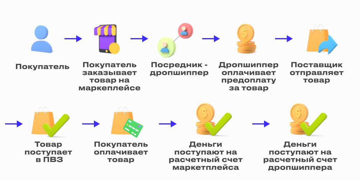
Схема сотрудничества:

  1. Дропшиппер регистрируется в CRM системе поставщика и выбирает товар из базы данных.
  2. Дропшиппер запускает продажи на маркетплейсе (оформляет карточки Wildberries, выставляет цены).
  3. Поступившие с маркета заказы оформляются в CRM-системе поставщика.
  4. Дропшиппер вносит фиксированную предоплату за товар (если это прописано в договоре).
  5. Поставщик отгружает заказы в ПВЗ Wildberries.
  6. Клиенты выкупают товар.
  7. Деньги поступают на рассчетный счет маркета.
  8. Марктплейс производит выплату на рассчетный счет дропшиппера.

Дропшиппер также может самостоятельно забирать заказы со склада поставщика и оформлять их доставку в ПВЗ маркетплейса. В среднем, используя такой подход, можно зарабатывать до 300-400 тыс.руб. в месяц. Такой вид бизнеса предполагает меньше вложений на старте, возможности для тестирования позиций и удаленное управление поставками.

Можно ли зарабатывать на Вайлдберриз без товара?

Компания предлагает пользователям несколько вариантов сотрудничества:

  • стать продавцом или поставщиком продукции;
  • заключить договор перевозки;
  • открыть ПВЗ. 

Однако, зарабатывать удаленно можно, будучи менеджером Wildberries, копирайтером по отзывам или заполняя карточки товаров. Чтобы освоить каждую из профессий, потребуется пройти специализированное обучение.

Советуем прочитать: Виртуальные номера: 10 бесплатных сервисов СМС-активаций 

В 2022 году в Интернете зарабатывает множество мошенников, желающих продавать курсы по маркетплейсам. Соискатель покупает курс за собственные деньги, но на деле оказывается, что представленная в нем информация — обыкновенный развод. Тем не менее, новичок все же может освоить популярный способ заработка, следуя простым советам, представленным в этой статье. О том, сколько новичку можно заработать на Валберис, мы поговорим в следующем разделе. 

Заработок на вайлдберриз без вложений отзывы

В Интернете нередко встречается мнение, что заработок на маркетплейсах — это мошенничество. Но так ли это на самом деле? Для того, чтобы получить деньги, потребуется составить план продаж и определить, какой из вариантов работы на WB будет наиболее предпочтительным. Рассмотрим подробнее каждый из вариантов. 

Заработок на заполнении карточек Вайлдберриз — отзывы о доходе: развод или реальный заработок?

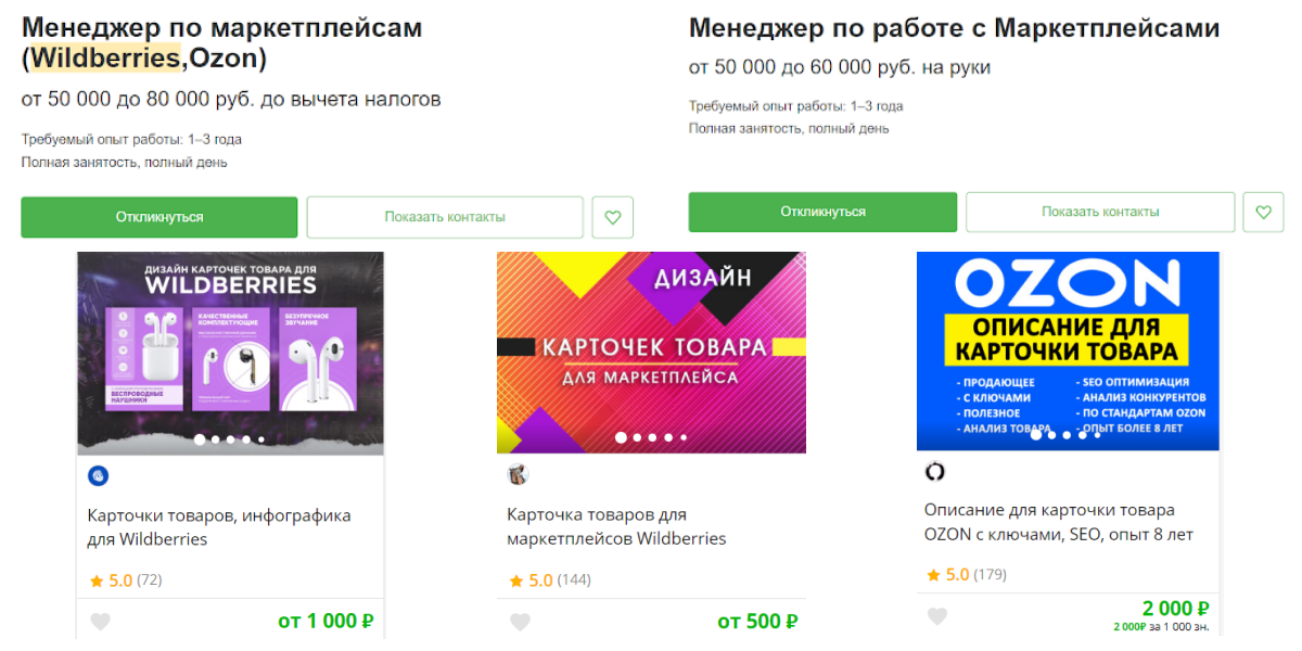
Для того, чтобы заработать на маркетплейсе удаленно и без вложений, можно заполнять карточки товаров за вознаграждение. Большинство поставщиков и продавцов нанимают фрилансеров для заполнения характеристик, наполнения карточки товара актуальным фото и видео контентом. Заработок на заполнении карточек подходит не всем фрилансерам, однако, это не развод на деньги. В среднем, подобные вакансии на популярных биржах фриланса оцениваются следующим образом:

  • При полной занятости менеджер по работе с карточками и характеристиками позиций может зарабатывать от 50 тыс.руб. 
  • На фриланс биржах стоимость разработки дизайна карточек стартует от 500 руб. 
  • SEO-оптимизация карточек товара от опытных специалистов стартует от 2 тыс. руб. за 1 тыс. знаков.
Заработок на Вайлдберриз

На фриланс-биржах и сайтах поиска работы содержится большое количество предложений о заработке на Вайлдберриз. За каждое выполненное задание фрилансер получает реальные деньги, несмотря на распространенное мнение о том, что заработок на маркете — развод. Договариваясь о сотрудничестве, важно обращать внимание на рейтинг работодателя и объективно оценивать свои навыки. 

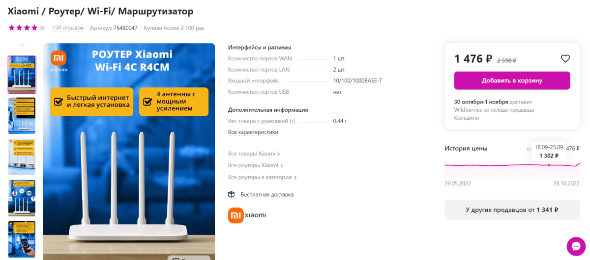
Что такое карточка? Это страница товара, который продается на площадке, с фото и видео описанием, а также отзывами и характеристиками.

Карточка товара на Wildberries

Как открыть ПВЗ и сколько можно заработать на складе Wildberries

Большинство начинающих предпринимателей интересуется, сколько можно зарабатывать в пункте выдачи WB. Многие считают, что открыть ПВЗ — слишком затратно, а распространенные данные о доходах — развод. Однако, чтобы зарабатывать на платформе, можно открыть свой склад или устроиться на работу в пункт выдачи заказов. 
Предпринимателю для того, чтобы открыть ПВЗ, потребуются первоначальные вложения. На старте потребуется потратиться на:

  • аренду помещения для хранения заказов;
  • оплату труда сотрудников;
  • техническое обеспечение работы пункта выдачи заказов: сигнализация, камеры видеонаблюдения, принтеры, кассовое оборудование, канцелярские принадлежности;
  • маркетинг и оформление интерьера. 

Занятость в ПВЗ предполагает, что сотрудник должен быть:

  • стрессоустойчивым;
  • ответственным;
  • доброжелательным;
  • внимательным. 

Средняя заработная плата сотрудников ПВЗ стартует от 30 тыс.руб. в месяц. Также на сайтах-агрегаторах вакансий присутствует большое количество предложений о работе по сменам. Стартовая заработная плата в таких вакансиях от 2 тыс.руб. 

Советуем прочитать: Стоит ли лить трафик с RuTube в 2024 

В среднем, заработок на Wildberries с ПВЗ для владельцев пункта со средней проходимостью и выкупом стартует от 50 тыс. рублей и доходит до 200 тыс.руб. в первые месяцы работы. На старте необходимо закладывать 500 — 700 тыс. руб. для текущих расходов. 

Менеджер Wildberries — реальный доход или обман?

Менеджер вб организует продажу позиций, курируя весь процесс обработки заказа. В 2022 году вакансии менеджера Wildberries можно встретить на любом сайте-агрегаторе вакансий. 

Что входит в обязанности менеджера вб?

Вакансия менеджера предполагает как удаленную работу, так и возможное присутствие в офисе. Работа на Вайлдберриз удаленно — обман? Это не так, однако, нужно четко понимать обязанности менеджера маркета. Менеджер Wildberries:

  • занимается созданием и продвижением карточек;
  • разбирается с налогообложением и оформлением товарооборота в 1С;
  • анализирует продажи и статистику спроса;
  • планирует поставки;
  • мониторит тренды и находит выгодные конкурентные преимущества. 

В настоящее время рынок инфобиза активно продает курсы для менеджеров WB. Однако, большинство из обучающих материалов — не более, чем развод на деньги. Цены обучающих курсов стартуют от 3 тыс.руб. и доходят до 100 тыс.руб. В образовательных программах обещают научить:

  • формировать карточки товаров;
  • проводить аналитику;
  • запускать рекламные кампании;
  • разбираться в логистике;
  • выводить карточки товара в ТОП выдачи. 

При выборе образовательных материалов важно обращать внимание на программу обучения, рейтинг школы или эксперта, смотреть разоблачения на обучение по вб. 

Реальные отзывы: заработок на Вайлдберриз и других маркетплейсах

Безусловно, получать прибыль на Wildberries и других маркетах честно можно и без собственного продукта. Желающие получать пассивный доход могут инвестировать в чужой проект под определенный процент или сдавать аккаунты в аренду. Однако, такой заработок предполагает высокие риски. Предпочтительнее выбирать собственный бизнес или найм у проверенного работодателя.

Сколько можно заработать на Wildberries

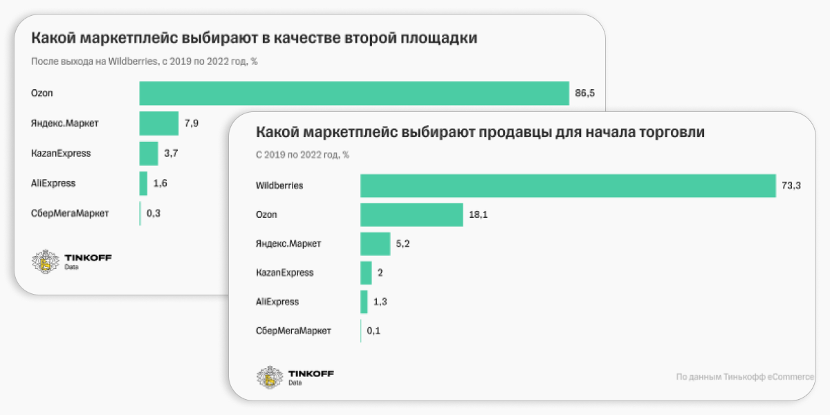
Согласно исследованиям Tinkoff, 73% новичков в бизнесе выбирают Wildberries стартовой площадкой. Более 60% продавцов — индивидуальные предприниматели или фирмы со штатом до 5 человек. WB находится на первом месте среди маркетов по объему продаж, оформив заказов на общую сумму 805700 млн. руб.

Статистика маркетплейсов

Около 50% выручки на WB приносит фешн-сегмент, в особенности, женская одежда и аксессуары. В топе также находятся аксессуары для дома, продукты для здоровья, домашних животных. Площадка удерживает от 1% до 30% от суммы заказов, рассчитывая комиссию на основе выбранного формата сотрудничества (FBO, FBA) и категории товара. 

FBO — обеспечение логистики и хранения заказов маркетом. 

FBS — продукт хранится у продавца, а маркет функционирует как витрина.  

Чтобы понять, сколько можно заработать при сотрудничестве с WB, стоит рассмотреть средний доход с ходового продукта. Если ваши друзья утверждают, что на WB можно заработать миллион, то это не обман. Для новичка вполне реально в первые два месяца работы выйти на чистый доход в 100-200 тыс. руб. Опытные селлеры зарабатывают от 400 тыс. руб. в мес., причем их доходы доходят до нескольких миллионов руб. в месяц. 

Выход на вб: отзывы

Как выйти на Wildberries и стоит ли вообще выходить на Вайлдберриз в 2024 году рассказал YouTube блогер Дмитрий Москаленко. Полный ролик можно посмотреть ниже:

Сколько можно заработать на Ozon

Ежедневная аудитория маркета, согласно собственным исследованиям компании, превышает 3,5 млн. человек. Среди наиболее популярных категорий на Озон находятся одежда,техника, книги, БАДы, продукты питания. Платформа сотрудниает с юр. лицами и ИП. 

На Ozon есть три схемы работы:

  • FBO — продажа со склада платформы; 
  • FBS — продажа со своего склада с доставкой Ozon Rocket;
  • realFBS — продажа со своего склада с доставкой любыми перевозчиками.

Маркет берет комиссию от 4% до 15%. На величину комиссии также влияет категория позиции и формат размещения на складе. Стоимость доставки одной товарной позиции не может быть ниже 20 руб. и выше 250 руб.

Заработок на Ozon не имеет ограничений. На сайте есть калькулятор для расчета прибыли с продаж определенной позиции. 

Инфлюенсеры также могут сотрудничать с маркетом, используя реферальную программу Озон. Маркет платит не с каждой продажи, а только 2 раза в месяц. Именно поэтому заходить на Озон лучше с опытом в продажах на Интернет-ресурсах. 

Сколько можно заработать на Яндекс Маркете 

В 2022 году Яндекс.Маркет предлагает более, чем 25 млн. товаров, зарабатывая на комиссии с продаж. Прибыль продавца будет зависеть от наценки и объемов продаж. Площадка сотрудничает с ИП и ООО. Наибольшим спросом на площадке пользуются техника, одежда, продукты питания, автомобильные аксессуары, косметика. 

На Яндекс.Маркет есть 3 схемы работы:

  • FBY — Яндекс.Маркет хранит и упаковывает заказы;
  • FBS — продавец самостоятельно обеспечивает хранение и упаковку заказов; 
  • FBY+ (поставка под заказ) – позиция хранится у продавца, а Яндекс.Маркет упаковывает заказы. 

Заработок на Яндекс Маркет, согласно реальным отзывам, далек от мошенничества. В среднем, за несколько месяцев работы новичок может выйти на доход от 50 тыс. руб. в мес. 

Заработок на Вайлдберриз реальные отзывы и кейсы на примере реальных людей

Правду о заработке на WB можно узнать только, посмотрев реальные отзывы продавцов на Вайлдберриз. Мошенничество на Wildberries случаются часто, однако, в Интернете все же есть немало успешных кейсов. 

Честный отзыв о работе на Wildberries: как заработать первые 2000000 рублей на вб

YouTube блогер Николай Шапкин зашел на площадку с первоначальными вложениями в 30 тыс. рублей. Большая часть ассортимента — оптовые детские товары.  В результате, позицию стали активно заказывать, и всего за 3 недели удалось получить 95242 руб. чистой прибылью с 4 разных продуктов без рекламы, отзывов и какого-либо продвижения. Еще через месяц у Николая с партнером получилось сделать 350 тыс.руб. чистыми за вычетом налогов, цены закупки и комиссии. Ниже для просмотра доступен курс Николая Шапкина про заработок в Валберис:

Таким образом, общая чистая прибыль за 3 месяца работы составила около 400 тыс. руб. Общая выручка за рассмотренный период составила порядка 2 млн. рублей.  Предприниматель советует делать ставки на позиции с ROI с 100-150% и чистой маржой после всех вычетов в районе 40-50%. Цена закупки не должна превышать 500 рублей, так как такой продукт будет хорошо продаваться весь год.  

Заработок 20 млн. руб. на Вайлдберриз на брендах украшений и детских игрушек 

Другая история о том, как хобби превратилось в реальный бизнес, началась в Ульяновске. Ольга Амирова – селлер и автор курса «Бизнес на маркетплейсах» за полтора года работы с плошадкой смогла сделать оборот более 20 млн. руб. с двумя брендами. 

Вместе с мужем Ольга создала бренд украшений — Meizel и магазин детских игрушек — Fanzo.Store. 

Несмотря на то, что Ольга знала, как продавать онлайн, систему продаж на маркете пришлось выстраивать с нуля. За время работы команда увеличилась до 9 человек. В настоящее время, около 95% пользователей выкупают товар.

Заработок на Вайлдберриз

Так, при обороте в 25 млн. руб. Ольге и ее команде удалось получить 22 млн. руб. за 1,5 года работы с маркетом. 

На чем зарабатывает Вайлдберриз

В основном, Wildberries зарабатывает на розничной торговле и продаже товаров через Интернет. Основной источник дохода компании — комиссионные с продажи товаров на своей платформе. Когда клиент делает покупку через сайт или приложение WB, маркетплейс получает процент от стоимости товара.

Компания также зарабатывает на дополнительных услугах, таких как: платные варианты доставки, ускоренные доставки, а также сотрудничество с брендами, рекламодателями и производителями, которые могут предоставлять специальные акции, скидки и промокоды.

Кроме того, Wildberries также развивает собственные бренды и продукцию, что позволяет получать дополнительную прибыль от их продаж.

Заключение 

Примеров успешного заработка на WB в Интернете достаточно. Как правило, тестирование, анализ конкурентов и выбор грамотной стратегии позволяют избежать ошибок и доказать, что заработать честные деньги на маркете возможно. Заработок на Вайлдберриз — далеко не развод. Стать продавцом на маркете, открыть ПВЗ, заполнять карточки удаленно или быть менеджером каждый решает самостоятельно. Однако, получить реальные деньги на площадке точно возможно. 

Удачи и профита!

Возможен ли заработок на Вайлдберриз без вложений?
Сколько можно зарабатывать на складе Вайлдберриз?
Заработок на заполнении карточек Вайлдберриз отзывы?
Есть ли на Wildberries мошенничество и обман?
Как устроиться на Вайлдберриз?
Как узнать сколько хранится товар на Вайлдберриз?

Комментарии отсутствуют. Будьте первым!

в ответ kakdelakisa

user avatar