a {
color: rgb(32, 63, 172) !important;
}
.menu .menu-item.current-menu-ancestor > a {
color: rgb(32, 63, 172) !important;
}
.menusearch .menu-item-has-children:hover .sub-menu {
display: flex;
position: absolute;
top: 100%;
z-index: 5000;
}
.menusearch .menu-item-has-children:hover > a::after {
transform: rotate(-180deg) translateY(-5px);
-webkit-transform: rotate(-180deg) translateY(-5px);
transition: 0.3s ease-in;
}
.menusearch .menu-item:last-child:hover .sub-menu {
display: grid;
grid-template-columns: 1fr 1fr;
right: 0;
}
.sub-menu {
display: none;
flex-direction: column;
justify-content: start;
align-items: start;
overflow: hidden;
transition: max-height ease-in 0.7s, opacity ease 0.5s, padding ease 0.5s;
border-bottom-left-radius: 4px;
border-bottom-right-radius: 4px;
border: 1px solid #f7f7f7;
border-top: none;
padding: 0;
background: #fff;
z-index: 998;
box-shadow: 0px 3px 4px 0px rgba(0, 0, 0, 0.1490196078);
}
.sub-menu .menu-item {
margin: 7px 0 7px 0;
position: relative;
}
.sub-menu .menu-item a {
color: #5b6471 !important;
position: relative;
padding: 7px 60px 7px 16px;
display: block;
cursor: pointer;
}
.sub-menu .menu-item a:hover {
color: #5b6471 !important;
}
.sub-menu .menu-item:last-child {
margin-bottom: 0;
}
.sub-menu .menu-item:hover {
background: #f4f6ff;
}
.sub-menu .menu-item.current-menu-item > a {
color: #5b6471 !important;
}
.sub-menu--init {
width: initial;
}
.sub-menu--shown {
width: initial;
opacity: 1;
max-height: 1000px;
padding: 0 0 4px 0;
}
.menu-item-has-children > a::after {
content: url('data:image/svg+xml,%3Csvg width="12" height="6" viewBox="0 0 12 6" fill="none" xmlns="http://www.w3.org/2000/svg"%3E%3Cpath d="M6.00011 5.24999C5.85011 5.24999 5.65011 5.19999 5.55011 5.09999L1.05011 1.59999C0.750109 1.34999 0.700109 0.849987 0.950109 0.549987C1.20011 0.249987 1.70011 0.199986 2.00011 0.449986L6.00011 3.54999L10.0001 0.449986C10.3001 0.199986 10.8001 0.249987 11.0501 0.549987C11.3001 0.849987 11.2501 1.34999 10.9501 1.59999L6.45011 5.09999C6.35011 5.19999 6.15011 5.24999 6.00011 5.24999Z" fill="%23B6C1C7"/%3E%3C/svg%3E%0A');
margin-left: 5px;
transition: 0.3s ease-out;
display: inline-block;
transform: translateY(-1px);
}
.menu--hidden {
display: none;
}
@media (max-width: 1720px) {
.menu .menu-item a {
font-size: 1rem;
}
.menu-item-has-children > a::after {
top: 27px;
}
.menu .menu-item-has-children:hover > a::after {
transform: rotate(-180deg) translateY(-4px);
-webkit-transform: rotate(-180deg) translateY(-4px);
}
.sub-menu .menu-item {
margin-right: 0;
display: block;
width: 100%;
}
}
@media (max-width: 1200px) {
.menu .menu-item {
margin-right: 15px;
}
.menu .menu-item:last-child {
margin-right: 0;
}
}
@media (max-width: 1200px) {
.sub-menu .menu-item {
margin-right: 0;
}
}
@media (max-width: 1000px) {
.menu {
display: none;
}
.burger .menu {
display: block;
}
}
.burger {
visibility: hidden;
position: fixed;
top: 0;
left: 0;
bottom: 0;
right: 0;
width: 80%;
background: #fff;
z-index: 999;
overflow: scroll;
height: 100vh;
transform: translateX(-100%);
transition: all 0.3s ease-in;
}
.burger .sub-menu {
display: none;
width: initial;
height: initial;
opacity: 1;
max-height: none;
border-radius: 0;
background: none;
color: #fff;
border: none;
box-shadow: none;
}
.burger .sub-menu .menu-item a {
padding-left: 40px;
}
.burger .sub-menu .menu-item a:hover {
padding-left: 35px;
}
.burger .sub-menu .menu-item::after {
content: none;
}
.burger .sub-menu .menu-item:hover {
background: none;
}
.burger .user__wrapper {
display: flex;
align-items: center;
flex-direction: row-reverse;
justify-content: space-between;
width: 100%;
}
.burger .user__wrapper.user--hidden {
display: none;
}
.burger .user {
width: 70px;
height: 70px;
}
.burger .login__button {
padding: 0;
background: none;
color: #000;
}
.burger-open {
visibility: visible;
transform: translateX(0%);
transition: all 0.3s ease-in;
}
.burger__menu {
background: #fff;
color: #5b6471;
}
.burger__menu .menu-item a {
padding: 12px 20px;
font-size: 1.125rem;
}
.burger__menu .menu-item a:hover {
background: #e5ebff;
border-left: 5px solid #3f63df;
padding-left: 15px;
}
.burger__menu .menu-item a:visited {
color: #5b6471;
}
.burger__usermenu {
list-style-type: none;
}
.burger__usermenu-item {
padding: 5px 0;
}
.burger__usermenu-item a {
color: #000;
font-weight: 600;
}
.burger__title {
padding: 0.875rem 3rem;
border-bottom: 1px solid #b6c1c7;
background: #fff;
display: flex;
justify-content: center;
align-items: center;
position: relative;
margin-bottom: 0.5rem;
}
.burger__title figure {
position: absolute;
left: 20px;
top: 18px;
}
.burger__title--h3 {
font-size: 18px;
line-height: 21px;
color: #000d20;
font-weight: 400;
}
.login__button--mobile {
display: none;
}
@media (max-width: 1000px) {
.login__button--desktop {
display: none !important;
}
.login__button--mobile {
display: block;
cursor: pointer;
}
.login__button--mobile figure {
height: 25px;
}
.login__button--mobile figure img {
height: 25px;
width: 25px;
}
}
@media (min-width: 500px) {
.burger__profile {
padding: 50px 100px 10px 100px;
}
}
#searchform {
width: 100%;
align-items: flex-end;
display: flex;
flex-direction: row-reverse;
gap: 0.5rem;
}
.search__input {
width: 100%;
border: none;
border-bottom: 1px solid #5b6471;
padding: 0.25rem;
}
.search__input:focus {
box-shadow: none;
border-bottom: 1px solid #203fac;
}
.search__button {
border: none;
background: none;
cursor: pointer;
height: 24px;
}
.search__button img {
width: 100%;
}
.menusearch {
width: 100%;
}
.search-wrapper {
display: flex;
flex-direction: column;
gap: 1.5rem;
}
.search-post {
display: flex;
flex-direction: column;
gap: 0.5rem;
padding: 10px;
}
.search-post:hover {
background-color: #f4f6ff;
}
.search-link:hover > h2 {
color: #203fac;
}
.search-link {
display: flex;
align-items: center;
color: #203fac;
}
.search-link p {
font-size: 1.125rem;
}
.search-link:visited {
color: #203fac;
}
.search-text {
color: #555555;
}
.search-section .divider:last-child {
display: none;
}
@media (max-width: 1720px) {
.search-link p {
font-size: 1rem;
}
.search__button {
height: 22px;
}
}
.branding {
position: relative;
}
.branding__poster {
max-width: 1920px;
margin: 0 auto;
padding-top: 320px;
}
.branding__link {
display: block;
position: absolute;
top: 60px;
left: 0;
width: 100%;
height: 260px;
background-position-y: 60px;
background-position-x: center;
background-repeat: no-repeat;
background-attachment: fixed;
}
.branding__link:hover {
filter: contrast(0.8);
}
.lazy {
opacity: 0;
transition: opacity 0.5s ease;
}
.lazy.entered.loaded {
opacity: 1 !important;
}
.branding__link {
opacity: 1;
transition: opacity 0.5s ease;
}
.branding__link.entered.loaded {
opacity: 1 !important;
}
.branbranding__poster--mobile {
display: none !important;
}
@media (max-width: 1440px) {
.branding__poster {
padding-top: 285px;
}
.branding__link {
background-size: 1700px auto;
height: 225px;
}
}
@media (max-width: 1300px) {
.branding__link {
background-size: 1500px auto;
height: 200px;
}
.branding__poster {
padding-top: 260px;
}
}
@media (max-width: 1100px) {
/* .branding__poster {
padding-top: 220px;
}
.branding__link {
height: 100% !important;
}*/
}
@media (max-width: 1023px) {
.branbranding__poster--desktop {
display: none;
}
.branbranding__poster--mobile {
display: block !important;
margin: 50px 0 0 0;
}
.branding__link--mobile {
display: block;
}
.branbranding__poster--mobile-wrap {
position: relative;
/*background: whitesmoke;*/
max-height: 80px;
overflow: hidden;
}
.branbranding__poster--mobile-wrap:before {
content: "";
display: block;
padding-top: 30%;
}
.branding__link--mobile {
display: block;
position: absolute;
width: 100%;
top: 0;
right: 0;
bottom: 0;
left: 0;
background-position-y: 50px;
background-position-x: center;
background-repeat: no-repeat;
background-attachment: fixed;
background-size: 100vw auto;
}
}
@media (min-width: 768px) and (max-width: 1023px) {
.branbranding__poster--mobile-wrap {
max-height: 300px;
}
}
* {
box-sizing: border-box;
margin: 0;
padding: 0;
}
a {
text-decoration: none;
}
img {
max-width: 100%;
height: auto;
}
input,
select,
textarea,
a,
button {
outline: none;
transition: all 0.3s ease;
font-family: "SF Pro", "Segoe UI", Tahoma, Geneva, Verdana, sans-serif !important;
}
input,
select,
textarea {
color: #000d20;
}
input:focus,
select:focus,
textarea:focus,
a:focus,
button:focus {
outline: none;
box-shadow: 0 0 2px #203fac;
}
p,
a,
div,
button,
select {
font-size: 1.125rem;
}
.page__text {
line-height: 140.5%;
color: #5b6471;
margin: 0.625rem 0 1.875rem 0;
}
.page__text h3 {
margin-bottom: 25px;
}
.page__text p {
margin-bottom: 15px;
}
img:not([src]):not([srcset]) {
visibility: hidden;
}
body {
font-family: "SF Pro", "Segoe UI", Tahoma, Geneva, Verdana, sans-serif;
font-weight: 400;
background: #fff;
}
input,
textarea {
font-size: 1.125rem;
}
input::placeholder {
font-size: 1.25rem;
}
html,
body {
width: 100%;
height: 100%;
margin: 0px;
padding: 0px;
scroll-behavior: smooth;
}
.very__long__stuff {
height: 3000px;
}
.main {
background: #fff;
transition: 0.3s ease-in-out;
border-radius: 20px;
padding: 3.25rem;
position: relative;
/* box-shadow: 0px 0px 15px 0px rgba(0, 0, 0, 0.15);*/
}
.main__content {
margin: 0 auto;
}
.swiper-slide {
height: auto !important;
}
.searchmobi {
display: none;
}
.searchmobi .search {
margin-top: 1rem;
}
.select {
position: relative;
display: block;
width: 100%;
max-width: 195px;
}
.select__head {
width: 100%;
max-width: 195px;
height: 34px;
border: 1px solid #b6c1c7;
border-radius: 4px;
padding: 6px 10px;
color: #000d20;
cursor: pointer;
position: relative;
}
.select__head::after {
content: url('data:image/svg+xml,%3Csvg width="12" height="6" viewBox="0 0 12 6" fill="none" xmlns="http://www.w3.org/2000/svg"%3E%3Cpath d="M6.00011 5.24999C5.85011 5.24999 5.65011 5.19999 5.55011 5.09999L1.05011 1.59999C0.750109 1.34999 0.700109 0.849987 0.950109 0.549987C1.20011 0.249987 1.70011 0.199986 2.00011 0.449986L6.00011 3.54999L10.0001 0.449986C10.3001 0.199986 10.8001 0.249987 11.0501 0.549987C11.3001 0.849987 11.2501 1.34999 10.9501 1.59999L6.45011 5.09999C6.35011 5.19999 6.15011 5.24999 6.00011 5.24999Z" fill="%23B6C1C7"/%3E%3C/svg%3E%0A');
position: absolute;
right: 13px;
top: 4px;
transition: 0.3s ease-out;
display: inline-block;
transform: translateY(-1px);
}
.select__head.open::after {
transform: rotate(180deg) translateY(-5px);
-webkit-transform: rotate(-180deg) translateY(-5px);
}
.select__list {
position: absolute;
top: 100%;
left: 0;
right: 0;
background: #fff;
max-width: 195px;
border: 1px solid #b6c1c7;
border-radius: 0 0 4px 4px;
margin-top: -1px;
z-index: 100;
font-size: 14px;
color: #424348;
flex-direction: column;
gap: 5px;
}
.select__list::-webkit-scrollbar {
width: 7px;
background-color: #f8f9fa;
padding: 5px;
}
.select__list::-webkit-scrollbar-thumb {
border-radius: 10px;
background-color: #d9d9d9;
}
.select__list .select__item {
position: relative;
padding: 8px 9px;
color: #5b6471;
list-style: none;
}
.select__list .select__item:first-child {
margin-top: 5px;
}
.select__list .select__item:last-child {
margin-bottom: 5px;
}
.select__list .select__item:visited {
color: #5b6471;
}
.select__list .select__item:hover {
background: #f4f6ff;
}
.open {
border-radius: 4px 4px 0 0;
}
.select__title {
font-weight: 400;
color: #5b6471;
line-height: 18px;
margin-bottom: 9px;
}
.rules {
padding-top: 5rem !important;
}
.rules__text {
line-height: 140.5%;
color: #000d20;
margin-top: 2rem;
}
.rules__text h2 {
margin-bottom: 1.5rem;
}
.rules__text h3 {
margin-bottom: 1rem;
}
.rules__text p {
margin-bottom: 1rem;
}
.rules__text dl,
.rules__text ol,
.rules__text ul {
padding-left: 20px;
margin-bottom: 1rem;
}
.rules__text li {
color: #000d20;
line-height: 150%;
}
@media (max-width: 1720px) {
.main {
max-width: 1100px;
padding: 2.5rem;
}
p,
a,
div,
button,
select {
font-size: 1rem;
}
.page__text {
margin: 0.625rem 0 1.5625rem 0;
}
input,
textarea {
font-size: 1rem;
}
input::placeholder {
font-size: 1rem;
}
}
@media (max-width: 1600px) {
.main {
max-width: 1050px;
padding: 1.625rem;
}
}
@media (max-width: 1400px) {
.main {
max-width: initial;
width: 100%;
padding: 1.25rem;
}
}
@media (max-width: 1000px) {
.page__text {
font-size: 1.125rem;
margin: 0.625rem 0 1.25rem 0;
}
.searchmobi {
display: initial;
}
.searchmobi .search--hidden {
display: flex;
}
.main {
border-radius: 0;
padding: 1.25rem;
box-shadow: none;
margin: 0 auto;
}
}
@media (max-width: 700px) {
.hide-on-mobile {
display: none;
}
.no-scrolling {
overflow: hidden;
}
}
.checkbox {
display: grid;
place-items: center;
width: 24px !important;
height: 24px !important;
padding: 0;
margin: 0;
color: #0040ff;
position: relative;
cursor: pointer;
appearance: none;
}
.checkbox:before {
content: "";
width: 100%;
height: 100%;
line-height: 1;
color: inherit;
border-width: 2px;
border-style: solid;
border-color: #b6c1c7;
border-radius: 4px;
transition: all 0.2s ease;
}
.checkbox:after {
content: "";
width: calc(100% - 12px);
height: calc(100% - 19px);
border-width: 0px 0px 2px 2px;
border-style: solid;
border-color: #fff;
transform: rotate(-45deg);
position: absolute;
top: 6px;
left: 5px;
transition: all 0.2s ease;
}
.checkbox:checked:before {
background: #0040ff;
border-color: #0040ff;
}
.checkbox:checked::after {
border-color: #fff;
}
.checkbox:disabled {
cursor: not-allowed;
}
.checkbox:disabled:before {
border-color: darkgray;
}
.checkbox:disabled:after {
border-color: transparent;
}
.checkbox:disabled:checked {
color: #0040ff;
opacity: 0.65;
}
.checkbox:disabled:checked:before {
border-color: #0040ff;
}
.checkbox:disabled:checked::after {
border-color: #fff;
}
.checkbox.focus,
.checkbox:focus {
outline: none;
box-shadow: none;
}
.checkbox__field {
display: grid;
grid-template-columns: repeat(2, max-content);
gap: 0.3rem;
align-items: center;
}
.checkbox__label {
color: rgb(91, 100, 113);
font-size: "1.25rem";
}
.title__h1 {
font-size: 1.875rem;
font-style: normal;
font-weight: 600;
line-height: 36px;
letter-spacing: 0em;
text-align: left;
}
h1 {
line-height: 36px;
font-size: 1.875rem;
font-weight: 600;
color: #000d20;
}
.title__h2 {
font-size: 1.375rem;
font-weight: 600;
}
.title__h2 a {
color: #000d20;
font-size: 1.375rem;
}
h2 {
font-size: 1.375rem;
font-weight: 600;
color: #000d20;
}
h3 {
font-size: 1.25rem;
font-weight: 600;
color: #000d20;
}
.title {
display: flex;
justify-content: space-between;
align-items: center;
margin-bottom: 1.875rem;
width: 100%;
}
.title__group {
display: grid;
grid-auto-flow: column;
align-items: center;
gap: 20px;
}
.title--middlemargin {
margin-bottom: 1.5625rem;
}
.title--smallmargin {
margin-bottom: 0.9375rem;
}
.title--nomargin {
margin: 0 !important;
}
.title--margintop {
margin-top: 1.875rem;
}
.title__link {
text-decoration: none;
color: #203fac;
}
.title__button-link {
max-height: 30px;
display: flex;
justify-content: center;
border-radius: 10px;
align-items: center;
color: #fff;
padding: 4.5px 16px;
font-size: 18px;
white-space: nowrap;
}
.title__button-link:hover {
filter: brightness(1.2);
}
.sponsor__button-link {
max-height: 30px;
display: flex;
justify-content: center;
border-radius: 10px;
align-items: center;
color: #fff;
padding: 4.5px 26px 4.5px 18px;
font-size: 18px;
white-space: nowrap;
gap: 10px;
background-color: #1f1e26;
text-transform: uppercase;
}
@media (max-width: 1720px) {
.title__h1 {
font-size: 1.6875rem;
}
h1 {
font-size: 1.6875rem;
}
.title__h2 {
font-size: 1.125rem;
}
h2 {
font-size: 1.25rem;
}
.title {
margin-bottom: 1.5625rem;
}
h3 {
font-size: 1.125rem;
}
}
@media (max-width: 1000px) {
.title__h1 {
font-size: 1.5rem;
line-height: 26px;
}
h1 {
font-size: 1.5rem;
}
.title__h2 {
font-size: 1.25rem;
}
h2 {
font-size: 1.25rem;
}
.title {
margin-bottom: 1.25rem;
}
h3 {
font-size: 1rem;
}
}
@media (max-width: 480px) {
.title {
margin-bottom: 1rem;
flex-wrap: wrap;
gap: 10px;
align-items: flex-start;
}
.title__group {
display: flex;
}
.title__h1 {
font-size: 1.375rem;
line-height: 1.2;
}
h1 {
font-size: 1.375rem;
}
.title__link {
font-size: 1rem;
}
.title--nomargin {
margin: 0;
}
.title--margintop {
margin: 2rem 0;
}
.title--mobile {
flex-direction: column-reverse;
gap: 2rem;
align-items: flex-start;
}
.title__button-link {
font-size: 12px;
padding: 8px 10px;
}
}
.button {
border-radius: 10px;
color: #fff;
display: block;
padding: 3px 15px;
font-family: "SF Pro", "Segoe UI", Tahoma, Geneva, Verdana, sans-serif;
background-color: #203fac;
cursor: pointer;
text-align: center;
}
.fix .button {
background-color: #fff;
color: #000;
}
.button__show-all {
background-color: #203fac;
color: #fff;
padding: 10px 37px;
border-radius: 10px;
font-weight: 600;
margin: 22px auto 0;
display: block;
width: fit-content;
}
.button--primary {
border: none;
border-radius: 10px;
background: #203fac;
color: #fff;
padding: 4px 16px 5px 16px;
width: fit-content;
text-align: center;
display: flex;
align-items: center;
justify-content: center;
gap: 8px;
}
.button--primary:hover {
background: #3f63df;
}
.button--secondary {
padding: 10px 16px;
display: block;
border-radius: 5px;
border: 1px solid #5b6471;
color: #5b6471;
background: #fff;
text-align: center;
max-width: 130px;
width: 100%;
}
.button--secondary:hover {
background: #b6c1c7;
border: 1px solid #b6c1c7;
color: #fff;
}
.button--hidden {
display: none !important;
}
.button--gray {
background: #b6c1c7;
}
.btn__show-all {
color: #5b6471;
border: 1px solid #758194;
text-align: center;
width: fit-content;
display: block;
padding: 3px 16px;
outline: none;
cursor: pointer;
border-radius: 10px;
}
.btn__show-all:hover {
color: #000d20;
border: 1px solid #000d20;
}
.button-respond {
color: #5b6471;
border: 1px solid #758194;
text-align: center;
width: fit-content;
display: block;
padding: 3px 16px;
outline: none;
cursor: pointer;
border-radius: 10px;
}
.button-respond:hover {
color: #000d20;
border: 1px solid #000d20;
}
.link--hover {
color: #203fac !important;
width: fit-content;
}
.link--hover::after {
content: "";
display: block;
width: 0;
height: 1px;
margin-top: -2px;
background: #203fac;
}
.link--hover:hover::after {
width: 100%;
}
.tag {
border: 1px solid #b6c1c7;
color: #b6c1c7;
border-radius: 20px;
padding: 1px 10px;
display: block;
width: fit-content;
}
.tag:hover {
border: 1px solid #3f63df;
color: #3f63df;
}
.button-submit {
display: flex;
align-items: center;
align-content: center;
justify-content: center;
font-family: "SF Pro", "Segoe UI", Tahoma, Geneva, Verdana, sans-serif;
white-space: nowrap;
border: 1px solid #203fac;
box-sizing: border-box;
border-radius: 10px;
background: none;
padding: 16px 15px;
width: fit-content;
color: #203fac;
cursor: pointer;
}
.button-submit:disabled {
background: #b6c1c7 !important;
border: 1px solid #b6c1c7 !important;
color: #fff !important;
}
.button-submit:disabled svg path {
fill: #fff;
}
.button-submit a {
color: #203fac;
}
.button-submit:hover a {
color: #fff;
}
.button-submit--disabled {
background: #b6c1c7 !important;
border: 1px solid #b6c1c7 !important;
color: #fff !important;
}
.button-submit--small {
padding: 2px 16px;
border-radius: 10px;
}
.button-submit:hover {
border: 1px solid #3f63df;
background: #3f63df;
color: #fff;
}
.button-submit:hover svg path {
fill: #fff;
}
.button-submit--gray {
border: 1px solid #5b6471;
color: #5b6471;
display: flex;
gap: 5px;
justify-content: center;
}
.button-submit--gray:hover {
border: 1px solid #b6c1c7;
background: #b6c1c7;
color: #fff;
}
.button--restore {
width: 100% !important;
margin-top: 20px;
height: 40px;
line-height: 38px;
padding: 0;
border: 1px solid #3f63df;
}
.button--restore:hover {
background: #fff;
color: #3f63df;
}
.button--decline {
padding: 10px 16px;
display: block;
border-radius: 5px;
border: 1px solid #203fac;
color: #203fac;
background: #fff;
text-align: center;
max-width: 130px;
width: 100%;
}
.button--decline:hover {
background: #3f63df;
border: 1px solid #3f63df;
color: #fff;
}
@media (max-width: 1720px) {
.button__show-all {
margin-top: 15px;
}
.link--hover::after {
margin-top: 0px;
}
.link--hover {
height: 23px;
}
.btn__show-all {
padding: 4px 16px;
}
.button-respond {
padding: 4px 16px;
}
.button--primary {
padding: 6px 16px 5px 16px;
}
}
@media (max-width: 1000px) {
.button {
border-radius: 10px;
}
.btn__show-all {
position: absolute;
bottom: 3px;
left: 50%;
transform: translate(-50%, -50%);
width: 100%;
padding: 6px 16px;
}
}
.tooltip-button {
margin-right: 10px;
position: relative;
border: 0;
outline: none;
background: transparent;
}
.tooltip-button:hover .tooltip {
opacity: 1;
visibility: visible;
height: auto;
}
.tooltip-button .tooltip {
background: #000d20;
border-radius: 5px;
color: #fff;
position: absolute;
transition: visibility 0s linear 0.3s, opacity 0.3s linear 0s;
opacity: 0;
visibility: hidden;
z-index: 2000;
top: 20px;
right: -9px;
padding: 10px;
width: max-content;
}
.tooltip-button .tooltip:after {
content: "";
position: absolute;
right: 9px;
left: initial;
top: -9px;
width: 0;
height: 0;
border-style: solid;
border-width: 0 8px 10px 8px;
border-color: transparent transparent #000d20 transparent;
}
.sponsor__outer {
border-radius: 7px;
-webkit-border-radius: 7px;
display: block;
overflow: hidden;
}
.sponsor__video {
display: block;
width: 100%;
}
.sponsor__video:hover {
filter: contrast(0.8);
}
.sponsor__wrapper {
padding: 15px;
}
.sponsor__vertical {
border: 1px solid #b6c1c7;
border-radius: 7px;
display: block;
position: relative;
overflow: hidden;
height: 100%;
max-height: 550px;
}
.sponsor__vertical-image {
object-fit: cover;
width: 100%;
height: 100%;
min-height: 500px;
margin: 0 auto;
display: block;
}
.sponsor__vertical-image:hover {
filter: contrast(0.8);
}
.sponsor--no-padding-bottom {
padding: 3rem 0 0 0;
}
@media (max-width: 1000px) {
.sponsor__outer {
border-radius: 5px;
}
.sponsor__vertical {
max-width: inherit;
max-height: inherit;
}
.sponsor__wrapper {
padding-left: 0;
}
}
@media (max-width: 700px) {
.sponsor__wrapper {
padding-left: 0;
padding-right: 0;
}
}
@media (max-width: 480px) {
.sponsor__outer {
max-height: 60px;
}
}
.breadcrumbs {
display: flex;
align-items: baseline;
grid-gap: 5px;
gap: 5px;
white-space: wrap;
flex-wrap: wrap;
-ms-overflow-style: none;
margin-bottom: 10px;
}
.breadcrumbs .breadcrumbs__separator {
color: #b6c1c7;
}
.breadcrumbs a {
color: #203fac;
}
.breadcrumbs a:visited {
color: #b6c1c7;
}
.blogs-education__section {
display: flex;
justify-content: space-between;
align-items: start;
}
.blogs-education__wrapper {
display: flex;
flex-direction: column;
gap: 30px;
width: 100%;
}
.blogs-education__title {
display: flex;
align-items: center;
justify-content: flex-start;
gap: 0.625rem;
margin-bottom: 0.625rem;
}
.blogs-education__title figure {
height: 24px;
margin: 0 !important;
}
.blogs-education__list {
padding-left: 20px;
line-height: 40px;
color: #5b6471;
position: relative;
z-index: 100;
}
.blogs-education__list li a {
color: #5b6471;
}
.blogs-education__list li:hover,
.blogs-education__list li:hover > a {
color: #3f63df !important;
}
.blogs-education__list li a:visited {
color: #5b6471;
}
.blogs-education__sidebar-list {
max-width: 400px;
min-width: 350px;
width: 100%;
list-style: none;
border: 1px solid #3f63df;
border-radius: 7px;
font-size: 1.25rem;
padding: 10px 0;
display: flex;
flex-direction: column;
margin-bottom: 35px;
}
.blogs-education__sidebar-list-item {
padding: 10px 20px 10px 20px;
color: #000d20;
font-size: 1.25rem;
transition: color 0.3s ease, background 0.3s ease;
}
.blogs-education__sidebar-list-item:visited {
color: #000d20;
}
.blogs-education__sidebar-list-item:hover {
background: #f4f6ff;
border-left: 5px solid #3f63df;
padding-left: 15px;
color: #3f63df;
}
.blogs-education__anchor {
margin-top: -80px;
padding-top: 80px;
}
.blogs--education .title,
.blogs--education .breadcrumbs {
position: relative;
z-index: 100;
}
.page-template-tmp-blog-education .main__content div:last-child {
margin-bottom: 35px;
}
@media (max-width: 1720px) {
.blogs-education__sidebar-list-item {
font-size: 1.125rem;
}
.blogs-education__section .sidebar {
top: 5rem;
}
}
@media (max-width: 1400px) {
.blogs-education__wrapper {
max-width: 650px;
}
}
@media (max-width: 1000px) {
.blogs-education__section .sidebar {
display: none;
}
.blogs-education__wrapper {
max-width: inherit;
}
}
.single__wrapper {
display: flex;
justify-content: space-between;
align-items: start;
margin-bottom: 6rem;
}
.no-container .single__content {
max-width: none;
}
.single-detail__content .sidebar {
min-width: 315px;
width: 24%;
margin-left: 0;
}
.single-detail__content .sidebar .sponsor__vertical-image {
min-width: initial;
}
.no-container .single__wrapper {
margin-bottom: 0;
}
.single__content {
width: 100%;
}
.single-detail__content {
display: flex;
justify-content: space-between;
align-items: start;
margin-bottom: 25px;
}
.single-detail__text {
max-width: 679px;
width: 100%;
display: flex;
flex-direction: column;
gap: 1.875rem;
line-height: 145.5%;
color: #000d20;
}
.single-detail__text ul,
.single-detail__text dl,
.single-detail__text ol {
padding-left: 20px;
}
.single-detail__text li {
color: #000d20;
line-height: 150%;
}
.single-detail__text a {
color: #203fac !important;
word-break: break-word;
font-size: inherit;
}
.single-detail__text a:visited {
color: #203fac !important;
}
.single-detail__text a:hover {
border-bottom: 1px solid #203fac;
}
.single-detail__content .sponsor__wrapper {
padding: 0;
}
blockquote {
border-left: 3px solid #203fac;
color: #1a1a1a;
font-size: 1.25em;
font-style: italic;
line-height: 145%;
padding: 1em 2em;
position: relative;
transition: 0.2s border ease-in-out;
z-index: 0;
}
blockquote:before {
content: "";
position: absolute;
top: 50%;
left: -4px;
height: 2em;
background-color: #fff;
width: 5px;
margin-top: -1em;
}
blockquote:after {
content: "❞";
position: absolute;
top: 50%;
left: -0.5em;
color: #203fac;
font-style: normal;
line-height: 1em;
text-align: center;
text-indent: -2px;
width: 1em;
margin-top: -0.5em;
transition: 0.2s all ease-in-out, 0.4s transform ease-in-out;
}
blockquote:active:after {
transform: rotateY(360deg);
}
cite {
display: block;
font-size: 0.75em;
line-height: 1.8em;
margin-top: 1em;
font-style: normal;
}
.single-detail__quote {
display: flex;
flex-direction: column;
position: relative;
}
.single-detail__quote::after {
content: url("/wp-content/themes/diasp__v2/static/img/misc/quote.svg");
position: absolute;
top: -6px;
left: calc(50% - 112px);
}
.single-detail__quote blockquote {
display: flex;
flex-direction: column-reverse;
padding: 0;
border-left: none;
}
.single-detail__quote blockquote p {
padding: 0 2em;
border-left: 2px solid #203fac;
}
.single-detail__quote blockquote cite strong {
color: #000d20;
font-size: 22px;
line-height: 27px;
}
.single-detail__quote blockquote cite {
color: #5b6471;
text-align: center;
margin-top: 0;
margin-bottom: 1em;
}
.single-detail__quote blockquote::after {
content: none;
}
.single-detail__quote blockquote:before {
content: none;
}
.single-detail__quote figure {
border-radius: 50%;
max-width: 128px;
max-height: 128px;
align-self: center;
}
.single-detail__quote figure img {
overflow: hidden;
object-fit: cover;
width: 100%;
min-width: 128px;
height: 128px;
}
.single-detail__quote .link-decoration-none {
border-radius: 50%;
}
.single-detail__text img {
width: 100%;
height: 100%;
object-fit: cover;
}
.single-detail__fig {
width: 100%;
max-width: 680px;
height: 100%;
}
.single-detail__img {
width: 100%;
height: 100%;
border-radius: 7px;
border: 1px solid #b6c1c7;
overflow: hidden;
}
.link-decoration-none {
display: flex;
}
.link-decoration-none:hover {
border-bottom: none !important;
}
#ez-toc-container {
padding: 20px 40px !important;
border-radius: 7px;
}
.ez-toc-title-container {
margin-bottom: 20px !important;
}
#ez-toc-container p.ez-toc-title {
font-weight: 600 !important;
}
#ez-toc-container a:hover {
text-decoration: none;
}
.ez-toc-link {
word-break: normal !important;
}
.single-related {
margin-top: 25px;
}
.single-related__post {
position: relative;
border: 1px solid #b6c1c7;
border-radius: 15px;
padding: 25px;
display: flex;
align-items: center;
justify-content: space-between;
transition: all 0.3s ease;
}
.single-related__post div {
color: #000d20;
transition: all 0.3s ease;
word-break: normal;
}
.single-related__post:hover {
border: 1px solid #203fac;
}
.single-related__post:hover > div {
color: #203fac;
}
.single-related__post > svg path {
transition: all 0.3s ease;
}
.single-related__post:hover > svg path {
fill: #203fac;
}
.single-detail__text table {
width: 100% !important;
height: 100% !important;
border-spacing: 0;
border-radius: 7px;
}
.single-detail__text table tr th,
.single-detail__text table tr td {
border-color: #b6c1c7 !important;
}
.single-detail__text table.partner-table tr td:first-child {
width: 14%;
}
.single-detail__text table.partner-table tr td:nth-child(2) {
width: 55%;
}
.single-detail__text table.partner-table tr td:nth-child(3) {
width: 20%;
word-break: break-word;
}
.single-detail__text table.partner-table tr td:last-child {
word-break: break-word;
width: 15%;
}
.single-detail__text table td {
vertical-align: top;
}
@media screen and (max-width: 1023px) {
table.partner-table thead {
display: none;
}
table.partner-table td {
display: flex;
flex-direction: column;
}
table.partner-table td::before {
content: attr(label);
font-weight: bold;
min-width: 120px;
}
}
.single-detail__text table td a img {
width: 28px;
height: 28px;
margin-right: 10px;
aspect-ratio: 1/1;
}
.single-detail__text table td a {
display: inline;
}
.single-detail__text table tbody tr:nth-child(2n) {
background: #fff;
}
.single-detail__text table tbody tr:nth-child(2n+1) {
background: #f3f6ff;
}
.single-detail__text table tbody tr:last-child td:first-child {
border-bottom-left-radius: 7px;
}
.single-detail__text table tbody tr:last-child td:last-child {
border-bottom-right-radius: 7px;
}
@media (max-width: 1720px) {
.single-detail__text {
gap: 1.5625rem;
}
}
@media (max-width: 1000px) {
.single-detail__text {
gap: 1.5625rem;
}
.single-detail__content .sponsor__vertical {
max-height: 450px;
max-width: 345px;
}
.single-detail__text table thead {
font-size: 14px;
}
.single-detail__text table tbody tr td:first-child {
padding-left: 20px;
}
}
@media (max-width: 650px) {
.single-detail__content {
flex-direction: column;
}
.single-detail__content .sponsor__wrapper {
padding: 0;
}
.single-detail__content .sponsor__wrapper {
padding: 1.25rem 0 0 0;
}
.single-detail__content .sponsor__vertical {
max-width: inherit;
}
.single-detail__content .sponsor__vertical-image {
width: 100%;
}
}
@media (max-width: 400px) {
.single-detail__text table thead {
font-size: 12px;
}
.single-detail__text table tbody tr td:first-child {
padding-left: 10px;
}
}
.single-article p {
margin: 2rem 0;
font-style: normal;
font-weight: 400;
line-height: 21px;
color: #555555;
}
.single-article .wp-block-image {
overflow: hidden;
border-radius: 7px;
}
.single-article p:first-child {
margin-top: 0;
}
.single-article p:last-child {
margin-bottom: 0;
}
.single-meta {
display: flex;
flex-direction: column;
align-items: start;
margin-top: 0.625rem;
}
.single-meta__group {
display: flex;
align-items: center;
gap: 1rem;
margin-bottom: 12px;
}
.single-meta__group-row {
display: flex;
align-items: center;
gap: 1rem;
}
.single-meta__item {
display: flex;
align-items: center;
gap: 5px;
font-size: 1.125rem;
color: #b6c1c7;
}
.single-meta__item figure {
margin-bottom: 0;
}
.meta__tags {
margin-bottom: 1.5625rem;
}
@media (max-width: 600px) {
.single-meta__group {
flex-wrap: wrap;
align-items: flex-start;
gap: 10px;
}
.single-meta__group-row {
gap: 10px;
}
}
.related-more-button__wrapper {
display: flex;
align-items: center;
justify-content: center;
margin-top: 30px;
}
#related-more-button {
color: #5b6471;
border: 1px solid #758194;
text-align: center;
width: fit-content;
display: block;
padding: 3px 16px;
outline: none;
cursor: pointer;
border-radius: 10px;
margin-bottom: 0;
}
#related-more-button svg {
display: none;
}
.trainings-detail__content {
display: flex;
}
.trainings__left-side {
margin-right: 70px;
}
.trainings__description {
display: flex;
align-items: center;
}
.trainings__description .review__item:first-child {
margin-right: 100px;
}
.trainings-detail__fig {
width: 345px;
height: 500px;
border: 1px solid #b6c1c7;
border-radius: 20px;
overflow: hidden;
}
.trainings-detail__img {
width: 100%;
height: 100%;
object-fit: cover;
}
.trainings__info {
display: flex;
align-items: center;
margin-top: 15px;
}
.trainings__list {
list-style: none;
}
.trainings__list:first-child {
margin-right: 20px;
}
.trainings__list:nth-child(2) {
color: #5b6471;
}
.trainings__list li {
margin-bottom: 15px;
}
.trainings__list a {
color: #203fac;
}
.trainings__social {
display: flex;
align-items: center;
color: #5b6471;
margin-bottom: 10px;
}
.trainings__social:last-child {
margin-bottom: 0;
}
.trainings__social svg {
margin-right: 15px;
}
.trainings-mt {
margin-top: 30px;
}
.trainings-statistic__title {
font-size: 20px;
line-height: 24px;
margin-bottom: 10px;
}
.trainings-statistic__list {
list-style: none;
display: flex;
}
.trainings-statistic__list li {
margin-right: 40px;
}
.trainings-statistic__list li:last-child {
margin-right: 0;
}
.review__arcticle {
display: flex;
flex-direction: column;
}
.review__title {
display: flex;
gap: 5px 16px;
align-items: center;
flex-wrap: wrap;
}
.review__fig {
width: 100%;
height: 550px;
border-radius: 7px 7px 0px 0px;
overflow: hidden;
border: 1px solid #b6c1c7;
}
.review__img {
width: 100%;
object-fit: cover;
height: 100%;
}
.review__description {
display: flex;
align-items: center;
justify-content: space-between;
width: 100%;
}
.review__description--affiliate {
justify-content: start;
gap: 100px;
}
.review__item {
display: flex;
flex-direction: column;
gap: 10px;
}
.review__item-text {
color: #758194;
}
.review__rating-stars {
display: flex;
align-items: center;
gap: 5px;
}
.review__rating-stars p {
color: #5b6471;
}
.review__price {
color: #1fb866;
font-weight: 400;
}
.review__promocode-field {
display: flex;
color: #758194;
}
.review__item a:hover {
border-bottom: none;
}
.review__link span {
color: #203fac;
display: flex;
gap: 4px;
}
.review__link span figure {
height: 20px;
}
.review__link span figure img {
height: 10px;
width: 11px;
}
.review__promocode-link {
color: #203fac;
border-bottom: #203fac 1px solid;
}
.review__promocode-link:visited {
color: #203fac;
}
.review__arcticle .button {
font-weight: 400;
white-space: nowrap;
padding: 5px 17px;
position: absolute;
right: 0;
top: 0;
}
.review__text--hidden {
display: none;
}
.review__comments--hidden {
display: none;
}
.review-stars {
display: flex;
cursor: pointer;
align-items: center;
}
.review-star {
stroke: #b6c1c7;
cursor: pointer;
}
.review-comments__button {
padding: 0 0.15rem;
background: none;
border: none;
cursor: pointer;
height: 16px;
}
.review-comments__button:first-child {
padding-left: 0;
margin-left: 0.3rem;
}
.review-comments__button--hover .review-star {
stroke: #203fac;
fill: #203fac;
}
.review-comments__button--current .review-star {
stroke: #203fac;
fill: #203fac;
}
.review-form {
border: 1px solid #b6c1c7;
border-radius: 7px;
display: flex;
padding: 20px 35px 20px 35px;
position: relative;
}
.review-comments__item {
position: relative;
display: flex;
flex-direction: column;
gap: 10px;
padding: 5px 0px 0px 40px;
width: 100%;
justify-content: space-between;
}
.review-comments__item--flexdir {
flex-direction: row;
}
.review__rating-group {
display: flex;
flex-direction: column;
justify-content: space-between;
}
.review__ratelike {
display: flex;
justify-content: space-between;
align-items: center;
}
.review-likes {
display: flex;
align-items: center;
margin-right: 20px;
color: #758194;
}
.review-likes svg {
margin-right: 7px;
}
.review-dislikes {
display: flex;
align-items: center;
color: #758194;
}
.review-dislikes svg {
transform: rotate(180deg);
margin-right: 7px;
}
.review__button {
background: none;
border: none;
color: #b6c1c7;
cursor: pointer;
position: relative;
}
.review__button::after {
content: url("data:image/svg+xml,%3Csvg width='11' height='5' viewBox='0 0 11 5' fill='none' xmlns='http://www.w3.org/2000/svg'%3E%3Cpath d='M5.21007 4.98009C5.06007 4.98009 4.86007 4.93009 4.76007 4.83009L0.260069 1.33009C-0.0399306 1.08009 -0.0899304 0.580089 0.16007 0.280089C0.41007 -0.0199107 0.91007 -0.0699111 1.21007 0.180089L5.21007 3.28009L9.21007 0.180089C9.51007 -0.0699111 10.0101 -0.0199107 10.2601 0.280089C10.5101 0.580089 10.4601 1.08009 10.1601 1.33009L5.66007 4.83009C5.56007 4.93009 5.36007 4.98009 5.21007 4.98009Z' fill='%23B6C1C7'/%3E%3C/svg%3E%0A");
position: absolute;
right: -20px;
top: -2px;
}
.review__button--reverse::after {
transform: rotate(180deg);
top: 5px;
}
.review__button svg {
margin-left: 10px;
}
.review-comments__content {
padding: 5px 0px 0px 40px;
width: 100%;
}
.review-comments__info {
position: relative;
display: flex;
flex-direction: column;
padding: 5px 60px 5px 0px;
border-right: 1px solid #b6c1c7;
}
.review-comments__author-info {
display: flex;
align-items: center;
gap: 12px;
margin-bottom: 10px;
}
.review-comments__author {
display: flex;
flex-direction: column;
gap: 5px;
}
.review-comments__author span {
display: flex;
align-items: center;
}
.review-comments__author span svg {
margin-right: 5px;
}
.review-comments__date {
font-style: normal;
font-weight: normal;
font-size: 1.125rem;
line-height: 21px;
color: #b6c1c7;
}
.review-comments__item-group {
display: flex;
flex-direction: column;
gap: 10px;
align-items: flex-start;
}
.review__title {
line-height: 24px;
color: #5b6471;
min-width: 125px;
}
.review-comments__input {
display: flex;
flex-direction: column;
gap: 10px;
max-width: initial;
margin-bottom: 20px;
}
.review-comments-sbm {
display: block;
margin-left: auto;
}
.review__comments-text {
border: 1px solid #b6c1c7;
border-radius: 4px;
padding: 5px;
max-width: initial;
width: 100%;
min-height: 34px;
max-height: 120px;
}
.review-comments__item .button {
margin-left: auto;
}
.single-comments .title .button figure {
height: 20px;
}
.review-comments__text {
line-height: 24px;
color: #5b6471;
max-height: 122px;
overflow: hidden;
}
.review-comments__text--open {
max-height: 100%;
}
.review-status {
position: absolute;
left: 0;
height: 100%;
width: 20px;
border-radius: 7px 0 0 7px;
}
.review-status--good {
background: #1fb866;
}
.review-status--bad {
background: #ff5f7b;
}
.review-status--neutral {
background: #ffd600;
}
.rate-general-count {
color: #5b6471;
height: 20px;
margin-left: 5px;
}
.review__description--affiliate .review-stars .rate-general-count {
height: 24px;
}
@media (max-width: 1720px) {
.review__description .review-comments__button {
margin-top: 2px;
}
.review-comments__date {
font-size: 1rem;
}
.review__description--affiliate .review-stars .rate-general-count {
height: 20px;
}
.rate-general-count {
height: 15px;
}
}
@media (max-width: 1400px) {
.review__fig {
height: 560px;
}
}
@media (max-width: 1000px) {
.review__fig {
height: 100%;
}
.review__img {
height: 100%;
}
}
@media (max-width: 800px) {
.review__description {
display: grid;
grid-template-columns: repeat(2, 1fr);
gap: 20px 0px;
}
.review-comments,
#review-form, #edit-review-form {
flex-direction: column;
}
.review-comments {
padding: 15px;
}
.review-comments__content {
padding: 10px;
}
.review-status {
top: 0;
height: 20px;
width: 100%;
border-radius: 7px 7px 0 0px;
}
.review-comments__info {
padding: 30px 15px;
border-bottom: 1px solid #b6c1c7;
border-right: none;
}
.review-comments__item {
padding: 21px 30px 60px 26px;
}
}
@media (max-width: 500px) {
.review__description {
grid-template-columns: repeat(1, 2fr);
}
.review-comments__item {
padding: 20px 30px 60px 20px;
}
}
.page-content {
min-height: 350px;
}
.ul-bg-grey {
background: #f9f9f9;
padding: 10px 10px 10px 30px !important;
border-radius: 5px;
}
.review-comments {
border: 1px solid #b6c1c7;
border-radius: 7px;
display: flex;
padding: 20px 35px 20px 35px;
position: relative;
}
#review-form,
#edit-review-form {
display: flex;
width: 100%;
box-sizing: border-box;
}
.star[data-click=true]:before {
color: #203fac;
content: "\f155";
}
.star-rating {
display: flex;
}
.screen-reader-text {
position: absolute;
margin: -1px;
padding: 0;
height: 1px;
width: 1px;
overflow: hidden;
clip: rect(0 0 0 0);
border: 0;
word-wrap: normal !important;
}
.star-rating .star-full:before {
content: "\f155";
}
.star-rating .star-half:before {
content: "\f459";
color: #203fac;
}
.star:before {
content: "\f154";
width: 15px;
padding-right: 5px;
}
.star-rating .star {
color: #b6c1c7;
display: flex;
font-family: dashicons;
font-size: 20px;
font-style: normal;
font-weight: 400;
height: 20px;
line-height: 1;
text-align: center;
text-decoration: inherit;
vertical-align: top;
min-width: 20px;
}
.star-rating .star:after {
content: "";
display: block;
width: 5px;
min-width: 5px;
height: 20px;
}
.star-full:before {
color: #203fac;
fill: #203fac;
}
.star-rating .star-full-click:before {
color: #b6c1c7;
content: "\f154";
}
.single-comments-item {
margin-bottom: 25px;
}
.review-likes:hover,
.review-dislikes:hover {
cursor: pointer;
}
.review-likes svg path,
.review-dislikes svg path {
stroke: #b6c1c7;
}
.review-likes svg:hover path,
.review-likes.voted path {
stroke: #1FB866;
}
.review-dislikes svg:hover path,
.review-dislikes.voted path {
stroke: #FF5263;
}
.review-comments {
margin-bottom: 25px;
}
.review-comments-top,
.review__rating-bottom {
display: flex;
justify-content: space-between;
align-items: center;
}
.review-comments__text {
flex-grow: 1;
}
.review-comments-actions-btns,
.review-comments-actions {
display: flex;
align-items: center;
align-content: center;
}
.review-comments-actions-btns {
margin-right: 25px;
}
.review-comments__status {
font-weight: 400;
padding: 4px 11px;
margin: 0;
border: 1px solid;
box-sizing: border-box;
border-radius: 5px;
font-size: 18px;
line-height: 23px;
}
.review-comments__status--check {
border-color: #ff9900 !important;
color: #ff9900 !important;
}
.review-comments__status--published {
border-color: #28c06e !important;
color: #28c06e !important;
}
.review-comments__status--reject {
border-color: #ff5263 !important;
color: #ff5263 !important;
}
.review-comments__trash {
margin-left: 15px;
border: 0;
background: transparent;
padding: 0;
height: 35px;
cursor: pointer;
}
.review-comments-actions-btns a {
display: block;
width: 35px;
height: 35px;
}
.vertical-review {
flex-direction: column;
padding: 15px !important;
}
.vertical-review .review-comments__info {
padding: 0 0 15px 0;
margin-bottom: 15px;
border-right: 0;
border-bottom: 1px solid #b6c1c7;
display: flex;
flex-direction: row;
align-content: center;
align-items: center;
flex-grow: 1;
}
.vertical-review .review-stars-col {
display: flex;
flex-grow: 1;
justify-content: space-between;
}
.vertical-review .review-stars-row {
width: fit-content;
}
.vertical-review .review-stars-col .review-stars-row:nth-child(1) .review__title {
min-width: 90px;
}
.vertical-review .review-comments__item {
padding: 0;
}
.vertical-review .review-comments__author-info {
gap: 0;
min-width: 205px;
margin-right: 10px;
}
.vertical-review .review-stars {
margin-bottom: 10px;
}
.vertical-review .review-comments__author {
margin-left: 10px;
}
.vertical-review .star-rating .star:after {
width: 2px;
min-width: 2px;
}
@media (max-width: 1023px) {
table.partner-table tr td {
width: 100% !important;
}
table.partner-table tr td br {
display: none;
}
}
.is-provider-youtube iframe {
width: 100%;
min-height: 500px;
}
.sidebar {
position: sticky;
top: 5rem;
}
@media (max-width: 1720px) {
.sidebar {
top: 3rem;
}
}
@media (max-width: 650px) {
.sidebar {
position: static;
}
}
.share {
display: flex;
justify-content: flex-start;
flex-direction: column;
}
.share__item {
display: flex;
justify-content: flex-start;
align-items: center;
gap: 0.5rem;
cursor: pointer;
width: 100%;
}
.share__item svg path {
fill: #fff;
}
.share__caption {
color: #fff;
}
.sidebar-actions .popup--shown {
transform: translatey(-150px);
position: absolute;
}
.sidebar-actions .popup--shown::after {
content: "";
position: absolute;
width: 10px;
height: 10px;
background: #000d20;
transform: rotate(-45deg);
left: 15px;
bottom: -5px;
}
.share__link {
display: none;
width: 100%;
padding: 0.625rem 1.25rem;
}
.sidebar-actions .popup--shown .share__link {
display: block;
}
.share__link:hover {
background: #333f51;
}
.popup--shown[data-popper-placement^=top]:after {
bottom: -5px;
}
.popup--shown[data-popper-placement^=bottom]:after {
top: -5px;
}
.sidebar-actions {
display: flex;
flex-direction: column;
padding: 0 20px;
margin-top: 1.25rem;
position: relative;
}
.sidebar-actions__item {
display: flex;
gap: 0.5rem;
align-items: center;
cursor: pointer;
height: 27px;
margin-bottom: 20px;
}
.sidebar-actions__icon {
fill: #b6c1c7;
transition: 0.3s ease;
}
.sidebar-actions__icon--misc {
fill: transparent;
}
.sidebar-actions__icon--active {
fill: #000d20;
}
.sidebar-actions__text {
margin-top: 5px;
color: #b6c1c7;
transition: 0.3s ease;
}
.sidebar-actions__text--active {
color: #000d20;
}
@media (max-width: 650px) {
.sidebar-actions {
flex-direction: row;
padding: 0;
}
.sidebar-actions__item svg {
transform: scale(0.8);
}
}
.sidebar-top-three {
display: flex;
flex-direction: column;
gap: 15px;
padding: 15px 0 0 15px;
margin-top: 10px;
}
.sidebar-top-three__group {
display: flex;
flex-direction: column;
border: 1px solid #b6c1c7;
border-radius: 7px;
}
.sidebar-top-three__item {
display: flex;
align-items: center;
justify-content: space-between;
padding: 12px 15px;
border-bottom: 1px solid #b6c1c7;
}
.sidebar-top-three__content {
display: flex;
flex-direction: column;
gap: 7px;
white-space: nowrap;
overflow: hidden;
max-width: 280px;
}
.sidebar-top-three__item:last-child {
border-bottom: none;
}
.sidebar-top-three__text {
display: flex;
align-items: center;
gap: 5px;
color: #5b6471;
}
.sidebar-top-three__text a {
color: #5b6471;
}
.sidebar-top-three__content span {
color: #1fb866;
}
.sidebar-top-three__link:hover > svg path {
fill: #000d20;
}
@media (max-width: 480px) {
.sidebar-top-three {
padding: 15px 0 0 0;
}
.sidebar-top-three__item {
padding: 12px 5px;
}
}
.weektop {
position: relative;
}
.card-popular__wrapper {
display: grid;
grid-template-columns: repeat(3, 1fr);
gap: 15px;
}
.card-popular__wrapper-small {
display: grid;
grid-template-columns: repeat(2, 1fr);
gap: 15px;
}
.weektop h3 {
font-weight: 400;
color: #5b6471;
}
.weektop-more-button__wrapper {
display: flex;
flex-direction: column;
align-items: center;
justify-content: center;
margin-top: 15px;
margin-bottom: 30px;
}
#weektop-more-button {
background: none;
color: #5b6471;
cursor: pointer;
border: 1px solid #758194;
text-align: center;
width: fit-content;
display: block;
padding: 3px 16px;
outline: none;
border-radius: 10px;
}
@media (max-width: 1000px) {
.weektop {
padding-bottom: 2.875rem;
}
.card-popular__wrapper {
grid-template-columns: repeat(2, 1fr);
}
.weektop-more-button__wrapper {
display: none;
}
}
@media (max-width: 700px) {
.card-popular__wrapper {
grid-template-columns: repeat(1, 2fr);
}
}
.home section {
padding: 35px 0;
}
.main {
max-width: 100%;
margin: 0;
padding: 0;
border-radius: 0;
}
.main__content {
padding-top: 35px;
}
.weektop-front,
.services-section {
background: rgb(255, 255, 255);
background: linear-gradient(0, rgb(255, 255, 255) 0%, rgb(248, 249, 253) 35%);
}
.home .title__h1 a {
font-size: 1.6875rem;
font-style: normal;
font-weight: 600;
line-height: 36px;
letter-spacing: 0em;
text-align: left;
color: #000;
}
.home .title__h1 a:hover {
color: #203fac;
}
.card-popular,
.btn__show-all {
background: #fff;
}
.new-articles {
display: flex;
}
.new-articles .card-popular__figure {
max-height: 295px !important;
}
.sponsor {
margin-bottom: 35px;
display: flex;
justify-content: center;
}
.front-links-nav {
display: flex;
justify-content: space-between;
margin-bottom: 35px;
gap: 15px;
}
.front-links-nav a {
width: 20%;
font-size: 1rem;
}
.card-popular__wrapper {
display: grid;
grid-template-columns: 1fr 1fr 1fr;
gap: 15px;
}
.category_wrapper {
grid-template-columns: 1fr 1fr 1fr 1fr;
}
.sponsor__wrapper {
padding: 0;
}
.news-section__wrapper {
padding: 0;
}
.news-wrap1 {
width: 25%;
min-width: 25%;
margin-left: 15px;
}
news-wrap1 .news-slider__card h2 {
margin-bottom: 10px;
}
.news-wrap1 h2 a {
font-size: 1.6875rem;
font-style: normal;
font-weight: 600;
line-height: 36px;
letter-spacing: 0em;
text-align: left;
color: #000;
}
.news-wrap1 h2 a:hover {
color: #203fac;
border-bottom: 0 !important;
}
.news-wrap1 .news-slider__card {
padding-top: 15px;
padding-bottom: 15px;
overflow: hidden;
background: #fff;
}
.news-wrap1 .btn__show-all {
margin-left: auto;
margin-bottom: 7px;
}
.news-wrap1 .news-section__wrapper {
padding: 0 !important;
}
.news-wrap1 .news-slider__card p {
overflow: hidden;
display: -webkit-box;
-webkit-line-clamp: 4;
-webkit-box-orient: vertical;
}
.card-popular__item-horizont-content {
background: #f8f9fd;
}
.news-wrap .news-slider__card {
height: 215px;
min-height: 215px;
}
.news-wrap {
display: grid;
grid-template-columns: 1fr 1fr 1fr;
gap: 15px;
}
.card-services__description {
background: #fff;
}
.news-section .news-slider__card {
background: #f8f9fd !important;
}
.videos {
background: #f8f9fd;
}
.new-articles {
background: rgb(248, 249, 253);
background: linear-gradient(0, rgb(255, 255, 255) 0%, rgb(248, 249, 253) 100%);
}
.new-articles-inner {
display: flex;
}
.new-articles-wrap {
overflow: hidden;
padding-bottom: 26px;
}
.new-articles .sponsor__wrapper {
max-height: initial;
height: auto;
min-width: 330px;
}
.new-articles-inner .card-popular__item {
margin-right: 30px !important;
}
.new-articles .sponsor__vertical {
max-height: initial;
}
.new-articles-slide {
display: flex;
gap: 15px;
}
.video-slider__card {
background: #fff;
padding: 15px !important;
border-radius: 7px;
}
.video-wrapper {
display: grid;
grid-template-columns: 1fr 1fr 1fr !important;
gap: 15px;
}
.video-slier__preview,
.video-slider__prev {
border-radius: 0 !important;
}
.card-popular__content {
min-height: 225px;
}
.card-popular__item-horizont,
.card-popular,
.sponsor__vertical,
.card-services {
border-radius: 4px !important;
}
.card-popular__figure {
border-top-left-radius: 4px !important;
border-top-right-radius: 4px !important;
}
.video-slider__prev {
border-radius: 4px !important;
overflow: hidden;
}
.card-popular__content {
padding: 10px 20px 20px 20px;
flex-grow: 1;
box-sizing: border-box;
display: flex;
flex-direction: column;
justify-content: space-between;
}
.front-banner {
min-width: 280px;
margin-left: 15px;
}
.front-banner .sponsor__wrapper {
padding: 0;
}
.weektop-flex {
display: flex;
}
.card-popular__item-horizont {
display: flex !important;
border-radius: 20px;
border: 1px solid #b6c1c7;
overflow: hidden;
}
.card-popular__item-horizont-thumb {
width: 595px;
height: 280px;
min-width: 595px;
}
.card-popular__item-horizont-thumb figure {
height: 280px;
}
.card-popular__item-horizont-content {
padding: 15px 25px 15px 45px;
display: flex;
flex-direction: column;
justify-content: space-between;
box-sizing: border-box;
}
.card-popular__item-horizont-content-title {
font-weight: 600;
font-size: 26px;
line-height: 24px;
/* black */
color: #000D20;
}
.card-popular__item-horizont-content-text {
font-weight: 400;
font-size: 18px;
line-height: 25px;
/* or 139% */
overflow: hidden;
display: -webkit-box;
-webkit-line-clamp: 5;
-webkit-box-orient: vertical;
/* grey */
margin: 25px 0;
color: #5B6471;
}
.card-popular__desc {
overflow: hidden;
display: -webkit-box;
-webkit-line-clamp: 4;
-webkit-box-orient: vertical;
}
.news-slider__card-content {
overflow: hidden;
display: -webkit-box;
-webkit-line-clamp: 6;
-webkit-box-orient: vertical;
}
.single-detail__text,
.single-detail__fig,
.single-detail__img {
max-width: initial;
}
.container {
width: 100%;
margin-right: auto;
margin-left: auto;
}
@media (min-width: 1199px) {
.container {
max-width: 1170px;
}
}
@media (min-width: 1365px) {
.container {
max-width: 1230px;
}
}
@media (min-width: 1439px) {
.container {
max-width: 1310px;
}
}
@media (min-width: 1600px) {
.container {
max-width: 1470px;
}
}
@media (max-width: 1400px) {
.home .card-popular__desc {
-webkit-line-clamp: 6;
}
}
.slick-dots {
display: flex;
align-content: center;
align-items: center;
justify-content: center;
list-style: none;
gap: 30px;
position: absolute;
bottom: -25px;
left: 0;
right: 0;
}
.slick-dots li {
width: 9px;
height: 9px;
border-radius: 50%;
/* light grey */
cursor: pointer;
border: 1px solid #B6C1C7;
}
.slick-dots li.slick-active {
background: #3F63DF;
border-color: #3F63DF;
}
.slick-dots li button {
display: none;
}
/* Slider */
.slick-slider {
position: relative;
display: block;
box-sizing: border-box;
-webkit-user-select: none;
-moz-user-select: none;
-ms-user-select: none;
user-select: none;
-webkit-touch-callout: none;
-khtml-user-select: none;
-ms-touch-action: pan-y;
touch-action: pan-y;
-webkit-tap-highlight-color: transparent;
}
.slick-list {
position: relative;
display: block;
overflow: hidden;
margin: 0;
padding: 0;
}
.slick-list:focus {
outline: none;
}
.slick-list.dragging {
cursor: pointer;
cursor: hand;
}
.slick-slider .slick-track,
.slick-slider .slick-list {
-webkit-transform: translate3d(0, 0, 0);
-moz-transform: translate3d(0, 0, 0);
-ms-transform: translate3d(0, 0, 0);
-o-transform: translate3d(0, 0, 0);
transform: translate3d(0, 0, 0);
}
.slick-track {
position: relative;
top: 0;
left: 0;
display: block;
margin-left: auto;
margin-right: auto;
}
.slick-track:before,
.slick-track:after {
display: table;
content: "";
}
.slick-track:after {
clear: both;
}
.slick-loading .slick-track {
visibility: hidden;
}
.slick-slide {
display: none;
float: left;
height: 100%;
min-height: 1px;
}
[dir=rtl] .slick-slide {
float: right;
}
.slick-slide img {
display: block;
}
.slick-slide.slick-loading img {
display: none;
}
.slick-slide.dragging img {
pointer-events: none;
}
.slick-initialized .slick-slide {
display: block;
}
.slick-loading .slick-slide {
visibility: hidden;
}
.slick-vertical .slick-slide {
display: block;
height: auto;
border: 1px solid transparent;
}
.slick-arrow.slick-hidden {
display: none;
}
.seo-text {
margin-bottom: 30px;
padding-bottom: 30px;
margin-top: 30px;
}
.seo-text h3,
.seo-text h2,
.seo-text p {
margin-bottom: 1.5625rem;
}
.seo-text ul,
.seo-text ol {
padding-left: 40px;
margin-bottom: 1.5625rem;
}
.seo-text img {
display: block;
max-width: 70%;
}
.news-slider__card p {
overflow: hidden;
display: -webkit-box;
-webkit-line-clamp: 4;
-webkit-box-orient: vertical;
}
.news-wrap-column {
max-height: 877px;
overflow-y: scroll;
scrollbar-width: thin;
scrollbar-color: #3F63DF #f8f9fd;
}
@media (max-width: 1440px) {
.news-wrap-column {
max-height: 844px;
}
}
@media (max-width: 1360px) {
.news-wrap-column {
max-height: 807px;
}
}
/* W3C standard
сейчас только для Firefox */
/* для Chrome/Edge/Safari */
.news-wrap-column::-webkit-scrollbar {
height: 12px;
width: 12px;
}
.news-wrap-column::-webkit-scrollbar-track {
background: #f8f9fd;
}
.news-wrap-column::-webkit-scrollbar-thumb {
background-color: #3F63DF;
border-radius: 5px;
border: 3px solid #f8f9fd;
}
.news-section {
margin-bottom: 25px;
}
.news-wraps .news-slider__card {
height: 225px;
min-height: 225px;
}
.news-slider__card h2 {
overflow: hidden;
display: -webkit-box;
-webkit-line-clamp: 3;
-webkit-box-orient: vertical;
}
@media (max-width: 1023px) {
.article-progress {
display: none;
}
.single-detail__content .sidebar {
width: 100%;
}
.container {
padding: 0 10px;
}
.new-articles-inner,
.weektop-flex {
flex-direction: column;
}
.card-popular__wrapper,
.video-wrapper {
grid-template-columns: 1fr !important;
}
.new-articles-inner .card-popular__item {
margin-right: 0 !important;
}
.front-links-nav {
flex-wrap: wrap;
justify-content: center;
}
.front-links-nav a {
width: fit-content;
cursor: pointer;
border: 1px solid #3f63df;
color: #3f63df;
border-radius: 20px;
padding: 3px 16px;
display: inline-block;
transition: 0.3s ease;
}
.card-popular__item {
padding: 0 !important;
}
.new-articles .sponsor__wrapper {
margin-top: 20px;
}
.news-wrap1 {
width: auto;
margin-left: 0;
margin-top: 15px;
}
.news-wrap .news-slider__card {
height: auto;
}
.btn__show-all {
width: 95%;
}
.sponsor {
margin-bottom: 15px;
}
.news-section__wrapper {
padding: 0 !important;
}
.home section {
padding: 5px 0;
}
}
#article-content {
max-width: 1070px;
position: relative;
}
.article-progress {
position: sticky;
top: 60px;
background: #f9f9f9;
margin: 0 75px;
width: 5px;
min-width: 5px;
min-height: calc(100vh - 70px);
}
.article-progress .loading {
background: #3663e0;
height: 35px;
min-height: 35px;
z-index: 99;
width: 5px;
position: absolute;
}
@media (min-width: 1550px) {
.single-related .category_wrapper .card-popular {
height: 450px;
}
}
.load-more-btn {
color: #5b6471;
border: 1px solid #758194;
text-align: center;
width: fit-content;
display: block;
padding: 3px 16px;
outline: none;
cursor: pointer;
border-radius: 10px;
margin-bottom: 0;
}
.vacancy-wrap {
display: flex;
}
.vacancy-sidebar-filter {
min-width: 300px;
margin-right: 25px;
}
.vacancy-inner, .resume-inner {
display: flex;
flex-wrap: wrap;
gap: 25px;
margin-bottom: 30px;
flex-grow: 1;
}
.vacancy-inner .no-post, .resume-inner .no-post {
flex-grow: 1;
}
.card-vacancy {
background: #FFFFFF;
border-radius: 20px;
padding: 20px 25px;
border: 1px solid #B6C1C7;
width: 48.699%;
box-sizing: border-box;
position: relative;
max-height: 321px;
}
.card-vacancy.vacancy-payed .premium-icon {
left: -20px;
top: -20px;
}
.card-vacancy .card-vacancy-title a {
display: block;
font-style: normal;
font-weight: 600;
font-size: 20px;
line-height: 24px;
/* identical to box height */
/* black */
color: #000D20;
margin-bottom: 20px;
}
.card-vacancy-meta-top {
justify-content: space-between;
align-content: center;
align-items: center;
margin-bottom: 15px;
}
.card-vacancy-meta-top .vacancy-category {
height: 30px;
color: #B6C1C7;
font-size: 16px;
border: 1px solid #B6C1C7;
border-radius: 10px;
padding: 0 15px;
line-height: 30px;
}
.card-vacancy-meta-top .vacancy-price {
color: #1FB866;
font-size: 16px;
line-height: 15px;
}
.card-vacancy-meta {
gap: 20px;
font-weight: 600;
font-size: 18px;
line-height: 25px;
color: #203FAC;
margin-bottom: 15px;
}
.card-vacancy-content {
font-style: normal;
font-weight: 400;
font-size: 16px;
line-height: 24px;
/* or 147% */
/* grey */
color: #5B6471;
margin-bottom: 15px;
overflow: hidden;
display: -webkit-box;
-webkit-line-clamp: 4;
-webkit-box-orient: vertical;
}
.card-vacancy-link {
display: flex;
justify-content: flex-end;
align-content: center;
align-items: center;
}
.card-vacancy-link p {
font-weight: 400;
font-size: 18px;
line-height: 15px;
/* main bl203FAC */
color: #203FAC;
}
.card-vacancy-link figure {
height: 12px;
line-height: 12px;
margin-left: 5px !important;
}
.vacancy-filter {
margin-bottom: 25px;
}
.vacancy-filter select {
width: 100%;
}
.vacancy-filter fieldset {
margin-bottom: 15px;
display: flex;
align-items: center;
align-content: center;
}
.vacancy-filter input[type=radio], .vacancy-filter input[type=checkbox] {
width: 20px;
height: 20px;
margin-right: 5px;
}
.vacancy-filter select {
height: 45px;
line-height: 45px;
outline: none;
}
.vacancy-filter label {
font-weight: 400;
font-size: 16px;
line-height: 19px;
/* identical to box height */
/* Grey */
color: #4E4E4E;
}
.vacancy-filter h3 {
font-weight: 400;
font-size: 18px;
line-height: 150.02%;
/* identical to box height, or 27px */
/* black */
color: #000D20;
margin-bottom: 10px;
}
.single_header {
display: flex;
justify-content: space-between;
padding-bottom: 25px;
margin-bottom: 25px;
border-bottom: 1px solid #B6C1C7;
}
.single_header-item-option {
font-style: normal;
font-weight: 600;
font-size: 22px;
line-height: 26px;
color: #000D20;
margin-bottom: 5px;
}
.single_header-item-value {
font-style: normal;
font-weight: 400;
font-size: 18px;
line-height: 21px;
/* grey */
color: #5B6471;
}
.single_header-item-value.company {
color: #203FAC;
}
.single_header-item-value.salary {
color: #1FB866;
}
@media (max-width: 1023px) {
.vacancy-wrap {
flex-direction: column;
}
.vacancy-sidebar-filter {
margin-right: 0;
}
.card-vacancy {
width: 100%;
}
}
#new-vacancy, #new-resume {
margin-bottom: 25px;
}
#new-vacancy .button-submit, #new-resume .button-submit {
width: 100%;
}
#new-vacancy .tagify, #new-resume .tagify {
width: 100%;
}
#new-vacancy .article-row input[type=text], #new-resume .article-row input[type=text] {
padding: 5px 20px;
background: #ffffff;
border-radius: 4px;
color: #555;
width: 100%;
border: 1px solid #b6c1c7;
font-size: 24px;
outline: none;
font-weight: 400;
}
#new-vacancy .article-row-inner, #new-resume .article-row-inner {
flex-grow: 1;
gap: 25px;
}
#new-vacancy .article-row-inner.employment-type-flex, #new-resume .article-row-inner.employment-type-flex {
align-items: center;
align-content: center;
}
#new-vacancy .article-row-inner .employment-type-city, #new-resume .article-row-inner .employment-type-city {
gap: 15px;
align-items: center;
align-content: center;
}
#new-vacancy .article-row-inner .row-checkbox, #new-resume .article-row-inner .row-checkbox {
align-content: center;
align-items: center;
gap: 15px;
padding-top: 28px;
}
#new-vacancy .article-row-inner .row-checkbox input[type=checkbox], #new-resume .article-row-inner .row-checkbox input[type=checkbox] {
width: 25px;
height: 25px;
}
#new-vacancy .radio-input, #new-resume .radio-input {
cursor: pointer;
}
#new-vacancy .radio-input:before, #new-resume .radio-input:before {
content: "";
display: block;
width: 17px;
height: 17px;
flex-shrink: 0;
flex-grow: 0;
background-color: #fff;
border: 1px solid #b6c1c7;
border-radius: 50%;
margin-right: 5px;
background-repeat: no-repeat;
background-position: center center;
background-size: 50% 50%;
transition: all 0.2s ease-in;
cursor: pointer;
}
#new-vacancy .radio-input.active:before, #new-resume .radio-input.active:before {
width: 5px;
height: 5px;
border: 7px solid #3f63df;
background-color: #fff;
}
#vacancies .card-vacancy {
display: flex;
flex-direction: column;
}
#vacancies .card-vacancy-content {
-webkit-line-clamp: 3;
}
.vacancy-btns {
gap: 15px;
margin-top: auto;
align-content: center;
align-items: center;
}
.vacancy-btns .card-popular__status {
font-weight: 400;
padding: 4px 11px;
margin: 0;
border: 1px solid;
box-sizing: border-box;
border-radius: 5px;
font-size: 18px;
}
.card-vacancy__group-btn {
display: flex;
gap: 15px;
}
/****************************** Resume ****************************/
#new-resume .article-row-inner {
justify-content: space-between;
}
#new-resume .article-row-inner .article-row-col.parent-row {
min-width: 33%;
}
#new-resume .article-row-inner .article-row-col.parent-row .article-row-inner {
justify-content: initial;
}
#new-resume .article-row-inner .article-row-col .article-row-inner {
min-height: 40px;
align-items: center;
align-content: center;
}
#upload-files {
width: 100%;
gap: 25px;
}
#upload-files .col-2 {
width: 50%;
}
#upload-files #user-resume-img-prev, #upload-files .user-resume-img-file-delete {
display: none;
}
#user-resume-img .loaded-image .user-resume-img-file-delete {
display: flex;
width: 45px;
min-width: 45px;
height: 45px;
min-height: 45px;
border: 1px solid #b6c1c7;
border-radius: 7px;
padding: 14px;
align-content: center;
align-items: center;
justify-content: center;
background: none;
cursor: pointer;
margin-left: 15px;
z-index: 1000;
position: absolute;
right: 25px;
top: 25px;
}
#user-resume-img .profile-input {
max-width: initial;
}
#user-resume-img .user-blog-img-wrapper.loaded-image {
max-height: 300px;
min-height: 250px;
position: relative;
}
#user-resume-img .user-blog-img-wrapper.loaded-image img {
display: block;
object-fit: contain;
position: absolute;
width: 100%;
height: 100%;
}
#user-resume-img .loaded-image #user-resume-img-prev {
display: block;
}
#resume-files .user-blog-img-wrapper {
flex-direction: column-reverse;
}
#resume-files .loaded.result-prev-wrap-img {
margin-bottom: 15px;
}
.card-vacancy-title .card-thumb {
display: flex;
width: 40px;
height: 40px;
border-radius: 50%;
background: #203fac;
justify-content: center;
align-items: center;
cursor: default;
overflow: hidden;
}
.card-resume {
display: flex;
flex-direction: column;
background: #FFFFFF;
border-radius: 20px;
padding: 20px 25px;
border: 1px solid #B6C1C7;
width: 48.699%;
box-sizing: border-box;
position: relative;
max-height: 321px;
}
.card-resume .card-resume-top {
justify-content: space-between;
align-content: center;
align-items: center;
margin-bottom: 5px;
}
.card-resume .card-resume-top .card-resume-title {
text-align: right;
}
.card-resume .card-resume-top .card-resume-title a {
display: block;
font-style: normal;
font-weight: 600;
font-size: 20px;
line-height: 24px;
color: #000D20;
margin-bottom: 5px;
}
.card-resume .card-resume-top .card-resume-job {
font-size: 16px;
font-weight: 600;
line-height: 18px;
color: #5b6471;
}
.card-resume .card-resume-top .card-thumb {
display: flex;
width: 55px;
height: 55px;
border-radius: 50%;
background: #203FAB;
justify-content: center;
align-items: center;
cursor: default;
overflow: hidden;
}
.card-resume .card-resume-meta-top {
justify-content: space-between;
align-content: center;
align-items: center;
margin: 15px 0;
}
.card-resume .resume-category {
height: 30px;
color: #B6C1C7;
font-size: 16px;
border: 1px solid #B6C1C7;
border-radius: 10px;
padding: 0 15px;
line-height: 30px;
}
.card-resume .card-resume-content {
font-style: normal;
font-weight: 400;
font-size: 16px;
line-height: 24px;
color: #5B6471;
margin-bottom: 15px;
overflow: hidden;
display: -webkit-box;
-webkit-line-clamp: 4;
-webkit-box-orient: vertical;
}
.card-resume .resume-price {
color: #1FB866;
font-size: 16px;
line-height: 15px;
}
.card-resume .resume-employment-type {
font-weight: 600;
font-size: 16px;
line-height: 20px;
color: #203FAC;
}
.card-resume .resume-btns {
gap: 15px;
margin-top: auto;
align-content: center;
align-items: center;
}
.card-resume .resume-btns .card-popular__status {
font-weight: 400;
padding: 4px 11px;
margin: 0;
border: 1px solid;
box-sizing: border-box;
border-radius: 5px;
font-size: 18px;
}
.card-resume .resume-btns .card-resume__group-btn {
display: flex;
gap: 15px;
}
.resume-info {
gap: 25px;
}
.resume-info .resume-thumb {
min-width: 150px;
max-width: 150px;
}
.resume-info .resume-thumb.no-foto {
background: #3F63DF;
}
.resume-info .resume-meta-row {
display: flex;
gap: 15px;
margin-bottom: 10px;
padding-bottom: 10px;
}
.resume-info .resume-meta-row .resume-param {
min-width: 150px;
font-size: 16px;
line-height: 20px;
}
.resume-info .resume-meta-row .resume-value {
flex-grow: 1;
font-size: 16px;
line-height: 20px;
font-weight: 600;
}
.resume-info .resume-files {
display: flex;
gap: 15px;
}
.resume-info .resume-files .prev-img-wrap {
width: 45px;
height: 45px;
}
.resume-info .resume-files .prev-img-wrap .prev-img {
min-width: 45px;
padding: 0;
border: 0;
}
.loader-vacancy {
margin-left: 325px;
display: flex;
justify-content: center;
}
.vacancy-wrapper-more-btn {
margin-left: 325px;
margin-bottom: 50px;
}
#related-more-button-vacancy {
color: #5b6471;
border: 1px solid #758194;
text-align: center;
width: fit-content;
display: block;
padding: 3px 16px;
outline: none;
cursor: pointer;
border-radius: 10px;
margin-bottom: 0;
}
.card-popular {
border: 1px solid #b6c1c7;
border-radius: 7px;
min-width: 345px;
display: flex;
flex-direction: column;
justify-content: space-between;
position: relative;
min-height: 430px;
}
@media (max-width: 1440px) {
.card-popular {
min-height: 410px;
}
}
.card-popular__figure {
max-height: 210px;
height: 100%;
border-top-left-radius: 7px;
border-top-right-radius: 7px;
overflow: hidden;
margin: 0;
padding: 0;
position: relative;
}
.card-popular__image {
width: 100%;
height: 100%;
object-fit: cover;
transition: 0.3s;
cursor: pointer;
}
.card-popular:hover .card-popular__image {
transform: scale(1.05);
filter: brightness(40%);
}
.card-popular__desc {
padding: 10px 20px 60px 20px;
border-top: 1px solid #b6c1c7;
}
.card-popular__link {
text-decoration: none;
color: #000;
}
.card-popular__title {
margin: 0;
line-height: 30px;
margin-bottom: 15px !important;
overflow: hidden;
display: -webkit-box;
-webkit-line-clamp: 3;
-webkit-box-orient: vertical;
}
.new-articles .card-popular__title {
margin-bottom: 15px;
}
.card-popular__excerpt {
overflow: hidden;
display: -webkit-box;
-webkit-line-clamp: 4;
-webkit-box-orient: vertical;
}
.card-popular__title:hover {
color: #203fac;
}
.card-popular__tags a {
list-style-type: none;
font-size: 0.9375rem;
background: #3f63df;
border-radius: 5px;
color: white;
padding: 3px 9px;
}
.card-popular__tags a:hover {
background: #5e81ff;
}
.card-popular__tags ul {
display: flex;
flex-wrap: wrap;
gap: 10px;
}
.card-popular__tags ul li {
display: flex;
flex-wrap: wrap;
}
.card-popular__desc p {
color: #5b6471;
word-break: break-word;
font-style: normal;
font-weight: normal;
line-height: 25px;
width: fit-content;
overflow: hidden;
max-height: 130px;
overflow: hidden;
display: -webkit-box;
-webkit-line-clamp: 4;
-webkit-box-orient: vertical;
}
.card-popular__more {
margin-top: 10px;
color: rgb(32, 63, 172);
width: fit-content;
}
.card-popular__more p {
font-size: 1.125rem;
}
.card-popular__misc {
margin-top: 15px;
display: flex;
justify-content: space-between;
align-items: center;
}
.card-popular__views {
display: flex;
align-items: center;
}
.card-popular__views-icon {
height: 20px;
margin-right: 5px;
}
p.card-popular__views-count {
font-size: 1rem;
line-height: 21px;
color: #b6c1c7;
margin-bottom: 0;
}
.card-popular__author {
font-size: 1.125rem;
line-height: 21px;
text-align: right;
color: #b6c1c7;
display: flex;
align-items: center;
}
.card-popular__author figure {
height: 16.5px;
margin-right: 5px !important;
}
.card-popular__group-btn {
position: absolute;
display: flex;
flex-direction: column;
gap: 10px;
top: 9px;
right: 12px;
z-index: 10;
}
.card-popular__trash {
outline: none;
background: none;
border: none;
cursor: pointer;
}
.card-popular__date {
position: absolute;
background: #ffffff;
box-shadow: 0px 0px 4px rgba(0, 0, 0, 0.15), 0px 0px 15px rgba(0, 0, 0, 0.15);
border-radius: 7px;
top: 20px;
left: 20px;
display: flex;
align-items: center;
color: #5b6471;
padding: 4px 10px;
font-size: 14px;
transition: opacity 0.3s ease;
opacity: 0;
}
.card-popular__date figure {
height: 18px;
margin-right: 5px !important;
}
.card-popular:hover .card-popular__date {
opacity: 1;
}
@media (max-width: 1720px) {
.card-popular__tags a {
font-size: 1rem;
}
.card-popular__desc p {
line-height: 23px;
}
.card-popular__more p {
font-size: 1rem;
}
.card-popular__author {
font-size: 1rem;
}
.card-popular__views-icon {
height: 19px;
}
.card-popular__views-icon img {
width: 23px;
}
.card-popular {
min-width: 312px;
}
.card-popular__title {
margin-bottom: 3px;
line-height: 24px;
}
.card-popular__tags {
margin-bottom: 6px;
}
.card-popular__image {
height: 100%;
}
.card-popular__tags ul li::after {
margin-top: -1px;
}
.card-popular__figure {
max-height: 200px;
}
}
@media (max-width: 1400px) {
.card-popular {
min-width: 280px;
}
}
@media (max-width: 1000px) {
.card-popular__item:nth-child(3n+1) {
padding-left: 15px;
}
.card-popular__item:nth-child(3n+3) {
padding-right: 15px;
}
.card-popular__item:nth-child(2n+1) {
padding-left: 0px;
}
.card-popular__item:nth-child(2n) {
padding-right: 0px;
}
.card-popular__item:nth-child(3) {
padding-top: 15px;
}
.card-popular__tags a {
font-size: 0.9375rem;
}
.card-popular__more p {
font-size: 0.9375rem;
}
}
@media (max-width: 1599px) {
.new-articles .card-popular__figure {
max-height: 265px !important;
}
}
@media (max-width: 700px) {
.card-popular__item:nth-child(2),
.card-popular__item:nth-child(3) {
padding-top: 15px;
}
.card-popular__item:nth-child(3n+1) {
padding-left: 0px;
}
.card-popular__item:nth-child(3n+3) {
padding-right: 0px;
}
.card-popular__item {
padding: 15px 0px;
}
.card-popular__item:nth-child(1) {
padding-top: 0px;
}
.card-popular__desc {
padding: 10px 15px 52px;
}
}
.category_wrapper .card-popular {
height: 430px;
}
.category_wrapper .sponsor__wrapper {
max-height: 430px;
}
.index-news {
position: relative;
}
.news-wrap {
display: grid;
grid-template-columns: repeat(3, 1fr);
}
.news-section__wrapper {
padding: 15px;
}
/*.news-section__wrapper:nth-child(3n + 1) {
padding-left: 0px;
}
.news-section__wrapper:nth-child(3n + 3) {
padding-right: 0px;
}*/
.news-slider__card {
background-color: #fff;
transition: all 0.3s ease;
}
.news-slider__card:hover {
background-color: #f4f6ff;
}
.news-slider__card {
display: flex;
flex-direction: column;
gap: 8px;
padding: 1.5625rem;
}
.news-slider__link {
color: #000;
}
.news-slider__link:visited {
color: #000;
}
.news-slider__card p {
color: #5b6471;
}
.news-slider__card__subtitle {
color: #5b6471;
display: flex;
align-items: center;
justify-content: flex-start;
gap: 5px;
font-size: 1rem;
}
.news-slider__card__subtitle figure {
margin: 0 !important;
}
.news-slider__link h2:hover {
color: #203fac;
}
.news-slider__card__subtitle figure {
height: 20px;
}
@media (max-width: 1720px) {
.news-slider__card {
padding: 1.25rem;
}
/* .news-section__wrapper:nth-child(1),
.news-section__wrapper:nth-child(2),
.news-section__wrapper:nth-child(3) {
padding-top: 0px;
}*/
.news-slider__card__subtitle {
font-size: 1rem;
}
}
.news-section {
position: relative;
}
@media (max-width: 1000px) {
.home .news-section {
padding-bottom: 95px;
margin-bottom: 25px;
}
.home .news-section .slick-dots {
bottom: -35px;
}
.news-section .btn__show-all {
bottom: 0;
width: initial;
left: 10px;
right: 10px;
transform: translate(0, 0);
box-sizing: border-box;
}
.news-wrap {
grid-template-columns: repeat(2, 1fr);
}
.news-section__wrapper:nth-child(3) {
padding-top: 15px;
}
.news-section__wrapper:nth-child(3n+1) {
padding-left: 15px;
}
.news-section__wrapper:nth-child(3n+3) {
padding-right: 15px;
}
.news-section__wrapper:nth-child(2n) {
padding-right: 0px;
}
.news-section__wrapper:nth-child(2n+1) {
padding-left: 0px;
}
.index-news {
padding-bottom: 2.625rem;
}
.index-news .btn__show-all {
bottom: -17px;
}
}
@media (max-width: 700px) {
.news-wrap {
grid-template-columns: repeat(1, 2fr);
}
.news-section__wrapper:nth-child(2),
.news-section__wrapper:nth-child(3) {
padding-top: 15px;
}
.news-section__wrapper:nth-child(3n+1) {
padding-left: 0px;
}
.news-section__wrapper:nth-child(3n+3) {
padding-right: 0px;
}
.news-section__wrapper {
padding: 15px 0px;
}
.news-section__wrapper:nth-child(1) {
padding-top: 0px;
}
}
@media (max-width: 360px) {
.news-slider__card {
padding: 0;
}
.news-section__wrapper:nth-child(1) {
padding-top: 15px;
}
}
.services-section {
position: relative;
}
.services__title {
font-weight: 600;
line-height: 43px;
text-align: left;
margin-bottom: 37px;
}
.services__mobitags-input {
display: none;
border-radius: 7px;
padding: 10px 20px;
--tag-pad: 0;
--tags-focus-border-color: none;
width: 100%;
}
.services__mobitags-input .tagify__input {
margin: 0;
}
.services__mobitags-input.tagify--focus {
border-color: #ddd;
}
.services__tags-dropdown .tagify__dropdown__item {
padding: 10px 20px;
color: #555;
box-sizing: border-box;
margin: 0;
}
.services__tags-dropdown .tagify__dropdown__wrapper {
border-bottom-left-radius: 20px;
border-bottom-right-radius: 20px;
border-color: #ddd;
overflow-y: auto;
}
.services__notfound {
color: #555555;
}
.services_page .divider:last-of-type {
display: none;
}
.services__wrapper {
display: flex;
flex-direction: column;
}
.index-networks {
margin-bottom: 50px;
}
.card-services {
display: flex;
background: #ffffff;
border: 1px solid #b6c1c7;
border-radius: 7px;
transition: 0.3s ease-in-out;
height: 161px;
position: relative;
margin-bottom: 25px;
}
.card-services__title {
display: flex;
align-items: center;
white-space: nowrap;
grid-gap: 10px;
gap: 10px;
}
.card-services__title a:hover h2 {
color: #203fac;
}
.card-services__figure {
width: 100%;
max-width: 269px;
overflow: hidden;
height: auto;
border-radius: 7px 0 0 7px;
}
.card-services__photo {
width: 100%;
max-width: 312px;
height: 100%;
object-fit: cover;
transition: 0.3s;
}
.card-services__description {
width: 100%;
display: flex;
justify-content: space-between;
align-items: center;
border-left: 1px solid #b6c1c7;
border-radius: 0 7px 7px 0;
}
.card-services__description--premium {
background: #f4f6ff;
}
.card-services__group {
display: flex;
align-items: center;
white-space: nowrap;
grid-gap: 10px;
gap: 10px;
}
.card-services__main {
display: flex;
flex-direction: column;
gap: 6px;
justify-content: start;
height: 100%;
max-width: 480px;
}
.card-services__link figure:hover .partners__link-svg {
fill: #000d20;
}
.card-services__link svg {
transition: all 0.3s ease;
}
.card-services__ref span {
color: #203fac;
display: flex;
align-items: center;
width: 163px;
gap: 4px;
justify-content: flex-end;
}
.card-services__ref span figure {
height: 20px;
}
.card-services__ref span figure img {
height: 10px;
width: 11px;
}
.card-services__text {
color: #555555;
line-height: 20px;
overflow: hidden;
display: -webkit-box;
-webkit-line-clamp: 2;
-webkit-box-orient: vertical;
}
.card-services__price {
display: flex;
flex-direction: column;
width: 20%;
}
.card-services__priceitem {
color: #20ac71;
}
.card-services__discount {
display: flex;
flex-direction: column;
width: 14%;
height: fit-content;
}
.card-services__review {
display: flex;
flex-direction: column;
justify-content: center;
align-items: flex-end;
height: 100%;
}
.card-services__review .review-icon {
margin-bottom: 10px !important;
}
.card-services__promocode {
color: #203fac;
display: flex;
align-items: center;
cursor: pointer;
}
.card-services__promo-link {
border-bottom: 1px solid #56aeff;
}
.card-services__promo-link {
color: #56aeff;
}
.card-services__promo-link:visited {
color: #56aeff;
}
.card-services__copy-promo .icon__path {
fill: #56aeff;
}
.card-services__group-promo {
display: flex;
align-items: flex-end;
gap: 5px;
}
.card-services__copy-promo {
cursor: pointer;
}
.premium-icon {
position: absolute;
top: -15px;
left: -15px;
z-index: 20;
}
@media (max-width: 1720px) {
.card-services__ref span figure {
height: 23px;
}
.card-services {
height: 128px;
}
.card-services__btn {
margin-top: 1rem;
}
.card-services__main {
min-height: initial;
max-width: inherit;
}
.card-services__figure {
max-width: 224px;
}
.card-services__link svg {
width: 25px;
height: 25px;
}
}
.card-services__description {
padding: 15px 25px 5px 25px;
}
@media (max-width: 1000px) {
.home .services-section {
padding-bottom: 75px;
margin-top: 20px;
}
.services-section .btn__show-all {
bottom: 0;
}
.card-services {
height: 145px;
}
.card-services__text {
max-height: 43px;
overflow: hidden;
}
.card-services__figure {
display: none;
}
.card-services__main {
width: 70%;
min-height: fit-content;
}
.card-services__description {
border-left: none;
border-radius: 7px;
}
.premium-icon {
left: 0;
}
}
@media (max-width: 600px) {
.card-services__title {
flex-wrap: wrap;
gap: 6px;
}
.card-services__text {
max-height: inherit;
}
.card-services__figure {
display: block;
}
.card-services {
flex-direction: column;
max-height: 600px;
height: 100%;
width: 100%;
border-radius: 7px;
}
.card-services__figure {
max-width: inherit;
border-radius: 7px 7px 0 0;
height: 180px;
border-bottom: 1px solid #b6c1c7;
}
.card-services__photo {
max-width: inherit;
height: 100%;
}
.card-services__description {
flex-direction: column;
padding: 20px;
line-height: 17px;
border-radius: 0 0 7px 7px;
}
.card-services__main {
width: inherit;
}
.card-services__price {
width: inherit;
}
.card-services__discount {
width: inherit;
min-height: 65px;
height: 100%;
}
.card-services__review {
width: inherit;
}
.card-services__review {
margin-top: 60px;
flex-direction: row;
align-items: center;
}
.card-services__btn {
padding: 0 10px;
margin-bottom: 12px;
}
}
.tooltip {
background: #000d20;
position: absolute;
border-radius: 5px;
z-index: 100;
color: #fff;
display: none;
top: 100%;
margin-top: 10px;
height: 0;
opacity: 0;
padding: 0;
}
.tooltip::before {
content: "";
position: absolute;
left: 0;
right: 0;
height: 15px;
top: -15px;
display: block;
}
.tooltip::after {
content: "";
position: absolute;
left: 50%;
margin-left: -8px;
top: -9px;
width: 0;
height: 0;
border-style: solid;
border-width: 0 8px 10px 8px;
border-color: transparent transparent #000d20 transparent;
}
.tooltip__ref:hover .tooltip {
height: initial;
opacity: 1;
padding: 10px 0;
transition: all 0.3s ease-in;
display: block;
}
.tooltip[data-popper-placement^=top]:after {
bottom: -5px;
}
.tooltip[data-popper-placement^=bottom]:after {
top: -5px;
}
.tooltip__inner {
padding: 0 10px;
}
.tooltip__ref {
cursor: pointer;
display: flex;
position: relative;
}
.tooltip__ref::after {
content: url('data:image/svg+xml,%3Csvg width="12" height="6" viewBox="0 0 12 6" fill="none" xmlns="http://www.w3.org/2000/svg"%3E%3Cpath d="M6.00011 5.24999C5.85011 5.24999 5.65011 5.19999 5.55011 5.09999L1.05011 1.59999C0.750109 1.34999 0.700109 0.849987 0.950109 0.549987C1.20011 0.249987 1.70011 0.199986 2.00011 0.449986L6.00011 3.54999L10.0001 0.449986C10.3001 0.199986 10.8001 0.249987 11.0501 0.549987C11.3001 0.849987 11.2501 1.34999 10.9501 1.59999L6.45011 5.09999C6.35011 5.19999 6.15011 5.24999 6.00011 5.24999Z" fill="%23B6C1C7"/%3E%3C/svg%3E%0A');
margin-left: 3px;
transition: 0.3s ease-out;
display: inline-block;
transform: translateY(-1px);
}
.tooltip__ref--nopopup::after {
content: none;
}
.tooltip__ref:hover::after,
.tooltip:hover + .tooltip__ref::after {
transform: rotate(-180deg) translateY(-5px);
-webkit-transform: rotate(-180deg) translateY(-5px);
transition: 0.3s ease-in;
}
.categories-title-wrap {
display: flex;
justify-content: start;
flex-wrap: wrap;
gap: 10px;
margin: 25px 0;
}
.categories__tag {
cursor: pointer;
border: 1px solid #b6c1c7;
color: #b6c1c7;
border-radius: 20px;
padding: 3px 16px;
display: inline-block;
transition: 0.3s ease;
}
.categories--centered {
justify-content: center;
align-items: center;
}
.categories__tag:hover {
border-color: #3f63df;
color: #3f63df;
}
.categories__tag--selected {
border-color: #3f63df;
color: #3f63df;
}
.categories__mobitags-input {
display: none;
}
@media (max-width: 1000px) {
.categories__mobitags-input {
display: flex;
}
.categories {
display: none;
}
.categories--blogs {
display: flex;
}
}
@media (max-width: 480px) {
.categories--blogs .categories__tag {
width: 100%;
text-align: center;
}
.categories--blogs {
gap: 15px;
}
}
@media (max-width: 1000px) {
.affiliate__wrapper {
display: grid;
grid-template-columns: repeat(2, 1fr);
}
.affiliate__wrapper .partners__card-wrapper {
padding: 0 10px 20px 10px !important;
}
.affiliate__wrapper > .divider {
display: none;
}
}
@media (max-width: 700px) {
.affiliate__wrapper {
display: grid;
grid-template-columns: repeat(1, 2fr);
}
.affiliate__wrapper .partners__card-wrapper {
padding: 0 0px 20px 0px !important;
}
}
.partners__card {
display: flex;
background: #fff;
border-radius: 7px;
border: 1px solid #b6c1c7;
max-height: 130px;
height: 100%;
margin-bottom: 25px;
position: relative;
}
.partners__card--index {
margin: 30px 0;
}
.partners__card--premium {
background: #f4f6ff;
}
.partners__article {
width: 100%;
padding: 20px 30px 30px;
display: flex;
align-items: center;
align-content: center;
justify-content: space-between;
}
.partners__article-description {
line-height: 20px;
overflow: hidden;
display: -webkit-box;
-webkit-line-clamp: 2;
-webkit-box-orient: vertical;
}
.partners__article-wrapper {
margin-bottom: 10px;
}
.partners__article-inner {
display: flex;
justify-content: space-between;
align-items: center;
}
.partners__card p {
color: #5b6471;
}
.partners__subtitle a {
display: flex;
align-items: center;
grid-gap: 10px;
gap: 10px;
font-weight: 600;
color: #000d20;
font-size: 1.25rem;
}
.partners__subtitle-group a:hover h2 {
color: #203fac;
}
.partners__link p {
color: #203fac;
}
.partners__links {
display: flex;
justify-content: center;
align-items: flex-end;
align-content: flex-end;
height: 100%;
flex-direction: column;
}
.partners__links .review-icon {
display: block;
width: 30px;
height: 30px;
margin-bottom: 20px !important;
}
.partners__link span {
color: #203fac;
display: flex;
align-items: center;
width: 163px;
grid-gap: 4px;
gap: 4px;
justify-content: flex-end;
height: 15px;
}
.partners__link span figure img {
width: 11px;
height: 10px;
}
.partners__link > figure {
height: 28px;
}
.partners__aroundbtn {
display: flex;
justify-content: center;
max-width: 1048px;
}
.partners__link--hover {
color: #203fac !important;
}
.partners__link figure:hover .partners__link-svg {
fill: #000d20;
}
.partners__link-svg {
transition: all 0.3s ease;
}
.partners__btn {
padding: 10px 18px;
background-color: #203fac;
color: #fff;
border-radius: 7px;
text-align: center;
max-width: 240px;
}
.partners__figure {
max-width: 310px;
width: 100%;
min-width: 310px;
max-height: 200px;
height: 100%;
border-top-left-radius: 7px;
border-bottom-left-radius: 7px;
border-right: 1px solid #b6c1c7;
overflow: hidden;
background: #fff;
}
.partners__image {
height: 100%;
width: 310px;
-o-object-fit: cover;
object-fit: cover;
-o-object-position: center;
object-position: center;
transition: 0.3s;
}
.partners__article__tag {
border: 1px solid #b6c1c7;
border-radius: 7px;
padding: 2px 10px;
color: #b6c1c7;
display: block;
text-align: center;
width: -webkit-fit-content;
width: -moz-fit-content;
width: fit-content;
}
.partners__subtitle-group {
display: flex;
align-items: center;
grid-gap: 5px 10px;
gap: 5px 10px;
}
.partners__tags {
display: flex;
grid-gap: 10px;
gap: 10px;
}
@media (max-width: 1720px) {
.partners__article {
padding: 15px 20px 20px;
}
.partners__card {
max-height: 140px;
}
.partners__link span figure img {
width: 11px;
height: 10px;
}
.partners__article-wrapper {
max-width: 445px;
}
}
.partners__card.id-20148 .partners__figure {
padding: 15px;
box-sizing: border-box;
}
@media (max-width: 1000px) {
.index-networks {
padding-bottom: 3.875rem;
}
.partners {
display: grid;
grid-template-columns: repeat(1, 2fr);
}
.partners__card--index {
margin: 0;
}
.partners__card {
max-height: inherit;
flex-direction: column;
border-radius: 7px;
min-width: 280px;
width: 100%;
}
.partners__article {
flex-direction: column;
align-items: flex-start;
height: 100%;
}
.partners__figure {
max-width: inherit;
max-height: 180px;
border-top-left-radius: 7px;
border-top-right-radius: 7px;
border-bottom-left-radius: 0;
border-right: none;
border-bottom: 1px solid #b6c1c7;
}
.partners__image {
width: 100%;
min-height: 180px;
}
.partners__card-wrapper {
padding: 15px;
}
.partners__card-wrapper:nth-child(odd) {
padding-left: 0;
}
.partners__card-wrapper:nth-child(2n) {
padding-right: 0;
}
.partners__card-wrapper:first-child, .partners__card-wrapper:nth-child(2) {
padding-top: 0;
}
.partners__links {
flex-direction: row;
width: 100%;
margin-top: 60px;
}
.partners__subtitle {
white-space: normal;
flex-wrap: wrap;
grid-gap: 7px 10px;
gap: 7px 10px;
}
.partners__subtitle-group {
flex-direction: column;
align-items: flex-start;
}
.partners__tags {
margin-left: -2px;
}
}
@media (max-width: 700px) {
.partners__card-wrapper:nth-child(2), .partners__card-wrapper:nth-child(3) {
padding-top: 15px;
}
.partners__card-wrapper:nth-child(3n+1) {
padding-left: 0;
}
.partners__card-wrapper:nth-child(3n+3) {
padding-right: 0;
}
.partners__card-wrapper {
padding: 15px 0;
}
.partners__card-wrapper:first-child {
padding-top: 0;
}
}
.partners__card-wrapper .partners__link .review-icon {
width: 30px;
height: 30px;
display: block;
}
.offers-fullpage {
max-width: 1350px;
margin: 0 auto 94px;
background: #fff;
border-radius: 7px;
padding: 59px 154px;
position: relative;
padding: 53px 152px 115px 154px;
box-shadow: 0px 0px 15px rgba(0, 0, 0, 0.15);
border-radius: 7px;
}
.offers__title {
font-weight: 600;
line-height: 43px;
text-align: left;
margin-bottom: 37px;
}
.offers__wrapper {
display: flex;
flex-direction: column;
}
.offers-filter {
gap: 25px;
margin-bottom: 50px;
}
.offers-filter .offers-filter-item {
flex-grow: 1;
}
.offers-filter .offers-filter-item-title {
margin-bottom: 15px;
}
#offers-more-button {
margin-bottom: 25px;
}
@media (max-width: 1000px) {
.offers__wrapper {
display: grid;
grid-template-columns: repeat(2, 1fr);
}
.offers__wrapper .page-offers__wrapper {
padding: 0 10px 20px 10px !important;
}
.offers__wrapper > .divider {
display: none;
}
}
@media (max-width: 700px) {
.offers-filter {
flex-direction: column;
}
}
@media (max-width: 700px) {
.offers__wrapper {
display: grid;
grid-template-columns: repeat(1, 2fr);
}
.offers__wrapper .page-offers__wrapper {
padding: 0 0px 20px 0px !important;
}
}
.offers-bet {
max-width: 715px;
width: 100%;
}
.offers-bet__card {
display: flex;
justify-content: space-between;
align-items: center;
border: 1px solid #b6c1c7;
border-radius: 7px;
padding: 12px 26px;
}
.offers-bet__column {
display: flex;
flex-direction: column;
margin-right: 30px;
}
.offers-bet__title {
margin-bottom: 15px;
font-weight: 700;
text-align: center;
}
.offers-bet__text {
color: #5b6471;
text-align: center;
}
.offers-bet__text--green {
color: #28c06e;
}
.button--bet {
height: 30px;
}
.offers-sources {
max-width: 715px;
width: 100%;
}
.offers-sources__table {
border: 1px solid #b6c1c7;
display: flex;
flex-direction: column;
border-radius: 7px;
}
.offers-sources__row {
display: flex;
justify-content: space-between;
width: 100%;
}
.offers-sources__title {
font-weight: 700;
}
.offers-sources__row div:first-child {
width: 70%;
}
.offers-sources__row div:last-child {
width: 30%;
}
.offers-sources__row div {
padding: 20px 30px;
display: flex;
justify-content: center;
align-items: center;
border-bottom: 1px solid #b6c1c7;
border-right: 1px solid #b6c1c7;
}
.offers-sources__row div:last-child {
border-right: none;
}
.offers-sources__row:last-child div {
border-bottom: none;
}
.page-offers {
background: #fff;
border-radius: 7px;
display: flex;
justify-content: space-between;
align-items: center;
padding: 20px 30px;
line-height: 140.5%;
border: 1px solid #b6c1c7;
margin-bottom: 25px;
position: relative;
}
.page-offers--index {
margin-bottom: 25px;
}
.page-offers__section {
display: flex;
flex-direction: column;
}
.page-offers__section--title {
width: 40%;
}
.page-offers__section--geo {
width: 27%;
}
.page-offers__section--network {
width: 20%;
}
.page-offers__section--btn {
width: 17%;
}
.page-offers__title {
display: flex;
align-items: center;
white-space: nowrap;
grid-gap: 0.5rem;
gap: 0.5rem;
margin-bottom: 8px;
position: relative;
}
.page-offers__title a {
font-weight: 400;
}
.card-offers__allgeo {
overflow: hidden;
display: -webkit-box;
-webkit-line-clamp: 3;
-webkit-box-orient: vertical;
}
.page-offers__content {
color: #555;
display: flex;
align-items: baseline;
flex-wrap: wrap;
min-width: 170px;
grid-gap: 5px;
gap: 5px;
line-height: 25px;
}
.page-offers__content a, .page-offers__content a:visited {
color: #5b6471;
}
.page-offers__price {
color: #56e096;
white-space: nowrap;
}
.page-offers__tag {
border: 1px solid #b6c1c7;
color: #b6c1c7;
border-radius: 7px;
padding: 2px 10px;
display: block;
width: -webkit-fit-content;
width: -moz-fit-content;
width: fit-content;
}
.page-offers__href {
color: #203fac;
text-decoration: none;
display: flex;
align-items: center;
grid-gap: 5px;
gap: 5px;
}
.page-offers__href figure {
height: 22px;
}
.page-offers__more {
color: #203fac;
display: flex;
align-items: center;
width: 163px;
grid-gap: 4px;
gap: 4px;
justify-content: flex-end;
}
.page-offers__more figure img {
width: 11px;
height: 10px;
}
.page-offers__geo {
color: #5b6471;
max-width: 85%;
}
.page-offers__title h2 {
max-width: 200px;
overflow: hidden;
}
.offers-index__wrapper {
display: flex;
flex-direction: column;
}
.page-offers--premium {
background-color: #f4f6ff;
}
.page-offers__href figure img {
height: 15px;
width: 15px;
}
@media (max-width: 1720px) {
.page-offers__href figure {
height: 20px;
}
.page-offers__title h2 {
max-width: 170px;
}
}
@media (max-width: 1400px) {
.page-offers {
max-width: none;
}
.page-offers__title h2 {
max-width: 138px;
}
}
@media (max-width: 1000px) {
.offers-index__wrapper {
display: grid;
grid-template-columns: repeat(2, 1fr);
}
.page-offers--index {
margin: 0;
}
.page-offers {
flex-direction: column;
align-items: flex-start;
padding: 25px 20px;
height: 100%;
}
.page-offers__title {
white-space: normal;
flex-wrap: wrap;
}
.page-offers__title h2 {
max-width: inherit;
}
.page-offers__wrapper {
padding: 15px;
}
.page-offers__wrapper:nth-child(odd) {
padding-left: 0;
}
.page-offers__wrapper:nth-child(2n) {
padding-right: 0;
}
.page-offers__wrapper:first-child, .page-offers__wrapper:nth-child(2) {
padding-top: 0;
}
.page-offers__section--geo, .page-offers__section--network, .page-offers__section--title {
width: 100%;
}
.page-offers__section--btn {
width: 100%;
align-items: flex-end;
}
.page-offers__section {
grid-gap: 5px;
gap: 5px;
margin-bottom: 10px;
}
.page-offers__section:last-child {
margin-bottom: 0;
}
.index-offers {
padding-bottom: 3.875rem;
}
.page-offers__geo {
display: flex;
}
}
@media (max-width: 700px) {
.offers-index__wrapper {
grid-template-columns: repeat(1, 2fr);
}
.page-offers__wrapper:nth-child(2), .page-offers__wrapper:nth-child(3) {
padding-top: 15px;
}
.page-offers__wrapper:nth-child(3n+1) {
padding-left: 0;
}
.page-offers__wrapper:nth-child(3n+3) {
padding-right: 0;
}
.page-offers__wrapper {
padding: 15px 0;
}
.page-offers__wrapper:first-child {
padding-top: 0;
}
}
.conferences__subtitle {
font-weight: 600;
line-height: 140.5%;
color: #b6c1c7;
margin-bottom: 1.875rem;
}
.conferences__subtitle-past {
color: #000d20;
}
.conferences-finished .divider:last-child {
display: none;
}
@media (max-width: 1720px) {
.conferences__subtitle {
margin-bottom: 1.5625rem;
}
}
@media (max-width: 1000px) {
.conferences__subtitle {
margin-bottom: 1.25rem;
}
}
.conferences-finished .card-conferences {
background: #f8f9fd;
}
.conferences-finished .card-conferences__figure img {
filter: grayscale(80%);
}
.card-conferences {
height: 161px;
width: 100%;
display: flex;
justify-content: space-between;
border-radius: 7px;
border: 1px solid #b6c1c7;
margin-bottom: 25px;
}
.card-conferences__figure {
border-radius: 7px 0px 0px 7px;
overflow: hidden;
max-width: 312px;
width: 100%;
margin-bottom: 0;
height: 161px;
}
.card-conferences__image {
width: 100%;
height: 100%;
object-fit: cover;
}
.card-conferences__figure--grayscale-version {
filter: grayscale(100%);
}
.card-conferences__wrapper {
display: flex;
justify-content: space-between;
width: 100%;
padding: 20px 28px 24px 28px;
border-left: 1px solid #b6c1c7;
}
.card-conferences__content {
display: flex;
gap: 6px;
flex-direction: column;
max-width: 440px;
width: 100%;
}
.card-conferences__info {
display: flex;
align-items: baseline;
gap: 20px;
}
.card-conferences__date {
display: flex;
align-items: center;
color: #b6c1c7;
font-size: 1.125rem;
gap: 5px;
}
.card-conferences__geo {
display: flex;
align-items: center;
color: #b6c1c7;
font-size: 1.125rem;
gap: 5px;
}
.card-conferences__date figure {
height: 19px;
}
.card-conferences__geo figure {
height: 19px;
}
.card-conferences__subtitle {
color: #000d20;
}
.card-conferences__subtitle:visited {
color: #000d20;
}
.card-conferences__subtitle:hover > h2 {
color: #203fac;
}
.card-conferences__subtitle h2 {
font-style: normal;
font-weight: 600;
line-height: 30px;
}
.card-conferences__content p {
line-height: 25px;
max-height: 50px;
overflow: hidden;
color: #5b6471;
}
.card-conferences__statusLink {
max-width: 110px;
max-height: 201px;
width: 100%;
display: flex;
flex-direction: column;
justify-content: space-between;
align-items: flex-end;
}
.card-conferences__status {
line-height: 24px;
color: #b6c1c7;
}
.card-conferences__link {
text-decoration: none;
color: #203fac;
display: flex;
align-items: center;
gap: 3px;
}
.card-conferences__link figure {
height: 20px;
}
.card-conferences__more {
position: relative;
}
@media (max-width: 1720px) {
.card-conferences__img {
max-width: 170px;
}
.card-conferences__number {
font-size: 1.875rem;
}
.card-conferences__date {
font-size: 1rem;
}
.card-conferences__geo {
font-size: 1rem;
}
.card-conferences__more::after {
right: -13px;
top: 7px;
}
.card-conferences__date figure {
height: 18px;
}
.card-conferences__date figure svg {
width: 16px;
height: 17px;
}
.card-conferences__geo figure {
height: 18px;
}
.card-conferences__geo figure img {
height: 18px;
width: 18px;
}
.card-conferences__link figure img {
width: 11px;
height: 10px;
}
.card-conferences__link figure {
height: 22px;
}
}
@media (max-width: 1000px) {
.card-conferences__figure {
display: none;
}
.card-conferences__wrapper {
border-left: none;
}
}
@media (max-width: 600px) {
.card-conferences {
flex-direction: column;
height: 100%;
border-radius: 7px;
}
.card-conferences__wrapper {
flex-direction: column;
padding: 20px;
}
.card-conferences__figure {
display: block;
border-bottom: 1px solid #b6c1c7;
max-width: inherit;
border-radius: 7px 7px 0 0;
max-height: 180px;
}
.card-conferences__image {
min-height: 180px;
width: 100%;
height: 100%;
}
.card-conferences__statusLink {
flex-direction: row;
max-height: inherit;
max-width: inherit;
margin-top: 60px;
}
.card-conferences__content p {
overflow: auto;
max-height: inherit;
}
.card-conferences__info {
flex-direction: column;
gap: 7px;
}
}
.conferences-detail__wrapper {
display: flex;
flex-direction: column;
}
.conferences-detail__info {
display: flex;
align-items: center;
justify-content: space-between;
margin-bottom: 25px;
}
.conferences-detail__info-item {
display: flex;
flex-direction: column;
gap: 5px;
}
.conferences-detail__info-item p {
line-height: 145.5%;
color: #5b6471;
}
.conferences-detail__link span {
color: #203fac;
display: flex;
align-items: center;
gap: 4px;
}
.conferences-detail__link span figure {
height: 20px;
}
.conferences-detail__link span figure img {
height: 10px;
width: 11px;
}
.conferences-detail__content {
display: flex;
justify-content: space-between;
align-items: start;
}
.conferences-detail__figure {
width: 100%;
overflow: hidden;
}
.conferences-detail__figure--grayscale-version {
filter: grayscale(100%);
}
.conferences-detail__image {
width: 100%;
object-fit: cover;
border: 1px solid #b6c1c7;
border-radius: 7px;
}
@media (max-width: 1720px) {
.conferences-detail__figure {
height: 380px;
}
.conferences-detail__image {
height: 380px;
}
}
@media (max-width: 1400px) {
.conferences-detail__figure {
height: 360px;
}
.conferences-detail__image {
height: 360px;
}
}
@media (max-width: 1000px) {
.conferences-detail__figure {
max-height: 360px;
height: 100%;
}
.conferences-detail__image {
max-height: 360px;
height: 100%;
}
}
@media (max-width: 768px) {
.conferences-detail__info {
display: grid;
grid-template-columns: repeat(2, 1fr);
gap: 20px;
}
}
@media (max-width: 500px) {
.conferences-detail__info {
display: flex;
flex-direction: column;
align-items: flex-start;
gap: 20px;
}
}
.vacancy-wrap {
padding-bottom: 35px;
}
.vacancy-card {
background: #fff;
border-radius: 7px;
display: flex;
justify-content: space-between;
align-items: center;
padding: 20px 30px;
line-height: 140.5%;
border: 1px solid #b6c1c7;
margin-bottom: 25px;
}
.vacancy-card-title {
margin-bottom: 15px;
}
.vacancy-card-thumb {
width: 240px;
min-width: 240px;
margin-right: 35px;
}
.vacancy-card-btns {
display: flex;
align-content: center;
align-items: center;
margin-left: 25px;
}
.vacancy-card-btns a {
display: flex;
align-items: center;
height: 20px;
}
.vacancy-card-btns a span {
margin-right: 5px;
}
.vacancy-card-btns a img {
height: 10px;
width: 11px;
min-width: 11px;
min-height: 10px;
}
.vacancy-card-excerpt {
color: #555555;
line-height: 20px;
overflow: hidden;
display: -webkit-box;
-webkit-line-clamp: 4;
-webkit-box-orient: vertical;
}
.vacancy-card-excerpt ul {
padding-left: 40px;
margin: 10px 0;
}
.vacancy-card-inner {
flex-grow: 1;
}
.instruments-container {
display: flex;
justify-content: center;
margin: 25px 0;
gap: 20px;
flex-wrap: wrap;
}
@media (max-width: 1023px) {
.instruments-container {
flex-wrap: wrap;
justify-content: center;
gap: 10px;
}
.instruments-container .button-submit {
padding: 5px;
}
}
.instruments__grid {
display: grid;
grid-template-columns: 1fr 1fr 1fr;
gap: 15px;
margin-bottom: 35px;
}
.instruments__card {
display: block;
position: relative;
padding: 2rem;
display: flex;
align-items: center;
justify-content: start;
border: 1px solid rgb(182, 193, 199);
border-radius: 0.5rem;
overflow: hidden;
height: 18.75rem;
}
.instruments__card.site-copy .instruments__image {
min-width: 65%;
}
.instruments__card.unic-foto .instruments__image {
min-width: 65%;
}
.instruments__card:nth-child(odd) {
background: #F4F6FF;
}
.instruments__title {
color: rgb(0, 13, 32);
font-size: 1.9rem;
z-index: 2;
}
.instruments__image {
position: absolute;
height: 100%;
object-fit: cover;
top: 0;
right: 0;
z-index: 1;
min-width: 55%;
max-width: 55%;
}
@media (max-width: 1720px) {
.instruments__card {
height: 16rem;
}
}
@media (max-width: 1400px) {
.instruments__card {
height: 14rem;
}
}
@media (max-width: 1000px) {
.instruments__card {
height: 12rem;
}
.instruments__image {
right: -2rem;
}
.instruments__grid {
gap: 2rem;
}
}
@media (max-width: 767px) {
.instruments__grid {
grid-template-columns: repeat(1, 1fr);
}
.instruments__image {
right: 0;
}
.instruments__card {
height: 14rem;
}
}
@media (max-width: 480px) {
.instruments__grid .title__h1 {
font-size: 1.2rem;
}
.instruments__card {
padding: 1rem;
height: 10rem;
}
}
.article-feed {
position: sticky;
bottom: 0;
width: 100%;
height: 85px;
background: #3f63df;
color: #fff;
box-shadow: 0px 0px 4px rgba(0, 0, 0, 0.15), 0px 0px 15px rgba(0, 0, 0, 0.15);
border-radius: 20px 20px 0px 0px;
z-index: 1000;
padding: 10px 280px 10px 160px;
display: flex;
align-items: center;
justify-content: flex-start;
}
.article-feed--mini {
margin-left: auto;
padding: 28px;
max-width: 228px;
overflow: hidden;
}
.article-feed__title {
font-weight: 600;
font-size: 24px;
line-height: 29px;
color: #fff;
margin-right: 90px;
width: 170px;
}
.article-feed__list {
display: flex;
justify-content: space-between;
align-items: center;
width: 100%;
list-style: none;
}
.article-feed__link {
display: flex;
align-items: center;
}
.article-feed__link a {
color: #e6e6e6;
}
.article-feed__link a:visited {
color: #e6e6e6;
}
.article-feed__link a:hover {
color: #fff;
}
.article-feed__link::before {
content: url("data:image/svg+xml,%3Csvg width='30' height='30' viewBox='0 0 30 30' fill='none' xmlns='http://www.w3.org/2000/svg'%3E%3Cg filter='url(%23filter0_dd_5350_10471)'%3E%3Ccircle cx='15' cy='15' r='5' fill='white'/%3E%3C/g%3E%3Cdefs%3E%3Cfilter id='filter0_dd_5350_10471' x='0' y='0' width='30' height='30' filterUnits='userSpaceOnUse' color-interpolation-filters='sRGB'%3E%3CfeFlood flood-opacity='0' result='BackgroundImageFix'/%3E%3CfeColorMatrix in='SourceAlpha' type='matrix' values='0 0 0 0 0 0 0 0 0 0 0 0 0 0 0 0 0 0 127 0' result='hardAlpha'/%3E%3CfeOffset/%3E%3CfeGaussianBlur stdDeviation='5'/%3E%3CfeColorMatrix type='matrix' values='0 0 0 0 1 0 0 0 0 1 0 0 0 0 1 0 0 0 0.5 0'/%3E%3CfeBlend mode='normal' in2='BackgroundImageFix' result='effect1_dropShadow_5350_10471'/%3E%3CfeColorMatrix in='SourceAlpha' type='matrix' values='0 0 0 0 0 0 0 0 0 0 0 0 0 0 0 0 0 0 127 0' result='hardAlpha'/%3E%3CfeOffset/%3E%3CfeGaussianBlur stdDeviation='2'/%3E%3CfeColorMatrix type='matrix' values='0 0 0 0 1 0 0 0 0 1 0 0 0 0 1 0 0 0 0.5 0'/%3E%3CfeBlend mode='normal' in2='effect1_dropShadow_5350_10471' result='effect2_dropShadow_5350_10471'/%3E%3CfeBlend mode='normal' in='SourceGraphic' in2='effect2_dropShadow_5350_10471' result='shape'/%3E%3C/filter%3E%3C/defs%3E%3C/svg%3E%0A");
height: 28px;
margin-right: 5px;
}
.article-feed__button {
position: absolute;
background: none;
border: none;
width: 17px;
height: 17px;
cursor: pointer;
transition: all 0.2s ease;
right: 165px;
top: 31px;
}
.article-feed--mini .article-feed__button {
right: 27px;
top: 38px;
transform: rotate(270deg);
}
@media (max-width: 1720px) {
.article-feed__title {
font-size: 20px;
}
.article-feed {
padding: 10px 200px;
}
.article-feed--mini {
padding: 28px;
max-width: 228px;
}
.article-feed__button {
right: 135px;
}
}
@media (max-width: 1200px) {
.article-feed {
display: none;
}
}
.html-editor-wrapper {
display: flex;
gap: 25px;
margin: 25px auto;
}
.instrument-html-editor {
flex-grow: 1;
min-width: 50%;
}
.code-editor {
border: 2px solid #eee;
border-radius: 10px;
padding: 5px 0;
max-height: 550px;
box-sizing: border-box;
}
.instrument-html-editor-btns {
display: flex;
gap: 15px;
padding-left: 70px;
height: 80px;
border-bottom: 2px solid #eee;
}
.instrument-html-editor-btns .editor-btn {
width: 45px;
height: 80px;
display: flex;
align-content: center;
align-items: center;
justify-content: center;
cursor: pointer;
}
.instrument-html-editor-btns .redo-btn img {
transform: scale(-1, 1);
}
.html-editor-overlay {
position: fixed;
top: 0;
right: 0;
bottom: 0;
left: 0;
width: 100%;
height: 100%;
background: rgba(255, 255, 255, 0.5);
display: none;
justify-content: center;
align-items: center;
align-content: center;
z-index: 9999;
}
#find-replace-popup_form {
padding: 25px;
background: #fff;
border-radius: 10px;
}
.find-replace-popup-row {
margin-bottom: 15px;
}
.text-font-size-btn {
display: flex;
align-content: center;
align-items: center;
}
#instrument-html-editor {
box-sizing: border-box;
flex-grow: 1;
min-height: 470px;
outline: none;
width: calc(100% - 60px) !important;
}
.scroll-btn {
display: none;
}
@media (max-width: 1023px) {
.html-editor-wrapper {
flex-direction: column;
}
}
.utm-gen__maintitle {
margin-bottom: 2rem;
}
.utm-gen__adress {
margin-bottom: 2rem;
}
.utm-gen__title {
margin: 1.875rem 0;
}
.utm-gen__title--weight {
font-weight: 400;
margin-bottom: 0.625rem;
}
.utm-gen-wrap {
display: flex;
justify-content: space-between;
}
.utm-gen-wrap-col {
width: 48%;
}
.utm-gen__adress-field {
display: flex;
justify-content: flex-start;
margin-bottom: 2rem;
}
.utm-gen__adress-field .select,
.utm-gen__settings-group .select {
max-width: 10.5rem;
}
.utm-gen__adress-field .select__head,
.utm-gen__settings-group .select__head {
color: #5b6471;
border-top-right-radius: 0;
border-bottom-right-radius: 0;
}
.utm-gen__adress-input {
height: 2.125rem;
width: 100%;
outline: none;
padding: 0.5rem 1rem;
border: 1px solid #b6c1c7;
box-sizing: border-box;
border-radius: 0 4px 4px 0;
margin-left: -1px;
text-align: center;
}
.utm-gen__section {
margin-bottom: 2rem;
}
.utm-gen__section-form {
display: flex;
flex-wrap: wrap;
justify-content: space-between;
align-items: center;
}
.utm-gen__section-item {
max-width: 153px;
}
.utm-gen__section-radio {
position: absolute;
z-index: -1;
opacity: 0;
}
.utm-gen__section-label {
color: #000d20;
cursor: pointer;
}
.utm-gen__section-radio + .utm-gen__section-label {
display: flex;
align-items: center;
user-select: none;
width: max-content;
}
.utm-gen__section-radio + .utm-gen__section-label::before {
content: "";
display: block;
width: 17px;
height: 17px;
flex-shrink: 0;
flex-grow: 0;
background-color: #fff;
border: 1px solid #b6c1c7;
border-radius: 50%;
margin-right: 5px;
background-repeat: no-repeat;
background-position: center center;
background-size: 50% 50%;
transition: all 0.2s ease-in;
}
.utm-gen__section-radio:not(:disabled):active + .utm-gen__section-label::before {
width: 5px;
height: 5px;
border: 7px solid #3f63df;
background-color: #fff;
}
.utm-gen__section-radio:checked + .utm-gen__section-label::before {
width: 5px;
height: 5px;
border: 7px solid #3f63df;
background-color: #fff;
}
.utm-gen__section-radio:disabled + .utm-gen__section-label::before {
background-color: #b6c1c7;
}
.utm-gen__parameters-switch {
position: relative;
display: block;
width: 48px;
height: 28px;
margin-left: 10px;
}
.utm-gen__parameters-switch input {
display: none;
}
.utm-gen__parameters-slider {
position: absolute;
cursor: pointer;
top: 0;
left: 0;
right: 0;
bottom: 0;
background: #e6e6e6;
-webkit-transition: 0.4s;
transition: 0.4s;
border: 1px solid #b6c1c7;
}
.utm-gen__parameters-slider:before {
position: absolute;
content: "";
top: 3px;
left: 4px;
background-color: white;
-webkit-transition: 0.4s;
transition: 0.4s;
}
.utm-gen__parameters-addon-checkbox:checked + .utm-gen__parameters-slider {
background-color: #3f63df;
border: 1px solid #3f63df;
}
.utm-gen__parameters-addon-checkbox:checked + .utm-gen__parameters-slider:before {
-webkit-transform: translateX(18px);
-ms-transform: translateX(18px);
transform: translateX(18px);
}
.utm-gen__parameters-slider.utm-gen__parameters-round {
border-radius: 14px;
width: 48px;
height: 28px;
}
.utm-gen__parameters-slider.utm-gen__parameters-round:before {
border-radius: 50%;
width: 20px;
height: 20px;
}
.utm-gen__parameters-item {
margin-bottom: 2rem;
}
.utm-gen__parameters-additional {
display: flex;
margin-bottom: 1.5rem;
align-items: center;
}
.utm-gen__parameters-additional .utm-gen__title {
margin-bottom: 0;
}
.utm-gen__parameters-subtitle {
color: #000000;
margin-bottom: 9px;
}
.utm-gen__parameters-item-subtitle {
color: #b6c1c7;
display: none;
margin-bottom: 0.5rem;
}
.utm-gen__parameters-field {
display: flex;
}
.utm-gen__parameters-addon {
display: flex;
justify-content: space-between;
align-items: center;
max-width: 10.5rem;
height: 2.125rem;
width: 100%;
color: #5b6471;
border-top-left-radius: 4px;
border-bottom-left-radius: 4px;
border: 1px solid #b6c1c7;
padding: 0.5rem 0.4375rem 0.5rem 0.625rem;
}
.utm-gen__parameters-addon-button {
display: block;
width: 16px;
height: 20px;
border-radius: 3px;
border: 0;
padding: 0;
background: none;
cursor: pointer;
position: relative;
}
.utm-gen__parameters-addon-button figure {
height: 17px;
}
.utm-gen__parameters-addon-input {
height: 2.125rem;
width: 100%;
outline: none;
padding: 0.5rem 1rem;
border: 1px solid #b6c1c7;
box-sizing: border-box;
border-radius: 0 4px 4px 0;
margin-left: -1px;
}
.utm-gen__result-group {
display: flex;
}
.utm-gen__result-button {
max-width: 10.5rem;
height: 2.125rem;
width: 100%;
color: #5b6471;
border-top-left-radius: 4px;
border-bottom-left-radius: 4px;
border: 1px solid #b6c1c7;
padding: 0 0.5rem 0 0.625rem;
cursor: pointer;
outline: none;
background: #fff;
display: flex;
align-items: center;
justify-content: space-between;
}
.utm-gen__result-button figure {
height: 19px;
}
.utm-gen__result-input {
height: 2.125rem;
width: 100%;
outline: none;
padding: 0.5rem 1rem;
border: 1px solid #b6c1c7;
box-sizing: border-box;
border-radius: 0 4px 4px 0;
margin-left: -1px;
}
.utm-gen__settings-additional {
display: flex;
margin-bottom: 1.5rem;
align-items: center;
}
.utm-gen__settings-additional .utm-gen__title {
margin-bottom: 0;
}
.utm-gen__settings-group {
display: flex;
}
.utm-gen__settings-select {
max-width: 10.5rem;
height: 2.125rem;
width: 100%;
color: #5b6471;
border-top-left-radius: 4px;
border-bottom-left-radius: 4px;
border: 1px solid #b6c1c7;
padding: 0 4.5rem 0 0.625rem;
cursor: pointer;
outline: none;
background: #fff;
}
.utm-gen__settings-input {
height: 2.125rem;
width: 100%;
outline: none;
padding: 0.5rem 1rem;
border: 1px solid #b6c1c7;
box-sizing: border-box;
border-radius: 0 4px 4px 0;
color: #5b6471;
margin-left: -1px;
}
.utm-gen__parameters-item-subtitle {
font-size: 1.125rem;
margin-top: 0.625rem;
}
.utm-gen__nav {
display: flex;
width: 100%;
border-bottom: 1px solid #b6c1c7;
}
.utm-gen__nav li {
list-style: none;
color: #5b6471;
padding: 6px 16px;
cursor: pointer;
border: 1px solid transparent;
border-bottom: none;
border-top-left-radius: 0.25rem;
border-top-right-radius: 0.25rem;
transition: all 0.3s ease-out;
}
.utm-gen__nav li:hover {
border: 1px solid #b6c1c7;
border-bottom: none;
color: #203fac;
}
.utm__general p {
margin-bottom: 1rem;
color: #5b6471;
}
.utm__general p:first-child {
margin-top: 1rem;
}
.utm__general p:last-child {
margin-bottom: 0;
}
.utm-active {
border: 1px solid #b6c1c7 !important;
border-bottom: none !important;
color: #203fac !important;
}
.utm-table {
border: 1px solid #b6c1c7;
box-sizing: border-box;
border-radius: 10px;
}
.utm-table__th {
padding: 15px;
border-bottom: 1px solid #b6c1c7;
font-weight: 400;
vertical-align: top;
}
.utm-table__th:first-child {
border-right: 1px solid #b6c1c7;
}
.utm-table__tr > .utm-table__th {
color: #5b6471;
}
.utm-table__tr:last-child > .utm-table__th {
border-bottom: none;
}
.utm-gen__subtitle {
color: #000d20;
margin-top: 30px;
margin-bottom: 30px;
}
.utm-gen__mistakes {
margin-bottom: 25px;
}
.utm-gen__mistakes-list {
color: #5b6471;
line-height: 141.5%;
padding-left: 20px;
}
.utm-gen__mistakes-list li span {
color: #203fac;
}
@media (max-width: 1000px) {
.utm-gen__section-form {
display: grid;
grid-template-columns: repeat(2, 1fr);
gap: 15px;
}
.utm-gen__parameters-item-subtitle {
font-size: 1rem;
}
}
@media (max-width: 600px) {
.utm-gen__nav {
display: grid;
grid-template-columns: repeat(2, 1fr);
}
.utm-gen__nav li {
text-align: center;
}
.utm-gen__nav li:first-child,
.utm-gen__nav li:nth-child(2) {
border-bottom: 1px solid #b6c1c7 !important;
margin-bottom: 1rem;
}
}
@media (max-width: 480px) {
.utm-gen__section-form {
display: grid;
grid-template-columns: repeat(1, 2fr);
}
.utm-table {
font-size: 15px;
}
.utm-table__th {
padding: 5px;
}
}
.tooltip-utm {
background: #000d20;
border-radius: 5px;
color: #fff;
position: absolute;
transition: visibility 0s linear 0.3s, opacity 0.3s linear 0s;
opacity: 0;
visibility: hidden;
z-index: 2000;
top: 30px;
left: -20px;
padding: 10px;
min-width: 400px;
width: fit-content;
word-break: break-all;
hyphens: manual;
}
.utm-gen__parameters-addon-button:hover .tooltip-utm {
display: flex;
flex-direction: column;
opacity: 1;
visibility: visible;
text-align: left;
}
.utm-gen__parameters-addon-button:hover .tooltip-utm:before {
content: "";
height: 45px;
min-width: 470px;
position: absolute;
top: -35px;
}
.utm-gen__parameters-addon-button:hover .tooltip-utm:after {
content: "";
position: absolute;
left: 20px;
top: -9px;
width: 0;
height: 0;
border-style: solid;
border-width: 0 8px 10px 8px;
border-color: transparent transparent #000d20 transparent;
}
.tooltip-utm p {
margin-bottom: 15px;
}
@media (max-width: 1023px) {
.utm-gen-wrap {
flex-direction: column;
}
.utm-gen-wrap-col {
width: 100%;
}
.tooltip-utm {
min-width: 300px;
left: -150px;
}
}
.url-detective-form {
display: flex;
flex-direction: column;
margin: 25px 0;
padding: 50px 25px;
border-radius: 10px;
border: 1px solid #b6c1c7;
background: #f3f6ff;
}
.url-detective__subtitle {
margin-bottom: 0.625rem;
font-weight: 600;
text-align: center;
}
.url-detective__input-wrapper {
width: 100%;
position: relative;
display: flex;
margin-bottom: 35px;
}
#url-detective {
display: flex;
flex-grow: 1;
max-width: 80%;
margin: 0 auto;
position: relative;
z-index: 1000;
}
.url-detective__input {
height: 53px;
width: 100%;
outline: none;
border-radius: 4px;
padding: 0.5rem 1rem;
border: 1px solid #b6c1c7;
font-size: 1.25rem;
color: #5b6471;
margin-right: 15px;
position: relative;
z-index: 100;
}
.url-detective__button {
border: 1px solid #3F63DF;
background: #3F63DF;
box-sizing: border-box;
border-radius: 10px;
padding: 16px 25px;
width: fit-content;
color: #fff;
cursor: pointer;
}
.url-detective__arrow {
display: flex;
justify-content: center;
color: #b6c1c7;
margin: 1.875rem 0 1.875rem 0;
}
.url-detective__link {
height: 2.125rem;
width: 100%;
border-radius: 4px;
border: 1px solid #b6c1c7;
text-align: center;
display: flex;
justify-content: center;
align-items: center;
}
.url-detective__link--blue {
background: #e6ebff;
}
.url-detective__link--green {
background: #e7ffe3;
}
.url-detective__paragraph {
color: #5b6471;
overflow: hidden;
white-space: nowrap;
padding: 8px 16px;
}
@media (max-width: 1720px) {
.url-detective__arrow {
margin: 1.5625rem 0 1.5625rem 0;
}
}
@media (max-width: 1000px) {
.url-detective__arrow {
margin: 1.25rem 0 1.25rem 0;
}
}
@media (max-width: 700px) {
.url-detective__input {
text-align: left;
}
}
.rd-gen__form {
display: grid;
grid-template-columns: repeat(3, 1fr);
}
.rd-gen__parameters-switch {
position: relative;
display: block;
width: 48px;
height: 28px;
margin-left: 10px;
}
.rd-gen__parameters-switch input {
display: none;
}
.rd-gen__parameters-addon-checkbox:checked + .rd-gen__parameters-slider:before {
-webkit-transform: translateX(26px);
-ms-transform: translateX(26px);
transform: translateX(26px);
}
.rd-gen__parameters-slider {
position: absolute;
cursor: pointer;
top: 0;
left: 0;
right: 0;
bottom: 0;
background: #e6e6e6;
-webkit-transition: 0.4s;
transition: 0.4s;
border: 1px solid #b6c1c7;
}
.rd-gen__parameters-slider:before {
position: absolute;
content: "";
top: 3px;
left: 4px;
background-color: white;
-webkit-transition: 0.4s;
transition: 0.4s;
border-radius: 50%;
width: 20px;
height: 20px;
}
.rd-gen__parameters-addon-checkbox:checked + .rd-gen__parameters-slider {
background-color: #3f63df;
border: 1px solid #3f63df;
}
.rd-gen__parameters-addon-checkbox:checked + .rd-gen__parameters-slider:before {
-webkit-transform: translateX(18px);
-ms-transform: translateX(18px);
transform: translateX(18px);
}
.rd-gen__parameters-slider {
border-radius: 14px;
width: 48px;
height: 28px;
}
.rd-gen__parameters-switch--mini {
margin-left: 0;
}
.rd-gen__parameters-slider--mini {
width: 31px;
height: 18px;
display: block;
margin: auto;
border-radius: 12px;
}
.rd-gen__parameters-slider--mini::before {
width: 12px;
height: 12px;
top: 2px;
left: 3px;
}
.rd-gen__parameters-addon-checkbox:checked + .rd-gen__parameters-slider--mini:before {
-webkit-transform: translateX(11px);
-ms-transform: translateX(11px);
transform: translateX(11px);
}
.rd-gen__title {
margin-bottom: 0.5rem;
}
.rd-gen__description {
margin-bottom: 2rem;
}
.rd-gen__form-item {
display: flex;
flex-direction: column;
width: 100%;
padding: 0.9375rem;
}
.rd-gen__form-item:nth-child(1),
.rd-gen__form-item:nth-child(2),
.rd-gen__form-item:nth-child(3) {
padding-top: 0;
}
.rd-gen__form-item:nth-child(3n+1) {
padding-left: 0;
}
.rd-gen__form-item:nth-child(3n+3) {
padding-right: 0px;
}
.rd-gen__form-title {
margin-bottom: 0.625rem;
font-weight: 400;
}
.rd-gen__field {
display: flex;
}
.rd-gen__form-input {
max-height: 2.125rem;
height: 100%;
width: 100%;
border: 1px solid #b6c1c7;
outline: none;
padding: 0.5rem 1rem;
border-radius: 4px;
}
.rd-gen__random {
display: none;
}
.rd-gen__file {
position: relative;
height: 2.125rem;
width: 100%;
border: 1px solid #203fac;
border-radius: 4px;
outline: none;
padding: 0.5rem 1rem;
display: flex;
align-items: center;
}
.rd-gen__file-input {
position: absolute;
top: 0;
left: 0;
width: 100%;
height: 100%;
opacity: 0;
z-index: 10;
cursor: pointer;
font-size: 0;
}
.rd-gen__file-button {
display: flex;
align-items: center;
justify-content: center;
width: 100%;
cursor: pointer;
color: #203fac;
gap: 0.5rem;
}
.rd-gen__file-button-icon {
fill: #203fac;
}
.rd-gen__upload-icon {
display: inline;
}
.rd-gen__accept-icon {
display: none;
}
.rd-gen__file-button figure {
height: 21px;
}
.rd-gen__file-button-text--loaded {
color: #1fb866;
}
.rd-gen__options {
display: flex;
align-items: center;
margin: 0.9375rem 0 1.875rem 0;
}
.rd-gen__settings {
display: flex;
align-items: center;
justify-content: space-between;
margin-bottom: 1.875rem;
}
.rd-gen__settings-item {
display: flex;
align-items: center;
}
.rd-gen__settings-text {
color: #000d20;
}
.rd-gen__countCards {
margin-top: 0.9375rem;
color: #5b6471;
margin-bottom: 35px;
}
.docgen__image {
margin-top: 10px;
width: 100%;
max-width: 600px;
}
.rd-gen__version {
color: #999;
font-weight: 600;
margin-left: 6px;
}
@media (max-width: 1000px) {
.rd-gen__form {
grid-template-columns: repeat(2, 1fr);
}
.rd-gen__form-item:nth-child(3) {
padding-top: 0.9375rem;
}
.rd-gen__form-item:nth-child(3n+1) {
padding-left: 0.9375rem;
}
.rd-gen__form-item:nth-child(3n+3) {
padding-right: 0.9375rem;
}
.rd-gen__form-item:nth-child(2n) {
padding-right: 0;
}
.rd-gen__form-item:nth-child(2n+1) {
padding-left: 0;
}
.rd-gen__settings {
display: grid;
grid-template-columns: repeat(2, 1fr);
gap: 0.9375rem;
}
}
@media (max-width: 600px) {
.rd-gen__form {
grid-template-columns: repeat(1, 2fr);
}
.rd-gen__settings {
grid-template-columns: repeat(1, 2fr);
}
.rd-gen__form-item {
padding-left: 0;
padding-right: 0;
}
.rd-gen__form-item:nth-child(2) {
padding-top: 0.9375rem;
}
.rd-gen__form-item:nth-child(3n+1) {
padding-left: 0;
}
.rd-gen__form-item:nth-child(3n+3) {
padding-right: 0;
}
}
.rd-gen__version {
font-size: 21px;
cursor: pointer;
}
.rd-gen__version.active {
color: #203fac;
}
.doc-gen-form-item-wrap {
min-height: 65px;
}
.doc-gen-form-rand-font-wrap {
gap: 15px;
margin-top: 10px;
}
.doc-gen-form-rand-font-wrap-item {
display: flex;
gap: 5px;
}
.doc-gen-form-rand-font-wrap-item input {
display: block;
width: 18px;
height: 18px;
}
.doc-gen-settings .doc-gen-form-settings-item {
margin-bottom: 15px;
}
.doc-gen-form-settings-label input {
display: none;
}
.doc-gen-form-settings-slider {
width: 31px;
height: 18px;
display: block;
margin: auto;
border-radius: 12px;
}
.doc-gen-form-settings-slider::before {
position: absolute;
content: "";
top: 2px;
left: 3px;
background-color: white;
-webkit-transition: 0.4s;
transition: 0.4s;
border-radius: 50%;
width: 12px;
height: 12px;
}
.doc-gen-form-settings-checkbox:checked + .doc-gen-form-settings-slider:before {
-webkit-transform: translateX(11px);
-ms-transform: translateX(11px);
transform: translateX(11px);
}
.doc-gen-form-settings-checkbox:checked + .doc-gen-form-settings-slider {
background-color: #3f63df;
border: 1px solid #3f63df;
}
.doc-gen-form-settings-label {
position: relative;
display: block;
width: 48px;
height: 28px;
}
.doc-gen-settings {
gap: 15px;
}
.doc-gen-form-settings-item {
display: flex;
gap: 15px;
align-items: center;
align-content: center;
}
.doc-gen-form-title {
margin-bottom: 10px;
}
#card-generator-user {
position: absolute;
top: 0;
left: 0;
width: 100%;
height: 100%;
opacity: 0;
z-index: 10;
cursor: pointer;
font-size: 0;
}
.doc-gen-form-file {
position: relative;
height: 2.125rem;
width: 100%;
border: 1px solid #203fac;
border-radius: 4px;
outline: none;
padding: 0.5rem 1rem;
display: flex;
align-items: center;
}
.doc-gen-form-button {
display: flex;
align-items: center;
justify-content: center;
width: 100%;
cursor: pointer;
color: #203fac;
gap: 0.5rem;
}
.doc-gen-form-button figure {
height: 21px;
}
.doc-gen-form-file.upload {
border: 1px solid rgb(31, 184, 102);
}
.doc-gen-form-file.upload .doc-gen-form-field-button-text {
color: rgb(31, 184, 102);
}
.doc-gen-form-row {
display: flex;
align-content: center;
align-items: center;
gap: 15px;
margin-bottom: 25px;
}
.doc-gen-form-item {
width: 33%;
}
.doc-gen-form-item input[type=text] {
width: 100%;
height: 34px;
line-height: 31px;
border: 1px solid #b6c1c7;
outline: none;
padding: 0.5rem 1rem;
border-radius: 4px;
}
.sex {
gap: 25px;
align-items: center;
align-content: center;
height: 34px;
}
.sex-item {
height: 34px;
line-height: 34px;
}
.sex-item.radio-item {
margin-bottom: 0;
}
#rd-version {
height: 34px;
line-height: 34px;
margin-left: 15px;
padding: 0 15px;
}
@media (max-width: 1023px) {
.doc-gen-form-row {
flex-direction: column;
}
.doc-gen-form-item {
width: 100%;
}
}
.rcrop-wrapper {
position: relative;
display: inline-block;
max-width: inherit;
}
.rcrop-wrapper img {
display: block;
}
.rcrop-wrapper .rcrop-croparea {
position: absolute;
top: 0;
left: 0;
z-index: 1000;
/*
.rcrop-handler{
position: absolute;
width: $handlerSize;
height: $handlerSize;
z-index:1001;
&:after{
content: "";
background: rgba(0,0,0,.5);
border : 1px solid rgba(255,255,255,.5);
position:absolute;
width: $handlerAfterSize;
height : $handlerAfterSize;
top: 50%;
margin-top: -$handlerAfterSize/2;
left: 50%;
margin-left: -$handlerAfterSize/2;
@include box-sizing(border-box);
}
&.rcrop-handler-top{
top: -$handlerSize/2;
left: 50%;
margin-left: -$handlerSize/2;
cursor : n-resize;
}
&.rcrop-handler-top-left{
top: -$handlerSize/2;
left: -$handlerSize/2;
cursor : nw-resize;
}
&.rcrop-handler-top-right{
top: -$handlerSize/2;
right: -$handlerSize/2;
cursor : ne-resize;
}
&.rcrop-handler-left{
margin-top: -$handlerSize/2;
top:50%;
left: -$handlerSize/2;
cursor : w-resize;
}
&.rcrop-handler-right{
margin-top: -$handlerSize/2;
top:50%;
right: -$handlerSize/2;
cursor : e-resize;
}
&.rcrop-handler-bottom{
bottom: -$handlerSize/2;
left: 50%;
margin-left: -$handlerSize/2;
cursor : s-resize;
}
&.rcrop-handler-bottom-left{
bottom: -$handlerSize/2;
left: -$handlerSize/2;
cursor : sw-resize;
}
&.rcrop-handler-bottom-right{
bottom: -$handlerSize/2;
right: -$handlerSize/2;
cursor : se-resize;
&:after{
@media screen and (max-width: $break-small) {
height : $handlerAfterSize * 2;
width : $handlerAfterSize * 2;
margin-left: -$handlerAfterSize;
margin-top : -$handlerAfterSize;
}
}
}
}
*/
}
.rcrop-wrapper .rcrop-croparea .rcrop-croparea-inner {
position: absolute;
top: 0;
left: 0;
width: 100%;
height: 100%;
border: 1px solid white;
-moz-box-sizing: border-box;
-webkit-box-sizing: border-box;
box-sizing: border-box;
}
.rcrop-wrapper .rcrop-outer-wrapper {
filter: progid:DXImageTransform.Microsoft.Alpha(Opacity=50);
opacity: 0.5;
position: absolute;
top: 0;
left: 0;
width: 100%;
height: 100%;
}
.rcrop-wrapper .rcrop-outer {
background: #fff;
position: absolute;
}
.rcrop-wrapper .rcrop-outer.rcrop-outer-left {
height: 100%;
left: 0;
top: 0;
}
.rcrop-wrapper .rcrop-outer.rcrop-outer-right {
height: 100%;
right: 0;
top: 0;
}
.rcrop-wrapper .rcrop-outer.rcrop-outer-top {
top: 0;
width: 100%;
}
.rcrop-wrapper .rcrop-outer.rcrop-outer-bottom {
bottom: 0;
width: 100%;
}
.rcrop-wrapper .rcrop-grid {
position: absolute;
top: 0;
left: 0;
width: 100%;
height: 100%;
}
.rcrop-wrapper .rcrop-grid-line {
position: absolute;
}
.rcrop-wrapper .rcrop-grid-line:nth-child(1) {
width: 100%;
height: 33%;
top: 33%;
left: 0;
border-top: 1px dashed #fff;
border-bottom: 1px dashed #fff;
}
.rcrop-wrapper .rcrop-grid-line:nth-child(2) {
height: 100%;
width: 33%;
left: 33%;
top: 0;
border-left: 1px dashed #fff;
border-right: 1px dashed #fff;
}
.rcrop-wrapper .rcrop-handler-wrapper {
position: absolute;
top: 0;
left: 0;
width: 100%;
height: 100%;
}
.rcrop-wrapper .rcrop-handler-wrapper .rcrop-handler-corner {
position: absolute;
width: 6px;
height: 6px;
background: #fff;
border: 1px solid #000;
}
.rcrop-wrapper .rcrop-handler-wrapper .rcrop-handler-top-left {
top: -3px;
left: -3px;
}
.rcrop-wrapper .rcrop-handler-wrapper .rcrop-handler-top-right {
top: -3px;
right: -3px;
}
.rcrop-wrapper .rcrop-handler-wrapper .rcrop-handler-bottom-left {
bottom: -3px;
left: -3px;
}
.rcrop-wrapper .rcrop-handler-wrapper .rcrop-handler-bottom-right {
bottom: -3px;
right: -3px;
}
.rcrop-wrapper .rcrop-handler-wrapper .rcrop-handler-border {
position: absolute;
width: 6px;
height: 6px;
background: #fff;
border: 1px solid #000;
}
.rcrop-wrapper .rcrop-handler-wrapper .rcrop-handler-top {
top: -3px;
left: 50%;
margin-left: -3px;
}
.rcrop-wrapper .rcrop-handler-wrapper .rcrop-handler-right {
right: -3px;
top: 50%;
margin-top: -3px;
}
.rcrop-wrapper .rcrop-handler-wrapper .rcrop-handler-bottom {
bottom: -3px;
left: 50%;
margin-left: -3px;
}
.rcrop-wrapper .rcrop-handler-wrapper .rcrop-handler-left {
left: -3px;
top: 50%;
margin-top: -3px;
}
.rcrop-wrapper .clayfy-touch-device .rcrop-handler-bottom-right {
display: none;
width: 18px;
height: 18px;
bottom: -5px;
right: -5px;
}
.clayfy-box:not(.clayfy-not-move) {
cursor: move;
}
.clayfy-ghost {
z-index: 1000;
}
.clayfy-ghost-opacity {
opacity: 0.5;
}
.clayfy-handler {
z-index: 1001;
}
.clayfy-handler.clayfy-top {
cursor: n-resize;
}
.clayfy-handler.clayfy-top.left {
cursor: nw-resize;
/*
&:before{
content: '';
position: absolute;
top:0; left:0;
height: 100%; width: 100%;
border-top: 1px solid #000;
border-left: 1px solid #000;
}
*/
}
.clayfy-handler.clayfy-top.right {
cursor: ne-resize;
}
.clayfy-handler.clayfy-bottom {
cursor: n-resize;
}
.clayfy-handler.clayfy-bottom.left {
cursor: sw-resize;
}
.clayfy-handler.clayfy-bottom.right {
cursor: se-resize;
}
.clayfy-handler.clayfy-left {
cursor: w-resize;
}
.clayfy-handler.clayfy-right {
cursor: w-resize;
}
.clayfy-handler.clayfy-touch-device {
background: #fff;
border: 1px solid #000;
border-radius: 3px;
}
.clayfy-sort-droparea {
border: 2px solid #ccc;
}
.img-wrap {
position: fixed;
top: 0;
right: 0;
bottom: 0;
left: 0;
display: none;
flex-direction: column;
justify-content: center;
align-content: center;
align-items: center;
background: rgba(0, 0, 0, 0.87);
z-index: 99999;
}
.img-wrap .img-container {
padding: 35px;
background: rgb(255, 255, 255);
max-width: 460px;
position: relative;
border-radius: 4px;
}
.img-wrap .img-container .loader__wrapper {
position: absolute;
top: 0;
right: 0;
bottom: 0;
left: 0;
display: flex;
flex-direction: column;
justify-content: center;
align-items: center;
align-content: center;
z-index: 1000;
}
.img-wrap .img-container .img-container-inner {
position: relative;
display: flex;
flex-direction: column;
justify-content: center;
align-items: center;
align-content: center;
min-height: 350px;
max-height: 400px;
background: rgba(20, 0, 0, 0.6);
min-width: 360px;
overflow: hidden;
}
.img-wrap .img-container .img-container-inner img {
display: block;
margin: 0 auto;
max-height: 400px;
object-fit: contain;
}
.img-wrap .img-container .bg-prev {
display: none;
position: absolute;
top: 0;
right: 0;
bottom: 0;
left: 0;
background: rgba(255, 255, 255, 0.3);
z-index: 9999;
}
.img-wrap .img-container #ready-prev {
align-items: center;
align-content: center;
justify-content: center;
font-family: "SF Pro", "Segoe UI", Tahoma, Geneva, Verdana, sans-serif;
white-space: nowrap;
border: 1px solid #203fac;
min-width: 200px;
box-sizing: border-box;
border-radius: 10px;
background: none;
padding: 16px 15px;
width: fit-content;
color: #203fac;
cursor: pointer;
margin: 15px auto 0 auto;
}
.img-wrap #remove-bg {
margin-bottom: 10px;
margin-top: 15px;
}
.img-wrap #use-bg-clear {
margin-bottom: 10px;
margin-top: 15px;
}
.img-wrap .button-submit--small {
display: flex;
align-items: center;
align-content: center;
justify-content: center;
font-family: "SF Pro", "Segoe UI", Tahoma, Geneva, Verdana, sans-serif;
white-space: nowrap;
border: 1px solid #203fac;
box-sizing: border-box;
border-radius: 10px;
background: #fff;
height: 25px;
line-height: 23px;
margin: 0 auto;
color: #203fac;
cursor: pointer;
}
.rcrop-wrapper {
margin: 0 auto;
}
.rcrop-preview-wrapper {
display: none !important;
}
#image-docgen {
max-width: 100%;
}
.proxychecker-form {
display: flex;
justify-content: center;
flex-direction: column;
background: #f4f6ff;
border-radius: 10px;
padding: 24px 30px 30px 30px;
margin-bottom: 30px;
}
table {
width: 100%;
border-spacing: 0;
}
.proxychecker > thead,
.proxychecker > tbody,
.proxychecker > tr,
.proxychecker > th,
.proxychecker > td {
display: block;
}
.proxychecker thead tr {
/* fallback */
width: 97%;
/* minus scroll bar width */
width: -webkit-calc(100% - 16px);
width: -moz-calc(100% - 16px);
width: calc(100% - 16px);
}
.proxychecker tr:after {
/* clearing float */
content: " ";
display: block;
visibility: hidden;
clear: both;
}
.proxychecker tbody {
max-height: 28.2rem;
overflow-y: auto;
overflow-x: hidden;
}
.proxychecker tbody td,
.proxychecker thead th {
width: 24%; /* 19% is less than (100% / 5 cols) = 20% */
float: left;
}
.proxychecker-title {
font-style: normal;
font-weight: normal;
font-size: 1.25rem;
line-height: 18px;
color: #5b6471;
margin-bottom: 15px;
}
.proxychecker-textarea {
max-width: initial;
min-height: 208px;
padding: 10px;
background: #ffffff;
border: 1px solid #b6c1c7;
box-sizing: border-box;
border-radius: 4px;
margin-bottom: 20px;
resize: none;
}
.proxychecker__checklist {
flex-wrap: wrap;
display: flex;
gap: 2rem;
}
.proxychecker__checkboxes {
margin: 2rem 0;
display: flex;
justify-content: space-between;
}
.proxychecker__table {
width: 100%;
border-spacing: 0;
border-radius: 7px;
}
.proxychecker__thead {
background: #3f63df;
color: #fff;
}
.proxychecker__th {
padding: 26px;
text-align: left;
}
.proxychecker__td {
padding: 26px;
text-align: left;
}
.proxychecker__tr:nth-child(2n+1) {
background: #f4f6ff;
}
.proxychecker__tr:nth-child(2n) {
background: #e6ebff;
}
.proxychecker__td-accept span {
color: #28c06e;
display: flex;
align-items: center;
justify-content: flex-end;
gap: 5px;
}
.proxychecker__td-decline span {
color: #ff5f7b;
display: flex;
align-items: center;
justify-content: flex-end;
gap: 5px;
}
.proxychecker__table th:first-child {
border-top-left-radius: 7px;
text-align: left;
}
.proxychecker__table th:last-child {
border-top-right-radius: 7px;
text-align: right;
}
.proxychecker__table tr:last-child td:first-child {
border-bottom-left-radius: 7px;
}
.proxychecker__table tr:last-child td:last-child {
border-bottom-right-radius: 7px;
}
.proxychecker__save {
margin: 1rem 0;
display: flex !important;
justify-content: center;
align-items: center;
gap: 0.7rem;
}
.proxychecker__save:hover {
background: #fff !important;
color: #203fac !important;
}
.proxychecker__center {
display: flex;
justify-content: center;
align-items: center;
}
@media (max-width: 1000px) {
.proxychecker-title {
font-size: 1.125rem;
}
.proxychecker-row-checkboxes {
flex-direction: column;
gap: 15px;
}
}
@media (max-width: 600px) {
.proxychecker-row-checkboxes {
gap: 20px;
}
.proxychecker-row-checkboxes__group {
flex-direction: column;
gap: 20px;
}
.proxychecker__td span p {
display: none;
}
.proxychecker__th {
padding: 20px;
}
.proxychecker__td {
padding: 20px;
}
.proxychecker__td-accept span {
justify-content: center;
}
.proxychecker__td-decline span {
justify-content: center;
}
.proxychecker__table {
border-radius: 10px;
}
.proxychecker__table th:first-child {
border-top-left-radius: 7px;
}
.proxychecker__table th:last-child {
border-top-right-radius: 7px;
text-align: center;
}
.proxychecker__table tr:last-child td:first-child {
border-bottom-left-radius: 7px;
}
.proxychecker__table tr:last-child td:last-child {
border-bottom-right-radius: 7px;
}
.proxychecker__checklist .checkbox__field {
width: 100px;
}
.proxychecker__checkboxes {
justify-content: flex-start;
align-items: baseline;
}
}
@media (max-width: 480px) {
.proxychecker__th {
padding: 20px 10px;
font-size: 1rem;
}
.proxychecker__td {
padding: 20px 10px;
font-size: 1rem;
}
}
.roi__fields {
display: grid;
grid-template-columns: repeat(7, 3fr) 1fr;
gap: 1.875rem;
}
.roi__field {
width: 100%;
display: flex;
flex-direction: column;
}
.roi-field-div {
display: flex;
align-items: center;
justify-content: center;
}
.roi-field-btn {
outline: none;
border: none;
background: none;
cursor: pointer;
margin-top: 20px;
}
.roi__input {
max-width: 7.5rem;
background: #ffffff;
width: 100%;
padding: 6px 10px;
border: 1px solid #b6c1c7;
box-sizing: border-box;
border-radius: 4px;
flex: none;
order: 1;
flex-grow: 0;
margin: 10px 0px;
color: #5b6471;
height: 2.125rem;
}
.roi__attributes {
display: grid;
grid-template-columns: repeat(3, 3fr);
grid-gap: 1.5rem 3rem;
margin-bottom: 25px;
margin-top: 15px;
}
.roi__attribute {
display: flex;
flex-direction: column;
gap: 3px;
}
.roi__flex {
display: flex;
justify-content: start;
align-items: center;
}
.roi__title {
margin-right: 0.2rem;
}
.roi__title--description {
color: #5b6471;
}
.roi__value {
color: #3f63df;
font-weight: 600;
margin-right: 0.2rem;
}
.roi-description {
color: #5b6471;
max-width: 51rem;
}
.roi-description__title {
margin-bottom: 0.625rem;
}
.roi-description__text {
margin-bottom: 2.5rem;
}
.roi__button {
display: block;
width: 16px;
height: 20px;
border-radius: 3px;
border: 0;
padding: 0;
background: none;
cursor: pointer;
position: relative;
}
.roi__button:hover .tooltip-roi {
opacity: 1;
visibility: visible;
transition: visibility 0s linear 0.3s, opacity 0.3s linear 0s;
}
.roi__button .tooltip-roi {
background: #000d20;
border-radius: 5px;
color: #fff;
box-shadow: rgba(0, 0, 0, 0.2) 2px 2px 3px;
position: absolute;
transition: visibility 0s linear 0.3s, opacity 0.3s linear 0s;
opacity: 0;
visibility: hidden;
z-index: 2000;
top: 30px;
right: -30px;
padding: 10px;
white-space: pre;
word-break: unset;
width: fit-content;
}
.roi__button .tooltip-roi:after {
content: "";
position: absolute;
right: 30px;
top: -9px;
width: 0;
height: 0;
border-style: solid;
border-width: 0 8px 10px 8px;
border-color: transparent transparent #000d20 transparent;
}
.roi__button figure {
height: 17px;
}
@media (max-width: 1720px) {
.roi-description__text {
margin-bottom: 2rem;
}
}
@media (max-width: 1000px) {
.roi__fields {
grid-template-columns: repeat(3, 3fr) 1fr;
gap: 0.9375rem 1.875rem;
}
.roi__attributes {
grid-template-columns: repeat(2, 3fr);
grid-gap: 1.5rem 3rem;
}
}
@media (max-width: 650px) {
.roi__fields {
grid-template-columns: repeat(1, 3fr) 1fr;
}
.roi__attributes {
grid-template-columns: repeat(1, 3fr);
}
}
@media (max-width: 350px) {
.roi__fields {
grid-template-columns: repeat(2, 1fr);
}
}
.faker-flags__grid {
display: grid;
grid-template-rows: repeat(2, 1fr);
grid-template-columns: repeat(18, 1fr);
gap: 20px;
padding: 0 63px;
margin: 25px 0;
}
.faker-flags__button {
background: none;
border: none;
outline: none;
width: 35px;
height: 35px;
cursor: pointer;
}
[data-tooltip-faker] {
position: relative;
}
[data-tooltip-faker]:hover:after {
content: attr(data-tooltip-faker);
position: absolute;
left: 0;
top: -30px;
background-color: #000d20;
color: #fff;
width: max-content;
padding: 5px;
border-radius: 5px;
z-index: 99;
font-size: 14px;
}
[data-tooltip-faker]:hover::before {
content: "";
position: absolute;
width: 10px;
height: 10px;
background: #000d20;
transform: rotate(-45deg);
left: 13px;
top: -10px;
}
.active--flag svg {
outline: 3px solid #203fac;
border-radius: 50%;
}
@media (max-width: 1720px) {
.faker-flags__grid {
padding: 0 25px;
}
}
@media (max-width: 1600px) {
.faker-flags__grid {
padding: 0 14px;
}
}
@media (max-width: 1400px) {
.faker-flags__grid {
gap: 19px;
padding: 0;
}
}
@media (max-width: 1000px) {
.faker-flags__grid {
grid-template-rows: repeat(3, 1fr);
grid-template-columns: repeat(12, 1fr);
gap: 15px;
}
}
@media (max-width: 650px) {
.faker-flags__grid {
grid-template-rows: repeat(4, 1fr);
grid-template-columns: repeat(9, 1fr);
}
}
@media (max-width: 480px) {
.faker-flags__grid {
grid-template-rows: repeat(6, 1fr);
grid-template-columns: repeat(6, 1fr);
}
}
.faker-personal__wrapper {
position: relative;
margin-bottom: 25px;
}
.faker-personal {
display: flex;
flex-direction: column;
border-radius: 10px;
border: 1px solid #b6c1c7;
overflow: hidden;
}
.faker-personal__row {
display: flex;
justify-content: space-between;
border-bottom: 1px solid #b6c1c7;
padding: 0 88px 0 118px;
}
.faker-personal__row:nth-child(2n) {
background: #f9f9f9;
}
.faker-personal__row:last-child {
border-bottom: none;
}
.faker-personal__group {
display: flex;
width: 100%;
padding: 20px;
}
.faker-personal__title {
width: 150px;
margin-right: 50px;
}
.faker-personal__main-title {
margin-right: 265px;
}
.faker-personal__name {
color: #5b6471;
}
.faker-personal__button {
background: none;
border: none;
outline: none;
width: 24px;
height: 24px;
cursor: pointer;
}
.loader__wrapper--faker {
position: absolute;
right: 0;
top: 7px;
}
.loader--faker {
display: inline-block;
width: 80px;
height: 80px;
position: relative;
}
.loader--faker div {
box-sizing: border-box;
display: block;
position: absolute;
width: 32px;
height: 32px;
margin: 8px;
border: 4px solid #b6c1c7;
border-radius: 50%;
animation: loader--faker 1.2s cubic-bezier(0.5, 0, 0.5, 1) infinite;
border-color: #b6c1c7 transparent transparent transparent;
}
.loader--faker div:nth-child(1) {
animation-delay: -0.45s;
}
.loader--faker div:nth-child(2) {
animation-delay: -0.3s;
}
.loader--faker div:nth-child(3) {
animation-delay: -0.15s;
}
@keyframes loader--faker {
0% {
transform: rotate(0deg);
}
100% {
transform: rotate(360deg);
}
}
@media (max-width: 1720px) {
.faker-personal__main-title {
margin-right: 245px;
}
}
@media (max-width: 1600px) {
.faker-personal__main-title {
margin-right: 235px;
}
}
@media (max-width: 1400px) {
.faker-personal__main-title {
margin-right: 215px;
}
}
@media (max-width: 1000px) {
.faker-personal__row {
padding: 0 50px;
}
.faker-personal__main-title {
margin-right: 30px;
}
}
@media (max-width: 700px) {
.faker-personal__row {
padding: 0;
border-bottom: none;
}
.faker-personal__group {
border-bottom: 1px solid #b6c1c7;
}
.faker-personal__title {
width: 123px;
margin-right: 15px;
}
.faker-personal__row {
flex-direction: column;
}
.faker-personal__row:nth-child(2n) {
background: #fff;
}
}
@media (max-width: 480px) {
.faker-personal__main-title {
margin-right: 15px;
}
}
.down-load {
width: 345px;
height: 54px;
background: #FFFFFF;
font-family: "SF Pro Display";
font-style: normal;
font-weight: 400;
font-size: 20px;
line-height: 18px;
color: #203FAC;
border: 1px solid #3F63DF;
border-radius: 4px;
display: flex;
align-content: center;
align-items: center;
justify-content: center;
position: relative;
margin: 25px auto;
}
.down-load-i {
margin-right: 5px;
}
.creative-unifier-result-text {
font-style: normal;
font-weight: 600;
font-size: 22px;
line-height: 18px;
color: #000000;
}
.creative-unifier-result {
display: none;
flex-direction: column;
justify-content: center;
align-content: center;
align-items: center;
}
.creative-unifier-result .loader {
display: inline-block;
width: 80px;
height: 80px;
position: relative;
}
.creative-unifier-result .loader div {
box-sizing: border-box;
display: block;
position: absolute;
width: 32px;
height: 32px;
margin: 8px;
border: 4px solid #b6c1c7;
border-radius: 50%;
animation: loader--faker 1.2s cubic-bezier(0.5, 0, 0.5, 1) infinite;
border-color: #b6c1c7 transparent transparent transparent;
}
.creative-unifier-result .loader div:nth-child(1) {
animation-delay: -0.45s;
}
.creative-unifier-result .loader div:nth-child(2) {
animation-delay: -0.3s;
}
.creative-unifier-result .loader div:nth-child(3) {
animation-delay: -0.15s;
}
@keyframes loader--faker {
0% {
transform: rotate(0deg);
}
100% {
transform: rotate(360deg);
}
}
.flex {
display: flex;
}
.result-prev-wrap {
width: 45%;
margin: 0 auto;
}
.result-prev-wrap-img {
display: flex;
gap: 10px;
justify-content: center;
}
.creative-unifier {
margin: 50px 0;
}
fieldset {
border: 0;
outline: none;
padding: 0;
margin: 0;
}
.params-wrap {
justify-content: space-between;
gap: 100px;
}
.prev-img-wrap {
position: relative;
}
.prev-img-wrap .remove {
width: 45px;
height: 45px;
right: 10px;
top: 10px;
display: flex;
align-items: center;
align-content: center;
justify-content: center;
border: 1px solid #203FAC;
position: absolute;
color: #203FAC;
z-index: 200;
border-radius: 4px;
background: #fff;
cursor: pointer;
}
.prev-img {
width: 180px;
min-width: 180px;
height: 180px;
display: block;
object-fit: contain;
padding: 5px;
box-sizing: border-box;
border: 1px solid #3F63DF;
border-radius: 4px;
}
.result-prev-wrap-text {
text-align: center;
margin-top: 10px;
}
.param-col {
flex-grow: 1;
}
.param-input-field {
display: none;
margin-bottom: 15px;
}
#creative-unifier .button-submit {
margin-top: 30px;
}
.param-input-field-name {
display: flex;
justify-content: space-between;
align-items: center;
max-width: 250px;
height: 2.125rem;
width: 100%;
color: #5b6471;
border-top-left-radius: 4px;
border-bottom-left-radius: 4px;
border: 1px solid #b6c1c7;
padding: 0.5rem 0.4375rem 0.5rem 0.625rem;
}
.param-input-field-value {
height: 2.125rem;
width: 100%;
outline: none;
padding: 0.5rem 1rem;
border: 1px solid #b6c1c7;
box-sizing: border-box;
border-radius: 0 4px 4px 0;
margin-left: -1px;
}
select.param-input-field-value {
padding: 0 1rem;
}
.color-filed {
cursor: pointer;
padding: 0;
outline: none;
-webkit-appearance: none;
}
.color-filed::-webkit-color-swatch-wrapper {
padding: 0;
}
.color-filed::-webkit-color-swatch {
border: none;
}
.file-upload {
padding: 25px;
background: #f3f6ff;
font-style: normal;
font-weight: 400;
font-size: 20px;
line-height: 18px;
color: #203FAC;
border: 1px solid #b6c1c7;
border-radius: 4px;
display: flex;
align-content: center;
align-items: center;
justify-content: center;
position: relative;
margin: 25px auto;
}
.file-upload-i {
margin-right: 15px;
}
.file-upload-text {
height: 45px;
line-height: 45px;
border-radius: 4px;
padding: 0 25px;
background: #203FAC;
color: #fff;
width: fit-content;
margin: 20px auto 0 auto;
}
.file-upload-title {
font-weight: bold;
font-size: 22px;
color: #000000;
}
.creative-file {
opacity: 0;
position: absolute;
top: 0;
right: 0;
bottom: 0;
left: 0;
cursor: pointer;
}
.main-params {
display: flex;
margin-bottom: 30px;
}
.main-params .radio-item:first-child {
margin-right: 50px;
}
.radio-item {
position: relative;
cursor: pointer;
margin-bottom: 15px;
}
.radio-item .radio-input {
position: absolute;
z-index: -1;
opacity: 0;
}
.radio-item .radio-label {
display: flex;
align-items: center;
cursor: pointer;
width: max-content;
}
.radio-item .radio-label:before {
content: "";
display: block;
width: 17px;
height: 17px;
flex-shrink: 0;
flex-grow: 0;
background-color: #fff;
border: 1px solid #b6c1c7;
border-radius: 50%;
margin-right: 5px;
background-repeat: no-repeat;
background-position: center center;
background-size: 50% 50%;
transition: all 0.2s ease-in;
}
.sub-params {
display: none;
}
.sub-params .radio-item {
margin-right: 15px;
}
.fieldset.checked .param-input-field,
.fieldset.checked .sub-params {
display: flex;
}
.radio-item .radio-input:checked + .radio-label:before {
width: 5px;
height: 5px;
border: 7px solid #3f63df;
background-color: #fff;
}
.creative-unifier h3 {
font-family: "SF Pro Display";
font-style: normal;
font-weight: 600;
font-size: 22px;
line-height: 18px;
/* identical to box height, or 82% */
color: #000000;
margin-bottom: 30px;
}
.unic-creo-count {
margin-top: 0.9375rem;
color: #5b6471;
margin-bottom: 35px;
}
@media (max-width: 1023px) {
.instruments-container {
flex-wrap: wrap;
}
.main-params,
.params-wrap {
flex-direction: column;
gap: 0;
}
.radio-item .radio-label {
width: initial;
}
.param-input-field-name {
font-size: 12px;
}
}
.url-site-copy-result {
display: none;
flex-direction: column;
justify-content: center;
align-content: center;
align-items: center;
margin-bottom: 25px;
}
.site-copy-form {
margin: 25px 0;
padding: 50px 25px;
border-radius: 10px;
border: 1px solid #b6c1c7;
background: #f3f6ff;
position: relative;
}
.search-icon-svg {
position: absolute;
top: -55px;
left: -70px;
}
.site-copy__subtitle {
margin-bottom: 0.625rem;
font-weight: 600;
text-align: center;
}
#site-copy {
display: flex;
max-width: 90%;
margin: 0 auto;
position: relative;
z-index: 100;
}
#site-copy-url_input {
height: 53px;
width: 100%;
outline: none;
border-radius: 4px 0 0 4px;
padding: 0.5rem 1rem;
border: 1px solid #b6c1c7;
font-size: 1.25rem;
margin-right: 15px;
box-sizing: border-box;
position: relative;
z-index: 100;
}
.site-copy-btn {
border: 1px solid #3F63DF;
background: #3F63DF;
box-sizing: border-box;
border-radius: 10px;
padding: 16px 25px;
width: fit-content;
color: #fff;
cursor: pointer;
}
.search-top-sites {
margin-bottom: 30px;
}
.search-top-sites-keywords {
margin: 30px 0;
padding: 50px 40px;
background: #F4F6FF;
border-radius: 10px;
}
.search-top-sites-keywords h3 {
font-weight: 400;
font-size: 20px;
line-height: 18px;
/* or 90% */
/* grey */
color: #5B6471;
margin-bottom: 15px;
}
#search-keywords {
width: 100%;
height: 350px;
padding: 15px 25px;
border: 1px solid #B6C1C7;
border-radius: 4px;
color: #B6C1C7;
}
.search-top-sites-select {
display: flex;
align-items: flex-start;
gap: 60px;
}
.search-top-sites-select h3 {
font-weight: 600;
font-size: 24px;
line-height: 29px;
/* identical to box height */
color: #000000;
margin-bottom: 30px;
}
.search-system-wrap {
width: 50%;
}
#search-system {
height: 35px;
line-height: 35px;
width: 100%;
/* light grey */
padding: 0 15px;
border: 1px solid #B6C1C7;
border-radius: 4px;
-webkit-appearance: none;
-moz-appearance: none;
display: flex;
position: relative;
background-image: linear-gradient(var(--baseFg), var(--baseFg)), linear-gradient(-135deg, transparent 50%, var(--accentBg) 50%), linear-gradient(-225deg, transparent 50%, var(--accentBg) 50%), linear-gradient(var(--accentBg) 42%, var(--accentFg) 42%);
background-repeat: no-repeat, no-repeat, no-repeat, no-repeat;
background-size: 1px 100%, 20px 22px, 20px 22px, 20px 100%;
cursor: pointer;
}
#search-system:after {
content: "";
background: #f8f8f8;
border-left: 1px solid #ccc;
-webkit-border-radius: 0 3px 3px 0;
-moz-border-radius: 0 3px 3px 0;
border-radius: 0 3px 3px 0;
top: 0;
bottom: 0;
width: 33px;
position: absolute;
right: 0;
}
#search-system:before {
content: "";
border-color: #888 transparent transparent transparent;
border-style: solid;
border-width: 5px 4px 0 4px;
height: 0;
right: 13px;
margin-left: -4px;
margin-top: -2px;
position: absolute;
top: 50%;
width: 0;
z-index: 10;
}
#search-system.system-open:before {
transform: rotate(180deg);
}
#search-system .search-system-select {
position: absolute;
left: -1px;
right: -1px;
top: 100%;
background: #fff;
border-top: 1px solid #B6C1C7;
border-left: 1px solid #B6C1C7;
border-right: 1px solid #B6C1C7;
border-bottom: 1px solid #B6C1C7;
border-radius: 0 0 4px 4px;
padding-left: 15px;
display: none;
z-index: 10;
}
#search-system.system-open .search-system-select {
display: block;
}
.region-wrap {
width: 50%;
}
.form-control {
border: 1px solid #ccc;
border-radius: 3px;
box-shadow: none !important;
margin-bottom: 15px;
}
.form-control:focus {
border: 1px solid #34495e;
}
.select2.select2-container {
width: 100% !important;
}
.select2.select2-container .select2-selection {
border: 1px solid #B6C1C7;
-webkit-border-radius: 4px;
-moz-border-radius: 4px;
border-radius: 4px;
height: 35px;
min-height: 35px;
outline: none !important;
padding-left: 10px;
transition: all 0.15s ease-in-out;
}
.select2.select2-container .select2-selection .select2-selection__rendered {
color: #333;
line-height: 32px;
padding-right: 33px;
}
.select2.select2-container .select2-selection .select2-selection__arrow {
background: #f8f8f8;
border-left: 1px solid #ccc;
-webkit-border-radius: 0 3px 3px 0;
-moz-border-radius: 0 3px 3px 0;
border-radius: 0 3px 3px 0;
height: 32px;
width: 33px;
}
.select2.select2-container.select2-container--open .select2-selection.select2-selection--single {
background: #f8f8f8;
}
.select2.select2-container.select2-container--open .select2-selection.select2-selection--single .select2-selection__arrow {
-webkit-border-radius: 0 3px 0 0;
-moz-border-radius: 0 3px 0 0;
border-radius: 0 3px 0 0;
}
.search-top-sites-radio {
margin: 30px 0;
}
.search-top-sites-radio h3 {
font-weight: 600;
font-size: 24px;
line-height: 29px;
/* identical to box height */
color: #000000;
margin-bottom: 30px;
}
.search-loader-wrap {
display: none;
justify-content: center;
flex-direction: column;
align-content: center;
align-items: center;
margin-top: 30px;
}
.search-loader-wrap .progress-bar {
height: 5px;
width: 100%;
border-radius: 20px;
background: #E6ECEF;
position: relative;
margin-bottom: 15px;
}
.search-loader-wrap .progress-bar .progress-line {
height: 5px;
background: #3F63DF;
border-radius: 100px;
width: 0;
position: absolute;
left: 0;
top: 0;
bottom: 0;
}
.search-loader-wrap .progress-bar-text {
display: flex;
align-items: center;
align-content: center;
}
.search-loader-wrap .progress-bar-text .progress-bar-value {
font-weight: 600;
margin-left: 10px;
}
#search-result-sbmt {
width: 250px;
height: 55px;
background: #3F63DF;
border: 1px solid #3F63DF;
box-shadow: 0px 4px 26px rgba(63, 99, 223, 0.42);
border-radius: 10px;
line-height: 53px;
box-sizing: border-box;
text-align: center;
font-weight: 600;
font-size: 18px;
/* white */
color: #FFFFFF;
}
#search-result-sbmt:hover {
background: #fff;
color: #203FAC;
}
.radio-top-wrap {
display: flex;
gap: 20px;
}
.radio-top-value {
display: flex;
align-items: center;
align-content: center;
justify-content: center;
white-space: nowrap;
border: 1px solid #203fac;
height: 45px;
line-height: 45px;
box-sizing: border-box;
border-radius: 10px;
background: none;
padding: 0 15px;
width: fit-content;
color: #203fac;
cursor: pointer;
}
.radio-top-value label {
margin-left: 10px;
}
.search-result-response-wrap {
display: none;
margin: 30px 0;
}
.search-result-response-wrap h3 {
font-weight: 600;
font-size: 24px;
line-height: 29px;
color: #000000;
margin-bottom: 30px;
}
#search-result-response {
display: flex;
gap: 2%;
flex-wrap: wrap;
}
.search_wrapper {
margin-bottom: 50px;
}
.search-results .search-title {
font-weight: 600;
font-size: 18px;
line-height: 21px;
color: #5B6471;
margin-bottom: 30px;
text-transform: lowercase;
}
.search-results .search-title::first-letter {
text-transform: uppercase;
}
.search-results-item {
display: flex;
align-items: center;
align-content: center;
height: 40px;
}
.search-results-position {
width: 25px;
min-width: 25px;
text-align: center;
line-height: 40px;
}
.search-results-favicon {
width: 30px;
min-width: 30px;
text-align: center;
line-height: 40px;
display: flex;
align-content: center;
align-items: center;
justify-content: center;
}
.search-results-url {
max-width: 280px;
text-overflow: ellipsis;
overflow: hidden;
white-space: nowrap;
}
.user-search-result {
margin: 30px auto;
}
.user-search-result h3 {
font-weight: 600;
font-size: 24px;
line-height: 29px;
/* identical to box height */
color: #000000;
margin-bottom: 30px;
}
.user-search-result-item {
height: 35px;
line-height: 35px;
display: flex;
align-items: center;
align-content: center;
}
.user-search-result-item .user-search-result-item-i {
width: 24px;
height: 24px;
margin-right: 10px !important;
}
.user-search-result-item a {
display: block;
padding: 0 10px 0 0;
color: #203fac;
}
.user-search-result-item span {
display: block;
margin-right: 10px;
}
.user-search-result-wrap {
display: flex;
}
.user-search-result-col {
width: 50%;
}
.switch-show-results {
display: flex;
justify-content: center;
gap: 15px;
flex-wrap: wrap;
}
.switch-show-results .switch-radio-item .switch-radio-item-input {
position: absolute;
z-index: -1;
opacity: 0;
}
.switch-show-results .switch-radio-item .switch-radio-item-input + .switch-radio-item-label:before {
content: "";
display: block;
width: 17px;
height: 17px;
flex-shrink: 0;
flex-grow: 0;
background-color: #fff;
border: 1px solid #b6c1c7;
border-radius: 50%;
margin-right: 5px;
background-repeat: no-repeat;
background-position: center center;
background-size: 50% 50%;
transition: all 0.2s ease-in;
}
.switch-show-results .switch-radio-item .switch-radio-item-input:checked + .switch-radio-item-label:before {
width: 5px;
height: 5px;
border: 7px solid #3f63df;
background-color: #fff;
}
.switch-show-results .switch-radio-item .switch-radio-item-label {
display: flex;
align-items: center;
user-select: none;
width: max-content;
color: #000d20;
cursor: pointer;
}
.popup-overlay {
position: fixed;
top: 0;
right: 0;
bottom: 0;
left: 0;
width: 100%;
height: 100%;
background: rgba(255, 255, 255, 0.5);
display: none;
justify-content: center;
align-items: center;
align-content: center;
z-index: 9999;
}
.user-own-list {
padding: 50px 40px;
background: #F4F6FF;
border-radius: 10px;
max-width: 70%;
min-width: 65%;
display: none;
}
.user-own-list h3 {
font-weight: 400;
font-size: 20px;
line-height: 18px;
color: #5B6471;
margin-bottom: 10px;
}
.user-own-list h4 {
font-weight: 400;
font-size: 18px;
line-height: 18px;
color: #5B6471;
margin-bottom: 15px;
}
.user-own-list #user-own-list {
width: 100%;
height: 350px;
padding: 15px 25px;
border: 1px solid #B6C1C7;
border-radius: 4px;
color: #B6C1C7;
}
.user-own-list .user-own-list-btns {
display: flex;
justify-content: flex-end;
margin-top: 15px;
}
.user-own-list .user-own-list-btns button {
cursor: pointer;
width: 200px;
height: 45px;
line-height: 43px;
border-radius: 5px;
text-align: center;
color: #3F63DF;
border: 1px solid #3F63DF;
}
.user-own-list .user-own-list-btns button:hover {
background: #3F63DF;
color: #fff;
}
.user-own-list .user-own-list-btns button[type=submit] {
background: #3F63DF;
color: #fff;
margin-left: 15px;
}
.user-own-list .user-own-list-btns button[type=submit]:hover {
color: #3F63DF;
background: #fff;
}
.minusator-wrap {
background: #f4f6ff;
border-radius: 10px;
padding: 24px 30px 30px 30px;
margin: 50px 0;
}
.minusator-wrap textarea {
margin-top: 15px;
}
#minusator-form {
margin-bottom: 50px;
position: relative;
}
#minusator-form #minusator-keywords {
width: 100%;
height: 400px;
padding: 15px 25px;
border: none;
border-radius: 10px;
}
#minusator-form #minusator-keywords-view {
width: 100%;
height: 400px;
border: none;
border-radius: 10px;
display: none;
background: #fff;
margin-top: 15px;
}
#minusator-form .title-wrap {
justify-content: space-between;
}
.minusator-btns-wrap {
margin-top: 25px;
justify-content: space-between;
}
.minusator-btns-wrap .minusator-btn-edit {
margin-right: 15px;
}
.minusator-result-wrap {
gap: 50px;
}
.minus-phrases {
width: 30%;
}
.clear-list {
flex-grow: 1;
}
#minus-phrases-keys,
#clear-list-keys {
height: 240px;
width: 100%;
}
.word-line {
height: 30px;
line-height: 30px;
margin-bottom: 5px;
padding: 0 20px;
position: relative;
}
.word-line:hover {
background: whitesmoke;
}
.word-line:hover .delete-row {
opacity: 1;
}
.word-line .word-wrap {
padding: 0 10px;
}
.word-line .word-wrap:hover {
cursor: pointer;
background: coral;
}
.word-line .word-wrap.active-word {
background: red;
}
.word-line .delete-row {
position: absolute;
right: 15px;
top: 50%;
margin-top: -15px;
width: 30px;
height: 30px;
display: flex;
align-content: center;
align-items: center;
justify-content: center;
opacity: 0;
cursor: pointer;
}
.title-wrap {
align-content: center;
align-items: center;
}
.title-wrap .copy-btn {
width: 30px;
height: 30px;
display: flex;
align-items: center;
justify-content: center;
background: #fff;
border-radius: 4px;
margin-left: 10px;
cursor: pointer;
}
.minusator-btn-delete {
display: flex;
align-items: center;
align-content: center;
justify-content: center;
color: #ff5263;
border-color: #ff5263;
}
.minusator-btn-delete svg {
display: block;
margin-right: 10px;
fill: #ff5263;
}
.minusator-btn-edit {
display: flex;
align-items: center;
align-content: center;
justify-content: center;
}
.minusator-btn-edit svg {
display: block;
margin-right: 10px;
}
@media (max-width: 1023px) {
.minusator-btns-wrap {
flex-direction: column;
align-items: center;
align-content: center;
gap: 15px;
}
.minusator-result-wrap {
flex-direction: column;
}
.minus-phrases {
width: 100%;
}
}
.proxy_gen__wrapper {
margin-bottom: 50px;
}
.proxy-gen {
width: 100%;
}
.proxy-gen thead {
background: #3f63df;
color: #fff;
}
.proxy-gen tbody tr:nth-child(2n) {
background: #e6ebff;
}
.proxy-gen tbody tr:nth-child(2n+1) {
background: #f4f6ff;
}
.proxy-gen td, .proxy-gen th {
width: 20%;
padding: 25px;
box-sizing: border-box;
text-align: center;
}
.proxy-server thead {
background: #3f63df;
color: #fff;
}
.proxy-server tbody tr:nth-child(2n) {
background: #e6ebff;
}
.proxy-server tbody tr:nth-child(2n+1) {
background: #f4f6ff;
}
.proxy-server td, .proxy-server th {
width: 20%;
padding: 25px;
box-sizing: border-box;
text-align: center;
}
.proxy-server .radio-check {
position: relative;
display: flex;
}
.proxy-server .radio-check:before {
content: "";
display: block;
width: 17px;
height: 17px;
background-color: #fff;
border: 1px solid #b6c1c7;
border-radius: 50%;
margin-right: 5px;
background-repeat: no-repeat;
background-position: center center;
background-size: 50% 50%;
transition: all 0.2s ease-in;
}
.proxy-server .server-table-row {
cursor: pointer;
}
.proxy-server .active-row .radio-check:before {
content: "";
width: 5px;
height: 5px;
border: 7px solid #3f63df;
background-color: #fff;
}
#proxy-gen-btn {
margin: 50px 0;
}
.no-proxy {
background: #f4f6ff;
height: 69px;
line-height: 69px;
text-align: center;
}
.add-user-server-wrap h3 {
margin-bottom: 15px;
}
#add-user-server {
margin-bottom: 25px;
background: #f4f6ff;
border-radius: 10px;
padding: 24px 30px 30px 30px;
}
#add-user-server .form-row {
gap: 15px;
}
#add-user-server fieldset {
display: block;
margin-bottom: 15px;
width: 50%;
}
#add-user-server label {
display: block;
margin-bottom: 0.625rem;
font-weight: 400;
color: #000d20;
}
#add-user-server input {
display: block;
height: 35px;
line-height: 33px;
width: 100%;
outline: none;
border-radius: 4px;
padding: 0 1rem;
border: 1px solid #b6c1c7;
font-size: 1.25rem;
box-sizing: border-box;
position: relative;
z-index: 100;
}
#add-user-server .button-submit {
height: 35px;
line-height: 33px;
margin-top: 29px;
}
.list-servers {
margin-bottom: 25px;
}
.list-servers h3 {
margin-bottom: 15px;
}
.list-proxy {
margin-bottom: 25px;
}
.list-proxy h3 {
margin-bottom: 15px;
}
.proxy-loader {
justify-content: space-between;
}
.proxy-loader .loader__wrapper {
flex-grow: 1;
}
.list-proxy-title-wrap {
margin-bottom: 15px;
gap: 15px;
}
.list-proxy-tabs-content {
display: none;
}
.list-proxy-tabs-content.active {
display: block;
}
.list-proxy-tabs-title.active {
background: #203fac;
color: #fff;
}
.download-proxy-list {
padding-top: 25px;
border-top: 1px solid silver;
justify-content: center;
gap: 15px;
align-items: center;
align-content: center;
}
.download-proxy-list-type {
gap: 15px;
}
.proxy-gen-form {
align-content: center;
align-items: center;
gap: 15px;
}
.proxy-gen-form-type {
gap: 15px;
}
.proxy-type {
position: relative;
}
.proxy-type:before {
content: "";
display: block;
width: 17px;
height: 17px;
flex-shrink: 0;
flex-grow: 0;
background-color: #fff;
border: 1px solid #b6c1c7;
border-radius: 50%;
margin-right: 5px;
background-repeat: no-repeat;
background-position: center center;
background-size: 50% 50%;
transition: all 0.2s ease-in;
}
.proxy-type.active:before {
width: 5px;
height: 5px;
border: 7px solid #3f63df;
background-color: #fff;
}
.download-proxy-list-type input {
position: absolute;
z-index: -1;
opacity: 0;
}
.download-proxy-list-type label {
display: flex;
align-items: center;
user-select: none;
width: max-content;
cursor: pointer;
}
.download-proxy-list-type label:before {
content: "";
display: block;
width: 17px;
height: 17px;
flex-shrink: 0;
flex-grow: 0;
background-color: #fff;
border: 1px solid #b6c1c7;
border-radius: 50%;
margin-right: 5px;
background-repeat: no-repeat;
background-position: center center;
background-size: 50% 50%;
transition: all 0.2s ease-in;
}
.download-proxy-list-type input:checked + label:before {
width: 5px;
height: 5px;
border: 7px solid #3f63df;
background-color: #fff;
}
.delete-server {
position: relative;
display: flex;
justify-content: center;
align-items: center;
align-content: center;
height: 69px;
}
.delete-server svg {
position: absolute;
display: block;
width: 13px;
height: 13px;
z-index: 1000;
}
.media-tabs-title {
filter: drop-shadow(0px 0px 10px rgba(1, 88, 255, 0.2));
height: 70px;
border-radius: 10px;
background: #fff;
font-weight: 600;
font-size: 22px;
line-height: 22px;
padding-left: 25px;
/* identical to box height */
display: flex;
align-items: center;
align-content: center;
/* main bl203FAC */
position: relative;
color: #203FAC;
cursor: pointer;
}
.media-tabs-title:before {
content: "+";
color: #E6E6E6;
font-weight: 400;
font-size: 42px;
line-height: 20px;
margin-right: 30px;
}
.media-tabs-content {
display: none;
padding: 20px;
background: #fff;
}
.media-tabs-item.active-tab {
border-radius: 10px;
filter: drop-shadow(0px 0px 16px rgba(1, 88, 255, 0.2));
background: #fff;
overflow: hidden;
}
.media-tabs-item.active-tab .media-tabs-title {
filter: initial;
border-bottom: 1px solid #E6E6E6;
border-radius: 0;
}
.media-tabs-item.active-tab .media-tabs-title:before {
content: "-";
}
.media-tabs-item.active-tab .media-tabs-content {
display: block;
}
.media-tabs-item {
margin-bottom: 40px;
}
.media-actions {
position: relative;
margin: 25px auto;
background: #F4F6FF;
/* very light grey */
border: 1px solid #E6E6E6;
border-radius: 20px;
padding: 35px 0;
text-align: center;
}
.media-actions .media-actions-title {
font-weight: 600;
font-size: 22px;
line-height: 26px;
/* main bl203FAC */
color: #203FAC;
margin-bottom: 15px;
}
.media-actions .media-actions-subtitle {
font-weight: 400;
font-size: 22px;
line-height: 25px;
/* identical to box height, or 114% */
/* black */
color: #000D20;
margin-bottom: 15px;
}
.media-actions .media-actions-btn {
display: block;
width: 308px;
height: 56px;
line-height: 54px;
text-align: center;
color: #fff;
/* secondary blue */
font-style: normal;
font-weight: 600;
font-size: 18px;
background: #3F63DF;
/* secondary blue */
border: 1px solid #3F63DF;
box-shadow: 0px 4px 26px rgba(63, 99, 223, 0.42);
border-radius: 10px;
margin: 0 auto;
z-index: 99999;
position: relative;
}
.media-actions .media-actions-btn:hover {
background: transparent;
color: #3F63DF;
}
.tg-icon-big {
position: absolute;
width: 201px;
height: 167px;
left: 20%;
top: 18px;
z-index: 10;
}
.tg-icon-small {
position: absolute;
width: 89px;
height: 74px;
right: 50px;
top: 20px;
}
.tab-inner-title {
display: flex;
width: fit-content;
padding-right: 15px;
font-weight: 600;
font-size: 20px;
line-height: 26px;
align-content: center;
align-items: center;
margin-bottom: 25px;
/* secondary blue */
color: #5B6471;
cursor: pointer;
}
.tab-inner-title:after {
content: "";
width: 12px;
height: 6px;
margin-left: 15px;
background-image: url("/wp-content/themes/diasp/build/src/img/media-arrow-grey.png");
}
.tab-inner-content {
display: none;
}
.tabs-inner-item.open-tab .tab-inner-content {
font-weight: 400;
font-size: 16px;
line-height: 25px;
/* or 156% */
/* grey */
color: #5B6471;
display: block;
margin-bottom: 25px;
padding-bottom: 25px;
border-bottom: 1px solid #E6E6E6;
}
.tabs-inner-item.open-tab .tab-inner-content p {
margin-bottom: 15px;
}
.tabs-inner-item.open-tab .tab-inner-content ul {
padding-left: 30px;
margin-bottom: 15px;
}
.tabs-inner-item.open-tab .tab-inner-title {
color: #3F63DF;
}
.tabs-inner-item.open-tab .tab-inner-title:after {
background-image: url("/wp-content/themes/diasp/build/src/img/media-arrow-blue.png");
}
.ads-type-meta .param {
display: flex;
}
.ads-type-meta .param .param-title {
font-weight: 600;
font-size: 18px;
line-height: 25px;
/* or 139% */
/* grey */
color: #5B6471;
width: 120px;
}
.ads-type-meta .param .param-value {
font-weight: 500;
font-size: 18px;
line-height: 25px;
/* or 139% */
/* grey */
color: #3F63DF;
}
.media-tabs-item:nth-child(4) .param-title,
.media-tabs-item:nth-child(5) .param-title,
.media-tabs-item:nth-child(6) .param-title {
width: 175px;
}
#ads-offers .tabs-inner-item:first-child .ads-type-meta {
display: none;
}
a.stat {
display: flex;
width: 308px;
height: 56px;
/* secondary blue */
background: #3F63DF;
/* secondary blue */
border: 1px solid #3F63DF;
box-shadow: 0px 4px 26px rgba(63, 99, 223, 0.42);
border-radius: 10px;
color: #fff;
justify-content: center;
align-items: center;
align-content: center;
}
a.stat:before {
content: "";
width: 25px;
height: 24px;
margin-right: 10px;
background-image: url("/wp-content/themes/diasp/build/src/img/Sheet_Icon_UIA.png");
}
.media-tabs-content ul {
padding-left: 40px;
}
.media-tabs-content ol {
padding-left: 40px;
margin-bottom: 15px;
}
.media-tabs-content p {
font-weight: 400;
font-size: 16px;
line-height: 25px;
/* or 156% */
/* grey */
color: #5B6471;
display: block;
margin-bottom: 15px;
}
.date-price {
color: #203FAC;
margin-left: -40%;
height: 40px;
font-weight: 600;
border: 1px solid #203FAC;
line-height: 40px;
padding: 0 20px;
border-radius: 4px;
}
.media-wrap {
display: flex;
gap: 50px;
}
.media-tabs {
flex-grow: 1;
}
.sidebars {
position: relative;
}
.media-sidebar {
position: sticky;
top: 5em;
max-width: 450px;
min-width: 400px;
width: 100%;
list-style: none;
border: 1px solid #3f63df;
border-radius: 7px;
font-size: 1.25rem;
padding: 10px 0;
display: flex;
flex-direction: column;
margin-bottom: 35px;
}
.media-sidebar ul {
padding: 0;
list-style: none;
}
.media-sidebar li {
display: flex;
}
.media-sidebar a {
display: block;
padding: 10px 20px 10px 20px;
color: #000d20;
font-size: 1.25rem;
transition: color 0.3s ease, background 0.3s ease;
}
@media (max-width: 1024px) {
.page-template-tmp-media-kit .title {
align-items: center;
}
.date-price {
margin-left: 0;
}
.media-wrap {
flex-direction: column-reverse;
gap: 0;
}
.media-sidebar {
min-width: 100%;
box-sizing: border-box;
}
.media-tabs-title {
height: initial;
padding: 22.5px 10px 22.5px 10px;
line-height: 24px;
box-sizing: border-box;
}
}
.neural-networks-wrap {
display: flex;
flex-wrap: wrap;
gap: 2%;
}
.neural-networks-wrap .loader__wrapper {
margin: 0 auto;
}
.neural-networks-wrap .card-neural-networks {
width: 23.5%;
box-sizing: border-box;
border: 1px solid #B6C1C7;
border-radius: 5px;
margin-bottom: 2%;
}
.neural-networks-wrap .card-neural-networks-thumb {
text-align: center;
}
.neural-networks-wrap .card-neural-networks-thumb figure {
max-height: 200px;
position: relative;
}
.neural-networks-wrap .card-neural-networks-thumb figure img {
display: block;
width: 100%;
height: 100%;
object-fit: cover;
transition: 0.3s;
cursor: pointer;
}
.neural-networks-wrap .card-neural-networks-inner {
padding: 10px 20px;
border-top: 1px solid #B6C1C7;
}
.neural-networks-wrap .card-neural-networks-inner-title {
margin-bottom: 10px;
}
.neural-networks-wrap .card-neural-networks-inner-title a {
font-style: normal;
font-weight: 600;
font-size: 22px;
line-height: 26px;
/* black */
color: #000D20;
}
.neural-networks-wrap .neural-networks-meta {
padding: 5px 16px;
width: fit-content;
height: 30px;
color: #203fac;
border: 1px solid #203fac;
border-radius: 10px;
margin-bottom: 10px;
overflow: hidden;
white-space: nowrap;
}
.neural-networks-wrap .card-neural-networks-inner-content {
font-weight: 400;
font-size: 16px;
line-height: 25px;
/* or 156% */
/* grey */
color: #5B6471;
overflow: hidden;
display: -webkit-box;
-webkit-line-clamp: 4;
-webkit-box-orient: vertical;
}
.neural-networks-main-tax {
justify-content: space-between;
margin-bottom: 35px;
text-align: center;
gap: 2%;
}
.neural-networks-main-tax a {
display: block;
width: 19%;
}
#neural-networks-search {
display: flex;
gap: 25px;
margin-bottom: 35px;
}
#neural-networks-search input {
display: block;
height: 50px;
line-height: 48px;
flex-grow: 1;
border: 1px solid #B6C1C7;
border-radius: 10px;
padding-left: 18px;
}
#neural-networks-search button {
background: #3F63DF;
/* secondary blue */
width: 285px;
height: 50px;
line-height: 48px;
border: 1px solid #3F63DF;
box-shadow: 0px 4px 26px rgba(63, 99, 223, 0.42);
border-radius: 10px;
color: #fff;
}
#neural-networks-search button:hover {
background: transparent;
color: #3F63DF;
}
.neural-networks-filter-payment {
justify-content: space-between;
align-items: flex-end;
align-content: center;
height: 34px;
margin-top: 26px;
}
.neural-networks-filter-wrap {
justify-content: space-between;
align-content: center;
align-items: center;
gap: 20px;
margin-bottom: 35px;
}
.neural-networks-filter {
width: 35%;
min-width: 35%;
}
.neural-networks-filter h3 {
margin-bottom: 10px;
}
.neural-networks-filter select {
height: 34px;
border: 1px solid #B6C1C7;
border-radius: 4px;
width: 100%;
padding-left: 18px;
}
.neural-networks-filter-payment {
width: 30%;
align-items: center;
align-content: center;
gap: 20px;
}
.neural-networks-filter-payment-radio-input {
position: absolute;
z-index: -1;
opacity: 0;
}
.neural-networks-filter-payment-radio-input:checked + .neural-networks-filter-payment-radio-label:before {
width: 5px;
height: 5px;
border: 7px solid #3f63df;
background-color: #fff;
}
.neural-networks-filter-payment-radio-label {
display: flex;
align-items: center;
user-select: none;
width: max-content;
cursor: pointer;
color: #000;
}
.neural-networks-filter-payment-radio-label:before {
content: "";
display: block;
width: 17px;
height: 17px;
flex-shrink: 0;
flex-grow: 0;
background-color: #fff;
border: 1px solid #b6c1c7;
border-radius: 50%;
margin-right: 5px;
background-repeat: no-repeat;
background-position: center center;
background-size: 50% 50%;
transition: all 0.2s ease-in;
}
/** single */
.neural-networks-header {
gap: 25px;
}
.neural-networks-header h3 {
margin-bottom: 10px;
}
.neural-networks-header .single-neural-networks-main-excerpt {
font-weight: 400;
font-size: 16px;
line-height: 25px;
/* or 156% */
/* grey */
color: #5B6471;
margin-bottom: 20px;
}
.neural-networks-header .neural-networks-meta-wrap {
gap: 10px;
flex-wrap: wrap;
margin-bottom: 15px;
}
.neural-networks-header .neural-networks-meta {
padding: 5px 16px;
width: fit-content;
height: 30px;
color: #B6C1C7;
border: 1px solid #B6C1C7;
border-radius: 10px;
}
.neural-networks-header .neural-networks-type-payment {
font-weight: 400;
font-size: 18px;
line-height: 21px;
/* green */
color: #1FB866;
}
.single-neural-networks-thum {
width: 45%;
min-width: 45%;
text-align: center;
}
.single-neural-networks-thum img {
display: block;
border: 0.85907px solid #B6C1C7;
border-radius: 8.5907px;
min-height: 270px;
}
.neural-networks-btn {
display: block;
width: 153px;
height: 32px;
border: 1px solid #203FAC;
/* main bl203FAC */
line-height: 30px;
color: #fff;
text-align: center;
background: #203FAC;
border-radius: 10px;
margin-top: 20px;
}
.neural-networks-btn:hover {
background: #fff;
color: #203FAC;
}
.related-neural-networks-wrap {
margin-top: 25px;
}
.related-neural-networks-wrap h3 {
margin-bottom: 15px;
}
#neural-networks-search {
position: relative;
}
.neural-networks-search-result {
display: none;
position: absolute;
left: 0;
right: 0;
top: 100%;
border: 1px solid #b6c1c7;
padding: 25px;
background: #fff;
z-index: 1000;
}
.neural-networks-search-result a {
display: block;
height: 35px;
line-height: 35px;
}
.neural-networks-main-tax .current {
background: #203fac;
color: #fff;
}
.neural-networks-type-payment-wrap {
flex-grow: 1;
margin-bottom: 15px;
}
.neural-networks-type-payment-wrap .neural-networks-btn {
margin-left: 20px;
}
@media (max-width: 1440px) {
.article-progress {
margin: 0 15px;
}
.single-neural-networks-thum {
min-width: 50%;
}
}
#neuro-more-button {
margin-bottom: 50px;
}
@media (max-width: 1023px) {
.neural-networks-main-tax {
flex-wrap: wrap;
justify-content: center;
}
.neural-networks-main-tax a {
width: fit-content;
margin-bottom: 2%;
}
.neural-networks-filter-wrap {
flex-direction: column;
}
.neural-networks-filter-wrap .neural-networks-filter {
width: 100%;
}
.neural-networks-filter-wrap .neural-networks-filter-payment {
width: 100%;
}
.neural-networks-wrap {
flex-direction: column;
}
.neural-networks-wrap .card-neural-networks {
width: 100%;
}
.neural-networks-header {
flex-direction: column;
}
.single-neural-networks-thum {
width: 100%;
}
.article-progress {
display: none;
}
.single-detail__content .sidebar {
width: 100% !important;
}
}
.meta-payment {
color: #1FB866 !important;
border-color: #1FB866 !important;
}
.hidden {
display: none !important;
}
figure {
margin: 0 !important;
}
/*# sourceMappingURL=first_screen.css.map */
Diasp.pro — Арбитраж Трафика и Заработок в Интернете
Главная › Блоги › Артём Кравченко: Как отличить инфобизнес от инфоцыганства
Артём Кравченко: Как отличить инфобизнес от инфоцыганства
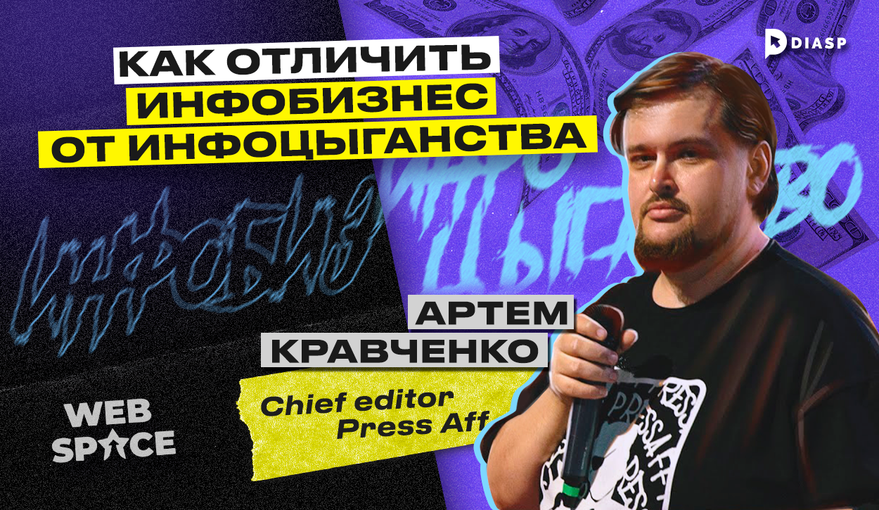
Команда WebSpace выпустила очередной выпуск про инфобизнес в арбитраже трафика. Главным героем интервью стал Артём Кравченко , который более 8 лет профессионально работает в индустрии affiliate-маркетинга. Команда diasp.pro предлагает разобраться, в чем главное отличие инфобизнеса от инфоцыганства, и стоит ли продавать обучающие курсы по арбитражу трафика?
Артём Кравченко
Артём Кравченко — главный редактор PressAff — медиаресурса о манимейкинге, рекламном арбитраже, партнерском CPA-маркетинге и заработке в Интернете. Артём в affiliate-маркетинге с 2014 года, является спикером различных конференций, имеет экспертность в вопросах инфобизнеса. Также он является автором группы ВКонтакте “Арбитражная справедливость ”, которая, на данный момент, перестала функционировать.
Главная проблема арбитража трафика
Одной из главных проблем арбитража трафика является отсутствие качественного обучения. Артём Кравченко акцентировал внимание на том, что из всех имеющихся статей по теме, нельзя делать качественный курс. Информация для изучения стала сложнее, а из-за арбитражной терминологии и расхождения в определениях, путаются не только новички и редакторы медиа, но и сами менеджеры партнерок и вебмастера.
Артём добавил, что желание структурировать фундаментальные основы арбитража также стало главной причиной ухода из партнерки AdCombo:
Арбитраж — это узкая ниша онлайн-маркетинга, а сам партнерский маркетинг — гораздо шире, и возможностей, с точки зрения заработка в Интернете, там больше. Поэтому захотелось попробовать себя в чем-то новом. Кроме того, арбитраж — нестабильная ниша, с легким присутствием авантюры и мошенничества, а в обычном бизнесе все фундаментально и стабильно. После того, как я попробовал поработать в белом, понятном бизнесе, захотелось внести немного порядка в арбитраж.
Артём Кравченко — главный редактор PressAff
В чем отличия инфобизнеса от инфоцыганства
Главным отличием инфобизнеса от инфоцыганства Артём называет методику. По его словам, любой педагогический процесс нужно начинать с диагностики и анализа.
Как новичку отличить инфобизнесмена от инфоцыганина
Артём Кравченко рассказал, что отличает инфобизнесменов от инфоцыган:
Статистика, отзывы, примеры кейсов.
Успешный коуч должен иметь подтверждающую статистику, а также примеры заливов, рекламных кабинетов и другие материалы. Если человек уверен в себе и ему есть, что показать, то он может научить других.
В обучении прописано соглашение сторон, ответственность, распределение обязанностей, а также условия возврата.
Бизнес должен быть официальным и иметь реквизиты.
При переводе денег, ученик должен понимать, что перед ним живой человек. В случае обмана, это даст возможность найти инфоцыганина, чтобы привлечь его к ответственности.
Однако, Артём Кравченко отмечает, что иногда виноваты сами ученики, которые согласны работать с фейками и переводить деньги без подтверждающих документов:
Если ты готов работать с ноунеймом, то ты сам виноват. Если клиент отдал деньги непроверенному человеку без каких-либо гарантий, то виноват не преподаватель, а сам ученик, потому что позволил себя развести. При покупке дорогого обучения, нужно думать о своей безопасности.
Артём Кравченко — главный редактор PressAff
Можно ли зайти в арбитраж самому
На вопрос о том, можно ли сегодня зайти в affiliate-индустрию без помощи ментора, Артём Кравченко ответил:
Арбитраж сильно изменился за последнее время. Раньше, можно было попробовать самостоятельно найти источник, изучить кейсы, сделать креатив, выбрать партнерку и залить без клоаки какой-либо оффер. Сейчас всё стало гораздо сложнее технически и информационно. Без помощи пройти такой же путь, что и несколько лет назад, практически, невозможно.
Артём Кравченко — главный редактор PressAff
Виды обучения в арбитраже
Выделяют несколько видов обучения:
Для опытных арбитражников с целью повышения квалификации;
Для новичков, которые хотят получать заработок в Сети .
Однако, Артём Кравченко отметил, что все обучение можно разделить на теоретическое и практическое. При этом, с практикой всегда бывают проблемы, потому что арбитраж трафика — это краткосрочная тема, которая дает возможность залить здесь и сейчас по определенным схемам, используя различные источники трафика, например, Facebook или Google.
Любая тема живет недолго, а обучение — это долгий процесс, который состоит из набора группы, теоретической и практической части. Но, когда дело доходит до практики, эти темы уже перестают работать. Теория и практика одинаково важны, но преимущество теоретического обучения в том, что знания остаются, а схемы и связки быстро перестают работать.
Артём Кравченко — главный редактор PressAff
Из чего состоит процесс обучения
На этот вопрос Артём Кравченко ответил, что для того, чтобы учить арбитражу, недостаточно самому лить трафик. Арбитраж нужно понимать глобально и частно на многих уровнях, а также знать, чего хочет аудитория. Весь процесс обучения, состоит из пяти составляющих:
Диагностика, постановка цели;
Разработка методологии;
Подготовка контента;
Исполнение;
Анализ результатов.
Минусы закупа рекламы у блогеров для обучения
Один из самых популярных способов привлечь аудиторию к своим курсам — реклама у блогеров. Суть способа — снять рекламный ролик, добавив в него интеграцию с популярной личностью для привлечения ЦА.
Артём рассказал, что такой формат рекламы для набора учеников на курсы не дает положительный отклик, т.к. аудитория не проходит циклы отбора, в отличие от партнерского маркетинга, где сначала нужно пройти отборочные этапы, вебинары. Это помогает отсеять нецелевых учеников и оставить только тех, кто пришел осознанно.
В арбитраже не проводится анализ и диагностика, поэтому здесь берут всех. Из-за этого, 99% людей ничего не получают из обучения, потому что являются целевой аудиторией только на уровне того, что хотят красивую жизнь. Когда они узнают про аккаунты, креативы, прокси, вертикали — они больше сюда не возвращаются.
Артём Кравченко — главный редактор PressAff
Подходы к обучению арбитражу трафика
Сейчас существует два основных подхода:
Обучение через личный бренд (авторский курс );
Обучение от компании.
Как считает Артём Кравченко, более перспективный и конвертящий подход — личное обучение, когда человек показывает, каким он стал или чего достиг. Такие курсы продаются лучше. Однако, такой подход не дает фундаментальных знаний по арбитражу трафика. Обучение через личный бренд призвано продать, заинтересовать и заставить купить курс, продвижение первостепенно, а контент отходит на второй план. Компания, наоборот, делает ставку на контент, а не на бренд, поэтому образовательным продуктам от компаний можно доверять больше.
Артём Кравченко о том, почему не льет трафик и не строит команду
Артём объяснил, почему сам не льет трафик, а также отказывается от создания команды:
Во-первых, у меня никогда не стояло таких амбиций, а во-вторых, всегда хотелось уйти от этого и заняться чем-то другим. Заниматься арбитражом трафика, особенно, когда ты все досконально изучаешь — не хочется. Мне кажется, что учить у меня получится лучше. Если бы я лил трафик, то в соло, потому что я доверяю себе, а кому-то другому мне уже сложно доверять.
Артём Кравченко — главный редактор PressAff
Заключение
Таким образом, топовый арбитражник — не всегда хороший учитель. Для создания качественного курса, нужнопонимать процесс обучения и правильно определять целевую аудиторию. Хорошего инфобизнесмена отличают примеры, статистика, цифры, а также наличие официальных документов и пользовательского соглашения. Главная задача инфоцыган на рынке — привлечь как можно больше учеников или продать свой курс новичкам, как можно дороже. Главная задача инфобизнесмена — не зарабатывать на учениках, а сделать качественный продукт.
Удачи и профита!
Другие статьи по теме:
Как отличить инфобизнесмена от инфоцыганина?
При выборе курса по арбитражу трафика, важно анализировать деятельность инфобизнесмена, который его продает. Обратите внимание на:
Статистику, отзывы, примеры кейсов.
Наличие соглашения сторон, в котором прописаны ответственность, распределение обязанностей, условия возврата.
Официальность бизнеса, наличие банковских реквизитов.
Как должен выглядеть процесс обучения в арбитраже трафика?
По мнению Артёма Кравченко, арбитраж трафика нужно понимать глобально и частно на многих уровнях, а также знать, чего хочет аудитория. Весь процесс обучения, состоит из пяти составляющих:
- Диагностика, постановка цели;
- Разработка методологии;
- Подготовка контента;
- Исполнение;
- Анализ результатов.
Реально ли зайти в арбитраж трафика самостоятельно в 2023 году?
Артём Кравченко утверждает, что арбитраж сильно изменился за последнее время. Ранее, можно было попробовать самостоятельно найти источник, изучить кейсы, сделать креатив, выбрать партнерку и залить без клоаки какой-либо оффер. Сейчас всё стало гораздо сложнее технически и информационно. Без помощи эксперта пройти такой же путь, что и несколько лет назад, практически, невозможно.Поэтому стоит внимательно подходить к выбору обучающих курсов по арбитражу трафика.
false
Вы уверены что хотите выйти?