a { color: rgb(32, 63, 172) !important; } .menu .menu-item.current-menu-ancestor > a { color: rgb(32, 63, 172) !important; } .menusearch .menu-item-has-children:hover .sub-menu { display: flex; position: absolute; top: 100%; z-index: 5000; } .menusearch .menu-item-has-children:hover > a::after { transform: rotate(-180deg) translateY(-5px); -webkit-transform: rotate(-180deg) translateY(-5px); transition: 0.3s ease-in; } .menusearch .menu-item:last-child:hover .sub-menu { display: grid; grid-template-columns: 1fr 1fr; right: 0; } .sub-menu { display: none; flex-direction: column; justify-content: start; align-items: start; overflow: hidden; transition: max-height ease-in 0.7s, opacity ease 0.5s, padding ease 0.5s; border-bottom-left-radius: 4px; border-bottom-right-radius: 4px; border: 1px solid #f7f7f7; border-top: none; padding: 0; background: #fff; z-index: 998; box-shadow: 0px 3px 4px 0px rgba(0, 0, 0, 0.1490196078); } .sub-menu .menu-item { margin: 7px 0 7px 0; position: relative; } .sub-menu .menu-item a { color: #5b6471 !important; position: relative; padding: 7px 60px 7px 16px; display: block; cursor: pointer; } .sub-menu .menu-item a:hover { color: #5b6471 !important; } .sub-menu .menu-item:last-child { margin-bottom: 0; } .sub-menu .menu-item:hover { background: #f4f6ff; } .sub-menu .menu-item.current-menu-item > a { color: #5b6471 !important; } .sub-menu--init { width: initial; } .sub-menu--shown { width: initial; opacity: 1; max-height: 1000px; padding: 0 0 4px 0; } .menu-item-has-children > a::after { content: url('data:image/svg+xml,%3Csvg width="12" height="6" viewBox="0 0 12 6" fill="none" xmlns="http://www.w3.org/2000/svg"%3E%3Cpath d="M6.00011 5.24999C5.85011 5.24999 5.65011 5.19999 5.55011 5.09999L1.05011 1.59999C0.750109 1.34999 0.700109 0.849987 0.950109 0.549987C1.20011 0.249987 1.70011 0.199986 2.00011 0.449986L6.00011 3.54999L10.0001 0.449986C10.3001 0.199986 10.8001 0.249987 11.0501 0.549987C11.3001 0.849987 11.2501 1.34999 10.9501 1.59999L6.45011 5.09999C6.35011 5.19999 6.15011 5.24999 6.00011 5.24999Z" fill="%23B6C1C7"/%3E%3C/svg%3E%0A'); margin-left: 5px; transition: 0.3s ease-out; display: inline-block; transform: translateY(-1px); } .menu--hidden { display: none; } @media (max-width: 1720px) { .menu .menu-item a { font-size: 1rem; } .menu-item-has-children > a::after { top: 27px; } .menu .menu-item-has-children:hover > a::after { transform: rotate(-180deg) translateY(-4px); -webkit-transform: rotate(-180deg) translateY(-4px); } .sub-menu .menu-item { margin-right: 0; display: block; width: 100%; } } @media (max-width: 1200px) { .menu .menu-item { margin-right: 15px; } .menu .menu-item:last-child { margin-right: 0; } } @media (max-width: 1200px) { .sub-menu .menu-item { margin-right: 0; } } @media (max-width: 1000px) { .menu { display: none; } .burger .menu { display: block; } } .burger { visibility: hidden; position: fixed; top: 0; left: 0; bottom: 0; right: 0; width: 80%; background: #fff; z-index: 999; overflow: scroll; height: 100vh; transform: translateX(-100%); transition: all 0.3s ease-in; } .burger .sub-menu { display: none; width: initial; height: initial; opacity: 1; max-height: none; border-radius: 0; background: none; color: #fff; border: none; box-shadow: none; } .burger .sub-menu .menu-item a { padding-left: 40px; } .burger .sub-menu .menu-item a:hover { padding-left: 35px; } .burger .sub-menu .menu-item::after { content: none; } .burger .sub-menu .menu-item:hover { background: none; } .burger .user__wrapper { display: flex; align-items: center; flex-direction: row-reverse; justify-content: space-between; width: 100%; } .burger .user__wrapper.user--hidden { display: none; } .burger .user { width: 70px; height: 70px; } .burger .login__button { padding: 0; background: none; color: #000; } .burger-open { visibility: visible; transform: translateX(0%); transition: all 0.3s ease-in; } .burger__menu { background: #fff; color: #5b6471; } .burger__menu .menu-item a { padding: 12px 20px; font-size: 1.125rem; } .burger__menu .menu-item a:hover { background: #e5ebff; border-left: 5px solid #3f63df; padding-left: 15px; } .burger__menu .menu-item a:visited { color: #5b6471; } .burger__usermenu { list-style-type: none; } .burger__usermenu-item { padding: 5px 0; } .burger__usermenu-item a { color: #000; font-weight: 600; } .burger__title { padding: 0.875rem 3rem; border-bottom: 1px solid #b6c1c7; background: #fff; display: flex; justify-content: center; align-items: center; position: relative; margin-bottom: 0.5rem; } .burger__title figure { position: absolute; left: 20px; top: 18px; } .burger__title--h3 { font-size: 18px; line-height: 21px; color: #000d20; font-weight: 400; } .login__button--mobile { display: none; } @media (max-width: 1000px) { .login__button--desktop { display: none !important; } .login__button--mobile { display: block; cursor: pointer; } .login__button--mobile figure { height: 25px; } .login__button--mobile figure img { height: 25px; width: 25px; } } @media (min-width: 500px) { .burger__profile { padding: 50px 100px 10px 100px; } } #searchform { width: 100%; align-items: flex-end; display: flex; flex-direction: row-reverse; gap: 0.5rem; } .search__input { width: 100%; border: none; border-bottom: 1px solid #5b6471; padding: 0.25rem; } .search__input:focus { box-shadow: none; border-bottom: 1px solid #203fac; } .search__button { border: none; background: none; cursor: pointer; height: 24px; } .search__button img { width: 100%; } .menusearch { width: 100%; } .search-wrapper { display: flex; flex-direction: column; gap: 1.5rem; } .search-post { display: flex; flex-direction: column; gap: 0.5rem; padding: 10px; } .search-post:hover { background-color: #f4f6ff; } .search-link:hover > h2 { color: #203fac; } .search-link { display: flex; align-items: center; color: #203fac; } .search-link p { font-size: 1.125rem; } .search-link:visited { color: #203fac; } .search-text { color: #555555; } .search-section .divider:last-child { display: none; } @media (max-width: 1720px) { .search-link p { font-size: 1rem; } .search__button { height: 22px; } } .branding { position: relative; } .branding__poster { max-width: 1920px; margin: 0 auto; padding-top: 320px; } .branding__link { display: block; position: absolute; top: 60px; left: 0; width: 100%; height: 260px; background-position-y: 60px; background-position-x: center; background-repeat: no-repeat; background-attachment: fixed; } .branding__link:hover { filter: contrast(0.8); } .lazy { opacity: 0; transition: opacity 0.5s ease; } .lazy.entered.loaded { opacity: 1 !important; } .branding__link { opacity: 1; transition: opacity 0.5s ease; } .branding__link.entered.loaded { opacity: 1 !important; } .branbranding__poster--mobile { display: none !important; } @media (max-width: 1440px) { .branding__poster { padding-top: 285px; } .branding__link { background-size: 1700px auto; height: 225px; } } @media (max-width: 1300px) { .branding__link { background-size: 1500px auto; height: 200px; } .branding__poster { padding-top: 260px; } } @media (max-width: 1100px) { /* .branding__poster { padding-top: 220px; } .branding__link { height: 100% !important; }*/ } @media (max-width: 1023px) { .branbranding__poster--desktop { display: none; } .branbranding__poster--mobile { display: block !important; margin: 50px 0 0 0; } .branding__link--mobile { display: block; } .branbranding__poster--mobile-wrap { position: relative; /*background: whitesmoke;*/ max-height: 80px; overflow: hidden; } .branbranding__poster--mobile-wrap:before { content: ""; display: block; padding-top: 30%; } .branding__link--mobile { display: block; position: absolute; width: 100%; top: 0; right: 0; bottom: 0; left: 0; background-position-y: 50px; background-position-x: center; background-repeat: no-repeat; background-attachment: fixed; background-size: 100vw auto; } } @media (min-width: 768px) and (max-width: 1023px) { .branbranding__poster--mobile-wrap { max-height: 300px; } } * { box-sizing: border-box; margin: 0; padding: 0; } a { text-decoration: none; } img { max-width: 100%; height: auto; } input, select, textarea, a, button { outline: none; transition: all 0.3s ease; font-family: "SF Pro", "Segoe UI", Tahoma, Geneva, Verdana, sans-serif !important; } input, select, textarea { color: #000d20; } input:focus, select:focus, textarea:focus, a:focus, button:focus { outline: none; box-shadow: 0 0 2px #203fac; } p, a, div, button, select { font-size: 1.125rem; } .page__text { line-height: 140.5%; color: #5b6471; margin: 0.625rem 0 1.875rem 0; } .page__text h3 { margin-bottom: 25px; } .page__text p { margin-bottom: 15px; } img:not([src]):not([srcset]) { visibility: hidden; } body { font-family: "SF Pro", "Segoe UI", Tahoma, Geneva, Verdana, sans-serif; font-weight: 400; background: #fff; } input, textarea { font-size: 1.125rem; } input::placeholder { font-size: 1.25rem; } html, body { width: 100%; height: 100%; margin: 0px; padding: 0px; scroll-behavior: smooth; } .very__long__stuff { height: 3000px; } .main { background: #fff; transition: 0.3s ease-in-out; border-radius: 20px; padding: 3.25rem; position: relative; /* box-shadow: 0px 0px 15px 0px rgba(0, 0, 0, 0.15);*/ } .main__content { margin: 0 auto; } .swiper-slide { height: auto !important; } .searchmobi { display: none; } .searchmobi .search { margin-top: 1rem; } .select { position: relative; display: block; width: 100%; max-width: 195px; } .select__head { width: 100%; max-width: 195px; height: 34px; border: 1px solid #b6c1c7; border-radius: 4px; padding: 6px 10px; color: #000d20; cursor: pointer; position: relative; } .select__head::after { content: url('data:image/svg+xml,%3Csvg width="12" height="6" viewBox="0 0 12 6" fill="none" xmlns="http://www.w3.org/2000/svg"%3E%3Cpath d="M6.00011 5.24999C5.85011 5.24999 5.65011 5.19999 5.55011 5.09999L1.05011 1.59999C0.750109 1.34999 0.700109 0.849987 0.950109 0.549987C1.20011 0.249987 1.70011 0.199986 2.00011 0.449986L6.00011 3.54999L10.0001 0.449986C10.3001 0.199986 10.8001 0.249987 11.0501 0.549987C11.3001 0.849987 11.2501 1.34999 10.9501 1.59999L6.45011 5.09999C6.35011 5.19999 6.15011 5.24999 6.00011 5.24999Z" fill="%23B6C1C7"/%3E%3C/svg%3E%0A'); position: absolute; right: 13px; top: 4px; transition: 0.3s ease-out; display: inline-block; transform: translateY(-1px); } .select__head.open::after { transform: rotate(180deg) translateY(-5px); -webkit-transform: rotate(-180deg) translateY(-5px); } .select__list { position: absolute; top: 100%; left: 0; right: 0; background: #fff; max-width: 195px; border: 1px solid #b6c1c7; border-radius: 0 0 4px 4px; margin-top: -1px; z-index: 100; font-size: 14px; color: #424348; flex-direction: column; gap: 5px; } .select__list::-webkit-scrollbar { width: 7px; background-color: #f8f9fa; padding: 5px; } .select__list::-webkit-scrollbar-thumb { border-radius: 10px; background-color: #d9d9d9; } .select__list .select__item { position: relative; padding: 8px 9px; color: #5b6471; list-style: none; } .select__list .select__item:first-child { margin-top: 5px; } .select__list .select__item:last-child { margin-bottom: 5px; } .select__list .select__item:visited { color: #5b6471; } .select__list .select__item:hover { background: #f4f6ff; } .open { border-radius: 4px 4px 0 0; } .select__title { font-weight: 400; color: #5b6471; line-height: 18px; margin-bottom: 9px; } .rules { padding-top: 5rem !important; } .rules__text { line-height: 140.5%; color: #000d20; margin-top: 2rem; } .rules__text h2 { margin-bottom: 1.5rem; } .rules__text h3 { margin-bottom: 1rem; } .rules__text p { margin-bottom: 1rem; } .rules__text dl, .rules__text ol, .rules__text ul { padding-left: 20px; margin-bottom: 1rem; } .rules__text li { color: #000d20; line-height: 150%; } @media (max-width: 1720px) { .main { max-width: 1100px; padding: 2.5rem; } p, a, div, button, select { font-size: 1rem; } .page__text { margin: 0.625rem 0 1.5625rem 0; } input, textarea { font-size: 1rem; } input::placeholder { font-size: 1rem; } } @media (max-width: 1600px) { .main { max-width: 1050px; padding: 1.625rem; } } @media (max-width: 1400px) { .main { max-width: initial; width: 100%; padding: 1.25rem; } } @media (max-width: 1000px) { .page__text { font-size: 1.125rem; margin: 0.625rem 0 1.25rem 0; } .searchmobi { display: initial; } .searchmobi .search--hidden { display: flex; } .main { border-radius: 0; padding: 1.25rem; box-shadow: none; margin: 0 auto; } } @media (max-width: 700px) { .hide-on-mobile { display: none; } .no-scrolling { overflow: hidden; } } .checkbox { display: grid; place-items: center; width: 24px !important; height: 24px !important; padding: 0; margin: 0; color: #0040ff; position: relative; cursor: pointer; appearance: none; } .checkbox:before { content: ""; width: 100%; height: 100%; line-height: 1; color: inherit; border-width: 2px; border-style: solid; border-color: #b6c1c7; border-radius: 4px; transition: all 0.2s ease; } .checkbox:after { content: ""; width: calc(100% - 12px); height: calc(100% - 19px); border-width: 0px 0px 2px 2px; border-style: solid; border-color: #fff; transform: rotate(-45deg); position: absolute; top: 6px; left: 5px; transition: all 0.2s ease; } .checkbox:checked:before { background: #0040ff; border-color: #0040ff; } .checkbox:checked::after { border-color: #fff; } .checkbox:disabled { cursor: not-allowed; } .checkbox:disabled:before { border-color: darkgray; } .checkbox:disabled:after { border-color: transparent; } .checkbox:disabled:checked { color: #0040ff; opacity: 0.65; } .checkbox:disabled:checked:before { border-color: #0040ff; } .checkbox:disabled:checked::after { border-color: #fff; } .checkbox.focus, .checkbox:focus { outline: none; box-shadow: none; } .checkbox__field { display: grid; grid-template-columns: repeat(2, max-content); gap: 0.3rem; align-items: center; } .checkbox__label { color: rgb(91, 100, 113); font-size: "1.25rem"; } .title__h1 { font-size: 1.875rem; font-style: normal; font-weight: 600; line-height: 36px; letter-spacing: 0em; text-align: left; } h1 { line-height: 36px; font-size: 1.875rem; font-weight: 600; color: #000d20; } .title__h2 { font-size: 1.375rem; font-weight: 600; } .title__h2 a { color: #000d20; font-size: 1.375rem; } h2 { font-size: 1.375rem; font-weight: 600; color: #000d20; } h3 { font-size: 1.25rem; font-weight: 600; color: #000d20; } .title { display: flex; justify-content: space-between; align-items: center; margin-bottom: 1.875rem; width: 100%; } .title__group { display: grid; grid-auto-flow: column; align-items: center; gap: 20px; } .title--middlemargin { margin-bottom: 1.5625rem; } .title--smallmargin { margin-bottom: 0.9375rem; } .title--nomargin { margin: 0 !important; } .title--margintop { margin-top: 1.875rem; } .title__link { text-decoration: none; color: #203fac; } .title__button-link { max-height: 30px; display: flex; justify-content: center; border-radius: 10px; align-items: center; color: #fff; padding: 4.5px 16px; font-size: 18px; white-space: nowrap; } .title__button-link:hover { filter: brightness(1.2); } .sponsor__button-link { max-height: 30px; display: flex; justify-content: center; border-radius: 10px; align-items: center; color: #fff; padding: 4.5px 26px 4.5px 18px; font-size: 18px; white-space: nowrap; gap: 10px; background-color: #1f1e26; text-transform: uppercase; } @media (max-width: 1720px) { .title__h1 { font-size: 1.6875rem; } h1 { font-size: 1.6875rem; } .title__h2 { font-size: 1.125rem; } h2 { font-size: 1.25rem; } .title { margin-bottom: 1.5625rem; } h3 { font-size: 1.125rem; } } @media (max-width: 1000px) { .title__h1 { font-size: 1.5rem; line-height: 26px; } h1 { font-size: 1.5rem; } .title__h2 { font-size: 1.25rem; } h2 { font-size: 1.25rem; } .title { margin-bottom: 1.25rem; } h3 { font-size: 1rem; } } @media (max-width: 480px) { .title { margin-bottom: 1rem; flex-wrap: wrap; gap: 10px; align-items: flex-start; } .title__group { display: flex; } .title__h1 { font-size: 1.375rem; line-height: 1.2; } h1 { font-size: 1.375rem; } .title__link { font-size: 1rem; } .title--nomargin { margin: 0; } .title--margintop { margin: 2rem 0; } .title--mobile { flex-direction: column-reverse; gap: 2rem; align-items: flex-start; } .title__button-link { font-size: 12px; padding: 8px 10px; } } .button { border-radius: 10px; color: #fff; display: block; padding: 3px 15px; font-family: "SF Pro", "Segoe UI", Tahoma, Geneva, Verdana, sans-serif; background-color: #203fac; cursor: pointer; text-align: center; } .fix .button { background-color: #fff; color: #000; } .button__show-all { background-color: #203fac; color: #fff; padding: 10px 37px; border-radius: 10px; font-weight: 600; margin: 22px auto 0; display: block; width: fit-content; } .button--primary { border: none; border-radius: 10px; background: #203fac; color: #fff; padding: 4px 16px 5px 16px; width: fit-content; text-align: center; display: flex; align-items: center; justify-content: center; gap: 8px; } .button--primary:hover { background: #3f63df; } .button--secondary { padding: 10px 16px; display: block; border-radius: 5px; border: 1px solid #5b6471; color: #5b6471; background: #fff; text-align: center; max-width: 130px; width: 100%; } .button--secondary:hover { background: #b6c1c7; border: 1px solid #b6c1c7; color: #fff; } .button--hidden { display: none !important; } .button--gray { background: #b6c1c7; } .btn__show-all { color: #5b6471; border: 1px solid #758194; text-align: center; width: fit-content; display: block; padding: 3px 16px; outline: none; cursor: pointer; border-radius: 10px; } .btn__show-all:hover { color: #000d20; border: 1px solid #000d20; } .button-respond { color: #5b6471; border: 1px solid #758194; text-align: center; width: fit-content; display: block; padding: 3px 16px; outline: none; cursor: pointer; border-radius: 10px; } .button-respond:hover { color: #000d20; border: 1px solid #000d20; } .link--hover { color: #203fac !important; width: fit-content; } .link--hover::after { content: ""; display: block; width: 0; height: 1px; margin-top: -2px; background: #203fac; } .link--hover:hover::after { width: 100%; } .tag { border: 1px solid #b6c1c7; color: #b6c1c7; border-radius: 20px; padding: 1px 10px; display: block; width: fit-content; } .tag:hover { border: 1px solid #3f63df; color: #3f63df; } .button-submit { display: flex; align-items: center; align-content: center; justify-content: center; font-family: "SF Pro", "Segoe UI", Tahoma, Geneva, Verdana, sans-serif; white-space: nowrap; border: 1px solid #203fac; box-sizing: border-box; border-radius: 10px; background: none; padding: 16px 15px; width: fit-content; color: #203fac; cursor: pointer; } .button-submit:disabled { background: #b6c1c7 !important; border: 1px solid #b6c1c7 !important; color: #fff !important; } .button-submit:disabled svg path { fill: #fff; } .button-submit a { color: #203fac; } .button-submit:hover a { color: #fff; } .button-submit--disabled { background: #b6c1c7 !important; border: 1px solid #b6c1c7 !important; color: #fff !important; } .button-submit--small { padding: 2px 16px; border-radius: 10px; } .button-submit:hover { border: 1px solid #3f63df; background: #3f63df; color: #fff; } .button-submit:hover svg path { fill: #fff; } .button-submit--gray { border: 1px solid #5b6471; color: #5b6471; display: flex; gap: 5px; justify-content: center; } .button-submit--gray:hover { border: 1px solid #b6c1c7; background: #b6c1c7; color: #fff; } .button--restore { width: 100% !important; margin-top: 20px; height: 40px; line-height: 38px; padding: 0; border: 1px solid #3f63df; } .button--restore:hover { background: #fff; color: #3f63df; } .button--decline { padding: 10px 16px; display: block; border-radius: 5px; border: 1px solid #203fac; color: #203fac; background: #fff; text-align: center; max-width: 130px; width: 100%; } .button--decline:hover { background: #3f63df; border: 1px solid #3f63df; color: #fff; } @media (max-width: 1720px) { .button__show-all { margin-top: 15px; } .link--hover::after { margin-top: 0px; } .link--hover { height: 23px; } .btn__show-all { padding: 4px 16px; } .button-respond { padding: 4px 16px; } .button--primary { padding: 6px 16px 5px 16px; } } @media (max-width: 1000px) { .button { border-radius: 10px; } .btn__show-all { position: absolute; bottom: 3px; left: 50%; transform: translate(-50%, -50%); width: 100%; padding: 6px 16px; } } .tooltip-button { margin-right: 10px; position: relative; border: 0; outline: none; background: transparent; } .tooltip-button:hover .tooltip { opacity: 1; visibility: visible; height: auto; } .tooltip-button .tooltip { background: #000d20; border-radius: 5px; color: #fff; position: absolute; transition: visibility 0s linear 0.3s, opacity 0.3s linear 0s; opacity: 0; visibility: hidden; z-index: 2000; top: 20px; right: -9px; padding: 10px; width: max-content; } .tooltip-button .tooltip:after { content: ""; position: absolute; right: 9px; left: initial; top: -9px; width: 0; height: 0; border-style: solid; border-width: 0 8px 10px 8px; border-color: transparent transparent #000d20 transparent; } .sponsor__outer { border-radius: 7px; -webkit-border-radius: 7px; display: block; overflow: hidden; } .sponsor__video { display: block; width: 100%; } .sponsor__video:hover { filter: contrast(0.8); } .sponsor__wrapper { padding: 15px; } .sponsor__vertical { border: 1px solid #b6c1c7; border-radius: 7px; display: block; position: relative; overflow: hidden; height: 100%; max-height: 550px; } .sponsor__vertical-image { object-fit: cover; width: 100%; height: 100%; min-height: 500px; margin: 0 auto; display: block; } .sponsor__vertical-image:hover { filter: contrast(0.8); } .sponsor--no-padding-bottom { padding: 3rem 0 0 0; } @media (max-width: 1000px) { .sponsor__outer { border-radius: 5px; } .sponsor__vertical { max-width: inherit; max-height: inherit; } .sponsor__wrapper { padding-left: 0; } } @media (max-width: 700px) { .sponsor__wrapper { padding-left: 0; padding-right: 0; } } @media (max-width: 480px) { .sponsor__outer { max-height: 60px; } } .breadcrumbs { display: flex; align-items: baseline; grid-gap: 5px; gap: 5px; white-space: wrap; flex-wrap: wrap; -ms-overflow-style: none; margin-bottom: 10px; } .breadcrumbs .breadcrumbs__separator { color: #b6c1c7; } .breadcrumbs a { color: #203fac; } .breadcrumbs a:visited { color: #b6c1c7; } .blogs-education__section { display: flex; justify-content: space-between; align-items: start; } .blogs-education__wrapper { display: flex; flex-direction: column; gap: 30px; width: 100%; } .blogs-education__title { display: flex; align-items: center; justify-content: flex-start; gap: 0.625rem; margin-bottom: 0.625rem; } .blogs-education__title figure { height: 24px; margin: 0 !important; } .blogs-education__list { padding-left: 20px; line-height: 40px; color: #5b6471; position: relative; z-index: 100; } .blogs-education__list li a { color: #5b6471; } .blogs-education__list li:hover, .blogs-education__list li:hover > a { color: #3f63df !important; } .blogs-education__list li a:visited { color: #5b6471; } .blogs-education__sidebar-list { max-width: 400px; min-width: 350px; width: 100%; list-style: none; border: 1px solid #3f63df; border-radius: 7px; font-size: 1.25rem; padding: 10px 0; display: flex; flex-direction: column; margin-bottom: 35px; } .blogs-education__sidebar-list-item { padding: 10px 20px 10px 20px; color: #000d20; font-size: 1.25rem; transition: color 0.3s ease, background 0.3s ease; } .blogs-education__sidebar-list-item:visited { color: #000d20; } .blogs-education__sidebar-list-item:hover { background: #f4f6ff; border-left: 5px solid #3f63df; padding-left: 15px; color: #3f63df; } .blogs-education__anchor { margin-top: -80px; padding-top: 80px; } .blogs--education .title, .blogs--education .breadcrumbs { position: relative; z-index: 100; } .page-template-tmp-blog-education .main__content div:last-child { margin-bottom: 35px; } @media (max-width: 1720px) { .blogs-education__sidebar-list-item { font-size: 1.125rem; } .blogs-education__section .sidebar { top: 5rem; } } @media (max-width: 1400px) { .blogs-education__wrapper { max-width: 650px; } } @media (max-width: 1000px) { .blogs-education__section .sidebar { display: none; } .blogs-education__wrapper { max-width: inherit; } } .single__wrapper { display: flex; justify-content: space-between; align-items: start; margin-bottom: 6rem; } .no-container .single__content { max-width: none; } .single-detail__content .sidebar { min-width: 315px; width: 24%; margin-left: 0; } .single-detail__content .sidebar .sponsor__vertical-image { min-width: initial; } .no-container .single__wrapper { margin-bottom: 0; } .single__content { width: 100%; } .single-detail__content { display: flex; justify-content: space-between; align-items: start; margin-bottom: 25px; } .single-detail__text { max-width: 679px; width: 100%; display: flex; flex-direction: column; gap: 1.875rem; line-height: 145.5%; color: #000d20; } .single-detail__text ul, .single-detail__text dl, .single-detail__text ol { padding-left: 20px; } .single-detail__text li { color: #000d20; line-height: 150%; } .single-detail__text a { color: #203fac !important; word-break: break-word; font-size: inherit; } .single-detail__text a:visited { color: #203fac !important; } .single-detail__text a:hover { border-bottom: 1px solid #203fac; } .single-detail__content .sponsor__wrapper { padding: 0; } blockquote { border-left: 3px solid #203fac; color: #1a1a1a; font-size: 1.25em; font-style: italic; line-height: 145%; padding: 1em 2em; position: relative; transition: 0.2s border ease-in-out; z-index: 0; } blockquote:before { content: ""; position: absolute; top: 50%; left: -4px; height: 2em; background-color: #fff; width: 5px; margin-top: -1em; } blockquote:after { content: "❞"; position: absolute; top: 50%; left: -0.5em; color: #203fac; font-style: normal; line-height: 1em; text-align: center; text-indent: -2px; width: 1em; margin-top: -0.5em; transition: 0.2s all ease-in-out, 0.4s transform ease-in-out; } blockquote:active:after { transform: rotateY(360deg); } cite { display: block; font-size: 0.75em; line-height: 1.8em; margin-top: 1em; font-style: normal; } .single-detail__quote { display: flex; flex-direction: column; position: relative; } .single-detail__quote::after { content: url("/wp-content/themes/diasp__v2/static/img/misc/quote.svg"); position: absolute; top: -6px; left: calc(50% - 112px); } .single-detail__quote blockquote { display: flex; flex-direction: column-reverse; padding: 0; border-left: none; } .single-detail__quote blockquote p { padding: 0 2em; border-left: 2px solid #203fac; } .single-detail__quote blockquote cite strong { color: #000d20; font-size: 22px; line-height: 27px; } .single-detail__quote blockquote cite { color: #5b6471; text-align: center; margin-top: 0; margin-bottom: 1em; } .single-detail__quote blockquote::after { content: none; } .single-detail__quote blockquote:before { content: none; } .single-detail__quote figure { border-radius: 50%; max-width: 128px; max-height: 128px; align-self: center; } .single-detail__quote figure img { overflow: hidden; object-fit: cover; width: 100%; min-width: 128px; height: 128px; } .single-detail__quote .link-decoration-none { border-radius: 50%; } .single-detail__text img { width: 100%; height: 100%; object-fit: cover; } .single-detail__fig { width: 100%; max-width: 680px; height: 100%; } .single-detail__img { width: 100%; height: 100%; border-radius: 7px; border: 1px solid #b6c1c7; overflow: hidden; } .link-decoration-none { display: flex; } .link-decoration-none:hover { border-bottom: none !important; } #ez-toc-container { padding: 20px 40px !important; border-radius: 7px; } .ez-toc-title-container { margin-bottom: 20px !important; } #ez-toc-container p.ez-toc-title { font-weight: 600 !important; } #ez-toc-container a:hover { text-decoration: none; } .ez-toc-link { word-break: normal !important; } .single-related { margin-top: 25px; } .single-related__post { position: relative; border: 1px solid #b6c1c7; border-radius: 15px; padding: 25px; display: flex; align-items: center; justify-content: space-between; transition: all 0.3s ease; } .single-related__post div { color: #000d20; transition: all 0.3s ease; word-break: normal; } .single-related__post:hover { border: 1px solid #203fac; } .single-related__post:hover > div { color: #203fac; } .single-related__post > svg path { transition: all 0.3s ease; } .single-related__post:hover > svg path { fill: #203fac; } .single-detail__text table { width: 100% !important; height: 100% !important; border-spacing: 0; border-radius: 7px; } .single-detail__text table tr th, .single-detail__text table tr td { border-color: #b6c1c7 !important; } .single-detail__text table.partner-table tr td:first-child { width: 14%; } .single-detail__text table.partner-table tr td:nth-child(2) { width: 55%; } .single-detail__text table.partner-table tr td:nth-child(3) { width: 20%; word-break: break-word; } .single-detail__text table.partner-table tr td:last-child { word-break: break-word; width: 15%; } .single-detail__text table td { vertical-align: top; } @media screen and (max-width: 1023px) { table.partner-table thead { display: none; } table.partner-table td { display: flex; flex-direction: column; } table.partner-table td::before { content: attr(label); font-weight: bold; min-width: 120px; } } .single-detail__text table td a img { width: 28px; height: 28px; margin-right: 10px; aspect-ratio: 1/1; } .single-detail__text table td a { display: inline; } .single-detail__text table tbody tr:nth-child(2n) { background: #fff; } .single-detail__text table tbody tr:nth-child(2n+1) { background: #f3f6ff; } .single-detail__text table tbody tr:last-child td:first-child { border-bottom-left-radius: 7px; } .single-detail__text table tbody tr:last-child td:last-child { border-bottom-right-radius: 7px; } @media (max-width: 1720px) { .single-detail__text { gap: 1.5625rem; } } @media (max-width: 1000px) { .single-detail__text { gap: 1.5625rem; } .single-detail__content .sponsor__vertical { max-height: 450px; max-width: 345px; } .single-detail__text table thead { font-size: 14px; } .single-detail__text table tbody tr td:first-child { padding-left: 20px; } } @media (max-width: 650px) { .single-detail__content { flex-direction: column; } .single-detail__content .sponsor__wrapper { padding: 0; } .single-detail__content .sponsor__wrapper { padding: 1.25rem 0 0 0; } .single-detail__content .sponsor__vertical { max-width: inherit; } .single-detail__content .sponsor__vertical-image { width: 100%; } } @media (max-width: 400px) { .single-detail__text table thead { font-size: 12px; } .single-detail__text table tbody tr td:first-child { padding-left: 10px; } } .single-article p { margin: 2rem 0; font-style: normal; font-weight: 400; line-height: 21px; color: #555555; } .single-article .wp-block-image { overflow: hidden; border-radius: 7px; } .single-article p:first-child { margin-top: 0; } .single-article p:last-child { margin-bottom: 0; } .single-meta { display: flex; flex-direction: column; align-items: start; margin-top: 0.625rem; } .single-meta__group { display: flex; align-items: center; gap: 1rem; margin-bottom: 12px; } .single-meta__group-row { display: flex; align-items: center; gap: 1rem; } .single-meta__item { display: flex; align-items: center; gap: 5px; font-size: 1.125rem; color: #b6c1c7; } .single-meta__item figure { margin-bottom: 0; } .meta__tags { margin-bottom: 1.5625rem; } @media (max-width: 600px) { .single-meta__group { flex-wrap: wrap; align-items: flex-start; gap: 10px; } .single-meta__group-row { gap: 10px; } } .related-more-button__wrapper { display: flex; align-items: center; justify-content: center; margin-top: 30px; } #related-more-button { color: #5b6471; border: 1px solid #758194; text-align: center; width: fit-content; display: block; padding: 3px 16px; outline: none; cursor: pointer; border-radius: 10px; margin-bottom: 0; } #related-more-button svg { display: none; } .trainings-detail__content { display: flex; } .trainings__left-side { margin-right: 70px; } .trainings__description { display: flex; align-items: center; } .trainings__description .review__item:first-child { margin-right: 100px; } .trainings-detail__fig { width: 345px; height: 500px; border: 1px solid #b6c1c7; border-radius: 20px; overflow: hidden; } .trainings-detail__img { width: 100%; height: 100%; object-fit: cover; } .trainings__info { display: flex; align-items: center; margin-top: 15px; } .trainings__list { list-style: none; } .trainings__list:first-child { margin-right: 20px; } .trainings__list:nth-child(2) { color: #5b6471; } .trainings__list li { margin-bottom: 15px; } .trainings__list a { color: #203fac; } .trainings__social { display: flex; align-items: center; color: #5b6471; margin-bottom: 10px; } .trainings__social:last-child { margin-bottom: 0; } .trainings__social svg { margin-right: 15px; } .trainings-mt { margin-top: 30px; } .trainings-statistic__title { font-size: 20px; line-height: 24px; margin-bottom: 10px; } .trainings-statistic__list { list-style: none; display: flex; } .trainings-statistic__list li { margin-right: 40px; } .trainings-statistic__list li:last-child { margin-right: 0; } .review__arcticle { display: flex; flex-direction: column; } .review__title { display: flex; gap: 5px 16px; align-items: center; flex-wrap: wrap; } .review__fig { width: 100%; height: 550px; border-radius: 7px 7px 0px 0px; overflow: hidden; border: 1px solid #b6c1c7; } .review__img { width: 100%; object-fit: cover; height: 100%; } .review__description { display: flex; align-items: center; justify-content: space-between; width: 100%; } .review__description--affiliate { justify-content: start; gap: 100px; } .review__item { display: flex; flex-direction: column; gap: 10px; } .review__item-text { color: #758194; } .review__rating-stars { display: flex; align-items: center; gap: 5px; } .review__rating-stars p { color: #5b6471; } .review__price { color: #1fb866; font-weight: 400; } .review__promocode-field { display: flex; color: #758194; } .review__item a:hover { border-bottom: none; } .review__link span { color: #203fac; display: flex; gap: 4px; } .review__link span figure { height: 20px; } .review__link span figure img { height: 10px; width: 11px; } .review__promocode-link { color: #203fac; border-bottom: #203fac 1px solid; } .review__promocode-link:visited { color: #203fac; } .review__arcticle .button { font-weight: 400; white-space: nowrap; padding: 5px 17px; position: absolute; right: 0; top: 0; } .review__text--hidden { display: none; } .review__comments--hidden { display: none; } .review-stars { display: flex; cursor: pointer; align-items: center; } .review-star { stroke: #b6c1c7; cursor: pointer; } .review-comments__button { padding: 0 0.15rem; background: none; border: none; cursor: pointer; height: 16px; } .review-comments__button:first-child { padding-left: 0; margin-left: 0.3rem; } .review-comments__button--hover .review-star { stroke: #203fac; fill: #203fac; } .review-comments__button--current .review-star { stroke: #203fac; fill: #203fac; } .review-form { border: 1px solid #b6c1c7; border-radius: 7px; display: flex; padding: 20px 35px 20px 35px; position: relative; } .review-comments__item { position: relative; display: flex; flex-direction: column; gap: 10px; padding: 5px 0px 0px 40px; width: 100%; justify-content: space-between; } .review-comments__item--flexdir { flex-direction: row; } .review__rating-group { display: flex; flex-direction: column; justify-content: space-between; } .review__ratelike { display: flex; justify-content: space-between; align-items: center; } .review-likes { display: flex; align-items: center; margin-right: 20px; color: #758194; } .review-likes svg { margin-right: 7px; } .review-dislikes { display: flex; align-items: center; color: #758194; } .review-dislikes svg { transform: rotate(180deg); margin-right: 7px; } .review__button { background: none; border: none; color: #b6c1c7; cursor: pointer; position: relative; } .review__button::after { content: url("data:image/svg+xml,%3Csvg width='11' height='5' viewBox='0 0 11 5' fill='none' xmlns='http://www.w3.org/2000/svg'%3E%3Cpath d='M5.21007 4.98009C5.06007 4.98009 4.86007 4.93009 4.76007 4.83009L0.260069 1.33009C-0.0399306 1.08009 -0.0899304 0.580089 0.16007 0.280089C0.41007 -0.0199107 0.91007 -0.0699111 1.21007 0.180089L5.21007 3.28009L9.21007 0.180089C9.51007 -0.0699111 10.0101 -0.0199107 10.2601 0.280089C10.5101 0.580089 10.4601 1.08009 10.1601 1.33009L5.66007 4.83009C5.56007 4.93009 5.36007 4.98009 5.21007 4.98009Z' fill='%23B6C1C7'/%3E%3C/svg%3E%0A"); position: absolute; right: -20px; top: -2px; } .review__button--reverse::after { transform: rotate(180deg); top: 5px; } .review__button svg { margin-left: 10px; } .review-comments__content { padding: 5px 0px 0px 40px; width: 100%; } .review-comments__info { position: relative; display: flex; flex-direction: column; padding: 5px 60px 5px 0px; border-right: 1px solid #b6c1c7; } .review-comments__author-info { display: flex; align-items: center; gap: 12px; margin-bottom: 10px; } .review-comments__author { display: flex; flex-direction: column; gap: 5px; } .review-comments__author span { display: flex; align-items: center; } .review-comments__author span svg { margin-right: 5px; } .review-comments__date { font-style: normal; font-weight: normal; font-size: 1.125rem; line-height: 21px; color: #b6c1c7; } .review-comments__item-group { display: flex; flex-direction: column; gap: 10px; align-items: flex-start; } .review__title { line-height: 24px; color: #5b6471; min-width: 125px; } .review-comments__input { display: flex; flex-direction: column; gap: 10px; max-width: initial; margin-bottom: 20px; } .review-comments-sbm { display: block; margin-left: auto; } .review__comments-text { border: 1px solid #b6c1c7; border-radius: 4px; padding: 5px; max-width: initial; width: 100%; min-height: 34px; max-height: 120px; } .review-comments__item .button { margin-left: auto; } .single-comments .title .button figure { height: 20px; } .review-comments__text { line-height: 24px; color: #5b6471; max-height: 122px; overflow: hidden; } .review-comments__text--open { max-height: 100%; } .review-status { position: absolute; left: 0; height: 100%; width: 20px; border-radius: 7px 0 0 7px; } .review-status--good { background: #1fb866; } .review-status--bad { background: #ff5f7b; } .review-status--neutral { background: #ffd600; } .rate-general-count { color: #5b6471; height: 20px; margin-left: 5px; } .review__description--affiliate .review-stars .rate-general-count { height: 24px; } @media (max-width: 1720px) { .review__description .review-comments__button { margin-top: 2px; } .review-comments__date { font-size: 1rem; } .review__description--affiliate .review-stars .rate-general-count { height: 20px; } .rate-general-count { height: 15px; } } @media (max-width: 1400px) { .review__fig { height: 560px; } } @media (max-width: 1000px) { .review__fig { height: 100%; } .review__img { height: 100%; } } @media (max-width: 800px) { .review__description { display: grid; grid-template-columns: repeat(2, 1fr); gap: 20px 0px; } .review-comments, #review-form, #edit-review-form { flex-direction: column; } .review-comments { padding: 15px; } .review-comments__content { padding: 10px; } .review-status { top: 0; height: 20px; width: 100%; border-radius: 7px 7px 0 0px; } .review-comments__info { padding: 30px 15px; border-bottom: 1px solid #b6c1c7; border-right: none; } .review-comments__item { padding: 21px 30px 60px 26px; } } @media (max-width: 500px) { .review__description { grid-template-columns: repeat(1, 2fr); } .review-comments__item { padding: 20px 30px 60px 20px; } } .page-content { min-height: 350px; } .ul-bg-grey { background: #f9f9f9; padding: 10px 10px 10px 30px !important; border-radius: 5px; } .review-comments { border: 1px solid #b6c1c7; border-radius: 7px; display: flex; padding: 20px 35px 20px 35px; position: relative; } #review-form, #edit-review-form { display: flex; width: 100%; box-sizing: border-box; } .star[data-click=true]:before { color: #203fac; content: "\f155"; } .star-rating { display: flex; } .screen-reader-text { position: absolute; margin: -1px; padding: 0; height: 1px; width: 1px; overflow: hidden; clip: rect(0 0 0 0); border: 0; word-wrap: normal !important; } .star-rating .star-full:before { content: "\f155"; } .star-rating .star-half:before { content: "\f459"; color: #203fac; } .star:before { content: "\f154"; width: 15px; padding-right: 5px; } .star-rating .star { color: #b6c1c7; display: flex; font-family: dashicons; font-size: 20px; font-style: normal; font-weight: 400; height: 20px; line-height: 1; text-align: center; text-decoration: inherit; vertical-align: top; min-width: 20px; } .star-rating .star:after { content: ""; display: block; width: 5px; min-width: 5px; height: 20px; } .star-full:before { color: #203fac; fill: #203fac; } .star-rating .star-full-click:before { color: #b6c1c7; content: "\f154"; } .single-comments-item { margin-bottom: 25px; } .review-likes:hover, .review-dislikes:hover { cursor: pointer; } .review-likes svg path, .review-dislikes svg path { stroke: #b6c1c7; } .review-likes svg:hover path, .review-likes.voted path { stroke: #1FB866; } .review-dislikes svg:hover path, .review-dislikes.voted path { stroke: #FF5263; } .review-comments { margin-bottom: 25px; } .review-comments-top, .review__rating-bottom { display: flex; justify-content: space-between; align-items: center; } .review-comments__text { flex-grow: 1; } .review-comments-actions-btns, .review-comments-actions { display: flex; align-items: center; align-content: center; } .review-comments-actions-btns { margin-right: 25px; } .review-comments__status { font-weight: 400; padding: 4px 11px; margin: 0; border: 1px solid; box-sizing: border-box; border-radius: 5px; font-size: 18px; line-height: 23px; } .review-comments__status--check { border-color: #ff9900 !important; color: #ff9900 !important; } .review-comments__status--published { border-color: #28c06e !important; color: #28c06e !important; } .review-comments__status--reject { border-color: #ff5263 !important; color: #ff5263 !important; } .review-comments__trash { margin-left: 15px; border: 0; background: transparent; padding: 0; height: 35px; cursor: pointer; } .review-comments-actions-btns a { display: block; width: 35px; height: 35px; } .vertical-review { flex-direction: column; padding: 15px !important; } .vertical-review .review-comments__info { padding: 0 0 15px 0; margin-bottom: 15px; border-right: 0; border-bottom: 1px solid #b6c1c7; display: flex; flex-direction: row; align-content: center; align-items: center; flex-grow: 1; } .vertical-review .review-stars-col { display: flex; flex-grow: 1; justify-content: space-between; } .vertical-review .review-stars-row { width: fit-content; } .vertical-review .review-stars-col .review-stars-row:nth-child(1) .review__title { min-width: 90px; } .vertical-review .review-comments__item { padding: 0; } .vertical-review .review-comments__author-info { gap: 0; min-width: 205px; margin-right: 10px; } .vertical-review .review-stars { margin-bottom: 10px; } .vertical-review .review-comments__author { margin-left: 10px; } .vertical-review .star-rating .star:after { width: 2px; min-width: 2px; } @media (max-width: 1023px) { table.partner-table tr td { width: 100% !important; } table.partner-table tr td br { display: none; } } .is-provider-youtube iframe { width: 100%; min-height: 500px; } .sidebar { position: sticky; top: 5rem; } @media (max-width: 1720px) { .sidebar { top: 3rem; } } @media (max-width: 650px) { .sidebar { position: static; } } .share { display: flex; justify-content: flex-start; flex-direction: column; } .share__item { display: flex; justify-content: flex-start; align-items: center; gap: 0.5rem; cursor: pointer; width: 100%; } .share__item svg path { fill: #fff; } .share__caption { color: #fff; } .sidebar-actions .popup--shown { transform: translatey(-150px); position: absolute; } .sidebar-actions .popup--shown::after { content: ""; position: absolute; width: 10px; height: 10px; background: #000d20; transform: rotate(-45deg); left: 15px; bottom: -5px; } .share__link { display: none; width: 100%; padding: 0.625rem 1.25rem; } .sidebar-actions .popup--shown .share__link { display: block; } .share__link:hover { background: #333f51; } .popup--shown[data-popper-placement^=top]:after { bottom: -5px; } .popup--shown[data-popper-placement^=bottom]:after { top: -5px; } .sidebar-actions { display: flex; flex-direction: column; padding: 0 20px; margin-top: 1.25rem; position: relative; } .sidebar-actions__item { display: flex; gap: 0.5rem; align-items: center; cursor: pointer; height: 27px; margin-bottom: 20px; } .sidebar-actions__icon { fill: #b6c1c7; transition: 0.3s ease; } .sidebar-actions__icon--misc { fill: transparent; } .sidebar-actions__icon--active { fill: #000d20; } .sidebar-actions__text { margin-top: 5px; color: #b6c1c7; transition: 0.3s ease; } .sidebar-actions__text--active { color: #000d20; } @media (max-width: 650px) { .sidebar-actions { flex-direction: row; padding: 0; } .sidebar-actions__item svg { transform: scale(0.8); } } .sidebar-top-three { display: flex; flex-direction: column; gap: 15px; padding: 15px 0 0 15px; margin-top: 10px; } .sidebar-top-three__group { display: flex; flex-direction: column; border: 1px solid #b6c1c7; border-radius: 7px; } .sidebar-top-three__item { display: flex; align-items: center; justify-content: space-between; padding: 12px 15px; border-bottom: 1px solid #b6c1c7; } .sidebar-top-three__content { display: flex; flex-direction: column; gap: 7px; white-space: nowrap; overflow: hidden; max-width: 280px; } .sidebar-top-three__item:last-child { border-bottom: none; } .sidebar-top-three__text { display: flex; align-items: center; gap: 5px; color: #5b6471; } .sidebar-top-three__text a { color: #5b6471; } .sidebar-top-three__content span { color: #1fb866; } .sidebar-top-three__link:hover > svg path { fill: #000d20; } @media (max-width: 480px) { .sidebar-top-three { padding: 15px 0 0 0; } .sidebar-top-three__item { padding: 12px 5px; } } .weektop { position: relative; } .card-popular__wrapper { display: grid; grid-template-columns: repeat(3, 1fr); gap: 15px; } .card-popular__wrapper-small { display: grid; grid-template-columns: repeat(2, 1fr); gap: 15px; } .weektop h3 { font-weight: 400; color: #5b6471; } .weektop-more-button__wrapper { display: flex; flex-direction: column; align-items: center; justify-content: center; margin-top: 15px; margin-bottom: 30px; } #weektop-more-button { background: none; color: #5b6471; cursor: pointer; border: 1px solid #758194; text-align: center; width: fit-content; display: block; padding: 3px 16px; outline: none; border-radius: 10px; } @media (max-width: 1000px) { .weektop { padding-bottom: 2.875rem; } .card-popular__wrapper { grid-template-columns: repeat(2, 1fr); } .weektop-more-button__wrapper { display: none; } } @media (max-width: 700px) { .card-popular__wrapper { grid-template-columns: repeat(1, 2fr); } } .home section { padding: 35px 0; } .main { max-width: 100%; margin: 0; padding: 0; border-radius: 0; } .main__content { padding-top: 35px; } .weektop-front, .services-section { background: rgb(255, 255, 255); background: linear-gradient(0, rgb(255, 255, 255) 0%, rgb(248, 249, 253) 35%); } .home .title__h1 a { font-size: 1.6875rem; font-style: normal; font-weight: 600; line-height: 36px; letter-spacing: 0em; text-align: left; color: #000; } .home .title__h1 a:hover { color: #203fac; } .card-popular, .btn__show-all { background: #fff; } .new-articles { display: flex; } .new-articles .card-popular__figure { max-height: 295px !important; } .sponsor { margin-bottom: 35px; display: flex; justify-content: center; } .front-links-nav { display: flex; justify-content: space-between; margin-bottom: 35px; gap: 15px; } .front-links-nav a { width: 20%; font-size: 1rem; } .card-popular__wrapper { display: grid; grid-template-columns: 1fr 1fr 1fr; gap: 15px; } .category_wrapper { grid-template-columns: 1fr 1fr 1fr 1fr; } .sponsor__wrapper { padding: 0; } .news-section__wrapper { padding: 0; } .news-wrap1 { width: 25%; min-width: 25%; margin-left: 15px; } news-wrap1 .news-slider__card h2 { margin-bottom: 10px; } .news-wrap1 h2 a { font-size: 1.6875rem; font-style: normal; font-weight: 600; line-height: 36px; letter-spacing: 0em; text-align: left; color: #000; } .news-wrap1 h2 a:hover { color: #203fac; border-bottom: 0 !important; } .news-wrap1 .news-slider__card { padding-top: 15px; padding-bottom: 15px; overflow: hidden; background: #fff; } .news-wrap1 .btn__show-all { margin-left: auto; margin-bottom: 7px; } .news-wrap1 .news-section__wrapper { padding: 0 !important; } .news-wrap1 .news-slider__card p { overflow: hidden; display: -webkit-box; -webkit-line-clamp: 4; -webkit-box-orient: vertical; } .card-popular__item-horizont-content { background: #f8f9fd; } .news-wrap .news-slider__card { height: 215px; min-height: 215px; } .news-wrap { display: grid; grid-template-columns: 1fr 1fr 1fr; gap: 15px; } .card-services__description { background: #fff; } .news-section .news-slider__card { background: #f8f9fd !important; } .videos { background: #f8f9fd; } .new-articles { background: rgb(248, 249, 253); background: linear-gradient(0, rgb(255, 255, 255) 0%, rgb(248, 249, 253) 100%); } .new-articles-inner { display: flex; } .new-articles-wrap { overflow: hidden; padding-bottom: 26px; } .new-articles .sponsor__wrapper { max-height: initial; height: auto; min-width: 330px; } .new-articles-inner .card-popular__item { margin-right: 30px !important; } .new-articles .sponsor__vertical { max-height: initial; } .new-articles-slide { display: flex; gap: 15px; } .video-slider__card { background: #fff; padding: 15px !important; border-radius: 7px; } .video-wrapper { display: grid; grid-template-columns: 1fr 1fr 1fr !important; gap: 15px; } .video-slier__preview, .video-slider__prev { border-radius: 0 !important; } .card-popular__content { min-height: 225px; } .card-popular__item-horizont, .card-popular, .sponsor__vertical, .card-services { border-radius: 4px !important; } .card-popular__figure { border-top-left-radius: 4px !important; border-top-right-radius: 4px !important; } .video-slider__prev { border-radius: 4px !important; overflow: hidden; } .card-popular__content { padding: 10px 20px 20px 20px; flex-grow: 1; box-sizing: border-box; display: flex; flex-direction: column; justify-content: space-between; } .front-banner { min-width: 280px; margin-left: 15px; } .front-banner .sponsor__wrapper { padding: 0; } .weektop-flex { display: flex; } .card-popular__item-horizont { display: flex !important; border-radius: 20px; border: 1px solid #b6c1c7; overflow: hidden; } .card-popular__item-horizont-thumb { width: 595px; height: 280px; min-width: 595px; } .card-popular__item-horizont-thumb figure { height: 280px; } .card-popular__item-horizont-content { padding: 15px 25px 15px 45px; display: flex; flex-direction: column; justify-content: space-between; box-sizing: border-box; } .card-popular__item-horizont-content-title { font-weight: 600; font-size: 26px; line-height: 24px; /* black */ color: #000D20; } .card-popular__item-horizont-content-text { font-weight: 400; font-size: 18px; line-height: 25px; /* or 139% */ overflow: hidden; display: -webkit-box; -webkit-line-clamp: 5; -webkit-box-orient: vertical; /* grey */ margin: 25px 0; color: #5B6471; } .card-popular__desc { overflow: hidden; display: -webkit-box; -webkit-line-clamp: 4; -webkit-box-orient: vertical; } .news-slider__card-content { overflow: hidden; display: -webkit-box; -webkit-line-clamp: 6; -webkit-box-orient: vertical; } .single-detail__text, .single-detail__fig, .single-detail__img { max-width: initial; } .container { width: 100%; margin-right: auto; margin-left: auto; } @media (min-width: 1199px) { .container { max-width: 1170px; } } @media (min-width: 1365px) { .container { max-width: 1230px; } } @media (min-width: 1439px) { .container { max-width: 1310px; } } @media (min-width: 1600px) { .container { max-width: 1470px; } } @media (max-width: 1400px) { .home .card-popular__desc { -webkit-line-clamp: 6; } } .slick-dots { display: flex; align-content: center; align-items: center; justify-content: center; list-style: none; gap: 30px; position: absolute; bottom: -25px; left: 0; right: 0; } .slick-dots li { width: 9px; height: 9px; border-radius: 50%; /* light grey */ cursor: pointer; border: 1px solid #B6C1C7; } .slick-dots li.slick-active { background: #3F63DF; border-color: #3F63DF; } .slick-dots li button { display: none; } /* Slider */ .slick-slider { position: relative; display: block; box-sizing: border-box; -webkit-user-select: none; -moz-user-select: none; -ms-user-select: none; user-select: none; -webkit-touch-callout: none; -khtml-user-select: none; -ms-touch-action: pan-y; touch-action: pan-y; -webkit-tap-highlight-color: transparent; } .slick-list { position: relative; display: block; overflow: hidden; margin: 0; padding: 0; } .slick-list:focus { outline: none; } .slick-list.dragging { cursor: pointer; cursor: hand; } .slick-slider .slick-track, .slick-slider .slick-list { -webkit-transform: translate3d(0, 0, 0); -moz-transform: translate3d(0, 0, 0); -ms-transform: translate3d(0, 0, 0); -o-transform: translate3d(0, 0, 0); transform: translate3d(0, 0, 0); } .slick-track { position: relative; top: 0; left: 0; display: block; margin-left: auto; margin-right: auto; } .slick-track:before, .slick-track:after { display: table; content: ""; } .slick-track:after { clear: both; } .slick-loading .slick-track { visibility: hidden; } .slick-slide { display: none; float: left; height: 100%; min-height: 1px; } [dir=rtl] .slick-slide { float: right; } .slick-slide img { display: block; } .slick-slide.slick-loading img { display: none; } .slick-slide.dragging img { pointer-events: none; } .slick-initialized .slick-slide { display: block; } .slick-loading .slick-slide { visibility: hidden; } .slick-vertical .slick-slide { display: block; height: auto; border: 1px solid transparent; } .slick-arrow.slick-hidden { display: none; } .seo-text { margin-bottom: 30px; padding-bottom: 30px; margin-top: 30px; } .seo-text h3, .seo-text h2, .seo-text p { margin-bottom: 1.5625rem; } .seo-text ul, .seo-text ol { padding-left: 40px; margin-bottom: 1.5625rem; } .seo-text img { display: block; max-width: 70%; } .news-slider__card p { overflow: hidden; display: -webkit-box; -webkit-line-clamp: 4; -webkit-box-orient: vertical; } .news-wrap-column { max-height: 877px; overflow-y: scroll; scrollbar-width: thin; scrollbar-color: #3F63DF #f8f9fd; } @media (max-width: 1440px) { .news-wrap-column { max-height: 844px; } } @media (max-width: 1360px) { .news-wrap-column { max-height: 807px; } } /* W3C standard сейчас только для Firefox */ /* для Chrome/Edge/Safari */ .news-wrap-column::-webkit-scrollbar { height: 12px; width: 12px; } .news-wrap-column::-webkit-scrollbar-track { background: #f8f9fd; } .news-wrap-column::-webkit-scrollbar-thumb { background-color: #3F63DF; border-radius: 5px; border: 3px solid #f8f9fd; } .news-section { margin-bottom: 25px; } .news-wraps .news-slider__card { height: 225px; min-height: 225px; } .news-slider__card h2 { overflow: hidden; display: -webkit-box; -webkit-line-clamp: 3; -webkit-box-orient: vertical; } @media (max-width: 1023px) { .article-progress { display: none; } .single-detail__content .sidebar { width: 100%; } .container { padding: 0 10px; } .new-articles-inner, .weektop-flex { flex-direction: column; } .card-popular__wrapper, .video-wrapper { grid-template-columns: 1fr !important; } .new-articles-inner .card-popular__item { margin-right: 0 !important; } .front-links-nav { flex-wrap: wrap; justify-content: center; } .front-links-nav a { width: fit-content; cursor: pointer; border: 1px solid #3f63df; color: #3f63df; border-radius: 20px; padding: 3px 16px; display: inline-block; transition: 0.3s ease; } .card-popular__item { padding: 0 !important; } .new-articles .sponsor__wrapper { margin-top: 20px; } .news-wrap1 { width: auto; margin-left: 0; margin-top: 15px; } .news-wrap .news-slider__card { height: auto; } .btn__show-all { width: 95%; } .sponsor { margin-bottom: 15px; } .news-section__wrapper { padding: 0 !important; } .home section { padding: 5px 0; } } #article-content { max-width: 1070px; position: relative; } .article-progress { position: sticky; top: 60px; background: #f9f9f9; margin: 0 75px; width: 5px; min-width: 5px; min-height: calc(100vh - 70px); } .article-progress .loading { background: #3663e0; height: 35px; min-height: 35px; z-index: 99; width: 5px; position: absolute; } @media (min-width: 1550px) { .single-related .category_wrapper .card-popular { height: 450px; } } .load-more-btn { color: #5b6471; border: 1px solid #758194; text-align: center; width: fit-content; display: block; padding: 3px 16px; outline: none; cursor: pointer; border-radius: 10px; margin-bottom: 0; } .vacancy-wrap { display: flex; } .vacancy-sidebar-filter { min-width: 300px; margin-right: 25px; } .vacancy-inner, .resume-inner { display: flex; flex-wrap: wrap; gap: 25px; margin-bottom: 30px; flex-grow: 1; } .vacancy-inner .no-post, .resume-inner .no-post { flex-grow: 1; } .card-vacancy { background: #FFFFFF; border-radius: 20px; padding: 20px 25px; border: 1px solid #B6C1C7; width: 48.699%; box-sizing: border-box; position: relative; max-height: 321px; } .card-vacancy.vacancy-payed .premium-icon { left: -20px; top: -20px; } .card-vacancy .card-vacancy-title a { display: block; font-style: normal; font-weight: 600; font-size: 20px; line-height: 24px; /* identical to box height */ /* black */ color: #000D20; margin-bottom: 20px; } .card-vacancy-meta-top { justify-content: space-between; align-content: center; align-items: center; margin-bottom: 15px; } .card-vacancy-meta-top .vacancy-category { height: 30px; color: #B6C1C7; font-size: 16px; border: 1px solid #B6C1C7; border-radius: 10px; padding: 0 15px; line-height: 30px; } .card-vacancy-meta-top .vacancy-price { color: #1FB866; font-size: 16px; line-height: 15px; } .card-vacancy-meta { gap: 20px; font-weight: 600; font-size: 18px; line-height: 25px; color: #203FAC; margin-bottom: 15px; } .card-vacancy-content { font-style: normal; font-weight: 400; font-size: 16px; line-height: 24px; /* or 147% */ /* grey */ color: #5B6471; margin-bottom: 15px; overflow: hidden; display: -webkit-box; -webkit-line-clamp: 4; -webkit-box-orient: vertical; } .card-vacancy-link { display: flex; justify-content: flex-end; align-content: center; align-items: center; } .card-vacancy-link p { font-weight: 400; font-size: 18px; line-height: 15px; /* main bl203FAC */ color: #203FAC; } .card-vacancy-link figure { height: 12px; line-height: 12px; margin-left: 5px !important; } .vacancy-filter { margin-bottom: 25px; } .vacancy-filter select { width: 100%; } .vacancy-filter fieldset { margin-bottom: 15px; display: flex; align-items: center; align-content: center; } .vacancy-filter input[type=radio], .vacancy-filter input[type=checkbox] { width: 20px; height: 20px; margin-right: 5px; } .vacancy-filter select { height: 45px; line-height: 45px; outline: none; } .vacancy-filter label { font-weight: 400; font-size: 16px; line-height: 19px; /* identical to box height */ /* Grey */ color: #4E4E4E; } .vacancy-filter h3 { font-weight: 400; font-size: 18px; line-height: 150.02%; /* identical to box height, or 27px */ /* black */ color: #000D20; margin-bottom: 10px; } .single_header { display: flex; justify-content: space-between; padding-bottom: 25px; margin-bottom: 25px; border-bottom: 1px solid #B6C1C7; } .single_header-item-option { font-style: normal; font-weight: 600; font-size: 22px; line-height: 26px; color: #000D20; margin-bottom: 5px; } .single_header-item-value { font-style: normal; font-weight: 400; font-size: 18px; line-height: 21px; /* grey */ color: #5B6471; } .single_header-item-value.company { color: #203FAC; } .single_header-item-value.salary { color: #1FB866; } @media (max-width: 1023px) { .vacancy-wrap { flex-direction: column; } .vacancy-sidebar-filter { margin-right: 0; } .card-vacancy { width: 100%; } } #new-vacancy, #new-resume { margin-bottom: 25px; } #new-vacancy .button-submit, #new-resume .button-submit { width: 100%; } #new-vacancy .tagify, #new-resume .tagify { width: 100%; } #new-vacancy .article-row input[type=text], #new-resume .article-row input[type=text] { padding: 5px 20px; background: #ffffff; border-radius: 4px; color: #555; width: 100%; border: 1px solid #b6c1c7; font-size: 24px; outline: none; font-weight: 400; } #new-vacancy .article-row-inner, #new-resume .article-row-inner { flex-grow: 1; gap: 25px; } #new-vacancy .article-row-inner.employment-type-flex, #new-resume .article-row-inner.employment-type-flex { align-items: center; align-content: center; } #new-vacancy .article-row-inner .employment-type-city, #new-resume .article-row-inner .employment-type-city { gap: 15px; align-items: center; align-content: center; } #new-vacancy .article-row-inner .row-checkbox, #new-resume .article-row-inner .row-checkbox { align-content: center; align-items: center; gap: 15px; padding-top: 28px; } #new-vacancy .article-row-inner .row-checkbox input[type=checkbox], #new-resume .article-row-inner .row-checkbox input[type=checkbox] { width: 25px; height: 25px; } #new-vacancy .radio-input, #new-resume .radio-input { cursor: pointer; } #new-vacancy .radio-input:before, #new-resume .radio-input:before { content: ""; display: block; width: 17px; height: 17px; flex-shrink: 0; flex-grow: 0; background-color: #fff; border: 1px solid #b6c1c7; border-radius: 50%; margin-right: 5px; background-repeat: no-repeat; background-position: center center; background-size: 50% 50%; transition: all 0.2s ease-in; cursor: pointer; } #new-vacancy .radio-input.active:before, #new-resume .radio-input.active:before { width: 5px; height: 5px; border: 7px solid #3f63df; background-color: #fff; } #vacancies .card-vacancy { display: flex; flex-direction: column; } #vacancies .card-vacancy-content { -webkit-line-clamp: 3; } .vacancy-btns { gap: 15px; margin-top: auto; align-content: center; align-items: center; } .vacancy-btns .card-popular__status { font-weight: 400; padding: 4px 11px; margin: 0; border: 1px solid; box-sizing: border-box; border-radius: 5px; font-size: 18px; } .card-vacancy__group-btn { display: flex; gap: 15px; } /****************************** Resume ****************************/ #new-resume .article-row-inner { justify-content: space-between; } #new-resume .article-row-inner .article-row-col.parent-row { min-width: 33%; } #new-resume .article-row-inner .article-row-col.parent-row .article-row-inner { justify-content: initial; } #new-resume .article-row-inner .article-row-col .article-row-inner { min-height: 40px; align-items: center; align-content: center; } #upload-files { width: 100%; gap: 25px; } #upload-files .col-2 { width: 50%; } #upload-files #user-resume-img-prev, #upload-files .user-resume-img-file-delete { display: none; } #user-resume-img .loaded-image .user-resume-img-file-delete { display: flex; width: 45px; min-width: 45px; height: 45px; min-height: 45px; border: 1px solid #b6c1c7; border-radius: 7px; padding: 14px; align-content: center; align-items: center; justify-content: center; background: none; cursor: pointer; margin-left: 15px; z-index: 1000; position: absolute; right: 25px; top: 25px; } #user-resume-img .profile-input { max-width: initial; } #user-resume-img .user-blog-img-wrapper.loaded-image { max-height: 300px; min-height: 250px; position: relative; } #user-resume-img .user-blog-img-wrapper.loaded-image img { display: block; object-fit: contain; position: absolute; width: 100%; height: 100%; } #user-resume-img .loaded-image #user-resume-img-prev { display: block; } #resume-files .user-blog-img-wrapper { flex-direction: column-reverse; } #resume-files .loaded.result-prev-wrap-img { margin-bottom: 15px; } .card-vacancy-title .card-thumb { display: flex; width: 40px; height: 40px; border-radius: 50%; background: #203fac; justify-content: center; align-items: center; cursor: default; overflow: hidden; } .card-resume { display: flex; flex-direction: column; background: #FFFFFF; border-radius: 20px; padding: 20px 25px; border: 1px solid #B6C1C7; width: 48.699%; box-sizing: border-box; position: relative; max-height: 321px; } .card-resume .card-resume-top { justify-content: space-between; align-content: center; align-items: center; margin-bottom: 5px; } .card-resume .card-resume-top .card-resume-title { text-align: right; } .card-resume .card-resume-top .card-resume-title a { display: block; font-style: normal; font-weight: 600; font-size: 20px; line-height: 24px; color: #000D20; margin-bottom: 5px; } .card-resume .card-resume-top .card-resume-job { font-size: 16px; font-weight: 600; line-height: 18px; color: #5b6471; } .card-resume .card-resume-top .card-thumb { display: flex; width: 55px; height: 55px; border-radius: 50%; background: #203FAB; justify-content: center; align-items: center; cursor: default; overflow: hidden; } .card-resume .card-resume-meta-top { justify-content: space-between; align-content: center; align-items: center; margin: 15px 0; } .card-resume .resume-category { height: 30px; color: #B6C1C7; font-size: 16px; border: 1px solid #B6C1C7; border-radius: 10px; padding: 0 15px; line-height: 30px; } .card-resume .card-resume-content { font-style: normal; font-weight: 400; font-size: 16px; line-height: 24px; color: #5B6471; margin-bottom: 15px; overflow: hidden; display: -webkit-box; -webkit-line-clamp: 4; -webkit-box-orient: vertical; } .card-resume .resume-price { color: #1FB866; font-size: 16px; line-height: 15px; } .card-resume .resume-employment-type { font-weight: 600; font-size: 16px; line-height: 20px; color: #203FAC; } .card-resume .resume-btns { gap: 15px; margin-top: auto; align-content: center; align-items: center; } .card-resume .resume-btns .card-popular__status { font-weight: 400; padding: 4px 11px; margin: 0; border: 1px solid; box-sizing: border-box; border-radius: 5px; font-size: 18px; } .card-resume .resume-btns .card-resume__group-btn { display: flex; gap: 15px; } .resume-info { gap: 25px; } .resume-info .resume-thumb { min-width: 150px; max-width: 150px; } .resume-info .resume-thumb.no-foto { background: #3F63DF; } .resume-info .resume-meta-row { display: flex; gap: 15px; margin-bottom: 10px; padding-bottom: 10px; } .resume-info .resume-meta-row .resume-param { min-width: 150px; font-size: 16px; line-height: 20px; } .resume-info .resume-meta-row .resume-value { flex-grow: 1; font-size: 16px; line-height: 20px; font-weight: 600; } .resume-info .resume-files { display: flex; gap: 15px; } .resume-info .resume-files .prev-img-wrap { width: 45px; height: 45px; } .resume-info .resume-files .prev-img-wrap .prev-img { min-width: 45px; padding: 0; border: 0; } .loader-vacancy { margin-left: 325px; display: flex; justify-content: center; } .vacancy-wrapper-more-btn { margin-left: 325px; margin-bottom: 50px; } #related-more-button-vacancy { color: #5b6471; border: 1px solid #758194; text-align: center; width: fit-content; display: block; padding: 3px 16px; outline: none; cursor: pointer; border-radius: 10px; margin-bottom: 0; } .card-popular { border: 1px solid #b6c1c7; border-radius: 7px; min-width: 345px; display: flex; flex-direction: column; justify-content: space-between; position: relative; min-height: 430px; } @media (max-width: 1440px) { .card-popular { min-height: 410px; } } .card-popular__figure { max-height: 210px; height: 100%; border-top-left-radius: 7px; border-top-right-radius: 7px; overflow: hidden; margin: 0; padding: 0; position: relative; } .card-popular__image { width: 100%; height: 100%; object-fit: cover; transition: 0.3s; cursor: pointer; } .card-popular:hover .card-popular__image { transform: scale(1.05); filter: brightness(40%); } .card-popular__desc { padding: 10px 20px 60px 20px; border-top: 1px solid #b6c1c7; } .card-popular__link { text-decoration: none; color: #000; } .card-popular__title { margin: 0; line-height: 30px; margin-bottom: 15px !important; overflow: hidden; display: -webkit-box; -webkit-line-clamp: 3; -webkit-box-orient: vertical; } .new-articles .card-popular__title { margin-bottom: 15px; } .card-popular__excerpt { overflow: hidden; display: -webkit-box; -webkit-line-clamp: 4; -webkit-box-orient: vertical; } .card-popular__title:hover { color: #203fac; } .card-popular__tags a { list-style-type: none; font-size: 0.9375rem; background: #3f63df; border-radius: 5px; color: white; padding: 3px 9px; } .card-popular__tags a:hover { background: #5e81ff; } .card-popular__tags ul { display: flex; flex-wrap: wrap; gap: 10px; } .card-popular__tags ul li { display: flex; flex-wrap: wrap; } .card-popular__desc p { color: #5b6471; word-break: break-word; font-style: normal; font-weight: normal; line-height: 25px; width: fit-content; overflow: hidden; max-height: 130px; overflow: hidden; display: -webkit-box; -webkit-line-clamp: 4; -webkit-box-orient: vertical; } .card-popular__more { margin-top: 10px; color: rgb(32, 63, 172); width: fit-content; } .card-popular__more p { font-size: 1.125rem; } .card-popular__misc { margin-top: 15px; display: flex; justify-content: space-between; align-items: center; } .card-popular__views { display: flex; align-items: center; } .card-popular__views-icon { height: 20px; margin-right: 5px; } p.card-popular__views-count { font-size: 1rem; line-height: 21px; color: #b6c1c7; margin-bottom: 0; } .card-popular__author { font-size: 1.125rem; line-height: 21px; text-align: right; color: #b6c1c7; display: flex; align-items: center; } .card-popular__author figure { height: 16.5px; margin-right: 5px !important; } .card-popular__group-btn { position: absolute; display: flex; flex-direction: column; gap: 10px; top: 9px; right: 12px; z-index: 10; } .card-popular__trash { outline: none; background: none; border: none; cursor: pointer; } .card-popular__date { position: absolute; background: #ffffff; box-shadow: 0px 0px 4px rgba(0, 0, 0, 0.15), 0px 0px 15px rgba(0, 0, 0, 0.15); border-radius: 7px; top: 20px; left: 20px; display: flex; align-items: center; color: #5b6471; padding: 4px 10px; font-size: 14px; transition: opacity 0.3s ease; opacity: 0; } .card-popular__date figure { height: 18px; margin-right: 5px !important; } .card-popular:hover .card-popular__date { opacity: 1; } @media (max-width: 1720px) { .card-popular__tags a { font-size: 1rem; } .card-popular__desc p { line-height: 23px; } .card-popular__more p { font-size: 1rem; } .card-popular__author { font-size: 1rem; } .card-popular__views-icon { height: 19px; } .card-popular__views-icon img { width: 23px; } .card-popular { min-width: 312px; } .card-popular__title { margin-bottom: 3px; line-height: 24px; } .card-popular__tags { margin-bottom: 6px; } .card-popular__image { height: 100%; } .card-popular__tags ul li::after { margin-top: -1px; } .card-popular__figure { max-height: 200px; } } @media (max-width: 1400px) { .card-popular { min-width: 280px; } } @media (max-width: 1000px) { .card-popular__item:nth-child(3n+1) { padding-left: 15px; } .card-popular__item:nth-child(3n+3) { padding-right: 15px; } .card-popular__item:nth-child(2n+1) { padding-left: 0px; } .card-popular__item:nth-child(2n) { padding-right: 0px; } .card-popular__item:nth-child(3) { padding-top: 15px; } .card-popular__tags a { font-size: 0.9375rem; } .card-popular__more p { font-size: 0.9375rem; } } @media (max-width: 1599px) { .new-articles .card-popular__figure { max-height: 265px !important; } } @media (max-width: 700px) { .card-popular__item:nth-child(2), .card-popular__item:nth-child(3) { padding-top: 15px; } .card-popular__item:nth-child(3n+1) { padding-left: 0px; } .card-popular__item:nth-child(3n+3) { padding-right: 0px; } .card-popular__item { padding: 15px 0px; } .card-popular__item:nth-child(1) { padding-top: 0px; } .card-popular__desc { padding: 10px 15px 52px; } } .category_wrapper .card-popular { height: 430px; } .category_wrapper .sponsor__wrapper { max-height: 430px; } .index-news { position: relative; } .news-wrap { display: grid; grid-template-columns: repeat(3, 1fr); } .news-section__wrapper { padding: 15px; } /*.news-section__wrapper:nth-child(3n + 1) { padding-left: 0px; } .news-section__wrapper:nth-child(3n + 3) { padding-right: 0px; }*/ .news-slider__card { background-color: #fff; transition: all 0.3s ease; } .news-slider__card:hover { background-color: #f4f6ff; } .news-slider__card { display: flex; flex-direction: column; gap: 8px; padding: 1.5625rem; } .news-slider__link { color: #000; } .news-slider__link:visited { color: #000; } .news-slider__card p { color: #5b6471; } .news-slider__card__subtitle { color: #5b6471; display: flex; align-items: center; justify-content: flex-start; gap: 5px; font-size: 1rem; } .news-slider__card__subtitle figure { margin: 0 !important; } .news-slider__link h2:hover { color: #203fac; } .news-slider__card__subtitle figure { height: 20px; } @media (max-width: 1720px) { .news-slider__card { padding: 1.25rem; } /* .news-section__wrapper:nth-child(1), .news-section__wrapper:nth-child(2), .news-section__wrapper:nth-child(3) { padding-top: 0px; }*/ .news-slider__card__subtitle { font-size: 1rem; } } .news-section { position: relative; } @media (max-width: 1000px) { .home .news-section { padding-bottom: 95px; margin-bottom: 25px; } .home .news-section .slick-dots { bottom: -35px; } .news-section .btn__show-all { bottom: 0; width: initial; left: 10px; right: 10px; transform: translate(0, 0); box-sizing: border-box; } .news-wrap { grid-template-columns: repeat(2, 1fr); } .news-section__wrapper:nth-child(3) { padding-top: 15px; } .news-section__wrapper:nth-child(3n+1) { padding-left: 15px; } .news-section__wrapper:nth-child(3n+3) { padding-right: 15px; } .news-section__wrapper:nth-child(2n) { padding-right: 0px; } .news-section__wrapper:nth-child(2n+1) { padding-left: 0px; } .index-news { padding-bottom: 2.625rem; } .index-news .btn__show-all { bottom: -17px; } } @media (max-width: 700px) { .news-wrap { grid-template-columns: repeat(1, 2fr); } .news-section__wrapper:nth-child(2), .news-section__wrapper:nth-child(3) { padding-top: 15px; } .news-section__wrapper:nth-child(3n+1) { padding-left: 0px; } .news-section__wrapper:nth-child(3n+3) { padding-right: 0px; } .news-section__wrapper { padding: 15px 0px; } .news-section__wrapper:nth-child(1) { padding-top: 0px; } } @media (max-width: 360px) { .news-slider__card { padding: 0; } .news-section__wrapper:nth-child(1) { padding-top: 15px; } } .services-section { position: relative; } .services__title { font-weight: 600; line-height: 43px; text-align: left; margin-bottom: 37px; } .services__mobitags-input { display: none; border-radius: 7px; padding: 10px 20px; --tag-pad: 0; --tags-focus-border-color: none; width: 100%; } .services__mobitags-input .tagify__input { margin: 0; } .services__mobitags-input.tagify--focus { border-color: #ddd; } .services__tags-dropdown .tagify__dropdown__item { padding: 10px 20px; color: #555; box-sizing: border-box; margin: 0; } .services__tags-dropdown .tagify__dropdown__wrapper { border-bottom-left-radius: 20px; border-bottom-right-radius: 20px; border-color: #ddd; overflow-y: auto; } .services__notfound { color: #555555; } .services_page .divider:last-of-type { display: none; } .services__wrapper { display: flex; flex-direction: column; } .index-networks { margin-bottom: 50px; } .card-services { display: flex; background: #ffffff; border: 1px solid #b6c1c7; border-radius: 7px; transition: 0.3s ease-in-out; height: 161px; position: relative; margin-bottom: 25px; } .card-services__title { display: flex; align-items: center; white-space: nowrap; grid-gap: 10px; gap: 10px; } .card-services__title a:hover h2 { color: #203fac; } .card-services__figure { width: 100%; max-width: 269px; overflow: hidden; height: auto; border-radius: 7px 0 0 7px; } .card-services__photo { width: 100%; max-width: 312px; height: 100%; object-fit: cover; transition: 0.3s; } .card-services__description { width: 100%; display: flex; justify-content: space-between; align-items: center; border-left: 1px solid #b6c1c7; border-radius: 0 7px 7px 0; } .card-services__description--premium { background: #f4f6ff; } .card-services__group { display: flex; align-items: center; white-space: nowrap; grid-gap: 10px; gap: 10px; } .card-services__main { display: flex; flex-direction: column; gap: 6px; justify-content: start; height: 100%; max-width: 480px; } .card-services__link figure:hover .partners__link-svg { fill: #000d20; } .card-services__link svg { transition: all 0.3s ease; } .card-services__ref span { color: #203fac; display: flex; align-items: center; width: 163px; gap: 4px; justify-content: flex-end; } .card-services__ref span figure { height: 20px; } .card-services__ref span figure img { height: 10px; width: 11px; } .card-services__text { color: #555555; line-height: 20px; overflow: hidden; display: -webkit-box; -webkit-line-clamp: 2; -webkit-box-orient: vertical; } .card-services__price { display: flex; flex-direction: column; width: 20%; } .card-services__priceitem { color: #20ac71; } .card-services__discount { display: flex; flex-direction: column; width: 14%; height: fit-content; } .card-services__review { display: flex; flex-direction: column; justify-content: center; align-items: flex-end; height: 100%; } .card-services__review .review-icon { margin-bottom: 10px !important; } .card-services__promocode { color: #203fac; display: flex; align-items: center; cursor: pointer; } .card-services__promo-link { border-bottom: 1px solid #56aeff; } .card-services__promo-link { color: #56aeff; } .card-services__promo-link:visited { color: #56aeff; } .card-services__copy-promo .icon__path { fill: #56aeff; } .card-services__group-promo { display: flex; align-items: flex-end; gap: 5px; } .card-services__copy-promo { cursor: pointer; } .premium-icon { position: absolute; top: -15px; left: -15px; z-index: 20; } @media (max-width: 1720px) { .card-services__ref span figure { height: 23px; } .card-services { height: 128px; } .card-services__btn { margin-top: 1rem; } .card-services__main { min-height: initial; max-width: inherit; } .card-services__figure { max-width: 224px; } .card-services__link svg { width: 25px; height: 25px; } } .card-services__description { padding: 15px 25px 5px 25px; } @media (max-width: 1000px) { .home .services-section { padding-bottom: 75px; margin-top: 20px; } .services-section .btn__show-all { bottom: 0; } .card-services { height: 145px; } .card-services__text { max-height: 43px; overflow: hidden; } .card-services__figure { display: none; } .card-services__main { width: 70%; min-height: fit-content; } .card-services__description { border-left: none; border-radius: 7px; } .premium-icon { left: 0; } } @media (max-width: 600px) { .card-services__title { flex-wrap: wrap; gap: 6px; } .card-services__text { max-height: inherit; } .card-services__figure { display: block; } .card-services { flex-direction: column; max-height: 600px; height: 100%; width: 100%; border-radius: 7px; } .card-services__figure { max-width: inherit; border-radius: 7px 7px 0 0; height: 180px; border-bottom: 1px solid #b6c1c7; } .card-services__photo { max-width: inherit; height: 100%; } .card-services__description { flex-direction: column; padding: 20px; line-height: 17px; border-radius: 0 0 7px 7px; } .card-services__main { width: inherit; } .card-services__price { width: inherit; } .card-services__discount { width: inherit; min-height: 65px; height: 100%; } .card-services__review { width: inherit; } .card-services__review { margin-top: 60px; flex-direction: row; align-items: center; } .card-services__btn { padding: 0 10px; margin-bottom: 12px; } } .tooltip { background: #000d20; position: absolute; border-radius: 5px; z-index: 100; color: #fff; display: none; top: 100%; margin-top: 10px; height: 0; opacity: 0; padding: 0; } .tooltip::before { content: ""; position: absolute; left: 0; right: 0; height: 15px; top: -15px; display: block; } .tooltip::after { content: ""; position: absolute; left: 50%; margin-left: -8px; top: -9px; width: 0; height: 0; border-style: solid; border-width: 0 8px 10px 8px; border-color: transparent transparent #000d20 transparent; } .tooltip__ref:hover .tooltip { height: initial; opacity: 1; padding: 10px 0; transition: all 0.3s ease-in; display: block; } .tooltip[data-popper-placement^=top]:after { bottom: -5px; } .tooltip[data-popper-placement^=bottom]:after { top: -5px; } .tooltip__inner { padding: 0 10px; } .tooltip__ref { cursor: pointer; display: flex; position: relative; } .tooltip__ref::after { content: url('data:image/svg+xml,%3Csvg width="12" height="6" viewBox="0 0 12 6" fill="none" xmlns="http://www.w3.org/2000/svg"%3E%3Cpath d="M6.00011 5.24999C5.85011 5.24999 5.65011 5.19999 5.55011 5.09999L1.05011 1.59999C0.750109 1.34999 0.700109 0.849987 0.950109 0.549987C1.20011 0.249987 1.70011 0.199986 2.00011 0.449986L6.00011 3.54999L10.0001 0.449986C10.3001 0.199986 10.8001 0.249987 11.0501 0.549987C11.3001 0.849987 11.2501 1.34999 10.9501 1.59999L6.45011 5.09999C6.35011 5.19999 6.15011 5.24999 6.00011 5.24999Z" fill="%23B6C1C7"/%3E%3C/svg%3E%0A'); margin-left: 3px; transition: 0.3s ease-out; display: inline-block; transform: translateY(-1px); } .tooltip__ref--nopopup::after { content: none; } .tooltip__ref:hover::after, .tooltip:hover + .tooltip__ref::after { transform: rotate(-180deg) translateY(-5px); -webkit-transform: rotate(-180deg) translateY(-5px); transition: 0.3s ease-in; } .categories-title-wrap { display: flex; justify-content: start; flex-wrap: wrap; gap: 10px; margin: 25px 0; } .categories__tag { cursor: pointer; border: 1px solid #b6c1c7; color: #b6c1c7; border-radius: 20px; padding: 3px 16px; display: inline-block; transition: 0.3s ease; } .categories--centered { justify-content: center; align-items: center; } .categories__tag:hover { border-color: #3f63df; color: #3f63df; } .categories__tag--selected { border-color: #3f63df; color: #3f63df; } .categories__mobitags-input { display: none; } @media (max-width: 1000px) { .categories__mobitags-input { display: flex; } .categories { display: none; } .categories--blogs { display: flex; } } @media (max-width: 480px) { .categories--blogs .categories__tag { width: 100%; text-align: center; } .categories--blogs { gap: 15px; } } @media (max-width: 1000px) { .affiliate__wrapper { display: grid; grid-template-columns: repeat(2, 1fr); } .affiliate__wrapper .partners__card-wrapper { padding: 0 10px 20px 10px !important; } .affiliate__wrapper > .divider { display: none; } } @media (max-width: 700px) { .affiliate__wrapper { display: grid; grid-template-columns: repeat(1, 2fr); } .affiliate__wrapper .partners__card-wrapper { padding: 0 0px 20px 0px !important; } } .partners__card { display: flex; background: #fff; border-radius: 7px; border: 1px solid #b6c1c7; max-height: 130px; height: 100%; margin-bottom: 25px; position: relative; } .partners__card--index { margin: 30px 0; } .partners__card--premium { background: #f4f6ff; } .partners__article { width: 100%; padding: 20px 30px 30px; display: flex; align-items: center; align-content: center; justify-content: space-between; } .partners__article-description { line-height: 20px; overflow: hidden; display: -webkit-box; -webkit-line-clamp: 2; -webkit-box-orient: vertical; } .partners__article-wrapper { margin-bottom: 10px; } .partners__article-inner { display: flex; justify-content: space-between; align-items: center; } .partners__card p { color: #5b6471; } .partners__subtitle a { display: flex; align-items: center; grid-gap: 10px; gap: 10px; font-weight: 600; color: #000d20; font-size: 1.25rem; } .partners__subtitle-group a:hover h2 { color: #203fac; } .partners__link p { color: #203fac; } .partners__links { display: flex; justify-content: center; align-items: flex-end; align-content: flex-end; height: 100%; flex-direction: column; } .partners__links .review-icon { display: block; width: 30px; height: 30px; margin-bottom: 20px !important; } .partners__link span { color: #203fac; display: flex; align-items: center; width: 163px; grid-gap: 4px; gap: 4px; justify-content: flex-end; height: 15px; } .partners__link span figure img { width: 11px; height: 10px; } .partners__link > figure { height: 28px; } .partners__aroundbtn { display: flex; justify-content: center; max-width: 1048px; } .partners__link--hover { color: #203fac !important; } .partners__link figure:hover .partners__link-svg { fill: #000d20; } .partners__link-svg { transition: all 0.3s ease; } .partners__btn { padding: 10px 18px; background-color: #203fac; color: #fff; border-radius: 7px; text-align: center; max-width: 240px; } .partners__figure { max-width: 310px; width: 100%; min-width: 310px; max-height: 200px; height: 100%; border-top-left-radius: 7px; border-bottom-left-radius: 7px; border-right: 1px solid #b6c1c7; overflow: hidden; background: #fff; } .partners__image { height: 100%; width: 310px; -o-object-fit: cover; object-fit: cover; -o-object-position: center; object-position: center; transition: 0.3s; } .partners__article__tag { border: 1px solid #b6c1c7; border-radius: 7px; padding: 2px 10px; color: #b6c1c7; display: block; text-align: center; width: -webkit-fit-content; width: -moz-fit-content; width: fit-content; } .partners__subtitle-group { display: flex; align-items: center; grid-gap: 5px 10px; gap: 5px 10px; } .partners__tags { display: flex; grid-gap: 10px; gap: 10px; } @media (max-width: 1720px) { .partners__article { padding: 15px 20px 20px; } .partners__card { max-height: 140px; } .partners__link span figure img { width: 11px; height: 10px; } .partners__article-wrapper { max-width: 445px; } } .partners__card.id-20148 .partners__figure { padding: 15px; box-sizing: border-box; } @media (max-width: 1000px) { .index-networks { padding-bottom: 3.875rem; } .partners { display: grid; grid-template-columns: repeat(1, 2fr); } .partners__card--index { margin: 0; } .partners__card { max-height: inherit; flex-direction: column; border-radius: 7px; min-width: 280px; width: 100%; } .partners__article { flex-direction: column; align-items: flex-start; height: 100%; } .partners__figure { max-width: inherit; max-height: 180px; border-top-left-radius: 7px; border-top-right-radius: 7px; border-bottom-left-radius: 0; border-right: none; border-bottom: 1px solid #b6c1c7; } .partners__image { width: 100%; min-height: 180px; } .partners__card-wrapper { padding: 15px; } .partners__card-wrapper:nth-child(odd) { padding-left: 0; } .partners__card-wrapper:nth-child(2n) { padding-right: 0; } .partners__card-wrapper:first-child, .partners__card-wrapper:nth-child(2) { padding-top: 0; } .partners__links { flex-direction: row; width: 100%; margin-top: 60px; } .partners__subtitle { white-space: normal; flex-wrap: wrap; grid-gap: 7px 10px; gap: 7px 10px; } .partners__subtitle-group { flex-direction: column; align-items: flex-start; } .partners__tags { margin-left: -2px; } } @media (max-width: 700px) { .partners__card-wrapper:nth-child(2), .partners__card-wrapper:nth-child(3) { padding-top: 15px; } .partners__card-wrapper:nth-child(3n+1) { padding-left: 0; } .partners__card-wrapper:nth-child(3n+3) { padding-right: 0; } .partners__card-wrapper { padding: 15px 0; } .partners__card-wrapper:first-child { padding-top: 0; } } .partners__card-wrapper .partners__link .review-icon { width: 30px; height: 30px; display: block; } .offers-fullpage { max-width: 1350px; margin: 0 auto 94px; background: #fff; border-radius: 7px; padding: 59px 154px; position: relative; padding: 53px 152px 115px 154px; box-shadow: 0px 0px 15px rgba(0, 0, 0, 0.15); border-radius: 7px; } .offers__title { font-weight: 600; line-height: 43px; text-align: left; margin-bottom: 37px; } .offers__wrapper { display: flex; flex-direction: column; } .offers-filter { gap: 25px; margin-bottom: 50px; } .offers-filter .offers-filter-item { flex-grow: 1; } .offers-filter .offers-filter-item-title { margin-bottom: 15px; } #offers-more-button { margin-bottom: 25px; } @media (max-width: 1000px) { .offers__wrapper { display: grid; grid-template-columns: repeat(2, 1fr); } .offers__wrapper .page-offers__wrapper { padding: 0 10px 20px 10px !important; } .offers__wrapper > .divider { display: none; } } @media (max-width: 700px) { .offers-filter { flex-direction: column; } } @media (max-width: 700px) { .offers__wrapper { display: grid; grid-template-columns: repeat(1, 2fr); } .offers__wrapper .page-offers__wrapper { padding: 0 0px 20px 0px !important; } } .offers-bet { max-width: 715px; width: 100%; } .offers-bet__card { display: flex; justify-content: space-between; align-items: center; border: 1px solid #b6c1c7; border-radius: 7px; padding: 12px 26px; } .offers-bet__column { display: flex; flex-direction: column; margin-right: 30px; } .offers-bet__title { margin-bottom: 15px; font-weight: 700; text-align: center; } .offers-bet__text { color: #5b6471; text-align: center; } .offers-bet__text--green { color: #28c06e; } .button--bet { height: 30px; } .offers-sources { max-width: 715px; width: 100%; } .offers-sources__table { border: 1px solid #b6c1c7; display: flex; flex-direction: column; border-radius: 7px; } .offers-sources__row { display: flex; justify-content: space-between; width: 100%; } .offers-sources__title { font-weight: 700; } .offers-sources__row div:first-child { width: 70%; } .offers-sources__row div:last-child { width: 30%; } .offers-sources__row div { padding: 20px 30px; display: flex; justify-content: center; align-items: center; border-bottom: 1px solid #b6c1c7; border-right: 1px solid #b6c1c7; } .offers-sources__row div:last-child { border-right: none; } .offers-sources__row:last-child div { border-bottom: none; } .page-offers { background: #fff; border-radius: 7px; display: flex; justify-content: space-between; align-items: center; padding: 20px 30px; line-height: 140.5%; border: 1px solid #b6c1c7; margin-bottom: 25px; position: relative; } .page-offers--index { margin-bottom: 25px; } .page-offers__section { display: flex; flex-direction: column; } .page-offers__section--title { width: 40%; } .page-offers__section--geo { width: 27%; } .page-offers__section--network { width: 20%; } .page-offers__section--btn { width: 17%; } .page-offers__title { display: flex; align-items: center; white-space: nowrap; grid-gap: 0.5rem; gap: 0.5rem; margin-bottom: 8px; position: relative; } .page-offers__title a { font-weight: 400; } .card-offers__allgeo { overflow: hidden; display: -webkit-box; -webkit-line-clamp: 3; -webkit-box-orient: vertical; } .page-offers__content { color: #555; display: flex; align-items: baseline; flex-wrap: wrap; min-width: 170px; grid-gap: 5px; gap: 5px; line-height: 25px; } .page-offers__content a, .page-offers__content a:visited { color: #5b6471; } .page-offers__price { color: #56e096; white-space: nowrap; } .page-offers__tag { border: 1px solid #b6c1c7; color: #b6c1c7; border-radius: 7px; padding: 2px 10px; display: block; width: -webkit-fit-content; width: -moz-fit-content; width: fit-content; } .page-offers__href { color: #203fac; text-decoration: none; display: flex; align-items: center; grid-gap: 5px; gap: 5px; } .page-offers__href figure { height: 22px; } .page-offers__more { color: #203fac; display: flex; align-items: center; width: 163px; grid-gap: 4px; gap: 4px; justify-content: flex-end; } .page-offers__more figure img { width: 11px; height: 10px; } .page-offers__geo { color: #5b6471; max-width: 85%; } .page-offers__title h2 { max-width: 200px; overflow: hidden; } .offers-index__wrapper { display: flex; flex-direction: column; } .page-offers--premium { background-color: #f4f6ff; } .page-offers__href figure img { height: 15px; width: 15px; } @media (max-width: 1720px) { .page-offers__href figure { height: 20px; } .page-offers__title h2 { max-width: 170px; } } @media (max-width: 1400px) { .page-offers { max-width: none; } .page-offers__title h2 { max-width: 138px; } } @media (max-width: 1000px) { .offers-index__wrapper { display: grid; grid-template-columns: repeat(2, 1fr); } .page-offers--index { margin: 0; } .page-offers { flex-direction: column; align-items: flex-start; padding: 25px 20px; height: 100%; } .page-offers__title { white-space: normal; flex-wrap: wrap; } .page-offers__title h2 { max-width: inherit; } .page-offers__wrapper { padding: 15px; } .page-offers__wrapper:nth-child(odd) { padding-left: 0; } .page-offers__wrapper:nth-child(2n) { padding-right: 0; } .page-offers__wrapper:first-child, .page-offers__wrapper:nth-child(2) { padding-top: 0; } .page-offers__section--geo, .page-offers__section--network, .page-offers__section--title { width: 100%; } .page-offers__section--btn { width: 100%; align-items: flex-end; } .page-offers__section { grid-gap: 5px; gap: 5px; margin-bottom: 10px; } .page-offers__section:last-child { margin-bottom: 0; } .index-offers { padding-bottom: 3.875rem; } .page-offers__geo { display: flex; } } @media (max-width: 700px) { .offers-index__wrapper { grid-template-columns: repeat(1, 2fr); } .page-offers__wrapper:nth-child(2), .page-offers__wrapper:nth-child(3) { padding-top: 15px; } .page-offers__wrapper:nth-child(3n+1) { padding-left: 0; } .page-offers__wrapper:nth-child(3n+3) { padding-right: 0; } .page-offers__wrapper { padding: 15px 0; } .page-offers__wrapper:first-child { padding-top: 0; } } .conferences__subtitle { font-weight: 600; line-height: 140.5%; color: #b6c1c7; margin-bottom: 1.875rem; } .conferences__subtitle-past { color: #000d20; } .conferences-finished .divider:last-child { display: none; } @media (max-width: 1720px) { .conferences__subtitle { margin-bottom: 1.5625rem; } } @media (max-width: 1000px) { .conferences__subtitle { margin-bottom: 1.25rem; } } .conferences-finished .card-conferences { background: #f8f9fd; } .conferences-finished .card-conferences__figure img { filter: grayscale(80%); } .card-conferences { height: 161px; width: 100%; display: flex; justify-content: space-between; border-radius: 7px; border: 1px solid #b6c1c7; margin-bottom: 25px; } .card-conferences__figure { border-radius: 7px 0px 0px 7px; overflow: hidden; max-width: 312px; width: 100%; margin-bottom: 0; height: 161px; } .card-conferences__image { width: 100%; height: 100%; object-fit: cover; } .card-conferences__figure--grayscale-version { filter: grayscale(100%); } .card-conferences__wrapper { display: flex; justify-content: space-between; width: 100%; padding: 20px 28px 24px 28px; border-left: 1px solid #b6c1c7; } .card-conferences__content { display: flex; gap: 6px; flex-direction: column; max-width: 440px; width: 100%; } .card-conferences__info { display: flex; align-items: baseline; gap: 20px; } .card-conferences__date { display: flex; align-items: center; color: #b6c1c7; font-size: 1.125rem; gap: 5px; } .card-conferences__geo { display: flex; align-items: center; color: #b6c1c7; font-size: 1.125rem; gap: 5px; } .card-conferences__date figure { height: 19px; } .card-conferences__geo figure { height: 19px; } .card-conferences__subtitle { color: #000d20; } .card-conferences__subtitle:visited { color: #000d20; } .card-conferences__subtitle:hover > h2 { color: #203fac; } .card-conferences__subtitle h2 { font-style: normal; font-weight: 600; line-height: 30px; } .card-conferences__content p { line-height: 25px; max-height: 50px; overflow: hidden; color: #5b6471; } .card-conferences__statusLink { max-width: 110px; max-height: 201px; width: 100%; display: flex; flex-direction: column; justify-content: space-between; align-items: flex-end; } .card-conferences__status { line-height: 24px; color: #b6c1c7; } .card-conferences__link { text-decoration: none; color: #203fac; display: flex; align-items: center; gap: 3px; } .card-conferences__link figure { height: 20px; } .card-conferences__more { position: relative; } @media (max-width: 1720px) { .card-conferences__img { max-width: 170px; } .card-conferences__number { font-size: 1.875rem; } .card-conferences__date { font-size: 1rem; } .card-conferences__geo { font-size: 1rem; } .card-conferences__more::after { right: -13px; top: 7px; } .card-conferences__date figure { height: 18px; } .card-conferences__date figure svg { width: 16px; height: 17px; } .card-conferences__geo figure { height: 18px; } .card-conferences__geo figure img { height: 18px; width: 18px; } .card-conferences__link figure img { width: 11px; height: 10px; } .card-conferences__link figure { height: 22px; } } @media (max-width: 1000px) { .card-conferences__figure { display: none; } .card-conferences__wrapper { border-left: none; } } @media (max-width: 600px) { .card-conferences { flex-direction: column; height: 100%; border-radius: 7px; } .card-conferences__wrapper { flex-direction: column; padding: 20px; } .card-conferences__figure { display: block; border-bottom: 1px solid #b6c1c7; max-width: inherit; border-radius: 7px 7px 0 0; max-height: 180px; } .card-conferences__image { min-height: 180px; width: 100%; height: 100%; } .card-conferences__statusLink { flex-direction: row; max-height: inherit; max-width: inherit; margin-top: 60px; } .card-conferences__content p { overflow: auto; max-height: inherit; } .card-conferences__info { flex-direction: column; gap: 7px; } } .conferences-detail__wrapper { display: flex; flex-direction: column; } .conferences-detail__info { display: flex; align-items: center; justify-content: space-between; margin-bottom: 25px; } .conferences-detail__info-item { display: flex; flex-direction: column; gap: 5px; } .conferences-detail__info-item p { line-height: 145.5%; color: #5b6471; } .conferences-detail__link span { color: #203fac; display: flex; align-items: center; gap: 4px; } .conferences-detail__link span figure { height: 20px; } .conferences-detail__link span figure img { height: 10px; width: 11px; } .conferences-detail__content { display: flex; justify-content: space-between; align-items: start; } .conferences-detail__figure { width: 100%; overflow: hidden; } .conferences-detail__figure--grayscale-version { filter: grayscale(100%); } .conferences-detail__image { width: 100%; object-fit: cover; border: 1px solid #b6c1c7; border-radius: 7px; } @media (max-width: 1720px) { .conferences-detail__figure { height: 380px; } .conferences-detail__image { height: 380px; } } @media (max-width: 1400px) { .conferences-detail__figure { height: 360px; } .conferences-detail__image { height: 360px; } } @media (max-width: 1000px) { .conferences-detail__figure { max-height: 360px; height: 100%; } .conferences-detail__image { max-height: 360px; height: 100%; } } @media (max-width: 768px) { .conferences-detail__info { display: grid; grid-template-columns: repeat(2, 1fr); gap: 20px; } } @media (max-width: 500px) { .conferences-detail__info { display: flex; flex-direction: column; align-items: flex-start; gap: 20px; } } .vacancy-wrap { padding-bottom: 35px; } .vacancy-card { background: #fff; border-radius: 7px; display: flex; justify-content: space-between; align-items: center; padding: 20px 30px; line-height: 140.5%; border: 1px solid #b6c1c7; margin-bottom: 25px; } .vacancy-card-title { margin-bottom: 15px; } .vacancy-card-thumb { width: 240px; min-width: 240px; margin-right: 35px; } .vacancy-card-btns { display: flex; align-content: center; align-items: center; margin-left: 25px; } .vacancy-card-btns a { display: flex; align-items: center; align-items: center; height: 20px; } .vacancy-card-btns a span { margin-right: 5px; } .vacancy-card-btns a img { height: 10px; width: 11px; min-width: 11px; min-height: 10px; } .vacancy-card-excerpt { color: #555555; line-height: 20px; overflow: hidden; display: -webkit-box; -webkit-line-clamp: 4; -webkit-box-orient: vertical; } .vacancy-card-excerpt ul { padding-left: 40px; margin: 10px 0; } .vacancy-card-inner { flex-grow: 1; } .instruments-container { display: flex; justify-content: center; margin: 25px 0; gap: 20px; flex-wrap: wrap; } @media (max-width: 1023px) { .instruments-container { flex-wrap: wrap; justify-content: center; gap: 10px; } .instruments-container .button-submit { padding: 5px; } } .instruments__grid { display: grid; grid-template-columns: 1fr 1fr 1fr; gap: 15px; margin-bottom: 35px; } .instruments__card { display: block; position: relative; padding: 2rem; display: flex; align-items: center; justify-content: start; border: 1px solid rgb(182, 193, 199); border-radius: 0.5rem; overflow: hidden; height: 18.75rem; } .instruments__card.site-copy .instruments__image { min-width: 65%; } .instruments__card.unic-foto .instruments__image { min-width: 65%; } .instruments__card:nth-child(odd) { background: #F4F6FF; } .instruments__title { color: rgb(0, 13, 32); font-size: 1.9rem; z-index: 2; } .instruments__image { position: absolute; height: 100%; object-fit: cover; top: 0; right: 0; z-index: 1; min-width: 55%; max-width: 55%; } @media (max-width: 1720px) { .instruments__card { height: 16rem; } } @media (max-width: 1400px) { .instruments__card { height: 14rem; } } @media (max-width: 1000px) { .instruments__card { height: 12rem; } .instruments__image { right: -2rem; } .instruments__grid { gap: 2rem; } } @media (max-width: 767px) { .instruments__grid { grid-template-columns: repeat(1, 1fr); } .instruments__image { right: 0; } .instruments__card { height: 14rem; } } @media (max-width: 480px) { .instruments__grid .title__h1 { font-size: 1.2rem; } .instruments__card { padding: 1rem; height: 10rem; } } .article-feed { position: sticky; bottom: 0; width: 100%; height: 85px; background: #3f63df; color: #fff; box-shadow: 0px 0px 4px rgba(0, 0, 0, 0.15), 0px 0px 15px rgba(0, 0, 0, 0.15); border-radius: 20px 20px 0px 0px; z-index: 1000; padding: 10px 280px 10px 160px; display: flex; align-items: center; justify-content: flex-start; } .article-feed--mini { margin-left: auto; padding: 28px; max-width: 228px; overflow: hidden; } .article-feed__title { font-weight: 600; font-size: 24px; line-height: 29px; color: #fff; margin-right: 90px; width: 170px; } .article-feed__list { display: flex; justify-content: space-between; align-items: center; width: 100%; list-style: none; } .article-feed__link { display: flex; align-items: center; } .article-feed__link a { color: #e6e6e6; } .article-feed__link a:visited { color: #e6e6e6; } .article-feed__link a:hover { color: #fff; } .article-feed__link::before { content: url("data:image/svg+xml,%3Csvg width='30' height='30' viewBox='0 0 30 30' fill='none' xmlns='http://www.w3.org/2000/svg'%3E%3Cg filter='url(%23filter0_dd_5350_10471)'%3E%3Ccircle cx='15' cy='15' r='5' fill='white'/%3E%3C/g%3E%3Cdefs%3E%3Cfilter id='filter0_dd_5350_10471' x='0' y='0' width='30' height='30' filterUnits='userSpaceOnUse' color-interpolation-filters='sRGB'%3E%3CfeFlood flood-opacity='0' result='BackgroundImageFix'/%3E%3CfeColorMatrix in='SourceAlpha' type='matrix' values='0 0 0 0 0 0 0 0 0 0 0 0 0 0 0 0 0 0 127 0' result='hardAlpha'/%3E%3CfeOffset/%3E%3CfeGaussianBlur stdDeviation='5'/%3E%3CfeColorMatrix type='matrix' values='0 0 0 0 1 0 0 0 0 1 0 0 0 0 1 0 0 0 0.5 0'/%3E%3CfeBlend mode='normal' in2='BackgroundImageFix' result='effect1_dropShadow_5350_10471'/%3E%3CfeColorMatrix in='SourceAlpha' type='matrix' values='0 0 0 0 0 0 0 0 0 0 0 0 0 0 0 0 0 0 127 0' result='hardAlpha'/%3E%3CfeOffset/%3E%3CfeGaussianBlur stdDeviation='2'/%3E%3CfeColorMatrix type='matrix' values='0 0 0 0 1 0 0 0 0 1 0 0 0 0 1 0 0 0 0.5 0'/%3E%3CfeBlend mode='normal' in2='effect1_dropShadow_5350_10471' result='effect2_dropShadow_5350_10471'/%3E%3CfeBlend mode='normal' in='SourceGraphic' in2='effect2_dropShadow_5350_10471' result='shape'/%3E%3C/filter%3E%3C/defs%3E%3C/svg%3E%0A"); height: 28px; margin-right: 5px; } .article-feed__button { position: absolute; background: none; border: none; width: 17px; height: 17px; cursor: pointer; transition: all 0.2s ease; right: 165px; top: 31px; } .article-feed--mini .article-feed__button { right: 27px; top: 38px; transform: rotate(270deg); } @media (max-width: 1720px) { .article-feed__title { font-size: 20px; } .article-feed { padding: 10px 200px; } .article-feed--mini { padding: 28px; max-width: 228px; } .article-feed__button { right: 135px; } } @media (max-width: 1200px) { .article-feed { display: none; } } .html-editor-wrapper { display: flex; gap: 25px; margin: 25px auto; } .instrument-html-editor { flex-grow: 1; min-width: 50%; } .code-editor { border: 2px solid #eee; border-radius: 10px; padding: 5px 0; max-height: 550px; box-sizing: border-box; } .instrument-html-editor-btns { display: flex; gap: 15px; padding-left: 70px; height: 80px; border-bottom: 2px solid #eee; } .instrument-html-editor-btns .editor-btn { width: 45px; height: 80px; display: flex; align-content: center; align-items: center; justify-content: center; cursor: pointer; } .instrument-html-editor-btns .redo-btn img { transform: scale(-1, 1); } .html-editor-overlay { position: fixed; top: 0; right: 0; bottom: 0; left: 0; width: 100%; height: 100%; background: rgba(255, 255, 255, 0.5); display: none; justify-content: center; align-items: center; align-content: center; z-index: 9999; } #find-replace-popup_form { padding: 25px; background: #fff; border-radius: 10px; } .find-replace-popup-row { margin-bottom: 15px; } .text-font-size-btn { display: flex; align-content: center; align-items: center; } #instrument-html-editor { box-sizing: border-box; flex-grow: 1; min-height: 470px; outline: none; width: calc(100% - 60px) !important; } .scroll-btn { display: none; } @media (max-width: 1023px) { .html-editor-wrapper { flex-direction: column; } } .utm-gen__maintitle { margin-bottom: 2rem; } .utm-gen__adress { margin-bottom: 2rem; } .utm-gen__title { margin: 1.875rem 0; } .utm-gen__title--weight { font-weight: 400; margin-bottom: 0.625rem; } .utm-gen-wrap { display: flex; justify-content: space-between; } .utm-gen-wrap-col { width: 48%; } .utm-gen__adress-field { display: flex; justify-content: flex-start; margin-bottom: 2rem; } .utm-gen__adress-field .select, .utm-gen__settings-group .select { max-width: 10.5rem; } .utm-gen__adress-field .select__head, .utm-gen__settings-group .select__head { color: #5b6471; border-top-right-radius: 0; border-bottom-right-radius: 0; } .utm-gen__adress-input { height: 2.125rem; width: 100%; outline: none; padding: 0.5rem 1rem; border: 1px solid #b6c1c7; box-sizing: border-box; border-radius: 0 4px 4px 0; margin-left: -1px; text-align: center; } .utm-gen__section { margin-bottom: 2rem; } .utm-gen__section-form { display: flex; flex-wrap: wrap; justify-content: space-between; align-items: center; } .utm-gen__section-item { max-width: 153px; } .utm-gen__section-radio { position: absolute; z-index: -1; opacity: 0; } .utm-gen__section-label { color: #000d20; cursor: pointer; } .utm-gen__section-radio + .utm-gen__section-label { display: flex; align-items: center; user-select: none; width: max-content; } .utm-gen__section-radio + .utm-gen__section-label::before { content: ""; display: block; width: 17px; height: 17px; flex-shrink: 0; flex-grow: 0; background-color: #fff; border: 1px solid #b6c1c7; border-radius: 50%; margin-right: 5px; background-repeat: no-repeat; background-position: center center; background-size: 50% 50%; transition: all 0.2s ease-in; } .utm-gen__section-radio:not(:disabled):active + .utm-gen__section-label::before { width: 5px; height: 5px; border: 7px solid #3f63df; background-color: #fff; } .utm-gen__section-radio:checked + .utm-gen__section-label::before { width: 5px; height: 5px; border: 7px solid #3f63df; background-color: #fff; } .utm-gen__section-radio:disabled + .utm-gen__section-label::before { background-color: #b6c1c7; } .utm-gen__parameters-switch { position: relative; display: block; width: 48px; height: 28px; margin-left: 10px; } .utm-gen__parameters-switch input { display: none; } .utm-gen__parameters-slider { position: absolute; cursor: pointer; top: 0; left: 0; right: 0; bottom: 0; background: #e6e6e6; -webkit-transition: 0.4s; transition: 0.4s; border: 1px solid #b6c1c7; } .utm-gen__parameters-slider:before { position: absolute; content: ""; top: 3px; left: 4px; background-color: white; -webkit-transition: 0.4s; transition: 0.4s; } .utm-gen__parameters-addon-checkbox:checked + .utm-gen__parameters-slider { background-color: #3f63df; border: 1px solid #3f63df; } .utm-gen__parameters-addon-checkbox:checked + .utm-gen__parameters-slider:before { -webkit-transform: translateX(18px); -ms-transform: translateX(18px); transform: translateX(18px); } .utm-gen__parameters-slider.utm-gen__parameters-round { border-radius: 14px; width: 48px; height: 28px; } .utm-gen__parameters-slider.utm-gen__parameters-round:before { border-radius: 50%; width: 20px; height: 20px; } .utm-gen__parameters-item { margin-bottom: 2rem; } .utm-gen__parameters-additional { display: flex; margin-bottom: 1.5rem; align-items: center; } .utm-gen__parameters-additional .utm-gen__title { margin-bottom: 0; } .utm-gen__parameters-subtitle { color: #000000; margin-bottom: 9px; } .utm-gen__parameters-item-subtitle { color: #b6c1c7; display: none; margin-bottom: 0.5rem; } .utm-gen__parameters-field { display: flex; } .utm-gen__parameters-addon { display: flex; justify-content: space-between; align-items: center; max-width: 10.5rem; height: 2.125rem; width: 100%; color: #5b6471; border-top-left-radius: 4px; border-bottom-left-radius: 4px; border: 1px solid #b6c1c7; padding: 0.5rem 0.4375rem 0.5rem 0.625rem; } .utm-gen__parameters-addon-button { display: block; width: 16px; height: 20px; border-radius: 3px; border: 0; padding: 0; background: none; cursor: pointer; position: relative; } .utm-gen__parameters-addon-button figure { height: 17px; } .utm-gen__parameters-addon-input { height: 2.125rem; width: 100%; outline: none; padding: 0.5rem 1rem; border: 1px solid #b6c1c7; box-sizing: border-box; border-radius: 0 4px 4px 0; margin-left: -1px; } .utm-gen__result-group { display: flex; } .utm-gen__result-button { max-width: 10.5rem; height: 2.125rem; width: 100%; color: #5b6471; border-top-left-radius: 4px; border-bottom-left-radius: 4px; border: 1px solid #b6c1c7; padding: 0 0.5rem 0 0.625rem; cursor: pointer; outline: none; background: #fff; display: flex; align-items: center; justify-content: space-between; } .utm-gen__result-button figure { height: 19px; } .utm-gen__result-input { height: 2.125rem; width: 100%; outline: none; padding: 0.5rem 1rem; border: 1px solid #b6c1c7; box-sizing: border-box; border-radius: 0 4px 4px 0; margin-left: -1px; } .utm-gen__settings-additional { display: flex; margin-bottom: 1.5rem; align-items: center; } .utm-gen__settings-additional .utm-gen__title { margin-bottom: 0; } .utm-gen__settings-group { display: flex; } .utm-gen__settings-select { max-width: 10.5rem; height: 2.125rem; width: 100%; color: #5b6471; border-top-left-radius: 4px; border-bottom-left-radius: 4px; border: 1px solid #b6c1c7; padding: 0 4.5rem 0 0.625rem; cursor: pointer; outline: none; background: #fff; } .utm-gen__settings-input { height: 2.125rem; width: 100%; outline: none; padding: 0.5rem 1rem; border: 1px solid #b6c1c7; box-sizing: border-box; border-radius: 0 4px 4px 0; color: #5b6471; margin-left: -1px; } .utm-gen__parameters-item-subtitle { font-size: 1.125rem; margin-top: 0.625rem; } .utm-gen__nav { display: flex; width: 100%; border-bottom: 1px solid #b6c1c7; } .utm-gen__nav li { list-style: none; color: #5b6471; padding: 6px 16px; cursor: pointer; border: 1px solid transparent; border-bottom: none; border-top-left-radius: 0.25rem; border-top-right-radius: 0.25rem; transition: all 0.3s ease-out; } .utm-gen__nav li:hover { border: 1px solid #b6c1c7; border-bottom: none; color: #203fac; } .utm__general p { margin-bottom: 1rem; color: #5b6471; } .utm__general p:first-child { margin-top: 1rem; } .utm__general p:last-child { margin-bottom: 0; } .utm-active { border: 1px solid #b6c1c7 !important; border-bottom: none !important; color: #203fac !important; } .utm-table { border: 1px solid #b6c1c7; box-sizing: border-box; border-radius: 10px; } .utm-table__th { padding: 15px; border-bottom: 1px solid #b6c1c7; font-weight: 400; vertical-align: top; } .utm-table__th:first-child { border-right: 1px solid #b6c1c7; } .utm-table__tr > .utm-table__th { color: #5b6471; } .utm-table__tr:last-child > .utm-table__th { border-bottom: none; } .utm-gen__subtitle { color: #000d20; margin-top: 30px; margin-bottom: 30px; } .utm-gen__mistakes { margin-bottom: 25px; } .utm-gen__mistakes-list { color: #5b6471; line-height: 141.5%; padding-left: 20px; } .utm-gen__mistakes-list li span { color: #203fac; } @media (max-width: 1000px) { .utm-gen__section-form { display: grid; grid-template-columns: repeat(2, 1fr); gap: 15px; } .utm-gen__parameters-item-subtitle { font-size: 1rem; } } @media (max-width: 600px) { .utm-gen__nav { display: grid; grid-template-columns: repeat(2, 1fr); } .utm-gen__nav li { text-align: center; } .utm-gen__nav li:first-child, .utm-gen__nav li:nth-child(2) { border-bottom: 1px solid #b6c1c7 !important; margin-bottom: 1rem; } } @media (max-width: 480px) { .utm-gen__section-form { display: grid; grid-template-columns: repeat(1, 2fr); } .utm-table { font-size: 15px; } .utm-table__th { padding: 5px; } } .tooltip-utm { background: #000d20; border-radius: 5px; color: #fff; position: absolute; transition: visibility 0s linear 0.3s, opacity 0.3s linear 0s; opacity: 0; visibility: hidden; z-index: 2000; top: 30px; left: -20px; padding: 10px; min-width: 400px; width: fit-content; word-break: break-all; hyphens: manual; } .utm-gen__parameters-addon-button:hover .tooltip-utm { display: flex; flex-direction: column; opacity: 1; visibility: visible; text-align: left; } .utm-gen__parameters-addon-button:hover .tooltip-utm:before { content: ""; height: 45px; min-width: 470px; position: absolute; top: -35px; } .utm-gen__parameters-addon-button:hover .tooltip-utm:after { content: ""; position: absolute; left: 20px; top: -9px; width: 0; height: 0; border-style: solid; border-width: 0 8px 10px 8px; border-color: transparent transparent #000d20 transparent; } .tooltip-utm p { margin-bottom: 15px; } @media (max-width: 1023px) { .utm-gen-wrap { flex-direction: column; } .utm-gen-wrap-col { width: 100%; } .tooltip-utm { min-width: 300px; left: -150px; } } .url-detective-form { display: flex; flex-direction: column; margin: 25px 0; padding: 50px 25px; border-radius: 10px; border: 1px solid #b6c1c7; background: #f3f6ff; } .url-detective__subtitle { margin-bottom: 0.625rem; font-weight: 600; text-align: center; } .url-detective__input-wrapper { width: 100%; position: relative; display: flex; margin-bottom: 35px; } #url-detective { display: flex; flex-grow: 1; max-width: 80%; margin: 0 auto; position: relative; z-index: 1000; } .url-detective__input { height: 53px; width: 100%; outline: none; border-radius: 4px; padding: 0.5rem 1rem; border: 1px solid #b6c1c7; font-size: 1.25rem; color: #5b6471; margin-right: 15px; position: relative; z-index: 100; } .url-detective__button { border: 1px solid #3F63DF; background: #3F63DF; box-sizing: border-box; border-radius: 10px; padding: 16px 25px; width: fit-content; color: #fff; cursor: pointer; } .url-detective__arrow { display: flex; justify-content: center; color: #b6c1c7; margin: 1.875rem 0 1.875rem 0; } .url-detective__link { height: 2.125rem; width: 100%; border-radius: 4px; border: 1px solid #b6c1c7; text-align: center; display: flex; justify-content: center; align-items: center; } .url-detective__link--blue { background: #e6ebff; } .url-detective__link--green { background: #e7ffe3; } .url-detective__paragraph { color: #5b6471; overflow: hidden; white-space: nowrap; padding: 8px 16px; } @media (max-width: 1720px) { .url-detective__arrow { margin: 1.5625rem 0 1.5625rem 0; } } @media (max-width: 1000px) { .url-detective__arrow { margin: 1.25rem 0 1.25rem 0; } } @media (max-width: 700px) { .url-detective__input { text-align: left; } } .rd-gen__form { display: grid; grid-template-columns: repeat(3, 1fr); } .rd-gen__parameters-switch { position: relative; display: block; width: 48px; height: 28px; margin-left: 10px; } .rd-gen__parameters-switch input { display: none; } .rd-gen__parameters-addon-checkbox:checked + .rd-gen__parameters-slider:before { -webkit-transform: translateX(26px); -ms-transform: translateX(26px); transform: translateX(26px); } .rd-gen__parameters-slider { position: absolute; cursor: pointer; top: 0; left: 0; right: 0; bottom: 0; background: #e6e6e6; -webkit-transition: 0.4s; transition: 0.4s; border: 1px solid #b6c1c7; } .rd-gen__parameters-slider:before { position: absolute; content: ""; top: 3px; left: 4px; background-color: white; -webkit-transition: 0.4s; transition: 0.4s; border-radius: 50%; width: 20px; height: 20px; } .rd-gen__parameters-addon-checkbox:checked + .rd-gen__parameters-slider { background-color: #3f63df; border: 1px solid #3f63df; } .rd-gen__parameters-addon-checkbox:checked + .rd-gen__parameters-slider:before { -webkit-transform: translateX(18px); -ms-transform: translateX(18px); transform: translateX(18px); } .rd-gen__parameters-slider { border-radius: 14px; width: 48px; height: 28px; } .rd-gen__parameters-switch--mini { margin-left: 0; } .rd-gen__parameters-slider--mini { width: 31px; height: 18px; display: block; margin: auto; border-radius: 12px; } .rd-gen__parameters-slider--mini::before { width: 12px; height: 12px; top: 2px; left: 3px; } .rd-gen__parameters-addon-checkbox:checked + .rd-gen__parameters-slider--mini:before { -webkit-transform: translateX(11px); -ms-transform: translateX(11px); transform: translateX(11px); } .rd-gen__title { margin-bottom: 0.5rem; } .rd-gen__description { margin-bottom: 2rem; } .rd-gen__form-item { display: flex; flex-direction: column; width: 100%; padding: 0.9375rem; } .rd-gen__form-item:nth-child(1), .rd-gen__form-item:nth-child(2), .rd-gen__form-item:nth-child(3) { padding-top: 0; } .rd-gen__form-item:nth-child(3n+1) { padding-left: 0; } .rd-gen__form-item:nth-child(3n+3) { padding-right: 0px; } .rd-gen__form-title { margin-bottom: 0.625rem; font-weight: 400; } .rd-gen__field { display: flex; } .rd-gen__form-input { max-height: 2.125rem; height: 100%; width: 100%; border: 1px solid #b6c1c7; outline: none; padding: 0.5rem 1rem; border-radius: 4px; } .rd-gen__random { display: none; } .rd-gen__file { position: relative; height: 2.125rem; width: 100%; border: 1px solid #203fac; border-radius: 4px; outline: none; padding: 0.5rem 1rem; display: flex; align-items: center; } .rd-gen__file-input { position: absolute; top: 0; left: 0; width: 100%; height: 100%; opacity: 0; z-index: 10; cursor: pointer; font-size: 0; } .rd-gen__file-button { display: flex; align-items: center; justify-content: center; width: 100%; cursor: pointer; color: #203fac; gap: 0.5rem; } .rd-gen__file-button-icon { fill: #203fac; } .rd-gen__upload-icon { display: inline; } .rd-gen__accept-icon { display: none; } .rd-gen__file-button figure { height: 21px; } .rd-gen__file-button-text--loaded { color: #1fb866; } .rd-gen__options { display: flex; align-items: center; margin: 0.9375rem 0 1.875rem 0; } .rd-gen__settings { display: flex; align-items: center; justify-content: space-between; margin-bottom: 1.875rem; } .rd-gen__settings-item { display: flex; align-items: center; } .rd-gen__settings-text { color: #000d20; } .rd-gen__countCards { margin-top: 0.9375rem; color: #5b6471; margin-bottom: 35px; } .docgen__image { margin-top: 10px; width: 100%; max-width: 600px; } .rd-gen__version { color: #999; font-weight: 600; margin-left: 6px; } @media (max-width: 1000px) { .rd-gen__form { grid-template-columns: repeat(2, 1fr); } .rd-gen__form-item:nth-child(3) { padding-top: 0.9375rem; } .rd-gen__form-item:nth-child(3n+1) { padding-left: 0.9375rem; } .rd-gen__form-item:nth-child(3n+3) { padding-right: 0.9375rem; } .rd-gen__form-item:nth-child(2n) { padding-right: 0; } .rd-gen__form-item:nth-child(2n+1) { padding-left: 0; } .rd-gen__settings { display: grid; grid-template-columns: repeat(2, 1fr); gap: 0.9375rem; } } @media (max-width: 600px) { .rd-gen__form { grid-template-columns: repeat(1, 2fr); } .rd-gen__settings { grid-template-columns: repeat(1, 2fr); } .rd-gen__form-item { padding-left: 0; padding-right: 0; } .rd-gen__form-item:nth-child(2) { padding-top: 0.9375rem; } .rd-gen__form-item:nth-child(3n+1) { padding-left: 0; } .rd-gen__form-item:nth-child(3n+3) { padding-right: 0; } } .rd-gen__version { font-size: 21px; cursor: pointer; } .rd-gen__version.active { color: #203fac; } .doc-gen-form-item-wrap { min-height: 65px; } .doc-gen-form-rand-font-wrap { gap: 15px; margin-top: 10px; } .doc-gen-form-rand-font-wrap-item { display: flex; gap: 5px; } .doc-gen-form-rand-font-wrap-item input { display: block; width: 18px; height: 18px; } .doc-gen-settings .doc-gen-form-settings-item { margin-bottom: 15px; } .doc-gen-form-settings-label input { display: none; } .doc-gen-form-settings-slider { width: 31px; height: 18px; display: block; margin: auto; border-radius: 12px; } .doc-gen-form-settings-slider::before { position: absolute; content: ""; top: 2px; left: 3px; background-color: white; -webkit-transition: 0.4s; transition: 0.4s; border-radius: 50%; width: 12px; height: 12px; } .doc-gen-form-settings-checkbox:checked + .doc-gen-form-settings-slider:before { -webkit-transform: translateX(11px); -ms-transform: translateX(11px); transform: translateX(11px); } .doc-gen-form-settings-checkbox:checked + .doc-gen-form-settings-slider { background-color: #3f63df; border: 1px solid #3f63df; } .doc-gen-form-settings-label { position: relative; display: block; width: 48px; height: 28px; } .doc-gen-settings { gap: 15px; } .doc-gen-form-settings-item { display: flex; gap: 15px; align-items: center; align-content: center; } .doc-gen-form-title { margin-bottom: 10px; } #card-generator-user { position: absolute; top: 0; left: 0; width: 100%; height: 100%; opacity: 0; z-index: 10; cursor: pointer; font-size: 0; } .doc-gen-form-file { position: relative; height: 2.125rem; width: 100%; border: 1px solid #203fac; border-radius: 4px; outline: none; padding: 0.5rem 1rem; display: flex; align-items: center; } .doc-gen-form-button { display: flex; align-items: center; justify-content: center; width: 100%; cursor: pointer; color: #203fac; gap: 0.5rem; } .doc-gen-form-button figure { height: 21px; } .doc-gen-form-file.upload { border: 1px solid rgb(31, 184, 102); } .doc-gen-form-file.upload .doc-gen-form-field-button-text { color: rgb(31, 184, 102); } .doc-gen-form-row { display: flex; align-content: center; align-items: center; gap: 15px; margin-bottom: 25px; } .doc-gen-form-item { width: 33%; } .doc-gen-form-item input[type=text] { width: 100%; height: 34px; line-height: 31px; border: 1px solid #b6c1c7; outline: none; padding: 0.5rem 1rem; border-radius: 4px; } .sex { gap: 25px; align-items: center; align-content: center; height: 34px; } .sex-item { height: 34px; line-height: 34px; } .sex-item.radio-item { margin-bottom: 0; } #rd-version { height: 34px; line-height: 34px; margin-left: 15px; padding: 0 15px; } @media (max-width: 1023px) { .doc-gen-form-row { flex-direction: column; } .doc-gen-form-item { width: 100%; } } .rcrop-wrapper { position: relative; display: inline-block; max-width: inherit; } .rcrop-wrapper img { display: block; } .rcrop-wrapper .rcrop-croparea { position: absolute; top: 0; left: 0; z-index: 1000; /* .rcrop-handler{ position: absolute; width: $handlerSize; height: $handlerSize; z-index:1001; &:after{ content: ""; background: rgba(0,0,0,.5); border : 1px solid rgba(255,255,255,.5); position:absolute; width: $handlerAfterSize; height : $handlerAfterSize; top: 50%; margin-top: -$handlerAfterSize/2; left: 50%; margin-left: -$handlerAfterSize/2; @include box-sizing(border-box); } &.rcrop-handler-top{ top: -$handlerSize/2; left: 50%; margin-left: -$handlerSize/2; cursor : n-resize; } &.rcrop-handler-top-left{ top: -$handlerSize/2; left: -$handlerSize/2; cursor : nw-resize; } &.rcrop-handler-top-right{ top: -$handlerSize/2; right: -$handlerSize/2; cursor : ne-resize; } &.rcrop-handler-left{ margin-top: -$handlerSize/2; top:50%; left: -$handlerSize/2; cursor : w-resize; } &.rcrop-handler-right{ margin-top: -$handlerSize/2; top:50%; right: -$handlerSize/2; cursor : e-resize; } &.rcrop-handler-bottom{ bottom: -$handlerSize/2; left: 50%; margin-left: -$handlerSize/2; cursor : s-resize; } &.rcrop-handler-bottom-left{ bottom: -$handlerSize/2; left: -$handlerSize/2; cursor : sw-resize; } &.rcrop-handler-bottom-right{ bottom: -$handlerSize/2; right: -$handlerSize/2; cursor : se-resize; &:after{ @media screen and (max-width: $break-small) { height : $handlerAfterSize * 2; width : $handlerAfterSize * 2; margin-left: -$handlerAfterSize; margin-top : -$handlerAfterSize; } } } } */ } .rcrop-wrapper .rcrop-croparea .rcrop-croparea-inner { position: absolute; top: 0; left: 0; width: 100%; height: 100%; border: 1px solid white; -moz-box-sizing: border-box; -webkit-box-sizing: border-box; box-sizing: border-box; } .rcrop-wrapper .rcrop-outer-wrapper { filter: progid:DXImageTransform.Microsoft.Alpha(Opacity=50); opacity: 0.5; position: absolute; top: 0; left: 0; width: 100%; height: 100%; } .rcrop-wrapper .rcrop-outer { background: #fff; position: absolute; } .rcrop-wrapper .rcrop-outer.rcrop-outer-left { height: 100%; left: 0; top: 0; } .rcrop-wrapper .rcrop-outer.rcrop-outer-right { height: 100%; right: 0; top: 0; } .rcrop-wrapper .rcrop-outer.rcrop-outer-top { top: 0; width: 100%; } .rcrop-wrapper .rcrop-outer.rcrop-outer-bottom { bottom: 0; width: 100%; } .rcrop-wrapper .rcrop-grid { position: absolute; top: 0; left: 0; width: 100%; height: 100%; } .rcrop-wrapper .rcrop-grid-line { position: absolute; } .rcrop-wrapper .rcrop-grid-line:nth-child(1) { width: 100%; height: 33%; top: 33%; left: 0; border-top: 1px dashed #fff; border-bottom: 1px dashed #fff; } .rcrop-wrapper .rcrop-grid-line:nth-child(2) { height: 100%; width: 33%; left: 33%; top: 0; border-left: 1px dashed #fff; border-right: 1px dashed #fff; } .rcrop-wrapper .rcrop-handler-wrapper { position: absolute; top: 0; left: 0; width: 100%; height: 100%; } .rcrop-wrapper .rcrop-handler-wrapper .rcrop-handler-corner { position: absolute; width: 6px; height: 6px; background: #fff; border: 1px solid #000; } .rcrop-wrapper .rcrop-handler-wrapper .rcrop-handler-top-left { top: -3px; left: -3px; } .rcrop-wrapper .rcrop-handler-wrapper .rcrop-handler-top-right { top: -3px; right: -3px; } .rcrop-wrapper .rcrop-handler-wrapper .rcrop-handler-bottom-left { bottom: -3px; left: -3px; } .rcrop-wrapper .rcrop-handler-wrapper .rcrop-handler-bottom-right { bottom: -3px; right: -3px; } .rcrop-wrapper .rcrop-handler-wrapper .rcrop-handler-border { position: absolute; width: 6px; height: 6px; background: #fff; border: 1px solid #000; } .rcrop-wrapper .rcrop-handler-wrapper .rcrop-handler-top { top: -3px; left: 50%; margin-left: -3px; } .rcrop-wrapper .rcrop-handler-wrapper .rcrop-handler-right { right: -3px; top: 50%; margin-top: -3px; } .rcrop-wrapper .rcrop-handler-wrapper .rcrop-handler-bottom { bottom: -3px; left: 50%; margin-left: -3px; } .rcrop-wrapper .rcrop-handler-wrapper .rcrop-handler-left { left: -3px; top: 50%; margin-top: -3px; } .rcrop-wrapper .clayfy-touch-device .rcrop-handler-bottom-right { display: none; width: 18px; height: 18px; bottom: -5px; right: -5px; } .clayfy-box:not(.clayfy-not-move) { cursor: move; } .clayfy-ghost { z-index: 1000; } .clayfy-ghost-opacity { opacity: 0.5; } .clayfy-handler { z-index: 1001; } .clayfy-handler.clayfy-top { cursor: n-resize; } .clayfy-handler.clayfy-top.left { cursor: nw-resize; /* &:before{ content: ''; position: absolute; top:0; left:0; height: 100%; width: 100%; border-top: 1px solid #000; border-left: 1px solid #000; } */ } .clayfy-handler.clayfy-top.right { cursor: ne-resize; } .clayfy-handler.clayfy-bottom { cursor: n-resize; } .clayfy-handler.clayfy-bottom.left { cursor: sw-resize; } .clayfy-handler.clayfy-bottom.right { cursor: se-resize; } .clayfy-handler.clayfy-left { cursor: w-resize; } .clayfy-handler.clayfy-right { cursor: w-resize; } .clayfy-handler.clayfy-touch-device { background: #fff; border: 1px solid #000; border-radius: 3px; } .clayfy-sort-droparea { border: 2px solid #ccc; } .img-wrap { position: fixed; top: 0; right: 0; bottom: 0; left: 0; display: none; flex-direction: column; justify-content: center; align-content: center; align-items: center; background: rgba(0, 0, 0, 0.87); z-index: 99999; } .img-wrap .img-container { padding: 35px; background: rgb(255, 255, 255); max-width: 460px; position: relative; border-radius: 4px; } .img-wrap .img-container .loader__wrapper { position: absolute; top: 0; right: 0; bottom: 0; left: 0; display: flex; flex-direction: column; justify-content: center; align-items: center; align-content: center; z-index: 1000; } .img-wrap .img-container .img-container-inner { position: relative; display: flex; flex-direction: column; justify-content: center; align-items: center; align-content: center; min-height: 350px; max-height: 400px; background: rgba(20, 0, 0, 0.6); min-width: 360px; overflow: hidden; } .img-wrap .img-container .img-container-inner img { display: block; margin: 0 auto; max-height: 400px; object-fit: contain; } .img-wrap .img-container .bg-prev { display: none; position: absolute; top: 0; right: 0; bottom: 0; left: 0; background: rgba(255, 255, 255, 0.3); z-index: 9999; } .img-wrap .img-container #ready-prev { align-items: center; align-content: center; justify-content: center; font-family: "SF Pro", "Segoe UI", Tahoma, Geneva, Verdana, sans-serif; white-space: nowrap; border: 1px solid #203fac; min-width: 200px; box-sizing: border-box; border-radius: 10px; background: none; padding: 16px 15px; width: fit-content; color: #203fac; cursor: pointer; margin: 15px auto 0 auto; } .img-wrap #remove-bg { margin-bottom: 10px; margin-top: 15px; } .img-wrap #use-bg-clear { margin-bottom: 10px; margin-top: 15px; } .img-wrap .button-submit--small { display: flex; align-items: center; align-content: center; justify-content: center; font-family: "SF Pro", "Segoe UI", Tahoma, Geneva, Verdana, sans-serif; white-space: nowrap; border: 1px solid #203fac; box-sizing: border-box; border-radius: 10px; background: #fff; height: 25px; line-height: 23px; margin: 0 auto; color: #203fac; cursor: pointer; } .rcrop-wrapper { margin: 0 auto; } .rcrop-preview-wrapper { display: none !important; } #image-docgen { max-width: 100%; } .proxychecker-form { display: flex; justify-content: center; flex-direction: column; background: #f4f6ff; border-radius: 10px; padding: 24px 30px 30px 30px; margin-bottom: 30px; } table { width: 100%; border-spacing: 0; } .proxychecker > thead, .proxychecker > tbody, .proxychecker > tr, .proxychecker > th, .proxychecker > td { display: block; } .proxychecker thead tr { /* fallback */ width: 97%; /* minus scroll bar width */ width: -webkit-calc(100% - 16px); width: -moz-calc(100% - 16px); width: calc(100% - 16px); } .proxychecker tr:after { /* clearing float */ content: " "; display: block; visibility: hidden; clear: both; } .proxychecker tbody { max-height: 28.2rem; overflow-y: auto; overflow-x: hidden; } .proxychecker tbody td, .proxychecker thead th { width: 24%; /* 19% is less than (100% / 5 cols) = 20% */ float: left; } .proxychecker-title { font-style: normal; font-weight: normal; font-size: 1.25rem; line-height: 18px; color: #5b6471; margin-bottom: 15px; } .proxychecker-textarea { max-width: initial; min-height: 208px; padding: 10px; background: #ffffff; border: 1px solid #b6c1c7; box-sizing: border-box; border-radius: 4px; margin-bottom: 20px; resize: none; } .proxychecker__checklist { flex-wrap: wrap; display: flex; gap: 2rem; } .proxychecker__checkboxes { margin: 2rem 0; display: flex; justify-content: space-between; } .proxychecker__table { width: 100%; border-spacing: 0; border-radius: 7px; } .proxychecker__thead { background: #3f63df; color: #fff; } .proxychecker__th { padding: 26px; text-align: left; } .proxychecker__td { padding: 26px; text-align: left; } .proxychecker__tr:nth-child(2n+1) { background: #f4f6ff; } .proxychecker__tr:nth-child(2n) { background: #e6ebff; } .proxychecker__td-accept span { color: #28c06e; display: flex; align-items: center; justify-content: flex-end; gap: 5px; } .proxychecker__td-decline span { color: #ff5f7b; display: flex; align-items: center; justify-content: flex-end; gap: 5px; } .proxychecker__table th:first-child { border-top-left-radius: 7px; text-align: left; } .proxychecker__table th:last-child { border-top-right-radius: 7px; text-align: right; } .proxychecker__table tr:last-child td:first-child { border-bottom-left-radius: 7px; } .proxychecker__table tr:last-child td:last-child { border-bottom-right-radius: 7px; } .proxychecker__save { margin: 1rem 0; display: flex !important; justify-content: center; align-items: center; gap: 0.7rem; } .proxychecker__save:hover { background: #fff !important; color: #203fac !important; } .proxychecker__center { display: flex; justify-content: center; align-items: center; } @media (max-width: 1000px) { .proxychecker-title { font-size: 1.125rem; } .proxychecker-row-checkboxes { flex-direction: column; gap: 15px; } } @media (max-width: 600px) { .proxychecker-row-checkboxes { gap: 20px; } .proxychecker-row-checkboxes__group { flex-direction: column; gap: 20px; } .proxychecker__td span p { display: none; } .proxychecker__th { padding: 20px; } .proxychecker__td { padding: 20px; } .proxychecker__td-accept span { justify-content: center; } .proxychecker__td-decline span { justify-content: center; } .proxychecker__table { border-radius: 10px; } .proxychecker__table th:first-child { border-top-left-radius: 7px; } .proxychecker__table th:last-child { border-top-right-radius: 7px; text-align: center; } .proxychecker__table tr:last-child td:first-child { border-bottom-left-radius: 7px; } .proxychecker__table tr:last-child td:last-child { border-bottom-right-radius: 7px; } .proxychecker__checklist .checkbox__field { width: 100px; } .proxychecker__checkboxes { justify-content: flex-start; align-items: baseline; } } @media (max-width: 480px) { .proxychecker__th { padding: 20px 10px; font-size: 1rem; } .proxychecker__td { padding: 20px 10px; font-size: 1rem; } } .roi__fields { display: grid; grid-template-columns: repeat(7, 3fr) 1fr; gap: 1.875rem; } .roi__field { width: 100%; display: flex; flex-direction: column; } .roi-field-div { display: flex; align-items: center; justify-content: center; } .roi-field-btn { outline: none; border: none; background: none; cursor: pointer; margin-top: 20px; } .roi__input { max-width: 7.5rem; background: #ffffff; width: 100%; padding: 6px 10px; border: 1px solid #b6c1c7; box-sizing: border-box; border-radius: 4px; flex: none; order: 1; flex-grow: 0; margin: 10px 0px; color: #5b6471; height: 2.125rem; } .roi__attributes { display: grid; grid-template-columns: repeat(3, 3fr); grid-gap: 1.5rem 3rem; margin-bottom: 25px; margin-top: 15px; } .roi__attribute { display: flex; flex-direction: column; gap: 3px; } .roi__flex { display: flex; justify-content: start; align-items: center; } .roi__title { margin-right: 0.2rem; } .roi__title--description { color: #5b6471; } .roi__value { color: #3f63df; font-weight: 600; margin-right: 0.2rem; } .roi-description { color: #5b6471; max-width: 51rem; } .roi-description__title { margin-bottom: 0.625rem; } .roi-description__text { margin-bottom: 2.5rem; } .roi__button { display: block; width: 16px; height: 20px; border-radius: 3px; border: 0; padding: 0; background: none; cursor: pointer; position: relative; } .roi__button:hover .tooltip-roi { opacity: 1; visibility: visible; transition: visibility 0s linear 0.3s, opacity 0.3s linear 0s; } .roi__button .tooltip-roi { background: #000d20; border-radius: 5px; color: #fff; box-shadow: rgba(0, 0, 0, 0.2) 2px 2px 3px; position: absolute; transition: visibility 0s linear 0.3s, opacity 0.3s linear 0s; opacity: 0; visibility: hidden; z-index: 2000; top: 30px; right: -30px; padding: 10px; white-space: pre; word-break: unset; width: fit-content; } .roi__button .tooltip-roi:after { content: ""; position: absolute; right: 30px; top: -9px; width: 0; height: 0; border-style: solid; border-width: 0 8px 10px 8px; border-color: transparent transparent #000d20 transparent; } .roi__button figure { height: 17px; } @media (max-width: 1720px) { .roi-description__text { margin-bottom: 2rem; } } @media (max-width: 1000px) { .roi__fields { grid-template-columns: repeat(3, 3fr) 1fr; gap: 0.9375rem 1.875rem; } .roi__attributes { grid-template-columns: repeat(2, 3fr); grid-gap: 1.5rem 3rem; } } @media (max-width: 650px) { .roi__fields { grid-template-columns: repeat(1, 3fr) 1fr; } .roi__attributes { grid-template-columns: repeat(1, 3fr); } } @media (max-width: 350px) { .roi__fields { grid-template-columns: repeat(2, 1fr); } } .faker-flags__grid { display: grid; grid-template-rows: repeat(2, 1fr); grid-template-columns: repeat(18, 1fr); gap: 20px; padding: 0 63px; margin: 25px 0; } .faker-flags__button { background: none; border: none; outline: none; width: 35px; height: 35px; cursor: pointer; } [data-tooltip-faker] { position: relative; } [data-tooltip-faker]:hover:after { content: attr(data-tooltip-faker); position: absolute; left: 0; top: -30px; background-color: #000d20; color: #fff; width: max-content; padding: 5px; border-radius: 5px; z-index: 99; font-size: 14px; } [data-tooltip-faker]:hover::before { content: ""; position: absolute; width: 10px; height: 10px; background: #000d20; transform: rotate(-45deg); left: 13px; top: -10px; } .active--flag svg { outline: 3px solid #203fac; border-radius: 50%; } @media (max-width: 1720px) { .faker-flags__grid { padding: 0 25px; } } @media (max-width: 1600px) { .faker-flags__grid { padding: 0 14px; } } @media (max-width: 1400px) { .faker-flags__grid { gap: 19px; padding: 0; } } @media (max-width: 1000px) { .faker-flags__grid { grid-template-rows: repeat(3, 1fr); grid-template-columns: repeat(12, 1fr); gap: 15px; } } @media (max-width: 650px) { .faker-flags__grid { grid-template-rows: repeat(4, 1fr); grid-template-columns: repeat(9, 1fr); } } @media (max-width: 480px) { .faker-flags__grid { grid-template-rows: repeat(6, 1fr); grid-template-columns: repeat(6, 1fr); } } .faker-personal__wrapper { position: relative; margin-bottom: 25px; } .faker-personal { display: flex; flex-direction: column; border-radius: 10px; border: 1px solid #b6c1c7; overflow: hidden; } .faker-personal__row { display: flex; justify-content: space-between; border-bottom: 1px solid #b6c1c7; padding: 0 88px 0 118px; } .faker-personal__row:nth-child(2n) { background: #f9f9f9; } .faker-personal__row:last-child { border-bottom: none; } .faker-personal__group { display: flex; width: 100%; padding: 20px; } .faker-personal__title { width: 150px; margin-right: 50px; } .faker-personal__main-title { margin-right: 265px; } .faker-personal__name { color: #5b6471; } .faker-personal__button { background: none; border: none; outline: none; width: 24px; height: 24px; cursor: pointer; } .loader__wrapper--faker { position: absolute; right: 0; top: 7px; } .loader--faker { display: inline-block; width: 80px; height: 80px; position: relative; } .loader--faker div { box-sizing: border-box; display: block; position: absolute; width: 32px; height: 32px; margin: 8px; border: 4px solid #b6c1c7; border-radius: 50%; animation: loader--faker 1.2s cubic-bezier(0.5, 0, 0.5, 1) infinite; border-color: #b6c1c7 transparent transparent transparent; } .loader--faker div:nth-child(1) { animation-delay: -0.45s; } .loader--faker div:nth-child(2) { animation-delay: -0.3s; } .loader--faker div:nth-child(3) { animation-delay: -0.15s; } @keyframes loader--faker { 0% { transform: rotate(0deg); } 100% { transform: rotate(360deg); } } @media (max-width: 1720px) { .faker-personal__main-title { margin-right: 245px; } } @media (max-width: 1600px) { .faker-personal__main-title { margin-right: 235px; } } @media (max-width: 1400px) { .faker-personal__main-title { margin-right: 215px; } } @media (max-width: 1000px) { .faker-personal__row { padding: 0 50px; } .faker-personal__main-title { margin-right: 30px; } } @media (max-width: 700px) { .faker-personal__row { padding: 0; border-bottom: none; } .faker-personal__group { border-bottom: 1px solid #b6c1c7; } .faker-personal__title { width: 123px; margin-right: 15px; } .faker-personal__row { flex-direction: column; } .faker-personal__row:nth-child(2n) { background: #fff; } } @media (max-width: 480px) { .faker-personal__main-title { margin-right: 15px; } } .down-load { width: 345px; height: 54px; background: #FFFFFF; font-family: "SF Pro Display"; font-style: normal; font-weight: 400; font-size: 20px; line-height: 18px; color: #203FAC; border: 1px solid #3F63DF; border-radius: 4px; display: flex; align-content: center; align-items: center; justify-content: center; position: relative; margin: 25px auto; } .down-load-i { margin-right: 5px; } .creative-unifier-result-text { font-style: normal; font-weight: 600; font-size: 22px; line-height: 18px; color: #000000; } .creative-unifier-result { display: none; flex-direction: column; justify-content: center; align-content: center; align-items: center; } .creative-unifier-result .loader { display: inline-block; width: 80px; height: 80px; position: relative; } .creative-unifier-result .loader div { box-sizing: border-box; display: block; position: absolute; width: 32px; height: 32px; margin: 8px; border: 4px solid #b6c1c7; border-radius: 50%; animation: loader--faker 1.2s cubic-bezier(0.5, 0, 0.5, 1) infinite; border-color: #b6c1c7 transparent transparent transparent; } .creative-unifier-result .loader div:nth-child(1) { animation-delay: -0.45s; } .creative-unifier-result .loader div:nth-child(2) { animation-delay: -0.3s; } .creative-unifier-result .loader div:nth-child(3) { animation-delay: -0.15s; } @keyframes loader--faker { 0% { transform: rotate(0deg); } 100% { transform: rotate(360deg); } } .flex { display: flex; } .result-prev-wrap { width: 45%; margin: 0 auto; } .result-prev-wrap-img { display: flex; gap: 10px; justify-content: center; } .creative-unifier { margin: 50px 0; } fieldset { border: 0; outline: none; padding: 0; margin: 0; } .params-wrap { justify-content: space-between; gap: 100px; } .prev-img-wrap { position: relative; } .prev-img-wrap .remove { width: 45px; height: 45px; right: 10px; top: 10px; display: flex; align-items: center; align-content: center; justify-content: center; border: 1px solid #203FAC; position: absolute; color: #203FAC; z-index: 200; border-radius: 4px; background: #fff; cursor: pointer; } .prev-img { width: 180px; min-width: 180px; height: 180px; display: block; object-fit: contain; padding: 5px; box-sizing: border-box; border: 1px solid #3F63DF; border-radius: 4px; } .result-prev-wrap-text { text-align: center; margin-top: 10px; } .param-col { flex-grow: 1; } .param-input-field { display: none; margin-bottom: 15px; } #creative-unifier .button-submit { margin-top: 30px; } .param-input-field-name { display: flex; justify-content: space-between; align-items: center; max-width: 250px; height: 2.125rem; width: 100%; color: #5b6471; border-top-left-radius: 4px; border-bottom-left-radius: 4px; border: 1px solid #b6c1c7; padding: 0.5rem 0.4375rem 0.5rem 0.625rem; } .param-input-field-value { height: 2.125rem; width: 100%; outline: none; padding: 0.5rem 1rem; border: 1px solid #b6c1c7; box-sizing: border-box; border-radius: 0 4px 4px 0; margin-left: -1px; } select.param-input-field-value { padding: 0 1rem; } .color-filed { cursor: pointer; padding: 0; outline: none; -webkit-appearance: none; } .color-filed::-webkit-color-swatch-wrapper { padding: 0; } .color-filed::-webkit-color-swatch { border: none; } .file-upload { padding: 25px; background: #f3f6ff; font-style: normal; font-weight: 400; font-size: 20px; line-height: 18px; color: #203FAC; border: 1px solid #b6c1c7; border-radius: 4px; display: flex; align-content: center; align-items: center; justify-content: center; position: relative; margin: 25px auto; } .file-upload-i { margin-right: 15px; } .file-upload-text { height: 45px; line-height: 45px; border-radius: 4px; padding: 0 25px; background: #203FAC; color: #fff; width: fit-content; margin: 20px auto 0 auto; } .file-upload-title { font-weight: bold; font-size: 22px; color: #000000; } .creative-file { opacity: 0; position: absolute; top: 0; right: 0; bottom: 0; left: 0; cursor: pointer; } .main-params { display: flex; margin-bottom: 30px; } .main-params .radio-item:first-child { margin-right: 50px; } .radio-item { position: relative; cursor: pointer; margin-bottom: 15px; } .radio-item .radio-input { position: absolute; z-index: -1; opacity: 0; } .radio-item .radio-label { display: flex; align-items: center; cursor: pointer; width: max-content; } .radio-item .radio-label:before { content: ""; display: block; width: 17px; height: 17px; flex-shrink: 0; flex-grow: 0; background-color: #fff; border: 1px solid #b6c1c7; border-radius: 50%; margin-right: 5px; background-repeat: no-repeat; background-position: center center; background-size: 50% 50%; transition: all 0.2s ease-in; } .sub-params { display: none; } .sub-params .radio-item { margin-right: 15px; } .fieldset.checked .param-input-field, .fieldset.checked .sub-params { display: flex; } .radio-item .radio-input:checked + .radio-label:before { width: 5px; height: 5px; border: 7px solid #3f63df; background-color: #fff; } .creative-unifier h3 { font-family: "SF Pro Display"; font-style: normal; font-weight: 600; font-size: 22px; line-height: 18px; /* identical to box height, or 82% */ color: #000000; margin-bottom: 30px; } .unic-creo-count { margin-top: 0.9375rem; color: #5b6471; margin-bottom: 35px; } @media (max-width: 1023px) { .instruments-container { flex-wrap: wrap; } .main-params, .params-wrap { flex-direction: column; gap: 0; } .radio-item .radio-label { width: initial; } .param-input-field-name { font-size: 12px; } } .url-site-copy-result { display: none; flex-direction: column; justify-content: center; align-content: center; align-items: center; margin-bottom: 25px; } .site-copy-form { margin: 25px 0; padding: 50px 25px; border-radius: 10px; border: 1px solid #b6c1c7; background: #f3f6ff; position: relative; } .search-icon-svg { position: absolute; top: -55px; left: -70px; } .site-copy__subtitle { margin-bottom: 0.625rem; font-weight: 600; text-align: center; } #site-copy { display: flex; max-width: 90%; margin: 0 auto; position: relative; z-index: 100; } #site-copy-url_input { height: 53px; width: 100%; outline: none; border-radius: 4px 0 0 4px; padding: 0.5rem 1rem; border: 1px solid #b6c1c7; font-size: 1.25rem; margin-right: 15px; box-sizing: border-box; position: relative; z-index: 100; } .site-copy-btn { border: 1px solid #3F63DF; background: #3F63DF; box-sizing: border-box; border-radius: 10px; padding: 16px 25px; width: fit-content; color: #fff; cursor: pointer; } .search-top-sites { margin-bottom: 30px; } .search-top-sites-keywords { margin: 30px 0; padding: 50px 40px; background: #F4F6FF; border-radius: 10px; } .search-top-sites-keywords h3 { font-weight: 400; font-size: 20px; line-height: 18px; /* or 90% */ /* grey */ color: #5B6471; margin-bottom: 15px; } #search-keywords { width: 100%; height: 350px; padding: 15px 25px; border: 1px solid #B6C1C7; border-radius: 4px; color: #B6C1C7; } .search-top-sites-select { display: flex; align-items: flex-start; gap: 60px; } .search-top-sites-select h3 { font-weight: 600; font-size: 24px; line-height: 29px; /* identical to box height */ color: #000000; margin-bottom: 30px; } .search-system-wrap { width: 50%; } #search-system { height: 35px; line-height: 35px; width: 100%; /* light grey */ padding: 0 15px; border: 1px solid #B6C1C7; border-radius: 4px; -webkit-appearance: none; -moz-appearance: none; display: flex; position: relative; background-image: linear-gradient(var(--baseFg), var(--baseFg)), linear-gradient(-135deg, transparent 50%, var(--accentBg) 50%), linear-gradient(-225deg, transparent 50%, var(--accentBg) 50%), linear-gradient(var(--accentBg) 42%, var(--accentFg) 42%); background-repeat: no-repeat, no-repeat, no-repeat, no-repeat; background-size: 1px 100%, 20px 22px, 20px 22px, 20px 100%; cursor: pointer; } #search-system:after { content: ""; background: #f8f8f8; border-left: 1px solid #ccc; -webkit-border-radius: 0 3px 3px 0; -moz-border-radius: 0 3px 3px 0; border-radius: 0 3px 3px 0; top: 0; bottom: 0; width: 33px; position: absolute; right: 0; } #search-system:before { content: ""; border-color: #888 transparent transparent transparent; border-style: solid; border-width: 5px 4px 0 4px; height: 0; right: 13px; margin-left: -4px; margin-top: -2px; position: absolute; top: 50%; width: 0; z-index: 10; } #search-system.system-open:before { transform: rotate(180deg); } #search-system .search-system-select { position: absolute; left: -1px; right: -1px; top: 100%; background: #fff; border-top: 1px solid #B6C1C7; border-left: 1px solid #B6C1C7; border-right: 1px solid #B6C1C7; border-bottom: 1px solid #B6C1C7; border-radius: 0 0 4px 4px; padding-left: 15px; display: none; z-index: 10; } #search-system.system-open .search-system-select { display: block; } .region-wrap { width: 50%; } .form-control { border: 1px solid #ccc; border-radius: 3px; box-shadow: none !important; margin-bottom: 15px; } .form-control:focus { border: 1px solid #34495e; } .select2.select2-container { width: 100% !important; } .select2.select2-container .select2-selection { border: 1px solid #B6C1C7; -webkit-border-radius: 4px; -moz-border-radius: 4px; border-radius: 4px; height: 35px; min-height: 35px; outline: none !important; padding-left: 10px; transition: all 0.15s ease-in-out; } .select2.select2-container .select2-selection .select2-selection__rendered { color: #333; line-height: 32px; padding-right: 33px; } .select2.select2-container .select2-selection .select2-selection__arrow { background: #f8f8f8; border-left: 1px solid #ccc; -webkit-border-radius: 0 3px 3px 0; -moz-border-radius: 0 3px 3px 0; border-radius: 0 3px 3px 0; height: 32px; width: 33px; } .select2.select2-container.select2-container--open .select2-selection.select2-selection--single { background: #f8f8f8; } .select2.select2-container.select2-container--open .select2-selection.select2-selection--single .select2-selection__arrow { -webkit-border-radius: 0 3px 0 0; -moz-border-radius: 0 3px 0 0; border-radius: 0 3px 0 0; } .search-top-sites-radio { margin: 30px 0; } .search-top-sites-radio h3 { font-weight: 600; font-size: 24px; line-height: 29px; /* identical to box height */ color: #000000; margin-bottom: 30px; } .search-loader-wrap { display: none; justify-content: center; flex-direction: column; align-content: center; align-items: center; margin-top: 30px; } .search-loader-wrap .progress-bar { height: 5px; width: 100%; border-radius: 20px; background: #E6ECEF; position: relative; margin-bottom: 15px; } .search-loader-wrap .progress-bar .progress-line { height: 5px; background: #3F63DF; border-radius: 100px; width: 0; position: absolute; left: 0; top: 0; bottom: 0; } .search-loader-wrap .progress-bar-text { display: flex; align-items: center; align-content: center; } .search-loader-wrap .progress-bar-text .progress-bar-value { font-weight: 600; margin-left: 10px; } #search-result-sbmt { width: 250px; height: 55px; background: #3F63DF; border: 1px solid #3F63DF; box-shadow: 0px 4px 26px rgba(63, 99, 223, 0.42); border-radius: 10px; line-height: 53px; box-sizing: border-box; text-align: center; font-weight: 600; font-size: 18px; /* white */ color: #FFFFFF; } #search-result-sbmt:hover { background: #fff; color: #203FAC; } .radio-top-wrap { display: flex; gap: 20px; } .radio-top-value { display: flex; align-items: center; align-content: center; justify-content: center; white-space: nowrap; border: 1px solid #203fac; height: 45px; line-height: 45px; box-sizing: border-box; border-radius: 10px; background: none; padding: 0 15px; width: fit-content; color: #203fac; cursor: pointer; } .radio-top-value label { margin-left: 10px; } .search-result-response-wrap { display: none; margin: 30px 0; } .search-result-response-wrap h3 { font-weight: 600; font-size: 24px; line-height: 29px; color: #000000; margin-bottom: 30px; } #search-result-response { display: flex; gap: 2%; flex-wrap: wrap; } .search_wrapper { margin-bottom: 50px; } .search-results .search-title { font-weight: 600; font-size: 18px; line-height: 21px; color: #5B6471; margin-bottom: 30px; text-transform: lowercase; } .search-results .search-title::first-letter { text-transform: uppercase; } .search-results-item { display: flex; align-items: center; align-content: center; height: 40px; } .search-results-position { width: 25px; min-width: 25px; text-align: center; line-height: 40px; } .search-results-favicon { width: 30px; min-width: 30px; text-align: center; line-height: 40px; display: flex; align-content: center; align-items: center; justify-content: center; } .search-results-url { max-width: 280px; text-overflow: ellipsis; overflow: hidden; white-space: nowrap; } .user-search-result { margin: 30px auto; } .user-search-result h3 { font-weight: 600; font-size: 24px; line-height: 29px; /* identical to box height */ color: #000000; margin-bottom: 30px; } .user-search-result-item { height: 35px; line-height: 35px; display: flex; align-items: center; align-content: center; } .user-search-result-item .user-search-result-item-i { width: 24px; height: 24px; margin-right: 10px !important; } .user-search-result-item a { display: block; padding: 0 10px 0 0; color: #203fac; } .user-search-result-item span { display: block; margin-right: 10px; } .user-search-result-wrap { display: flex; } .user-search-result-col { width: 50%; } .switch-show-results { display: flex; justify-content: center; gap: 15px; flex-wrap: wrap; } .switch-show-results .switch-radio-item .switch-radio-item-input { position: absolute; z-index: -1; opacity: 0; } .switch-show-results .switch-radio-item .switch-radio-item-input + .switch-radio-item-label:before { content: ""; display: block; width: 17px; height: 17px; flex-shrink: 0; flex-grow: 0; background-color: #fff; border: 1px solid #b6c1c7; border-radius: 50%; margin-right: 5px; background-repeat: no-repeat; background-position: center center; background-size: 50% 50%; transition: all 0.2s ease-in; } .switch-show-results .switch-radio-item .switch-radio-item-input:checked + .switch-radio-item-label:before { width: 5px; height: 5px; border: 7px solid #3f63df; background-color: #fff; } .switch-show-results .switch-radio-item .switch-radio-item-label { display: flex; align-items: center; user-select: none; width: max-content; color: #000d20; cursor: pointer; } .popup-overlay { position: fixed; top: 0; right: 0; bottom: 0; left: 0; width: 100%; height: 100%; background: rgba(255, 255, 255, 0.5); display: none; justify-content: center; align-items: center; align-content: center; z-index: 9999; } .user-own-list { padding: 50px 40px; background: #F4F6FF; border-radius: 10px; max-width: 70%; min-width: 65%; display: none; } .user-own-list h3 { font-weight: 400; font-size: 20px; line-height: 18px; color: #5B6471; margin-bottom: 10px; } .user-own-list h4 { font-weight: 400; font-size: 18px; line-height: 18px; color: #5B6471; margin-bottom: 15px; } .user-own-list #user-own-list { width: 100%; height: 350px; padding: 15px 25px; border: 1px solid #B6C1C7; border-radius: 4px; color: #B6C1C7; } .user-own-list .user-own-list-btns { display: flex; justify-content: flex-end; margin-top: 15px; } .user-own-list .user-own-list-btns button { cursor: pointer; width: 200px; height: 45px; line-height: 43px; border-radius: 5px; text-align: center; color: #3F63DF; border: 1px solid #3F63DF; } .user-own-list .user-own-list-btns button:hover { background: #3F63DF; color: #fff; } .user-own-list .user-own-list-btns button[type=submit] { background: #3F63DF; color: #fff; margin-left: 15px; } .user-own-list .user-own-list-btns button[type=submit]:hover { color: #3F63DF; background: #fff; } .minusator-wrap { background: #f4f6ff; border-radius: 10px; padding: 24px 30px 30px 30px; margin: 50px 0; } .minusator-wrap textarea { margin-top: 15px; } #minusator-form { margin-bottom: 50px; position: relative; } #minusator-form #minusator-keywords { width: 100%; height: 400px; padding: 15px 25px; border: none; border-radius: 10px; } #minusator-form #minusator-keywords-view { width: 100%; height: 400px; border: none; border-radius: 10px; display: none; background: #fff; margin-top: 15px; } #minusator-form .title-wrap { justify-content: space-between; } .minusator-btns-wrap { margin-top: 25px; justify-content: space-between; } .minusator-btns-wrap .minusator-btn-edit { margin-right: 15px; } .minusator-result-wrap { gap: 50px; } .minus-phrases { width: 30%; } .clear-list { flex-grow: 1; } #minus-phrases-keys, #clear-list-keys { height: 240px; width: 100%; } .word-line { height: 30px; line-height: 30px; margin-bottom: 5px; padding: 0 20px; position: relative; } .word-line:hover { background: whitesmoke; } .word-line:hover .delete-row { opacity: 1; } .word-line .word-wrap { padding: 0 10px; } .word-line .word-wrap:hover { cursor: pointer; background: coral; } .word-line .word-wrap.active-word { background: red; } .word-line .delete-row { position: absolute; right: 15px; top: 50%; margin-top: -15px; width: 30px; height: 30px; display: flex; align-content: center; align-items: center; justify-content: center; opacity: 0; cursor: pointer; } .title-wrap { align-content: center; align-items: center; } .title-wrap .copy-btn { width: 30px; height: 30px; display: flex; align-items: center; justify-content: center; background: #fff; border-radius: 4px; margin-left: 10px; cursor: pointer; } .minusator-btn-delete { display: flex; align-items: center; align-content: center; justify-content: center; color: #ff5263; border-color: #ff5263; } .minusator-btn-delete svg { display: block; margin-right: 10px; fill: #ff5263; } .minusator-btn-edit { display: flex; align-items: center; align-content: center; justify-content: center; } .minusator-btn-edit svg { display: block; margin-right: 10px; } @media (max-width: 1023px) { .minusator-btns-wrap { flex-direction: column; align-items: center; align-content: center; gap: 15px; } .minusator-result-wrap { flex-direction: column; } .minus-phrases { width: 100%; } } .proxy_gen__wrapper { margin-bottom: 50px; } .proxy-gen { width: 100%; } .proxy-gen thead { background: #3f63df; color: #fff; } .proxy-gen tbody tr:nth-child(2n) { background: #e6ebff; } .proxy-gen tbody tr:nth-child(2n+1) { background: #f4f6ff; } .proxy-gen td, .proxy-gen th { width: 20%; padding: 25px; box-sizing: border-box; text-align: center; } .proxy-server thead { background: #3f63df; color: #fff; } .proxy-server tbody tr:nth-child(2n) { background: #e6ebff; } .proxy-server tbody tr:nth-child(2n+1) { background: #f4f6ff; } .proxy-server td, .proxy-server th { width: 20%; padding: 25px; box-sizing: border-box; text-align: center; } .proxy-server .radio-check { position: relative; display: flex; } .proxy-server .radio-check:before { content: ""; display: block; width: 17px; height: 17px; background-color: #fff; border: 1px solid #b6c1c7; border-radius: 50%; margin-right: 5px; background-repeat: no-repeat; background-position: center center; background-size: 50% 50%; transition: all 0.2s ease-in; } .proxy-server .server-table-row { cursor: pointer; } .proxy-server .active-row .radio-check:before { content: ""; width: 5px; height: 5px; border: 7px solid #3f63df; background-color: #fff; } #proxy-gen-btn { margin: 50px 0; } .no-proxy { background: #f4f6ff; height: 69px; line-height: 69px; text-align: center; } .add-user-server-wrap h3 { margin-bottom: 15px; } #add-user-server { margin-bottom: 25px; background: #f4f6ff; border-radius: 10px; padding: 24px 30px 30px 30px; } #add-user-server .form-row { gap: 15px; } #add-user-server fieldset { display: block; margin-bottom: 15px; width: 50%; } #add-user-server label { display: block; margin-bottom: 0.625rem; font-weight: 400; color: #000d20; } #add-user-server input { display: block; height: 35px; line-height: 33px; width: 100%; outline: none; border-radius: 4px; padding: 0 1rem; border: 1px solid #b6c1c7; font-size: 1.25rem; box-sizing: border-box; position: relative; z-index: 100; } #add-user-server .button-submit { height: 35px; line-height: 33px; margin-top: 29px; } .list-servers { margin-bottom: 25px; } .list-servers h3 { margin-bottom: 15px; } .list-proxy { margin-bottom: 25px; } .list-proxy h3 { margin-bottom: 15px; } .proxy-loader { justify-content: space-between; } .proxy-loader .loader__wrapper { flex-grow: 1; } .list-proxy-title-wrap { margin-bottom: 15px; gap: 15px; } .list-proxy-tabs-content { display: none; } .list-proxy-tabs-content.active { display: block; } .list-proxy-tabs-title.active { background: #203fac; color: #fff; } .download-proxy-list { padding-top: 25px; border-top: 1px solid silver; justify-content: center; gap: 15px; align-items: center; align-content: center; } .download-proxy-list-type { gap: 15px; } .proxy-gen-form { align-content: center; align-items: center; gap: 15px; } .proxy-gen-form-type { gap: 15px; } .proxy-type { position: relative; } .proxy-type:before { content: ""; display: block; width: 17px; height: 17px; flex-shrink: 0; flex-grow: 0; background-color: #fff; border: 1px solid #b6c1c7; border-radius: 50%; margin-right: 5px; background-repeat: no-repeat; background-position: center center; background-size: 50% 50%; transition: all 0.2s ease-in; } .proxy-type.active:before { width: 5px; height: 5px; border: 7px solid #3f63df; background-color: #fff; } .download-proxy-list-type input { position: absolute; z-index: -1; opacity: 0; } .download-proxy-list-type label { display: flex; align-items: center; user-select: none; width: max-content; cursor: pointer; } .download-proxy-list-type label:before { content: ""; display: block; width: 17px; height: 17px; flex-shrink: 0; flex-grow: 0; background-color: #fff; border: 1px solid #b6c1c7; border-radius: 50%; margin-right: 5px; background-repeat: no-repeat; background-position: center center; background-size: 50% 50%; transition: all 0.2s ease-in; } .download-proxy-list-type input:checked + label:before { width: 5px; height: 5px; border: 7px solid #3f63df; background-color: #fff; } .delete-server { position: relative; display: flex; justify-content: center; align-items: center; align-content: center; height: 69px; } .delete-server svg { position: absolute; display: block; width: 13px; height: 13px; z-index: 1000; } .media-tabs-title { filter: drop-shadow(0px 0px 10px rgba(1, 88, 255, 0.2)); height: 70px; border-radius: 10px; background: #fff; font-weight: 600; font-size: 22px; line-height: 22px; padding-left: 25px; /* identical to box height */ display: flex; align-items: center; align-content: center; /* main bl203FAC */ position: relative; color: #203FAC; cursor: pointer; } .media-tabs-title:before { content: "+"; color: #E6E6E6; font-weight: 400; font-size: 42px; line-height: 20px; margin-right: 30px; } .media-tabs-content { display: none; padding: 20px; background: #fff; } .media-tabs-item.active-tab { border-radius: 10px; filter: drop-shadow(0px 0px 16px rgba(1, 88, 255, 0.2)); background: #fff; overflow: hidden; } .media-tabs-item.active-tab .media-tabs-title { filter: initial; border-bottom: 1px solid #E6E6E6; border-radius: 0; } .media-tabs-item.active-tab .media-tabs-title:before { content: "-"; } .media-tabs-item.active-tab .media-tabs-content { display: block; } .media-tabs-item { margin-bottom: 40px; } .media-actions { position: relative; margin: 25px auto; background: #F4F6FF; /* very light grey */ border: 1px solid #E6E6E6; border-radius: 20px; padding: 35px 0; text-align: center; } .media-actions .media-actions-title { font-weight: 600; font-size: 22px; line-height: 26px; /* main bl203FAC */ color: #203FAC; margin-bottom: 15px; } .media-actions .media-actions-subtitle { font-weight: 400; font-size: 22px; line-height: 25px; /* identical to box height, or 114% */ /* black */ color: #000D20; margin-bottom: 15px; } .media-actions .media-actions-btn { display: block; width: 308px; height: 56px; line-height: 54px; text-align: center; color: #fff; /* secondary blue */ font-style: normal; font-weight: 600; font-size: 18px; background: #3F63DF; /* secondary blue */ border: 1px solid #3F63DF; box-shadow: 0px 4px 26px rgba(63, 99, 223, 0.42); border-radius: 10px; margin: 0 auto; z-index: 99999; position: relative; } .media-actions .media-actions-btn:hover { background: transparent; color: #3F63DF; } .tg-icon-big { position: absolute; width: 201px; height: 167px; left: 20%; top: 18px; z-index: 10; } .tg-icon-small { position: absolute; width: 89px; height: 74px; right: 50px; top: 20px; } .tab-inner-title { display: flex; width: fit-content; padding-right: 15px; font-weight: 600; font-size: 20px; line-height: 26px; align-content: center; align-items: center; margin-bottom: 25px; /* secondary blue */ color: #5B6471; cursor: pointer; } .tab-inner-title:after { content: ""; width: 12px; height: 6px; margin-left: 15px; background-image: url("/wp-content/themes/diasp/build/src/img/media-arrow-grey.png"); } .tab-inner-content { display: none; } .tabs-inner-item.open-tab .tab-inner-content { font-weight: 400; font-size: 16px; line-height: 25px; /* or 156% */ /* grey */ color: #5B6471; display: block; margin-bottom: 25px; padding-bottom: 25px; border-bottom: 1px solid #E6E6E6; } .tabs-inner-item.open-tab .tab-inner-content p { margin-bottom: 15px; } .tabs-inner-item.open-tab .tab-inner-content ul { padding-left: 30px; margin-bottom: 15px; } .tabs-inner-item.open-tab .tab-inner-title { color: #3F63DF; } .tabs-inner-item.open-tab .tab-inner-title:after { background-image: url("/wp-content/themes/diasp/build/src/img/media-arrow-blue.png"); } .ads-type-meta .param { display: flex; } .ads-type-meta .param .param-title { font-weight: 600; font-size: 18px; line-height: 25px; /* or 139% */ /* grey */ color: #5B6471; width: 120px; } .ads-type-meta .param .param-value { font-weight: 500; font-size: 18px; line-height: 25px; /* or 139% */ /* grey */ color: #3F63DF; } .media-tabs-item:nth-child(4) .param-title, .media-tabs-item:nth-child(5) .param-title, .media-tabs-item:nth-child(6) .param-title { width: 175px; } #ads-offers .tabs-inner-item:first-child .ads-type-meta { display: none; } a.stat { display: flex; width: 308px; height: 56px; /* secondary blue */ background: #3F63DF; /* secondary blue */ border: 1px solid #3F63DF; box-shadow: 0px 4px 26px rgba(63, 99, 223, 0.42); border-radius: 10px; color: #fff; justify-content: center; align-items: center; align-content: center; } a.stat:before { content: ""; width: 25px; height: 24px; margin-right: 10px; background-image: url("/wp-content/themes/diasp/build/src/img/Sheet_Icon_UIA.png"); } .media-tabs-content ul { padding-left: 40px; } .media-tabs-content ol { padding-left: 40px; margin-bottom: 15px; } .media-tabs-content p { font-weight: 400; font-size: 16px; line-height: 25px; /* or 156% */ /* grey */ color: #5B6471; display: block; margin-bottom: 15px; } .date-price { color: #203FAC; margin-left: -40%; height: 40px; font-weight: 600; border: 1px solid #203FAC; line-height: 40px; padding: 0 20px; border-radius: 4px; } .media-wrap { display: flex; gap: 50px; } .media-tabs { flex-grow: 1; } .sidebars { position: relative; } .media-sidebar { position: sticky; top: 5em; max-width: 450px; min-width: 400px; width: 100%; list-style: none; border: 1px solid #3f63df; border-radius: 7px; font-size: 1.25rem; padding: 10px 0; display: flex; flex-direction: column; margin-bottom: 35px; } .media-sidebar ul { padding: 0; list-style: none; } .media-sidebar li { display: flex; } .media-sidebar a { display: block; padding: 10px 20px 10px 20px; color: #000d20; font-size: 1.25rem; transition: color 0.3s ease, background 0.3s ease; } @media (max-width: 1024px) { .page-template-tmp-media-kit .title { align-items: center; } .date-price { margin-left: 0; } .media-wrap { flex-direction: column-reverse; gap: 0; } .media-sidebar { min-width: 100%; box-sizing: border-box; } .media-tabs-title { height: initial; padding: 22.5px 10px 22.5px 10px; line-height: 24px; box-sizing: border-box; } } .neural-networks-wrap { display: flex; flex-wrap: wrap; gap: 2%; } .neural-networks-wrap .loader__wrapper { margin: 0 auto; } .neural-networks-wrap .card-neural-networks { width: 23.5%; box-sizing: border-box; border: 1px solid #B6C1C7; border-radius: 5px; margin-bottom: 2%; } .neural-networks-wrap .card-neural-networks-thumb { text-align: center; } .neural-networks-wrap .card-neural-networks-thumb figure { max-height: 200px; position: relative; } .neural-networks-wrap .card-neural-networks-thumb figure img { display: block; width: 100%; height: 100%; object-fit: cover; transition: 0.3s; cursor: pointer; } .neural-networks-wrap .card-neural-networks-inner { padding: 10px 20px; border-top: 1px solid #B6C1C7; } .neural-networks-wrap .card-neural-networks-inner-title { margin-bottom: 10px; } .neural-networks-wrap .card-neural-networks-inner-title a { font-style: normal; font-weight: 600; font-size: 22px; line-height: 26px; /* black */ color: #000D20; } .neural-networks-wrap .neural-networks-meta { padding: 5px 16px; width: fit-content; height: 30px; color: #203fac; border: 1px solid #203fac; border-radius: 10px; margin-bottom: 10px; overflow: hidden; white-space: nowrap; } .neural-networks-wrap .card-neural-networks-inner-content { font-weight: 400; font-size: 16px; line-height: 25px; /* or 156% */ /* grey */ color: #5B6471; overflow: hidden; display: -webkit-box; -webkit-line-clamp: 4; -webkit-box-orient: vertical; } .neural-networks-main-tax { justify-content: space-between; margin-bottom: 35px; text-align: center; gap: 2%; } .neural-networks-main-tax a { display: block; width: 19%; } #neural-networks-search { display: flex; gap: 25px; margin-bottom: 35px; } #neural-networks-search input { display: block; height: 50px; line-height: 48px; flex-grow: 1; border: 1px solid #B6C1C7; border-radius: 10px; padding-left: 18px; } #neural-networks-search button { background: #3F63DF; /* secondary blue */ width: 285px; height: 50px; line-height: 48px; border: 1px solid #3F63DF; box-shadow: 0px 4px 26px rgba(63, 99, 223, 0.42); border-radius: 10px; color: #fff; } #neural-networks-search button:hover { background: transparent; color: #3F63DF; } .neural-networks-filter-payment { justify-content: space-between; align-items: flex-end; align-content: center; height: 34px; margin-top: 26px; } .neural-networks-filter-wrap { justify-content: space-between; align-content: center; align-items: center; gap: 20px; margin-bottom: 35px; } .neural-networks-filter { width: 35%; min-width: 35%; } .neural-networks-filter h3 { margin-bottom: 10px; } .neural-networks-filter select { height: 34px; border: 1px solid #B6C1C7; border-radius: 4px; width: 100%; padding-left: 18px; } .neural-networks-filter-payment { width: 30%; align-items: center; align-content: center; gap: 20px; } .neural-networks-filter-payment-radio-input { position: absolute; z-index: -1; opacity: 0; } .neural-networks-filter-payment-radio-input:checked + .neural-networks-filter-payment-radio-label:before { width: 5px; height: 5px; border: 7px solid #3f63df; background-color: #fff; } .neural-networks-filter-payment-radio-label { display: flex; align-items: center; user-select: none; width: max-content; cursor: pointer; color: #000; } .neural-networks-filter-payment-radio-label:before { content: ""; display: block; width: 17px; height: 17px; flex-shrink: 0; flex-grow: 0; background-color: #fff; border: 1px solid #b6c1c7; border-radius: 50%; margin-right: 5px; background-repeat: no-repeat; background-position: center center; background-size: 50% 50%; transition: all 0.2s ease-in; } /** single */ .neural-networks-header { gap: 25px; } .neural-networks-header h3 { margin-bottom: 10px; } .neural-networks-header .single-neural-networks-main-excerpt { font-weight: 400; font-size: 16px; line-height: 25px; /* or 156% */ /* grey */ color: #5B6471; margin-bottom: 20px; } .neural-networks-header .neural-networks-meta-wrap { gap: 10px; flex-wrap: wrap; margin-bottom: 15px; } .neural-networks-header .neural-networks-meta { padding: 5px 16px; width: fit-content; height: 30px; color: #B6C1C7; border: 1px solid #B6C1C7; border-radius: 10px; } .neural-networks-header .neural-networks-type-payment { font-weight: 400; font-size: 18px; line-height: 21px; /* green */ color: #1FB866; } .single-neural-networks-thum { width: 45%; min-width: 45%; text-align: center; } .single-neural-networks-thum img { display: block; border: 0.85907px solid #B6C1C7; border-radius: 8.5907px; min-height: 270px; } .neural-networks-btn { display: block; width: 153px; height: 32px; border: 1px solid #203FAC; /* main bl203FAC */ line-height: 30px; color: #fff; text-align: center; background: #203FAC; border-radius: 10px; margin-top: 20px; } .neural-networks-btn:hover { background: #fff; color: #203FAC; } .related-neural-networks-wrap { margin-top: 25px; } .related-neural-networks-wrap h3 { margin-bottom: 15px; } #neural-networks-search { position: relative; } .neural-networks-search-result { display: none; position: absolute; left: 0; right: 0; top: 100%; border: 1px solid #b6c1c7; padding: 25px; background: #fff; z-index: 1000; } .neural-networks-search-result a { display: block; height: 35px; line-height: 35px; } .neural-networks-main-tax .current { background: #203fac; color: #fff; } .neural-networks-type-payment-wrap { flex-grow: 1; margin-bottom: 15px; } .neural-networks-type-payment-wrap .neural-networks-btn { margin-left: 20px; } @media (max-width: 1440px) { .article-progress { margin: 0 15px; } .single-neural-networks-thum { min-width: 50%; } } #neuro-more-button { margin-bottom: 50px; } @media (max-width: 1023px) { .neural-networks-main-tax { flex-wrap: wrap; justify-content: center; } .neural-networks-main-tax a { width: fit-content; margin-bottom: 2%; } .neural-networks-filter-wrap { flex-direction: column; } .neural-networks-filter-wrap .neural-networks-filter { width: 100%; } .neural-networks-filter-wrap .neural-networks-filter-payment { width: 100%; } .neural-networks-wrap { flex-direction: column; } .neural-networks-wrap .card-neural-networks { width: 100%; } .neural-networks-header { flex-direction: column; } .single-neural-networks-thum { width: 100%; } .article-progress { display: none; } .single-detail__content .sidebar { width: 100% !important; } } .meta-payment { color: #1FB866 !important; border-color: #1FB866 !important; } .hidden { display: none !important; } figure { margin: 0 !important; } /*# sourceMappingURL=first_screen.css.map */
back

Diasp.pro — Арбитраж Трафика и Заработок в Интернете

Знакомство с командами: интервью с SEO Dream Team

user
Diasp
news
21 февраля 2023 г.
view
comments
0
comments
интервью с SEO Dream Team

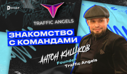
“Знакомство с командами” — рубрика, в которой редакция diasp.pro берёт интервью у самых ярких команд, связанных с арбитражем трафика. Сегодня мы хотим представить вам топовую команду — “SEO Dream Team”. Одним из её основателей является Alex SEO Nomad. В рамках интервью мы поговорили о создании команды, SEO-трафике, разобрали ошибки арбитражников и обсудили обучающий курс. 

Глава 1. О себе и команде SEO Dream Team

Alex, привет! Ты достаточно медийная личность в аффилейт маркетинге, но расскажи немного о себе и своей команде тем, кто только начал свой путь в арбитраже трафика?
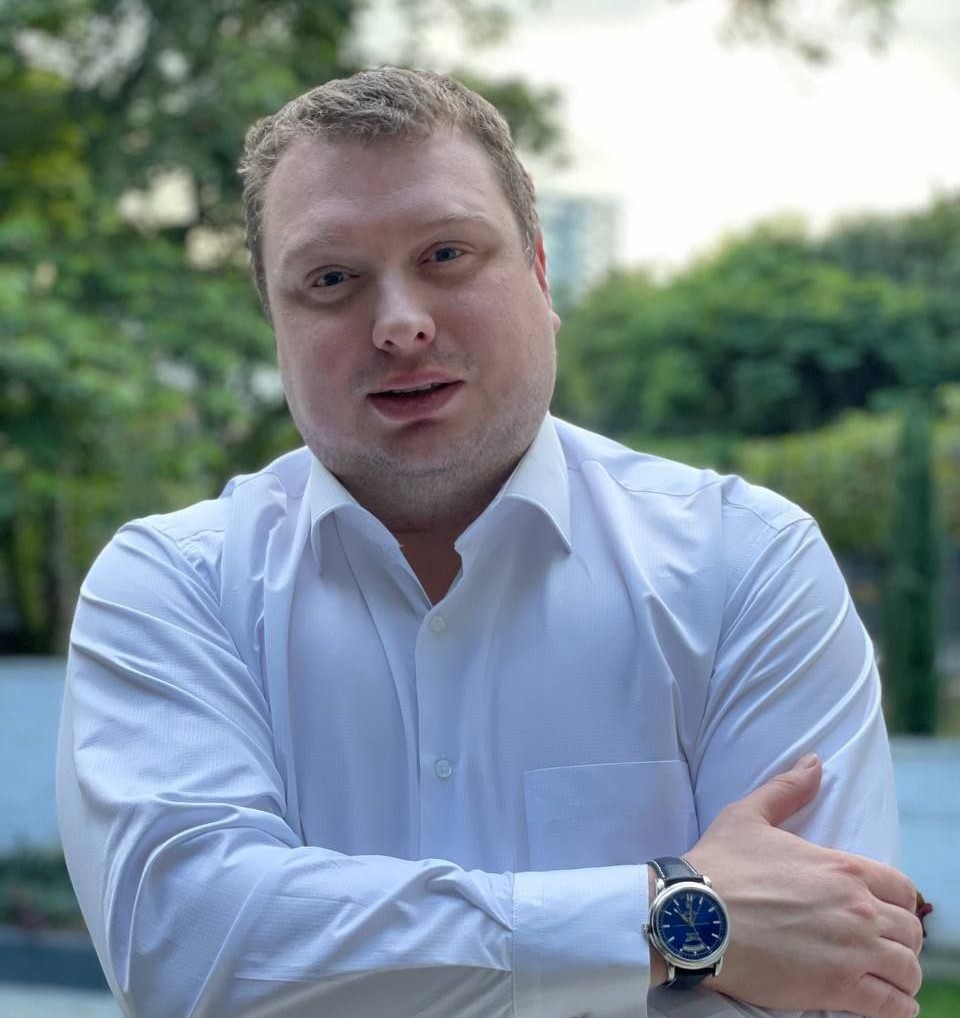
Привет! Нечасто слышу, что я медийная личность 🙂 Скорее, токсичная в определенных кругах и к определенным людям.

Меня зовут Лёша Малов, автор книг “Исповедь кардера”. Родился в Одессе, детство провел в Полтаве, юность и молодость в Санкт-Петербурге.

Команда у нас очень крутая, нет лишних ребят. Но всегда пытаемся найти новых тиммейтов. Замечу, у нас не компания, хоть юридически у нас их три в разных уголках мира, по сути у нас команда, где все тиммейты. Так повелось с самого начала.

Есть два основателя команды, я и Леонид. Если я занимаюсь развитием бизнеса и технической частью, то Лео подчищает наши тылы и занимается организационными вопросами. 

Еще недавно вытащили парня из Киева в Латам. Я его знаю года два, а хантил минимум год — Александр. Познакомились с ним, когда он был тим-лидом PIN-UP, с тех пор и дружим 🙂 Да, схантили его уже после того, как он покинул пост хеда другой партнерской программы. Парень шарит в SEO, не пришлось долго обучать. А что еще важнее, шарит в партнерках, посему теперь занимается распределением нашего SEO-трафика. PIN-UP — спасибо за кадры 🙂

Благодаря своим знаниям быстро вышел на роль младшего партнера с норм процентом от общей прибыли.

И да, я с Сашей провели детство в соседних районах в Полтаве. Некое землячество 🙂

Исповедь Кардера достаточно популярная книга в аффилейт сфере, есть ли у тебя в планах написать что-нибудь ещё?

Их две части. Многие ждут третью. Но уже во второй Изя Питерский давал понять, что воровать плохо и надо уходить в легал. Думаю, что 3-я часть будет об этом. А может и вовсе выльется в “Исповедь гембл сеошника”. Пока не знаю. Но Саша Риддик, как главный вдохновитель третьей части и почитатель предыдущих, очень ждет. Постараюсь не разочаровать читателей.

Есть желание попробовать себя, например, в литературных романах?

Мне хватает романов реальных. А в целом, если серьезно, пока есть силы — буду зарабатывать. После лет 60 на пенсию, в свой дом на побережье океана, продолжать писать книги. Там и на книжные романы будет время.

Расскажи немного подробнее о команде, как принял решение создать команду и почему “Dream Team”? С какими вертикалями работаете? 

О команде — забавная история. Она создалась благодаря 1Win, Серёга Лучший — спасибо! Когда-то я работал Lead SEO на гембл продукт и мне дали полномочия собрать команду под себя. Команду собрал из ребят, с которыми работал ранее, классные специалисты. До сих пор все в команде, кроме одного. С продуктом работа сложилась не совсем, такое бывает в SEO, что не все стреляет в сроки. Но ощущения и воспоминания о продукте очень крутые. В итоге, я и моя команда  оказались на вольных хлебах, где начали катить уже свои сайты. Прошло полгода и карманов для бабла перестало хватать 🙂

А с Сашей познакомились лишь два с половиной, или даже три, года назад.

Да, первый траф мы сливали именно на тот продукт, где работали. После — появился Пин-Ап 🙂 

В одном из видео, ты говорил, что в команде 5 человек. Увеличилось ли число участников? 

Да, сейчас у нас мощный колумбийский офис, это плюс 8 колумбийцев и бразильцев 🙂 То есть, сейчас команда состоит уже из 14 человек. На днях, наш Латам офис выкатил свой первый сайт под нашим надзором. Еще 7 будут в индексе в течение 2-х недель. И все это будет под Южную, Центральную и Северную Америку, за исключением США 🙂
Ждите много трафика panamericana от SDT! 🙂

Почему всё-таки «SEO Dream Team»? Кто придумал название?

Случайно вышло. Когда работали на продукт, то кичась своим опытом, назвали чатик “Dream Team”. После выросло в отдельный чатик “SEO Dream Team”, а позже и в название компании 🙂 

А в данный момент, с какими вертикалями работает команда Dream Team?

До 2023 только лишь гемблинг. Но, в 2022 мы начали вкладывать деньги в свои игры. Lucky Aviator — как пример, уже есть в казино 2aries. Будет больше. В 2023 году у нас три направления: операторская деятельность, гемблинг сео и белый проект под латам-рынок. Скорее всего, это будет своеобразный аналог Авито. Грубо говоря, каталог товаров. Это то, что мы умеем двигать лучше всего.

И знаете чему я рад больше всего? На все это нам не нужны инвестиции, наших заработанных средств хватает, спасибо, гемблинг 🙂 Хотя, если зайдут партнеры с уникальными торговыми предложениями и решениями, то я только за! 🙂

Да, кстати, с удовольствием пристроим свои игры в продукты. С нас не только игра, но и качественный SEO-трафик 🙂

Какими сервисами и расходниками пользуется ваша команда?

1. Ahrefs;
2. Google search console;
3. Мой мозг;
4. Навыки Юры;
5. Скиллы Саши; 
6. Ответственность Лео.

С какими проблемами вы чаще всего сталкиваетесь в работе и как их решаете?

Самая большая проблема всех SEO-специалистов — качественные ссылки. Если я расскажу, как мы это решаем, то эта информация позволит стать миллионером 🙂

Глава 2. Арбитраж трафика и SEO-тенденции

Как ты начал свой путь в SEO и как оказался в арбитраже трафика? С какими вертикалями работал? 

В SEO я начал свой путь году в 2006 году. Давно 🙂 Много было пройдено, а сеошка постоянно меняется, и от этого лишь веселее. В Gambling мы попали 3 года назад, повторюсь, благодаря Серёге Лучшему и 1Win. До этого я был Head of SEO в 220 вольт, более 1.000.000 страниц в индексе гугла. Грубо говоря, в гемблинг SEO я пришел из e-commerce SEO 🙂

Из вертикалей: e-commerce и инфобизнес. Прежде, чем прийти в гемблинг, я насладился всем 🙂 Это было очень круто, спасибо всем моим бывшим коллегам!

Выдели основные ошибки, которые допускают арбитражники в SEO?

Выделю одну — арбитражники не умеют в SEO. Совершенно другая вертикаль. У них есть хитрость и желание обмануть систему, чтобы получить почти мгновенный результат. А у нас много работы и долгое ожидание результата. Сеошники — задроты, и я такой 🙂

Как ты думаешь, успели ли поменяться тенденции в SEO в 2023 году?

2023 только начался. Для SEO прошедший месяц — не срок. Да, Google выкатил апдейт, мы, благодаря кошерным сайтам, стали еще выше, многие спам-сайты вылетели. В целом, год начался неплохо.

Искусственный Интеллект — не проблема. Сеошники пережили множество алгоритмов, поэтому и ИИ научимся правильно юзать в любых его проявлениях 🙂

Крутишь ли ты ПФ или при работе делаешь упор только на текстовую релевантность и ссылки?

Никогда не кручу поведенческий фактор. У меня сайты за неделю в топы Яши (Яндекса) попадают без ссылок и поведенческого фактора.

В чем разница между русскоязычным и англоязычным SEO? Ощущается ли языковой барьер, есть ли в штате переводчики?

Лишь в Яндексе. Если вы умеете двигать под Google в RU, то вам не составит труда сделать это и на других языках. Подходы к Google и Яндекс —  различны, поэтому в RU приходится учитывать оба подхода. А вот мультиязычность — это то, чему надо будет научиться 🙂

А насчёт языкового барьера, у меня офисы в Эмиратах и Колумбии, сотрудники говорят на русском, украинском, английском, испанском и португальском.

На какую поисковую систему лучше ориентироваться при написании SEO-текстов в Латаме и почему?

Google, ибо другие локальные поисковики не могут с ним конкурировать. В данный момент, 90+ процентов у Google.

Глава 3. Обучающий курс

Расскажи подробнее про своё обучение? На кого оно направлено и что получат пользователи в конце курса? 

Да, есть рефы. Ребята SEO-специалисты приходят в гемблинг и перестают жить на зарплату. Я не могу дать оценку своему курсу, но могу дать реферала, который расскажет о своем пути. Если он будет не против. Скажу одно, мы не берем с ребят денег. 3-5% сверх нам платит партнерская программа. Все эти деньги идут на благотворительность. За 2022 год на благотворительность мы потратили $45 000.

И, тем более, меня бесят курсы инфо-цыган, которые за два дня обучения берут 2500 долларов. Невозможно понять SEO за два дня. А если эти деньги у человека последние? В общем, это неправильно, по моему мнению.

Как ты считаешь, ты вложил в него всё, что хотел или есть какие-то элементы, которые бы ты изменил?

О, нет. Там будет еще куча всего нового. Будет очень интересно. Только фишка в том, что студенты не уходят, а помогают обучать следующие потоки и сами дополнительно развиваются 🙂 Чат рефералов — это не просто курс, это комьюнити 🙂

Как пришла идея создать курс? И сколько времени занял процесс от подготовки к запуску курса?

Не помню, как пришла идея, но подготовки не было. Я просто рассказываю ребятам, что и как делать, исходя из своего опыта. Импровизация. Более того, слегка Саша Риддик подтолкнул. За что ему — спасибо!

Глава 4. Советы и рекомендации

Судя по твоим ответам, ты всегда стараешься выстраивать рабочие отношения в дружеском ключе. Значит, всё-таки дружба и бизнес совместимы?

Дружба и бизнес — сочетаются нормально. Я дружу с Лео, он мой бизнес-партнер. Я дружу с Сашей Риддиком (люблю, бро), PIN-UP — всегда будет получать от нас ФД, как и 1Win, благодаря Серёже Лучшему. Также дружу с Владом и Рафом и ещё очень большим количеством ребят из партнерок и продуктов. 

Я больше скажу, разногласия и бизнес — это тоже нормально 🙂 Мы с Кармой начали наши отношения с конфликтов, теперь сердечки друг другу шлем 🙂 

Я, в целом, токсик, увы. Но, если я уважаю и люблю ребят, то вы увидите совершенно другого человека. Моя команда это знает.

Как попасть к вам в команду и какие требования предъявляете к соискателям?

Грудь третьего размера — шутка. Знание сеошки и общение со мной минимум 3 месяца. Лишь после этого я позову на беседу в команду. В нашей команде лишь один человек был исключением — Юра. Его посоветовали, мы взяли и не ошиблись.

Можешь дать несколько советов новичкам, которые только начинают свой путь в SEO? Что посоветуешь из литературы? 

Познавайте e-commerce SEO, после нескольких лет в e-commerce, Gambling SEO вам покажется легким. Из литературы — читайте Ашманова для старта, там все есть. Дальше английский язык и английские источники, блоги.

А просмотр YouTube-канала Alex SEO сможет в этом помочь?

Нет, там лишь путь, как мы парились и начинали свой международный бизнес. Сначала это был канал о чиле и путешествиях, после о том, как в нестабильной обстановке открыть свой бизнес за границей. Чуть позже о бабках и нормальной жизни. А теперь… Теперь мне надо нанять редактора для этого канала, который будет ездить со мной и все снимать. Моего времени на ютуб, увы, больше нет.

Алексей, чтобы ты сказал тем, кто прочитает это интервью?

Я хочу, нет, я прошу: каждый, кто заработал хотя бы 100к — отдайте хотя бы 5к на образование и детей. Мы будем старыми, а они в это время будут управлять миром. Вы ведь не хотите, чтобы миром управляли тупые?

Заключение

Подробнее ознакомиться с деятельностью команды “SEO Dream Team”, обучающим курсом и предстоящих событиях — можно в телеграм-канале.

Ориентировочно, летом или в начале осени состоится круглый стол “CPA Club”, в котором примут участие самые профитные рефералы SEO Dream Team. На мероприятии будут обсуждать последние тренды в SEO и конверт партнерок. 

Команда diasp.pro подготовила для читателей интервью с самыми известными командами в арбитраже трафика. Оставайтесь на связи, подписывайтесь на обновления и следите за нашими новостями.

Будет очень интересно! 

Советуем прочитать: “Мое обучение — это не просто арбитраж трафика, это — арбитраж жизни.”: главное из исследования Web Space с Артемием Сибирским 

Комментарии отсутствуют. Будьте первым!

в ответ kakdelakisa

user avatar