


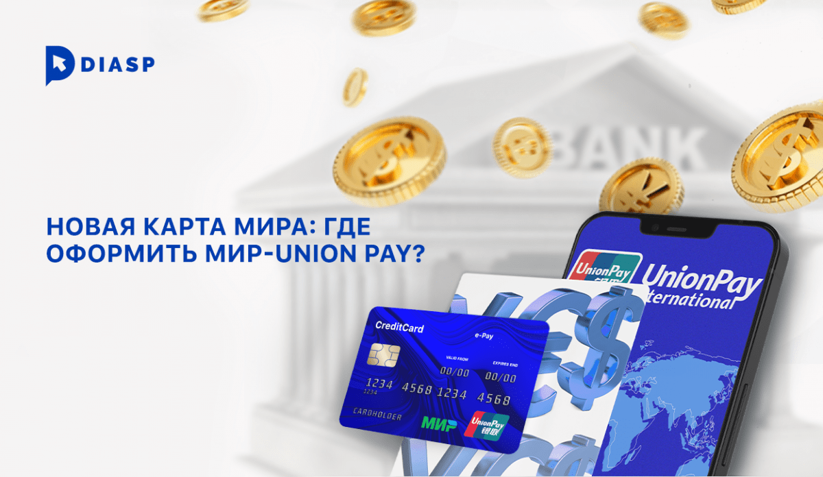
После ухода с российского финансового рынка платежных систем Visa и MasterCard, аналитиками зафиксирован резкий спрос населения на карты китайской платежной системы Union Pay. Кобейджинговая карта платежных систем Мир — Union Pay призвана решить проблему перевода денежных средств.
Содержание
UnionPay (CUP)
UnionPay (CUP) — платежная система, основанная ассоциацией банков КНР в 2002 году. Уже в 2015 году Union Pay была признана крупнейшей в мире, обогнав Visa и Mastercard по доле обрабатываемых транзакций.
На сегодяшний день UnionPay принимается в 180 странах по всему миру, с 2007 года и в России.
Центральный Банк РФ заявил о выпуске кобейджинговых карт платежных систем МИР и Union Pay крупнейшими российскими банками для проведения транзакций в России и за рубежом.
Рассмотрим, какие российские банки уже предлагают возможность оформления карт МИР-UnionPay или планируют запускать оформление карт в ближайшем будущем.
Какие банки планируют запуск МИР-Union Pay
Сбербанк, Тинькофф-Банк, Московский кредитный банк, Альфа-Банк, Райффайзенбанк, «Юмани», банк «Дом.РФ», Совкомбанк прорабатывают возможность выпуска кобейджиннговых карт в ближайшее время.
Пресс-центр «Тинькофф» отмечает, что банком прорабатывается возможность использования карты с платежных систем «Мир» и «Union Pay» сразу же после ее оформления.
В каких банках можно оформить МИР-Union Pay
Некоторые российские банки уже работают с платежной системой UnionPay.
Газпромбанк
Газпромбанк предлагает оформление Умной карты UnionPay.
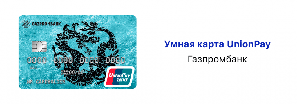
Оформление — на данный момент только в отделении банка.
Стоимость выпуска карты — 15 тыс. рублей.
Стоимость годового обслуживания — 200 руб.
Ранее стоимость выпуска карты составляла 5 тысяч рублей, однако, представители банка 15 марта заявили об увеличении стоимости в 3 раза из-за ажиотажа.
Россельхозбанк
Россельхозбанк первым в России приступил к выпуску кобейджинговой карты «Мир»- UnionPay. Россельхозбанк предлагает клиентам оформить кобейджинговые карты «Мир»-UnionPay и дебетовую карту «Своя».
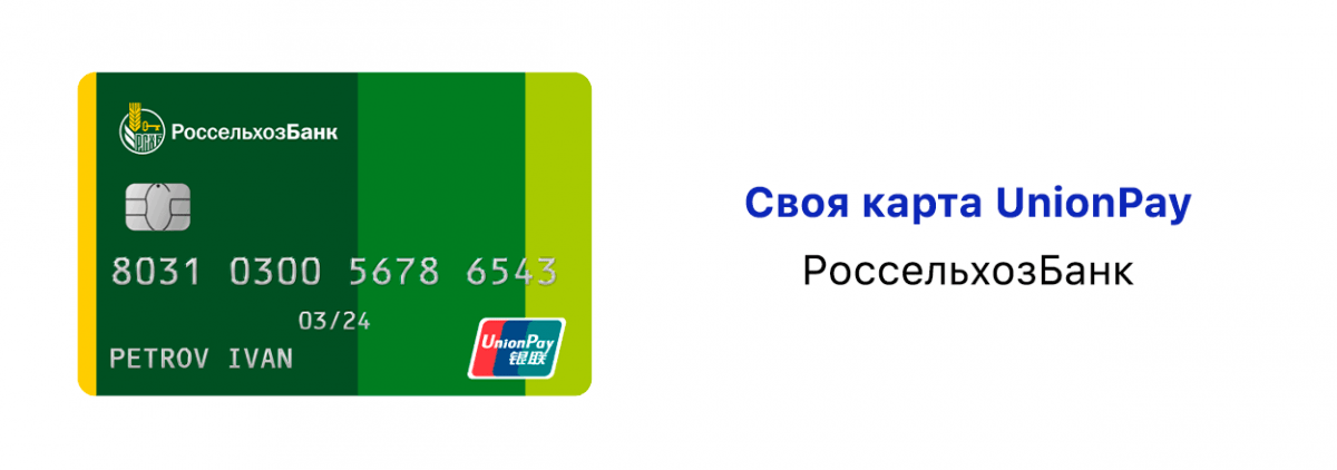
Стоимость выпуска карты:
- «моментальная» — 7,5 тыс. рублей;
- «именная» — 9,5 тыс. рублей.
Стоимость годового обслуживания карты:
- 200 руб. для пластиковой карты;
- 150 руб. для виртуальной карты.
Годовое обслуживание дополнительной карты:
- 600 руб. для пластиковой карты;
- 150 руб. для виртуальной карты.
Ограничения по количеству действующих карт:
- не более 10 карт к одному счету (2 виртуальных).
Валюта счета — рубли, доллары, евро.
Банк Санкт-Петербург
Стоимость выпуска карты UnionPay Classic от банка «Санкт-Петербург» зависит от срочности.
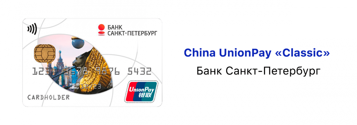
Стоимость выпуска:
- обычный выпуск — 10 тыс. рублей;
- срочный выпуск — 50 тыс. рублей.
Стоимость годового обслуживания карты — 5 тыс. рублей.
Оформление — на данный момент только в отделении банка.
Валюта счета — рубли, доллары, евро.
Банк «Зенит»
Банк начал выпускать карты UnionPay с 2017 года.
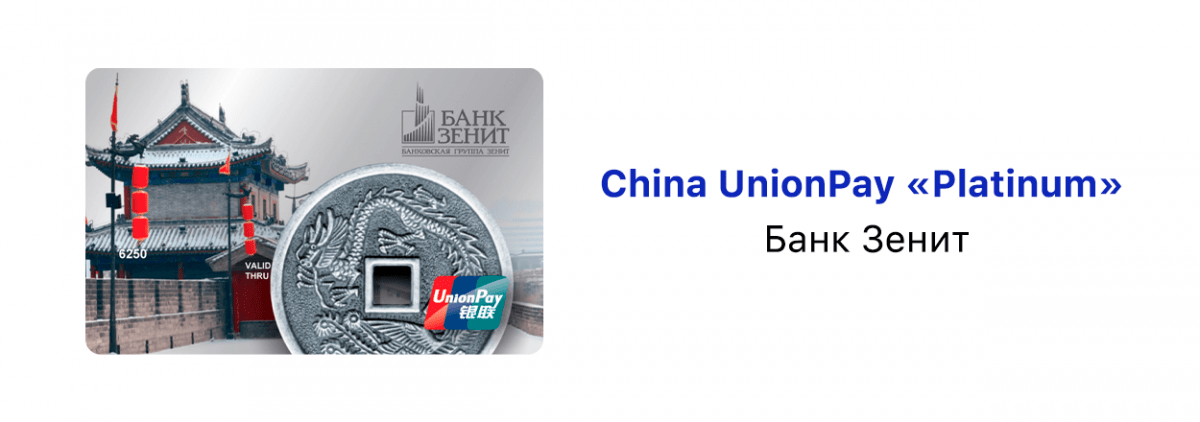
Оформление — на данный момент только в отделении банка.
Стоимость выпуска:
- обычный выпуск тариф «Премиальный» — 1,2 тыс. рублей;
- срочный выпуск в течение 2-х дней — 2 тыс. рублей.
Стоимость обслуживания в месяц — 299 рублей.
Валюта счета — рубли, доллары, евро.
Банк «Солидарность»
Банк выпускает карты платежной системы Union Pay и МИР-Union Pay. В связи с большим количеством заявок на оформление карт в последний месяц, банк анонсировал выпуск неименных карт, ничем не отличающихся по функционалу от именных . При получении карты держателю предоставляется доступ к мобильному приложению банка с полным функционалом платежей. Подать заявку можно через сайт, срок выдачи — 2 недели.
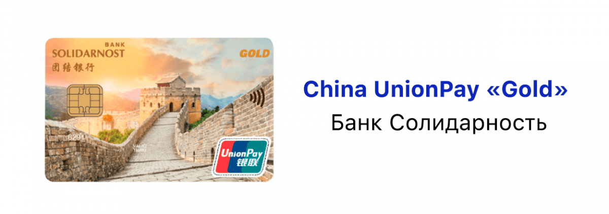
Стоимость выпуска карты — бесплатно.
Стоимость ежемесячного обслуживания — 99 руб.
Ограничения по количеству действующих карт:
- не более 2 карт к одному счету.
Ранее такие банки, как Совкомбанк, Промсвязьбанк, Примсоцбанк, Почта банк также выпускали карты платежной системы Union Pay, однако, из-за наложенных США санкций на финансовый сектор и большого количества заявок, временно прекратили оформление карт.
Полный список банков, доступных для оформления карт платежной системы Union Pay доступен по ссылке.
Следите за обновлениями!