a { color: rgb(32, 63, 172) !important; } .menu .menu-item.current-menu-ancestor > a { color: rgb(32, 63, 172) !important; } .menusearch .menu-item-has-children:hover .sub-menu { display: flex; position: absolute; top: 100%; z-index: 5000; } .menusearch .menu-item-has-children:hover > a::after { transform: rotate(-180deg) translateY(-5px); -webkit-transform: rotate(-180deg) translateY(-5px); transition: 0.3s ease-in; } .menusearch .menu-item:last-child:hover .sub-menu { display: grid; grid-template-columns: 1fr 1fr; right: 0; } .sub-menu { display: none; flex-direction: column; justify-content: start; align-items: start; overflow: hidden; transition: max-height ease-in 0.7s, opacity ease 0.5s, padding ease 0.5s; border-bottom-left-radius: 4px; border-bottom-right-radius: 4px; border: 1px solid #f7f7f7; border-top: none; padding: 0; background: #fff; z-index: 998; box-shadow: 0px 3px 4px 0px rgba(0, 0, 0, 0.1490196078); } .sub-menu .menu-item { margin: 7px 0 7px 0; position: relative; } .sub-menu .menu-item a { color: #5b6471 !important; position: relative; padding: 7px 60px 7px 16px; display: block; cursor: pointer; } .sub-menu .menu-item a:hover { color: #5b6471 !important; } .sub-menu .menu-item:last-child { margin-bottom: 0; } .sub-menu .menu-item:hover { background: #f4f6ff; } .sub-menu .menu-item.current-menu-item > a { color: #5b6471 !important; } .sub-menu--init { width: initial; } .sub-menu--shown { width: initial; opacity: 1; max-height: 1000px; padding: 0 0 4px 0; } .menu-item-has-children > a::after { content: url('data:image/svg+xml,%3Csvg width="12" height="6" viewBox="0 0 12 6" fill="none" xmlns="http://www.w3.org/2000/svg"%3E%3Cpath d="M6.00011 5.24999C5.85011 5.24999 5.65011 5.19999 5.55011 5.09999L1.05011 1.59999C0.750109 1.34999 0.700109 0.849987 0.950109 0.549987C1.20011 0.249987 1.70011 0.199986 2.00011 0.449986L6.00011 3.54999L10.0001 0.449986C10.3001 0.199986 10.8001 0.249987 11.0501 0.549987C11.3001 0.849987 11.2501 1.34999 10.9501 1.59999L6.45011 5.09999C6.35011 5.19999 6.15011 5.24999 6.00011 5.24999Z" fill="%23B6C1C7"/%3E%3C/svg%3E%0A'); margin-left: 5px; transition: 0.3s ease-out; display: inline-block; transform: translateY(-1px); } .menu--hidden { display: none; } @media (max-width: 1720px) { .menu .menu-item a { font-size: 1rem; } .menu-item-has-children > a::after { top: 27px; } .menu .menu-item-has-children:hover > a::after { transform: rotate(-180deg) translateY(-4px); -webkit-transform: rotate(-180deg) translateY(-4px); } .sub-menu .menu-item { margin-right: 0; display: block; width: 100%; } } @media (max-width: 1200px) { .menu .menu-item { margin-right: 15px; } .menu .menu-item:last-child { margin-right: 0; } } @media (max-width: 1200px) { .sub-menu .menu-item { margin-right: 0; } } @media (max-width: 1000px) { .menu { display: none; } .burger .menu { display: block; } } .burger { visibility: hidden; position: fixed; top: 0; left: 0; bottom: 0; right: 0; width: 80%; background: #fff; z-index: 999; overflow: scroll; height: 100vh; transform: translateX(-100%); transition: all 0.3s ease-in; } .burger .sub-menu { display: none; width: initial; height: initial; opacity: 1; max-height: none; border-radius: 0; background: none; color: #fff; border: none; box-shadow: none; } .burger .sub-menu .menu-item a { padding-left: 40px; } .burger .sub-menu .menu-item a:hover { padding-left: 35px; } .burger .sub-menu .menu-item::after { content: none; } .burger .sub-menu .menu-item:hover { background: none; } .burger .user__wrapper { display: flex; align-items: center; flex-direction: row-reverse; justify-content: space-between; width: 100%; } .burger .user__wrapper.user--hidden { display: none; } .burger .user { width: 70px; height: 70px; } .burger .login__button { padding: 0; background: none; color: #000; } .burger-open { visibility: visible; transform: translateX(0%); transition: all 0.3s ease-in; } .burger__menu { background: #fff; color: #5b6471; } .burger__menu .menu-item a { padding: 12px 20px; font-size: 1.125rem; } .burger__menu .menu-item a:hover { background: #e5ebff; border-left: 5px solid #3f63df; padding-left: 15px; } .burger__menu .menu-item a:visited { color: #5b6471; } .burger__usermenu { list-style-type: none; } .burger__usermenu-item { padding: 5px 0; } .burger__usermenu-item a { color: #000; font-weight: 600; } .burger__title { padding: 0.875rem 3rem; border-bottom: 1px solid #b6c1c7; background: #fff; display: flex; justify-content: center; align-items: center; position: relative; margin-bottom: 0.5rem; } .burger__title figure { position: absolute; left: 20px; top: 18px; } .burger__title--h3 { font-size: 18px; line-height: 21px; color: #000d20; font-weight: 400; } .login__button--mobile { display: none; } @media (max-width: 1000px) { .login__button--desktop { display: none !important; } .login__button--mobile { display: block; cursor: pointer; } .login__button--mobile figure { height: 25px; } .login__button--mobile figure img { height: 25px; width: 25px; } } @media (min-width: 500px) { .burger__profile { padding: 50px 100px 10px 100px; } } #searchform { width: 100%; align-items: flex-end; display: flex; flex-direction: row-reverse; gap: 0.5rem; } .search__input { width: 100%; border: none; border-bottom: 1px solid #5b6471; padding: 0.25rem; } .search__input:focus { box-shadow: none; border-bottom: 1px solid #203fac; } .search__button { border: none; background: none; cursor: pointer; height: 24px; } .search__button img { width: 100%; } .menusearch { width: 100%; } .search-wrapper { display: flex; flex-direction: column; gap: 1.5rem; } .search-post { display: flex; flex-direction: column; gap: 0.5rem; padding: 10px; } .search-post:hover { background-color: #f4f6ff; } .search-link:hover > h2 { color: #203fac; } .search-link { display: flex; align-items: center; color: #203fac; } .search-link p { font-size: 1.125rem; } .search-link:visited { color: #203fac; } .search-text { color: #555555; } .search-section .divider:last-child { display: none; } @media (max-width: 1720px) { .search-link p { font-size: 1rem; } .search__button { height: 22px; } } .branding { position: relative; } .branding__poster { max-width: 1920px; margin: 0 auto; padding-top: 320px; } .branding__link { display: block; position: absolute; top: 60px; left: 0; width: 100%; height: 260px; background-position-y: 60px; background-position-x: center; background-repeat: no-repeat; background-attachment: fixed; } .branding__link:hover { filter: contrast(0.8); } .lazy { opacity: 0; transition: opacity 0.5s ease; } .lazy.entered.loaded { opacity: 1 !important; } .branding__link { opacity: 1; transition: opacity 0.5s ease; } .branding__link.entered.loaded { opacity: 1 !important; } .branbranding__poster--mobile { display: none !important; } @media (max-width: 1440px) { .branding__poster { padding-top: 285px; } .branding__link { background-size: 1700px auto; height: 225px; } } @media (max-width: 1300px) { .branding__link { background-size: 1500px auto; height: 200px; } .branding__poster { padding-top: 260px; } } @media (max-width: 1100px) { /* .branding__poster { padding-top: 220px; } .branding__link { height: 100% !important; }*/ } @media (max-width: 1023px) { .branbranding__poster--desktop { display: none; } .branbranding__poster--mobile { display: block !important; margin: 50px 0 0 0; } .branding__link--mobile { display: block; } .branbranding__poster--mobile-wrap { position: relative; /*background: whitesmoke;*/ max-height: 80px; overflow: hidden; } .branbranding__poster--mobile-wrap:before { content: ""; display: block; padding-top: 30%; } .branding__link--mobile { display: block; position: absolute; width: 100%; top: 0; right: 0; bottom: 0; left: 0; background-position-y: 50px; background-position-x: center; background-repeat: no-repeat; background-attachment: fixed; background-size: 100vw auto; } } @media (min-width: 768px) and (max-width: 1023px) { .branbranding__poster--mobile-wrap { max-height: 300px; } } * { box-sizing: border-box; margin: 0; padding: 0; } a { text-decoration: none; } img { max-width: 100%; height: auto; } input, select, textarea, a, button { outline: none; transition: all 0.3s ease; font-family: "SF Pro", "Segoe UI", Tahoma, Geneva, Verdana, sans-serif !important; } input, select, textarea { color: #000d20; } input:focus, select:focus, textarea:focus, a:focus, button:focus { outline: none; box-shadow: 0 0 2px #203fac; } p, a, div, button, select { font-size: 1.125rem; } .page__text { line-height: 140.5%; color: #5b6471; margin: 0.625rem 0 1.875rem 0; } .page__text h3 { margin-bottom: 25px; } .page__text p { margin-bottom: 15px; } img:not([src]):not([srcset]) { visibility: hidden; } body { font-family: "SF Pro", "Segoe UI", Tahoma, Geneva, Verdana, sans-serif; font-weight: 400; background: #fff; } input, textarea { font-size: 1.125rem; } input::placeholder { font-size: 1.25rem; } html, body { width: 100%; height: 100%; margin: 0px; padding: 0px; scroll-behavior: smooth; } .very__long__stuff { height: 3000px; } .main { background: #fff; transition: 0.3s ease-in-out; border-radius: 20px; padding: 3.25rem; position: relative; /* box-shadow: 0px 0px 15px 0px rgba(0, 0, 0, 0.15);*/ } .main__content { margin: 0 auto; } .swiper-slide { height: auto !important; } .searchmobi { display: none; } .searchmobi .search { margin-top: 1rem; } .select { position: relative; display: block; width: 100%; max-width: 195px; } .select__head { width: 100%; max-width: 195px; height: 34px; border: 1px solid #b6c1c7; border-radius: 4px; padding: 6px 10px; color: #000d20; cursor: pointer; position: relative; } .select__head::after { content: url('data:image/svg+xml,%3Csvg width="12" height="6" viewBox="0 0 12 6" fill="none" xmlns="http://www.w3.org/2000/svg"%3E%3Cpath d="M6.00011 5.24999C5.85011 5.24999 5.65011 5.19999 5.55011 5.09999L1.05011 1.59999C0.750109 1.34999 0.700109 0.849987 0.950109 0.549987C1.20011 0.249987 1.70011 0.199986 2.00011 0.449986L6.00011 3.54999L10.0001 0.449986C10.3001 0.199986 10.8001 0.249987 11.0501 0.549987C11.3001 0.849987 11.2501 1.34999 10.9501 1.59999L6.45011 5.09999C6.35011 5.19999 6.15011 5.24999 6.00011 5.24999Z" fill="%23B6C1C7"/%3E%3C/svg%3E%0A'); position: absolute; right: 13px; top: 4px; transition: 0.3s ease-out; display: inline-block; transform: translateY(-1px); } .select__head.open::after { transform: rotate(180deg) translateY(-5px); -webkit-transform: rotate(-180deg) translateY(-5px); } .select__list { position: absolute; top: 100%; left: 0; right: 0; background: #fff; max-width: 195px; border: 1px solid #b6c1c7; border-radius: 0 0 4px 4px; margin-top: -1px; z-index: 100; font-size: 14px; color: #424348; flex-direction: column; gap: 5px; } .select__list::-webkit-scrollbar { width: 7px; background-color: #f8f9fa; padding: 5px; } .select__list::-webkit-scrollbar-thumb { border-radius: 10px; background-color: #d9d9d9; } .select__list .select__item { position: relative; padding: 8px 9px; color: #5b6471; list-style: none; } .select__list .select__item:first-child { margin-top: 5px; } .select__list .select__item:last-child { margin-bottom: 5px; } .select__list .select__item:visited { color: #5b6471; } .select__list .select__item:hover { background: #f4f6ff; } .open { border-radius: 4px 4px 0 0; } .select__title { font-weight: 400; color: #5b6471; line-height: 18px; margin-bottom: 9px; } .rules { padding-top: 5rem !important; } .rules__text { line-height: 140.5%; color: #000d20; margin-top: 2rem; } .rules__text h2 { margin-bottom: 1.5rem; } .rules__text h3 { margin-bottom: 1rem; } .rules__text p { margin-bottom: 1rem; } .rules__text dl, .rules__text ol, .rules__text ul { padding-left: 20px; margin-bottom: 1rem; } .rules__text li { color: #000d20; line-height: 150%; } @media (max-width: 1720px) { .main { max-width: 1100px; padding: 2.5rem; } p, a, div, button, select { font-size: 1rem; } .page__text { margin: 0.625rem 0 1.5625rem 0; } input, textarea { font-size: 1rem; } input::placeholder { font-size: 1rem; } } @media (max-width: 1600px) { .main { max-width: 1050px; padding: 1.625rem; } } @media (max-width: 1400px) { .main { max-width: initial; width: 100%; padding: 1.25rem; } } @media (max-width: 1000px) { .page__text { font-size: 1.125rem; margin: 0.625rem 0 1.25rem 0; } .searchmobi { display: initial; } .searchmobi .search--hidden { display: flex; } .main { border-radius: 0; padding: 1.25rem; box-shadow: none; margin: 0 auto; } } @media (max-width: 700px) { .hide-on-mobile { display: none; } .no-scrolling { overflow: hidden; } } .checkbox { display: grid; place-items: center; width: 24px !important; height: 24px !important; padding: 0; margin: 0; color: #0040ff; position: relative; cursor: pointer; appearance: none; } .checkbox:before { content: ""; width: 100%; height: 100%; line-height: 1; color: inherit; border-width: 2px; border-style: solid; border-color: #b6c1c7; border-radius: 4px; transition: all 0.2s ease; } .checkbox:after { content: ""; width: calc(100% - 12px); height: calc(100% - 19px); border-width: 0px 0px 2px 2px; border-style: solid; border-color: #fff; transform: rotate(-45deg); position: absolute; top: 6px; left: 5px; transition: all 0.2s ease; } .checkbox:checked:before { background: #0040ff; border-color: #0040ff; } .checkbox:checked::after { border-color: #fff; } .checkbox:disabled { cursor: not-allowed; } .checkbox:disabled:before { border-color: darkgray; } .checkbox:disabled:after { border-color: transparent; } .checkbox:disabled:checked { color: #0040ff; opacity: 0.65; } .checkbox:disabled:checked:before { border-color: #0040ff; } .checkbox:disabled:checked::after { border-color: #fff; } .checkbox.focus, .checkbox:focus { outline: none; box-shadow: none; } .checkbox__field { display: grid; grid-template-columns: repeat(2, max-content); gap: 0.3rem; align-items: center; } .checkbox__label { color: rgb(91, 100, 113); font-size: "1.25rem"; } .title__h1 { font-size: 1.875rem; font-style: normal; font-weight: 600; line-height: 36px; letter-spacing: 0em; text-align: left; } h1 { line-height: 36px; font-size: 1.875rem; font-weight: 600; color: #000d20; } .title__h2 { font-size: 1.375rem; font-weight: 600; } .title__h2 a { color: #000d20; font-size: 1.375rem; } h2 { font-size: 1.375rem; font-weight: 600; color: #000d20; } h3 { font-size: 1.25rem; font-weight: 600; color: #000d20; } .title { display: flex; justify-content: space-between; align-items: center; margin-bottom: 1.875rem; width: 100%; } .title__group { display: grid; grid-auto-flow: column; align-items: center; gap: 20px; } .title--middlemargin { margin-bottom: 1.5625rem; } .title--smallmargin { margin-bottom: 0.9375rem; } .title--nomargin { margin: 0 !important; } .title--margintop { margin-top: 1.875rem; } .title__link { text-decoration: none; color: #203fac; } .title__button-link { max-height: 30px; display: flex; justify-content: center; border-radius: 10px; align-items: center; color: #fff; padding: 4.5px 16px; font-size: 18px; white-space: nowrap; } .title__button-link:hover { filter: brightness(1.2); } .sponsor__button-link { max-height: 30px; display: flex; justify-content: center; border-radius: 10px; align-items: center; color: #fff; padding: 4.5px 26px 4.5px 18px; font-size: 18px; white-space: nowrap; gap: 10px; background-color: #1f1e26; text-transform: uppercase; } @media (max-width: 1720px) { .title__h1 { font-size: 1.6875rem; } h1 { font-size: 1.6875rem; } .title__h2 { font-size: 1.125rem; } h2 { font-size: 1.25rem; } .title { margin-bottom: 1.5625rem; } h3 { font-size: 1.125rem; } } @media (max-width: 1000px) { .title__h1 { font-size: 1.5rem; line-height: 26px; } h1 { font-size: 1.5rem; } .title__h2 { font-size: 1.25rem; } h2 { font-size: 1.25rem; } .title { margin-bottom: 1.25rem; } h3 { font-size: 1rem; } } @media (max-width: 480px) { .title { margin-bottom: 1rem; flex-wrap: wrap; gap: 10px; align-items: flex-start; } .title__group { display: flex; } .title__h1 { font-size: 1.375rem; line-height: 1.2; } h1 { font-size: 1.375rem; } .title__link { font-size: 1rem; } .title--nomargin { margin: 0; } .title--margintop { margin: 2rem 0; } .title--mobile { flex-direction: column-reverse; gap: 2rem; align-items: flex-start; } .title__button-link { font-size: 12px; padding: 8px 10px; } } .button { border-radius: 10px; color: #fff; display: block; padding: 3px 15px; font-family: "SF Pro", "Segoe UI", Tahoma, Geneva, Verdana, sans-serif; background-color: #203fac; cursor: pointer; text-align: center; } .fix .button { background-color: #fff; color: #000; } .button__show-all { background-color: #203fac; color: #fff; padding: 10px 37px; border-radius: 10px; font-weight: 600; margin: 22px auto 0; display: block; width: fit-content; } .button--primary { border: none; border-radius: 10px; background: #203fac; color: #fff; padding: 4px 16px 5px 16px; width: fit-content; text-align: center; display: flex; align-items: center; justify-content: center; gap: 8px; } .button--primary:hover { background: #3f63df; } .button--secondary { padding: 10px 16px; display: block; border-radius: 5px; border: 1px solid #5b6471; color: #5b6471; background: #fff; text-align: center; max-width: 130px; width: 100%; } .button--secondary:hover { background: #b6c1c7; border: 1px solid #b6c1c7; color: #fff; } .button--hidden { display: none !important; } .button--gray { background: #b6c1c7; } .btn__show-all { color: #5b6471; border: 1px solid #758194; text-align: center; width: fit-content; display: block; padding: 3px 16px; outline: none; cursor: pointer; border-radius: 10px; } .btn__show-all:hover { color: #000d20; border: 1px solid #000d20; } .button-respond { color: #5b6471; border: 1px solid #758194; text-align: center; width: fit-content; display: block; padding: 3px 16px; outline: none; cursor: pointer; border-radius: 10px; } .button-respond:hover { color: #000d20; border: 1px solid #000d20; } .link--hover { color: #203fac !important; width: fit-content; } .link--hover::after { content: ""; display: block; width: 0; height: 1px; margin-top: -2px; background: #203fac; } .link--hover:hover::after { width: 100%; } .tag { border: 1px solid #b6c1c7; color: #b6c1c7; border-radius: 20px; padding: 1px 10px; display: block; width: fit-content; } .tag:hover { border: 1px solid #3f63df; color: #3f63df; } .button-submit { display: flex; align-items: center; align-content: center; justify-content: center; font-family: "SF Pro", "Segoe UI", Tahoma, Geneva, Verdana, sans-serif; white-space: nowrap; border: 1px solid #203fac; box-sizing: border-box; border-radius: 10px; background: none; padding: 16px 15px; width: fit-content; color: #203fac; cursor: pointer; } .button-submit:disabled { background: #b6c1c7 !important; border: 1px solid #b6c1c7 !important; color: #fff !important; } .button-submit:disabled svg path { fill: #fff; } .button-submit a { color: #203fac; } .button-submit:hover a { color: #fff; } .button-submit--disabled { background: #b6c1c7 !important; border: 1px solid #b6c1c7 !important; color: #fff !important; } .button-submit--small { padding: 2px 16px; border-radius: 10px; } .button-submit:hover { border: 1px solid #3f63df; background: #3f63df; color: #fff; } .button-submit:hover svg path { fill: #fff; } .button-submit--gray { border: 1px solid #5b6471; color: #5b6471; display: flex; gap: 5px; justify-content: center; } .button-submit--gray:hover { border: 1px solid #b6c1c7; background: #b6c1c7; color: #fff; } .button--restore { width: 100% !important; margin-top: 20px; height: 40px; line-height: 38px; padding: 0; border: 1px solid #3f63df; } .button--restore:hover { background: #fff; color: #3f63df; } .button--decline { padding: 10px 16px; display: block; border-radius: 5px; border: 1px solid #203fac; color: #203fac; background: #fff; text-align: center; max-width: 130px; width: 100%; } .button--decline:hover { background: #3f63df; border: 1px solid #3f63df; color: #fff; } @media (max-width: 1720px) { .button__show-all { margin-top: 15px; } .link--hover::after { margin-top: 0px; } .link--hover { height: 23px; } .btn__show-all { padding: 4px 16px; } .button-respond { padding: 4px 16px; } .button--primary { padding: 6px 16px 5px 16px; } } @media (max-width: 1000px) { .button { border-radius: 10px; } .btn__show-all { position: absolute; bottom: 3px; left: 50%; transform: translate(-50%, -50%); width: 100%; padding: 6px 16px; } } .tooltip-button { margin-right: 10px; position: relative; border: 0; outline: none; background: transparent; } .tooltip-button:hover .tooltip { opacity: 1; visibility: visible; height: auto; } .tooltip-button .tooltip { background: #000d20; border-radius: 5px; color: #fff; position: absolute; transition: visibility 0s linear 0.3s, opacity 0.3s linear 0s; opacity: 0; visibility: hidden; z-index: 2000; top: 20px; right: -9px; padding: 10px; width: max-content; } .tooltip-button .tooltip:after { content: ""; position: absolute; right: 9px; left: initial; top: -9px; width: 0; height: 0; border-style: solid; border-width: 0 8px 10px 8px; border-color: transparent transparent #000d20 transparent; } .sponsor__outer { border-radius: 7px; -webkit-border-radius: 7px; display: block; overflow: hidden; } .sponsor__video { display: block; width: 100%; } .sponsor__video:hover { filter: contrast(0.8); } .sponsor__wrapper { padding: 15px; } .sponsor__vertical { border: 1px solid #b6c1c7; border-radius: 7px; display: block; position: relative; overflow: hidden; height: 100%; max-height: 550px; } .sponsor__vertical-image { object-fit: cover; width: 100%; height: 100%; min-height: 500px; margin: 0 auto; display: block; } .sponsor__vertical-image:hover { filter: contrast(0.8); } .sponsor--no-padding-bottom { padding: 3rem 0 0 0; } @media (max-width: 1000px) { .sponsor__outer { border-radius: 5px; } .sponsor__vertical { max-width: inherit; max-height: inherit; } .sponsor__wrapper { padding-left: 0; } } @media (max-width: 700px) { .sponsor__wrapper { padding-left: 0; padding-right: 0; } } @media (max-width: 480px) { .sponsor__outer { max-height: 60px; } } .breadcrumbs { display: flex; align-items: baseline; grid-gap: 5px; gap: 5px; white-space: wrap; flex-wrap: wrap; -ms-overflow-style: none; margin-bottom: 10px; } .breadcrumbs .breadcrumbs__separator { color: #b6c1c7; } .breadcrumbs a { color: #203fac; } .breadcrumbs a:visited { color: #b6c1c7; } .blogs-education__section { display: flex; justify-content: space-between; align-items: start; } .blogs-education__wrapper { display: flex; flex-direction: column; gap: 30px; width: 100%; } .blogs-education__title { display: flex; align-items: center; justify-content: flex-start; gap: 0.625rem; margin-bottom: 0.625rem; } .blogs-education__title figure { height: 24px; margin: 0 !important; } .blogs-education__list { padding-left: 20px; line-height: 40px; color: #5b6471; position: relative; z-index: 100; } .blogs-education__list li a { color: #5b6471; } .blogs-education__list li:hover, .blogs-education__list li:hover > a { color: #3f63df !important; } .blogs-education__list li a:visited { color: #5b6471; } .blogs-education__sidebar-list { max-width: 400px; min-width: 350px; width: 100%; list-style: none; border: 1px solid #3f63df; border-radius: 7px; font-size: 1.25rem; padding: 10px 0; display: flex; flex-direction: column; margin-bottom: 35px; } .blogs-education__sidebar-list-item { padding: 10px 20px 10px 20px; color: #000d20; font-size: 1.25rem; transition: color 0.3s ease, background 0.3s ease; } .blogs-education__sidebar-list-item:visited { color: #000d20; } .blogs-education__sidebar-list-item:hover { background: #f4f6ff; border-left: 5px solid #3f63df; padding-left: 15px; color: #3f63df; } .blogs-education__anchor { margin-top: -80px; padding-top: 80px; } .blogs--education .title, .blogs--education .breadcrumbs { position: relative; z-index: 100; } .page-template-tmp-blog-education .main__content div:last-child { margin-bottom: 35px; } @media (max-width: 1720px) { .blogs-education__sidebar-list-item { font-size: 1.125rem; } .blogs-education__section .sidebar { top: 5rem; } } @media (max-width: 1400px) { .blogs-education__wrapper { max-width: 650px; } } @media (max-width: 1000px) { .blogs-education__section .sidebar { display: none; } .blogs-education__wrapper { max-width: inherit; } } .single__wrapper { display: flex; justify-content: space-between; align-items: start; margin-bottom: 6rem; } .no-container .single__content { max-width: none; } .single-detail__content .sidebar { min-width: 315px; width: 24%; margin-left: 0; } .single-detail__content .sidebar .sponsor__vertical-image { min-width: initial; } .no-container .single__wrapper { margin-bottom: 0; } .single__content { width: 100%; } .single-detail__content { display: flex; justify-content: space-between; align-items: start; margin-bottom: 25px; } .single-detail__text { max-width: 679px; width: 100%; display: flex; flex-direction: column; gap: 1.875rem; line-height: 145.5%; color: #000d20; } .single-detail__text ul, .single-detail__text dl, .single-detail__text ol { padding-left: 20px; } .single-detail__text li { color: #000d20; line-height: 150%; } .single-detail__text a { color: #203fac !important; word-break: break-word; font-size: inherit; } .single-detail__text a:visited { color: #203fac !important; } .single-detail__text a:hover { border-bottom: 1px solid #203fac; } .single-detail__content .sponsor__wrapper { padding: 0; } blockquote { border-left: 3px solid #203fac; color: #1a1a1a; font-size: 1.25em; font-style: italic; line-height: 145%; padding: 1em 2em; position: relative; transition: 0.2s border ease-in-out; z-index: 0; } blockquote:before { content: ""; position: absolute; top: 50%; left: -4px; height: 2em; background-color: #fff; width: 5px; margin-top: -1em; } blockquote:after { content: "❞"; position: absolute; top: 50%; left: -0.5em; color: #203fac; font-style: normal; line-height: 1em; text-align: center; text-indent: -2px; width: 1em; margin-top: -0.5em; transition: 0.2s all ease-in-out, 0.4s transform ease-in-out; } blockquote:active:after { transform: rotateY(360deg); } cite { display: block; font-size: 0.75em; line-height: 1.8em; margin-top: 1em; font-style: normal; } .single-detail__quote { display: flex; flex-direction: column; position: relative; } .single-detail__quote::after { content: url("/wp-content/themes/diasp__v2/static/img/misc/quote.svg"); position: absolute; top: -6px; left: calc(50% - 112px); } .single-detail__quote blockquote { display: flex; flex-direction: column-reverse; padding: 0; border-left: none; } .single-detail__quote blockquote p { padding: 0 2em; border-left: 2px solid #203fac; } .single-detail__quote blockquote cite strong { color: #000d20; font-size: 22px; line-height: 27px; } .single-detail__quote blockquote cite { color: #5b6471; text-align: center; margin-top: 0; margin-bottom: 1em; } .single-detail__quote blockquote::after { content: none; } .single-detail__quote blockquote:before { content: none; } .single-detail__quote figure { border-radius: 50%; max-width: 128px; max-height: 128px; align-self: center; } .single-detail__quote figure img { overflow: hidden; object-fit: cover; width: 100%; min-width: 128px; height: 128px; } .single-detail__quote .link-decoration-none { border-radius: 50%; } .single-detail__text img { width: 100%; height: 100%; object-fit: cover; } .single-detail__fig { width: 100%; max-width: 680px; height: 100%; } .single-detail__img { width: 100%; height: 100%; border-radius: 7px; border: 1px solid #b6c1c7; overflow: hidden; } .link-decoration-none { display: flex; } .link-decoration-none:hover { border-bottom: none !important; } #ez-toc-container { padding: 20px 40px !important; border-radius: 7px; } .ez-toc-title-container { margin-bottom: 20px !important; } #ez-toc-container p.ez-toc-title { font-weight: 600 !important; } #ez-toc-container a:hover { text-decoration: none; } .ez-toc-link { word-break: normal !important; } .single-related { margin-top: 25px; } .single-related__post { position: relative; border: 1px solid #b6c1c7; border-radius: 15px; padding: 25px; display: flex; align-items: center; justify-content: space-between; transition: all 0.3s ease; } .single-related__post div { color: #000d20; transition: all 0.3s ease; word-break: normal; } .single-related__post:hover { border: 1px solid #203fac; } .single-related__post:hover > div { color: #203fac; } .single-related__post > svg path { transition: all 0.3s ease; } .single-related__post:hover > svg path { fill: #203fac; } .single-detail__text table { width: 100% !important; height: 100% !important; border-spacing: 0; border-radius: 7px; } .single-detail__text table tr th, .single-detail__text table tr td { border-color: #b6c1c7 !important; } .single-detail__text table.partner-table tr td:first-child { width: 14%; } .single-detail__text table.partner-table tr td:nth-child(2) { width: 55%; } .single-detail__text table.partner-table tr td:nth-child(3) { width: 20%; word-break: break-word; } .single-detail__text table.partner-table tr td:last-child { word-break: break-word; width: 15%; } .single-detail__text table td { vertical-align: top; } @media screen and (max-width: 1023px) { table.partner-table thead { display: none; } table.partner-table td { display: flex; flex-direction: column; } table.partner-table td::before { content: attr(label); font-weight: bold; min-width: 120px; } } .single-detail__text table td a img { width: 28px; height: 28px; margin-right: 10px; aspect-ratio: 1/1; } .single-detail__text table td a { display: inline; } .single-detail__text table tbody tr:nth-child(2n) { background: #fff; } .single-detail__text table tbody tr:nth-child(2n+1) { background: #f3f6ff; } .single-detail__text table tbody tr:last-child td:first-child { border-bottom-left-radius: 7px; } .single-detail__text table tbody tr:last-child td:last-child { border-bottom-right-radius: 7px; } @media (max-width: 1720px) { .single-detail__text { gap: 1.5625rem; } } @media (max-width: 1000px) { .single-detail__text { gap: 1.5625rem; } .single-detail__content .sponsor__vertical { max-height: 450px; max-width: 345px; } .single-detail__text table thead { font-size: 14px; } .single-detail__text table tbody tr td:first-child { padding-left: 20px; } } @media (max-width: 650px) { .single-detail__content { flex-direction: column; } .single-detail__content .sponsor__wrapper { padding: 0; } .single-detail__content .sponsor__wrapper { padding: 1.25rem 0 0 0; } .single-detail__content .sponsor__vertical { max-width: inherit; } .single-detail__content .sponsor__vertical-image { width: 100%; } } @media (max-width: 400px) { .single-detail__text table thead { font-size: 12px; } .single-detail__text table tbody tr td:first-child { padding-left: 10px; } } .single-article p { margin: 2rem 0; font-style: normal; font-weight: 400; line-height: 21px; color: #555555; } .single-article .wp-block-image { overflow: hidden; border-radius: 7px; } .single-article p:first-child { margin-top: 0; } .single-article p:last-child { margin-bottom: 0; } .single-meta { display: flex; flex-direction: column; align-items: start; margin-top: 0.625rem; } .single-meta__group { display: flex; align-items: center; gap: 1rem; margin-bottom: 12px; } .single-meta__group-row { display: flex; align-items: center; gap: 1rem; } .single-meta__item { display: flex; align-items: center; gap: 5px; font-size: 1.125rem; color: #b6c1c7; } .single-meta__item figure { margin-bottom: 0; } .meta__tags { margin-bottom: 1.5625rem; } @media (max-width: 600px) { .single-meta__group { flex-wrap: wrap; align-items: flex-start; gap: 10px; } .single-meta__group-row { gap: 10px; } } .related-more-button__wrapper { display: flex; align-items: center; justify-content: center; margin-top: 30px; } #related-more-button { color: #5b6471; border: 1px solid #758194; text-align: center; width: fit-content; display: block; padding: 3px 16px; outline: none; cursor: pointer; border-radius: 10px; margin-bottom: 0; } #related-more-button svg { display: none; } .trainings-detail__content { display: flex; } .trainings__left-side { margin-right: 70px; } .trainings__description { display: flex; align-items: center; } .trainings__description .review__item:first-child { margin-right: 100px; } .trainings-detail__fig { width: 345px; height: 500px; border: 1px solid #b6c1c7; border-radius: 20px; overflow: hidden; } .trainings-detail__img { width: 100%; height: 100%; object-fit: cover; } .trainings__info { display: flex; align-items: center; margin-top: 15px; } .trainings__list { list-style: none; } .trainings__list:first-child { margin-right: 20px; } .trainings__list:nth-child(2) { color: #5b6471; } .trainings__list li { margin-bottom: 15px; } .trainings__list a { color: #203fac; } .trainings__social { display: flex; align-items: center; color: #5b6471; margin-bottom: 10px; } .trainings__social:last-child { margin-bottom: 0; } .trainings__social svg { margin-right: 15px; } .trainings-mt { margin-top: 30px; } .trainings-statistic__title { font-size: 20px; line-height: 24px; margin-bottom: 10px; } .trainings-statistic__list { list-style: none; display: flex; } .trainings-statistic__list li { margin-right: 40px; } .trainings-statistic__list li:last-child { margin-right: 0; } .review__arcticle { display: flex; flex-direction: column; } .review__title { display: flex; gap: 5px 16px; align-items: center; flex-wrap: wrap; } .review__fig { width: 100%; height: 550px; border-radius: 7px 7px 0px 0px; overflow: hidden; border: 1px solid #b6c1c7; } .review__img { width: 100%; object-fit: cover; height: 100%; } .review__description { display: flex; align-items: center; justify-content: space-between; width: 100%; } .review__description--affiliate { justify-content: start; gap: 100px; } .review__item { display: flex; flex-direction: column; gap: 10px; } .review__item-text { color: #758194; } .review__rating-stars { display: flex; align-items: center; gap: 5px; } .review__rating-stars p { color: #5b6471; } .review__price { color: #1fb866; font-weight: 400; } .review__promocode-field { display: flex; color: #758194; } .review__item a:hover { border-bottom: none; } .review__link span { color: #203fac; display: flex; gap: 4px; } .review__link span figure { height: 20px; } .review__link span figure img { height: 10px; width: 11px; } .review__promocode-link { color: #203fac; border-bottom: #203fac 1px solid; } .review__promocode-link:visited { color: #203fac; } .review__arcticle .button { font-weight: 400; white-space: nowrap; padding: 5px 17px; position: absolute; right: 0; top: 0; } .review__text--hidden { display: none; } .review__comments--hidden { display: none; } .review-stars { display: flex; cursor: pointer; align-items: center; } .review-star { stroke: #b6c1c7; cursor: pointer; } .review-comments__button { padding: 0 0.15rem; background: none; border: none; cursor: pointer; height: 16px; } .review-comments__button:first-child { padding-left: 0; margin-left: 0.3rem; } .review-comments__button--hover .review-star { stroke: #203fac; fill: #203fac; } .review-comments__button--current .review-star { stroke: #203fac; fill: #203fac; } .review-form { border: 1px solid #b6c1c7; border-radius: 7px; display: flex; padding: 20px 35px 20px 35px; position: relative; } .review-comments__item { position: relative; display: flex; flex-direction: column; gap: 10px; padding: 5px 0px 0px 40px; width: 100%; justify-content: space-between; } .review-comments__item--flexdir { flex-direction: row; } .review__rating-group { display: flex; flex-direction: column; justify-content: space-between; } .review__ratelike { display: flex; justify-content: space-between; align-items: center; } .review-likes { display: flex; align-items: center; margin-right: 20px; color: #758194; } .review-likes svg { margin-right: 7px; } .review-dislikes { display: flex; align-items: center; color: #758194; } .review-dislikes svg { transform: rotate(180deg); margin-right: 7px; } .review__button { background: none; border: none; color: #b6c1c7; cursor: pointer; position: relative; } .review__button::after { content: url("data:image/svg+xml,%3Csvg width='11' height='5' viewBox='0 0 11 5' fill='none' xmlns='http://www.w3.org/2000/svg'%3E%3Cpath d='M5.21007 4.98009C5.06007 4.98009 4.86007 4.93009 4.76007 4.83009L0.260069 1.33009C-0.0399306 1.08009 -0.0899304 0.580089 0.16007 0.280089C0.41007 -0.0199107 0.91007 -0.0699111 1.21007 0.180089L5.21007 3.28009L9.21007 0.180089C9.51007 -0.0699111 10.0101 -0.0199107 10.2601 0.280089C10.5101 0.580089 10.4601 1.08009 10.1601 1.33009L5.66007 4.83009C5.56007 4.93009 5.36007 4.98009 5.21007 4.98009Z' fill='%23B6C1C7'/%3E%3C/svg%3E%0A"); position: absolute; right: -20px; top: -2px; } .review__button--reverse::after { transform: rotate(180deg); top: 5px; } .review__button svg { margin-left: 10px; } .review-comments__content { padding: 5px 0px 0px 40px; width: 100%; } .review-comments__info { position: relative; display: flex; flex-direction: column; padding: 5px 60px 5px 0px; border-right: 1px solid #b6c1c7; } .review-comments__author-info { display: flex; align-items: center; gap: 12px; margin-bottom: 10px; } .review-comments__author { display: flex; flex-direction: column; gap: 5px; } .review-comments__author span { display: flex; align-items: center; } .review-comments__author span svg { margin-right: 5px; } .review-comments__date { font-style: normal; font-weight: normal; font-size: 1.125rem; line-height: 21px; color: #b6c1c7; } .review-comments__item-group { display: flex; flex-direction: column; gap: 10px; align-items: flex-start; } .review__title { line-height: 24px; color: #5b6471; min-width: 125px; } .review-comments__input { display: flex; flex-direction: column; gap: 10px; max-width: initial; margin-bottom: 20px; } .review-comments-sbm { display: block; margin-left: auto; } .review__comments-text { border: 1px solid #b6c1c7; border-radius: 4px; padding: 5px; max-width: initial; width: 100%; min-height: 34px; max-height: 120px; } .review-comments__item .button { margin-left: auto; } .single-comments .title .button figure { height: 20px; } .review-comments__text { line-height: 24px; color: #5b6471; max-height: 122px; overflow: hidden; } .review-comments__text--open { max-height: 100%; } .review-status { position: absolute; left: 0; height: 100%; width: 20px; border-radius: 7px 0 0 7px; } .review-status--good { background: #1fb866; } .review-status--bad { background: #ff5f7b; } .review-status--neutral { background: #ffd600; } .rate-general-count { color: #5b6471; height: 20px; margin-left: 5px; } .review__description--affiliate .review-stars .rate-general-count { height: 24px; } @media (max-width: 1720px) { .review__description .review-comments__button { margin-top: 2px; } .review-comments__date { font-size: 1rem; } .review__description--affiliate .review-stars .rate-general-count { height: 20px; } .rate-general-count { height: 15px; } } @media (max-width: 1400px) { .review__fig { height: 560px; } } @media (max-width: 1000px) { .review__fig { height: 100%; } .review__img { height: 100%; } } @media (max-width: 800px) { .review__description { display: grid; grid-template-columns: repeat(2, 1fr); gap: 20px 0px; } .review-comments, #review-form, #edit-review-form { flex-direction: column; } .review-comments { padding: 15px; } .review-comments__content { padding: 10px; } .review-status { top: 0; height: 20px; width: 100%; border-radius: 7px 7px 0 0px; } .review-comments__info { padding: 30px 15px; border-bottom: 1px solid #b6c1c7; border-right: none; } .review-comments__item { padding: 21px 30px 60px 26px; } } @media (max-width: 500px) { .review__description { grid-template-columns: repeat(1, 2fr); } .review-comments__item { padding: 20px 30px 60px 20px; } } .page-content { min-height: 350px; } .ul-bg-grey { background: #f9f9f9; padding: 10px 10px 10px 30px !important; border-radius: 5px; } .review-comments { border: 1px solid #b6c1c7; border-radius: 7px; display: flex; padding: 20px 35px 20px 35px; position: relative; } #review-form, #edit-review-form { display: flex; width: 100%; box-sizing: border-box; } .star[data-click=true]:before { color: #203fac; content: "\f155"; } .star-rating { display: flex; } .screen-reader-text { position: absolute; margin: -1px; padding: 0; height: 1px; width: 1px; overflow: hidden; clip: rect(0 0 0 0); border: 0; word-wrap: normal !important; } .star-rating .star-full:before { content: "\f155"; } .star-rating .star-half:before { content: "\f459"; color: #203fac; } .star:before { content: "\f154"; width: 15px; padding-right: 5px; } .star-rating .star { color: #b6c1c7; display: flex; font-family: dashicons; font-size: 20px; font-style: normal; font-weight: 400; height: 20px; line-height: 1; text-align: center; text-decoration: inherit; vertical-align: top; min-width: 20px; } .star-rating .star:after { content: ""; display: block; width: 5px; min-width: 5px; height: 20px; } .star-full:before { color: #203fac; fill: #203fac; } .star-rating .star-full-click:before { color: #b6c1c7; content: "\f154"; } .single-comments-item { margin-bottom: 25px; } .review-likes:hover, .review-dislikes:hover { cursor: pointer; } .review-likes svg path, .review-dislikes svg path { stroke: #b6c1c7; } .review-likes svg:hover path, .review-likes.voted path { stroke: #1FB866; } .review-dislikes svg:hover path, .review-dislikes.voted path { stroke: #FF5263; } .review-comments { margin-bottom: 25px; } .review-comments-top, .review__rating-bottom { display: flex; justify-content: space-between; align-items: center; } .review-comments__text { flex-grow: 1; } .review-comments-actions-btns, .review-comments-actions { display: flex; align-items: center; align-content: center; } .review-comments-actions-btns { margin-right: 25px; } .review-comments__status { font-weight: 400; padding: 4px 11px; margin: 0; border: 1px solid; box-sizing: border-box; border-radius: 5px; font-size: 18px; line-height: 23px; } .review-comments__status--check { border-color: #ff9900 !important; color: #ff9900 !important; } .review-comments__status--published { border-color: #28c06e !important; color: #28c06e !important; } .review-comments__status--reject { border-color: #ff5263 !important; color: #ff5263 !important; } .review-comments__trash { margin-left: 15px; border: 0; background: transparent; padding: 0; height: 35px; cursor: pointer; } .review-comments-actions-btns a { display: block; width: 35px; height: 35px; } .vertical-review { flex-direction: column; padding: 15px !important; } .vertical-review .review-comments__info { padding: 0 0 15px 0; margin-bottom: 15px; border-right: 0; border-bottom: 1px solid #b6c1c7; display: flex; flex-direction: row; align-content: center; align-items: center; flex-grow: 1; } .vertical-review .review-stars-col { display: flex; flex-grow: 1; justify-content: space-between; } .vertical-review .review-stars-row { width: fit-content; } .vertical-review .review-stars-col .review-stars-row:nth-child(1) .review__title { min-width: 90px; } .vertical-review .review-comments__item { padding: 0; } .vertical-review .review-comments__author-info { gap: 0; min-width: 205px; margin-right: 10px; } .vertical-review .review-stars { margin-bottom: 10px; } .vertical-review .review-comments__author { margin-left: 10px; } .vertical-review .star-rating .star:after { width: 2px; min-width: 2px; } @media (max-width: 1023px) { table.partner-table tr td { width: 100% !important; } table.partner-table tr td br { display: none; } } .is-provider-youtube iframe { width: 100%; min-height: 500px; } .sidebar { position: sticky; top: 5rem; } @media (max-width: 1720px) { .sidebar { top: 3rem; } } @media (max-width: 650px) { .sidebar { position: static; } } .share { display: flex; justify-content: flex-start; flex-direction: column; } .share__item { display: flex; justify-content: flex-start; align-items: center; gap: 0.5rem; cursor: pointer; width: 100%; } .share__item svg path { fill: #fff; } .share__caption { color: #fff; } .sidebar-actions .popup--shown { transform: translatey(-150px); position: absolute; } .sidebar-actions .popup--shown::after { content: ""; position: absolute; width: 10px; height: 10px; background: #000d20; transform: rotate(-45deg); left: 15px; bottom: -5px; } .share__link { display: none; width: 100%; padding: 0.625rem 1.25rem; } .sidebar-actions .popup--shown .share__link { display: block; } .share__link:hover { background: #333f51; } .popup--shown[data-popper-placement^=top]:after { bottom: -5px; } .popup--shown[data-popper-placement^=bottom]:after { top: -5px; } .sidebar-actions { display: flex; flex-direction: column; padding: 0 20px; margin-top: 1.25rem; position: relative; } .sidebar-actions__item { display: flex; gap: 0.5rem; align-items: center; cursor: pointer; height: 27px; margin-bottom: 20px; } .sidebar-actions__icon { fill: #b6c1c7; transition: 0.3s ease; } .sidebar-actions__icon--misc { fill: transparent; } .sidebar-actions__icon--active { fill: #000d20; } .sidebar-actions__text { margin-top: 5px; color: #b6c1c7; transition: 0.3s ease; } .sidebar-actions__text--active { color: #000d20; } @media (max-width: 650px) { .sidebar-actions { flex-direction: row; padding: 0; } .sidebar-actions__item svg { transform: scale(0.8); } } .sidebar-top-three { display: flex; flex-direction: column; gap: 15px; padding: 15px 0 0 15px; margin-top: 10px; } .sidebar-top-three__group { display: flex; flex-direction: column; border: 1px solid #b6c1c7; border-radius: 7px; } .sidebar-top-three__item { display: flex; align-items: center; justify-content: space-between; padding: 12px 15px; border-bottom: 1px solid #b6c1c7; } .sidebar-top-three__content { display: flex; flex-direction: column; gap: 7px; white-space: nowrap; overflow: hidden; max-width: 280px; } .sidebar-top-three__item:last-child { border-bottom: none; } .sidebar-top-three__text { display: flex; align-items: center; gap: 5px; color: #5b6471; } .sidebar-top-three__text a { color: #5b6471; } .sidebar-top-three__content span { color: #1fb866; } .sidebar-top-three__link:hover > svg path { fill: #000d20; } @media (max-width: 480px) { .sidebar-top-three { padding: 15px 0 0 0; } .sidebar-top-three__item { padding: 12px 5px; } } .weektop { position: relative; } .card-popular__wrapper { display: grid; grid-template-columns: repeat(3, 1fr); gap: 15px; } .card-popular__wrapper-small { display: grid; grid-template-columns: repeat(2, 1fr); gap: 15px; } .weektop h3 { font-weight: 400; color: #5b6471; } .weektop-more-button__wrapper { display: flex; flex-direction: column; align-items: center; justify-content: center; margin-top: 15px; margin-bottom: 30px; } #weektop-more-button { background: none; color: #5b6471; cursor: pointer; border: 1px solid #758194; text-align: center; width: fit-content; display: block; padding: 3px 16px; outline: none; border-radius: 10px; } @media (max-width: 1000px) { .weektop { padding-bottom: 2.875rem; } .card-popular__wrapper { grid-template-columns: repeat(2, 1fr); } .weektop-more-button__wrapper { display: none; } } @media (max-width: 700px) { .card-popular__wrapper { grid-template-columns: repeat(1, 2fr); } } .home section { padding: 35px 0; } .main { max-width: 100%; margin: 0; padding: 0; border-radius: 0; } .main__content { padding-top: 35px; } .weektop-front, .services-section { background: rgb(255, 255, 255); background: linear-gradient(0, rgb(255, 255, 255) 0%, rgb(248, 249, 253) 35%); } .home .title__h1 a { font-size: 1.6875rem; font-style: normal; font-weight: 600; line-height: 36px; letter-spacing: 0em; text-align: left; color: #000; } .home .title__h1 a:hover { color: #203fac; } .card-popular, .btn__show-all { background: #fff; } .new-articles { display: flex; } .new-articles .card-popular__figure { max-height: 295px !important; } .sponsor { margin-bottom: 35px; display: flex; justify-content: center; } .front-links-nav { display: flex; justify-content: space-between; margin-bottom: 35px; gap: 15px; } .front-links-nav a { width: 20%; font-size: 1rem; } .card-popular__wrapper { display: grid; grid-template-columns: 1fr 1fr 1fr; gap: 15px; } .category_wrapper { grid-template-columns: 1fr 1fr 1fr 1fr; } .sponsor__wrapper { padding: 0; } .news-section__wrapper { padding: 0; } .news-wrap1 { width: 25%; min-width: 25%; margin-left: 15px; } news-wrap1 .news-slider__card h2 { margin-bottom: 10px; } .news-wrap1 h2 a { font-size: 1.6875rem; font-style: normal; font-weight: 600; line-height: 36px; letter-spacing: 0em; text-align: left; color: #000; } .news-wrap1 h2 a:hover { color: #203fac; border-bottom: 0 !important; } .news-wrap1 .news-slider__card { padding-top: 15px; padding-bottom: 15px; overflow: hidden; background: #fff; } .news-wrap1 .btn__show-all { margin-left: auto; margin-bottom: 7px; } .news-wrap1 .news-section__wrapper { padding: 0 !important; } .news-wrap1 .news-slider__card p { overflow: hidden; display: -webkit-box; -webkit-line-clamp: 4; -webkit-box-orient: vertical; } .card-popular__item-horizont-content { background: #f8f9fd; } .news-wrap .news-slider__card { height: 215px; min-height: 215px; } .news-wrap { display: grid; grid-template-columns: 1fr 1fr 1fr; gap: 15px; } .card-services__description { background: #fff; } .news-section .news-slider__card { background: #f8f9fd !important; } .videos { background: #f8f9fd; } .new-articles { background: rgb(248, 249, 253); background: linear-gradient(0, rgb(255, 255, 255) 0%, rgb(248, 249, 253) 100%); } .new-articles-inner { display: flex; } .new-articles-wrap { overflow: hidden; padding-bottom: 26px; } .new-articles .sponsor__wrapper { max-height: initial; height: auto; min-width: 330px; } .new-articles-inner .card-popular__item { margin-right: 30px !important; } .new-articles .sponsor__vertical { max-height: initial; } .new-articles-slide { display: flex; gap: 15px; } .video-slider__card { background: #fff; padding: 15px !important; border-radius: 7px; } .video-wrapper { display: grid; grid-template-columns: 1fr 1fr 1fr !important; gap: 15px; } .video-slier__preview, .video-slider__prev { border-radius: 0 !important; } .card-popular__content { min-height: 225px; } .card-popular__item-horizont, .card-popular, .sponsor__vertical, .card-services { border-radius: 4px !important; } .card-popular__figure { border-top-left-radius: 4px !important; border-top-right-radius: 4px !important; } .video-slider__prev { border-radius: 4px !important; overflow: hidden; } .card-popular__content { padding: 10px 20px 20px 20px; flex-grow: 1; box-sizing: border-box; display: flex; flex-direction: column; justify-content: space-between; } .front-banner { min-width: 280px; margin-left: 15px; } .front-banner .sponsor__wrapper { padding: 0; } .weektop-flex { display: flex; } .card-popular__item-horizont { display: flex !important; border-radius: 20px; border: 1px solid #b6c1c7; overflow: hidden; } .card-popular__item-horizont-thumb { width: 595px; height: 280px; min-width: 595px; } .card-popular__item-horizont-thumb figure { height: 280px; } .card-popular__item-horizont-content { padding: 15px 25px 15px 45px; display: flex; flex-direction: column; justify-content: space-between; box-sizing: border-box; } .card-popular__item-horizont-content-title { font-weight: 600; font-size: 26px; line-height: 24px; /* black */ color: #000D20; } .card-popular__item-horizont-content-text { font-weight: 400; font-size: 18px; line-height: 25px; /* or 139% */ overflow: hidden; display: -webkit-box; -webkit-line-clamp: 5; -webkit-box-orient: vertical; /* grey */ margin: 25px 0; color: #5B6471; } .card-popular__desc { overflow: hidden; display: -webkit-box; -webkit-line-clamp: 4; -webkit-box-orient: vertical; } .news-slider__card-content { overflow: hidden; display: -webkit-box; -webkit-line-clamp: 6; -webkit-box-orient: vertical; } .single-detail__text, .single-detail__fig, .single-detail__img { max-width: initial; } .container { width: 100%; margin-right: auto; margin-left: auto; } @media (min-width: 1199px) { .container { max-width: 1170px; } } @media (min-width: 1365px) { .container { max-width: 1230px; } } @media (min-width: 1439px) { .container { max-width: 1310px; } } @media (min-width: 1600px) { .container { max-width: 1470px; } } @media (max-width: 1400px) { .home .card-popular__desc { -webkit-line-clamp: 6; } } .slick-dots { display: flex; align-content: center; align-items: center; justify-content: center; list-style: none; gap: 30px; position: absolute; bottom: -25px; left: 0; right: 0; } .slick-dots li { width: 9px; height: 9px; border-radius: 50%; /* light grey */ cursor: pointer; border: 1px solid #B6C1C7; } .slick-dots li.slick-active { background: #3F63DF; border-color: #3F63DF; } .slick-dots li button { display: none; } /* Slider */ .slick-slider { position: relative; display: block; box-sizing: border-box; -webkit-user-select: none; -moz-user-select: none; -ms-user-select: none; user-select: none; -webkit-touch-callout: none; -khtml-user-select: none; -ms-touch-action: pan-y; touch-action: pan-y; -webkit-tap-highlight-color: transparent; } .slick-list { position: relative; display: block; overflow: hidden; margin: 0; padding: 0; } .slick-list:focus { outline: none; } .slick-list.dragging { cursor: pointer; cursor: hand; } .slick-slider .slick-track, .slick-slider .slick-list { -webkit-transform: translate3d(0, 0, 0); -moz-transform: translate3d(0, 0, 0); -ms-transform: translate3d(0, 0, 0); -o-transform: translate3d(0, 0, 0); transform: translate3d(0, 0, 0); } .slick-track { position: relative; top: 0; left: 0; display: block; margin-left: auto; margin-right: auto; } .slick-track:before, .slick-track:after { display: table; content: ""; } .slick-track:after { clear: both; } .slick-loading .slick-track { visibility: hidden; } .slick-slide { display: none; float: left; height: 100%; min-height: 1px; } [dir=rtl] .slick-slide { float: right; } .slick-slide img { display: block; } .slick-slide.slick-loading img { display: none; } .slick-slide.dragging img { pointer-events: none; } .slick-initialized .slick-slide { display: block; } .slick-loading .slick-slide { visibility: hidden; } .slick-vertical .slick-slide { display: block; height: auto; border: 1px solid transparent; } .slick-arrow.slick-hidden { display: none; } .seo-text { margin-bottom: 30px; padding-bottom: 30px; margin-top: 30px; } .seo-text h3, .seo-text h2, .seo-text p { margin-bottom: 1.5625rem; } .seo-text ul, .seo-text ol { padding-left: 40px; margin-bottom: 1.5625rem; } .seo-text img { display: block; max-width: 70%; } .news-slider__card p { overflow: hidden; display: -webkit-box; -webkit-line-clamp: 4; -webkit-box-orient: vertical; } .news-wrap-column { max-height: 877px; overflow-y: scroll; scrollbar-width: thin; scrollbar-color: #3F63DF #f8f9fd; } @media (max-width: 1440px) { .news-wrap-column { max-height: 844px; } } @media (max-width: 1360px) { .news-wrap-column { max-height: 807px; } } /* W3C standard сейчас только для Firefox */ /* для Chrome/Edge/Safari */ .news-wrap-column::-webkit-scrollbar { height: 12px; width: 12px; } .news-wrap-column::-webkit-scrollbar-track { background: #f8f9fd; } .news-wrap-column::-webkit-scrollbar-thumb { background-color: #3F63DF; border-radius: 5px; border: 3px solid #f8f9fd; } .news-section { margin-bottom: 25px; } .news-wraps .news-slider__card { height: 225px; min-height: 225px; } .news-slider__card h2 { overflow: hidden; display: -webkit-box; -webkit-line-clamp: 3; -webkit-box-orient: vertical; } @media (max-width: 1023px) { .article-progress { display: none; } .single-detail__content .sidebar { width: 100%; } .container { padding: 0 10px; } .new-articles-inner, .weektop-flex { flex-direction: column; } .card-popular__wrapper, .video-wrapper { grid-template-columns: 1fr !important; } .new-articles-inner .card-popular__item { margin-right: 0 !important; } .front-links-nav { flex-wrap: wrap; justify-content: center; } .front-links-nav a { width: fit-content; cursor: pointer; border: 1px solid #3f63df; color: #3f63df; border-radius: 20px; padding: 3px 16px; display: inline-block; transition: 0.3s ease; } .card-popular__item { padding: 0 !important; } .new-articles .sponsor__wrapper { margin-top: 20px; } .news-wrap1 { width: auto; margin-left: 0; margin-top: 15px; } .news-wrap .news-slider__card { height: auto; } .btn__show-all { width: 95%; } .sponsor { margin-bottom: 15px; } .news-section__wrapper { padding: 0 !important; } .home section { padding: 5px 0; } } #article-content { max-width: 1070px; position: relative; } .article-progress { position: sticky; top: 60px; background: #f9f9f9; margin: 0 75px; width: 5px; min-width: 5px; min-height: calc(100vh - 70px); } .article-progress .loading { background: #3663e0; height: 35px; min-height: 35px; z-index: 99; width: 5px; position: absolute; } @media (min-width: 1550px) { .single-related .category_wrapper .card-popular { height: 450px; } } .load-more-btn { color: #5b6471; border: 1px solid #758194; text-align: center; width: fit-content; display: block; padding: 3px 16px; outline: none; cursor: pointer; border-radius: 10px; margin-bottom: 0; } .vacancy-wrap { display: flex; } .vacancy-sidebar-filter { min-width: 300px; margin-right: 25px; } .vacancy-inner, .resume-inner { display: flex; flex-wrap: wrap; gap: 25px; margin-bottom: 30px; flex-grow: 1; } .vacancy-inner .no-post, .resume-inner .no-post { flex-grow: 1; } .card-vacancy { background: #FFFFFF; border-radius: 20px; padding: 20px 25px; border: 1px solid #B6C1C7; width: 48.699%; box-sizing: border-box; position: relative; max-height: 321px; } .card-vacancy.vacancy-payed .premium-icon { left: -20px; top: -20px; } .card-vacancy .card-vacancy-title a { display: block; font-style: normal; font-weight: 600; font-size: 20px; line-height: 24px; /* identical to box height */ /* black */ color: #000D20; margin-bottom: 20px; } .card-vacancy-meta-top { justify-content: space-between; align-content: center; align-items: center; margin-bottom: 15px; } .card-vacancy-meta-top .vacancy-category { height: 30px; color: #B6C1C7; font-size: 16px; border: 1px solid #B6C1C7; border-radius: 10px; padding: 0 15px; line-height: 30px; } .card-vacancy-meta-top .vacancy-price { color: #1FB866; font-size: 16px; line-height: 15px; } .card-vacancy-meta { gap: 20px; font-weight: 600; font-size: 18px; line-height: 25px; color: #203FAC; margin-bottom: 15px; } .card-vacancy-content { font-style: normal; font-weight: 400; font-size: 16px; line-height: 24px; /* or 147% */ /* grey */ color: #5B6471; margin-bottom: 15px; overflow: hidden; display: -webkit-box; -webkit-line-clamp: 4; -webkit-box-orient: vertical; } .card-vacancy-link { display: flex; justify-content: flex-end; align-content: center; align-items: center; } .card-vacancy-link p { font-weight: 400; font-size: 18px; line-height: 15px; /* main bl203FAC */ color: #203FAC; } .card-vacancy-link figure { height: 12px; line-height: 12px; margin-left: 5px !important; } .vacancy-filter { margin-bottom: 25px; } .vacancy-filter select { width: 100%; } .vacancy-filter fieldset { margin-bottom: 15px; display: flex; align-items: center; align-content: center; } .vacancy-filter input[type=radio], .vacancy-filter input[type=checkbox] { width: 20px; height: 20px; margin-right: 5px; } .vacancy-filter select { height: 45px; line-height: 45px; outline: none; } .vacancy-filter label { font-weight: 400; font-size: 16px; line-height: 19px; /* identical to box height */ /* Grey */ color: #4E4E4E; } .vacancy-filter h3 { font-weight: 400; font-size: 18px; line-height: 150.02%; /* identical to box height, or 27px */ /* black */ color: #000D20; margin-bottom: 10px; } .single_header { display: flex; justify-content: space-between; padding-bottom: 25px; margin-bottom: 25px; border-bottom: 1px solid #B6C1C7; } .single_header-item-option { font-style: normal; font-weight: 600; font-size: 22px; line-height: 26px; color: #000D20; margin-bottom: 5px; } .single_header-item-value { font-style: normal; font-weight: 400; font-size: 18px; line-height: 21px; /* grey */ color: #5B6471; } .single_header-item-value.company { color: #203FAC; } .single_header-item-value.salary { color: #1FB866; } @media (max-width: 1023px) { .vacancy-wrap { flex-direction: column; } .vacancy-sidebar-filter { margin-right: 0; } .card-vacancy { width: 100%; } } #new-vacancy, #new-resume { margin-bottom: 25px; } #new-vacancy .button-submit, #new-resume .button-submit { width: 100%; } #new-vacancy .tagify, #new-resume .tagify { width: 100%; } #new-vacancy .article-row input[type=text], #new-resume .article-row input[type=text] { padding: 5px 20px; background: #ffffff; border-radius: 4px; color: #555; width: 100%; border: 1px solid #b6c1c7; font-size: 24px; outline: none; font-weight: 400; } #new-vacancy .article-row-inner, #new-resume .article-row-inner { flex-grow: 1; gap: 25px; } #new-vacancy .article-row-inner.employment-type-flex, #new-resume .article-row-inner.employment-type-flex { align-items: center; align-content: center; } #new-vacancy .article-row-inner .employment-type-city, #new-resume .article-row-inner .employment-type-city { gap: 15px; align-items: center; align-content: center; } #new-vacancy .article-row-inner .row-checkbox, #new-resume .article-row-inner .row-checkbox { align-content: center; align-items: center; gap: 15px; padding-top: 28px; } #new-vacancy .article-row-inner .row-checkbox input[type=checkbox], #new-resume .article-row-inner .row-checkbox input[type=checkbox] { width: 25px; height: 25px; } #new-vacancy .radio-input, #new-resume .radio-input { cursor: pointer; } #new-vacancy .radio-input:before, #new-resume .radio-input:before { content: ""; display: block; width: 17px; height: 17px; flex-shrink: 0; flex-grow: 0; background-color: #fff; border: 1px solid #b6c1c7; border-radius: 50%; margin-right: 5px; background-repeat: no-repeat; background-position: center center; background-size: 50% 50%; transition: all 0.2s ease-in; cursor: pointer; } #new-vacancy .radio-input.active:before, #new-resume .radio-input.active:before { width: 5px; height: 5px; border: 7px solid #3f63df; background-color: #fff; } #vacancies .card-vacancy { display: flex; flex-direction: column; } #vacancies .card-vacancy-content { -webkit-line-clamp: 3; } .vacancy-btns { gap: 15px; margin-top: auto; align-content: center; align-items: center; } .vacancy-btns .card-popular__status { font-weight: 400; padding: 4px 11px; margin: 0; border: 1px solid; box-sizing: border-box; border-radius: 5px; font-size: 18px; } .card-vacancy__group-btn { display: flex; gap: 15px; } /****************************** Resume ****************************/ #new-resume .article-row-inner { justify-content: space-between; } #new-resume .article-row-inner .article-row-col.parent-row { min-width: 33%; } #new-resume .article-row-inner .article-row-col.parent-row .article-row-inner { justify-content: initial; } #new-resume .article-row-inner .article-row-col .article-row-inner { min-height: 40px; align-items: center; align-content: center; } #upload-files { width: 100%; gap: 25px; } #upload-files .col-2 { width: 50%; } #upload-files #user-resume-img-prev, #upload-files .user-resume-img-file-delete { display: none; } #user-resume-img .loaded-image .user-resume-img-file-delete { display: flex; width: 45px; min-width: 45px; height: 45px; min-height: 45px; border: 1px solid #b6c1c7; border-radius: 7px; padding: 14px; align-content: center; align-items: center; justify-content: center; background: none; cursor: pointer; margin-left: 15px; z-index: 1000; position: absolute; right: 25px; top: 25px; } #user-resume-img .profile-input { max-width: initial; } #user-resume-img .user-blog-img-wrapper.loaded-image { max-height: 300px; min-height: 250px; position: relative; } #user-resume-img .user-blog-img-wrapper.loaded-image img { display: block; object-fit: contain; position: absolute; width: 100%; height: 100%; } #user-resume-img .loaded-image #user-resume-img-prev { display: block; } #resume-files .user-blog-img-wrapper { flex-direction: column-reverse; } #resume-files .loaded.result-prev-wrap-img { margin-bottom: 15px; } .card-vacancy-title .card-thumb { display: flex; width: 40px; height: 40px; border-radius: 50%; background: #203fac; justify-content: center; align-items: center; cursor: default; overflow: hidden; } .card-resume { display: flex; flex-direction: column; background: #FFFFFF; border-radius: 20px; padding: 20px 25px; border: 1px solid #B6C1C7; width: 48.699%; box-sizing: border-box; position: relative; max-height: 321px; } .card-resume .card-resume-top { justify-content: space-between; align-content: center; align-items: center; margin-bottom: 5px; } .card-resume .card-resume-top .card-resume-title { text-align: right; } .card-resume .card-resume-top .card-resume-title a { display: block; font-style: normal; font-weight: 600; font-size: 20px; line-height: 24px; color: #000D20; margin-bottom: 5px; } .card-resume .card-resume-top .card-resume-job { font-size: 16px; font-weight: 600; line-height: 18px; color: #5b6471; } .card-resume .card-resume-top .card-thumb { display: flex; width: 55px; height: 55px; border-radius: 50%; background: #203FAB; justify-content: center; align-items: center; cursor: default; overflow: hidden; } .card-resume .card-resume-meta-top { justify-content: space-between; align-content: center; align-items: center; margin: 15px 0; } .card-resume .resume-category { height: 30px; color: #B6C1C7; font-size: 16px; border: 1px solid #B6C1C7; border-radius: 10px; padding: 0 15px; line-height: 30px; } .card-resume .card-resume-content { font-style: normal; font-weight: 400; font-size: 16px; line-height: 24px; color: #5B6471; margin-bottom: 15px; overflow: hidden; display: -webkit-box; -webkit-line-clamp: 4; -webkit-box-orient: vertical; } .card-resume .resume-price { color: #1FB866; font-size: 16px; line-height: 15px; } .card-resume .resume-employment-type { font-weight: 600; font-size: 16px; line-height: 20px; color: #203FAC; } .card-resume .resume-btns { gap: 15px; margin-top: auto; align-content: center; align-items: center; } .card-resume .resume-btns .card-popular__status { font-weight: 400; padding: 4px 11px; margin: 0; border: 1px solid; box-sizing: border-box; border-radius: 5px; font-size: 18px; } .card-resume .resume-btns .card-resume__group-btn { display: flex; gap: 15px; } .resume-info { gap: 25px; } .resume-info .resume-thumb { min-width: 150px; max-width: 150px; } .resume-info .resume-thumb.no-foto { background: #3F63DF; } .resume-info .resume-meta-row { display: flex; gap: 15px; margin-bottom: 10px; padding-bottom: 10px; } .resume-info .resume-meta-row .resume-param { min-width: 150px; font-size: 16px; line-height: 20px; } .resume-info .resume-meta-row .resume-value { flex-grow: 1; font-size: 16px; line-height: 20px; font-weight: 600; } .resume-info .resume-files { display: flex; gap: 15px; } .resume-info .resume-files .prev-img-wrap { width: 45px; height: 45px; } .resume-info .resume-files .prev-img-wrap .prev-img { min-width: 45px; padding: 0; border: 0; } .loader-vacancy { margin-left: 325px; display: flex; justify-content: center; } .vacancy-wrapper-more-btn { margin-left: 325px; margin-bottom: 50px; } #related-more-button-vacancy { color: #5b6471; border: 1px solid #758194; text-align: center; width: fit-content; display: block; padding: 3px 16px; outline: none; cursor: pointer; border-radius: 10px; margin-bottom: 0; } .card-popular { border: 1px solid #b6c1c7; border-radius: 7px; min-width: 345px; display: flex; flex-direction: column; justify-content: space-between; position: relative; min-height: 430px; } @media (max-width: 1440px) { .card-popular { min-height: 410px; } } .card-popular__figure { max-height: 210px; height: 100%; border-top-left-radius: 7px; border-top-right-radius: 7px; overflow: hidden; margin: 0; padding: 0; position: relative; } .card-popular__image { width: 100%; height: 100%; object-fit: cover; transition: 0.3s; cursor: pointer; } .card-popular:hover .card-popular__image { transform: scale(1.05); filter: brightness(40%); } .card-popular__desc { padding: 10px 20px 60px 20px; border-top: 1px solid #b6c1c7; } .card-popular__link { text-decoration: none; color: #000; } .card-popular__title { margin: 0; line-height: 30px; margin-bottom: 15px !important; overflow: hidden; display: -webkit-box; -webkit-line-clamp: 3; -webkit-box-orient: vertical; } .new-articles .card-popular__title { margin-bottom: 15px; } .card-popular__excerpt { overflow: hidden; display: -webkit-box; -webkit-line-clamp: 4; -webkit-box-orient: vertical; } .card-popular__title:hover { color: #203fac; } .card-popular__tags a { list-style-type: none; font-size: 0.9375rem; background: #3f63df; border-radius: 5px; color: white; padding: 3px 9px; } .card-popular__tags a:hover { background: #5e81ff; } .card-popular__tags ul { display: flex; flex-wrap: wrap; gap: 10px; } .card-popular__tags ul li { display: flex; flex-wrap: wrap; } .card-popular__desc p { color: #5b6471; word-break: break-word; font-style: normal; font-weight: normal; line-height: 25px; width: fit-content; overflow: hidden; max-height: 130px; overflow: hidden; display: -webkit-box; -webkit-line-clamp: 4; -webkit-box-orient: vertical; } .card-popular__more { margin-top: 10px; color: rgb(32, 63, 172); width: fit-content; } .card-popular__more p { font-size: 1.125rem; } .card-popular__misc { margin-top: 15px; display: flex; justify-content: space-between; align-items: center; } .card-popular__views { display: flex; align-items: center; } .card-popular__views-icon { height: 20px; margin-right: 5px; } p.card-popular__views-count { font-size: 1rem; line-height: 21px; color: #b6c1c7; margin-bottom: 0; } .card-popular__author { font-size: 1.125rem; line-height: 21px; text-align: right; color: #b6c1c7; display: flex; align-items: center; } .card-popular__author figure { height: 16.5px; margin-right: 5px !important; } .card-popular__group-btn { position: absolute; display: flex; flex-direction: column; gap: 10px; top: 9px; right: 12px; z-index: 10; } .card-popular__trash { outline: none; background: none; border: none; cursor: pointer; } .card-popular__date { position: absolute; background: #ffffff; box-shadow: 0px 0px 4px rgba(0, 0, 0, 0.15), 0px 0px 15px rgba(0, 0, 0, 0.15); border-radius: 7px; top: 20px; left: 20px; display: flex; align-items: center; color: #5b6471; padding: 4px 10px; font-size: 14px; transition: opacity 0.3s ease; opacity: 0; } .card-popular__date figure { height: 18px; margin-right: 5px !important; } .card-popular:hover .card-popular__date { opacity: 1; } @media (max-width: 1720px) { .card-popular__tags a { font-size: 1rem; } .card-popular__desc p { line-height: 23px; } .card-popular__more p { font-size: 1rem; } .card-popular__author { font-size: 1rem; } .card-popular__views-icon { height: 19px; } .card-popular__views-icon img { width: 23px; } .card-popular { min-width: 312px; } .card-popular__title { margin-bottom: 3px; line-height: 24px; } .card-popular__tags { margin-bottom: 6px; } .card-popular__image { height: 100%; } .card-popular__tags ul li::after { margin-top: -1px; } .card-popular__figure { max-height: 200px; } } @media (max-width: 1400px) { .card-popular { min-width: 280px; } } @media (max-width: 1000px) { .card-popular__item:nth-child(3n+1) { padding-left: 15px; } .card-popular__item:nth-child(3n+3) { padding-right: 15px; } .card-popular__item:nth-child(2n+1) { padding-left: 0px; } .card-popular__item:nth-child(2n) { padding-right: 0px; } .card-popular__item:nth-child(3) { padding-top: 15px; } .card-popular__tags a { font-size: 0.9375rem; } .card-popular__more p { font-size: 0.9375rem; } } @media (max-width: 1599px) { .new-articles .card-popular__figure { max-height: 265px !important; } } @media (max-width: 700px) { .card-popular__item:nth-child(2), .card-popular__item:nth-child(3) { padding-top: 15px; } .card-popular__item:nth-child(3n+1) { padding-left: 0px; } .card-popular__item:nth-child(3n+3) { padding-right: 0px; } .card-popular__item { padding: 15px 0px; } .card-popular__item:nth-child(1) { padding-top: 0px; } .card-popular__desc { padding: 10px 15px 52px; } } .category_wrapper .card-popular { height: 430px; } .category_wrapper .sponsor__wrapper { max-height: 430px; } .index-news { position: relative; } .news-wrap { display: grid; grid-template-columns: repeat(3, 1fr); } .news-section__wrapper { padding: 15px; } /*.news-section__wrapper:nth-child(3n + 1) { padding-left: 0px; } .news-section__wrapper:nth-child(3n + 3) { padding-right: 0px; }*/ .news-slider__card { background-color: #fff; transition: all 0.3s ease; } .news-slider__card:hover { background-color: #f4f6ff; } .news-slider__card { display: flex; flex-direction: column; gap: 8px; padding: 1.5625rem; } .news-slider__link { color: #000; } .news-slider__link:visited { color: #000; } .news-slider__card p { color: #5b6471; } .news-slider__card__subtitle { color: #5b6471; display: flex; align-items: center; justify-content: flex-start; gap: 5px; font-size: 1rem; } .news-slider__card__subtitle figure { margin: 0 !important; } .news-slider__link h2:hover { color: #203fac; } .news-slider__card__subtitle figure { height: 20px; } @media (max-width: 1720px) { .news-slider__card { padding: 1.25rem; } /* .news-section__wrapper:nth-child(1), .news-section__wrapper:nth-child(2), .news-section__wrapper:nth-child(3) { padding-top: 0px; }*/ .news-slider__card__subtitle { font-size: 1rem; } } .news-section { position: relative; } @media (max-width: 1000px) { .home .news-section { padding-bottom: 95px; margin-bottom: 25px; } .home .news-section .slick-dots { bottom: -35px; } .news-section .btn__show-all { bottom: 0; width: initial; left: 10px; right: 10px; transform: translate(0, 0); box-sizing: border-box; } .news-wrap { grid-template-columns: repeat(2, 1fr); } .news-section__wrapper:nth-child(3) { padding-top: 15px; } .news-section__wrapper:nth-child(3n+1) { padding-left: 15px; } .news-section__wrapper:nth-child(3n+3) { padding-right: 15px; } .news-section__wrapper:nth-child(2n) { padding-right: 0px; } .news-section__wrapper:nth-child(2n+1) { padding-left: 0px; } .index-news { padding-bottom: 2.625rem; } .index-news .btn__show-all { bottom: -17px; } } @media (max-width: 700px) { .news-wrap { grid-template-columns: repeat(1, 2fr); } .news-section__wrapper:nth-child(2), .news-section__wrapper:nth-child(3) { padding-top: 15px; } .news-section__wrapper:nth-child(3n+1) { padding-left: 0px; } .news-section__wrapper:nth-child(3n+3) { padding-right: 0px; } .news-section__wrapper { padding: 15px 0px; } .news-section__wrapper:nth-child(1) { padding-top: 0px; } } @media (max-width: 360px) { .news-slider__card { padding: 0; } .news-section__wrapper:nth-child(1) { padding-top: 15px; } } .services-section { position: relative; } .services__title { font-weight: 600; line-height: 43px; text-align: left; margin-bottom: 37px; } .services__mobitags-input { display: none; border-radius: 7px; padding: 10px 20px; --tag-pad: 0; --tags-focus-border-color: none; width: 100%; } .services__mobitags-input .tagify__input { margin: 0; } .services__mobitags-input.tagify--focus { border-color: #ddd; } .services__tags-dropdown .tagify__dropdown__item { padding: 10px 20px; color: #555; box-sizing: border-box; margin: 0; } .services__tags-dropdown .tagify__dropdown__wrapper { border-bottom-left-radius: 20px; border-bottom-right-radius: 20px; border-color: #ddd; overflow-y: auto; } .services__notfound { color: #555555; } .services_page .divider:last-of-type { display: none; } .services__wrapper { display: flex; flex-direction: column; } .index-networks { margin-bottom: 50px; } .card-services { display: flex; background: #ffffff; border: 1px solid #b6c1c7; border-radius: 7px; transition: 0.3s ease-in-out; height: 161px; position: relative; margin-bottom: 25px; } .card-services__title { display: flex; align-items: center; white-space: nowrap; grid-gap: 10px; gap: 10px; } .card-services__title a:hover h2 { color: #203fac; } .card-services__figure { width: 100%; max-width: 269px; overflow: hidden; height: auto; border-radius: 7px 0 0 7px; } .card-services__photo { width: 100%; max-width: 312px; height: 100%; object-fit: cover; transition: 0.3s; } .card-services__description { width: 100%; display: flex; justify-content: space-between; align-items: center; border-left: 1px solid #b6c1c7; border-radius: 0 7px 7px 0; } .card-services__description--premium { background: #f4f6ff; } .card-services__group { display: flex; align-items: center; white-space: nowrap; grid-gap: 10px; gap: 10px; } .card-services__main { display: flex; flex-direction: column; gap: 6px; justify-content: start; height: 100%; max-width: 480px; } .card-services__link figure:hover .partners__link-svg { fill: #000d20; } .card-services__link svg { transition: all 0.3s ease; } .card-services__ref span { color: #203fac; display: flex; align-items: center; width: 163px; gap: 4px; justify-content: flex-end; } .card-services__ref span figure { height: 20px; } .card-services__ref span figure img { height: 10px; width: 11px; } .card-services__text { color: #555555; line-height: 20px; overflow: hidden; display: -webkit-box; -webkit-line-clamp: 2; -webkit-box-orient: vertical; } .card-services__price { display: flex; flex-direction: column; width: 20%; } .card-services__priceitem { color: #20ac71; } .card-services__discount { display: flex; flex-direction: column; width: 14%; height: fit-content; } .card-services__review { display: flex; flex-direction: column; justify-content: center; align-items: flex-end; height: 100%; } .card-services__review .review-icon { margin-bottom: 10px !important; } .card-services__promocode { color: #203fac; display: flex; align-items: center; cursor: pointer; } .card-services__promo-link { border-bottom: 1px solid #56aeff; } .card-services__promo-link { color: #56aeff; } .card-services__promo-link:visited { color: #56aeff; } .card-services__copy-promo .icon__path { fill: #56aeff; } .card-services__group-promo { display: flex; align-items: flex-end; gap: 5px; } .card-services__copy-promo { cursor: pointer; } .premium-icon { position: absolute; top: -15px; left: -15px; z-index: 20; } @media (max-width: 1720px) { .card-services__ref span figure { height: 23px; } .card-services { height: 128px; } .card-services__btn { margin-top: 1rem; } .card-services__main { min-height: initial; max-width: inherit; } .card-services__figure { max-width: 224px; } .card-services__link svg { width: 25px; height: 25px; } } .card-services__description { padding: 15px 25px 5px 25px; } @media (max-width: 1000px) { .home .services-section { padding-bottom: 75px; margin-top: 20px; } .services-section .btn__show-all { bottom: 0; } .card-services { height: 145px; } .card-services__text { max-height: 43px; overflow: hidden; } .card-services__figure { display: none; } .card-services__main { width: 70%; min-height: fit-content; } .card-services__description { border-left: none; border-radius: 7px; } .premium-icon { left: 0; } } @media (max-width: 600px) { .card-services__title { flex-wrap: wrap; gap: 6px; } .card-services__text { max-height: inherit; } .card-services__figure { display: block; } .card-services { flex-direction: column; max-height: 600px; height: 100%; width: 100%; border-radius: 7px; } .card-services__figure { max-width: inherit; border-radius: 7px 7px 0 0; height: 180px; border-bottom: 1px solid #b6c1c7; } .card-services__photo { max-width: inherit; height: 100%; } .card-services__description { flex-direction: column; padding: 20px; line-height: 17px; border-radius: 0 0 7px 7px; } .card-services__main { width: inherit; } .card-services__price { width: inherit; } .card-services__discount { width: inherit; min-height: 65px; height: 100%; } .card-services__review { width: inherit; } .card-services__review { margin-top: 60px; flex-direction: row; align-items: center; } .card-services__btn { padding: 0 10px; margin-bottom: 12px; } } .tooltip { background: #000d20; position: absolute; border-radius: 5px; z-index: 100; color: #fff; display: none; top: 100%; margin-top: 10px; height: 0; opacity: 0; padding: 0; } .tooltip::before { content: ""; position: absolute; left: 0; right: 0; height: 15px; top: -15px; display: block; } .tooltip::after { content: ""; position: absolute; left: 50%; margin-left: -8px; top: -9px; width: 0; height: 0; border-style: solid; border-width: 0 8px 10px 8px; border-color: transparent transparent #000d20 transparent; } .tooltip__ref:hover .tooltip { height: initial; opacity: 1; padding: 10px 0; transition: all 0.3s ease-in; display: block; } .tooltip[data-popper-placement^=top]:after { bottom: -5px; } .tooltip[data-popper-placement^=bottom]:after { top: -5px; } .tooltip__inner { padding: 0 10px; } .tooltip__ref { cursor: pointer; display: flex; position: relative; } .tooltip__ref::after { content: url('data:image/svg+xml,%3Csvg width="12" height="6" viewBox="0 0 12 6" fill="none" xmlns="http://www.w3.org/2000/svg"%3E%3Cpath d="M6.00011 5.24999C5.85011 5.24999 5.65011 5.19999 5.55011 5.09999L1.05011 1.59999C0.750109 1.34999 0.700109 0.849987 0.950109 0.549987C1.20011 0.249987 1.70011 0.199986 2.00011 0.449986L6.00011 3.54999L10.0001 0.449986C10.3001 0.199986 10.8001 0.249987 11.0501 0.549987C11.3001 0.849987 11.2501 1.34999 10.9501 1.59999L6.45011 5.09999C6.35011 5.19999 6.15011 5.24999 6.00011 5.24999Z" fill="%23B6C1C7"/%3E%3C/svg%3E%0A'); margin-left: 3px; transition: 0.3s ease-out; display: inline-block; transform: translateY(-1px); } .tooltip__ref--nopopup::after { content: none; } .tooltip__ref:hover::after, .tooltip:hover + .tooltip__ref::after { transform: rotate(-180deg) translateY(-5px); -webkit-transform: rotate(-180deg) translateY(-5px); transition: 0.3s ease-in; } .categories-title-wrap { display: flex; justify-content: start; flex-wrap: wrap; gap: 10px; margin: 25px 0; } .categories__tag { cursor: pointer; border: 1px solid #b6c1c7; color: #b6c1c7; border-radius: 20px; padding: 3px 16px; display: inline-block; transition: 0.3s ease; } .categories--centered { justify-content: center; align-items: center; } .categories__tag:hover { border-color: #3f63df; color: #3f63df; } .categories__tag--selected { border-color: #3f63df; color: #3f63df; } .categories__mobitags-input { display: none; } @media (max-width: 1000px) { .categories__mobitags-input { display: flex; } .categories { display: none; } .categories--blogs { display: flex; } } @media (max-width: 480px) { .categories--blogs .categories__tag { width: 100%; text-align: center; } .categories--blogs { gap: 15px; } } @media (max-width: 1000px) { .affiliate__wrapper { display: grid; grid-template-columns: repeat(2, 1fr); } .affiliate__wrapper .partners__card-wrapper { padding: 0 10px 20px 10px !important; } .affiliate__wrapper > .divider { display: none; } } @media (max-width: 700px) { .affiliate__wrapper { display: grid; grid-template-columns: repeat(1, 2fr); } .affiliate__wrapper .partners__card-wrapper { padding: 0 0px 20px 0px !important; } } .partners__card { display: flex; background: #fff; border-radius: 7px; border: 1px solid #b6c1c7; max-height: 130px; height: 100%; margin-bottom: 25px; position: relative; } .partners__card--index { margin: 30px 0; } .partners__card--premium { background: #f4f6ff; } .partners__article { width: 100%; padding: 20px 30px 30px; display: flex; align-items: center; align-content: center; justify-content: space-between; } .partners__article-description { line-height: 20px; overflow: hidden; display: -webkit-box; -webkit-line-clamp: 2; -webkit-box-orient: vertical; } .partners__article-wrapper { margin-bottom: 10px; } .partners__article-inner { display: flex; justify-content: space-between; align-items: center; } .partners__card p { color: #5b6471; } .partners__subtitle a { display: flex; align-items: center; grid-gap: 10px; gap: 10px; font-weight: 600; color: #000d20; font-size: 1.25rem; } .partners__subtitle-group a:hover h2 { color: #203fac; } .partners__link p { color: #203fac; } .partners__links { display: flex; justify-content: center; align-items: flex-end; align-content: flex-end; height: 100%; flex-direction: column; } .partners__links .review-icon { display: block; width: 30px; height: 30px; margin-bottom: 20px !important; } .partners__link span { color: #203fac; display: flex; align-items: center; width: 163px; grid-gap: 4px; gap: 4px; justify-content: flex-end; height: 15px; } .partners__link span figure img { width: 11px; height: 10px; } .partners__link > figure { height: 28px; } .partners__aroundbtn { display: flex; justify-content: center; max-width: 1048px; } .partners__link--hover { color: #203fac !important; } .partners__link figure:hover .partners__link-svg { fill: #000d20; } .partners__link-svg { transition: all 0.3s ease; } .partners__btn { padding: 10px 18px; background-color: #203fac; color: #fff; border-radius: 7px; text-align: center; max-width: 240px; } .partners__figure { max-width: 310px; width: 100%; min-width: 310px; max-height: 200px; height: 100%; border-top-left-radius: 7px; border-bottom-left-radius: 7px; border-right: 1px solid #b6c1c7; overflow: hidden; background: #fff; } .partners__image { height: 100%; width: 310px; -o-object-fit: cover; object-fit: cover; -o-object-position: center; object-position: center; transition: 0.3s; } .partners__article__tag { border: 1px solid #b6c1c7; border-radius: 7px; padding: 2px 10px; color: #b6c1c7; display: block; text-align: center; width: -webkit-fit-content; width: -moz-fit-content; width: fit-content; } .partners__subtitle-group { display: flex; align-items: center; grid-gap: 5px 10px; gap: 5px 10px; } .partners__tags { display: flex; grid-gap: 10px; gap: 10px; } @media (max-width: 1720px) { .partners__article { padding: 15px 20px 20px; } .partners__card { max-height: 140px; } .partners__link span figure img { width: 11px; height: 10px; } .partners__article-wrapper { max-width: 445px; } } .partners__card.id-20148 .partners__figure { padding: 15px; box-sizing: border-box; } @media (max-width: 1000px) { .index-networks { padding-bottom: 3.875rem; } .partners { display: grid; grid-template-columns: repeat(1, 2fr); } .partners__card--index { margin: 0; } .partners__card { max-height: inherit; flex-direction: column; border-radius: 7px; min-width: 280px; width: 100%; } .partners__article { flex-direction: column; align-items: flex-start; height: 100%; } .partners__figure { max-width: inherit; max-height: 180px; border-top-left-radius: 7px; border-top-right-radius: 7px; border-bottom-left-radius: 0; border-right: none; border-bottom: 1px solid #b6c1c7; } .partners__image { width: 100%; min-height: 180px; } .partners__card-wrapper { padding: 15px; } .partners__card-wrapper:nth-child(odd) { padding-left: 0; } .partners__card-wrapper:nth-child(2n) { padding-right: 0; } .partners__card-wrapper:first-child, .partners__card-wrapper:nth-child(2) { padding-top: 0; } .partners__links { flex-direction: row; width: 100%; margin-top: 60px; } .partners__subtitle { white-space: normal; flex-wrap: wrap; grid-gap: 7px 10px; gap: 7px 10px; } .partners__subtitle-group { flex-direction: column; align-items: flex-start; } .partners__tags { margin-left: -2px; } } @media (max-width: 700px) { .partners__card-wrapper:nth-child(2), .partners__card-wrapper:nth-child(3) { padding-top: 15px; } .partners__card-wrapper:nth-child(3n+1) { padding-left: 0; } .partners__card-wrapper:nth-child(3n+3) { padding-right: 0; } .partners__card-wrapper { padding: 15px 0; } .partners__card-wrapper:first-child { padding-top: 0; } } .partners__card-wrapper .partners__link .review-icon { width: 30px; height: 30px; display: block; } .offers-fullpage { max-width: 1350px; margin: 0 auto 94px; background: #fff; border-radius: 7px; padding: 59px 154px; position: relative; padding: 53px 152px 115px 154px; box-shadow: 0px 0px 15px rgba(0, 0, 0, 0.15); border-radius: 7px; } .offers__title { font-weight: 600; line-height: 43px; text-align: left; margin-bottom: 37px; } .offers__wrapper { display: flex; flex-direction: column; } .offers-filter { gap: 25px; margin-bottom: 50px; } .offers-filter .offers-filter-item { flex-grow: 1; } .offers-filter .offers-filter-item-title { margin-bottom: 15px; } #offers-more-button { margin-bottom: 25px; } @media (max-width: 1000px) { .offers__wrapper { display: grid; grid-template-columns: repeat(2, 1fr); } .offers__wrapper .page-offers__wrapper { padding: 0 10px 20px 10px !important; } .offers__wrapper > .divider { display: none; } } @media (max-width: 700px) { .offers-filter { flex-direction: column; } } @media (max-width: 700px) { .offers__wrapper { display: grid; grid-template-columns: repeat(1, 2fr); } .offers__wrapper .page-offers__wrapper { padding: 0 0px 20px 0px !important; } } .offers-bet { max-width: 715px; width: 100%; } .offers-bet__card { display: flex; justify-content: space-between; align-items: center; border: 1px solid #b6c1c7; border-radius: 7px; padding: 12px 26px; } .offers-bet__column { display: flex; flex-direction: column; margin-right: 30px; } .offers-bet__title { margin-bottom: 15px; font-weight: 700; text-align: center; } .offers-bet__text { color: #5b6471; text-align: center; } .offers-bet__text--green { color: #28c06e; } .button--bet { height: 30px; } .offers-sources { max-width: 715px; width: 100%; } .offers-sources__table { border: 1px solid #b6c1c7; display: flex; flex-direction: column; border-radius: 7px; } .offers-sources__row { display: flex; justify-content: space-between; width: 100%; } .offers-sources__title { font-weight: 700; } .offers-sources__row div:first-child { width: 70%; } .offers-sources__row div:last-child { width: 30%; } .offers-sources__row div { padding: 20px 30px; display: flex; justify-content: center; align-items: center; border-bottom: 1px solid #b6c1c7; border-right: 1px solid #b6c1c7; } .offers-sources__row div:last-child { border-right: none; } .offers-sources__row:last-child div { border-bottom: none; } .page-offers { background: #fff; border-radius: 7px; display: flex; justify-content: space-between; align-items: center; padding: 20px 30px; line-height: 140.5%; border: 1px solid #b6c1c7; margin-bottom: 25px; position: relative; } .page-offers--index { margin-bottom: 25px; } .page-offers__section { display: flex; flex-direction: column; } .page-offers__section--title { width: 40%; } .page-offers__section--geo { width: 27%; } .page-offers__section--network { width: 20%; } .page-offers__section--btn { width: 17%; } .page-offers__title { display: flex; align-items: center; white-space: nowrap; grid-gap: 0.5rem; gap: 0.5rem; margin-bottom: 8px; position: relative; } .page-offers__title a { font-weight: 400; } .card-offers__allgeo { overflow: hidden; display: -webkit-box; -webkit-line-clamp: 3; -webkit-box-orient: vertical; } .page-offers__content { color: #555; display: flex; align-items: baseline; flex-wrap: wrap; min-width: 170px; grid-gap: 5px; gap: 5px; line-height: 25px; } .page-offers__content a, .page-offers__content a:visited { color: #5b6471; } .page-offers__price { color: #56e096; white-space: nowrap; } .page-offers__tag { border: 1px solid #b6c1c7; color: #b6c1c7; border-radius: 7px; padding: 2px 10px; display: block; width: -webkit-fit-content; width: -moz-fit-content; width: fit-content; } .page-offers__href { color: #203fac; text-decoration: none; display: flex; align-items: center; grid-gap: 5px; gap: 5px; } .page-offers__href figure { height: 22px; } .page-offers__more { color: #203fac; display: flex; align-items: center; width: 163px; grid-gap: 4px; gap: 4px; justify-content: flex-end; } .page-offers__more figure img { width: 11px; height: 10px; } .page-offers__geo { color: #5b6471; max-width: 85%; } .page-offers__title h2 { max-width: 200px; overflow: hidden; } .offers-index__wrapper { display: flex; flex-direction: column; } .page-offers--premium { background-color: #f4f6ff; } .page-offers__href figure img { height: 15px; width: 15px; } @media (max-width: 1720px) { .page-offers__href figure { height: 20px; } .page-offers__title h2 { max-width: 170px; } } @media (max-width: 1400px) { .page-offers { max-width: none; } .page-offers__title h2 { max-width: 138px; } } @media (max-width: 1000px) { .offers-index__wrapper { display: grid; grid-template-columns: repeat(2, 1fr); } .page-offers--index { margin: 0; } .page-offers { flex-direction: column; align-items: flex-start; padding: 25px 20px; height: 100%; } .page-offers__title { white-space: normal; flex-wrap: wrap; } .page-offers__title h2 { max-width: inherit; } .page-offers__wrapper { padding: 15px; } .page-offers__wrapper:nth-child(odd) { padding-left: 0; } .page-offers__wrapper:nth-child(2n) { padding-right: 0; } .page-offers__wrapper:first-child, .page-offers__wrapper:nth-child(2) { padding-top: 0; } .page-offers__section--geo, .page-offers__section--network, .page-offers__section--title { width: 100%; } .page-offers__section--btn { width: 100%; align-items: flex-end; } .page-offers__section { grid-gap: 5px; gap: 5px; margin-bottom: 10px; } .page-offers__section:last-child { margin-bottom: 0; } .index-offers { padding-bottom: 3.875rem; } .page-offers__geo { display: flex; } } @media (max-width: 700px) { .offers-index__wrapper { grid-template-columns: repeat(1, 2fr); } .page-offers__wrapper:nth-child(2), .page-offers__wrapper:nth-child(3) { padding-top: 15px; } .page-offers__wrapper:nth-child(3n+1) { padding-left: 0; } .page-offers__wrapper:nth-child(3n+3) { padding-right: 0; } .page-offers__wrapper { padding: 15px 0; } .page-offers__wrapper:first-child { padding-top: 0; } } .conferences__subtitle { font-weight: 600; line-height: 140.5%; color: #b6c1c7; margin-bottom: 1.875rem; } .conferences__subtitle-past { color: #000d20; } .conferences-finished .divider:last-child { display: none; } @media (max-width: 1720px) { .conferences__subtitle { margin-bottom: 1.5625rem; } } @media (max-width: 1000px) { .conferences__subtitle { margin-bottom: 1.25rem; } } .conferences-finished .card-conferences { background: #f8f9fd; } .conferences-finished .card-conferences__figure img { filter: grayscale(80%); } .card-conferences { height: 161px; width: 100%; display: flex; justify-content: space-between; border-radius: 7px; border: 1px solid #b6c1c7; margin-bottom: 25px; } .card-conferences__figure { border-radius: 7px 0px 0px 7px; overflow: hidden; max-width: 312px; width: 100%; margin-bottom: 0; height: 161px; } .card-conferences__image { width: 100%; height: 100%; object-fit: cover; } .card-conferences__figure--grayscale-version { filter: grayscale(100%); } .card-conferences__wrapper { display: flex; justify-content: space-between; width: 100%; padding: 20px 28px 24px 28px; border-left: 1px solid #b6c1c7; } .card-conferences__content { display: flex; gap: 6px; flex-direction: column; max-width: 440px; width: 100%; } .card-conferences__info { display: flex; align-items: baseline; gap: 20px; } .card-conferences__date { display: flex; align-items: center; color: #b6c1c7; font-size: 1.125rem; gap: 5px; } .card-conferences__geo { display: flex; align-items: center; color: #b6c1c7; font-size: 1.125rem; gap: 5px; } .card-conferences__date figure { height: 19px; } .card-conferences__geo figure { height: 19px; } .card-conferences__subtitle { color: #000d20; } .card-conferences__subtitle:visited { color: #000d20; } .card-conferences__subtitle:hover > h2 { color: #203fac; } .card-conferences__subtitle h2 { font-style: normal; font-weight: 600; line-height: 30px; } .card-conferences__content p { line-height: 25px; max-height: 50px; overflow: hidden; color: #5b6471; } .card-conferences__statusLink { max-width: 110px; max-height: 201px; width: 100%; display: flex; flex-direction: column; justify-content: space-between; align-items: flex-end; } .card-conferences__status { line-height: 24px; color: #b6c1c7; } .card-conferences__link { text-decoration: none; color: #203fac; display: flex; align-items: center; gap: 3px; } .card-conferences__link figure { height: 20px; } .card-conferences__more { position: relative; } @media (max-width: 1720px) { .card-conferences__img { max-width: 170px; } .card-conferences__number { font-size: 1.875rem; } .card-conferences__date { font-size: 1rem; } .card-conferences__geo { font-size: 1rem; } .card-conferences__more::after { right: -13px; top: 7px; } .card-conferences__date figure { height: 18px; } .card-conferences__date figure svg { width: 16px; height: 17px; } .card-conferences__geo figure { height: 18px; } .card-conferences__geo figure img { height: 18px; width: 18px; } .card-conferences__link figure img { width: 11px; height: 10px; } .card-conferences__link figure { height: 22px; } } @media (max-width: 1000px) { .card-conferences__figure { display: none; } .card-conferences__wrapper { border-left: none; } } @media (max-width: 600px) { .card-conferences { flex-direction: column; height: 100%; border-radius: 7px; } .card-conferences__wrapper { flex-direction: column; padding: 20px; } .card-conferences__figure { display: block; border-bottom: 1px solid #b6c1c7; max-width: inherit; border-radius: 7px 7px 0 0; max-height: 180px; } .card-conferences__image { min-height: 180px; width: 100%; height: 100%; } .card-conferences__statusLink { flex-direction: row; max-height: inherit; max-width: inherit; margin-top: 60px; } .card-conferences__content p { overflow: auto; max-height: inherit; } .card-conferences__info { flex-direction: column; gap: 7px; } } .conferences-detail__wrapper { display: flex; flex-direction: column; } .conferences-detail__info { display: flex; align-items: center; justify-content: space-between; margin-bottom: 25px; } .conferences-detail__info-item { display: flex; flex-direction: column; gap: 5px; } .conferences-detail__info-item p { line-height: 145.5%; color: #5b6471; } .conferences-detail__link span { color: #203fac; display: flex; align-items: center; gap: 4px; } .conferences-detail__link span figure { height: 20px; } .conferences-detail__link span figure img { height: 10px; width: 11px; } .conferences-detail__content { display: flex; justify-content: space-between; align-items: start; } .conferences-detail__figure { width: 100%; overflow: hidden; } .conferences-detail__figure--grayscale-version { filter: grayscale(100%); } .conferences-detail__image { width: 100%; object-fit: cover; border: 1px solid #b6c1c7; border-radius: 7px; } @media (max-width: 1720px) { .conferences-detail__figure { height: 380px; } .conferences-detail__image { height: 380px; } } @media (max-width: 1400px) { .conferences-detail__figure { height: 360px; } .conferences-detail__image { height: 360px; } } @media (max-width: 1000px) { .conferences-detail__figure { max-height: 360px; height: 100%; } .conferences-detail__image { max-height: 360px; height: 100%; } } @media (max-width: 768px) { .conferences-detail__info { display: grid; grid-template-columns: repeat(2, 1fr); gap: 20px; } } @media (max-width: 500px) { .conferences-detail__info { display: flex; flex-direction: column; align-items: flex-start; gap: 20px; } } .vacancy-wrap { padding-bottom: 35px; } .vacancy-card { background: #fff; border-radius: 7px; display: flex; justify-content: space-between; align-items: center; padding: 20px 30px; line-height: 140.5%; border: 1px solid #b6c1c7; margin-bottom: 25px; } .vacancy-card-title { margin-bottom: 15px; } .vacancy-card-thumb { width: 240px; min-width: 240px; margin-right: 35px; } .vacancy-card-btns { display: flex; align-content: center; align-items: center; margin-left: 25px; } .vacancy-card-btns a { display: flex; align-items: center; align-items: center; height: 20px; } .vacancy-card-btns a span { margin-right: 5px; } .vacancy-card-btns a img { height: 10px; width: 11px; min-width: 11px; min-height: 10px; } .vacancy-card-excerpt { color: #555555; line-height: 20px; overflow: hidden; display: -webkit-box; -webkit-line-clamp: 4; -webkit-box-orient: vertical; } .vacancy-card-excerpt ul { padding-left: 40px; margin: 10px 0; } .vacancy-card-inner { flex-grow: 1; } .instruments-container { display: flex; justify-content: center; margin: 25px 0; gap: 20px; flex-wrap: wrap; } @media (max-width: 1023px) { .instruments-container { flex-wrap: wrap; justify-content: center; gap: 10px; } .instruments-container .button-submit { padding: 5px; } } .instruments__grid { display: grid; grid-template-columns: 1fr 1fr 1fr; gap: 15px; margin-bottom: 35px; } .instruments__card { display: block; position: relative; padding: 2rem; display: flex; align-items: center; justify-content: start; border: 1px solid rgb(182, 193, 199); border-radius: 0.5rem; overflow: hidden; height: 18.75rem; } .instruments__card.site-copy .instruments__image { min-width: 65%; } .instruments__card.unic-foto .instruments__image { min-width: 65%; } .instruments__card:nth-child(odd) { background: #F4F6FF; } .instruments__title { color: rgb(0, 13, 32); font-size: 1.9rem; z-index: 2; } .instruments__image { position: absolute; height: 100%; object-fit: cover; top: 0; right: 0; z-index: 1; min-width: 55%; max-width: 55%; } @media (max-width: 1720px) { .instruments__card { height: 16rem; } } @media (max-width: 1400px) { .instruments__card { height: 14rem; } } @media (max-width: 1000px) { .instruments__card { height: 12rem; } .instruments__image { right: -2rem; } .instruments__grid { gap: 2rem; } } @media (max-width: 767px) { .instruments__grid { grid-template-columns: repeat(1, 1fr); } .instruments__image { right: 0; } .instruments__card { height: 14rem; } } @media (max-width: 480px) { .instruments__grid .title__h1 { font-size: 1.2rem; } .instruments__card { padding: 1rem; height: 10rem; } } .article-feed { position: sticky; bottom: 0; width: 100%; height: 85px; background: #3f63df; color: #fff; box-shadow: 0px 0px 4px rgba(0, 0, 0, 0.15), 0px 0px 15px rgba(0, 0, 0, 0.15); border-radius: 20px 20px 0px 0px; z-index: 1000; padding: 10px 280px 10px 160px; display: flex; align-items: center; justify-content: flex-start; } .article-feed--mini { margin-left: auto; padding: 28px; max-width: 228px; overflow: hidden; } .article-feed__title { font-weight: 600; font-size: 24px; line-height: 29px; color: #fff; margin-right: 90px; width: 170px; } .article-feed__list { display: flex; justify-content: space-between; align-items: center; width: 100%; list-style: none; } .article-feed__link { display: flex; align-items: center; } .article-feed__link a { color: #e6e6e6; } .article-feed__link a:visited { color: #e6e6e6; } .article-feed__link a:hover { color: #fff; } .article-feed__link::before { content: url("data:image/svg+xml,%3Csvg width='30' height='30' viewBox='0 0 30 30' fill='none' xmlns='http://www.w3.org/2000/svg'%3E%3Cg filter='url(%23filter0_dd_5350_10471)'%3E%3Ccircle cx='15' cy='15' r='5' fill='white'/%3E%3C/g%3E%3Cdefs%3E%3Cfilter id='filter0_dd_5350_10471' x='0' y='0' width='30' height='30' filterUnits='userSpaceOnUse' color-interpolation-filters='sRGB'%3E%3CfeFlood flood-opacity='0' result='BackgroundImageFix'/%3E%3CfeColorMatrix in='SourceAlpha' type='matrix' values='0 0 0 0 0 0 0 0 0 0 0 0 0 0 0 0 0 0 127 0' result='hardAlpha'/%3E%3CfeOffset/%3E%3CfeGaussianBlur stdDeviation='5'/%3E%3CfeColorMatrix type='matrix' values='0 0 0 0 1 0 0 0 0 1 0 0 0 0 1 0 0 0 0.5 0'/%3E%3CfeBlend mode='normal' in2='BackgroundImageFix' result='effect1_dropShadow_5350_10471'/%3E%3CfeColorMatrix in='SourceAlpha' type='matrix' values='0 0 0 0 0 0 0 0 0 0 0 0 0 0 0 0 0 0 127 0' result='hardAlpha'/%3E%3CfeOffset/%3E%3CfeGaussianBlur stdDeviation='2'/%3E%3CfeColorMatrix type='matrix' values='0 0 0 0 1 0 0 0 0 1 0 0 0 0 1 0 0 0 0.5 0'/%3E%3CfeBlend mode='normal' in2='effect1_dropShadow_5350_10471' result='effect2_dropShadow_5350_10471'/%3E%3CfeBlend mode='normal' in='SourceGraphic' in2='effect2_dropShadow_5350_10471' result='shape'/%3E%3C/filter%3E%3C/defs%3E%3C/svg%3E%0A"); height: 28px; margin-right: 5px; } .article-feed__button { position: absolute; background: none; border: none; width: 17px; height: 17px; cursor: pointer; transition: all 0.2s ease; right: 165px; top: 31px; } .article-feed--mini .article-feed__button { right: 27px; top: 38px; transform: rotate(270deg); } @media (max-width: 1720px) { .article-feed__title { font-size: 20px; } .article-feed { padding: 10px 200px; } .article-feed--mini { padding: 28px; max-width: 228px; } .article-feed__button { right: 135px; } } @media (max-width: 1200px) { .article-feed { display: none; } } .html-editor-wrapper { display: flex; gap: 25px; margin: 25px auto; } .instrument-html-editor { flex-grow: 1; min-width: 50%; } .code-editor { border: 2px solid #eee; border-radius: 10px; padding: 5px 0; max-height: 550px; box-sizing: border-box; } .instrument-html-editor-btns { display: flex; gap: 15px; padding-left: 70px; height: 80px; border-bottom: 2px solid #eee; } .instrument-html-editor-btns .editor-btn { width: 45px; height: 80px; display: flex; align-content: center; align-items: center; justify-content: center; cursor: pointer; } .instrument-html-editor-btns .redo-btn img { transform: scale(-1, 1); } .html-editor-overlay { position: fixed; top: 0; right: 0; bottom: 0; left: 0; width: 100%; height: 100%; background: rgba(255, 255, 255, 0.5); display: none; justify-content: center; align-items: center; align-content: center; z-index: 9999; } #find-replace-popup_form { padding: 25px; background: #fff; border-radius: 10px; } .find-replace-popup-row { margin-bottom: 15px; } .text-font-size-btn { display: flex; align-content: center; align-items: center; } #instrument-html-editor { box-sizing: border-box; flex-grow: 1; min-height: 470px; outline: none; width: calc(100% - 60px) !important; } .scroll-btn { display: none; } @media (max-width: 1023px) { .html-editor-wrapper { flex-direction: column; } } .utm-gen__maintitle { margin-bottom: 2rem; } .utm-gen__adress { margin-bottom: 2rem; } .utm-gen__title { margin: 1.875rem 0; } .utm-gen__title--weight { font-weight: 400; margin-bottom: 0.625rem; } .utm-gen-wrap { display: flex; justify-content: space-between; } .utm-gen-wrap-col { width: 48%; } .utm-gen__adress-field { display: flex; justify-content: flex-start; margin-bottom: 2rem; } .utm-gen__adress-field .select, .utm-gen__settings-group .select { max-width: 10.5rem; } .utm-gen__adress-field .select__head, .utm-gen__settings-group .select__head { color: #5b6471; border-top-right-radius: 0; border-bottom-right-radius: 0; } .utm-gen__adress-input { height: 2.125rem; width: 100%; outline: none; padding: 0.5rem 1rem; border: 1px solid #b6c1c7; box-sizing: border-box; border-radius: 0 4px 4px 0; margin-left: -1px; text-align: center; } .utm-gen__section { margin-bottom: 2rem; } .utm-gen__section-form { display: flex; flex-wrap: wrap; justify-content: space-between; align-items: center; } .utm-gen__section-item { max-width: 153px; } .utm-gen__section-radio { position: absolute; z-index: -1; opacity: 0; } .utm-gen__section-label { color: #000d20; cursor: pointer; } .utm-gen__section-radio + .utm-gen__section-label { display: flex; align-items: center; user-select: none; width: max-content; } .utm-gen__section-radio + .utm-gen__section-label::before { content: ""; display: block; width: 17px; height: 17px; flex-shrink: 0; flex-grow: 0; background-color: #fff; border: 1px solid #b6c1c7; border-radius: 50%; margin-right: 5px; background-repeat: no-repeat; background-position: center center; background-size: 50% 50%; transition: all 0.2s ease-in; } .utm-gen__section-radio:not(:disabled):active + .utm-gen__section-label::before { width: 5px; height: 5px; border: 7px solid #3f63df; background-color: #fff; } .utm-gen__section-radio:checked + .utm-gen__section-label::before { width: 5px; height: 5px; border: 7px solid #3f63df; background-color: #fff; } .utm-gen__section-radio:disabled + .utm-gen__section-label::before { background-color: #b6c1c7; } .utm-gen__parameters-switch { position: relative; display: block; width: 48px; height: 28px; margin-left: 10px; } .utm-gen__parameters-switch input { display: none; } .utm-gen__parameters-slider { position: absolute; cursor: pointer; top: 0; left: 0; right: 0; bottom: 0; background: #e6e6e6; -webkit-transition: 0.4s; transition: 0.4s; border: 1px solid #b6c1c7; } .utm-gen__parameters-slider:before { position: absolute; content: ""; top: 3px; left: 4px; background-color: white; -webkit-transition: 0.4s; transition: 0.4s; } .utm-gen__parameters-addon-checkbox:checked + .utm-gen__parameters-slider { background-color: #3f63df; border: 1px solid #3f63df; } .utm-gen__parameters-addon-checkbox:checked + .utm-gen__parameters-slider:before { -webkit-transform: translateX(18px); -ms-transform: translateX(18px); transform: translateX(18px); } .utm-gen__parameters-slider.utm-gen__parameters-round { border-radius: 14px; width: 48px; height: 28px; } .utm-gen__parameters-slider.utm-gen__parameters-round:before { border-radius: 50%; width: 20px; height: 20px; } .utm-gen__parameters-item { margin-bottom: 2rem; } .utm-gen__parameters-additional { display: flex; margin-bottom: 1.5rem; align-items: center; } .utm-gen__parameters-additional .utm-gen__title { margin-bottom: 0; } .utm-gen__parameters-subtitle { color: #000000; margin-bottom: 9px; } .utm-gen__parameters-item-subtitle { color: #b6c1c7; display: none; margin-bottom: 0.5rem; } .utm-gen__parameters-field { display: flex; } .utm-gen__parameters-addon { display: flex; justify-content: space-between; align-items: center; max-width: 10.5rem; height: 2.125rem; width: 100%; color: #5b6471; border-top-left-radius: 4px; border-bottom-left-radius: 4px; border: 1px solid #b6c1c7; padding: 0.5rem 0.4375rem 0.5rem 0.625rem; } .utm-gen__parameters-addon-button { display: block; width: 16px; height: 20px; border-radius: 3px; border: 0; padding: 0; background: none; cursor: pointer; position: relative; } .utm-gen__parameters-addon-button figure { height: 17px; } .utm-gen__parameters-addon-input { height: 2.125rem; width: 100%; outline: none; padding: 0.5rem 1rem; border: 1px solid #b6c1c7; box-sizing: border-box; border-radius: 0 4px 4px 0; margin-left: -1px; } .utm-gen__result-group { display: flex; } .utm-gen__result-button { max-width: 10.5rem; height: 2.125rem; width: 100%; color: #5b6471; border-top-left-radius: 4px; border-bottom-left-radius: 4px; border: 1px solid #b6c1c7; padding: 0 0.5rem 0 0.625rem; cursor: pointer; outline: none; background: #fff; display: flex; align-items: center; justify-content: space-between; } .utm-gen__result-button figure { height: 19px; } .utm-gen__result-input { height: 2.125rem; width: 100%; outline: none; padding: 0.5rem 1rem; border: 1px solid #b6c1c7; box-sizing: border-box; border-radius: 0 4px 4px 0; margin-left: -1px; } .utm-gen__settings-additional { display: flex; margin-bottom: 1.5rem; align-items: center; } .utm-gen__settings-additional .utm-gen__title { margin-bottom: 0; } .utm-gen__settings-group { display: flex; } .utm-gen__settings-select { max-width: 10.5rem; height: 2.125rem; width: 100%; color: #5b6471; border-top-left-radius: 4px; border-bottom-left-radius: 4px; border: 1px solid #b6c1c7; padding: 0 4.5rem 0 0.625rem; cursor: pointer; outline: none; background: #fff; } .utm-gen__settings-input { height: 2.125rem; width: 100%; outline: none; padding: 0.5rem 1rem; border: 1px solid #b6c1c7; box-sizing: border-box; border-radius: 0 4px 4px 0; color: #5b6471; margin-left: -1px; } .utm-gen__parameters-item-subtitle { font-size: 1.125rem; margin-top: 0.625rem; } .utm-gen__nav { display: flex; width: 100%; border-bottom: 1px solid #b6c1c7; } .utm-gen__nav li { list-style: none; color: #5b6471; padding: 6px 16px; cursor: pointer; border: 1px solid transparent; border-bottom: none; border-top-left-radius: 0.25rem; border-top-right-radius: 0.25rem; transition: all 0.3s ease-out; } .utm-gen__nav li:hover { border: 1px solid #b6c1c7; border-bottom: none; color: #203fac; } .utm__general p { margin-bottom: 1rem; color: #5b6471; } .utm__general p:first-child { margin-top: 1rem; } .utm__general p:last-child { margin-bottom: 0; } .utm-active { border: 1px solid #b6c1c7 !important; border-bottom: none !important; color: #203fac !important; } .utm-table { border: 1px solid #b6c1c7; box-sizing: border-box; border-radius: 10px; } .utm-table__th { padding: 15px; border-bottom: 1px solid #b6c1c7; font-weight: 400; vertical-align: top; } .utm-table__th:first-child { border-right: 1px solid #b6c1c7; } .utm-table__tr > .utm-table__th { color: #5b6471; } .utm-table__tr:last-child > .utm-table__th { border-bottom: none; } .utm-gen__subtitle { color: #000d20; margin-top: 30px; margin-bottom: 30px; } .utm-gen__mistakes { margin-bottom: 25px; } .utm-gen__mistakes-list { color: #5b6471; line-height: 141.5%; padding-left: 20px; } .utm-gen__mistakes-list li span { color: #203fac; } @media (max-width: 1000px) { .utm-gen__section-form { display: grid; grid-template-columns: repeat(2, 1fr); gap: 15px; } .utm-gen__parameters-item-subtitle { font-size: 1rem; } } @media (max-width: 600px) { .utm-gen__nav { display: grid; grid-template-columns: repeat(2, 1fr); } .utm-gen__nav li { text-align: center; } .utm-gen__nav li:first-child, .utm-gen__nav li:nth-child(2) { border-bottom: 1px solid #b6c1c7 !important; margin-bottom: 1rem; } } @media (max-width: 480px) { .utm-gen__section-form { display: grid; grid-template-columns: repeat(1, 2fr); } .utm-table { font-size: 15px; } .utm-table__th { padding: 5px; } } .tooltip-utm { background: #000d20; border-radius: 5px; color: #fff; position: absolute; transition: visibility 0s linear 0.3s, opacity 0.3s linear 0s; opacity: 0; visibility: hidden; z-index: 2000; top: 30px; left: -20px; padding: 10px; min-width: 400px; width: fit-content; word-break: break-all; hyphens: manual; } .utm-gen__parameters-addon-button:hover .tooltip-utm { display: flex; flex-direction: column; opacity: 1; visibility: visible; text-align: left; } .utm-gen__parameters-addon-button:hover .tooltip-utm:before { content: ""; height: 45px; min-width: 470px; position: absolute; top: -35px; } .utm-gen__parameters-addon-button:hover .tooltip-utm:after { content: ""; position: absolute; left: 20px; top: -9px; width: 0; height: 0; border-style: solid; border-width: 0 8px 10px 8px; border-color: transparent transparent #000d20 transparent; } .tooltip-utm p { margin-bottom: 15px; } @media (max-width: 1023px) { .utm-gen-wrap { flex-direction: column; } .utm-gen-wrap-col { width: 100%; } .tooltip-utm { min-width: 300px; left: -150px; } } .url-detective-form { display: flex; flex-direction: column; margin: 25px 0; padding: 50px 25px; border-radius: 10px; border: 1px solid #b6c1c7; background: #f3f6ff; } .url-detective__subtitle { margin-bottom: 0.625rem; font-weight: 600; text-align: center; } .url-detective__input-wrapper { width: 100%; position: relative; display: flex; margin-bottom: 35px; } #url-detective { display: flex; flex-grow: 1; max-width: 80%; margin: 0 auto; position: relative; z-index: 1000; } .url-detective__input { height: 53px; width: 100%; outline: none; border-radius: 4px; padding: 0.5rem 1rem; border: 1px solid #b6c1c7; font-size: 1.25rem; color: #5b6471; margin-right: 15px; position: relative; z-index: 100; } .url-detective__button { border: 1px solid #3F63DF; background: #3F63DF; box-sizing: border-box; border-radius: 10px; padding: 16px 25px; width: fit-content; color: #fff; cursor: pointer; } .url-detective__arrow { display: flex; justify-content: center; color: #b6c1c7; margin: 1.875rem 0 1.875rem 0; } .url-detective__link { height: 2.125rem; width: 100%; border-radius: 4px; border: 1px solid #b6c1c7; text-align: center; display: flex; justify-content: center; align-items: center; } .url-detective__link--blue { background: #e6ebff; } .url-detective__link--green { background: #e7ffe3; } .url-detective__paragraph { color: #5b6471; overflow: hidden; white-space: nowrap; padding: 8px 16px; } @media (max-width: 1720px) { .url-detective__arrow { margin: 1.5625rem 0 1.5625rem 0; } } @media (max-width: 1000px) { .url-detective__arrow { margin: 1.25rem 0 1.25rem 0; } } @media (max-width: 700px) { .url-detective__input { text-align: left; } } .rd-gen__form { display: grid; grid-template-columns: repeat(3, 1fr); } .rd-gen__parameters-switch { position: relative; display: block; width: 48px; height: 28px; margin-left: 10px; } .rd-gen__parameters-switch input { display: none; } .rd-gen__parameters-addon-checkbox:checked + .rd-gen__parameters-slider:before { -webkit-transform: translateX(26px); -ms-transform: translateX(26px); transform: translateX(26px); } .rd-gen__parameters-slider { position: absolute; cursor: pointer; top: 0; left: 0; right: 0; bottom: 0; background: #e6e6e6; -webkit-transition: 0.4s; transition: 0.4s; border: 1px solid #b6c1c7; } .rd-gen__parameters-slider:before { position: absolute; content: ""; top: 3px; left: 4px; background-color: white; -webkit-transition: 0.4s; transition: 0.4s; border-radius: 50%; width: 20px; height: 20px; } .rd-gen__parameters-addon-checkbox:checked + .rd-gen__parameters-slider { background-color: #3f63df; border: 1px solid #3f63df; } .rd-gen__parameters-addon-checkbox:checked + .rd-gen__parameters-slider:before { -webkit-transform: translateX(18px); -ms-transform: translateX(18px); transform: translateX(18px); } .rd-gen__parameters-slider { border-radius: 14px; width: 48px; height: 28px; } .rd-gen__parameters-switch--mini { margin-left: 0; } .rd-gen__parameters-slider--mini { width: 31px; height: 18px; display: block; margin: auto; border-radius: 12px; } .rd-gen__parameters-slider--mini::before { width: 12px; height: 12px; top: 2px; left: 3px; } .rd-gen__parameters-addon-checkbox:checked + .rd-gen__parameters-slider--mini:before { -webkit-transform: translateX(11px); -ms-transform: translateX(11px); transform: translateX(11px); } .rd-gen__title { margin-bottom: 0.5rem; } .rd-gen__description { margin-bottom: 2rem; } .rd-gen__form-item { display: flex; flex-direction: column; width: 100%; padding: 0.9375rem; } .rd-gen__form-item:nth-child(1), .rd-gen__form-item:nth-child(2), .rd-gen__form-item:nth-child(3) { padding-top: 0; } .rd-gen__form-item:nth-child(3n+1) { padding-left: 0; } .rd-gen__form-item:nth-child(3n+3) { padding-right: 0px; } .rd-gen__form-title { margin-bottom: 0.625rem; font-weight: 400; } .rd-gen__field { display: flex; } .rd-gen__form-input { max-height: 2.125rem; height: 100%; width: 100%; border: 1px solid #b6c1c7; outline: none; padding: 0.5rem 1rem; border-radius: 4px; } .rd-gen__random { display: none; } .rd-gen__file { position: relative; height: 2.125rem; width: 100%; border: 1px solid #203fac; border-radius: 4px; outline: none; padding: 0.5rem 1rem; display: flex; align-items: center; } .rd-gen__file-input { position: absolute; top: 0; left: 0; width: 100%; height: 100%; opacity: 0; z-index: 10; cursor: pointer; font-size: 0; } .rd-gen__file-button { display: flex; align-items: center; justify-content: center; width: 100%; cursor: pointer; color: #203fac; gap: 0.5rem; } .rd-gen__file-button-icon { fill: #203fac; } .rd-gen__upload-icon { display: inline; } .rd-gen__accept-icon { display: none; } .rd-gen__file-button figure { height: 21px; } .rd-gen__file-button-text--loaded { color: #1fb866; } .rd-gen__options { display: flex; align-items: center; margin: 0.9375rem 0 1.875rem 0; } .rd-gen__settings { display: flex; align-items: center; justify-content: space-between; margin-bottom: 1.875rem; } .rd-gen__settings-item { display: flex; align-items: center; } .rd-gen__settings-text { color: #000d20; } .rd-gen__countCards { margin-top: 0.9375rem; color: #5b6471; margin-bottom: 35px; } .docgen__image { margin-top: 10px; width: 100%; max-width: 600px; } .rd-gen__version { color: #999; font-weight: 600; margin-left: 6px; } @media (max-width: 1000px) { .rd-gen__form { grid-template-columns: repeat(2, 1fr); } .rd-gen__form-item:nth-child(3) { padding-top: 0.9375rem; } .rd-gen__form-item:nth-child(3n+1) { padding-left: 0.9375rem; } .rd-gen__form-item:nth-child(3n+3) { padding-right: 0.9375rem; } .rd-gen__form-item:nth-child(2n) { padding-right: 0; } .rd-gen__form-item:nth-child(2n+1) { padding-left: 0; } .rd-gen__settings { display: grid; grid-template-columns: repeat(2, 1fr); gap: 0.9375rem; } } @media (max-width: 600px) { .rd-gen__form { grid-template-columns: repeat(1, 2fr); } .rd-gen__settings { grid-template-columns: repeat(1, 2fr); } .rd-gen__form-item { padding-left: 0; padding-right: 0; } .rd-gen__form-item:nth-child(2) { padding-top: 0.9375rem; } .rd-gen__form-item:nth-child(3n+1) { padding-left: 0; } .rd-gen__form-item:nth-child(3n+3) { padding-right: 0; } } .rd-gen__version { font-size: 21px; cursor: pointer; } .rd-gen__version.active { color: #203fac; } .doc-gen-form-item-wrap { min-height: 65px; } .doc-gen-form-rand-font-wrap { gap: 15px; margin-top: 10px; } .doc-gen-form-rand-font-wrap-item { display: flex; gap: 5px; } .doc-gen-form-rand-font-wrap-item input { display: block; width: 18px; height: 18px; } .doc-gen-settings .doc-gen-form-settings-item { margin-bottom: 15px; } .doc-gen-form-settings-label input { display: none; } .doc-gen-form-settings-slider { width: 31px; height: 18px; display: block; margin: auto; border-radius: 12px; } .doc-gen-form-settings-slider::before { position: absolute; content: ""; top: 2px; left: 3px; background-color: white; -webkit-transition: 0.4s; transition: 0.4s; border-radius: 50%; width: 12px; height: 12px; } .doc-gen-form-settings-checkbox:checked + .doc-gen-form-settings-slider:before { -webkit-transform: translateX(11px); -ms-transform: translateX(11px); transform: translateX(11px); } .doc-gen-form-settings-checkbox:checked + .doc-gen-form-settings-slider { background-color: #3f63df; border: 1px solid #3f63df; } .doc-gen-form-settings-label { position: relative; display: block; width: 48px; height: 28px; } .doc-gen-settings { gap: 15px; } .doc-gen-form-settings-item { display: flex; gap: 15px; align-items: center; align-content: center; } .doc-gen-form-title { margin-bottom: 10px; } #card-generator-user { position: absolute; top: 0; left: 0; width: 100%; height: 100%; opacity: 0; z-index: 10; cursor: pointer; font-size: 0; } .doc-gen-form-file { position: relative; height: 2.125rem; width: 100%; border: 1px solid #203fac; border-radius: 4px; outline: none; padding: 0.5rem 1rem; display: flex; align-items: center; } .doc-gen-form-button { display: flex; align-items: center; justify-content: center; width: 100%; cursor: pointer; color: #203fac; gap: 0.5rem; } .doc-gen-form-button figure { height: 21px; } .doc-gen-form-file.upload { border: 1px solid rgb(31, 184, 102); } .doc-gen-form-file.upload .doc-gen-form-field-button-text { color: rgb(31, 184, 102); } .doc-gen-form-row { display: flex; align-content: center; align-items: center; gap: 15px; margin-bottom: 25px; } .doc-gen-form-item { width: 33%; } .doc-gen-form-item input[type=text] { width: 100%; height: 34px; line-height: 31px; border: 1px solid #b6c1c7; outline: none; padding: 0.5rem 1rem; border-radius: 4px; } .sex { gap: 25px; align-items: center; align-content: center; height: 34px; } .sex-item { height: 34px; line-height: 34px; } .sex-item.radio-item { margin-bottom: 0; } #rd-version { height: 34px; line-height: 34px; margin-left: 15px; padding: 0 15px; } @media (max-width: 1023px) { .doc-gen-form-row { flex-direction: column; } .doc-gen-form-item { width: 100%; } } .rcrop-wrapper { position: relative; display: inline-block; max-width: inherit; } .rcrop-wrapper img { display: block; } .rcrop-wrapper .rcrop-croparea { position: absolute; top: 0; left: 0; z-index: 1000; /* .rcrop-handler{ position: absolute; width: $handlerSize; height: $handlerSize; z-index:1001; &:after{ content: ""; background: rgba(0,0,0,.5); border : 1px solid rgba(255,255,255,.5); position:absolute; width: $handlerAfterSize; height : $handlerAfterSize; top: 50%; margin-top: -$handlerAfterSize/2; left: 50%; margin-left: -$handlerAfterSize/2; @include box-sizing(border-box); } &.rcrop-handler-top{ top: -$handlerSize/2; left: 50%; margin-left: -$handlerSize/2; cursor : n-resize; } &.rcrop-handler-top-left{ top: -$handlerSize/2; left: -$handlerSize/2; cursor : nw-resize; } &.rcrop-handler-top-right{ top: -$handlerSize/2; right: -$handlerSize/2; cursor : ne-resize; } &.rcrop-handler-left{ margin-top: -$handlerSize/2; top:50%; left: -$handlerSize/2; cursor : w-resize; } &.rcrop-handler-right{ margin-top: -$handlerSize/2; top:50%; right: -$handlerSize/2; cursor : e-resize; } &.rcrop-handler-bottom{ bottom: -$handlerSize/2; left: 50%; margin-left: -$handlerSize/2; cursor : s-resize; } &.rcrop-handler-bottom-left{ bottom: -$handlerSize/2; left: -$handlerSize/2; cursor : sw-resize; } &.rcrop-handler-bottom-right{ bottom: -$handlerSize/2; right: -$handlerSize/2; cursor : se-resize; &:after{ @media screen and (max-width: $break-small) { height : $handlerAfterSize * 2; width : $handlerAfterSize * 2; margin-left: -$handlerAfterSize; margin-top : -$handlerAfterSize; } } } } */ } .rcrop-wrapper .rcrop-croparea .rcrop-croparea-inner { position: absolute; top: 0; left: 0; width: 100%; height: 100%; border: 1px solid white; -moz-box-sizing: border-box; -webkit-box-sizing: border-box; box-sizing: border-box; } .rcrop-wrapper .rcrop-outer-wrapper { filter: progid:DXImageTransform.Microsoft.Alpha(Opacity=50); opacity: 0.5; position: absolute; top: 0; left: 0; width: 100%; height: 100%; } .rcrop-wrapper .rcrop-outer { background: #fff; position: absolute; } .rcrop-wrapper .rcrop-outer.rcrop-outer-left { height: 100%; left: 0; top: 0; } .rcrop-wrapper .rcrop-outer.rcrop-outer-right { height: 100%; right: 0; top: 0; } .rcrop-wrapper .rcrop-outer.rcrop-outer-top { top: 0; width: 100%; } .rcrop-wrapper .rcrop-outer.rcrop-outer-bottom { bottom: 0; width: 100%; } .rcrop-wrapper .rcrop-grid { position: absolute; top: 0; left: 0; width: 100%; height: 100%; } .rcrop-wrapper .rcrop-grid-line { position: absolute; } .rcrop-wrapper .rcrop-grid-line:nth-child(1) { width: 100%; height: 33%; top: 33%; left: 0; border-top: 1px dashed #fff; border-bottom: 1px dashed #fff; } .rcrop-wrapper .rcrop-grid-line:nth-child(2) { height: 100%; width: 33%; left: 33%; top: 0; border-left: 1px dashed #fff; border-right: 1px dashed #fff; } .rcrop-wrapper .rcrop-handler-wrapper { position: absolute; top: 0; left: 0; width: 100%; height: 100%; } .rcrop-wrapper .rcrop-handler-wrapper .rcrop-handler-corner { position: absolute; width: 6px; height: 6px; background: #fff; border: 1px solid #000; } .rcrop-wrapper .rcrop-handler-wrapper .rcrop-handler-top-left { top: -3px; left: -3px; } .rcrop-wrapper .rcrop-handler-wrapper .rcrop-handler-top-right { top: -3px; right: -3px; } .rcrop-wrapper .rcrop-handler-wrapper .rcrop-handler-bottom-left { bottom: -3px; left: -3px; } .rcrop-wrapper .rcrop-handler-wrapper .rcrop-handler-bottom-right { bottom: -3px; right: -3px; } .rcrop-wrapper .rcrop-handler-wrapper .rcrop-handler-border { position: absolute; width: 6px; height: 6px; background: #fff; border: 1px solid #000; } .rcrop-wrapper .rcrop-handler-wrapper .rcrop-handler-top { top: -3px; left: 50%; margin-left: -3px; } .rcrop-wrapper .rcrop-handler-wrapper .rcrop-handler-right { right: -3px; top: 50%; margin-top: -3px; } .rcrop-wrapper .rcrop-handler-wrapper .rcrop-handler-bottom { bottom: -3px; left: 50%; margin-left: -3px; } .rcrop-wrapper .rcrop-handler-wrapper .rcrop-handler-left { left: -3px; top: 50%; margin-top: -3px; } .rcrop-wrapper .clayfy-touch-device .rcrop-handler-bottom-right { display: none; width: 18px; height: 18px; bottom: -5px; right: -5px; } .clayfy-box:not(.clayfy-not-move) { cursor: move; } .clayfy-ghost { z-index: 1000; } .clayfy-ghost-opacity { opacity: 0.5; } .clayfy-handler { z-index: 1001; } .clayfy-handler.clayfy-top { cursor: n-resize; } .clayfy-handler.clayfy-top.left { cursor: nw-resize; /* &:before{ content: ''; position: absolute; top:0; left:0; height: 100%; width: 100%; border-top: 1px solid #000; border-left: 1px solid #000; } */ } .clayfy-handler.clayfy-top.right { cursor: ne-resize; } .clayfy-handler.clayfy-bottom { cursor: n-resize; } .clayfy-handler.clayfy-bottom.left { cursor: sw-resize; } .clayfy-handler.clayfy-bottom.right { cursor: se-resize; } .clayfy-handler.clayfy-left { cursor: w-resize; } .clayfy-handler.clayfy-right { cursor: w-resize; } .clayfy-handler.clayfy-touch-device { background: #fff; border: 1px solid #000; border-radius: 3px; } .clayfy-sort-droparea { border: 2px solid #ccc; } .img-wrap { position: fixed; top: 0; right: 0; bottom: 0; left: 0; display: none; flex-direction: column; justify-content: center; align-content: center; align-items: center; background: rgba(0, 0, 0, 0.87); z-index: 99999; } .img-wrap .img-container { padding: 35px; background: rgb(255, 255, 255); max-width: 460px; position: relative; border-radius: 4px; } .img-wrap .img-container .loader__wrapper { position: absolute; top: 0; right: 0; bottom: 0; left: 0; display: flex; flex-direction: column; justify-content: center; align-items: center; align-content: center; z-index: 1000; } .img-wrap .img-container .img-container-inner { position: relative; display: flex; flex-direction: column; justify-content: center; align-items: center; align-content: center; min-height: 350px; max-height: 400px; background: rgba(20, 0, 0, 0.6); min-width: 360px; overflow: hidden; } .img-wrap .img-container .img-container-inner img { display: block; margin: 0 auto; max-height: 400px; object-fit: contain; } .img-wrap .img-container .bg-prev { display: none; position: absolute; top: 0; right: 0; bottom: 0; left: 0; background: rgba(255, 255, 255, 0.3); z-index: 9999; } .img-wrap .img-container #ready-prev { align-items: center; align-content: center; justify-content: center; font-family: "SF Pro", "Segoe UI", Tahoma, Geneva, Verdana, sans-serif; white-space: nowrap; border: 1px solid #203fac; min-width: 200px; box-sizing: border-box; border-radius: 10px; background: none; padding: 16px 15px; width: fit-content; color: #203fac; cursor: pointer; margin: 15px auto 0 auto; } .img-wrap #remove-bg { margin-bottom: 10px; margin-top: 15px; } .img-wrap #use-bg-clear { margin-bottom: 10px; margin-top: 15px; } .img-wrap .button-submit--small { display: flex; align-items: center; align-content: center; justify-content: center; font-family: "SF Pro", "Segoe UI", Tahoma, Geneva, Verdana, sans-serif; white-space: nowrap; border: 1px solid #203fac; box-sizing: border-box; border-radius: 10px; background: #fff; height: 25px; line-height: 23px; margin: 0 auto; color: #203fac; cursor: pointer; } .rcrop-wrapper { margin: 0 auto; } .rcrop-preview-wrapper { display: none !important; } #image-docgen { max-width: 100%; } .proxychecker-form { display: flex; justify-content: center; flex-direction: column; background: #f4f6ff; border-radius: 10px; padding: 24px 30px 30px 30px; margin-bottom: 30px; } table { width: 100%; border-spacing: 0; } .proxychecker > thead, .proxychecker > tbody, .proxychecker > tr, .proxychecker > th, .proxychecker > td { display: block; } .proxychecker thead tr { /* fallback */ width: 97%; /* minus scroll bar width */ width: -webkit-calc(100% - 16px); width: -moz-calc(100% - 16px); width: calc(100% - 16px); } .proxychecker tr:after { /* clearing float */ content: " "; display: block; visibility: hidden; clear: both; } .proxychecker tbody { max-height: 28.2rem; overflow-y: auto; overflow-x: hidden; } .proxychecker tbody td, .proxychecker thead th { width: 24%; /* 19% is less than (100% / 5 cols) = 20% */ float: left; } .proxychecker-title { font-style: normal; font-weight: normal; font-size: 1.25rem; line-height: 18px; color: #5b6471; margin-bottom: 15px; } .proxychecker-textarea { max-width: initial; min-height: 208px; padding: 10px; background: #ffffff; border: 1px solid #b6c1c7; box-sizing: border-box; border-radius: 4px; margin-bottom: 20px; resize: none; } .proxychecker__checklist { flex-wrap: wrap; display: flex; gap: 2rem; } .proxychecker__checkboxes { margin: 2rem 0; display: flex; justify-content: space-between; } .proxychecker__table { width: 100%; border-spacing: 0; border-radius: 7px; } .proxychecker__thead { background: #3f63df; color: #fff; } .proxychecker__th { padding: 26px; text-align: left; } .proxychecker__td { padding: 26px; text-align: left; } .proxychecker__tr:nth-child(2n+1) { background: #f4f6ff; } .proxychecker__tr:nth-child(2n) { background: #e6ebff; } .proxychecker__td-accept span { color: #28c06e; display: flex; align-items: center; justify-content: flex-end; gap: 5px; } .proxychecker__td-decline span { color: #ff5f7b; display: flex; align-items: center; justify-content: flex-end; gap: 5px; } .proxychecker__table th:first-child { border-top-left-radius: 7px; text-align: left; } .proxychecker__table th:last-child { border-top-right-radius: 7px; text-align: right; } .proxychecker__table tr:last-child td:first-child { border-bottom-left-radius: 7px; } .proxychecker__table tr:last-child td:last-child { border-bottom-right-radius: 7px; } .proxychecker__save { margin: 1rem 0; display: flex !important; justify-content: center; align-items: center; gap: 0.7rem; } .proxychecker__save:hover { background: #fff !important; color: #203fac !important; } .proxychecker__center { display: flex; justify-content: center; align-items: center; } @media (max-width: 1000px) { .proxychecker-title { font-size: 1.125rem; } .proxychecker-row-checkboxes { flex-direction: column; gap: 15px; } } @media (max-width: 600px) { .proxychecker-row-checkboxes { gap: 20px; } .proxychecker-row-checkboxes__group { flex-direction: column; gap: 20px; } .proxychecker__td span p { display: none; } .proxychecker__th { padding: 20px; } .proxychecker__td { padding: 20px; } .proxychecker__td-accept span { justify-content: center; } .proxychecker__td-decline span { justify-content: center; } .proxychecker__table { border-radius: 10px; } .proxychecker__table th:first-child { border-top-left-radius: 7px; } .proxychecker__table th:last-child { border-top-right-radius: 7px; text-align: center; } .proxychecker__table tr:last-child td:first-child { border-bottom-left-radius: 7px; } .proxychecker__table tr:last-child td:last-child { border-bottom-right-radius: 7px; } .proxychecker__checklist .checkbox__field { width: 100px; } .proxychecker__checkboxes { justify-content: flex-start; align-items: baseline; } } @media (max-width: 480px) { .proxychecker__th { padding: 20px 10px; font-size: 1rem; } .proxychecker__td { padding: 20px 10px; font-size: 1rem; } } .roi__fields { display: grid; grid-template-columns: repeat(7, 3fr) 1fr; gap: 1.875rem; } .roi__field { width: 100%; display: flex; flex-direction: column; } .roi-field-div { display: flex; align-items: center; justify-content: center; } .roi-field-btn { outline: none; border: none; background: none; cursor: pointer; margin-top: 20px; } .roi__input { max-width: 7.5rem; background: #ffffff; width: 100%; padding: 6px 10px; border: 1px solid #b6c1c7; box-sizing: border-box; border-radius: 4px; flex: none; order: 1; flex-grow: 0; margin: 10px 0px; color: #5b6471; height: 2.125rem; } .roi__attributes { display: grid; grid-template-columns: repeat(3, 3fr); grid-gap: 1.5rem 3rem; margin-bottom: 25px; margin-top: 15px; } .roi__attribute { display: flex; flex-direction: column; gap: 3px; } .roi__flex { display: flex; justify-content: start; align-items: center; } .roi__title { margin-right: 0.2rem; } .roi__title--description { color: #5b6471; } .roi__value { color: #3f63df; font-weight: 600; margin-right: 0.2rem; } .roi-description { color: #5b6471; max-width: 51rem; } .roi-description__title { margin-bottom: 0.625rem; } .roi-description__text { margin-bottom: 2.5rem; } .roi__button { display: block; width: 16px; height: 20px; border-radius: 3px; border: 0; padding: 0; background: none; cursor: pointer; position: relative; } .roi__button:hover .tooltip-roi { opacity: 1; visibility: visible; transition: visibility 0s linear 0.3s, opacity 0.3s linear 0s; } .roi__button .tooltip-roi { background: #000d20; border-radius: 5px; color: #fff; box-shadow: rgba(0, 0, 0, 0.2) 2px 2px 3px; position: absolute; transition: visibility 0s linear 0.3s, opacity 0.3s linear 0s; opacity: 0; visibility: hidden; z-index: 2000; top: 30px; right: -30px; padding: 10px; white-space: pre; word-break: unset; width: fit-content; } .roi__button .tooltip-roi:after { content: ""; position: absolute; right: 30px; top: -9px; width: 0; height: 0; border-style: solid; border-width: 0 8px 10px 8px; border-color: transparent transparent #000d20 transparent; } .roi__button figure { height: 17px; } @media (max-width: 1720px) { .roi-description__text { margin-bottom: 2rem; } } @media (max-width: 1000px) { .roi__fields { grid-template-columns: repeat(3, 3fr) 1fr; gap: 0.9375rem 1.875rem; } .roi__attributes { grid-template-columns: repeat(2, 3fr); grid-gap: 1.5rem 3rem; } } @media (max-width: 650px) { .roi__fields { grid-template-columns: repeat(1, 3fr) 1fr; } .roi__attributes { grid-template-columns: repeat(1, 3fr); } } @media (max-width: 350px) { .roi__fields { grid-template-columns: repeat(2, 1fr); } } .faker-flags__grid { display: grid; grid-template-rows: repeat(2, 1fr); grid-template-columns: repeat(18, 1fr); gap: 20px; padding: 0 63px; margin: 25px 0; } .faker-flags__button { background: none; border: none; outline: none; width: 35px; height: 35px; cursor: pointer; } [data-tooltip-faker] { position: relative; } [data-tooltip-faker]:hover:after { content: attr(data-tooltip-faker); position: absolute; left: 0; top: -30px; background-color: #000d20; color: #fff; width: max-content; padding: 5px; border-radius: 5px; z-index: 99; font-size: 14px; } [data-tooltip-faker]:hover::before { content: ""; position: absolute; width: 10px; height: 10px; background: #000d20; transform: rotate(-45deg); left: 13px; top: -10px; } .active--flag svg { outline: 3px solid #203fac; border-radius: 50%; } @media (max-width: 1720px) { .faker-flags__grid { padding: 0 25px; } } @media (max-width: 1600px) { .faker-flags__grid { padding: 0 14px; } } @media (max-width: 1400px) { .faker-flags__grid { gap: 19px; padding: 0; } } @media (max-width: 1000px) { .faker-flags__grid { grid-template-rows: repeat(3, 1fr); grid-template-columns: repeat(12, 1fr); gap: 15px; } } @media (max-width: 650px) { .faker-flags__grid { grid-template-rows: repeat(4, 1fr); grid-template-columns: repeat(9, 1fr); } } @media (max-width: 480px) { .faker-flags__grid { grid-template-rows: repeat(6, 1fr); grid-template-columns: repeat(6, 1fr); } } .faker-personal__wrapper { position: relative; margin-bottom: 25px; } .faker-personal { display: flex; flex-direction: column; border-radius: 10px; border: 1px solid #b6c1c7; overflow: hidden; } .faker-personal__row { display: flex; justify-content: space-between; border-bottom: 1px solid #b6c1c7; padding: 0 88px 0 118px; } .faker-personal__row:nth-child(2n) { background: #f9f9f9; } .faker-personal__row:last-child { border-bottom: none; } .faker-personal__group { display: flex; width: 100%; padding: 20px; } .faker-personal__title { width: 150px; margin-right: 50px; } .faker-personal__main-title { margin-right: 265px; } .faker-personal__name { color: #5b6471; } .faker-personal__button { background: none; border: none; outline: none; width: 24px; height: 24px; cursor: pointer; } .loader__wrapper--faker { position: absolute; right: 0; top: 7px; } .loader--faker { display: inline-block; width: 80px; height: 80px; position: relative; } .loader--faker div { box-sizing: border-box; display: block; position: absolute; width: 32px; height: 32px; margin: 8px; border: 4px solid #b6c1c7; border-radius: 50%; animation: loader--faker 1.2s cubic-bezier(0.5, 0, 0.5, 1) infinite; border-color: #b6c1c7 transparent transparent transparent; } .loader--faker div:nth-child(1) { animation-delay: -0.45s; } .loader--faker div:nth-child(2) { animation-delay: -0.3s; } .loader--faker div:nth-child(3) { animation-delay: -0.15s; } @keyframes loader--faker { 0% { transform: rotate(0deg); } 100% { transform: rotate(360deg); } } @media (max-width: 1720px) { .faker-personal__main-title { margin-right: 245px; } } @media (max-width: 1600px) { .faker-personal__main-title { margin-right: 235px; } } @media (max-width: 1400px) { .faker-personal__main-title { margin-right: 215px; } } @media (max-width: 1000px) { .faker-personal__row { padding: 0 50px; } .faker-personal__main-title { margin-right: 30px; } } @media (max-width: 700px) { .faker-personal__row { padding: 0; border-bottom: none; } .faker-personal__group { border-bottom: 1px solid #b6c1c7; } .faker-personal__title { width: 123px; margin-right: 15px; } .faker-personal__row { flex-direction: column; } .faker-personal__row:nth-child(2n) { background: #fff; } } @media (max-width: 480px) { .faker-personal__main-title { margin-right: 15px; } } .down-load { width: 345px; height: 54px; background: #FFFFFF; font-family: "SF Pro Display"; font-style: normal; font-weight: 400; font-size: 20px; line-height: 18px; color: #203FAC; border: 1px solid #3F63DF; border-radius: 4px; display: flex; align-content: center; align-items: center; justify-content: center; position: relative; margin: 25px auto; } .down-load-i { margin-right: 5px; } .creative-unifier-result-text { font-style: normal; font-weight: 600; font-size: 22px; line-height: 18px; color: #000000; } .creative-unifier-result { display: none; flex-direction: column; justify-content: center; align-content: center; align-items: center; } .creative-unifier-result .loader { display: inline-block; width: 80px; height: 80px; position: relative; } .creative-unifier-result .loader div { box-sizing: border-box; display: block; position: absolute; width: 32px; height: 32px; margin: 8px; border: 4px solid #b6c1c7; border-radius: 50%; animation: loader--faker 1.2s cubic-bezier(0.5, 0, 0.5, 1) infinite; border-color: #b6c1c7 transparent transparent transparent; } .creative-unifier-result .loader div:nth-child(1) { animation-delay: -0.45s; } .creative-unifier-result .loader div:nth-child(2) { animation-delay: -0.3s; } .creative-unifier-result .loader div:nth-child(3) { animation-delay: -0.15s; } @keyframes loader--faker { 0% { transform: rotate(0deg); } 100% { transform: rotate(360deg); } } .flex { display: flex; } .result-prev-wrap { width: 45%; margin: 0 auto; } .result-prev-wrap-img { display: flex; gap: 10px; justify-content: center; } .creative-unifier { margin: 50px 0; } fieldset { border: 0; outline: none; padding: 0; margin: 0; } .params-wrap { justify-content: space-between; gap: 100px; } .prev-img-wrap { position: relative; } .prev-img-wrap .remove { width: 45px; height: 45px; right: 10px; top: 10px; display: flex; align-items: center; align-content: center; justify-content: center; border: 1px solid #203FAC; position: absolute; color: #203FAC; z-index: 200; border-radius: 4px; background: #fff; cursor: pointer; } .prev-img { width: 180px; min-width: 180px; height: 180px; display: block; object-fit: contain; padding: 5px; box-sizing: border-box; border: 1px solid #3F63DF; border-radius: 4px; } .result-prev-wrap-text { text-align: center; margin-top: 10px; } .param-col { flex-grow: 1; } .param-input-field { display: none; margin-bottom: 15px; } #creative-unifier .button-submit { margin-top: 30px; } .param-input-field-name { display: flex; justify-content: space-between; align-items: center; max-width: 250px; height: 2.125rem; width: 100%; color: #5b6471; border-top-left-radius: 4px; border-bottom-left-radius: 4px; border: 1px solid #b6c1c7; padding: 0.5rem 0.4375rem 0.5rem 0.625rem; } .param-input-field-value { height: 2.125rem; width: 100%; outline: none; padding: 0.5rem 1rem; border: 1px solid #b6c1c7; box-sizing: border-box; border-radius: 0 4px 4px 0; margin-left: -1px; } select.param-input-field-value { padding: 0 1rem; } .color-filed { cursor: pointer; padding: 0; outline: none; -webkit-appearance: none; } .color-filed::-webkit-color-swatch-wrapper { padding: 0; } .color-filed::-webkit-color-swatch { border: none; } .file-upload { padding: 25px; background: #f3f6ff; font-style: normal; font-weight: 400; font-size: 20px; line-height: 18px; color: #203FAC; border: 1px solid #b6c1c7; border-radius: 4px; display: flex; align-content: center; align-items: center; justify-content: center; position: relative; margin: 25px auto; } .file-upload-i { margin-right: 15px; } .file-upload-text { height: 45px; line-height: 45px; border-radius: 4px; padding: 0 25px; background: #203FAC; color: #fff; width: fit-content; margin: 20px auto 0 auto; } .file-upload-title { font-weight: bold; font-size: 22px; color: #000000; } .creative-file { opacity: 0; position: absolute; top: 0; right: 0; bottom: 0; left: 0; cursor: pointer; } .main-params { display: flex; margin-bottom: 30px; } .main-params .radio-item:first-child { margin-right: 50px; } .radio-item { position: relative; cursor: pointer; margin-bottom: 15px; } .radio-item .radio-input { position: absolute; z-index: -1; opacity: 0; } .radio-item .radio-label { display: flex; align-items: center; cursor: pointer; width: max-content; } .radio-item .radio-label:before { content: ""; display: block; width: 17px; height: 17px; flex-shrink: 0; flex-grow: 0; background-color: #fff; border: 1px solid #b6c1c7; border-radius: 50%; margin-right: 5px; background-repeat: no-repeat; background-position: center center; background-size: 50% 50%; transition: all 0.2s ease-in; } .sub-params { display: none; } .sub-params .radio-item { margin-right: 15px; } .fieldset.checked .param-input-field, .fieldset.checked .sub-params { display: flex; } .radio-item .radio-input:checked + .radio-label:before { width: 5px; height: 5px; border: 7px solid #3f63df; background-color: #fff; } .creative-unifier h3 { font-family: "SF Pro Display"; font-style: normal; font-weight: 600; font-size: 22px; line-height: 18px; /* identical to box height, or 82% */ color: #000000; margin-bottom: 30px; } .unic-creo-count { margin-top: 0.9375rem; color: #5b6471; margin-bottom: 35px; } @media (max-width: 1023px) { .instruments-container { flex-wrap: wrap; } .main-params, .params-wrap { flex-direction: column; gap: 0; } .radio-item .radio-label { width: initial; } .param-input-field-name { font-size: 12px; } } .url-site-copy-result { display: none; flex-direction: column; justify-content: center; align-content: center; align-items: center; margin-bottom: 25px; } .site-copy-form { margin: 25px 0; padding: 50px 25px; border-radius: 10px; border: 1px solid #b6c1c7; background: #f3f6ff; position: relative; } .search-icon-svg { position: absolute; top: -55px; left: -70px; } .site-copy__subtitle { margin-bottom: 0.625rem; font-weight: 600; text-align: center; } #site-copy { display: flex; max-width: 90%; margin: 0 auto; position: relative; z-index: 100; } #site-copy-url_input { height: 53px; width: 100%; outline: none; border-radius: 4px 0 0 4px; padding: 0.5rem 1rem; border: 1px solid #b6c1c7; font-size: 1.25rem; margin-right: 15px; box-sizing: border-box; position: relative; z-index: 100; } .site-copy-btn { border: 1px solid #3F63DF; background: #3F63DF; box-sizing: border-box; border-radius: 10px; padding: 16px 25px; width: fit-content; color: #fff; cursor: pointer; } .search-top-sites { margin-bottom: 30px; } .search-top-sites-keywords { margin: 30px 0; padding: 50px 40px; background: #F4F6FF; border-radius: 10px; } .search-top-sites-keywords h3 { font-weight: 400; font-size: 20px; line-height: 18px; /* or 90% */ /* grey */ color: #5B6471; margin-bottom: 15px; } #search-keywords { width: 100%; height: 350px; padding: 15px 25px; border: 1px solid #B6C1C7; border-radius: 4px; color: #B6C1C7; } .search-top-sites-select { display: flex; align-items: flex-start; gap: 60px; } .search-top-sites-select h3 { font-weight: 600; font-size: 24px; line-height: 29px; /* identical to box height */ color: #000000; margin-bottom: 30px; } .search-system-wrap { width: 50%; } #search-system { height: 35px; line-height: 35px; width: 100%; /* light grey */ padding: 0 15px; border: 1px solid #B6C1C7; border-radius: 4px; -webkit-appearance: none; -moz-appearance: none; display: flex; position: relative; background-image: linear-gradient(var(--baseFg), var(--baseFg)), linear-gradient(-135deg, transparent 50%, var(--accentBg) 50%), linear-gradient(-225deg, transparent 50%, var(--accentBg) 50%), linear-gradient(var(--accentBg) 42%, var(--accentFg) 42%); background-repeat: no-repeat, no-repeat, no-repeat, no-repeat; background-size: 1px 100%, 20px 22px, 20px 22px, 20px 100%; cursor: pointer; } #search-system:after { content: ""; background: #f8f8f8; border-left: 1px solid #ccc; -webkit-border-radius: 0 3px 3px 0; -moz-border-radius: 0 3px 3px 0; border-radius: 0 3px 3px 0; top: 0; bottom: 0; width: 33px; position: absolute; right: 0; } #search-system:before { content: ""; border-color: #888 transparent transparent transparent; border-style: solid; border-width: 5px 4px 0 4px; height: 0; right: 13px; margin-left: -4px; margin-top: -2px; position: absolute; top: 50%; width: 0; z-index: 10; } #search-system.system-open:before { transform: rotate(180deg); } #search-system .search-system-select { position: absolute; left: -1px; right: -1px; top: 100%; background: #fff; border-top: 1px solid #B6C1C7; border-left: 1px solid #B6C1C7; border-right: 1px solid #B6C1C7; border-bottom: 1px solid #B6C1C7; border-radius: 0 0 4px 4px; padding-left: 15px; display: none; z-index: 10; } #search-system.system-open .search-system-select { display: block; } .region-wrap { width: 50%; } .form-control { border: 1px solid #ccc; border-radius: 3px; box-shadow: none !important; margin-bottom: 15px; } .form-control:focus { border: 1px solid #34495e; } .select2.select2-container { width: 100% !important; } .select2.select2-container .select2-selection { border: 1px solid #B6C1C7; -webkit-border-radius: 4px; -moz-border-radius: 4px; border-radius: 4px; height: 35px; min-height: 35px; outline: none !important; padding-left: 10px; transition: all 0.15s ease-in-out; } .select2.select2-container .select2-selection .select2-selection__rendered { color: #333; line-height: 32px; padding-right: 33px; } .select2.select2-container .select2-selection .select2-selection__arrow { background: #f8f8f8; border-left: 1px solid #ccc; -webkit-border-radius: 0 3px 3px 0; -moz-border-radius: 0 3px 3px 0; border-radius: 0 3px 3px 0; height: 32px; width: 33px; } .select2.select2-container.select2-container--open .select2-selection.select2-selection--single { background: #f8f8f8; } .select2.select2-container.select2-container--open .select2-selection.select2-selection--single .select2-selection__arrow { -webkit-border-radius: 0 3px 0 0; -moz-border-radius: 0 3px 0 0; border-radius: 0 3px 0 0; } .search-top-sites-radio { margin: 30px 0; } .search-top-sites-radio h3 { font-weight: 600; font-size: 24px; line-height: 29px; /* identical to box height */ color: #000000; margin-bottom: 30px; } .search-loader-wrap { display: none; justify-content: center; flex-direction: column; align-content: center; align-items: center; margin-top: 30px; } .search-loader-wrap .progress-bar { height: 5px; width: 100%; border-radius: 20px; background: #E6ECEF; position: relative; margin-bottom: 15px; } .search-loader-wrap .progress-bar .progress-line { height: 5px; background: #3F63DF; border-radius: 100px; width: 0; position: absolute; left: 0; top: 0; bottom: 0; } .search-loader-wrap .progress-bar-text { display: flex; align-items: center; align-content: center; } .search-loader-wrap .progress-bar-text .progress-bar-value { font-weight: 600; margin-left: 10px; } #search-result-sbmt { width: 250px; height: 55px; background: #3F63DF; border: 1px solid #3F63DF; box-shadow: 0px 4px 26px rgba(63, 99, 223, 0.42); border-radius: 10px; line-height: 53px; box-sizing: border-box; text-align: center; font-weight: 600; font-size: 18px; /* white */ color: #FFFFFF; } #search-result-sbmt:hover { background: #fff; color: #203FAC; } .radio-top-wrap { display: flex; gap: 20px; } .radio-top-value { display: flex; align-items: center; align-content: center; justify-content: center; white-space: nowrap; border: 1px solid #203fac; height: 45px; line-height: 45px; box-sizing: border-box; border-radius: 10px; background: none; padding: 0 15px; width: fit-content; color: #203fac; cursor: pointer; } .radio-top-value label { margin-left: 10px; } .search-result-response-wrap { display: none; margin: 30px 0; } .search-result-response-wrap h3 { font-weight: 600; font-size: 24px; line-height: 29px; color: #000000; margin-bottom: 30px; } #search-result-response { display: flex; gap: 2%; flex-wrap: wrap; } .search_wrapper { margin-bottom: 50px; } .search-results .search-title { font-weight: 600; font-size: 18px; line-height: 21px; color: #5B6471; margin-bottom: 30px; text-transform: lowercase; } .search-results .search-title::first-letter { text-transform: uppercase; } .search-results-item { display: flex; align-items: center; align-content: center; height: 40px; } .search-results-position { width: 25px; min-width: 25px; text-align: center; line-height: 40px; } .search-results-favicon { width: 30px; min-width: 30px; text-align: center; line-height: 40px; display: flex; align-content: center; align-items: center; justify-content: center; } .search-results-url { max-width: 280px; text-overflow: ellipsis; overflow: hidden; white-space: nowrap; } .user-search-result { margin: 30px auto; } .user-search-result h3 { font-weight: 600; font-size: 24px; line-height: 29px; /* identical to box height */ color: #000000; margin-bottom: 30px; } .user-search-result-item { height: 35px; line-height: 35px; display: flex; align-items: center; align-content: center; } .user-search-result-item .user-search-result-item-i { width: 24px; height: 24px; margin-right: 10px !important; } .user-search-result-item a { display: block; padding: 0 10px 0 0; color: #203fac; } .user-search-result-item span { display: block; margin-right: 10px; } .user-search-result-wrap { display: flex; } .user-search-result-col { width: 50%; } .switch-show-results { display: flex; justify-content: center; gap: 15px; flex-wrap: wrap; } .switch-show-results .switch-radio-item .switch-radio-item-input { position: absolute; z-index: -1; opacity: 0; } .switch-show-results .switch-radio-item .switch-radio-item-input + .switch-radio-item-label:before { content: ""; display: block; width: 17px; height: 17px; flex-shrink: 0; flex-grow: 0; background-color: #fff; border: 1px solid #b6c1c7; border-radius: 50%; margin-right: 5px; background-repeat: no-repeat; background-position: center center; background-size: 50% 50%; transition: all 0.2s ease-in; } .switch-show-results .switch-radio-item .switch-radio-item-input:checked + .switch-radio-item-label:before { width: 5px; height: 5px; border: 7px solid #3f63df; background-color: #fff; } .switch-show-results .switch-radio-item .switch-radio-item-label { display: flex; align-items: center; user-select: none; width: max-content; color: #000d20; cursor: pointer; } .popup-overlay { position: fixed; top: 0; right: 0; bottom: 0; left: 0; width: 100%; height: 100%; background: rgba(255, 255, 255, 0.5); display: none; justify-content: center; align-items: center; align-content: center; z-index: 9999; } .user-own-list { padding: 50px 40px; background: #F4F6FF; border-radius: 10px; max-width: 70%; min-width: 65%; display: none; } .user-own-list h3 { font-weight: 400; font-size: 20px; line-height: 18px; color: #5B6471; margin-bottom: 10px; } .user-own-list h4 { font-weight: 400; font-size: 18px; line-height: 18px; color: #5B6471; margin-bottom: 15px; } .user-own-list #user-own-list { width: 100%; height: 350px; padding: 15px 25px; border: 1px solid #B6C1C7; border-radius: 4px; color: #B6C1C7; } .user-own-list .user-own-list-btns { display: flex; justify-content: flex-end; margin-top: 15px; } .user-own-list .user-own-list-btns button { cursor: pointer; width: 200px; height: 45px; line-height: 43px; border-radius: 5px; text-align: center; color: #3F63DF; border: 1px solid #3F63DF; } .user-own-list .user-own-list-btns button:hover { background: #3F63DF; color: #fff; } .user-own-list .user-own-list-btns button[type=submit] { background: #3F63DF; color: #fff; margin-left: 15px; } .user-own-list .user-own-list-btns button[type=submit]:hover { color: #3F63DF; background: #fff; } .minusator-wrap { background: #f4f6ff; border-radius: 10px; padding: 24px 30px 30px 30px; margin: 50px 0; } .minusator-wrap textarea { margin-top: 15px; } #minusator-form { margin-bottom: 50px; position: relative; } #minusator-form #minusator-keywords { width: 100%; height: 400px; padding: 15px 25px; border: none; border-radius: 10px; } #minusator-form #minusator-keywords-view { width: 100%; height: 400px; border: none; border-radius: 10px; display: none; background: #fff; margin-top: 15px; } #minusator-form .title-wrap { justify-content: space-between; } .minusator-btns-wrap { margin-top: 25px; justify-content: space-between; } .minusator-btns-wrap .minusator-btn-edit { margin-right: 15px; } .minusator-result-wrap { gap: 50px; } .minus-phrases { width: 30%; } .clear-list { flex-grow: 1; } #minus-phrases-keys, #clear-list-keys { height: 240px; width: 100%; } .word-line { height: 30px; line-height: 30px; margin-bottom: 5px; padding: 0 20px; position: relative; } .word-line:hover { background: whitesmoke; } .word-line:hover .delete-row { opacity: 1; } .word-line .word-wrap { padding: 0 10px; } .word-line .word-wrap:hover { cursor: pointer; background: coral; } .word-line .word-wrap.active-word { background: red; } .word-line .delete-row { position: absolute; right: 15px; top: 50%; margin-top: -15px; width: 30px; height: 30px; display: flex; align-content: center; align-items: center; justify-content: center; opacity: 0; cursor: pointer; } .title-wrap { align-content: center; align-items: center; } .title-wrap .copy-btn { width: 30px; height: 30px; display: flex; align-items: center; justify-content: center; background: #fff; border-radius: 4px; margin-left: 10px; cursor: pointer; } .minusator-btn-delete { display: flex; align-items: center; align-content: center; justify-content: center; color: #ff5263; border-color: #ff5263; } .minusator-btn-delete svg { display: block; margin-right: 10px; fill: #ff5263; } .minusator-btn-edit { display: flex; align-items: center; align-content: center; justify-content: center; } .minusator-btn-edit svg { display: block; margin-right: 10px; } @media (max-width: 1023px) { .minusator-btns-wrap { flex-direction: column; align-items: center; align-content: center; gap: 15px; } .minusator-result-wrap { flex-direction: column; } .minus-phrases { width: 100%; } } .proxy_gen__wrapper { margin-bottom: 50px; } .proxy-gen { width: 100%; } .proxy-gen thead { background: #3f63df; color: #fff; } .proxy-gen tbody tr:nth-child(2n) { background: #e6ebff; } .proxy-gen tbody tr:nth-child(2n+1) { background: #f4f6ff; } .proxy-gen td, .proxy-gen th { width: 20%; padding: 25px; box-sizing: border-box; text-align: center; } .proxy-server thead { background: #3f63df; color: #fff; } .proxy-server tbody tr:nth-child(2n) { background: #e6ebff; } .proxy-server tbody tr:nth-child(2n+1) { background: #f4f6ff; } .proxy-server td, .proxy-server th { width: 20%; padding: 25px; box-sizing: border-box; text-align: center; } .proxy-server .radio-check { position: relative; display: flex; } .proxy-server .radio-check:before { content: ""; display: block; width: 17px; height: 17px; background-color: #fff; border: 1px solid #b6c1c7; border-radius: 50%; margin-right: 5px; background-repeat: no-repeat; background-position: center center; background-size: 50% 50%; transition: all 0.2s ease-in; } .proxy-server .server-table-row { cursor: pointer; } .proxy-server .active-row .radio-check:before { content: ""; width: 5px; height: 5px; border: 7px solid #3f63df; background-color: #fff; } #proxy-gen-btn { margin: 50px 0; } .no-proxy { background: #f4f6ff; height: 69px; line-height: 69px; text-align: center; } .add-user-server-wrap h3 { margin-bottom: 15px; } #add-user-server { margin-bottom: 25px; background: #f4f6ff; border-radius: 10px; padding: 24px 30px 30px 30px; } #add-user-server .form-row { gap: 15px; } #add-user-server fieldset { display: block; margin-bottom: 15px; width: 50%; } #add-user-server label { display: block; margin-bottom: 0.625rem; font-weight: 400; color: #000d20; } #add-user-server input { display: block; height: 35px; line-height: 33px; width: 100%; outline: none; border-radius: 4px; padding: 0 1rem; border: 1px solid #b6c1c7; font-size: 1.25rem; box-sizing: border-box; position: relative; z-index: 100; } #add-user-server .button-submit { height: 35px; line-height: 33px; margin-top: 29px; } .list-servers { margin-bottom: 25px; } .list-servers h3 { margin-bottom: 15px; } .list-proxy { margin-bottom: 25px; } .list-proxy h3 { margin-bottom: 15px; } .proxy-loader { justify-content: space-between; } .proxy-loader .loader__wrapper { flex-grow: 1; } .list-proxy-title-wrap { margin-bottom: 15px; gap: 15px; } .list-proxy-tabs-content { display: none; } .list-proxy-tabs-content.active { display: block; } .list-proxy-tabs-title.active { background: #203fac; color: #fff; } .download-proxy-list { padding-top: 25px; border-top: 1px solid silver; justify-content: center; gap: 15px; align-items: center; align-content: center; } .download-proxy-list-type { gap: 15px; } .proxy-gen-form { align-content: center; align-items: center; gap: 15px; } .proxy-gen-form-type { gap: 15px; } .proxy-type { position: relative; } .proxy-type:before { content: ""; display: block; width: 17px; height: 17px; flex-shrink: 0; flex-grow: 0; background-color: #fff; border: 1px solid #b6c1c7; border-radius: 50%; margin-right: 5px; background-repeat: no-repeat; background-position: center center; background-size: 50% 50%; transition: all 0.2s ease-in; } .proxy-type.active:before { width: 5px; height: 5px; border: 7px solid #3f63df; background-color: #fff; } .download-proxy-list-type input { position: absolute; z-index: -1; opacity: 0; } .download-proxy-list-type label { display: flex; align-items: center; user-select: none; width: max-content; cursor: pointer; } .download-proxy-list-type label:before { content: ""; display: block; width: 17px; height: 17px; flex-shrink: 0; flex-grow: 0; background-color: #fff; border: 1px solid #b6c1c7; border-radius: 50%; margin-right: 5px; background-repeat: no-repeat; background-position: center center; background-size: 50% 50%; transition: all 0.2s ease-in; } .download-proxy-list-type input:checked + label:before { width: 5px; height: 5px; border: 7px solid #3f63df; background-color: #fff; } .delete-server { position: relative; display: flex; justify-content: center; align-items: center; align-content: center; height: 69px; } .delete-server svg { position: absolute; display: block; width: 13px; height: 13px; z-index: 1000; } .media-tabs-title { filter: drop-shadow(0px 0px 10px rgba(1, 88, 255, 0.2)); height: 70px; border-radius: 10px; background: #fff; font-weight: 600; font-size: 22px; line-height: 22px; padding-left: 25px; /* identical to box height */ display: flex; align-items: center; align-content: center; /* main bl203FAC */ position: relative; color: #203FAC; cursor: pointer; } .media-tabs-title:before { content: "+"; color: #E6E6E6; font-weight: 400; font-size: 42px; line-height: 20px; margin-right: 30px; } .media-tabs-content { display: none; padding: 20px; background: #fff; } .media-tabs-item.active-tab { border-radius: 10px; filter: drop-shadow(0px 0px 16px rgba(1, 88, 255, 0.2)); background: #fff; overflow: hidden; } .media-tabs-item.active-tab .media-tabs-title { filter: initial; border-bottom: 1px solid #E6E6E6; border-radius: 0; } .media-tabs-item.active-tab .media-tabs-title:before { content: "-"; } .media-tabs-item.active-tab .media-tabs-content { display: block; } .media-tabs-item { margin-bottom: 40px; } .media-actions { position: relative; margin: 25px auto; background: #F4F6FF; /* very light grey */ border: 1px solid #E6E6E6; border-radius: 20px; padding: 35px 0; text-align: center; } .media-actions .media-actions-title { font-weight: 600; font-size: 22px; line-height: 26px; /* main bl203FAC */ color: #203FAC; margin-bottom: 15px; } .media-actions .media-actions-subtitle { font-weight: 400; font-size: 22px; line-height: 25px; /* identical to box height, or 114% */ /* black */ color: #000D20; margin-bottom: 15px; } .media-actions .media-actions-btn { display: block; width: 308px; height: 56px; line-height: 54px; text-align: center; color: #fff; /* secondary blue */ font-style: normal; font-weight: 600; font-size: 18px; background: #3F63DF; /* secondary blue */ border: 1px solid #3F63DF; box-shadow: 0px 4px 26px rgba(63, 99, 223, 0.42); border-radius: 10px; margin: 0 auto; z-index: 99999; position: relative; } .media-actions .media-actions-btn:hover { background: transparent; color: #3F63DF; } .tg-icon-big { position: absolute; width: 201px; height: 167px; left: 20%; top: 18px; z-index: 10; } .tg-icon-small { position: absolute; width: 89px; height: 74px; right: 50px; top: 20px; } .tab-inner-title { display: flex; width: fit-content; padding-right: 15px; font-weight: 600; font-size: 20px; line-height: 26px; align-content: center; align-items: center; margin-bottom: 25px; /* secondary blue */ color: #5B6471; cursor: pointer; } .tab-inner-title:after { content: ""; width: 12px; height: 6px; margin-left: 15px; background-image: url("/wp-content/themes/diasp/build/src/img/media-arrow-grey.png"); } .tab-inner-content { display: none; } .tabs-inner-item.open-tab .tab-inner-content { font-weight: 400; font-size: 16px; line-height: 25px; /* or 156% */ /* grey */ color: #5B6471; display: block; margin-bottom: 25px; padding-bottom: 25px; border-bottom: 1px solid #E6E6E6; } .tabs-inner-item.open-tab .tab-inner-content p { margin-bottom: 15px; } .tabs-inner-item.open-tab .tab-inner-content ul { padding-left: 30px; margin-bottom: 15px; } .tabs-inner-item.open-tab .tab-inner-title { color: #3F63DF; } .tabs-inner-item.open-tab .tab-inner-title:after { background-image: url("/wp-content/themes/diasp/build/src/img/media-arrow-blue.png"); } .ads-type-meta .param { display: flex; } .ads-type-meta .param .param-title { font-weight: 600; font-size: 18px; line-height: 25px; /* or 139% */ /* grey */ color: #5B6471; width: 120px; } .ads-type-meta .param .param-value { font-weight: 500; font-size: 18px; line-height: 25px; /* or 139% */ /* grey */ color: #3F63DF; } .media-tabs-item:nth-child(4) .param-title, .media-tabs-item:nth-child(5) .param-title, .media-tabs-item:nth-child(6) .param-title { width: 175px; } #ads-offers .tabs-inner-item:first-child .ads-type-meta { display: none; } a.stat { display: flex; width: 308px; height: 56px; /* secondary blue */ background: #3F63DF; /* secondary blue */ border: 1px solid #3F63DF; box-shadow: 0px 4px 26px rgba(63, 99, 223, 0.42); border-radius: 10px; color: #fff; justify-content: center; align-items: center; align-content: center; } a.stat:before { content: ""; width: 25px; height: 24px; margin-right: 10px; background-image: url("/wp-content/themes/diasp/build/src/img/Sheet_Icon_UIA.png"); } .media-tabs-content ul { padding-left: 40px; } .media-tabs-content ol { padding-left: 40px; margin-bottom: 15px; } .media-tabs-content p { font-weight: 400; font-size: 16px; line-height: 25px; /* or 156% */ /* grey */ color: #5B6471; display: block; margin-bottom: 15px; } .date-price { color: #203FAC; margin-left: -40%; height: 40px; font-weight: 600; border: 1px solid #203FAC; line-height: 40px; padding: 0 20px; border-radius: 4px; } .media-wrap { display: flex; gap: 50px; } .media-tabs { flex-grow: 1; } .sidebars { position: relative; } .media-sidebar { position: sticky; top: 5em; max-width: 450px; min-width: 400px; width: 100%; list-style: none; border: 1px solid #3f63df; border-radius: 7px; font-size: 1.25rem; padding: 10px 0; display: flex; flex-direction: column; margin-bottom: 35px; } .media-sidebar ul { padding: 0; list-style: none; } .media-sidebar li { display: flex; } .media-sidebar a { display: block; padding: 10px 20px 10px 20px; color: #000d20; font-size: 1.25rem; transition: color 0.3s ease, background 0.3s ease; } @media (max-width: 1024px) { .page-template-tmp-media-kit .title { align-items: center; } .date-price { margin-left: 0; } .media-wrap { flex-direction: column-reverse; gap: 0; } .media-sidebar { min-width: 100%; box-sizing: border-box; } .media-tabs-title { height: initial; padding: 22.5px 10px 22.5px 10px; line-height: 24px; box-sizing: border-box; } } .neural-networks-wrap { display: flex; flex-wrap: wrap; gap: 2%; } .neural-networks-wrap .loader__wrapper { margin: 0 auto; } .neural-networks-wrap .card-neural-networks { width: 23.5%; box-sizing: border-box; border: 1px solid #B6C1C7; border-radius: 5px; margin-bottom: 2%; } .neural-networks-wrap .card-neural-networks-thumb { text-align: center; } .neural-networks-wrap .card-neural-networks-thumb figure { max-height: 200px; position: relative; } .neural-networks-wrap .card-neural-networks-thumb figure img { display: block; width: 100%; height: 100%; object-fit: cover; transition: 0.3s; cursor: pointer; } .neural-networks-wrap .card-neural-networks-inner { padding: 10px 20px; border-top: 1px solid #B6C1C7; } .neural-networks-wrap .card-neural-networks-inner-title { margin-bottom: 10px; } .neural-networks-wrap .card-neural-networks-inner-title a { font-style: normal; font-weight: 600; font-size: 22px; line-height: 26px; /* black */ color: #000D20; } .neural-networks-wrap .neural-networks-meta { padding: 5px 16px; width: fit-content; height: 30px; color: #203fac; border: 1px solid #203fac; border-radius: 10px; margin-bottom: 10px; overflow: hidden; white-space: nowrap; } .neural-networks-wrap .card-neural-networks-inner-content { font-weight: 400; font-size: 16px; line-height: 25px; /* or 156% */ /* grey */ color: #5B6471; overflow: hidden; display: -webkit-box; -webkit-line-clamp: 4; -webkit-box-orient: vertical; } .neural-networks-main-tax { justify-content: space-between; margin-bottom: 35px; text-align: center; gap: 2%; } .neural-networks-main-tax a { display: block; width: 19%; } #neural-networks-search { display: flex; gap: 25px; margin-bottom: 35px; } #neural-networks-search input { display: block; height: 50px; line-height: 48px; flex-grow: 1; border: 1px solid #B6C1C7; border-radius: 10px; padding-left: 18px; } #neural-networks-search button { background: #3F63DF; /* secondary blue */ width: 285px; height: 50px; line-height: 48px; border: 1px solid #3F63DF; box-shadow: 0px 4px 26px rgba(63, 99, 223, 0.42); border-radius: 10px; color: #fff; } #neural-networks-search button:hover { background: transparent; color: #3F63DF; } .neural-networks-filter-payment { justify-content: space-between; align-items: flex-end; align-content: center; height: 34px; margin-top: 26px; } .neural-networks-filter-wrap { justify-content: space-between; align-content: center; align-items: center; gap: 20px; margin-bottom: 35px; } .neural-networks-filter { width: 35%; min-width: 35%; } .neural-networks-filter h3 { margin-bottom: 10px; } .neural-networks-filter select { height: 34px; border: 1px solid #B6C1C7; border-radius: 4px; width: 100%; padding-left: 18px; } .neural-networks-filter-payment { width: 30%; align-items: center; align-content: center; gap: 20px; } .neural-networks-filter-payment-radio-input { position: absolute; z-index: -1; opacity: 0; } .neural-networks-filter-payment-radio-input:checked + .neural-networks-filter-payment-radio-label:before { width: 5px; height: 5px; border: 7px solid #3f63df; background-color: #fff; } .neural-networks-filter-payment-radio-label { display: flex; align-items: center; user-select: none; width: max-content; cursor: pointer; color: #000; } .neural-networks-filter-payment-radio-label:before { content: ""; display: block; width: 17px; height: 17px; flex-shrink: 0; flex-grow: 0; background-color: #fff; border: 1px solid #b6c1c7; border-radius: 50%; margin-right: 5px; background-repeat: no-repeat; background-position: center center; background-size: 50% 50%; transition: all 0.2s ease-in; } /** single */ .neural-networks-header { gap: 25px; } .neural-networks-header h3 { margin-bottom: 10px; } .neural-networks-header .single-neural-networks-main-excerpt { font-weight: 400; font-size: 16px; line-height: 25px; /* or 156% */ /* grey */ color: #5B6471; margin-bottom: 20px; } .neural-networks-header .neural-networks-meta-wrap { gap: 10px; flex-wrap: wrap; margin-bottom: 15px; } .neural-networks-header .neural-networks-meta { padding: 5px 16px; width: fit-content; height: 30px; color: #B6C1C7; border: 1px solid #B6C1C7; border-radius: 10px; } .neural-networks-header .neural-networks-type-payment { font-weight: 400; font-size: 18px; line-height: 21px; /* green */ color: #1FB866; } .single-neural-networks-thum { width: 45%; min-width: 45%; text-align: center; } .single-neural-networks-thum img { display: block; border: 0.85907px solid #B6C1C7; border-radius: 8.5907px; min-height: 270px; } .neural-networks-btn { display: block; width: 153px; height: 32px; border: 1px solid #203FAC; /* main bl203FAC */ line-height: 30px; color: #fff; text-align: center; background: #203FAC; border-radius: 10px; margin-top: 20px; } .neural-networks-btn:hover { background: #fff; color: #203FAC; } .related-neural-networks-wrap { margin-top: 25px; } .related-neural-networks-wrap h3 { margin-bottom: 15px; } #neural-networks-search { position: relative; } .neural-networks-search-result { display: none; position: absolute; left: 0; right: 0; top: 100%; border: 1px solid #b6c1c7; padding: 25px; background: #fff; z-index: 1000; } .neural-networks-search-result a { display: block; height: 35px; line-height: 35px; } .neural-networks-main-tax .current { background: #203fac; color: #fff; } .neural-networks-type-payment-wrap { flex-grow: 1; margin-bottom: 15px; } .neural-networks-type-payment-wrap .neural-networks-btn { margin-left: 20px; } @media (max-width: 1440px) { .article-progress { margin: 0 15px; } .single-neural-networks-thum { min-width: 50%; } } #neuro-more-button { margin-bottom: 50px; } @media (max-width: 1023px) { .neural-networks-main-tax { flex-wrap: wrap; justify-content: center; } .neural-networks-main-tax a { width: fit-content; margin-bottom: 2%; } .neural-networks-filter-wrap { flex-direction: column; } .neural-networks-filter-wrap .neural-networks-filter { width: 100%; } .neural-networks-filter-wrap .neural-networks-filter-payment { width: 100%; } .neural-networks-wrap { flex-direction: column; } .neural-networks-wrap .card-neural-networks { width: 100%; } .neural-networks-header { flex-direction: column; } .single-neural-networks-thum { width: 100%; } .article-progress { display: none; } .single-detail__content .sidebar { width: 100% !important; } } .meta-payment { color: #1FB866 !important; border-color: #1FB866 !important; } .hidden { display: none !important; } figure { margin: 0 !important; } /*# sourceMappingURL=first_screen.css.map */
back

Diasp.pro — Арбитраж Трафика и Заработок в Интернете

Метрики Facebook: все что нужно знать о показателях ФБ

user
Diasp
news
25 августа 2023 г.
view
comments
0
comments
Метрики Facebook

В мире affiliate-маркетинга Фейсбук является одним из самых сильных и популярных источников, предоставляя арбитражникам уникальные инструменты для рекламы и привлечения трафика. Залог успешного продвижения через ФБ — не только качественный контент и творческий подход, но и анализ специальных метрик, которые помогут оценить эффективность выбранной стратегии. Команда diasp.pro выделит основные метрики Facebook, которые должен знать каждый новичок в 2024 году, а также разберет, на что влияет тот или иной показатель.

Что такое метрика

Метрика (Metric) — это числовой показатель, который представляет собой статистические данные, позволяющие оценить и измерить эффективность рекламной кампании на той или иной платформе. При помощи метрик аффилейт-менеджеры могут получить более глубокое понимание того, как пользователи взаимодействуют с контентом, объявлениями и страницей в целом. В итоге, сбор и анализ статистики помогает определить успешность рекламы и оптимизировать ее для достижения поставленных целей.

Основные показатели Facebook 

Наша редакция предлагает ознакомиться с основными метриками ФБ, которые помогут оценить результативность ваших действий. Умение анализировать показатели поможет быстро и своевременно реагировать на малейшие изменения в вашей РК. 

Охват

Охват (Reach) — количество уникальных пользователей, которые просматривали вашу запись. Большой охват свидетельствует о привлекательности контента и о высокой видимости перед аудиторией.

CPA

CPA (Cost Per Action) — Метрика Facebook, которая определяет сумму, затраченную на любое целевое действие, совершенное пользователем. Сюда можно отнести регистрацию, показ, лайк, комментарий, покупку и любое другое действие, выбранное главной целью рекламной кампании.

CTR 

CTR (Click Through Rate) — показатель, который показывает соотношение между числом кликов и общим числом показов вашего объявления на Facebook. Высокий CTR означает, что контент вызывает интерес у пользователей, и они активно переходят по ссылкам. Для вычисления CTR нужно разделить количество кликов по объявлению на общее количество его показов.

Показы

Показы отражают сколько раз ваш контент был выведен пользователям на экране мобильного устройства или компьютера. Общее число показов включает в себя не только отображение рекламы на главном экране Facebook, но и в других разделах, например, в ленте новостей, на боковой панели, в инструментах и др. К показам также относятся повторные просмотры объявлений от одного и того же лида.

Relevance score

Relevance score (Релевантность) — оценка от 1 до 10, определяющая насколько ваше объявление отвечает запросам целевой аудитории. Данный параметр можно отследить только после того, как ваша реклама набрала 500 и более показов.

Регистрация

Показатель Facebook, который подсчитывает, сколько пользователей зарегистрировались на сайте или заполнили специальную форму, перейдя по рекламной ссылке. 

CPC

CPC (Cost Per Click) определяет среднюю стоимость клика вашего объявления. Его важно измерять для оценки эффективности вложенных средств. Чтобы узнать цену клика, необходимо разделить сумму рекламных расходов на общее количество кликов по объявлению.

Частота объявления

Фейсбук определяет среднее количество раз, когда пользователь видел ваше объявление. При помощи данного инструмента можно эффективно изменять частоту вывода рекламы, учитывая усталость аудитории от рекламных объявлений, сообщений и т.д.

ROI

ROI (Return On Investment) — возврат инвестиций. Параметр, который показывает соотношение между прибылью и затратами на рекламу. Зная точный ROI можно понять окупаются ли вложенные средства или нет.

Вовлеченность

Вовлеченность (Engagement) — метрика, объединяющая в себе несколько показателей, такие как: количество лайков, комментариев, репостов, кликов по вашему контенту. Чем выше уровень вовлеченности в процентах, тем больше взаимодействий с рекламой можно добиться от посетителей. Формула для расчета вовлеченности: (лайки + комментарии) / подписчики * 100%.

CPM

CPM показывает среднюю стоимость за 1000 показов объявления и позволяет получить данные об эффективности выбранной стратегии. Чтобы рассчитать CPM, необходимо поделить рекламный бюджет на количество просмотров и полученный результат умножить на 1000.

Conversions

Conversion (Конверсии) могут включать различные действия, совершаемые клиентами, например: заполнение формы, покупка, подписка, регистрация и др. Эта метрика помогает измерить, насколько успешно работает ваша реклама и приводит ли она к нужным результатам.

Советуем прочитать: Пиксель Facebook: для чего он нужен и как установить на сайт"

Дополнительные метрики Фейсбука

Кроме основных показателей, вебмастер может отследить и другие метрики, которые могут сказать об успехе или неудаче рекламной кампании. Рассмотрим наиболее популярные из них.

Метрики для оценки стоимости

  • Стоимость ответа на событие.

Cost per event response (Стоимость ответа на событие). Затраты на отклик на событие — это средняя цена каждого отклика Facebook на событие. Она измеряется путем вычисления общих затрат, деленных на количество откликов на событие.

  • Стоимость за уникальный клик.

Cost per unique click (Стоимость за уникальный клик) — это средняя стоимость за каждый уникальный клик (все). Этот показатель является оценочным. Чтобы ее рассчитать, необходимо разделить потраченную сумму на уникальные клики. 

  • Стоимость ответа на сообщение.

Cost per messaging reply (Стоимость ответа на сообщение) — Фейсбук указывает среднюю стоимость каждого ответа, которая рассчитывается путем деления всего бюджета на общее количество отправленных сообщений.

  • Стоимость лайка.

Стоимость лайка страницы (Cost per Page like) — средний показатель стоимость лайка страницы ФБ, который можно узнать путем деления общей суммы расходов на количество лайков.

  • Стоимость клика по уникальной ссылке.

Cost per unique link click (Стоимость за клик по уникальной ссылке) — это оценочная метрика, использующая выборочные данные, чтобы узнать, сколько в среднем стоит один уникальный клик по вашему URL.

Показатели просмотров 

  • Просмотры видео за 10 секунд.

10-second video views (Просмотры видео за 10 секунд). При 10-секундном просмотре видео подсчитывается количество раз, когда оно воспроизводилось в течение как минимум 10 секунд, или 97% от его общей продолжительности, если ролик короче 10 секунд. Например, если пользователь проигрывает 9,7 секунды 10-секундного видео, это засчитывается за полный просмотр. Однако, если кто-то смотрит одно и то же 10-секундное видео в течение 5 секунд, а затем пересматривает первые 5 секунд, это не считается 10-секундным просмотром видео, поскольку повторы исключены.

  • Просмотры видео.

Video watches (Просмотры видео) показывают сколько раз проигрывалось то или иное видео. Можно настроить отслеживание просмотров на 25, 50, 75 и 95 процентов от всей длины ролика.

  • Среднее время просмотра видео.

Video average watch time (Среднее время просмотра видео) — это показатель среднего времени воспроизведения видео. Любой тайминг, затраченный на воспроизведение видео, учитывается для одного показа. Для расчета усредненного времени, нужно разделить общую длину видео на общее количество воспроизведений, включая повторы.

  • Триплеи.

ThruPlays (Триплеи) — метрика, подсчитывающая, сколько раз видео воспроизводилось до завершения или не менее 15 секунд. Тем не менее, 97% от всей длины видео уже считается полным просмотром, поскольку клиенты часто отключаются до того, как начнутся титры и исчезнет контент.

Оценочные метрики

  • Потраченная сумма.

Amount spent (Потраченная сумма) — это предполагаемое количество денег, затраченное на рекламную кампанию за какой-либо период. Данная метрика позволяет маркетологам отслеживать, сколько они потратили денег за выбранный промежуток. Она включает как уже выставленные счета, так и суммы, которые еще не были выставлены.

  • Ответы на сообщения.

Messaging replies (Ответы на сообщения) — количество ответов на сообщения, отправленных пользователями Facebook Messenger, которые могут быть отнесены к рекламе. Сюда могут входить ответы на объявления, или ответы в переписке по обмену сообщениями, которая началась после того, как пользователи увидели объявление или нажали на него.

  • Ответы на события.

Event responses (Ответы на события) — подходит только для платной рекламы мероприятий, концертов или других ивентов. Метрика считывает все отклики посетителей на какое-либо событие.

  • Заблокированные сообщения.

Blocked messaging connections (Заблокированные чаты в мессенджере Facebook). Это показатель, который измеряет, сколько раз пользователи заблокировали переписки с ФБ по поводу вашей рекламы. 

  • Лайки по страницам.

Page likes (Лайки по страницам) — позволяют узнать сколько лайков собрала ваша страница или запись в ФБ. Лайки могут помочь получить представление о пользователях, которым интересен ваш контент и сформировать целевую аудиторию для дальнейшей маркетинговой стратегии.

Где посмотреть рекламную статистику ФБ

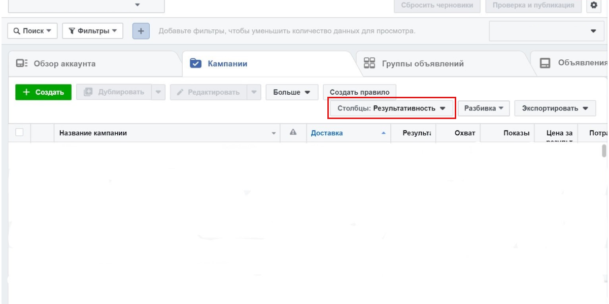
Представленные метрики Фейсбука можно найти в Ads Manager после запуска хотя бы одной рекламной кампании. Для этого, необходимо создать новую РК и перейти в рекламный кабинет. На вкладке «Обзор аккаунта» можно найти основные сведения по вашему объявлению, такие как: охват, потраченная сумма, клики, показы.

Чтобы подключить дополнительные метрики, необходимо перейти на вкладку «Кампании» и выбрать раздел «Столбцы»:

Кампании и столбцы в Фейсбук

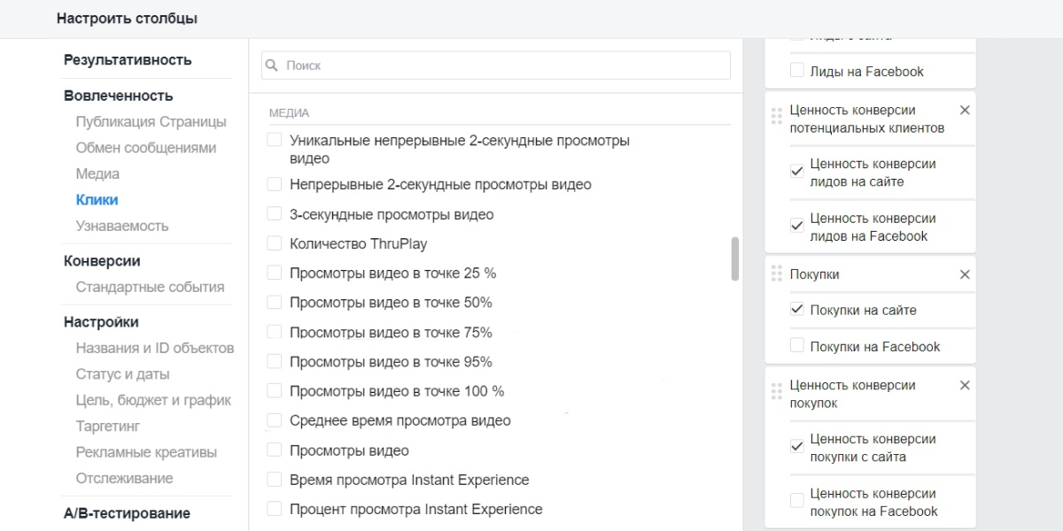
После этого, откроется новое окно. В нем отобразятся все показатели, которые можно включить/отключить в зависимости от целей вашей кампании:

настроить столбцы в фейсбук

Заключение

Итак, запуская рекламную кампанию в Фейсбук, вы автоматически получаете доступ к большому количеству инструментов для отслеживания показателей. При помощи основных метрик Facebook можно анализировать эффективность выбранной стратегии и своевременно влиять на РК через Ads Manager. Также, вы можете подключить дополнительные метрики в рекламном кабинете ФБ, чтобы собирать больше статистических данных.

Удачи и профита!

Ответы на популярные вопросы
Что такое метрики?
Для чего используется метрики Facebook?
Какая рекламная статистика доступна в Фейсбук?
Как добавить дополнительные показатели для отслеживания кампаний в ФБ?

Комментарии отсутствуют. Будьте первым!

в ответ kakdelakisa

user avatar