a { color: rgb(32, 63, 172) !important; } .menu .menu-item.current-menu-ancestor > a { color: rgb(32, 63, 172) !important; } .menusearch .menu-item-has-children:hover .sub-menu { display: flex; position: absolute; top: 100%; z-index: 5000; } .menusearch .menu-item-has-children:hover > a::after { transform: rotate(-180deg) translateY(-5px); -webkit-transform: rotate(-180deg) translateY(-5px); transition: 0.3s ease-in; } .menusearch .menu-item:last-child:hover .sub-menu { display: grid; grid-template-columns: 1fr 1fr; right: 0; } .sub-menu { display: none; flex-direction: column; justify-content: start; align-items: start; overflow: hidden; transition: max-height ease-in 0.7s, opacity ease 0.5s, padding ease 0.5s; border-bottom-left-radius: 4px; border-bottom-right-radius: 4px; border: 1px solid #f7f7f7; border-top: none; padding: 0; background: #fff; z-index: 998; box-shadow: 0px 3px 4px 0px rgba(0, 0, 0, 0.1490196078); } .sub-menu .menu-item { margin: 7px 0 7px 0; position: relative; } .sub-menu .menu-item a { color: #5b6471 !important; position: relative; padding: 7px 60px 7px 16px; display: block; cursor: pointer; } .sub-menu .menu-item a:hover { color: #5b6471 !important; } .sub-menu .menu-item:last-child { margin-bottom: 0; } .sub-menu .menu-item:hover { background: #f4f6ff; } .sub-menu .menu-item.current-menu-item > a { color: #5b6471 !important; } .sub-menu--init { width: initial; } .sub-menu--shown { width: initial; opacity: 1; max-height: 1000px; padding: 0 0 4px 0; } .menu-item-has-children > a::after { content: url('data:image/svg+xml,%3Csvg width="12" height="6" viewBox="0 0 12 6" fill="none" xmlns="http://www.w3.org/2000/svg"%3E%3Cpath d="M6.00011 5.24999C5.85011 5.24999 5.65011 5.19999 5.55011 5.09999L1.05011 1.59999C0.750109 1.34999 0.700109 0.849987 0.950109 0.549987C1.20011 0.249987 1.70011 0.199986 2.00011 0.449986L6.00011 3.54999L10.0001 0.449986C10.3001 0.199986 10.8001 0.249987 11.0501 0.549987C11.3001 0.849987 11.2501 1.34999 10.9501 1.59999L6.45011 5.09999C6.35011 5.19999 6.15011 5.24999 6.00011 5.24999Z" fill="%23B6C1C7"/%3E%3C/svg%3E%0A'); margin-left: 5px; transition: 0.3s ease-out; display: inline-block; transform: translateY(-1px); } .menu--hidden { display: none; } @media (max-width: 1720px) { .menu .menu-item a { font-size: 1rem; } .menu-item-has-children > a::after { top: 27px; } .menu .menu-item-has-children:hover > a::after { transform: rotate(-180deg) translateY(-4px); -webkit-transform: rotate(-180deg) translateY(-4px); } .sub-menu .menu-item { margin-right: 0; display: block; width: 100%; } } @media (max-width: 1200px) { .menu .menu-item { margin-right: 15px; } .menu .menu-item:last-child { margin-right: 0; } } @media (max-width: 1200px) { .sub-menu .menu-item { margin-right: 0; } } @media (max-width: 1000px) { .menu { display: none; } .burger .menu { display: block; } } .burger { visibility: hidden; position: fixed; top: 0; left: 0; bottom: 0; right: 0; width: 80%; background: #fff; z-index: 999; overflow: scroll; height: 100vh; transform: translateX(-100%); transition: all 0.3s ease-in; } .burger .sub-menu { display: none; width: initial; height: initial; opacity: 1; max-height: none; border-radius: 0; background: none; color: #fff; border: none; box-shadow: none; } .burger .sub-menu .menu-item a { padding-left: 40px; } .burger .sub-menu .menu-item a:hover { padding-left: 35px; } .burger .sub-menu .menu-item::after { content: none; } .burger .sub-menu .menu-item:hover { background: none; } .burger .user__wrapper { display: flex; align-items: center; flex-direction: row-reverse; justify-content: space-between; width: 100%; } .burger .user__wrapper.user--hidden { display: none; } .burger .user { width: 70px; height: 70px; } .burger .login__button { padding: 0; background: none; color: #000; } .burger-open { visibility: visible; transform: translateX(0%); transition: all 0.3s ease-in; } .burger__menu { background: #fff; color: #5b6471; } .burger__menu .menu-item a { padding: 12px 20px; font-size: 1.125rem; } .burger__menu .menu-item a:hover { background: #e5ebff; border-left: 5px solid #3f63df; padding-left: 15px; } .burger__menu .menu-item a:visited { color: #5b6471; } .burger__usermenu { list-style-type: none; } .burger__usermenu-item { padding: 5px 0; } .burger__usermenu-item a { color: #000; font-weight: 600; } .burger__title { padding: 0.875rem 3rem; border-bottom: 1px solid #b6c1c7; background: #fff; display: flex; justify-content: center; align-items: center; position: relative; margin-bottom: 0.5rem; } .burger__title figure { position: absolute; left: 20px; top: 18px; } .burger__title--h3 { font-size: 18px; line-height: 21px; color: #000d20; font-weight: 400; } .login__button--mobile { display: none; } @media (max-width: 1000px) { .login__button--desktop { display: none !important; } .login__button--mobile { display: block; cursor: pointer; } .login__button--mobile figure { height: 25px; } .login__button--mobile figure img { height: 25px; width: 25px; } } @media (min-width: 500px) { .burger__profile { padding: 50px 100px 10px 100px; } } #searchform { width: 100%; align-items: flex-end; display: flex; flex-direction: row-reverse; gap: 0.5rem; } .search__input { width: 100%; border: none; border-bottom: 1px solid #5b6471; padding: 0.25rem; } .search__input:focus { box-shadow: none; border-bottom: 1px solid #203fac; } .search__button { border: none; background: none; cursor: pointer; height: 24px; } .search__button img { width: 100%; } .menusearch { width: 100%; } .search-wrapper { display: flex; flex-direction: column; gap: 1.5rem; } .search-post { display: flex; flex-direction: column; gap: 0.5rem; padding: 10px; } .search-post:hover { background-color: #f4f6ff; } .search-link:hover > h2 { color: #203fac; } .search-link { display: flex; align-items: center; color: #203fac; } .search-link p { font-size: 1.125rem; } .search-link:visited { color: #203fac; } .search-text { color: #555555; } .search-section .divider:last-child { display: none; } @media (max-width: 1720px) { .search-link p { font-size: 1rem; } .search__button { height: 22px; } } .branding { position: relative; } .branding__poster { max-width: 1920px; margin: 0 auto; padding-top: 320px; } .branding__link { display: block; position: absolute; top: 60px; left: 0; width: 100%; height: 260px; background-position-y: 60px; background-position-x: center; background-repeat: no-repeat; background-attachment: fixed; } .branding__link:hover { filter: contrast(0.8); } .lazy { opacity: 0; transition: opacity 0.5s ease; } .lazy.entered.loaded { opacity: 1 !important; } .branding__link { opacity: 1; transition: opacity 0.5s ease; } .branding__link.entered.loaded { opacity: 1 !important; } .branbranding__poster--mobile { display: none !important; } @media (max-width: 1440px) { .branding__poster { padding-top: 285px; } .branding__link { background-size: 1700px auto; height: 225px; } } @media (max-width: 1300px) { .branding__link { background-size: 1500px auto; height: 200px; } .branding__poster { padding-top: 260px; } } @media (max-width: 1100px) { /* .branding__poster { padding-top: 220px; } .branding__link { height: 100% !important; }*/ } @media (max-width: 1023px) { .branbranding__poster--desktop { display: none; } .branbranding__poster--mobile { display: block !important; margin: 50px 0 0 0; } .branding__link--mobile { display: block; } .branbranding__poster--mobile-wrap { position: relative; /*background: whitesmoke;*/ max-height: 80px; overflow: hidden; } .branbranding__poster--mobile-wrap:before { content: ""; display: block; padding-top: 30%; } .branding__link--mobile { display: block; position: absolute; width: 100%; top: 0; right: 0; bottom: 0; left: 0; background-position-y: 50px; background-position-x: center; background-repeat: no-repeat; background-attachment: fixed; background-size: 100vw auto; } } @media (min-width: 768px) and (max-width: 1023px) { .branbranding__poster--mobile-wrap { max-height: 300px; } } * { box-sizing: border-box; margin: 0; padding: 0; } a { text-decoration: none; } img { max-width: 100%; height: auto; } input, select, textarea, a, button { outline: none; transition: all 0.3s ease; font-family: "SF Pro", "Segoe UI", Tahoma, Geneva, Verdana, sans-serif !important; } input, select, textarea { color: #000d20; } input:focus, select:focus, textarea:focus, a:focus, button:focus { outline: none; box-shadow: 0 0 2px #203fac; } p, a, div, button, select { font-size: 1.125rem; } .page__text { line-height: 140.5%; color: #5b6471; margin: 0.625rem 0 1.875rem 0; } .page__text h3 { margin-bottom: 25px; } .page__text p { margin-bottom: 15px; } img:not([src]):not([srcset]) { visibility: hidden; } body { font-family: "SF Pro", "Segoe UI", Tahoma, Geneva, Verdana, sans-serif; font-weight: 400; background: #fff; } input, textarea { font-size: 1.125rem; } input::placeholder { font-size: 1.25rem; } html, body { width: 100%; height: 100%; margin: 0px; padding: 0px; scroll-behavior: smooth; } .very__long__stuff { height: 3000px; } .main { background: #fff; transition: 0.3s ease-in-out; border-radius: 20px; padding: 3.25rem; position: relative; /* box-shadow: 0px 0px 15px 0px rgba(0, 0, 0, 0.15);*/ } .main__content { margin: 0 auto; } .swiper-slide { height: auto !important; } .searchmobi { display: none; } .searchmobi .search { margin-top: 1rem; } .select { position: relative; display: block; width: 100%; max-width: 195px; } .select__head { width: 100%; max-width: 195px; height: 34px; border: 1px solid #b6c1c7; border-radius: 4px; padding: 6px 10px; color: #000d20; cursor: pointer; position: relative; } .select__head::after { content: url('data:image/svg+xml,%3Csvg width="12" height="6" viewBox="0 0 12 6" fill="none" xmlns="http://www.w3.org/2000/svg"%3E%3Cpath d="M6.00011 5.24999C5.85011 5.24999 5.65011 5.19999 5.55011 5.09999L1.05011 1.59999C0.750109 1.34999 0.700109 0.849987 0.950109 0.549987C1.20011 0.249987 1.70011 0.199986 2.00011 0.449986L6.00011 3.54999L10.0001 0.449986C10.3001 0.199986 10.8001 0.249987 11.0501 0.549987C11.3001 0.849987 11.2501 1.34999 10.9501 1.59999L6.45011 5.09999C6.35011 5.19999 6.15011 5.24999 6.00011 5.24999Z" fill="%23B6C1C7"/%3E%3C/svg%3E%0A'); position: absolute; right: 13px; top: 4px; transition: 0.3s ease-out; display: inline-block; transform: translateY(-1px); } .select__head.open::after { transform: rotate(180deg) translateY(-5px); -webkit-transform: rotate(-180deg) translateY(-5px); } .select__list { position: absolute; top: 100%; left: 0; right: 0; background: #fff; max-width: 195px; border: 1px solid #b6c1c7; border-radius: 0 0 4px 4px; margin-top: -1px; z-index: 100; font-size: 14px; color: #424348; flex-direction: column; gap: 5px; } .select__list::-webkit-scrollbar { width: 7px; background-color: #f8f9fa; padding: 5px; } .select__list::-webkit-scrollbar-thumb { border-radius: 10px; background-color: #d9d9d9; } .select__list .select__item { position: relative; padding: 8px 9px; color: #5b6471; list-style: none; } .select__list .select__item:first-child { margin-top: 5px; } .select__list .select__item:last-child { margin-bottom: 5px; } .select__list .select__item:visited { color: #5b6471; } .select__list .select__item:hover { background: #f4f6ff; } .open { border-radius: 4px 4px 0 0; } .select__title { font-weight: 400; color: #5b6471; line-height: 18px; margin-bottom: 9px; } .rules { padding-top: 5rem !important; } .rules__text { line-height: 140.5%; color: #000d20; margin-top: 2rem; } .rules__text h2 { margin-bottom: 1.5rem; } .rules__text h3 { margin-bottom: 1rem; } .rules__text p { margin-bottom: 1rem; } .rules__text dl, .rules__text ol, .rules__text ul { padding-left: 20px; margin-bottom: 1rem; } .rules__text li { color: #000d20; line-height: 150%; } @media (max-width: 1720px) { .main { max-width: 1100px; padding: 2.5rem; } p, a, div, button, select { font-size: 1rem; } .page__text { margin: 0.625rem 0 1.5625rem 0; } input, textarea { font-size: 1rem; } input::placeholder { font-size: 1rem; } } @media (max-width: 1600px) { .main { max-width: 1050px; padding: 1.625rem; } } @media (max-width: 1400px) { .main { max-width: initial; width: 100%; padding: 1.25rem; } } @media (max-width: 1000px) { .page__text { font-size: 1.125rem; margin: 0.625rem 0 1.25rem 0; } .searchmobi { display: initial; } .searchmobi .search--hidden { display: flex; } .main { border-radius: 0; padding: 1.25rem; box-shadow: none; margin: 0 auto; } } @media (max-width: 700px) { .hide-on-mobile { display: none; } .no-scrolling { overflow: hidden; } } .checkbox { display: grid; place-items: center; width: 24px !important; height: 24px !important; padding: 0; margin: 0; color: #0040ff; position: relative; cursor: pointer; appearance: none; } .checkbox:before { content: ""; width: 100%; height: 100%; line-height: 1; color: inherit; border-width: 2px; border-style: solid; border-color: #b6c1c7; border-radius: 4px; transition: all 0.2s ease; } .checkbox:after { content: ""; width: calc(100% - 12px); height: calc(100% - 19px); border-width: 0px 0px 2px 2px; border-style: solid; border-color: #fff; transform: rotate(-45deg); position: absolute; top: 6px; left: 5px; transition: all 0.2s ease; } .checkbox:checked:before { background: #0040ff; border-color: #0040ff; } .checkbox:checked::after { border-color: #fff; } .checkbox:disabled { cursor: not-allowed; } .checkbox:disabled:before { border-color: darkgray; } .checkbox:disabled:after { border-color: transparent; } .checkbox:disabled:checked { color: #0040ff; opacity: 0.65; } .checkbox:disabled:checked:before { border-color: #0040ff; } .checkbox:disabled:checked::after { border-color: #fff; } .checkbox.focus, .checkbox:focus { outline: none; box-shadow: none; } .checkbox__field { display: grid; grid-template-columns: repeat(2, max-content); gap: 0.3rem; align-items: center; } .checkbox__label { color: rgb(91, 100, 113); font-size: "1.25rem"; } .title__h1 { font-size: 1.875rem; font-style: normal; font-weight: 600; line-height: 36px; letter-spacing: 0em; text-align: left; } h1 { line-height: 36px; font-size: 1.875rem; font-weight: 600; color: #000d20; } .title__h2 { font-size: 1.375rem; font-weight: 600; } .title__h2 a { color: #000d20; font-size: 1.375rem; } h2 { font-size: 1.375rem; font-weight: 600; color: #000d20; } h3 { font-size: 1.25rem; font-weight: 600; color: #000d20; } .title { display: flex; justify-content: space-between; align-items: center; margin-bottom: 1.875rem; width: 100%; } .title__group { display: grid; grid-auto-flow: column; align-items: center; gap: 20px; } .title--middlemargin { margin-bottom: 1.5625rem; } .title--smallmargin { margin-bottom: 0.9375rem; } .title--nomargin { margin: 0 !important; } .title--margintop { margin-top: 1.875rem; } .title__link { text-decoration: none; color: #203fac; } .title__button-link { max-height: 30px; display: flex; justify-content: center; border-radius: 10px; align-items: center; color: #fff; padding: 4.5px 16px; font-size: 18px; white-space: nowrap; } .title__button-link:hover { filter: brightness(1.2); } .sponsor__button-link { max-height: 30px; display: flex; justify-content: center; border-radius: 10px; align-items: center; color: #fff; padding: 4.5px 26px 4.5px 18px; font-size: 18px; white-space: nowrap; gap: 10px; background-color: #1f1e26; text-transform: uppercase; } @media (max-width: 1720px) { .title__h1 { font-size: 1.6875rem; } h1 { font-size: 1.6875rem; } .title__h2 { font-size: 1.125rem; } h2 { font-size: 1.25rem; } .title { margin-bottom: 1.5625rem; } h3 { font-size: 1.125rem; } } @media (max-width: 1000px) { .title__h1 { font-size: 1.5rem; line-height: 26px; } h1 { font-size: 1.5rem; } .title__h2 { font-size: 1.25rem; } h2 { font-size: 1.25rem; } .title { margin-bottom: 1.25rem; } h3 { font-size: 1rem; } } @media (max-width: 480px) { .title { margin-bottom: 1rem; flex-wrap: wrap; gap: 10px; align-items: flex-start; } .title__group { display: flex; } .title__h1 { font-size: 1.375rem; line-height: 1.2; } h1 { font-size: 1.375rem; } .title__link { font-size: 1rem; } .title--nomargin { margin: 0; } .title--margintop { margin: 2rem 0; } .title--mobile { flex-direction: column-reverse; gap: 2rem; align-items: flex-start; } .title__button-link { font-size: 12px; padding: 8px 10px; } } .button { border-radius: 10px; color: #fff; display: block; padding: 3px 15px; font-family: "SF Pro", "Segoe UI", Tahoma, Geneva, Verdana, sans-serif; background-color: #203fac; cursor: pointer; text-align: center; } .fix .button { background-color: #fff; color: #000; } .button__show-all { background-color: #203fac; color: #fff; padding: 10px 37px; border-radius: 10px; font-weight: 600; margin: 22px auto 0; display: block; width: fit-content; } .button--primary { border: none; border-radius: 10px; background: #203fac; color: #fff; padding: 4px 16px 5px 16px; width: fit-content; text-align: center; display: flex; align-items: center; justify-content: center; gap: 8px; } .button--primary:hover { background: #3f63df; } .button--secondary { padding: 10px 16px; display: block; border-radius: 5px; border: 1px solid #5b6471; color: #5b6471; background: #fff; text-align: center; max-width: 130px; width: 100%; } .button--secondary:hover { background: #b6c1c7; border: 1px solid #b6c1c7; color: #fff; } .button--hidden { display: none !important; } .button--gray { background: #b6c1c7; } .btn__show-all { color: #5b6471; border: 1px solid #758194; text-align: center; width: fit-content; display: block; padding: 3px 16px; outline: none; cursor: pointer; border-radius: 10px; } .btn__show-all:hover { color: #000d20; border: 1px solid #000d20; } .button-respond { color: #5b6471; border: 1px solid #758194; text-align: center; width: fit-content; display: block; padding: 3px 16px; outline: none; cursor: pointer; border-radius: 10px; } .button-respond:hover { color: #000d20; border: 1px solid #000d20; } .link--hover { color: #203fac !important; width: fit-content; } .link--hover::after { content: ""; display: block; width: 0; height: 1px; margin-top: -2px; background: #203fac; } .link--hover:hover::after { width: 100%; } .tag { border: 1px solid #b6c1c7; color: #b6c1c7; border-radius: 20px; padding: 1px 10px; display: block; width: fit-content; } .tag:hover { border: 1px solid #3f63df; color: #3f63df; } .button-submit { display: flex; align-items: center; align-content: center; justify-content: center; font-family: "SF Pro", "Segoe UI", Tahoma, Geneva, Verdana, sans-serif; white-space: nowrap; border: 1px solid #203fac; box-sizing: border-box; border-radius: 10px; background: none; padding: 16px 15px; width: fit-content; color: #203fac; cursor: pointer; } .button-submit:disabled { background: #b6c1c7 !important; border: 1px solid #b6c1c7 !important; color: #fff !important; } .button-submit:disabled svg path { fill: #fff; } .button-submit a { color: #203fac; } .button-submit:hover a { color: #fff; } .button-submit--disabled { background: #b6c1c7 !important; border: 1px solid #b6c1c7 !important; color: #fff !important; } .button-submit--small { padding: 2px 16px; border-radius: 10px; } .button-submit:hover { border: 1px solid #3f63df; background: #3f63df; color: #fff; } .button-submit:hover svg path { fill: #fff; } .button-submit--gray { border: 1px solid #5b6471; color: #5b6471; display: flex; gap: 5px; justify-content: center; } .button-submit--gray:hover { border: 1px solid #b6c1c7; background: #b6c1c7; color: #fff; } .button--restore { width: 100% !important; margin-top: 20px; height: 40px; line-height: 38px; padding: 0; border: 1px solid #3f63df; } .button--restore:hover { background: #fff; color: #3f63df; } .button--decline { padding: 10px 16px; display: block; border-radius: 5px; border: 1px solid #203fac; color: #203fac; background: #fff; text-align: center; max-width: 130px; width: 100%; } .button--decline:hover { background: #3f63df; border: 1px solid #3f63df; color: #fff; } @media (max-width: 1720px) { .button__show-all { margin-top: 15px; } .link--hover::after { margin-top: 0px; } .link--hover { height: 23px; } .btn__show-all { padding: 4px 16px; } .button-respond { padding: 4px 16px; } .button--primary { padding: 6px 16px 5px 16px; } } @media (max-width: 1000px) { .button { border-radius: 10px; } .btn__show-all { position: absolute; bottom: 3px; left: 50%; transform: translate(-50%, -50%); width: 100%; padding: 6px 16px; } } .tooltip-button { margin-right: 10px; position: relative; border: 0; outline: none; background: transparent; } .tooltip-button:hover .tooltip { opacity: 1; visibility: visible; height: auto; } .tooltip-button .tooltip { background: #000d20; border-radius: 5px; color: #fff; position: absolute; transition: visibility 0s linear 0.3s, opacity 0.3s linear 0s; opacity: 0; visibility: hidden; z-index: 2000; top: 20px; right: -9px; padding: 10px; width: max-content; } .tooltip-button .tooltip:after { content: ""; position: absolute; right: 9px; left: initial; top: -9px; width: 0; height: 0; border-style: solid; border-width: 0 8px 10px 8px; border-color: transparent transparent #000d20 transparent; } .sponsor__outer { border-radius: 7px; -webkit-border-radius: 7px; display: block; overflow: hidden; } .sponsor__video { display: block; width: 100%; } .sponsor__video:hover { filter: contrast(0.8); } .sponsor__wrapper { padding: 15px; } .sponsor__vertical { border: 1px solid #b6c1c7; border-radius: 7px; display: block; position: relative; overflow: hidden; height: 100%; max-height: 550px; } .sponsor__vertical-image { object-fit: cover; width: 100%; height: 100%; min-height: 500px; margin: 0 auto; display: block; } .sponsor__vertical-image:hover { filter: contrast(0.8); } .sponsor--no-padding-bottom { padding: 3rem 0 0 0; } @media (max-width: 1000px) { .sponsor__outer { border-radius: 5px; } .sponsor__vertical { max-width: inherit; max-height: inherit; } .sponsor__wrapper { padding-left: 0; } } @media (max-width: 700px) { .sponsor__wrapper { padding-left: 0; padding-right: 0; } } @media (max-width: 480px) { .sponsor__outer { max-height: 60px; } } .breadcrumbs { display: flex; align-items: baseline; grid-gap: 5px; gap: 5px; white-space: wrap; flex-wrap: wrap; -ms-overflow-style: none; margin-bottom: 10px; } .breadcrumbs .breadcrumbs__separator { color: #b6c1c7; } .breadcrumbs a { color: #203fac; } .breadcrumbs a:visited { color: #b6c1c7; } .blogs-education__section { display: flex; justify-content: space-between; align-items: start; } .blogs-education__wrapper { display: flex; flex-direction: column; gap: 30px; width: 100%; } .blogs-education__title { display: flex; align-items: center; justify-content: flex-start; gap: 0.625rem; margin-bottom: 0.625rem; } .blogs-education__title figure { height: 24px; margin: 0 !important; } .blogs-education__list { padding-left: 20px; line-height: 40px; color: #5b6471; position: relative; z-index: 100; } .blogs-education__list li a { color: #5b6471; } .blogs-education__list li:hover, .blogs-education__list li:hover > a { color: #3f63df !important; } .blogs-education__list li a:visited { color: #5b6471; } .blogs-education__sidebar-list { max-width: 400px; min-width: 350px; width: 100%; list-style: none; border: 1px solid #3f63df; border-radius: 7px; font-size: 1.25rem; padding: 10px 0; display: flex; flex-direction: column; margin-bottom: 35px; } .blogs-education__sidebar-list-item { padding: 10px 20px 10px 20px; color: #000d20; font-size: 1.25rem; transition: color 0.3s ease, background 0.3s ease; } .blogs-education__sidebar-list-item:visited { color: #000d20; } .blogs-education__sidebar-list-item:hover { background: #f4f6ff; border-left: 5px solid #3f63df; padding-left: 15px; color: #3f63df; } .blogs-education__anchor { margin-top: -80px; padding-top: 80px; } .blogs--education .title, .blogs--education .breadcrumbs { position: relative; z-index: 100; } .page-template-tmp-blog-education .main__content div:last-child { margin-bottom: 35px; } @media (max-width: 1720px) { .blogs-education__sidebar-list-item { font-size: 1.125rem; } .blogs-education__section .sidebar { top: 5rem; } } @media (max-width: 1400px) { .blogs-education__wrapper { max-width: 650px; } } @media (max-width: 1000px) { .blogs-education__section .sidebar { display: none; } .blogs-education__wrapper { max-width: inherit; } } .single__wrapper { display: flex; justify-content: space-between; align-items: start; margin-bottom: 6rem; } .no-container .single__content { max-width: none; } .single-detail__content .sidebar { min-width: 315px; width: 24%; margin-left: 0; } .single-detail__content .sidebar .sponsor__vertical-image { min-width: initial; } .no-container .single__wrapper { margin-bottom: 0; } .single__content { width: 100%; } .single-detail__content { display: flex; justify-content: space-between; align-items: start; margin-bottom: 25px; } .single-detail__text { max-width: 679px; width: 100%; display: flex; flex-direction: column; gap: 1.875rem; line-height: 145.5%; color: #000d20; } .single-detail__text ul, .single-detail__text dl, .single-detail__text ol { padding-left: 20px; } .single-detail__text li { color: #000d20; line-height: 150%; } .single-detail__text a { color: #203fac !important; word-break: break-word; font-size: inherit; } .single-detail__text a:visited { color: #203fac !important; } .single-detail__text a:hover { border-bottom: 1px solid #203fac; } .single-detail__content .sponsor__wrapper { padding: 0; } blockquote { border-left: 3px solid #203fac; color: #1a1a1a; font-size: 1.25em; font-style: italic; line-height: 145%; padding: 1em 2em; position: relative; transition: 0.2s border ease-in-out; z-index: 0; } blockquote:before { content: ""; position: absolute; top: 50%; left: -4px; height: 2em; background-color: #fff; width: 5px; margin-top: -1em; } blockquote:after { content: "❞"; position: absolute; top: 50%; left: -0.5em; color: #203fac; font-style: normal; line-height: 1em; text-align: center; text-indent: -2px; width: 1em; margin-top: -0.5em; transition: 0.2s all ease-in-out, 0.4s transform ease-in-out; } blockquote:active:after { transform: rotateY(360deg); } cite { display: block; font-size: 0.75em; line-height: 1.8em; margin-top: 1em; font-style: normal; } .single-detail__quote { display: flex; flex-direction: column; position: relative; } .single-detail__quote::after { content: url("/wp-content/themes/diasp__v2/static/img/misc/quote.svg"); position: absolute; top: -6px; left: calc(50% - 112px); } .single-detail__quote blockquote { display: flex; flex-direction: column-reverse; padding: 0; border-left: none; } .single-detail__quote blockquote p { padding: 0 2em; border-left: 2px solid #203fac; } .single-detail__quote blockquote cite strong { color: #000d20; font-size: 22px; line-height: 27px; } .single-detail__quote blockquote cite { color: #5b6471; text-align: center; margin-top: 0; margin-bottom: 1em; } .single-detail__quote blockquote::after { content: none; } .single-detail__quote blockquote:before { content: none; } .single-detail__quote figure { border-radius: 50%; max-width: 128px; max-height: 128px; align-self: center; } .single-detail__quote figure img { overflow: hidden; object-fit: cover; width: 100%; min-width: 128px; height: 128px; } .single-detail__quote .link-decoration-none { border-radius: 50%; } .single-detail__text img { width: 100%; height: 100%; object-fit: cover; } .single-detail__fig { width: 100%; max-width: 680px; height: 100%; } .single-detail__img { width: 100%; height: 100%; border-radius: 7px; border: 1px solid #b6c1c7; overflow: hidden; } .link-decoration-none { display: flex; } .link-decoration-none:hover { border-bottom: none !important; } #ez-toc-container { padding: 20px 40px !important; border-radius: 7px; } .ez-toc-title-container { margin-bottom: 20px !important; } #ez-toc-container p.ez-toc-title { font-weight: 600 !important; } #ez-toc-container a:hover { text-decoration: none; } .ez-toc-link { word-break: normal !important; } .single-related { margin-top: 25px; } .single-related__post { position: relative; border: 1px solid #b6c1c7; border-radius: 15px; padding: 25px; display: flex; align-items: center; justify-content: space-between; transition: all 0.3s ease; } .single-related__post div { color: #000d20; transition: all 0.3s ease; word-break: normal; } .single-related__post:hover { border: 1px solid #203fac; } .single-related__post:hover > div { color: #203fac; } .single-related__post > svg path { transition: all 0.3s ease; } .single-related__post:hover > svg path { fill: #203fac; } .single-detail__text table { width: 100% !important; height: 100% !important; border-spacing: 0; border-radius: 7px; } .single-detail__text table tr th, .single-detail__text table tr td { border-color: #b6c1c7 !important; } .single-detail__text table.partner-table tr td:first-child { width: 14%; } .single-detail__text table.partner-table tr td:nth-child(2) { width: 55%; } .single-detail__text table.partner-table tr td:nth-child(3) { width: 20%; word-break: break-word; } .single-detail__text table.partner-table tr td:last-child { word-break: break-word; width: 15%; } .single-detail__text table td { vertical-align: top; } @media screen and (max-width: 1023px) { table.partner-table thead { display: none; } table.partner-table td { display: flex; flex-direction: column; } table.partner-table td::before { content: attr(label); font-weight: bold; min-width: 120px; } } .single-detail__text table td a img { width: 28px; height: 28px; margin-right: 10px; aspect-ratio: 1/1; } .single-detail__text table td a { display: inline; } .single-detail__text table tbody tr:nth-child(2n) { background: #fff; } .single-detail__text table tbody tr:nth-child(2n+1) { background: #f3f6ff; } .single-detail__text table tbody tr:last-child td:first-child { border-bottom-left-radius: 7px; } .single-detail__text table tbody tr:last-child td:last-child { border-bottom-right-radius: 7px; } @media (max-width: 1720px) { .single-detail__text { gap: 1.5625rem; } } @media (max-width: 1000px) { .single-detail__text { gap: 1.5625rem; } .single-detail__content .sponsor__vertical { max-height: 450px; max-width: 345px; } .single-detail__text table thead { font-size: 14px; } .single-detail__text table tbody tr td:first-child { padding-left: 20px; } } @media (max-width: 650px) { .single-detail__content { flex-direction: column; } .single-detail__content .sponsor__wrapper { padding: 0; } .single-detail__content .sponsor__wrapper { padding: 1.25rem 0 0 0; } .single-detail__content .sponsor__vertical { max-width: inherit; } .single-detail__content .sponsor__vertical-image { width: 100%; } } @media (max-width: 400px) { .single-detail__text table thead { font-size: 12px; } .single-detail__text table tbody tr td:first-child { padding-left: 10px; } } .single-article p { margin: 2rem 0; font-style: normal; font-weight: 400; line-height: 21px; color: #555555; } .single-article .wp-block-image { overflow: hidden; border-radius: 7px; } .single-article p:first-child { margin-top: 0; } .single-article p:last-child { margin-bottom: 0; } .single-meta { display: flex; flex-direction: column; align-items: start; margin-top: 0.625rem; } .single-meta__group { display: flex; align-items: center; gap: 1rem; margin-bottom: 12px; } .single-meta__group-row { display: flex; align-items: center; gap: 1rem; } .single-meta__item { display: flex; align-items: center; gap: 5px; font-size: 1.125rem; color: #b6c1c7; } .single-meta__item figure { margin-bottom: 0; } .meta__tags { margin-bottom: 1.5625rem; } @media (max-width: 600px) { .single-meta__group { flex-wrap: wrap; align-items: flex-start; gap: 10px; } .single-meta__group-row { gap: 10px; } } .related-more-button__wrapper { display: flex; align-items: center; justify-content: center; margin-top: 30px; } #related-more-button { color: #5b6471; border: 1px solid #758194; text-align: center; width: fit-content; display: block; padding: 3px 16px; outline: none; cursor: pointer; border-radius: 10px; margin-bottom: 0; } #related-more-button svg { display: none; } .trainings-detail__content { display: flex; } .trainings__left-side { margin-right: 70px; } .trainings__description { display: flex; align-items: center; } .trainings__description .review__item:first-child { margin-right: 100px; } .trainings-detail__fig { width: 345px; height: 500px; border: 1px solid #b6c1c7; border-radius: 20px; overflow: hidden; } .trainings-detail__img { width: 100%; height: 100%; object-fit: cover; } .trainings__info { display: flex; align-items: center; margin-top: 15px; } .trainings__list { list-style: none; } .trainings__list:first-child { margin-right: 20px; } .trainings__list:nth-child(2) { color: #5b6471; } .trainings__list li { margin-bottom: 15px; } .trainings__list a { color: #203fac; } .trainings__social { display: flex; align-items: center; color: #5b6471; margin-bottom: 10px; } .trainings__social:last-child { margin-bottom: 0; } .trainings__social svg { margin-right: 15px; } .trainings-mt { margin-top: 30px; } .trainings-statistic__title { font-size: 20px; line-height: 24px; margin-bottom: 10px; } .trainings-statistic__list { list-style: none; display: flex; } .trainings-statistic__list li { margin-right: 40px; } .trainings-statistic__list li:last-child { margin-right: 0; } .review__arcticle { display: flex; flex-direction: column; } .review__title { display: flex; gap: 5px 16px; align-items: center; flex-wrap: wrap; } .review__fig { width: 100%; height: 550px; border-radius: 7px 7px 0px 0px; overflow: hidden; border: 1px solid #b6c1c7; } .review__img { width: 100%; object-fit: cover; height: 100%; } .review__description { display: flex; align-items: center; justify-content: space-between; width: 100%; } .review__description--affiliate { justify-content: start; gap: 100px; } .review__item { display: flex; flex-direction: column; gap: 10px; } .review__item-text { color: #758194; } .review__rating-stars { display: flex; align-items: center; gap: 5px; } .review__rating-stars p { color: #5b6471; } .review__price { color: #1fb866; font-weight: 400; } .review__promocode-field { display: flex; color: #758194; } .review__item a:hover { border-bottom: none; } .review__link span { color: #203fac; display: flex; gap: 4px; } .review__link span figure { height: 20px; } .review__link span figure img { height: 10px; width: 11px; } .review__promocode-link { color: #203fac; border-bottom: #203fac 1px solid; } .review__promocode-link:visited { color: #203fac; } .review__arcticle .button { font-weight: 400; white-space: nowrap; padding: 5px 17px; position: absolute; right: 0; top: 0; } .review__text--hidden { display: none; } .review__comments--hidden { display: none; } .review-stars { display: flex; cursor: pointer; align-items: center; } .review-star { stroke: #b6c1c7; cursor: pointer; } .review-comments__button { padding: 0 0.15rem; background: none; border: none; cursor: pointer; height: 16px; } .review-comments__button:first-child { padding-left: 0; margin-left: 0.3rem; } .review-comments__button--hover .review-star { stroke: #203fac; fill: #203fac; } .review-comments__button--current .review-star { stroke: #203fac; fill: #203fac; } .review-form { border: 1px solid #b6c1c7; border-radius: 7px; display: flex; padding: 20px 35px 20px 35px; position: relative; } .review-comments__item { position: relative; display: flex; flex-direction: column; gap: 10px; padding: 5px 0px 0px 40px; width: 100%; justify-content: space-between; } .review-comments__item--flexdir { flex-direction: row; } .review__rating-group { display: flex; flex-direction: column; justify-content: space-between; } .review__ratelike { display: flex; justify-content: space-between; align-items: center; } .review-likes { display: flex; align-items: center; margin-right: 20px; color: #758194; } .review-likes svg { margin-right: 7px; } .review-dislikes { display: flex; align-items: center; color: #758194; } .review-dislikes svg { transform: rotate(180deg); margin-right: 7px; } .review__button { background: none; border: none; color: #b6c1c7; cursor: pointer; position: relative; } .review__button::after { content: url("data:image/svg+xml,%3Csvg width='11' height='5' viewBox='0 0 11 5' fill='none' xmlns='http://www.w3.org/2000/svg'%3E%3Cpath d='M5.21007 4.98009C5.06007 4.98009 4.86007 4.93009 4.76007 4.83009L0.260069 1.33009C-0.0399306 1.08009 -0.0899304 0.580089 0.16007 0.280089C0.41007 -0.0199107 0.91007 -0.0699111 1.21007 0.180089L5.21007 3.28009L9.21007 0.180089C9.51007 -0.0699111 10.0101 -0.0199107 10.2601 0.280089C10.5101 0.580089 10.4601 1.08009 10.1601 1.33009L5.66007 4.83009C5.56007 4.93009 5.36007 4.98009 5.21007 4.98009Z' fill='%23B6C1C7'/%3E%3C/svg%3E%0A"); position: absolute; right: -20px; top: -2px; } .review__button--reverse::after { transform: rotate(180deg); top: 5px; } .review__button svg { margin-left: 10px; } .review-comments__content { padding: 5px 0px 0px 40px; width: 100%; } .review-comments__info { position: relative; display: flex; flex-direction: column; padding: 5px 60px 5px 0px; border-right: 1px solid #b6c1c7; } .review-comments__author-info { display: flex; align-items: center; gap: 12px; margin-bottom: 10px; } .review-comments__author { display: flex; flex-direction: column; gap: 5px; } .review-comments__author span { display: flex; align-items: center; } .review-comments__author span svg { margin-right: 5px; } .review-comments__date { font-style: normal; font-weight: normal; font-size: 1.125rem; line-height: 21px; color: #b6c1c7; } .review-comments__item-group { display: flex; flex-direction: column; gap: 10px; align-items: flex-start; } .review__title { line-height: 24px; color: #5b6471; min-width: 125px; } .review-comments__input { display: flex; flex-direction: column; gap: 10px; max-width: initial; margin-bottom: 20px; } .review-comments-sbm { display: block; margin-left: auto; } .review__comments-text { border: 1px solid #b6c1c7; border-radius: 4px; padding: 5px; max-width: initial; width: 100%; min-height: 34px; max-height: 120px; } .review-comments__item .button { margin-left: auto; } .single-comments .title .button figure { height: 20px; } .review-comments__text { line-height: 24px; color: #5b6471; max-height: 122px; overflow: hidden; } .review-comments__text--open { max-height: 100%; } .review-status { position: absolute; left: 0; height: 100%; width: 20px; border-radius: 7px 0 0 7px; } .review-status--good { background: #1fb866; } .review-status--bad { background: #ff5f7b; } .review-status--neutral { background: #ffd600; } .rate-general-count { color: #5b6471; height: 20px; margin-left: 5px; } .review__description--affiliate .review-stars .rate-general-count { height: 24px; } @media (max-width: 1720px) { .review__description .review-comments__button { margin-top: 2px; } .review-comments__date { font-size: 1rem; } .review__description--affiliate .review-stars .rate-general-count { height: 20px; } .rate-general-count { height: 15px; } } @media (max-width: 1400px) { .review__fig { height: 560px; } } @media (max-width: 1000px) { .review__fig { height: 100%; } .review__img { height: 100%; } } @media (max-width: 800px) { .review__description { display: grid; grid-template-columns: repeat(2, 1fr); gap: 20px 0px; } .review-comments, #review-form, #edit-review-form { flex-direction: column; } .review-comments { padding: 15px; } .review-comments__content { padding: 10px; } .review-status { top: 0; height: 20px; width: 100%; border-radius: 7px 7px 0 0px; } .review-comments__info { padding: 30px 15px; border-bottom: 1px solid #b6c1c7; border-right: none; } .review-comments__item { padding: 21px 30px 60px 26px; } } @media (max-width: 500px) { .review__description { grid-template-columns: repeat(1, 2fr); } .review-comments__item { padding: 20px 30px 60px 20px; } } .page-content { min-height: 350px; } .ul-bg-grey { background: #f9f9f9; padding: 10px 10px 10px 30px !important; border-radius: 5px; } .review-comments { border: 1px solid #b6c1c7; border-radius: 7px; display: flex; padding: 20px 35px 20px 35px; position: relative; } #review-form, #edit-review-form { display: flex; width: 100%; box-sizing: border-box; } .star[data-click=true]:before { color: #203fac; content: "\f155"; } .star-rating { display: flex; } .screen-reader-text { position: absolute; margin: -1px; padding: 0; height: 1px; width: 1px; overflow: hidden; clip: rect(0 0 0 0); border: 0; word-wrap: normal !important; } .star-rating .star-full:before { content: "\f155"; } .star-rating .star-half:before { content: "\f459"; color: #203fac; } .star:before { content: "\f154"; width: 15px; padding-right: 5px; } .star-rating .star { color: #b6c1c7; display: flex; font-family: dashicons; font-size: 20px; font-style: normal; font-weight: 400; height: 20px; line-height: 1; text-align: center; text-decoration: inherit; vertical-align: top; min-width: 20px; } .star-rating .star:after { content: ""; display: block; width: 5px; min-width: 5px; height: 20px; } .star-full:before { color: #203fac; fill: #203fac; } .star-rating .star-full-click:before { color: #b6c1c7; content: "\f154"; } .single-comments-item { margin-bottom: 25px; } .review-likes:hover, .review-dislikes:hover { cursor: pointer; } .review-likes svg path, .review-dislikes svg path { stroke: #b6c1c7; } .review-likes svg:hover path, .review-likes.voted path { stroke: #1FB866; } .review-dislikes svg:hover path, .review-dislikes.voted path { stroke: #FF5263; } .review-comments { margin-bottom: 25px; } .review-comments-top, .review__rating-bottom { display: flex; justify-content: space-between; align-items: center; } .review-comments__text { flex-grow: 1; } .review-comments-actions-btns, .review-comments-actions { display: flex; align-items: center; align-content: center; } .review-comments-actions-btns { margin-right: 25px; } .review-comments__status { font-weight: 400; padding: 4px 11px; margin: 0; border: 1px solid; box-sizing: border-box; border-radius: 5px; font-size: 18px; line-height: 23px; } .review-comments__status--check { border-color: #ff9900 !important; color: #ff9900 !important; } .review-comments__status--published { border-color: #28c06e !important; color: #28c06e !important; } .review-comments__status--reject { border-color: #ff5263 !important; color: #ff5263 !important; } .review-comments__trash { margin-left: 15px; border: 0; background: transparent; padding: 0; height: 35px; cursor: pointer; } .review-comments-actions-btns a { display: block; width: 35px; height: 35px; } .vertical-review { flex-direction: column; padding: 15px !important; } .vertical-review .review-comments__info { padding: 0 0 15px 0; margin-bottom: 15px; border-right: 0; border-bottom: 1px solid #b6c1c7; display: flex; flex-direction: row; align-content: center; align-items: center; flex-grow: 1; } .vertical-review .review-stars-col { display: flex; flex-grow: 1; justify-content: space-between; } .vertical-review .review-stars-row { width: fit-content; } .vertical-review .review-stars-col .review-stars-row:nth-child(1) .review__title { min-width: 90px; } .vertical-review .review-comments__item { padding: 0; } .vertical-review .review-comments__author-info { gap: 0; min-width: 205px; margin-right: 10px; } .vertical-review .review-stars { margin-bottom: 10px; } .vertical-review .review-comments__author { margin-left: 10px; } .vertical-review .star-rating .star:after { width: 2px; min-width: 2px; } @media (max-width: 1023px) { table.partner-table tr td { width: 100% !important; } table.partner-table tr td br { display: none; } } .is-provider-youtube iframe { width: 100%; min-height: 500px; } .sidebar { position: sticky; top: 5rem; } @media (max-width: 1720px) { .sidebar { top: 3rem; } } @media (max-width: 650px) { .sidebar { position: static; } } .share { display: flex; justify-content: flex-start; flex-direction: column; } .share__item { display: flex; justify-content: flex-start; align-items: center; gap: 0.5rem; cursor: pointer; width: 100%; } .share__item svg path { fill: #fff; } .share__caption { color: #fff; } .sidebar-actions .popup--shown { transform: translatey(-150px); position: absolute; } .sidebar-actions .popup--shown::after { content: ""; position: absolute; width: 10px; height: 10px; background: #000d20; transform: rotate(-45deg); left: 15px; bottom: -5px; } .share__link { display: none; width: 100%; padding: 0.625rem 1.25rem; } .sidebar-actions .popup--shown .share__link { display: block; } .share__link:hover { background: #333f51; } .popup--shown[data-popper-placement^=top]:after { bottom: -5px; } .popup--shown[data-popper-placement^=bottom]:after { top: -5px; } .sidebar-actions { display: flex; flex-direction: column; padding: 0 20px; margin-top: 1.25rem; position: relative; } .sidebar-actions__item { display: flex; gap: 0.5rem; align-items: center; cursor: pointer; height: 27px; margin-bottom: 20px; } .sidebar-actions__icon { fill: #b6c1c7; transition: 0.3s ease; } .sidebar-actions__icon--misc { fill: transparent; } .sidebar-actions__icon--active { fill: #000d20; } .sidebar-actions__text { margin-top: 5px; color: #b6c1c7; transition: 0.3s ease; } .sidebar-actions__text--active { color: #000d20; } @media (max-width: 650px) { .sidebar-actions { flex-direction: row; padding: 0; } .sidebar-actions__item svg { transform: scale(0.8); } } .sidebar-top-three { display: flex; flex-direction: column; gap: 15px; padding: 15px 0 0 15px; margin-top: 10px; } .sidebar-top-three__group { display: flex; flex-direction: column; border: 1px solid #b6c1c7; border-radius: 7px; } .sidebar-top-three__item { display: flex; align-items: center; justify-content: space-between; padding: 12px 15px; border-bottom: 1px solid #b6c1c7; } .sidebar-top-three__content { display: flex; flex-direction: column; gap: 7px; white-space: nowrap; overflow: hidden; max-width: 280px; } .sidebar-top-three__item:last-child { border-bottom: none; } .sidebar-top-three__text { display: flex; align-items: center; gap: 5px; color: #5b6471; } .sidebar-top-three__text a { color: #5b6471; } .sidebar-top-three__content span { color: #1fb866; } .sidebar-top-three__link:hover > svg path { fill: #000d20; } @media (max-width: 480px) { .sidebar-top-three { padding: 15px 0 0 0; } .sidebar-top-three__item { padding: 12px 5px; } } .weektop { position: relative; } .card-popular__wrapper { display: grid; grid-template-columns: repeat(3, 1fr); gap: 15px; } .card-popular__wrapper-small { display: grid; grid-template-columns: repeat(2, 1fr); gap: 15px; } .weektop h3 { font-weight: 400; color: #5b6471; } .weektop-more-button__wrapper { display: flex; flex-direction: column; align-items: center; justify-content: center; margin-top: 15px; margin-bottom: 30px; } #weektop-more-button { background: none; color: #5b6471; cursor: pointer; border: 1px solid #758194; text-align: center; width: fit-content; display: block; padding: 3px 16px; outline: none; border-radius: 10px; } @media (max-width: 1000px) { .weektop { padding-bottom: 2.875rem; } .card-popular__wrapper { grid-template-columns: repeat(2, 1fr); } .weektop-more-button__wrapper { display: none; } } @media (max-width: 700px) { .card-popular__wrapper { grid-template-columns: repeat(1, 2fr); } } .home section { padding: 35px 0; } .main { max-width: 100%; margin: 0; padding: 0; border-radius: 0; } .main__content { padding-top: 35px; } .weektop-front, .services-section { background: rgb(255, 255, 255); background: linear-gradient(0, rgb(255, 255, 255) 0%, rgb(248, 249, 253) 35%); } .home .title__h1 a { font-size: 1.6875rem; font-style: normal; font-weight: 600; line-height: 36px; letter-spacing: 0em; text-align: left; color: #000; } .home .title__h1 a:hover { color: #203fac; } .card-popular, .btn__show-all { background: #fff; } .new-articles { display: flex; } .new-articles .card-popular__figure { max-height: 295px !important; } .sponsor { margin-bottom: 35px; display: flex; justify-content: center; } .front-links-nav { display: flex; justify-content: space-between; margin-bottom: 35px; gap: 15px; } .front-links-nav a { width: 20%; font-size: 1rem; } .card-popular__wrapper { display: grid; grid-template-columns: 1fr 1fr 1fr; gap: 15px; } .category_wrapper { grid-template-columns: 1fr 1fr 1fr 1fr; } .sponsor__wrapper { padding: 0; } .news-section__wrapper { padding: 0; } .news-wrap1 { width: 25%; min-width: 25%; margin-left: 15px; } news-wrap1 .news-slider__card h2 { margin-bottom: 10px; } .news-wrap1 h2 a { font-size: 1.6875rem; font-style: normal; font-weight: 600; line-height: 36px; letter-spacing: 0em; text-align: left; color: #000; } .news-wrap1 h2 a:hover { color: #203fac; border-bottom: 0 !important; } .news-wrap1 .news-slider__card { padding-top: 15px; padding-bottom: 15px; overflow: hidden; background: #fff; } .news-wrap1 .btn__show-all { margin-left: auto; margin-bottom: 7px; } .news-wrap1 .news-section__wrapper { padding: 0 !important; } .news-wrap1 .news-slider__card p { overflow: hidden; display: -webkit-box; -webkit-line-clamp: 4; -webkit-box-orient: vertical; } .card-popular__item-horizont-content { background: #f8f9fd; } .news-wrap .news-slider__card { height: 215px; min-height: 215px; } .news-wrap { display: grid; grid-template-columns: 1fr 1fr 1fr; gap: 15px; } .card-services__description { background: #fff; } .news-section .news-slider__card { background: #f8f9fd !important; } .videos { background: #f8f9fd; } .new-articles { background: rgb(248, 249, 253); background: linear-gradient(0, rgb(255, 255, 255) 0%, rgb(248, 249, 253) 100%); } .new-articles-inner { display: flex; } .new-articles-wrap { overflow: hidden; padding-bottom: 26px; } .new-articles .sponsor__wrapper { max-height: initial; height: auto; min-width: 330px; } .new-articles-inner .card-popular__item { margin-right: 30px !important; } .new-articles .sponsor__vertical { max-height: initial; } .new-articles-slide { display: flex; gap: 15px; } .video-slider__card { background: #fff; padding: 15px !important; border-radius: 7px; } .video-wrapper { display: grid; grid-template-columns: 1fr 1fr 1fr !important; gap: 15px; } .video-slier__preview, .video-slider__prev { border-radius: 0 !important; } .card-popular__content { min-height: 225px; } .card-popular__item-horizont, .card-popular, .sponsor__vertical, .card-services { border-radius: 4px !important; } .card-popular__figure { border-top-left-radius: 4px !important; border-top-right-radius: 4px !important; } .video-slider__prev { border-radius: 4px !important; overflow: hidden; } .card-popular__content { padding: 10px 20px 20px 20px; flex-grow: 1; box-sizing: border-box; display: flex; flex-direction: column; justify-content: space-between; } .front-banner { min-width: 280px; margin-left: 15px; } .front-banner .sponsor__wrapper { padding: 0; } .weektop-flex { display: flex; } .card-popular__item-horizont { display: flex !important; border-radius: 20px; border: 1px solid #b6c1c7; overflow: hidden; } .card-popular__item-horizont-thumb { width: 595px; height: 280px; min-width: 595px; } .card-popular__item-horizont-thumb figure { height: 280px; } .card-popular__item-horizont-content { padding: 15px 25px 15px 45px; display: flex; flex-direction: column; justify-content: space-between; box-sizing: border-box; } .card-popular__item-horizont-content-title { font-weight: 600; font-size: 26px; line-height: 24px; /* black */ color: #000D20; } .card-popular__item-horizont-content-text { font-weight: 400; font-size: 18px; line-height: 25px; /* or 139% */ overflow: hidden; display: -webkit-box; -webkit-line-clamp: 5; -webkit-box-orient: vertical; /* grey */ margin: 25px 0; color: #5B6471; } .card-popular__desc { overflow: hidden; display: -webkit-box; -webkit-line-clamp: 4; -webkit-box-orient: vertical; } .news-slider__card-content { overflow: hidden; display: -webkit-box; -webkit-line-clamp: 6; -webkit-box-orient: vertical; } .single-detail__text, .single-detail__fig, .single-detail__img { max-width: initial; } .container { width: 100%; margin-right: auto; margin-left: auto; } @media (min-width: 1199px) { .container { max-width: 1170px; } } @media (min-width: 1365px) { .container { max-width: 1230px; } } @media (min-width: 1439px) { .container { max-width: 1310px; } } @media (min-width: 1600px) { .container { max-width: 1470px; } } @media (max-width: 1400px) { .home .card-popular__desc { -webkit-line-clamp: 6; } } .slick-dots { display: flex; align-content: center; align-items: center; justify-content: center; list-style: none; gap: 30px; position: absolute; bottom: -25px; left: 0; right: 0; } .slick-dots li { width: 9px; height: 9px; border-radius: 50%; /* light grey */ cursor: pointer; border: 1px solid #B6C1C7; } .slick-dots li.slick-active { background: #3F63DF; border-color: #3F63DF; } .slick-dots li button { display: none; } /* Slider */ .slick-slider { position: relative; display: block; box-sizing: border-box; -webkit-user-select: none; -moz-user-select: none; -ms-user-select: none; user-select: none; -webkit-touch-callout: none; -khtml-user-select: none; -ms-touch-action: pan-y; touch-action: pan-y; -webkit-tap-highlight-color: transparent; } .slick-list { position: relative; display: block; overflow: hidden; margin: 0; padding: 0; } .slick-list:focus { outline: none; } .slick-list.dragging { cursor: pointer; cursor: hand; } .slick-slider .slick-track, .slick-slider .slick-list { -webkit-transform: translate3d(0, 0, 0); -moz-transform: translate3d(0, 0, 0); -ms-transform: translate3d(0, 0, 0); -o-transform: translate3d(0, 0, 0); transform: translate3d(0, 0, 0); } .slick-track { position: relative; top: 0; left: 0; display: block; margin-left: auto; margin-right: auto; } .slick-track:before, .slick-track:after { display: table; content: ""; } .slick-track:after { clear: both; } .slick-loading .slick-track { visibility: hidden; } .slick-slide { display: none; float: left; height: 100%; min-height: 1px; } [dir=rtl] .slick-slide { float: right; } .slick-slide img { display: block; } .slick-slide.slick-loading img { display: none; } .slick-slide.dragging img { pointer-events: none; } .slick-initialized .slick-slide { display: block; } .slick-loading .slick-slide { visibility: hidden; } .slick-vertical .slick-slide { display: block; height: auto; border: 1px solid transparent; } .slick-arrow.slick-hidden { display: none; } .seo-text { margin-bottom: 30px; padding-bottom: 30px; margin-top: 30px; } .seo-text h3, .seo-text h2, .seo-text p { margin-bottom: 1.5625rem; } .seo-text ul, .seo-text ol { padding-left: 40px; margin-bottom: 1.5625rem; } .seo-text img { display: block; max-width: 70%; } .news-slider__card p { overflow: hidden; display: -webkit-box; -webkit-line-clamp: 4; -webkit-box-orient: vertical; } .news-wrap-column { max-height: 877px; overflow-y: scroll; scrollbar-width: thin; scrollbar-color: #3F63DF #f8f9fd; } @media (max-width: 1440px) { .news-wrap-column { max-height: 844px; } } @media (max-width: 1360px) { .news-wrap-column { max-height: 807px; } } /* W3C standard сейчас только для Firefox */ /* для Chrome/Edge/Safari */ .news-wrap-column::-webkit-scrollbar { height: 12px; width: 12px; } .news-wrap-column::-webkit-scrollbar-track { background: #f8f9fd; } .news-wrap-column::-webkit-scrollbar-thumb { background-color: #3F63DF; border-radius: 5px; border: 3px solid #f8f9fd; } .news-section { margin-bottom: 25px; } .news-wraps .news-slider__card { height: 225px; min-height: 225px; } .news-slider__card h2 { overflow: hidden; display: -webkit-box; -webkit-line-clamp: 3; -webkit-box-orient: vertical; } @media (max-width: 1023px) { .article-progress { display: none; } .single-detail__content .sidebar { width: 100%; } .container { padding: 0 10px; } .new-articles-inner, .weektop-flex { flex-direction: column; } .card-popular__wrapper, .video-wrapper { grid-template-columns: 1fr !important; } .new-articles-inner .card-popular__item { margin-right: 0 !important; } .front-links-nav { flex-wrap: wrap; justify-content: center; } .front-links-nav a { width: fit-content; cursor: pointer; border: 1px solid #3f63df; color: #3f63df; border-radius: 20px; padding: 3px 16px; display: inline-block; transition: 0.3s ease; } .card-popular__item { padding: 0 !important; } .new-articles .sponsor__wrapper { margin-top: 20px; } .news-wrap1 { width: auto; margin-left: 0; margin-top: 15px; } .news-wrap .news-slider__card { height: auto; } .btn__show-all { width: 95%; } .sponsor { margin-bottom: 15px; } .news-section__wrapper { padding: 0 !important; } .home section { padding: 5px 0; } } #article-content { max-width: 1070px; position: relative; } .article-progress { position: sticky; top: 60px; background: #f9f9f9; margin: 0 75px; width: 5px; min-width: 5px; min-height: calc(100vh - 70px); } .article-progress .loading { background: #3663e0; height: 35px; min-height: 35px; z-index: 99; width: 5px; position: absolute; } @media (min-width: 1550px) { .single-related .category_wrapper .card-popular { height: 450px; } } .load-more-btn { color: #5b6471; border: 1px solid #758194; text-align: center; width: fit-content; display: block; padding: 3px 16px; outline: none; cursor: pointer; border-radius: 10px; margin-bottom: 0; } .vacancy-wrap { display: flex; } .vacancy-sidebar-filter { min-width: 300px; margin-right: 25px; } .vacancy-inner, .resume-inner { display: flex; flex-wrap: wrap; gap: 25px; margin-bottom: 30px; flex-grow: 1; } .vacancy-inner .no-post, .resume-inner .no-post { flex-grow: 1; } .card-vacancy { background: #FFFFFF; border-radius: 20px; padding: 20px 25px; border: 1px solid #B6C1C7; width: 48.699%; box-sizing: border-box; position: relative; max-height: 321px; } .card-vacancy.vacancy-payed .premium-icon { left: -20px; top: -20px; } .card-vacancy .card-vacancy-title a { display: block; font-style: normal; font-weight: 600; font-size: 20px; line-height: 24px; /* identical to box height */ /* black */ color: #000D20; margin-bottom: 20px; } .card-vacancy-meta-top { justify-content: space-between; align-content: center; align-items: center; margin-bottom: 15px; } .card-vacancy-meta-top .vacancy-category { height: 30px; color: #B6C1C7; font-size: 16px; border: 1px solid #B6C1C7; border-radius: 10px; padding: 0 15px; line-height: 30px; } .card-vacancy-meta-top .vacancy-price { color: #1FB866; font-size: 16px; line-height: 15px; } .card-vacancy-meta { gap: 20px; font-weight: 600; font-size: 18px; line-height: 25px; color: #203FAC; margin-bottom: 15px; } .card-vacancy-content { font-style: normal; font-weight: 400; font-size: 16px; line-height: 24px; /* or 147% */ /* grey */ color: #5B6471; margin-bottom: 15px; overflow: hidden; display: -webkit-box; -webkit-line-clamp: 4; -webkit-box-orient: vertical; } .card-vacancy-link { display: flex; justify-content: flex-end; align-content: center; align-items: center; } .card-vacancy-link p { font-weight: 400; font-size: 18px; line-height: 15px; /* main bl203FAC */ color: #203FAC; } .card-vacancy-link figure { height: 12px; line-height: 12px; margin-left: 5px !important; } .vacancy-filter { margin-bottom: 25px; } .vacancy-filter select { width: 100%; } .vacancy-filter fieldset { margin-bottom: 15px; display: flex; align-items: center; align-content: center; } .vacancy-filter input[type=radio], .vacancy-filter input[type=checkbox] { width: 20px; height: 20px; margin-right: 5px; } .vacancy-filter select { height: 45px; line-height: 45px; outline: none; } .vacancy-filter label { font-weight: 400; font-size: 16px; line-height: 19px; /* identical to box height */ /* Grey */ color: #4E4E4E; } .vacancy-filter h3 { font-weight: 400; font-size: 18px; line-height: 150.02%; /* identical to box height, or 27px */ /* black */ color: #000D20; margin-bottom: 10px; } .single_header { display: flex; justify-content: space-between; padding-bottom: 25px; margin-bottom: 25px; border-bottom: 1px solid #B6C1C7; } .single_header-item-option { font-style: normal; font-weight: 600; font-size: 22px; line-height: 26px; color: #000D20; margin-bottom: 5px; } .single_header-item-value { font-style: normal; font-weight: 400; font-size: 18px; line-height: 21px; /* grey */ color: #5B6471; } .single_header-item-value.company { color: #203FAC; } .single_header-item-value.salary { color: #1FB866; } @media (max-width: 1023px) { .vacancy-wrap { flex-direction: column; } .vacancy-sidebar-filter { margin-right: 0; } .card-vacancy { width: 100%; } } #new-vacancy, #new-resume { margin-bottom: 25px; } #new-vacancy .button-submit, #new-resume .button-submit { width: 100%; } #new-vacancy .tagify, #new-resume .tagify { width: 100%; } #new-vacancy .article-row input[type=text], #new-resume .article-row input[type=text] { padding: 5px 20px; background: #ffffff; border-radius: 4px; color: #555; width: 100%; border: 1px solid #b6c1c7; font-size: 24px; outline: none; font-weight: 400; } #new-vacancy .article-row-inner, #new-resume .article-row-inner { flex-grow: 1; gap: 25px; } #new-vacancy .article-row-inner.employment-type-flex, #new-resume .article-row-inner.employment-type-flex { align-items: center; align-content: center; } #new-vacancy .article-row-inner .employment-type-city, #new-resume .article-row-inner .employment-type-city { gap: 15px; align-items: center; align-content: center; } #new-vacancy .article-row-inner .row-checkbox, #new-resume .article-row-inner .row-checkbox { align-content: center; align-items: center; gap: 15px; padding-top: 28px; } #new-vacancy .article-row-inner .row-checkbox input[type=checkbox], #new-resume .article-row-inner .row-checkbox input[type=checkbox] { width: 25px; height: 25px; } #new-vacancy .radio-input, #new-resume .radio-input { cursor: pointer; } #new-vacancy .radio-input:before, #new-resume .radio-input:before { content: ""; display: block; width: 17px; height: 17px; flex-shrink: 0; flex-grow: 0; background-color: #fff; border: 1px solid #b6c1c7; border-radius: 50%; margin-right: 5px; background-repeat: no-repeat; background-position: center center; background-size: 50% 50%; transition: all 0.2s ease-in; cursor: pointer; } #new-vacancy .radio-input.active:before, #new-resume .radio-input.active:before { width: 5px; height: 5px; border: 7px solid #3f63df; background-color: #fff; } #vacancies .card-vacancy { display: flex; flex-direction: column; } #vacancies .card-vacancy-content { -webkit-line-clamp: 3; } .vacancy-btns { gap: 15px; margin-top: auto; align-content: center; align-items: center; } .vacancy-btns .card-popular__status { font-weight: 400; padding: 4px 11px; margin: 0; border: 1px solid; box-sizing: border-box; border-radius: 5px; font-size: 18px; } .card-vacancy__group-btn { display: flex; gap: 15px; } /****************************** Resume ****************************/ #new-resume .article-row-inner { justify-content: space-between; } #new-resume .article-row-inner .article-row-col.parent-row { min-width: 33%; } #new-resume .article-row-inner .article-row-col.parent-row .article-row-inner { justify-content: initial; } #new-resume .article-row-inner .article-row-col .article-row-inner { min-height: 40px; align-items: center; align-content: center; } #upload-files { width: 100%; gap: 25px; } #upload-files .col-2 { width: 50%; } #upload-files #user-resume-img-prev, #upload-files .user-resume-img-file-delete { display: none; } #user-resume-img .loaded-image .user-resume-img-file-delete { display: flex; width: 45px; min-width: 45px; height: 45px; min-height: 45px; border: 1px solid #b6c1c7; border-radius: 7px; padding: 14px; align-content: center; align-items: center; justify-content: center; background: none; cursor: pointer; margin-left: 15px; z-index: 1000; position: absolute; right: 25px; top: 25px; } #user-resume-img .profile-input { max-width: initial; } #user-resume-img .user-blog-img-wrapper.loaded-image { max-height: 300px; min-height: 250px; position: relative; } #user-resume-img .user-blog-img-wrapper.loaded-image img { display: block; object-fit: contain; position: absolute; width: 100%; height: 100%; } #user-resume-img .loaded-image #user-resume-img-prev { display: block; } #resume-files .user-blog-img-wrapper { flex-direction: column-reverse; } #resume-files .loaded.result-prev-wrap-img { margin-bottom: 15px; } .card-vacancy-title .card-thumb { display: flex; width: 40px; height: 40px; border-radius: 50%; background: #203fac; justify-content: center; align-items: center; cursor: default; overflow: hidden; } .card-resume { display: flex; flex-direction: column; background: #FFFFFF; border-radius: 20px; padding: 20px 25px; border: 1px solid #B6C1C7; width: 48.699%; box-sizing: border-box; position: relative; max-height: 321px; } .card-resume .card-resume-top { justify-content: space-between; align-content: center; align-items: center; margin-bottom: 5px; } .card-resume .card-resume-top .card-resume-title { text-align: right; } .card-resume .card-resume-top .card-resume-title a { display: block; font-style: normal; font-weight: 600; font-size: 20px; line-height: 24px; color: #000D20; margin-bottom: 5px; } .card-resume .card-resume-top .card-resume-job { font-size: 16px; font-weight: 600; line-height: 18px; color: #5b6471; } .card-resume .card-resume-top .card-thumb { display: flex; width: 55px; height: 55px; border-radius: 50%; background: #203FAB; justify-content: center; align-items: center; cursor: default; overflow: hidden; } .card-resume .card-resume-meta-top { justify-content: space-between; align-content: center; align-items: center; margin: 15px 0; } .card-resume .resume-category { height: 30px; color: #B6C1C7; font-size: 16px; border: 1px solid #B6C1C7; border-radius: 10px; padding: 0 15px; line-height: 30px; } .card-resume .card-resume-content { font-style: normal; font-weight: 400; font-size: 16px; line-height: 24px; color: #5B6471; margin-bottom: 15px; overflow: hidden; display: -webkit-box; -webkit-line-clamp: 4; -webkit-box-orient: vertical; } .card-resume .resume-price { color: #1FB866; font-size: 16px; line-height: 15px; } .card-resume .resume-employment-type { font-weight: 600; font-size: 16px; line-height: 20px; color: #203FAC; } .card-resume .resume-btns { gap: 15px; margin-top: auto; align-content: center; align-items: center; } .card-resume .resume-btns .card-popular__status { font-weight: 400; padding: 4px 11px; margin: 0; border: 1px solid; box-sizing: border-box; border-radius: 5px; font-size: 18px; } .card-resume .resume-btns .card-resume__group-btn { display: flex; gap: 15px; } .resume-info { gap: 25px; } .resume-info .resume-thumb { min-width: 150px; max-width: 150px; } .resume-info .resume-thumb.no-foto { background: #3F63DF; } .resume-info .resume-meta-row { display: flex; gap: 15px; margin-bottom: 10px; padding-bottom: 10px; } .resume-info .resume-meta-row .resume-param { min-width: 150px; font-size: 16px; line-height: 20px; } .resume-info .resume-meta-row .resume-value { flex-grow: 1; font-size: 16px; line-height: 20px; font-weight: 600; } .resume-info .resume-files { display: flex; gap: 15px; } .resume-info .resume-files .prev-img-wrap { width: 45px; height: 45px; } .resume-info .resume-files .prev-img-wrap .prev-img { min-width: 45px; padding: 0; border: 0; } .loader-vacancy { margin-left: 325px; display: flex; justify-content: center; } .vacancy-wrapper-more-btn { margin-left: 325px; margin-bottom: 50px; } #related-more-button-vacancy { color: #5b6471; border: 1px solid #758194; text-align: center; width: fit-content; display: block; padding: 3px 16px; outline: none; cursor: pointer; border-radius: 10px; margin-bottom: 0; } .card-popular { border: 1px solid #b6c1c7; border-radius: 7px; min-width: 345px; display: flex; flex-direction: column; justify-content: space-between; position: relative; min-height: 430px; } @media (max-width: 1440px) { .card-popular { min-height: 410px; } } .card-popular__figure { max-height: 210px; height: 100%; border-top-left-radius: 7px; border-top-right-radius: 7px; overflow: hidden; margin: 0; padding: 0; position: relative; } .card-popular__image { width: 100%; height: 100%; object-fit: cover; transition: 0.3s; cursor: pointer; } .card-popular:hover .card-popular__image { transform: scale(1.05); filter: brightness(40%); } .card-popular__desc { padding: 10px 20px 60px 20px; border-top: 1px solid #b6c1c7; } .card-popular__link { text-decoration: none; color: #000; } .card-popular__title { margin: 0; line-height: 30px; margin-bottom: 15px !important; overflow: hidden; display: -webkit-box; -webkit-line-clamp: 3; -webkit-box-orient: vertical; } .new-articles .card-popular__title { margin-bottom: 15px; } .card-popular__excerpt { overflow: hidden; display: -webkit-box; -webkit-line-clamp: 4; -webkit-box-orient: vertical; } .card-popular__title:hover { color: #203fac; } .card-popular__tags a { list-style-type: none; font-size: 0.9375rem; background: #3f63df; border-radius: 5px; color: white; padding: 3px 9px; } .card-popular__tags a:hover { background: #5e81ff; } .card-popular__tags ul { display: flex; flex-wrap: wrap; gap: 10px; } .card-popular__tags ul li { display: flex; flex-wrap: wrap; } .card-popular__desc p { color: #5b6471; word-break: break-word; font-style: normal; font-weight: normal; line-height: 25px; width: fit-content; overflow: hidden; max-height: 130px; overflow: hidden; display: -webkit-box; -webkit-line-clamp: 4; -webkit-box-orient: vertical; } .card-popular__more { margin-top: 10px; color: rgb(32, 63, 172); width: fit-content; } .card-popular__more p { font-size: 1.125rem; } .card-popular__misc { margin-top: 15px; display: flex; justify-content: space-between; align-items: center; } .card-popular__views { display: flex; align-items: center; } .card-popular__views-icon { height: 20px; margin-right: 5px; } p.card-popular__views-count { font-size: 1rem; line-height: 21px; color: #b6c1c7; margin-bottom: 0; } .card-popular__author { font-size: 1.125rem; line-height: 21px; text-align: right; color: #b6c1c7; display: flex; align-items: center; } .card-popular__author figure { height: 16.5px; margin-right: 5px !important; } .card-popular__group-btn { position: absolute; display: flex; flex-direction: column; gap: 10px; top: 9px; right: 12px; z-index: 10; } .card-popular__trash { outline: none; background: none; border: none; cursor: pointer; } .card-popular__date { position: absolute; background: #ffffff; box-shadow: 0px 0px 4px rgba(0, 0, 0, 0.15), 0px 0px 15px rgba(0, 0, 0, 0.15); border-radius: 7px; top: 20px; left: 20px; display: flex; align-items: center; color: #5b6471; padding: 4px 10px; font-size: 14px; transition: opacity 0.3s ease; opacity: 0; } .card-popular__date figure { height: 18px; margin-right: 5px !important; } .card-popular:hover .card-popular__date { opacity: 1; } @media (max-width: 1720px) { .card-popular__tags a { font-size: 1rem; } .card-popular__desc p { line-height: 23px; } .card-popular__more p { font-size: 1rem; } .card-popular__author { font-size: 1rem; } .card-popular__views-icon { height: 19px; } .card-popular__views-icon img { width: 23px; } .card-popular { min-width: 312px; } .card-popular__title { margin-bottom: 3px; line-height: 24px; } .card-popular__tags { margin-bottom: 6px; } .card-popular__image { height: 100%; } .card-popular__tags ul li::after { margin-top: -1px; } .card-popular__figure { max-height: 200px; } } @media (max-width: 1400px) { .card-popular { min-width: 280px; } } @media (max-width: 1000px) { .card-popular__item:nth-child(3n+1) { padding-left: 15px; } .card-popular__item:nth-child(3n+3) { padding-right: 15px; } .card-popular__item:nth-child(2n+1) { padding-left: 0px; } .card-popular__item:nth-child(2n) { padding-right: 0px; } .card-popular__item:nth-child(3) { padding-top: 15px; } .card-popular__tags a { font-size: 0.9375rem; } .card-popular__more p { font-size: 0.9375rem; } } @media (max-width: 1599px) { .new-articles .card-popular__figure { max-height: 265px !important; } } @media (max-width: 700px) { .card-popular__item:nth-child(2), .card-popular__item:nth-child(3) { padding-top: 15px; } .card-popular__item:nth-child(3n+1) { padding-left: 0px; } .card-popular__item:nth-child(3n+3) { padding-right: 0px; } .card-popular__item { padding: 15px 0px; } .card-popular__item:nth-child(1) { padding-top: 0px; } .card-popular__desc { padding: 10px 15px 52px; } } .category_wrapper .card-popular { height: 430px; } .category_wrapper .sponsor__wrapper { max-height: 430px; } .index-news { position: relative; } .news-wrap { display: grid; grid-template-columns: repeat(3, 1fr); } .news-section__wrapper { padding: 15px; } /*.news-section__wrapper:nth-child(3n + 1) { padding-left: 0px; } .news-section__wrapper:nth-child(3n + 3) { padding-right: 0px; }*/ .news-slider__card { background-color: #fff; transition: all 0.3s ease; } .news-slider__card:hover { background-color: #f4f6ff; } .news-slider__card { display: flex; flex-direction: column; gap: 8px; padding: 1.5625rem; } .news-slider__link { color: #000; } .news-slider__link:visited { color: #000; } .news-slider__card p { color: #5b6471; } .news-slider__card__subtitle { color: #5b6471; display: flex; align-items: center; justify-content: flex-start; gap: 5px; font-size: 1rem; } .news-slider__card__subtitle figure { margin: 0 !important; } .news-slider__link h2:hover { color: #203fac; } .news-slider__card__subtitle figure { height: 20px; } @media (max-width: 1720px) { .news-slider__card { padding: 1.25rem; } /* .news-section__wrapper:nth-child(1), .news-section__wrapper:nth-child(2), .news-section__wrapper:nth-child(3) { padding-top: 0px; }*/ .news-slider__card__subtitle { font-size: 1rem; } } .news-section { position: relative; } @media (max-width: 1000px) { .home .news-section { padding-bottom: 95px; margin-bottom: 25px; } .home .news-section .slick-dots { bottom: -35px; } .news-section .btn__show-all { bottom: 0; width: initial; left: 10px; right: 10px; transform: translate(0, 0); box-sizing: border-box; } .news-wrap { grid-template-columns: repeat(2, 1fr); } .news-section__wrapper:nth-child(3) { padding-top: 15px; } .news-section__wrapper:nth-child(3n+1) { padding-left: 15px; } .news-section__wrapper:nth-child(3n+3) { padding-right: 15px; } .news-section__wrapper:nth-child(2n) { padding-right: 0px; } .news-section__wrapper:nth-child(2n+1) { padding-left: 0px; } .index-news { padding-bottom: 2.625rem; } .index-news .btn__show-all { bottom: -17px; } } @media (max-width: 700px) { .news-wrap { grid-template-columns: repeat(1, 2fr); } .news-section__wrapper:nth-child(2), .news-section__wrapper:nth-child(3) { padding-top: 15px; } .news-section__wrapper:nth-child(3n+1) { padding-left: 0px; } .news-section__wrapper:nth-child(3n+3) { padding-right: 0px; } .news-section__wrapper { padding: 15px 0px; } .news-section__wrapper:nth-child(1) { padding-top: 0px; } } @media (max-width: 360px) { .news-slider__card { padding: 0; } .news-section__wrapper:nth-child(1) { padding-top: 15px; } } .services-section { position: relative; } .services__title { font-weight: 600; line-height: 43px; text-align: left; margin-bottom: 37px; } .services__mobitags-input { display: none; border-radius: 7px; padding: 10px 20px; --tag-pad: 0; --tags-focus-border-color: none; width: 100%; } .services__mobitags-input .tagify__input { margin: 0; } .services__mobitags-input.tagify--focus { border-color: #ddd; } .services__tags-dropdown .tagify__dropdown__item { padding: 10px 20px; color: #555; box-sizing: border-box; margin: 0; } .services__tags-dropdown .tagify__dropdown__wrapper { border-bottom-left-radius: 20px; border-bottom-right-radius: 20px; border-color: #ddd; overflow-y: auto; } .services__notfound { color: #555555; } .services_page .divider:last-of-type { display: none; } .services__wrapper { display: flex; flex-direction: column; } .index-networks { margin-bottom: 50px; } .card-services { display: flex; background: #ffffff; border: 1px solid #b6c1c7; border-radius: 7px; transition: 0.3s ease-in-out; height: 161px; position: relative; margin-bottom: 25px; } .card-services__title { display: flex; align-items: center; white-space: nowrap; grid-gap: 10px; gap: 10px; } .card-services__title a:hover h2 { color: #203fac; } .card-services__figure { width: 100%; max-width: 269px; overflow: hidden; height: auto; border-radius: 7px 0 0 7px; } .card-services__photo { width: 100%; max-width: 312px; height: 100%; object-fit: cover; transition: 0.3s; } .card-services__description { width: 100%; display: flex; justify-content: space-between; align-items: center; border-left: 1px solid #b6c1c7; border-radius: 0 7px 7px 0; } .card-services__description--premium { background: #f4f6ff; } .card-services__group { display: flex; align-items: center; white-space: nowrap; grid-gap: 10px; gap: 10px; } .card-services__main { display: flex; flex-direction: column; gap: 6px; justify-content: start; height: 100%; max-width: 480px; } .card-services__link figure:hover .partners__link-svg { fill: #000d20; } .card-services__link svg { transition: all 0.3s ease; } .card-services__ref span { color: #203fac; display: flex; align-items: center; width: 163px; gap: 4px; justify-content: flex-end; } .card-services__ref span figure { height: 20px; } .card-services__ref span figure img { height: 10px; width: 11px; } .card-services__text { color: #555555; line-height: 20px; overflow: hidden; display: -webkit-box; -webkit-line-clamp: 2; -webkit-box-orient: vertical; } .card-services__price { display: flex; flex-direction: column; width: 20%; } .card-services__priceitem { color: #20ac71; } .card-services__discount { display: flex; flex-direction: column; width: 14%; height: fit-content; } .card-services__review { display: flex; flex-direction: column; justify-content: center; align-items: flex-end; height: 100%; } .card-services__review .review-icon { margin-bottom: 10px !important; } .card-services__promocode { color: #203fac; display: flex; align-items: center; cursor: pointer; } .card-services__promo-link { border-bottom: 1px solid #56aeff; } .card-services__promo-link { color: #56aeff; } .card-services__promo-link:visited { color: #56aeff; } .card-services__copy-promo .icon__path { fill: #56aeff; } .card-services__group-promo { display: flex; align-items: flex-end; gap: 5px; } .card-services__copy-promo { cursor: pointer; } .premium-icon { position: absolute; top: -15px; left: -15px; z-index: 20; } @media (max-width: 1720px) { .card-services__ref span figure { height: 23px; } .card-services { height: 128px; } .card-services__btn { margin-top: 1rem; } .card-services__main { min-height: initial; max-width: inherit; } .card-services__figure { max-width: 224px; } .card-services__link svg { width: 25px; height: 25px; } } .card-services__description { padding: 15px 25px 5px 25px; } @media (max-width: 1000px) { .home .services-section { padding-bottom: 75px; margin-top: 20px; } .services-section .btn__show-all { bottom: 0; } .card-services { height: 145px; } .card-services__text { max-height: 43px; overflow: hidden; } .card-services__figure { display: none; } .card-services__main { width: 70%; min-height: fit-content; } .card-services__description { border-left: none; border-radius: 7px; } .premium-icon { left: 0; } } @media (max-width: 600px) { .card-services__title { flex-wrap: wrap; gap: 6px; } .card-services__text { max-height: inherit; } .card-services__figure { display: block; } .card-services { flex-direction: column; max-height: 600px; height: 100%; width: 100%; border-radius: 7px; } .card-services__figure { max-width: inherit; border-radius: 7px 7px 0 0; height: 180px; border-bottom: 1px solid #b6c1c7; } .card-services__photo { max-width: inherit; height: 100%; } .card-services__description { flex-direction: column; padding: 20px; line-height: 17px; border-radius: 0 0 7px 7px; } .card-services__main { width: inherit; } .card-services__price { width: inherit; } .card-services__discount { width: inherit; min-height: 65px; height: 100%; } .card-services__review { width: inherit; } .card-services__review { margin-top: 60px; flex-direction: row; align-items: center; } .card-services__btn { padding: 0 10px; margin-bottom: 12px; } } .tooltip { background: #000d20; position: absolute; border-radius: 5px; z-index: 100; color: #fff; display: none; top: 100%; margin-top: 10px; height: 0; opacity: 0; padding: 0; } .tooltip::before { content: ""; position: absolute; left: 0; right: 0; height: 15px; top: -15px; display: block; } .tooltip::after { content: ""; position: absolute; left: 50%; margin-left: -8px; top: -9px; width: 0; height: 0; border-style: solid; border-width: 0 8px 10px 8px; border-color: transparent transparent #000d20 transparent; } .tooltip__ref:hover .tooltip { height: initial; opacity: 1; padding: 10px 0; transition: all 0.3s ease-in; display: block; } .tooltip[data-popper-placement^=top]:after { bottom: -5px; } .tooltip[data-popper-placement^=bottom]:after { top: -5px; } .tooltip__inner { padding: 0 10px; } .tooltip__ref { cursor: pointer; display: flex; position: relative; } .tooltip__ref::after { content: url('data:image/svg+xml,%3Csvg width="12" height="6" viewBox="0 0 12 6" fill="none" xmlns="http://www.w3.org/2000/svg"%3E%3Cpath d="M6.00011 5.24999C5.85011 5.24999 5.65011 5.19999 5.55011 5.09999L1.05011 1.59999C0.750109 1.34999 0.700109 0.849987 0.950109 0.549987C1.20011 0.249987 1.70011 0.199986 2.00011 0.449986L6.00011 3.54999L10.0001 0.449986C10.3001 0.199986 10.8001 0.249987 11.0501 0.549987C11.3001 0.849987 11.2501 1.34999 10.9501 1.59999L6.45011 5.09999C6.35011 5.19999 6.15011 5.24999 6.00011 5.24999Z" fill="%23B6C1C7"/%3E%3C/svg%3E%0A'); margin-left: 3px; transition: 0.3s ease-out; display: inline-block; transform: translateY(-1px); } .tooltip__ref--nopopup::after { content: none; } .tooltip__ref:hover::after, .tooltip:hover + .tooltip__ref::after { transform: rotate(-180deg) translateY(-5px); -webkit-transform: rotate(-180deg) translateY(-5px); transition: 0.3s ease-in; } .categories-title-wrap { display: flex; justify-content: start; flex-wrap: wrap; gap: 10px; margin: 25px 0; } .categories__tag { cursor: pointer; border: 1px solid #b6c1c7; color: #b6c1c7; border-radius: 20px; padding: 3px 16px; display: inline-block; transition: 0.3s ease; } .categories--centered { justify-content: center; align-items: center; } .categories__tag:hover { border-color: #3f63df; color: #3f63df; } .categories__tag--selected { border-color: #3f63df; color: #3f63df; } .categories__mobitags-input { display: none; } @media (max-width: 1000px) { .categories__mobitags-input { display: flex; } .categories { display: none; } .categories--blogs { display: flex; } } @media (max-width: 480px) { .categories--blogs .categories__tag { width: 100%; text-align: center; } .categories--blogs { gap: 15px; } } @media (max-width: 1000px) { .affiliate__wrapper { display: grid; grid-template-columns: repeat(2, 1fr); } .affiliate__wrapper .partners__card-wrapper { padding: 0 10px 20px 10px !important; } .affiliate__wrapper > .divider { display: none; } } @media (max-width: 700px) { .affiliate__wrapper { display: grid; grid-template-columns: repeat(1, 2fr); } .affiliate__wrapper .partners__card-wrapper { padding: 0 0px 20px 0px !important; } } .partners__card { display: flex; background: #fff; border-radius: 7px; border: 1px solid #b6c1c7; max-height: 130px; height: 100%; margin-bottom: 25px; position: relative; } .partners__card--index { margin: 30px 0; } .partners__card--premium { background: #f4f6ff; } .partners__article { width: 100%; padding: 20px 30px 30px; display: flex; align-items: center; align-content: center; justify-content: space-between; } .partners__article-description { line-height: 20px; overflow: hidden; display: -webkit-box; -webkit-line-clamp: 2; -webkit-box-orient: vertical; } .partners__article-wrapper { margin-bottom: 10px; } .partners__article-inner { display: flex; justify-content: space-between; align-items: center; } .partners__card p { color: #5b6471; } .partners__subtitle a { display: flex; align-items: center; grid-gap: 10px; gap: 10px; font-weight: 600; color: #000d20; font-size: 1.25rem; } .partners__subtitle-group a:hover h2 { color: #203fac; } .partners__link p { color: #203fac; } .partners__links { display: flex; justify-content: center; align-items: flex-end; align-content: flex-end; height: 100%; flex-direction: column; } .partners__links .review-icon { display: block; width: 30px; height: 30px; margin-bottom: 20px !important; } .partners__link span { color: #203fac; display: flex; align-items: center; width: 163px; grid-gap: 4px; gap: 4px; justify-content: flex-end; height: 15px; } .partners__link span figure img { width: 11px; height: 10px; } .partners__link > figure { height: 28px; } .partners__aroundbtn { display: flex; justify-content: center; max-width: 1048px; } .partners__link--hover { color: #203fac !important; } .partners__link figure:hover .partners__link-svg { fill: #000d20; } .partners__link-svg { transition: all 0.3s ease; } .partners__btn { padding: 10px 18px; background-color: #203fac; color: #fff; border-radius: 7px; text-align: center; max-width: 240px; } .partners__figure { max-width: 310px; width: 100%; min-width: 310px; max-height: 200px; height: 100%; border-top-left-radius: 7px; border-bottom-left-radius: 7px; border-right: 1px solid #b6c1c7; overflow: hidden; background: #fff; } .partners__image { height: 100%; width: 310px; -o-object-fit: cover; object-fit: cover; -o-object-position: center; object-position: center; transition: 0.3s; } .partners__article__tag { border: 1px solid #b6c1c7; border-radius: 7px; padding: 2px 10px; color: #b6c1c7; display: block; text-align: center; width: -webkit-fit-content; width: -moz-fit-content; width: fit-content; } .partners__subtitle-group { display: flex; align-items: center; grid-gap: 5px 10px; gap: 5px 10px; } .partners__tags { display: flex; grid-gap: 10px; gap: 10px; } @media (max-width: 1720px) { .partners__article { padding: 15px 20px 20px; } .partners__card { max-height: 140px; } .partners__link span figure img { width: 11px; height: 10px; } .partners__article-wrapper { max-width: 445px; } } .partners__card.id-20148 .partners__figure { padding: 15px; box-sizing: border-box; } @media (max-width: 1000px) { .index-networks { padding-bottom: 3.875rem; } .partners { display: grid; grid-template-columns: repeat(1, 2fr); } .partners__card--index { margin: 0; } .partners__card { max-height: inherit; flex-direction: column; border-radius: 7px; min-width: 280px; width: 100%; } .partners__article { flex-direction: column; align-items: flex-start; height: 100%; } .partners__figure { max-width: inherit; max-height: 180px; border-top-left-radius: 7px; border-top-right-radius: 7px; border-bottom-left-radius: 0; border-right: none; border-bottom: 1px solid #b6c1c7; } .partners__image { width: 100%; min-height: 180px; } .partners__card-wrapper { padding: 15px; } .partners__card-wrapper:nth-child(odd) { padding-left: 0; } .partners__card-wrapper:nth-child(2n) { padding-right: 0; } .partners__card-wrapper:first-child, .partners__card-wrapper:nth-child(2) { padding-top: 0; } .partners__links { flex-direction: row; width: 100%; margin-top: 60px; } .partners__subtitle { white-space: normal; flex-wrap: wrap; grid-gap: 7px 10px; gap: 7px 10px; } .partners__subtitle-group { flex-direction: column; align-items: flex-start; } .partners__tags { margin-left: -2px; } } @media (max-width: 700px) { .partners__card-wrapper:nth-child(2), .partners__card-wrapper:nth-child(3) { padding-top: 15px; } .partners__card-wrapper:nth-child(3n+1) { padding-left: 0; } .partners__card-wrapper:nth-child(3n+3) { padding-right: 0; } .partners__card-wrapper { padding: 15px 0; } .partners__card-wrapper:first-child { padding-top: 0; } } .partners__card-wrapper .partners__link .review-icon { width: 30px; height: 30px; display: block; } .offers-fullpage { max-width: 1350px; margin: 0 auto 94px; background: #fff; border-radius: 7px; padding: 59px 154px; position: relative; padding: 53px 152px 115px 154px; box-shadow: 0px 0px 15px rgba(0, 0, 0, 0.15); border-radius: 7px; } .offers__title { font-weight: 600; line-height: 43px; text-align: left; margin-bottom: 37px; } .offers__wrapper { display: flex; flex-direction: column; } .offers-filter { gap: 25px; margin-bottom: 50px; } .offers-filter .offers-filter-item { flex-grow: 1; } .offers-filter .offers-filter-item-title { margin-bottom: 15px; } #offers-more-button { margin-bottom: 25px; } @media (max-width: 1000px) { .offers__wrapper { display: grid; grid-template-columns: repeat(2, 1fr); } .offers__wrapper .page-offers__wrapper { padding: 0 10px 20px 10px !important; } .offers__wrapper > .divider { display: none; } } @media (max-width: 700px) { .offers-filter { flex-direction: column; } } @media (max-width: 700px) { .offers__wrapper { display: grid; grid-template-columns: repeat(1, 2fr); } .offers__wrapper .page-offers__wrapper { padding: 0 0px 20px 0px !important; } } .offers-bet { max-width: 715px; width: 100%; } .offers-bet__card { display: flex; justify-content: space-between; align-items: center; border: 1px solid #b6c1c7; border-radius: 7px; padding: 12px 26px; } .offers-bet__column { display: flex; flex-direction: column; margin-right: 30px; } .offers-bet__title { margin-bottom: 15px; font-weight: 700; text-align: center; } .offers-bet__text { color: #5b6471; text-align: center; } .offers-bet__text--green { color: #28c06e; } .button--bet { height: 30px; } .offers-sources { max-width: 715px; width: 100%; } .offers-sources__table { border: 1px solid #b6c1c7; display: flex; flex-direction: column; border-radius: 7px; } .offers-sources__row { display: flex; justify-content: space-between; width: 100%; } .offers-sources__title { font-weight: 700; } .offers-sources__row div:first-child { width: 70%; } .offers-sources__row div:last-child { width: 30%; } .offers-sources__row div { padding: 20px 30px; display: flex; justify-content: center; align-items: center; border-bottom: 1px solid #b6c1c7; border-right: 1px solid #b6c1c7; } .offers-sources__row div:last-child { border-right: none; } .offers-sources__row:last-child div { border-bottom: none; } .page-offers { background: #fff; border-radius: 7px; display: flex; justify-content: space-between; align-items: center; padding: 20px 30px; line-height: 140.5%; border: 1px solid #b6c1c7; margin-bottom: 25px; position: relative; } .page-offers--index { margin-bottom: 25px; } .page-offers__section { display: flex; flex-direction: column; } .page-offers__section--title { width: 40%; } .page-offers__section--geo { width: 27%; } .page-offers__section--network { width: 20%; } .page-offers__section--btn { width: 17%; } .page-offers__title { display: flex; align-items: center; white-space: nowrap; grid-gap: 0.5rem; gap: 0.5rem; margin-bottom: 8px; position: relative; } .page-offers__title a { font-weight: 400; } .card-offers__allgeo { overflow: hidden; display: -webkit-box; -webkit-line-clamp: 3; -webkit-box-orient: vertical; } .page-offers__content { color: #555; display: flex; align-items: baseline; flex-wrap: wrap; min-width: 170px; grid-gap: 5px; gap: 5px; line-height: 25px; } .page-offers__content a, .page-offers__content a:visited { color: #5b6471; } .page-offers__price { color: #56e096; white-space: nowrap; } .page-offers__tag { border: 1px solid #b6c1c7; color: #b6c1c7; border-radius: 7px; padding: 2px 10px; display: block; width: -webkit-fit-content; width: -moz-fit-content; width: fit-content; } .page-offers__href { color: #203fac; text-decoration: none; display: flex; align-items: center; grid-gap: 5px; gap: 5px; } .page-offers__href figure { height: 22px; } .page-offers__more { color: #203fac; display: flex; align-items: center; width: 163px; grid-gap: 4px; gap: 4px; justify-content: flex-end; } .page-offers__more figure img { width: 11px; height: 10px; } .page-offers__geo { color: #5b6471; max-width: 85%; } .page-offers__title h2 { max-width: 200px; overflow: hidden; } .offers-index__wrapper { display: flex; flex-direction: column; } .page-offers--premium { background-color: #f4f6ff; } .page-offers__href figure img { height: 15px; width: 15px; } @media (max-width: 1720px) { .page-offers__href figure { height: 20px; } .page-offers__title h2 { max-width: 170px; } } @media (max-width: 1400px) { .page-offers { max-width: none; } .page-offers__title h2 { max-width: 138px; } } @media (max-width: 1000px) { .offers-index__wrapper { display: grid; grid-template-columns: repeat(2, 1fr); } .page-offers--index { margin: 0; } .page-offers { flex-direction: column; align-items: flex-start; padding: 25px 20px; height: 100%; } .page-offers__title { white-space: normal; flex-wrap: wrap; } .page-offers__title h2 { max-width: inherit; } .page-offers__wrapper { padding: 15px; } .page-offers__wrapper:nth-child(odd) { padding-left: 0; } .page-offers__wrapper:nth-child(2n) { padding-right: 0; } .page-offers__wrapper:first-child, .page-offers__wrapper:nth-child(2) { padding-top: 0; } .page-offers__section--geo, .page-offers__section--network, .page-offers__section--title { width: 100%; } .page-offers__section--btn { width: 100%; align-items: flex-end; } .page-offers__section { grid-gap: 5px; gap: 5px; margin-bottom: 10px; } .page-offers__section:last-child { margin-bottom: 0; } .index-offers { padding-bottom: 3.875rem; } .page-offers__geo { display: flex; } } @media (max-width: 700px) { .offers-index__wrapper { grid-template-columns: repeat(1, 2fr); } .page-offers__wrapper:nth-child(2), .page-offers__wrapper:nth-child(3) { padding-top: 15px; } .page-offers__wrapper:nth-child(3n+1) { padding-left: 0; } .page-offers__wrapper:nth-child(3n+3) { padding-right: 0; } .page-offers__wrapper { padding: 15px 0; } .page-offers__wrapper:first-child { padding-top: 0; } } .conferences__subtitle { font-weight: 600; line-height: 140.5%; color: #b6c1c7; margin-bottom: 1.875rem; } .conferences__subtitle-past { color: #000d20; } .conferences-finished .divider:last-child { display: none; } @media (max-width: 1720px) { .conferences__subtitle { margin-bottom: 1.5625rem; } } @media (max-width: 1000px) { .conferences__subtitle { margin-bottom: 1.25rem; } } .conferences-finished .card-conferences { background: #f8f9fd; } .conferences-finished .card-conferences__figure img { filter: grayscale(80%); } .card-conferences { height: 161px; width: 100%; display: flex; justify-content: space-between; border-radius: 7px; border: 1px solid #b6c1c7; margin-bottom: 25px; } .card-conferences__figure { border-radius: 7px 0px 0px 7px; overflow: hidden; max-width: 312px; width: 100%; margin-bottom: 0; height: 161px; } .card-conferences__image { width: 100%; height: 100%; object-fit: cover; } .card-conferences__figure--grayscale-version { filter: grayscale(100%); } .card-conferences__wrapper { display: flex; justify-content: space-between; width: 100%; padding: 20px 28px 24px 28px; border-left: 1px solid #b6c1c7; } .card-conferences__content { display: flex; gap: 6px; flex-direction: column; max-width: 440px; width: 100%; } .card-conferences__info { display: flex; align-items: baseline; gap: 20px; } .card-conferences__date { display: flex; align-items: center; color: #b6c1c7; font-size: 1.125rem; gap: 5px; } .card-conferences__geo { display: flex; align-items: center; color: #b6c1c7; font-size: 1.125rem; gap: 5px; } .card-conferences__date figure { height: 19px; } .card-conferences__geo figure { height: 19px; } .card-conferences__subtitle { color: #000d20; } .card-conferences__subtitle:visited { color: #000d20; } .card-conferences__subtitle:hover > h2 { color: #203fac; } .card-conferences__subtitle h2 { font-style: normal; font-weight: 600; line-height: 30px; } .card-conferences__content p { line-height: 25px; max-height: 50px; overflow: hidden; color: #5b6471; } .card-conferences__statusLink { max-width: 110px; max-height: 201px; width: 100%; display: flex; flex-direction: column; justify-content: space-between; align-items: flex-end; } .card-conferences__status { line-height: 24px; color: #b6c1c7; } .card-conferences__link { text-decoration: none; color: #203fac; display: flex; align-items: center; gap: 3px; } .card-conferences__link figure { height: 20px; } .card-conferences__more { position: relative; } @media (max-width: 1720px) { .card-conferences__img { max-width: 170px; } .card-conferences__number { font-size: 1.875rem; } .card-conferences__date { font-size: 1rem; } .card-conferences__geo { font-size: 1rem; } .card-conferences__more::after { right: -13px; top: 7px; } .card-conferences__date figure { height: 18px; } .card-conferences__date figure svg { width: 16px; height: 17px; } .card-conferences__geo figure { height: 18px; } .card-conferences__geo figure img { height: 18px; width: 18px; } .card-conferences__link figure img { width: 11px; height: 10px; } .card-conferences__link figure { height: 22px; } } @media (max-width: 1000px) { .card-conferences__figure { display: none; } .card-conferences__wrapper { border-left: none; } } @media (max-width: 600px) { .card-conferences { flex-direction: column; height: 100%; border-radius: 7px; } .card-conferences__wrapper { flex-direction: column; padding: 20px; } .card-conferences__figure { display: block; border-bottom: 1px solid #b6c1c7; max-width: inherit; border-radius: 7px 7px 0 0; max-height: 180px; } .card-conferences__image { min-height: 180px; width: 100%; height: 100%; } .card-conferences__statusLink { flex-direction: row; max-height: inherit; max-width: inherit; margin-top: 60px; } .card-conferences__content p { overflow: auto; max-height: inherit; } .card-conferences__info { flex-direction: column; gap: 7px; } } .conferences-detail__wrapper { display: flex; flex-direction: column; } .conferences-detail__info { display: flex; align-items: center; justify-content: space-between; margin-bottom: 25px; } .conferences-detail__info-item { display: flex; flex-direction: column; gap: 5px; } .conferences-detail__info-item p { line-height: 145.5%; color: #5b6471; } .conferences-detail__link span { color: #203fac; display: flex; align-items: center; gap: 4px; } .conferences-detail__link span figure { height: 20px; } .conferences-detail__link span figure img { height: 10px; width: 11px; } .conferences-detail__content { display: flex; justify-content: space-between; align-items: start; } .conferences-detail__figure { width: 100%; overflow: hidden; } .conferences-detail__figure--grayscale-version { filter: grayscale(100%); } .conferences-detail__image { width: 100%; object-fit: cover; border: 1px solid #b6c1c7; border-radius: 7px; } @media (max-width: 1720px) { .conferences-detail__figure { height: 380px; } .conferences-detail__image { height: 380px; } } @media (max-width: 1400px) { .conferences-detail__figure { height: 360px; } .conferences-detail__image { height: 360px; } } @media (max-width: 1000px) { .conferences-detail__figure { max-height: 360px; height: 100%; } .conferences-detail__image { max-height: 360px; height: 100%; } } @media (max-width: 768px) { .conferences-detail__info { display: grid; grid-template-columns: repeat(2, 1fr); gap: 20px; } } @media (max-width: 500px) { .conferences-detail__info { display: flex; flex-direction: column; align-items: flex-start; gap: 20px; } } .vacancy-wrap { padding-bottom: 35px; } .vacancy-card { background: #fff; border-radius: 7px; display: flex; justify-content: space-between; align-items: center; padding: 20px 30px; line-height: 140.5%; border: 1px solid #b6c1c7; margin-bottom: 25px; } .vacancy-card-title { margin-bottom: 15px; } .vacancy-card-thumb { width: 240px; min-width: 240px; margin-right: 35px; } .vacancy-card-btns { display: flex; align-content: center; align-items: center; margin-left: 25px; } .vacancy-card-btns a { display: flex; align-items: center; align-items: center; height: 20px; } .vacancy-card-btns a span { margin-right: 5px; } .vacancy-card-btns a img { height: 10px; width: 11px; min-width: 11px; min-height: 10px; } .vacancy-card-excerpt { color: #555555; line-height: 20px; overflow: hidden; display: -webkit-box; -webkit-line-clamp: 4; -webkit-box-orient: vertical; } .vacancy-card-excerpt ul { padding-left: 40px; margin: 10px 0; } .vacancy-card-inner { flex-grow: 1; } .instruments-container { display: flex; justify-content: center; margin: 25px 0; gap: 20px; flex-wrap: wrap; } @media (max-width: 1023px) { .instruments-container { flex-wrap: wrap; justify-content: center; gap: 10px; } .instruments-container .button-submit { padding: 5px; } } .instruments__grid { display: grid; grid-template-columns: 1fr 1fr 1fr; gap: 15px; margin-bottom: 35px; } .instruments__card { display: block; position: relative; padding: 2rem; display: flex; align-items: center; justify-content: start; border: 1px solid rgb(182, 193, 199); border-radius: 0.5rem; overflow: hidden; height: 18.75rem; } .instruments__card.site-copy .instruments__image { min-width: 65%; } .instruments__card.unic-foto .instruments__image { min-width: 65%; } .instruments__card:nth-child(odd) { background: #F4F6FF; } .instruments__title { color: rgb(0, 13, 32); font-size: 1.9rem; z-index: 2; } .instruments__image { position: absolute; height: 100%; object-fit: cover; top: 0; right: 0; z-index: 1; min-width: 55%; max-width: 55%; } @media (max-width: 1720px) { .instruments__card { height: 16rem; } } @media (max-width: 1400px) { .instruments__card { height: 14rem; } } @media (max-width: 1000px) { .instruments__card { height: 12rem; } .instruments__image { right: -2rem; } .instruments__grid { gap: 2rem; } } @media (max-width: 767px) { .instruments__grid { grid-template-columns: repeat(1, 1fr); } .instruments__image { right: 0; } .instruments__card { height: 14rem; } } @media (max-width: 480px) { .instruments__grid .title__h1 { font-size: 1.2rem; } .instruments__card { padding: 1rem; height: 10rem; } } .article-feed { position: sticky; bottom: 0; width: 100%; height: 85px; background: #3f63df; color: #fff; box-shadow: 0px 0px 4px rgba(0, 0, 0, 0.15), 0px 0px 15px rgba(0, 0, 0, 0.15); border-radius: 20px 20px 0px 0px; z-index: 1000; padding: 10px 280px 10px 160px; display: flex; align-items: center; justify-content: flex-start; } .article-feed--mini { margin-left: auto; padding: 28px; max-width: 228px; overflow: hidden; } .article-feed__title { font-weight: 600; font-size: 24px; line-height: 29px; color: #fff; margin-right: 90px; width: 170px; } .article-feed__list { display: flex; justify-content: space-between; align-items: center; width: 100%; list-style: none; } .article-feed__link { display: flex; align-items: center; } .article-feed__link a { color: #e6e6e6; } .article-feed__link a:visited { color: #e6e6e6; } .article-feed__link a:hover { color: #fff; } .article-feed__link::before { content: url("data:image/svg+xml,%3Csvg width='30' height='30' viewBox='0 0 30 30' fill='none' xmlns='http://www.w3.org/2000/svg'%3E%3Cg filter='url(%23filter0_dd_5350_10471)'%3E%3Ccircle cx='15' cy='15' r='5' fill='white'/%3E%3C/g%3E%3Cdefs%3E%3Cfilter id='filter0_dd_5350_10471' x='0' y='0' width='30' height='30' filterUnits='userSpaceOnUse' color-interpolation-filters='sRGB'%3E%3CfeFlood flood-opacity='0' result='BackgroundImageFix'/%3E%3CfeColorMatrix in='SourceAlpha' type='matrix' values='0 0 0 0 0 0 0 0 0 0 0 0 0 0 0 0 0 0 127 0' result='hardAlpha'/%3E%3CfeOffset/%3E%3CfeGaussianBlur stdDeviation='5'/%3E%3CfeColorMatrix type='matrix' values='0 0 0 0 1 0 0 0 0 1 0 0 0 0 1 0 0 0 0.5 0'/%3E%3CfeBlend mode='normal' in2='BackgroundImageFix' result='effect1_dropShadow_5350_10471'/%3E%3CfeColorMatrix in='SourceAlpha' type='matrix' values='0 0 0 0 0 0 0 0 0 0 0 0 0 0 0 0 0 0 127 0' result='hardAlpha'/%3E%3CfeOffset/%3E%3CfeGaussianBlur stdDeviation='2'/%3E%3CfeColorMatrix type='matrix' values='0 0 0 0 1 0 0 0 0 1 0 0 0 0 1 0 0 0 0.5 0'/%3E%3CfeBlend mode='normal' in2='effect1_dropShadow_5350_10471' result='effect2_dropShadow_5350_10471'/%3E%3CfeBlend mode='normal' in='SourceGraphic' in2='effect2_dropShadow_5350_10471' result='shape'/%3E%3C/filter%3E%3C/defs%3E%3C/svg%3E%0A"); height: 28px; margin-right: 5px; } .article-feed__button { position: absolute; background: none; border: none; width: 17px; height: 17px; cursor: pointer; transition: all 0.2s ease; right: 165px; top: 31px; } .article-feed--mini .article-feed__button { right: 27px; top: 38px; transform: rotate(270deg); } @media (max-width: 1720px) { .article-feed__title { font-size: 20px; } .article-feed { padding: 10px 200px; } .article-feed--mini { padding: 28px; max-width: 228px; } .article-feed__button { right: 135px; } } @media (max-width: 1200px) { .article-feed { display: none; } } .html-editor-wrapper { display: flex; gap: 25px; margin: 25px auto; } .instrument-html-editor { flex-grow: 1; min-width: 50%; } .code-editor { border: 2px solid #eee; border-radius: 10px; padding: 5px 0; max-height: 550px; box-sizing: border-box; } .instrument-html-editor-btns { display: flex; gap: 15px; padding-left: 70px; height: 80px; border-bottom: 2px solid #eee; } .instrument-html-editor-btns .editor-btn { width: 45px; height: 80px; display: flex; align-content: center; align-items: center; justify-content: center; cursor: pointer; } .instrument-html-editor-btns .redo-btn img { transform: scale(-1, 1); } .html-editor-overlay { position: fixed; top: 0; right: 0; bottom: 0; left: 0; width: 100%; height: 100%; background: rgba(255, 255, 255, 0.5); display: none; justify-content: center; align-items: center; align-content: center; z-index: 9999; } #find-replace-popup_form { padding: 25px; background: #fff; border-radius: 10px; } .find-replace-popup-row { margin-bottom: 15px; } .text-font-size-btn { display: flex; align-content: center; align-items: center; } #instrument-html-editor { box-sizing: border-box; flex-grow: 1; min-height: 470px; outline: none; width: calc(100% - 60px) !important; } .scroll-btn { display: none; } @media (max-width: 1023px) { .html-editor-wrapper { flex-direction: column; } } .utm-gen__maintitle { margin-bottom: 2rem; } .utm-gen__adress { margin-bottom: 2rem; } .utm-gen__title { margin: 1.875rem 0; } .utm-gen__title--weight { font-weight: 400; margin-bottom: 0.625rem; } .utm-gen-wrap { display: flex; justify-content: space-between; } .utm-gen-wrap-col { width: 48%; } .utm-gen__adress-field { display: flex; justify-content: flex-start; margin-bottom: 2rem; } .utm-gen__adress-field .select, .utm-gen__settings-group .select { max-width: 10.5rem; } .utm-gen__adress-field .select__head, .utm-gen__settings-group .select__head { color: #5b6471; border-top-right-radius: 0; border-bottom-right-radius: 0; } .utm-gen__adress-input { height: 2.125rem; width: 100%; outline: none; padding: 0.5rem 1rem; border: 1px solid #b6c1c7; box-sizing: border-box; border-radius: 0 4px 4px 0; margin-left: -1px; text-align: center; } .utm-gen__section { margin-bottom: 2rem; } .utm-gen__section-form { display: flex; flex-wrap: wrap; justify-content: space-between; align-items: center; } .utm-gen__section-item { max-width: 153px; } .utm-gen__section-radio { position: absolute; z-index: -1; opacity: 0; } .utm-gen__section-label { color: #000d20; cursor: pointer; } .utm-gen__section-radio + .utm-gen__section-label { display: flex; align-items: center; user-select: none; width: max-content; } .utm-gen__section-radio + .utm-gen__section-label::before { content: ""; display: block; width: 17px; height: 17px; flex-shrink: 0; flex-grow: 0; background-color: #fff; border: 1px solid #b6c1c7; border-radius: 50%; margin-right: 5px; background-repeat: no-repeat; background-position: center center; background-size: 50% 50%; transition: all 0.2s ease-in; } .utm-gen__section-radio:not(:disabled):active + .utm-gen__section-label::before { width: 5px; height: 5px; border: 7px solid #3f63df; background-color: #fff; } .utm-gen__section-radio:checked + .utm-gen__section-label::before { width: 5px; height: 5px; border: 7px solid #3f63df; background-color: #fff; } .utm-gen__section-radio:disabled + .utm-gen__section-label::before { background-color: #b6c1c7; } .utm-gen__parameters-switch { position: relative; display: block; width: 48px; height: 28px; margin-left: 10px; } .utm-gen__parameters-switch input { display: none; } .utm-gen__parameters-slider { position: absolute; cursor: pointer; top: 0; left: 0; right: 0; bottom: 0; background: #e6e6e6; -webkit-transition: 0.4s; transition: 0.4s; border: 1px solid #b6c1c7; } .utm-gen__parameters-slider:before { position: absolute; content: ""; top: 3px; left: 4px; background-color: white; -webkit-transition: 0.4s; transition: 0.4s; } .utm-gen__parameters-addon-checkbox:checked + .utm-gen__parameters-slider { background-color: #3f63df; border: 1px solid #3f63df; } .utm-gen__parameters-addon-checkbox:checked + .utm-gen__parameters-slider:before { -webkit-transform: translateX(18px); -ms-transform: translateX(18px); transform: translateX(18px); } .utm-gen__parameters-slider.utm-gen__parameters-round { border-radius: 14px; width: 48px; height: 28px; } .utm-gen__parameters-slider.utm-gen__parameters-round:before { border-radius: 50%; width: 20px; height: 20px; } .utm-gen__parameters-item { margin-bottom: 2rem; } .utm-gen__parameters-additional { display: flex; margin-bottom: 1.5rem; align-items: center; } .utm-gen__parameters-additional .utm-gen__title { margin-bottom: 0; } .utm-gen__parameters-subtitle { color: #000000; margin-bottom: 9px; } .utm-gen__parameters-item-subtitle { color: #b6c1c7; display: none; margin-bottom: 0.5rem; } .utm-gen__parameters-field { display: flex; } .utm-gen__parameters-addon { display: flex; justify-content: space-between; align-items: center; max-width: 10.5rem; height: 2.125rem; width: 100%; color: #5b6471; border-top-left-radius: 4px; border-bottom-left-radius: 4px; border: 1px solid #b6c1c7; padding: 0.5rem 0.4375rem 0.5rem 0.625rem; } .utm-gen__parameters-addon-button { display: block; width: 16px; height: 20px; border-radius: 3px; border: 0; padding: 0; background: none; cursor: pointer; position: relative; } .utm-gen__parameters-addon-button figure { height: 17px; } .utm-gen__parameters-addon-input { height: 2.125rem; width: 100%; outline: none; padding: 0.5rem 1rem; border: 1px solid #b6c1c7; box-sizing: border-box; border-radius: 0 4px 4px 0; margin-left: -1px; } .utm-gen__result-group { display: flex; } .utm-gen__result-button { max-width: 10.5rem; height: 2.125rem; width: 100%; color: #5b6471; border-top-left-radius: 4px; border-bottom-left-radius: 4px; border: 1px solid #b6c1c7; padding: 0 0.5rem 0 0.625rem; cursor: pointer; outline: none; background: #fff; display: flex; align-items: center; justify-content: space-between; } .utm-gen__result-button figure { height: 19px; } .utm-gen__result-input { height: 2.125rem; width: 100%; outline: none; padding: 0.5rem 1rem; border: 1px solid #b6c1c7; box-sizing: border-box; border-radius: 0 4px 4px 0; margin-left: -1px; } .utm-gen__settings-additional { display: flex; margin-bottom: 1.5rem; align-items: center; } .utm-gen__settings-additional .utm-gen__title { margin-bottom: 0; } .utm-gen__settings-group { display: flex; } .utm-gen__settings-select { max-width: 10.5rem; height: 2.125rem; width: 100%; color: #5b6471; border-top-left-radius: 4px; border-bottom-left-radius: 4px; border: 1px solid #b6c1c7; padding: 0 4.5rem 0 0.625rem; cursor: pointer; outline: none; background: #fff; } .utm-gen__settings-input { height: 2.125rem; width: 100%; outline: none; padding: 0.5rem 1rem; border: 1px solid #b6c1c7; box-sizing: border-box; border-radius: 0 4px 4px 0; color: #5b6471; margin-left: -1px; } .utm-gen__parameters-item-subtitle { font-size: 1.125rem; margin-top: 0.625rem; } .utm-gen__nav { display: flex; width: 100%; border-bottom: 1px solid #b6c1c7; } .utm-gen__nav li { list-style: none; color: #5b6471; padding: 6px 16px; cursor: pointer; border: 1px solid transparent; border-bottom: none; border-top-left-radius: 0.25rem; border-top-right-radius: 0.25rem; transition: all 0.3s ease-out; } .utm-gen__nav li:hover { border: 1px solid #b6c1c7; border-bottom: none; color: #203fac; } .utm__general p { margin-bottom: 1rem; color: #5b6471; } .utm__general p:first-child { margin-top: 1rem; } .utm__general p:last-child { margin-bottom: 0; } .utm-active { border: 1px solid #b6c1c7 !important; border-bottom: none !important; color: #203fac !important; } .utm-table { border: 1px solid #b6c1c7; box-sizing: border-box; border-radius: 10px; } .utm-table__th { padding: 15px; border-bottom: 1px solid #b6c1c7; font-weight: 400; vertical-align: top; } .utm-table__th:first-child { border-right: 1px solid #b6c1c7; } .utm-table__tr > .utm-table__th { color: #5b6471; } .utm-table__tr:last-child > .utm-table__th { border-bottom: none; } .utm-gen__subtitle { color: #000d20; margin-top: 30px; margin-bottom: 30px; } .utm-gen__mistakes { margin-bottom: 25px; } .utm-gen__mistakes-list { color: #5b6471; line-height: 141.5%; padding-left: 20px; } .utm-gen__mistakes-list li span { color: #203fac; } @media (max-width: 1000px) { .utm-gen__section-form { display: grid; grid-template-columns: repeat(2, 1fr); gap: 15px; } .utm-gen__parameters-item-subtitle { font-size: 1rem; } } @media (max-width: 600px) { .utm-gen__nav { display: grid; grid-template-columns: repeat(2, 1fr); } .utm-gen__nav li { text-align: center; } .utm-gen__nav li:first-child, .utm-gen__nav li:nth-child(2) { border-bottom: 1px solid #b6c1c7 !important; margin-bottom: 1rem; } } @media (max-width: 480px) { .utm-gen__section-form { display: grid; grid-template-columns: repeat(1, 2fr); } .utm-table { font-size: 15px; } .utm-table__th { padding: 5px; } } .tooltip-utm { background: #000d20; border-radius: 5px; color: #fff; position: absolute; transition: visibility 0s linear 0.3s, opacity 0.3s linear 0s; opacity: 0; visibility: hidden; z-index: 2000; top: 30px; left: -20px; padding: 10px; min-width: 400px; width: fit-content; word-break: break-all; hyphens: manual; } .utm-gen__parameters-addon-button:hover .tooltip-utm { display: flex; flex-direction: column; opacity: 1; visibility: visible; text-align: left; } .utm-gen__parameters-addon-button:hover .tooltip-utm:before { content: ""; height: 45px; min-width: 470px; position: absolute; top: -35px; } .utm-gen__parameters-addon-button:hover .tooltip-utm:after { content: ""; position: absolute; left: 20px; top: -9px; width: 0; height: 0; border-style: solid; border-width: 0 8px 10px 8px; border-color: transparent transparent #000d20 transparent; } .tooltip-utm p { margin-bottom: 15px; } @media (max-width: 1023px) { .utm-gen-wrap { flex-direction: column; } .utm-gen-wrap-col { width: 100%; } .tooltip-utm { min-width: 300px; left: -150px; } } .url-detective-form { display: flex; flex-direction: column; margin: 25px 0; padding: 50px 25px; border-radius: 10px; border: 1px solid #b6c1c7; background: #f3f6ff; } .url-detective__subtitle { margin-bottom: 0.625rem; font-weight: 600; text-align: center; } .url-detective__input-wrapper { width: 100%; position: relative; display: flex; margin-bottom: 35px; } #url-detective { display: flex; flex-grow: 1; max-width: 80%; margin: 0 auto; position: relative; z-index: 1000; } .url-detective__input { height: 53px; width: 100%; outline: none; border-radius: 4px; padding: 0.5rem 1rem; border: 1px solid #b6c1c7; font-size: 1.25rem; color: #5b6471; margin-right: 15px; position: relative; z-index: 100; } .url-detective__button { border: 1px solid #3F63DF; background: #3F63DF; box-sizing: border-box; border-radius: 10px; padding: 16px 25px; width: fit-content; color: #fff; cursor: pointer; } .url-detective__arrow { display: flex; justify-content: center; color: #b6c1c7; margin: 1.875rem 0 1.875rem 0; } .url-detective__link { height: 2.125rem; width: 100%; border-radius: 4px; border: 1px solid #b6c1c7; text-align: center; display: flex; justify-content: center; align-items: center; } .url-detective__link--blue { background: #e6ebff; } .url-detective__link--green { background: #e7ffe3; } .url-detective__paragraph { color: #5b6471; overflow: hidden; white-space: nowrap; padding: 8px 16px; } @media (max-width: 1720px) { .url-detective__arrow { margin: 1.5625rem 0 1.5625rem 0; } } @media (max-width: 1000px) { .url-detective__arrow { margin: 1.25rem 0 1.25rem 0; } } @media (max-width: 700px) { .url-detective__input { text-align: left; } } .rd-gen__form { display: grid; grid-template-columns: repeat(3, 1fr); } .rd-gen__parameters-switch { position: relative; display: block; width: 48px; height: 28px; margin-left: 10px; } .rd-gen__parameters-switch input { display: none; } .rd-gen__parameters-addon-checkbox:checked + .rd-gen__parameters-slider:before { -webkit-transform: translateX(26px); -ms-transform: translateX(26px); transform: translateX(26px); } .rd-gen__parameters-slider { position: absolute; cursor: pointer; top: 0; left: 0; right: 0; bottom: 0; background: #e6e6e6; -webkit-transition: 0.4s; transition: 0.4s; border: 1px solid #b6c1c7; } .rd-gen__parameters-slider:before { position: absolute; content: ""; top: 3px; left: 4px; background-color: white; -webkit-transition: 0.4s; transition: 0.4s; border-radius: 50%; width: 20px; height: 20px; } .rd-gen__parameters-addon-checkbox:checked + .rd-gen__parameters-slider { background-color: #3f63df; border: 1px solid #3f63df; } .rd-gen__parameters-addon-checkbox:checked + .rd-gen__parameters-slider:before { -webkit-transform: translateX(18px); -ms-transform: translateX(18px); transform: translateX(18px); } .rd-gen__parameters-slider { border-radius: 14px; width: 48px; height: 28px; } .rd-gen__parameters-switch--mini { margin-left: 0; } .rd-gen__parameters-slider--mini { width: 31px; height: 18px; display: block; margin: auto; border-radius: 12px; } .rd-gen__parameters-slider--mini::before { width: 12px; height: 12px; top: 2px; left: 3px; } .rd-gen__parameters-addon-checkbox:checked + .rd-gen__parameters-slider--mini:before { -webkit-transform: translateX(11px); -ms-transform: translateX(11px); transform: translateX(11px); } .rd-gen__title { margin-bottom: 0.5rem; } .rd-gen__description { margin-bottom: 2rem; } .rd-gen__form-item { display: flex; flex-direction: column; width: 100%; padding: 0.9375rem; } .rd-gen__form-item:nth-child(1), .rd-gen__form-item:nth-child(2), .rd-gen__form-item:nth-child(3) { padding-top: 0; } .rd-gen__form-item:nth-child(3n+1) { padding-left: 0; } .rd-gen__form-item:nth-child(3n+3) { padding-right: 0px; } .rd-gen__form-title { margin-bottom: 0.625rem; font-weight: 400; } .rd-gen__field { display: flex; } .rd-gen__form-input { max-height: 2.125rem; height: 100%; width: 100%; border: 1px solid #b6c1c7; outline: none; padding: 0.5rem 1rem; border-radius: 4px; } .rd-gen__random { display: none; } .rd-gen__file { position: relative; height: 2.125rem; width: 100%; border: 1px solid #203fac; border-radius: 4px; outline: none; padding: 0.5rem 1rem; display: flex; align-items: center; } .rd-gen__file-input { position: absolute; top: 0; left: 0; width: 100%; height: 100%; opacity: 0; z-index: 10; cursor: pointer; font-size: 0; } .rd-gen__file-button { display: flex; align-items: center; justify-content: center; width: 100%; cursor: pointer; color: #203fac; gap: 0.5rem; } .rd-gen__file-button-icon { fill: #203fac; } .rd-gen__upload-icon { display: inline; } .rd-gen__accept-icon { display: none; } .rd-gen__file-button figure { height: 21px; } .rd-gen__file-button-text--loaded { color: #1fb866; } .rd-gen__options { display: flex; align-items: center; margin: 0.9375rem 0 1.875rem 0; } .rd-gen__settings { display: flex; align-items: center; justify-content: space-between; margin-bottom: 1.875rem; } .rd-gen__settings-item { display: flex; align-items: center; } .rd-gen__settings-text { color: #000d20; } .rd-gen__countCards { margin-top: 0.9375rem; color: #5b6471; margin-bottom: 35px; } .docgen__image { margin-top: 10px; width: 100%; max-width: 600px; } .rd-gen__version { color: #999; font-weight: 600; margin-left: 6px; } @media (max-width: 1000px) { .rd-gen__form { grid-template-columns: repeat(2, 1fr); } .rd-gen__form-item:nth-child(3) { padding-top: 0.9375rem; } .rd-gen__form-item:nth-child(3n+1) { padding-left: 0.9375rem; } .rd-gen__form-item:nth-child(3n+3) { padding-right: 0.9375rem; } .rd-gen__form-item:nth-child(2n) { padding-right: 0; } .rd-gen__form-item:nth-child(2n+1) { padding-left: 0; } .rd-gen__settings { display: grid; grid-template-columns: repeat(2, 1fr); gap: 0.9375rem; } } @media (max-width: 600px) { .rd-gen__form { grid-template-columns: repeat(1, 2fr); } .rd-gen__settings { grid-template-columns: repeat(1, 2fr); } .rd-gen__form-item { padding-left: 0; padding-right: 0; } .rd-gen__form-item:nth-child(2) { padding-top: 0.9375rem; } .rd-gen__form-item:nth-child(3n+1) { padding-left: 0; } .rd-gen__form-item:nth-child(3n+3) { padding-right: 0; } } .rd-gen__version { font-size: 21px; cursor: pointer; } .rd-gen__version.active { color: #203fac; } .doc-gen-form-item-wrap { min-height: 65px; } .doc-gen-form-rand-font-wrap { gap: 15px; margin-top: 10px; } .doc-gen-form-rand-font-wrap-item { display: flex; gap: 5px; } .doc-gen-form-rand-font-wrap-item input { display: block; width: 18px; height: 18px; } .doc-gen-settings .doc-gen-form-settings-item { margin-bottom: 15px; } .doc-gen-form-settings-label input { display: none; } .doc-gen-form-settings-slider { width: 31px; height: 18px; display: block; margin: auto; border-radius: 12px; } .doc-gen-form-settings-slider::before { position: absolute; content: ""; top: 2px; left: 3px; background-color: white; -webkit-transition: 0.4s; transition: 0.4s; border-radius: 50%; width: 12px; height: 12px; } .doc-gen-form-settings-checkbox:checked + .doc-gen-form-settings-slider:before { -webkit-transform: translateX(11px); -ms-transform: translateX(11px); transform: translateX(11px); } .doc-gen-form-settings-checkbox:checked + .doc-gen-form-settings-slider { background-color: #3f63df; border: 1px solid #3f63df; } .doc-gen-form-settings-label { position: relative; display: block; width: 48px; height: 28px; } .doc-gen-settings { gap: 15px; } .doc-gen-form-settings-item { display: flex; gap: 15px; align-items: center; align-content: center; } .doc-gen-form-title { margin-bottom: 10px; } #card-generator-user { position: absolute; top: 0; left: 0; width: 100%; height: 100%; opacity: 0; z-index: 10; cursor: pointer; font-size: 0; } .doc-gen-form-file { position: relative; height: 2.125rem; width: 100%; border: 1px solid #203fac; border-radius: 4px; outline: none; padding: 0.5rem 1rem; display: flex; align-items: center; } .doc-gen-form-button { display: flex; align-items: center; justify-content: center; width: 100%; cursor: pointer; color: #203fac; gap: 0.5rem; } .doc-gen-form-button figure { height: 21px; } .doc-gen-form-file.upload { border: 1px solid rgb(31, 184, 102); } .doc-gen-form-file.upload .doc-gen-form-field-button-text { color: rgb(31, 184, 102); } .doc-gen-form-row { display: flex; align-content: center; align-items: center; gap: 15px; margin-bottom: 25px; } .doc-gen-form-item { width: 33%; } .doc-gen-form-item input[type=text] { width: 100%; height: 34px; line-height: 31px; border: 1px solid #b6c1c7; outline: none; padding: 0.5rem 1rem; border-radius: 4px; } .sex { gap: 25px; align-items: center; align-content: center; height: 34px; } .sex-item { height: 34px; line-height: 34px; } .sex-item.radio-item { margin-bottom: 0; } #rd-version { height: 34px; line-height: 34px; margin-left: 15px; padding: 0 15px; } @media (max-width: 1023px) { .doc-gen-form-row { flex-direction: column; } .doc-gen-form-item { width: 100%; } } .rcrop-wrapper { position: relative; display: inline-block; max-width: inherit; } .rcrop-wrapper img { display: block; } .rcrop-wrapper .rcrop-croparea { position: absolute; top: 0; left: 0; z-index: 1000; /* .rcrop-handler{ position: absolute; width: $handlerSize; height: $handlerSize; z-index:1001; &:after{ content: ""; background: rgba(0,0,0,.5); border : 1px solid rgba(255,255,255,.5); position:absolute; width: $handlerAfterSize; height : $handlerAfterSize; top: 50%; margin-top: -$handlerAfterSize/2; left: 50%; margin-left: -$handlerAfterSize/2; @include box-sizing(border-box); } &.rcrop-handler-top{ top: -$handlerSize/2; left: 50%; margin-left: -$handlerSize/2; cursor : n-resize; } &.rcrop-handler-top-left{ top: -$handlerSize/2; left: -$handlerSize/2; cursor : nw-resize; } &.rcrop-handler-top-right{ top: -$handlerSize/2; right: -$handlerSize/2; cursor : ne-resize; } &.rcrop-handler-left{ margin-top: -$handlerSize/2; top:50%; left: -$handlerSize/2; cursor : w-resize; } &.rcrop-handler-right{ margin-top: -$handlerSize/2; top:50%; right: -$handlerSize/2; cursor : e-resize; } &.rcrop-handler-bottom{ bottom: -$handlerSize/2; left: 50%; margin-left: -$handlerSize/2; cursor : s-resize; } &.rcrop-handler-bottom-left{ bottom: -$handlerSize/2; left: -$handlerSize/2; cursor : sw-resize; } &.rcrop-handler-bottom-right{ bottom: -$handlerSize/2; right: -$handlerSize/2; cursor : se-resize; &:after{ @media screen and (max-width: $break-small) { height : $handlerAfterSize * 2; width : $handlerAfterSize * 2; margin-left: -$handlerAfterSize; margin-top : -$handlerAfterSize; } } } } */ } .rcrop-wrapper .rcrop-croparea .rcrop-croparea-inner { position: absolute; top: 0; left: 0; width: 100%; height: 100%; border: 1px solid white; -moz-box-sizing: border-box; -webkit-box-sizing: border-box; box-sizing: border-box; } .rcrop-wrapper .rcrop-outer-wrapper { filter: progid:DXImageTransform.Microsoft.Alpha(Opacity=50); opacity: 0.5; position: absolute; top: 0; left: 0; width: 100%; height: 100%; } .rcrop-wrapper .rcrop-outer { background: #fff; position: absolute; } .rcrop-wrapper .rcrop-outer.rcrop-outer-left { height: 100%; left: 0; top: 0; } .rcrop-wrapper .rcrop-outer.rcrop-outer-right { height: 100%; right: 0; top: 0; } .rcrop-wrapper .rcrop-outer.rcrop-outer-top { top: 0; width: 100%; } .rcrop-wrapper .rcrop-outer.rcrop-outer-bottom { bottom: 0; width: 100%; } .rcrop-wrapper .rcrop-grid { position: absolute; top: 0; left: 0; width: 100%; height: 100%; } .rcrop-wrapper .rcrop-grid-line { position: absolute; } .rcrop-wrapper .rcrop-grid-line:nth-child(1) { width: 100%; height: 33%; top: 33%; left: 0; border-top: 1px dashed #fff; border-bottom: 1px dashed #fff; } .rcrop-wrapper .rcrop-grid-line:nth-child(2) { height: 100%; width: 33%; left: 33%; top: 0; border-left: 1px dashed #fff; border-right: 1px dashed #fff; } .rcrop-wrapper .rcrop-handler-wrapper { position: absolute; top: 0; left: 0; width: 100%; height: 100%; } .rcrop-wrapper .rcrop-handler-wrapper .rcrop-handler-corner { position: absolute; width: 6px; height: 6px; background: #fff; border: 1px solid #000; } .rcrop-wrapper .rcrop-handler-wrapper .rcrop-handler-top-left { top: -3px; left: -3px; } .rcrop-wrapper .rcrop-handler-wrapper .rcrop-handler-top-right { top: -3px; right: -3px; } .rcrop-wrapper .rcrop-handler-wrapper .rcrop-handler-bottom-left { bottom: -3px; left: -3px; } .rcrop-wrapper .rcrop-handler-wrapper .rcrop-handler-bottom-right { bottom: -3px; right: -3px; } .rcrop-wrapper .rcrop-handler-wrapper .rcrop-handler-border { position: absolute; width: 6px; height: 6px; background: #fff; border: 1px solid #000; } .rcrop-wrapper .rcrop-handler-wrapper .rcrop-handler-top { top: -3px; left: 50%; margin-left: -3px; } .rcrop-wrapper .rcrop-handler-wrapper .rcrop-handler-right { right: -3px; top: 50%; margin-top: -3px; } .rcrop-wrapper .rcrop-handler-wrapper .rcrop-handler-bottom { bottom: -3px; left: 50%; margin-left: -3px; } .rcrop-wrapper .rcrop-handler-wrapper .rcrop-handler-left { left: -3px; top: 50%; margin-top: -3px; } .rcrop-wrapper .clayfy-touch-device .rcrop-handler-bottom-right { display: none; width: 18px; height: 18px; bottom: -5px; right: -5px; } .clayfy-box:not(.clayfy-not-move) { cursor: move; } .clayfy-ghost { z-index: 1000; } .clayfy-ghost-opacity { opacity: 0.5; } .clayfy-handler { z-index: 1001; } .clayfy-handler.clayfy-top { cursor: n-resize; } .clayfy-handler.clayfy-top.left { cursor: nw-resize; /* &:before{ content: ''; position: absolute; top:0; left:0; height: 100%; width: 100%; border-top: 1px solid #000; border-left: 1px solid #000; } */ } .clayfy-handler.clayfy-top.right { cursor: ne-resize; } .clayfy-handler.clayfy-bottom { cursor: n-resize; } .clayfy-handler.clayfy-bottom.left { cursor: sw-resize; } .clayfy-handler.clayfy-bottom.right { cursor: se-resize; } .clayfy-handler.clayfy-left { cursor: w-resize; } .clayfy-handler.clayfy-right { cursor: w-resize; } .clayfy-handler.clayfy-touch-device { background: #fff; border: 1px solid #000; border-radius: 3px; } .clayfy-sort-droparea { border: 2px solid #ccc; } .img-wrap { position: fixed; top: 0; right: 0; bottom: 0; left: 0; display: none; flex-direction: column; justify-content: center; align-content: center; align-items: center; background: rgba(0, 0, 0, 0.87); z-index: 99999; } .img-wrap .img-container { padding: 35px; background: rgb(255, 255, 255); max-width: 460px; position: relative; border-radius: 4px; } .img-wrap .img-container .loader__wrapper { position: absolute; top: 0; right: 0; bottom: 0; left: 0; display: flex; flex-direction: column; justify-content: center; align-items: center; align-content: center; z-index: 1000; } .img-wrap .img-container .img-container-inner { position: relative; display: flex; flex-direction: column; justify-content: center; align-items: center; align-content: center; min-height: 350px; max-height: 400px; background: rgba(20, 0, 0, 0.6); min-width: 360px; overflow: hidden; } .img-wrap .img-container .img-container-inner img { display: block; margin: 0 auto; max-height: 400px; object-fit: contain; } .img-wrap .img-container .bg-prev { display: none; position: absolute; top: 0; right: 0; bottom: 0; left: 0; background: rgba(255, 255, 255, 0.3); z-index: 9999; } .img-wrap .img-container #ready-prev { align-items: center; align-content: center; justify-content: center; font-family: "SF Pro", "Segoe UI", Tahoma, Geneva, Verdana, sans-serif; white-space: nowrap; border: 1px solid #203fac; min-width: 200px; box-sizing: border-box; border-radius: 10px; background: none; padding: 16px 15px; width: fit-content; color: #203fac; cursor: pointer; margin: 15px auto 0 auto; } .img-wrap #remove-bg { margin-bottom: 10px; margin-top: 15px; } .img-wrap #use-bg-clear { margin-bottom: 10px; margin-top: 15px; } .img-wrap .button-submit--small { display: flex; align-items: center; align-content: center; justify-content: center; font-family: "SF Pro", "Segoe UI", Tahoma, Geneva, Verdana, sans-serif; white-space: nowrap; border: 1px solid #203fac; box-sizing: border-box; border-radius: 10px; background: #fff; height: 25px; line-height: 23px; margin: 0 auto; color: #203fac; cursor: pointer; } .rcrop-wrapper { margin: 0 auto; } .rcrop-preview-wrapper { display: none !important; } #image-docgen { max-width: 100%; } .proxychecker-form { display: flex; justify-content: center; flex-direction: column; background: #f4f6ff; border-radius: 10px; padding: 24px 30px 30px 30px; margin-bottom: 30px; } table { width: 100%; border-spacing: 0; } .proxychecker > thead, .proxychecker > tbody, .proxychecker > tr, .proxychecker > th, .proxychecker > td { display: block; } .proxychecker thead tr { /* fallback */ width: 97%; /* minus scroll bar width */ width: -webkit-calc(100% - 16px); width: -moz-calc(100% - 16px); width: calc(100% - 16px); } .proxychecker tr:after { /* clearing float */ content: " "; display: block; visibility: hidden; clear: both; } .proxychecker tbody { max-height: 28.2rem; overflow-y: auto; overflow-x: hidden; } .proxychecker tbody td, .proxychecker thead th { width: 24%; /* 19% is less than (100% / 5 cols) = 20% */ float: left; } .proxychecker-title { font-style: normal; font-weight: normal; font-size: 1.25rem; line-height: 18px; color: #5b6471; margin-bottom: 15px; } .proxychecker-textarea { max-width: initial; min-height: 208px; padding: 10px; background: #ffffff; border: 1px solid #b6c1c7; box-sizing: border-box; border-radius: 4px; margin-bottom: 20px; resize: none; } .proxychecker__checklist { flex-wrap: wrap; display: flex; gap: 2rem; } .proxychecker__checkboxes { margin: 2rem 0; display: flex; justify-content: space-between; } .proxychecker__table { width: 100%; border-spacing: 0; border-radius: 7px; } .proxychecker__thead { background: #3f63df; color: #fff; } .proxychecker__th { padding: 26px; text-align: left; } .proxychecker__td { padding: 26px; text-align: left; } .proxychecker__tr:nth-child(2n+1) { background: #f4f6ff; } .proxychecker__tr:nth-child(2n) { background: #e6ebff; } .proxychecker__td-accept span { color: #28c06e; display: flex; align-items: center; justify-content: flex-end; gap: 5px; } .proxychecker__td-decline span { color: #ff5f7b; display: flex; align-items: center; justify-content: flex-end; gap: 5px; } .proxychecker__table th:first-child { border-top-left-radius: 7px; text-align: left; } .proxychecker__table th:last-child { border-top-right-radius: 7px; text-align: right; } .proxychecker__table tr:last-child td:first-child { border-bottom-left-radius: 7px; } .proxychecker__table tr:last-child td:last-child { border-bottom-right-radius: 7px; } .proxychecker__save { margin: 1rem 0; display: flex !important; justify-content: center; align-items: center; gap: 0.7rem; } .proxychecker__save:hover { background: #fff !important; color: #203fac !important; } .proxychecker__center { display: flex; justify-content: center; align-items: center; } @media (max-width: 1000px) { .proxychecker-title { font-size: 1.125rem; } .proxychecker-row-checkboxes { flex-direction: column; gap: 15px; } } @media (max-width: 600px) { .proxychecker-row-checkboxes { gap: 20px; } .proxychecker-row-checkboxes__group { flex-direction: column; gap: 20px; } .proxychecker__td span p { display: none; } .proxychecker__th { padding: 20px; } .proxychecker__td { padding: 20px; } .proxychecker__td-accept span { justify-content: center; } .proxychecker__td-decline span { justify-content: center; } .proxychecker__table { border-radius: 10px; } .proxychecker__table th:first-child { border-top-left-radius: 7px; } .proxychecker__table th:last-child { border-top-right-radius: 7px; text-align: center; } .proxychecker__table tr:last-child td:first-child { border-bottom-left-radius: 7px; } .proxychecker__table tr:last-child td:last-child { border-bottom-right-radius: 7px; } .proxychecker__checklist .checkbox__field { width: 100px; } .proxychecker__checkboxes { justify-content: flex-start; align-items: baseline; } } @media (max-width: 480px) { .proxychecker__th { padding: 20px 10px; font-size: 1rem; } .proxychecker__td { padding: 20px 10px; font-size: 1rem; } } .roi__fields { display: grid; grid-template-columns: repeat(7, 3fr) 1fr; gap: 1.875rem; } .roi__field { width: 100%; display: flex; flex-direction: column; } .roi-field-div { display: flex; align-items: center; justify-content: center; } .roi-field-btn { outline: none; border: none; background: none; cursor: pointer; margin-top: 20px; } .roi__input { max-width: 7.5rem; background: #ffffff; width: 100%; padding: 6px 10px; border: 1px solid #b6c1c7; box-sizing: border-box; border-radius: 4px; flex: none; order: 1; flex-grow: 0; margin: 10px 0px; color: #5b6471; height: 2.125rem; } .roi__attributes { display: grid; grid-template-columns: repeat(3, 3fr); grid-gap: 1.5rem 3rem; margin-bottom: 25px; margin-top: 15px; } .roi__attribute { display: flex; flex-direction: column; gap: 3px; } .roi__flex { display: flex; justify-content: start; align-items: center; } .roi__title { margin-right: 0.2rem; } .roi__title--description { color: #5b6471; } .roi__value { color: #3f63df; font-weight: 600; margin-right: 0.2rem; } .roi-description { color: #5b6471; max-width: 51rem; } .roi-description__title { margin-bottom: 0.625rem; } .roi-description__text { margin-bottom: 2.5rem; } .roi__button { display: block; width: 16px; height: 20px; border-radius: 3px; border: 0; padding: 0; background: none; cursor: pointer; position: relative; } .roi__button:hover .tooltip-roi { opacity: 1; visibility: visible; transition: visibility 0s linear 0.3s, opacity 0.3s linear 0s; } .roi__button .tooltip-roi { background: #000d20; border-radius: 5px; color: #fff; box-shadow: rgba(0, 0, 0, 0.2) 2px 2px 3px; position: absolute; transition: visibility 0s linear 0.3s, opacity 0.3s linear 0s; opacity: 0; visibility: hidden; z-index: 2000; top: 30px; right: -30px; padding: 10px; white-space: pre; word-break: unset; width: fit-content; } .roi__button .tooltip-roi:after { content: ""; position: absolute; right: 30px; top: -9px; width: 0; height: 0; border-style: solid; border-width: 0 8px 10px 8px; border-color: transparent transparent #000d20 transparent; } .roi__button figure { height: 17px; } @media (max-width: 1720px) { .roi-description__text { margin-bottom: 2rem; } } @media (max-width: 1000px) { .roi__fields { grid-template-columns: repeat(3, 3fr) 1fr; gap: 0.9375rem 1.875rem; } .roi__attributes { grid-template-columns: repeat(2, 3fr); grid-gap: 1.5rem 3rem; } } @media (max-width: 650px) { .roi__fields { grid-template-columns: repeat(1, 3fr) 1fr; } .roi__attributes { grid-template-columns: repeat(1, 3fr); } } @media (max-width: 350px) { .roi__fields { grid-template-columns: repeat(2, 1fr); } } .faker-flags__grid { display: grid; grid-template-rows: repeat(2, 1fr); grid-template-columns: repeat(18, 1fr); gap: 20px; padding: 0 63px; margin: 25px 0; } .faker-flags__button { background: none; border: none; outline: none; width: 35px; height: 35px; cursor: pointer; } [data-tooltip-faker] { position: relative; } [data-tooltip-faker]:hover:after { content: attr(data-tooltip-faker); position: absolute; left: 0; top: -30px; background-color: #000d20; color: #fff; width: max-content; padding: 5px; border-radius: 5px; z-index: 99; font-size: 14px; } [data-tooltip-faker]:hover::before { content: ""; position: absolute; width: 10px; height: 10px; background: #000d20; transform: rotate(-45deg); left: 13px; top: -10px; } .active--flag svg { outline: 3px solid #203fac; border-radius: 50%; } @media (max-width: 1720px) { .faker-flags__grid { padding: 0 25px; } } @media (max-width: 1600px) { .faker-flags__grid { padding: 0 14px; } } @media (max-width: 1400px) { .faker-flags__grid { gap: 19px; padding: 0; } } @media (max-width: 1000px) { .faker-flags__grid { grid-template-rows: repeat(3, 1fr); grid-template-columns: repeat(12, 1fr); gap: 15px; } } @media (max-width: 650px) { .faker-flags__grid { grid-template-rows: repeat(4, 1fr); grid-template-columns: repeat(9, 1fr); } } @media (max-width: 480px) { .faker-flags__grid { grid-template-rows: repeat(6, 1fr); grid-template-columns: repeat(6, 1fr); } } .faker-personal__wrapper { position: relative; margin-bottom: 25px; } .faker-personal { display: flex; flex-direction: column; border-radius: 10px; border: 1px solid #b6c1c7; overflow: hidden; } .faker-personal__row { display: flex; justify-content: space-between; border-bottom: 1px solid #b6c1c7; padding: 0 88px 0 118px; } .faker-personal__row:nth-child(2n) { background: #f9f9f9; } .faker-personal__row:last-child { border-bottom: none; } .faker-personal__group { display: flex; width: 100%; padding: 20px; } .faker-personal__title { width: 150px; margin-right: 50px; } .faker-personal__main-title { margin-right: 265px; } .faker-personal__name { color: #5b6471; } .faker-personal__button { background: none; border: none; outline: none; width: 24px; height: 24px; cursor: pointer; } .loader__wrapper--faker { position: absolute; right: 0; top: 7px; } .loader--faker { display: inline-block; width: 80px; height: 80px; position: relative; } .loader--faker div { box-sizing: border-box; display: block; position: absolute; width: 32px; height: 32px; margin: 8px; border: 4px solid #b6c1c7; border-radius: 50%; animation: loader--faker 1.2s cubic-bezier(0.5, 0, 0.5, 1) infinite; border-color: #b6c1c7 transparent transparent transparent; } .loader--faker div:nth-child(1) { animation-delay: -0.45s; } .loader--faker div:nth-child(2) { animation-delay: -0.3s; } .loader--faker div:nth-child(3) { animation-delay: -0.15s; } @keyframes loader--faker { 0% { transform: rotate(0deg); } 100% { transform: rotate(360deg); } } @media (max-width: 1720px) { .faker-personal__main-title { margin-right: 245px; } } @media (max-width: 1600px) { .faker-personal__main-title { margin-right: 235px; } } @media (max-width: 1400px) { .faker-personal__main-title { margin-right: 215px; } } @media (max-width: 1000px) { .faker-personal__row { padding: 0 50px; } .faker-personal__main-title { margin-right: 30px; } } @media (max-width: 700px) { .faker-personal__row { padding: 0; border-bottom: none; } .faker-personal__group { border-bottom: 1px solid #b6c1c7; } .faker-personal__title { width: 123px; margin-right: 15px; } .faker-personal__row { flex-direction: column; } .faker-personal__row:nth-child(2n) { background: #fff; } } @media (max-width: 480px) { .faker-personal__main-title { margin-right: 15px; } } .down-load { width: 345px; height: 54px; background: #FFFFFF; font-family: "SF Pro Display"; font-style: normal; font-weight: 400; font-size: 20px; line-height: 18px; color: #203FAC; border: 1px solid #3F63DF; border-radius: 4px; display: flex; align-content: center; align-items: center; justify-content: center; position: relative; margin: 25px auto; } .down-load-i { margin-right: 5px; } .creative-unifier-result-text { font-style: normal; font-weight: 600; font-size: 22px; line-height: 18px; color: #000000; } .creative-unifier-result { display: none; flex-direction: column; justify-content: center; align-content: center; align-items: center; } .creative-unifier-result .loader { display: inline-block; width: 80px; height: 80px; position: relative; } .creative-unifier-result .loader div { box-sizing: border-box; display: block; position: absolute; width: 32px; height: 32px; margin: 8px; border: 4px solid #b6c1c7; border-radius: 50%; animation: loader--faker 1.2s cubic-bezier(0.5, 0, 0.5, 1) infinite; border-color: #b6c1c7 transparent transparent transparent; } .creative-unifier-result .loader div:nth-child(1) { animation-delay: -0.45s; } .creative-unifier-result .loader div:nth-child(2) { animation-delay: -0.3s; } .creative-unifier-result .loader div:nth-child(3) { animation-delay: -0.15s; } @keyframes loader--faker { 0% { transform: rotate(0deg); } 100% { transform: rotate(360deg); } } .flex { display: flex; } .result-prev-wrap { width: 45%; margin: 0 auto; } .result-prev-wrap-img { display: flex; gap: 10px; justify-content: center; } .creative-unifier { margin: 50px 0; } fieldset { border: 0; outline: none; padding: 0; margin: 0; } .params-wrap { justify-content: space-between; gap: 100px; } .prev-img-wrap { position: relative; } .prev-img-wrap .remove { width: 45px; height: 45px; right: 10px; top: 10px; display: flex; align-items: center; align-content: center; justify-content: center; border: 1px solid #203FAC; position: absolute; color: #203FAC; z-index: 200; border-radius: 4px; background: #fff; cursor: pointer; } .prev-img { width: 180px; min-width: 180px; height: 180px; display: block; object-fit: contain; padding: 5px; box-sizing: border-box; border: 1px solid #3F63DF; border-radius: 4px; } .result-prev-wrap-text { text-align: center; margin-top: 10px; } .param-col { flex-grow: 1; } .param-input-field { display: none; margin-bottom: 15px; } #creative-unifier .button-submit { margin-top: 30px; } .param-input-field-name { display: flex; justify-content: space-between; align-items: center; max-width: 250px; height: 2.125rem; width: 100%; color: #5b6471; border-top-left-radius: 4px; border-bottom-left-radius: 4px; border: 1px solid #b6c1c7; padding: 0.5rem 0.4375rem 0.5rem 0.625rem; } .param-input-field-value { height: 2.125rem; width: 100%; outline: none; padding: 0.5rem 1rem; border: 1px solid #b6c1c7; box-sizing: border-box; border-radius: 0 4px 4px 0; margin-left: -1px; } select.param-input-field-value { padding: 0 1rem; } .color-filed { cursor: pointer; padding: 0; outline: none; -webkit-appearance: none; } .color-filed::-webkit-color-swatch-wrapper { padding: 0; } .color-filed::-webkit-color-swatch { border: none; } .file-upload { padding: 25px; background: #f3f6ff; font-style: normal; font-weight: 400; font-size: 20px; line-height: 18px; color: #203FAC; border: 1px solid #b6c1c7; border-radius: 4px; display: flex; align-content: center; align-items: center; justify-content: center; position: relative; margin: 25px auto; } .file-upload-i { margin-right: 15px; } .file-upload-text { height: 45px; line-height: 45px; border-radius: 4px; padding: 0 25px; background: #203FAC; color: #fff; width: fit-content; margin: 20px auto 0 auto; } .file-upload-title { font-weight: bold; font-size: 22px; color: #000000; } .creative-file { opacity: 0; position: absolute; top: 0; right: 0; bottom: 0; left: 0; cursor: pointer; } .main-params { display: flex; margin-bottom: 30px; } .main-params .radio-item:first-child { margin-right: 50px; } .radio-item { position: relative; cursor: pointer; margin-bottom: 15px; } .radio-item .radio-input { position: absolute; z-index: -1; opacity: 0; } .radio-item .radio-label { display: flex; align-items: center; cursor: pointer; width: max-content; } .radio-item .radio-label:before { content: ""; display: block; width: 17px; height: 17px; flex-shrink: 0; flex-grow: 0; background-color: #fff; border: 1px solid #b6c1c7; border-radius: 50%; margin-right: 5px; background-repeat: no-repeat; background-position: center center; background-size: 50% 50%; transition: all 0.2s ease-in; } .sub-params { display: none; } .sub-params .radio-item { margin-right: 15px; } .fieldset.checked .param-input-field, .fieldset.checked .sub-params { display: flex; } .radio-item .radio-input:checked + .radio-label:before { width: 5px; height: 5px; border: 7px solid #3f63df; background-color: #fff; } .creative-unifier h3 { font-family: "SF Pro Display"; font-style: normal; font-weight: 600; font-size: 22px; line-height: 18px; /* identical to box height, or 82% */ color: #000000; margin-bottom: 30px; } .unic-creo-count { margin-top: 0.9375rem; color: #5b6471; margin-bottom: 35px; } @media (max-width: 1023px) { .instruments-container { flex-wrap: wrap; } .main-params, .params-wrap { flex-direction: column; gap: 0; } .radio-item .radio-label { width: initial; } .param-input-field-name { font-size: 12px; } } .url-site-copy-result { display: none; flex-direction: column; justify-content: center; align-content: center; align-items: center; margin-bottom: 25px; } .site-copy-form { margin: 25px 0; padding: 50px 25px; border-radius: 10px; border: 1px solid #b6c1c7; background: #f3f6ff; position: relative; } .search-icon-svg { position: absolute; top: -55px; left: -70px; } .site-copy__subtitle { margin-bottom: 0.625rem; font-weight: 600; text-align: center; } #site-copy { display: flex; max-width: 90%; margin: 0 auto; position: relative; z-index: 100; } #site-copy-url_input { height: 53px; width: 100%; outline: none; border-radius: 4px 0 0 4px; padding: 0.5rem 1rem; border: 1px solid #b6c1c7; font-size: 1.25rem; margin-right: 15px; box-sizing: border-box; position: relative; z-index: 100; } .site-copy-btn { border: 1px solid #3F63DF; background: #3F63DF; box-sizing: border-box; border-radius: 10px; padding: 16px 25px; width: fit-content; color: #fff; cursor: pointer; } .search-top-sites { margin-bottom: 30px; } .search-top-sites-keywords { margin: 30px 0; padding: 50px 40px; background: #F4F6FF; border-radius: 10px; } .search-top-sites-keywords h3 { font-weight: 400; font-size: 20px; line-height: 18px; /* or 90% */ /* grey */ color: #5B6471; margin-bottom: 15px; } #search-keywords { width: 100%; height: 350px; padding: 15px 25px; border: 1px solid #B6C1C7; border-radius: 4px; color: #B6C1C7; } .search-top-sites-select { display: flex; align-items: flex-start; gap: 60px; } .search-top-sites-select h3 { font-weight: 600; font-size: 24px; line-height: 29px; /* identical to box height */ color: #000000; margin-bottom: 30px; } .search-system-wrap { width: 50%; } #search-system { height: 35px; line-height: 35px; width: 100%; /* light grey */ padding: 0 15px; border: 1px solid #B6C1C7; border-radius: 4px; -webkit-appearance: none; -moz-appearance: none; display: flex; position: relative; background-image: linear-gradient(var(--baseFg), var(--baseFg)), linear-gradient(-135deg, transparent 50%, var(--accentBg) 50%), linear-gradient(-225deg, transparent 50%, var(--accentBg) 50%), linear-gradient(var(--accentBg) 42%, var(--accentFg) 42%); background-repeat: no-repeat, no-repeat, no-repeat, no-repeat; background-size: 1px 100%, 20px 22px, 20px 22px, 20px 100%; cursor: pointer; } #search-system:after { content: ""; background: #f8f8f8; border-left: 1px solid #ccc; -webkit-border-radius: 0 3px 3px 0; -moz-border-radius: 0 3px 3px 0; border-radius: 0 3px 3px 0; top: 0; bottom: 0; width: 33px; position: absolute; right: 0; } #search-system:before { content: ""; border-color: #888 transparent transparent transparent; border-style: solid; border-width: 5px 4px 0 4px; height: 0; right: 13px; margin-left: -4px; margin-top: -2px; position: absolute; top: 50%; width: 0; z-index: 10; } #search-system.system-open:before { transform: rotate(180deg); } #search-system .search-system-select { position: absolute; left: -1px; right: -1px; top: 100%; background: #fff; border-top: 1px solid #B6C1C7; border-left: 1px solid #B6C1C7; border-right: 1px solid #B6C1C7; border-bottom: 1px solid #B6C1C7; border-radius: 0 0 4px 4px; padding-left: 15px; display: none; z-index: 10; } #search-system.system-open .search-system-select { display: block; } .region-wrap { width: 50%; } .form-control { border: 1px solid #ccc; border-radius: 3px; box-shadow: none !important; margin-bottom: 15px; } .form-control:focus { border: 1px solid #34495e; } .select2.select2-container { width: 100% !important; } .select2.select2-container .select2-selection { border: 1px solid #B6C1C7; -webkit-border-radius: 4px; -moz-border-radius: 4px; border-radius: 4px; height: 35px; min-height: 35px; outline: none !important; padding-left: 10px; transition: all 0.15s ease-in-out; } .select2.select2-container .select2-selection .select2-selection__rendered { color: #333; line-height: 32px; padding-right: 33px; } .select2.select2-container .select2-selection .select2-selection__arrow { background: #f8f8f8; border-left: 1px solid #ccc; -webkit-border-radius: 0 3px 3px 0; -moz-border-radius: 0 3px 3px 0; border-radius: 0 3px 3px 0; height: 32px; width: 33px; } .select2.select2-container.select2-container--open .select2-selection.select2-selection--single { background: #f8f8f8; } .select2.select2-container.select2-container--open .select2-selection.select2-selection--single .select2-selection__arrow { -webkit-border-radius: 0 3px 0 0; -moz-border-radius: 0 3px 0 0; border-radius: 0 3px 0 0; } .search-top-sites-radio { margin: 30px 0; } .search-top-sites-radio h3 { font-weight: 600; font-size: 24px; line-height: 29px; /* identical to box height */ color: #000000; margin-bottom: 30px; } .search-loader-wrap { display: none; justify-content: center; flex-direction: column; align-content: center; align-items: center; margin-top: 30px; } .search-loader-wrap .progress-bar { height: 5px; width: 100%; border-radius: 20px; background: #E6ECEF; position: relative; margin-bottom: 15px; } .search-loader-wrap .progress-bar .progress-line { height: 5px; background: #3F63DF; border-radius: 100px; width: 0; position: absolute; left: 0; top: 0; bottom: 0; } .search-loader-wrap .progress-bar-text { display: flex; align-items: center; align-content: center; } .search-loader-wrap .progress-bar-text .progress-bar-value { font-weight: 600; margin-left: 10px; } #search-result-sbmt { width: 250px; height: 55px; background: #3F63DF; border: 1px solid #3F63DF; box-shadow: 0px 4px 26px rgba(63, 99, 223, 0.42); border-radius: 10px; line-height: 53px; box-sizing: border-box; text-align: center; font-weight: 600; font-size: 18px; /* white */ color: #FFFFFF; } #search-result-sbmt:hover { background: #fff; color: #203FAC; } .radio-top-wrap { display: flex; gap: 20px; } .radio-top-value { display: flex; align-items: center; align-content: center; justify-content: center; white-space: nowrap; border: 1px solid #203fac; height: 45px; line-height: 45px; box-sizing: border-box; border-radius: 10px; background: none; padding: 0 15px; width: fit-content; color: #203fac; cursor: pointer; } .radio-top-value label { margin-left: 10px; } .search-result-response-wrap { display: none; margin: 30px 0; } .search-result-response-wrap h3 { font-weight: 600; font-size: 24px; line-height: 29px; color: #000000; margin-bottom: 30px; } #search-result-response { display: flex; gap: 2%; flex-wrap: wrap; } .search_wrapper { margin-bottom: 50px; } .search-results .search-title { font-weight: 600; font-size: 18px; line-height: 21px; color: #5B6471; margin-bottom: 30px; text-transform: lowercase; } .search-results .search-title::first-letter { text-transform: uppercase; } .search-results-item { display: flex; align-items: center; align-content: center; height: 40px; } .search-results-position { width: 25px; min-width: 25px; text-align: center; line-height: 40px; } .search-results-favicon { width: 30px; min-width: 30px; text-align: center; line-height: 40px; display: flex; align-content: center; align-items: center; justify-content: center; } .search-results-url { max-width: 280px; text-overflow: ellipsis; overflow: hidden; white-space: nowrap; } .user-search-result { margin: 30px auto; } .user-search-result h3 { font-weight: 600; font-size: 24px; line-height: 29px; /* identical to box height */ color: #000000; margin-bottom: 30px; } .user-search-result-item { height: 35px; line-height: 35px; display: flex; align-items: center; align-content: center; } .user-search-result-item .user-search-result-item-i { width: 24px; height: 24px; margin-right: 10px !important; } .user-search-result-item a { display: block; padding: 0 10px 0 0; color: #203fac; } .user-search-result-item span { display: block; margin-right: 10px; } .user-search-result-wrap { display: flex; } .user-search-result-col { width: 50%; } .switch-show-results { display: flex; justify-content: center; gap: 15px; flex-wrap: wrap; } .switch-show-results .switch-radio-item .switch-radio-item-input { position: absolute; z-index: -1; opacity: 0; } .switch-show-results .switch-radio-item .switch-radio-item-input + .switch-radio-item-label:before { content: ""; display: block; width: 17px; height: 17px; flex-shrink: 0; flex-grow: 0; background-color: #fff; border: 1px solid #b6c1c7; border-radius: 50%; margin-right: 5px; background-repeat: no-repeat; background-position: center center; background-size: 50% 50%; transition: all 0.2s ease-in; } .switch-show-results .switch-radio-item .switch-radio-item-input:checked + .switch-radio-item-label:before { width: 5px; height: 5px; border: 7px solid #3f63df; background-color: #fff; } .switch-show-results .switch-radio-item .switch-radio-item-label { display: flex; align-items: center; user-select: none; width: max-content; color: #000d20; cursor: pointer; } .popup-overlay { position: fixed; top: 0; right: 0; bottom: 0; left: 0; width: 100%; height: 100%; background: rgba(255, 255, 255, 0.5); display: none; justify-content: center; align-items: center; align-content: center; z-index: 9999; } .user-own-list { padding: 50px 40px; background: #F4F6FF; border-radius: 10px; max-width: 70%; min-width: 65%; display: none; } .user-own-list h3 { font-weight: 400; font-size: 20px; line-height: 18px; color: #5B6471; margin-bottom: 10px; } .user-own-list h4 { font-weight: 400; font-size: 18px; line-height: 18px; color: #5B6471; margin-bottom: 15px; } .user-own-list #user-own-list { width: 100%; height: 350px; padding: 15px 25px; border: 1px solid #B6C1C7; border-radius: 4px; color: #B6C1C7; } .user-own-list .user-own-list-btns { display: flex; justify-content: flex-end; margin-top: 15px; } .user-own-list .user-own-list-btns button { cursor: pointer; width: 200px; height: 45px; line-height: 43px; border-radius: 5px; text-align: center; color: #3F63DF; border: 1px solid #3F63DF; } .user-own-list .user-own-list-btns button:hover { background: #3F63DF; color: #fff; } .user-own-list .user-own-list-btns button[type=submit] { background: #3F63DF; color: #fff; margin-left: 15px; } .user-own-list .user-own-list-btns button[type=submit]:hover { color: #3F63DF; background: #fff; } .minusator-wrap { background: #f4f6ff; border-radius: 10px; padding: 24px 30px 30px 30px; margin: 50px 0; } .minusator-wrap textarea { margin-top: 15px; } #minusator-form { margin-bottom: 50px; position: relative; } #minusator-form #minusator-keywords { width: 100%; height: 400px; padding: 15px 25px; border: none; border-radius: 10px; } #minusator-form #minusator-keywords-view { width: 100%; height: 400px; border: none; border-radius: 10px; display: none; background: #fff; margin-top: 15px; } #minusator-form .title-wrap { justify-content: space-between; } .minusator-btns-wrap { margin-top: 25px; justify-content: space-between; } .minusator-btns-wrap .minusator-btn-edit { margin-right: 15px; } .minusator-result-wrap { gap: 50px; } .minus-phrases { width: 30%; } .clear-list { flex-grow: 1; } #minus-phrases-keys, #clear-list-keys { height: 240px; width: 100%; } .word-line { height: 30px; line-height: 30px; margin-bottom: 5px; padding: 0 20px; position: relative; } .word-line:hover { background: whitesmoke; } .word-line:hover .delete-row { opacity: 1; } .word-line .word-wrap { padding: 0 10px; } .word-line .word-wrap:hover { cursor: pointer; background: coral; } .word-line .word-wrap.active-word { background: red; } .word-line .delete-row { position: absolute; right: 15px; top: 50%; margin-top: -15px; width: 30px; height: 30px; display: flex; align-content: center; align-items: center; justify-content: center; opacity: 0; cursor: pointer; } .title-wrap { align-content: center; align-items: center; } .title-wrap .copy-btn { width: 30px; height: 30px; display: flex; align-items: center; justify-content: center; background: #fff; border-radius: 4px; margin-left: 10px; cursor: pointer; } .minusator-btn-delete { display: flex; align-items: center; align-content: center; justify-content: center; color: #ff5263; border-color: #ff5263; } .minusator-btn-delete svg { display: block; margin-right: 10px; fill: #ff5263; } .minusator-btn-edit { display: flex; align-items: center; align-content: center; justify-content: center; } .minusator-btn-edit svg { display: block; margin-right: 10px; } @media (max-width: 1023px) { .minusator-btns-wrap { flex-direction: column; align-items: center; align-content: center; gap: 15px; } .minusator-result-wrap { flex-direction: column; } .minus-phrases { width: 100%; } } .proxy_gen__wrapper { margin-bottom: 50px; } .proxy-gen { width: 100%; } .proxy-gen thead { background: #3f63df; color: #fff; } .proxy-gen tbody tr:nth-child(2n) { background: #e6ebff; } .proxy-gen tbody tr:nth-child(2n+1) { background: #f4f6ff; } .proxy-gen td, .proxy-gen th { width: 20%; padding: 25px; box-sizing: border-box; text-align: center; } .proxy-server thead { background: #3f63df; color: #fff; } .proxy-server tbody tr:nth-child(2n) { background: #e6ebff; } .proxy-server tbody tr:nth-child(2n+1) { background: #f4f6ff; } .proxy-server td, .proxy-server th { width: 20%; padding: 25px; box-sizing: border-box; text-align: center; } .proxy-server .radio-check { position: relative; display: flex; } .proxy-server .radio-check:before { content: ""; display: block; width: 17px; height: 17px; background-color: #fff; border: 1px solid #b6c1c7; border-radius: 50%; margin-right: 5px; background-repeat: no-repeat; background-position: center center; background-size: 50% 50%; transition: all 0.2s ease-in; } .proxy-server .server-table-row { cursor: pointer; } .proxy-server .active-row .radio-check:before { content: ""; width: 5px; height: 5px; border: 7px solid #3f63df; background-color: #fff; } #proxy-gen-btn { margin: 50px 0; } .no-proxy { background: #f4f6ff; height: 69px; line-height: 69px; text-align: center; } .add-user-server-wrap h3 { margin-bottom: 15px; } #add-user-server { margin-bottom: 25px; background: #f4f6ff; border-radius: 10px; padding: 24px 30px 30px 30px; } #add-user-server .form-row { gap: 15px; } #add-user-server fieldset { display: block; margin-bottom: 15px; width: 50%; } #add-user-server label { display: block; margin-bottom: 0.625rem; font-weight: 400; color: #000d20; } #add-user-server input { display: block; height: 35px; line-height: 33px; width: 100%; outline: none; border-radius: 4px; padding: 0 1rem; border: 1px solid #b6c1c7; font-size: 1.25rem; box-sizing: border-box; position: relative; z-index: 100; } #add-user-server .button-submit { height: 35px; line-height: 33px; margin-top: 29px; } .list-servers { margin-bottom: 25px; } .list-servers h3 { margin-bottom: 15px; } .list-proxy { margin-bottom: 25px; } .list-proxy h3 { margin-bottom: 15px; } .proxy-loader { justify-content: space-between; } .proxy-loader .loader__wrapper { flex-grow: 1; } .list-proxy-title-wrap { margin-bottom: 15px; gap: 15px; } .list-proxy-tabs-content { display: none; } .list-proxy-tabs-content.active { display: block; } .list-proxy-tabs-title.active { background: #203fac; color: #fff; } .download-proxy-list { padding-top: 25px; border-top: 1px solid silver; justify-content: center; gap: 15px; align-items: center; align-content: center; } .download-proxy-list-type { gap: 15px; } .proxy-gen-form { align-content: center; align-items: center; gap: 15px; } .proxy-gen-form-type { gap: 15px; } .proxy-type { position: relative; } .proxy-type:before { content: ""; display: block; width: 17px; height: 17px; flex-shrink: 0; flex-grow: 0; background-color: #fff; border: 1px solid #b6c1c7; border-radius: 50%; margin-right: 5px; background-repeat: no-repeat; background-position: center center; background-size: 50% 50%; transition: all 0.2s ease-in; } .proxy-type.active:before { width: 5px; height: 5px; border: 7px solid #3f63df; background-color: #fff; } .download-proxy-list-type input { position: absolute; z-index: -1; opacity: 0; } .download-proxy-list-type label { display: flex; align-items: center; user-select: none; width: max-content; cursor: pointer; } .download-proxy-list-type label:before { content: ""; display: block; width: 17px; height: 17px; flex-shrink: 0; flex-grow: 0; background-color: #fff; border: 1px solid #b6c1c7; border-radius: 50%; margin-right: 5px; background-repeat: no-repeat; background-position: center center; background-size: 50% 50%; transition: all 0.2s ease-in; } .download-proxy-list-type input:checked + label:before { width: 5px; height: 5px; border: 7px solid #3f63df; background-color: #fff; } .delete-server { position: relative; display: flex; justify-content: center; align-items: center; align-content: center; height: 69px; } .delete-server svg { position: absolute; display: block; width: 13px; height: 13px; z-index: 1000; } .media-tabs-title { filter: drop-shadow(0px 0px 10px rgba(1, 88, 255, 0.2)); height: 70px; border-radius: 10px; background: #fff; font-weight: 600; font-size: 22px; line-height: 22px; padding-left: 25px; /* identical to box height */ display: flex; align-items: center; align-content: center; /* main bl203FAC */ position: relative; color: #203FAC; cursor: pointer; } .media-tabs-title:before { content: "+"; color: #E6E6E6; font-weight: 400; font-size: 42px; line-height: 20px; margin-right: 30px; } .media-tabs-content { display: none; padding: 20px; background: #fff; } .media-tabs-item.active-tab { border-radius: 10px; filter: drop-shadow(0px 0px 16px rgba(1, 88, 255, 0.2)); background: #fff; overflow: hidden; } .media-tabs-item.active-tab .media-tabs-title { filter: initial; border-bottom: 1px solid #E6E6E6; border-radius: 0; } .media-tabs-item.active-tab .media-tabs-title:before { content: "-"; } .media-tabs-item.active-tab .media-tabs-content { display: block; } .media-tabs-item { margin-bottom: 40px; } .media-actions { position: relative; margin: 25px auto; background: #F4F6FF; /* very light grey */ border: 1px solid #E6E6E6; border-radius: 20px; padding: 35px 0; text-align: center; } .media-actions .media-actions-title { font-weight: 600; font-size: 22px; line-height: 26px; /* main bl203FAC */ color: #203FAC; margin-bottom: 15px; } .media-actions .media-actions-subtitle { font-weight: 400; font-size: 22px; line-height: 25px; /* identical to box height, or 114% */ /* black */ color: #000D20; margin-bottom: 15px; } .media-actions .media-actions-btn { display: block; width: 308px; height: 56px; line-height: 54px; text-align: center; color: #fff; /* secondary blue */ font-style: normal; font-weight: 600; font-size: 18px; background: #3F63DF; /* secondary blue */ border: 1px solid #3F63DF; box-shadow: 0px 4px 26px rgba(63, 99, 223, 0.42); border-radius: 10px; margin: 0 auto; z-index: 99999; position: relative; } .media-actions .media-actions-btn:hover { background: transparent; color: #3F63DF; } .tg-icon-big { position: absolute; width: 201px; height: 167px; left: 20%; top: 18px; z-index: 10; } .tg-icon-small { position: absolute; width: 89px; height: 74px; right: 50px; top: 20px; } .tab-inner-title { display: flex; width: fit-content; padding-right: 15px; font-weight: 600; font-size: 20px; line-height: 26px; align-content: center; align-items: center; margin-bottom: 25px; /* secondary blue */ color: #5B6471; cursor: pointer; } .tab-inner-title:after { content: ""; width: 12px; height: 6px; margin-left: 15px; background-image: url("/wp-content/themes/diasp/build/src/img/media-arrow-grey.png"); } .tab-inner-content { display: none; } .tabs-inner-item.open-tab .tab-inner-content { font-weight: 400; font-size: 16px; line-height: 25px; /* or 156% */ /* grey */ color: #5B6471; display: block; margin-bottom: 25px; padding-bottom: 25px; border-bottom: 1px solid #E6E6E6; } .tabs-inner-item.open-tab .tab-inner-content p { margin-bottom: 15px; } .tabs-inner-item.open-tab .tab-inner-content ul { padding-left: 30px; margin-bottom: 15px; } .tabs-inner-item.open-tab .tab-inner-title { color: #3F63DF; } .tabs-inner-item.open-tab .tab-inner-title:after { background-image: url("/wp-content/themes/diasp/build/src/img/media-arrow-blue.png"); } .ads-type-meta .param { display: flex; } .ads-type-meta .param .param-title { font-weight: 600; font-size: 18px; line-height: 25px; /* or 139% */ /* grey */ color: #5B6471; width: 120px; } .ads-type-meta .param .param-value { font-weight: 500; font-size: 18px; line-height: 25px; /* or 139% */ /* grey */ color: #3F63DF; } .media-tabs-item:nth-child(4) .param-title, .media-tabs-item:nth-child(5) .param-title, .media-tabs-item:nth-child(6) .param-title { width: 175px; } #ads-offers .tabs-inner-item:first-child .ads-type-meta { display: none; } a.stat { display: flex; width: 308px; height: 56px; /* secondary blue */ background: #3F63DF; /* secondary blue */ border: 1px solid #3F63DF; box-shadow: 0px 4px 26px rgba(63, 99, 223, 0.42); border-radius: 10px; color: #fff; justify-content: center; align-items: center; align-content: center; } a.stat:before { content: ""; width: 25px; height: 24px; margin-right: 10px; background-image: url("/wp-content/themes/diasp/build/src/img/Sheet_Icon_UIA.png"); } .media-tabs-content ul { padding-left: 40px; } .media-tabs-content ol { padding-left: 40px; margin-bottom: 15px; } .media-tabs-content p { font-weight: 400; font-size: 16px; line-height: 25px; /* or 156% */ /* grey */ color: #5B6471; display: block; margin-bottom: 15px; } .date-price { color: #203FAC; margin-left: -40%; height: 40px; font-weight: 600; border: 1px solid #203FAC; line-height: 40px; padding: 0 20px; border-radius: 4px; } .media-wrap { display: flex; gap: 50px; } .media-tabs { flex-grow: 1; } .sidebars { position: relative; } .media-sidebar { position: sticky; top: 5em; max-width: 450px; min-width: 400px; width: 100%; list-style: none; border: 1px solid #3f63df; border-radius: 7px; font-size: 1.25rem; padding: 10px 0; display: flex; flex-direction: column; margin-bottom: 35px; } .media-sidebar ul { padding: 0; list-style: none; } .media-sidebar li { display: flex; } .media-sidebar a { display: block; padding: 10px 20px 10px 20px; color: #000d20; font-size: 1.25rem; transition: color 0.3s ease, background 0.3s ease; } @media (max-width: 1024px) { .page-template-tmp-media-kit .title { align-items: center; } .date-price { margin-left: 0; } .media-wrap { flex-direction: column-reverse; gap: 0; } .media-sidebar { min-width: 100%; box-sizing: border-box; } .media-tabs-title { height: initial; padding: 22.5px 10px 22.5px 10px; line-height: 24px; box-sizing: border-box; } } .neural-networks-wrap { display: flex; flex-wrap: wrap; gap: 2%; } .neural-networks-wrap .loader__wrapper { margin: 0 auto; } .neural-networks-wrap .card-neural-networks { width: 23.5%; box-sizing: border-box; border: 1px solid #B6C1C7; border-radius: 5px; margin-bottom: 2%; } .neural-networks-wrap .card-neural-networks-thumb { text-align: center; } .neural-networks-wrap .card-neural-networks-thumb figure { max-height: 200px; position: relative; } .neural-networks-wrap .card-neural-networks-thumb figure img { display: block; width: 100%; height: 100%; object-fit: cover; transition: 0.3s; cursor: pointer; } .neural-networks-wrap .card-neural-networks-inner { padding: 10px 20px; border-top: 1px solid #B6C1C7; } .neural-networks-wrap .card-neural-networks-inner-title { margin-bottom: 10px; } .neural-networks-wrap .card-neural-networks-inner-title a { font-style: normal; font-weight: 600; font-size: 22px; line-height: 26px; /* black */ color: #000D20; } .neural-networks-wrap .neural-networks-meta { padding: 5px 16px; width: fit-content; height: 30px; color: #203fac; border: 1px solid #203fac; border-radius: 10px; margin-bottom: 10px; overflow: hidden; white-space: nowrap; } .neural-networks-wrap .card-neural-networks-inner-content { font-weight: 400; font-size: 16px; line-height: 25px; /* or 156% */ /* grey */ color: #5B6471; overflow: hidden; display: -webkit-box; -webkit-line-clamp: 4; -webkit-box-orient: vertical; } .neural-networks-main-tax { justify-content: space-between; margin-bottom: 35px; text-align: center; gap: 2%; } .neural-networks-main-tax a { display: block; width: 19%; } #neural-networks-search { display: flex; gap: 25px; margin-bottom: 35px; } #neural-networks-search input { display: block; height: 50px; line-height: 48px; flex-grow: 1; border: 1px solid #B6C1C7; border-radius: 10px; padding-left: 18px; } #neural-networks-search button { background: #3F63DF; /* secondary blue */ width: 285px; height: 50px; line-height: 48px; border: 1px solid #3F63DF; box-shadow: 0px 4px 26px rgba(63, 99, 223, 0.42); border-radius: 10px; color: #fff; } #neural-networks-search button:hover { background: transparent; color: #3F63DF; } .neural-networks-filter-payment { justify-content: space-between; align-items: flex-end; align-content: center; height: 34px; margin-top: 26px; } .neural-networks-filter-wrap { justify-content: space-between; align-content: center; align-items: center; gap: 20px; margin-bottom: 35px; } .neural-networks-filter { width: 35%; min-width: 35%; } .neural-networks-filter h3 { margin-bottom: 10px; } .neural-networks-filter select { height: 34px; border: 1px solid #B6C1C7; border-radius: 4px; width: 100%; padding-left: 18px; } .neural-networks-filter-payment { width: 30%; align-items: center; align-content: center; gap: 20px; } .neural-networks-filter-payment-radio-input { position: absolute; z-index: -1; opacity: 0; } .neural-networks-filter-payment-radio-input:checked + .neural-networks-filter-payment-radio-label:before { width: 5px; height: 5px; border: 7px solid #3f63df; background-color: #fff; } .neural-networks-filter-payment-radio-label { display: flex; align-items: center; user-select: none; width: max-content; cursor: pointer; color: #000; } .neural-networks-filter-payment-radio-label:before { content: ""; display: block; width: 17px; height: 17px; flex-shrink: 0; flex-grow: 0; background-color: #fff; border: 1px solid #b6c1c7; border-radius: 50%; margin-right: 5px; background-repeat: no-repeat; background-position: center center; background-size: 50% 50%; transition: all 0.2s ease-in; } /** single */ .neural-networks-header { gap: 25px; } .neural-networks-header h3 { margin-bottom: 10px; } .neural-networks-header .single-neural-networks-main-excerpt { font-weight: 400; font-size: 16px; line-height: 25px; /* or 156% */ /* grey */ color: #5B6471; margin-bottom: 20px; } .neural-networks-header .neural-networks-meta-wrap { gap: 10px; flex-wrap: wrap; margin-bottom: 15px; } .neural-networks-header .neural-networks-meta { padding: 5px 16px; width: fit-content; height: 30px; color: #B6C1C7; border: 1px solid #B6C1C7; border-radius: 10px; } .neural-networks-header .neural-networks-type-payment { font-weight: 400; font-size: 18px; line-height: 21px; /* green */ color: #1FB866; } .single-neural-networks-thum { width: 45%; min-width: 45%; text-align: center; } .single-neural-networks-thum img { display: block; border: 0.85907px solid #B6C1C7; border-radius: 8.5907px; min-height: 270px; } .neural-networks-btn { display: block; width: 153px; height: 32px; border: 1px solid #203FAC; /* main bl203FAC */ line-height: 30px; color: #fff; text-align: center; background: #203FAC; border-radius: 10px; margin-top: 20px; } .neural-networks-btn:hover { background: #fff; color: #203FAC; } .related-neural-networks-wrap { margin-top: 25px; } .related-neural-networks-wrap h3 { margin-bottom: 15px; } #neural-networks-search { position: relative; } .neural-networks-search-result { display: none; position: absolute; left: 0; right: 0; top: 100%; border: 1px solid #b6c1c7; padding: 25px; background: #fff; z-index: 1000; } .neural-networks-search-result a { display: block; height: 35px; line-height: 35px; } .neural-networks-main-tax .current { background: #203fac; color: #fff; } .neural-networks-type-payment-wrap { flex-grow: 1; margin-bottom: 15px; } .neural-networks-type-payment-wrap .neural-networks-btn { margin-left: 20px; } @media (max-width: 1440px) { .article-progress { margin: 0 15px; } .single-neural-networks-thum { min-width: 50%; } } #neuro-more-button { margin-bottom: 50px; } @media (max-width: 1023px) { .neural-networks-main-tax { flex-wrap: wrap; justify-content: center; } .neural-networks-main-tax a { width: fit-content; margin-bottom: 2%; } .neural-networks-filter-wrap { flex-direction: column; } .neural-networks-filter-wrap .neural-networks-filter { width: 100%; } .neural-networks-filter-wrap .neural-networks-filter-payment { width: 100%; } .neural-networks-wrap { flex-direction: column; } .neural-networks-wrap .card-neural-networks { width: 100%; } .neural-networks-header { flex-direction: column; } .single-neural-networks-thum { width: 100%; } .article-progress { display: none; } .single-detail__content .sidebar { width: 100% !important; } } .meta-payment { color: #1FB866 !important; border-color: #1FB866 !important; } .hidden { display: none !important; } figure { margin: 0 !important; } /*# sourceMappingURL=first_screen.css.map */
back

Diasp.pro — Арбитраж Трафика и Заработок в Интернете

Партизанский маркетинг: методы, функции и запуск

user
Diasp
news
11 декабря 2023 г.
view
comments
0
comments
Партизанский маркетинг: методы, функции и запуск

В 2023 году варианты продвижения бизнеса становятся все более необычными. За счет высокой конкуренции стартапам все сложнее добиться узнаваемости на рынке. Партизанский маркетинг — возможность бесплатно или с небольшими затратами раскрутить свой бренд и получить минимальную клиентскую базу. В этой статье команда diasp.pro расскажет, что из себя представляет партизанский маркетинг и как его использовать. 

Что такое партизанский маркетинг

Партизанский маркетинг — способ продвижения продукта, когда бизнес при малых затратах набирает значительные охваты. Другими словами, это разновидность маркетинга, при которой потенциальные клиенты не понимают, что наткнулись на рекламу. Основной инструмент этого подхода — креативность. Чем больше эмоций получают клиенты — тем больше охваты. 

Советуем прочитать: Таргетинг ВКонтакте 

Зачем нужен партизанский маркетинг

Сам термин был придуман рекламщиком Д.К.Левинсоном. Он провел аналогию с партизанами, так как этот вид маркетинга был создан для незаметного проведения рекламных кампаний. 
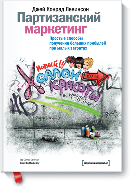
Д.К.Левинсон, книга "Партизанский маркетинг"

Джей Левинсон написал книгу «‎Партизанский маркетинг». От нее и пошла эта тенденция развития бизнеса. На обложке описана суть подхода: «‎Простые способы получения больших прибылей при малых затратах». 

Каким же функциями обладает партизанский маркетинг?

  1. Привлечение внимания. Нестандартные и неожиданные методы способны привлечь внимание потенциальных клиентов.
  2. Создание вовлеченности. Аудитория запоминает креативные маркетинговые ходы и создает ажиотаж вокруг продукта.
  3. Распространение информации. Потенциальные клиенты распространяют в социальных сетях или среди своих знакомых громкие ходы рекламщиков.
  4. Создание брендовой уникальности. Удивляя аудиторию, бренды создают уникальный имидж. Это важно, ведь удивить людей становится все сложнее.
  5. Экономия ресурсов. Методы партизанского маркетинга либо бесплатные, либо малозатратные, поэтому начинающие бизнесмены при минимальном бюджете способны себе их позволить. 

Партизанский маркетинг используется в различных сферах бизнеса и включает дополнительные функции в зависимости от целей, которые они преследуют.

Методы партизанского маркетинга

Партизанский маркетинг требует определенной стратегии. Оценивая свой уровень развития, особенности аудитории и финансовые возможности, каждая компания выбирает свой способ раскрутки. 

Существуют следующие методы партизанского маркетинга:

Вирусный контент

Пример вирусного контента

К этому виду относят всевозможные картинки, видеоролики, гифки, мемы. Как правило, такой контент аудитория распространяет в социальных сетях. Instagram, Tik Tok, ВКонтакте — популярные площадки для вирусных публикаций.

Познавательная информация, преподнесенная в юмористической форме, всегда смотрится выигрышно. Аудитория лайкает, репостит и сохраняет ее, чтобы не потерять. Охваты впоследствии становятся выше, и контент бренда все чаще залетает в рекомендации. 

В первую очередь необходимо обратить внимание на качество такого контента. Он должен быть уникальным. Даже трендовые видео, темы которых заимствованы у других пользователей, необходимо обыграть в стилистике бренда. Это важно, чтобы публикации запоминались людьми, а не терялись в общем потоке. 

Ambient marketing

Пример эмбиент-маркетинга

Суть этой разновидности заключается уже в самом названии. В переводе с английского языка «‎ambient» — «‎окружающий». Реклама размещается на зданиях, дорогах, окнах и т.д. 

Здесь все зависит от фантазии: используются баннеры, подсветки, граффити. В первую очередь упор делается на визуализацию. Чем ярче и креативнее размещенная реклама, тем больше аудитории она привлечет. 

Важно понимать, что за несанкционированное размещение рекламы придется нести ответственность перед законом. Как правило, в таких случаях налагается штраф. Если хотите использовать эмбиент-маркетинг, стоит сначала проверить, где это не запрещено. 

Засадный маркетинг

Пример засадного маркетинга

Вид маркетинга, при котором бренды создают иллюзию, что имеют отношение к каким-то крупным событиям. Для более простого понимания, можем привести пример. 

На Чемпионате мира по футболу 2014 из-под шорт футболиста Неймара были видны трусы с логотипом компании «‎Blue Man». Началось расследование, так как бренд разместил изображения игрока в социальных сетях. Как известно, участники Чемпионата не имеют права рекламировать продукцию брендов, которые его не спонсируют. Скорее всего, это был так называемый «‎подарок» от компании футболисту. По итогу расследования никакой ответственности ни бренд, ни спортсмен не понесли, так как для признания факта покупки рекламы не было оснований. Зато компания «‎Blue Man» из-за размещенного снимка получила большую прибавку к клиентской базе. 

Засадная реклама может быть использована и по-другому. Например, на крупном чемпионате компания может раздавать атрибутику для болельщиков (флажки, шарфы и т.д.). 

Коллаборация

Пример коллаборации

Это один из самых популярных видов партизанского маркетинга. Его суть заключается в том, чтобы две компании выпустили общий продукт для увеличения клиентской базы каждой.

Коллаборации могут быть самыми неожиданными. Например, компания, выпускающая продовольственные товары, может сотрудничать с брендом одежды или обуви. Преимущество заключается в том, что целевая аудитория одного производителя легко может стать вашей. Взаимный пиар приносит выгоду обеим сторонам. 

Эпатаж

Пример эпатажной рекламы

По-другому этот маркетинговый ход можно назвать провокационным. Он работает на эмоции потенциальных клиентов. На самом деле, это рискованный шаг, так как вместе с аудиторией может привлечь негатив за счет «‎кричащих» картинок или фраз. 

Подобная реклама базируется на каламбуре и двусмысленности для привлечения внимания.

Life Placement

Пример лайф-плейсмента

Вид скрытой рекламы, при котором специально нанятые актеры разыгрывают спектакль, где хвалят продукт производителя. Люди, которые видят эту постановку, не догадываются, что это маркетинговый ход. Потенциальные клиенты верят, что актеры — это обыкновенные покупатели, которым понравился товар или услуга. 

Для использования лайф-плейсмента необходимо подобрать места, где чаще всего бывает целевая аудитория, чтобы получить больший охват. 

Product Placement (скрытая реклама)

Пример скрытой рекламы

Чаще всего этот партизанский вид маркетинга используется в фильмах, сериалах или роликах. Например, главные герои в нескольких эпизодах могут использовать шампунь конкретного бренда. При этом другая атрибутика в экранизации не брендирована. Зритель не понимает, что это реклама, но запоминает продукт.

На YouTube рекламу часто заказывают у популярных блогеров, которые невзначай показывают или используют предоставленный товар.

Такая реклама, как правило, дорогая. Если есть средства, то можно в нее вложиться. Для небольшого бюджета тоже есть варианты:

  1. купить рекламу у нераскрученного блогера и надеяться, что она залетит;
  2. писать в комментариях под видео-обзорами с фейкового аккаунта с просьбой о разборе вашего продукта.

UGC-контент

Пример UGC-контента

Это один из бесплатных видов партизанского маркетинга. В него входят всевозможные отзывы, обзоры, упоминания компании в соцсетях.
Просите клиентов после покупки вашего продукта оставить отзыв. Это можно настроить так, чтобы просьба о мнении потребителя приходила ему автоматически. Чтобы простимулировать клиентов написать о товаре или услуге, можно предложить ему купон или скидку на следующую покупку.

Обзоры — второй вид пользовательского контента. Для того, чтобы люди хотели делиться вашим продуктом в соцсетях, необходимо придумать креативное оформление товара и дизайн упаковки. 

Реклама, созданная нейросетью

Реклама, созданная нейросетью

Используйте нейросети для создания наружной рекламы. Преимущество ее в том, что все связанное с искусственным интеллектом сейчас в тренде. С его помощью можно создавать оригинальные картинки. Для больших охватов рекомендуется упоминать в Интернете, что рекламный кейс был сгенерирован нейросетью. Однако важно следить за качеством изображения, чтобы товар или услуга привлекали внимание аудитории. 

Социальная реклама

Пример социальной рекламы

Этот вид партизанской рекламы всегда в тренде, потому что имеет просветительский характер. Социалки призваны вызвать эмоции аудитории. Чем сильнее слоган, тем больше охватов он получит. Социальная реклама нацелена также на то, чтобы компании, запускающие ее, тоже получили отклик. 

Один из примеров — рекламная кампания «У мусора есть свой дом» в 2011 году. На билбордах изобразили пустые жестяные банки и бутылки, которые «‎просили помочь им добраться до дома». Это изображение быстро распространилось по России и получило большой отклик. 

Челленджи и конкурсы

Реклама с челленджем

Распространенный вид рекламы бренда в социальных сетях. Чаще всего его используют в Tik Tok. Как это работает? Компания может снять видео, в котором просит аудиторию повторить какое-то действие. Лучше всего выбирать что-то простое, чтобы как можно больше пользователей смогли это повторить. 

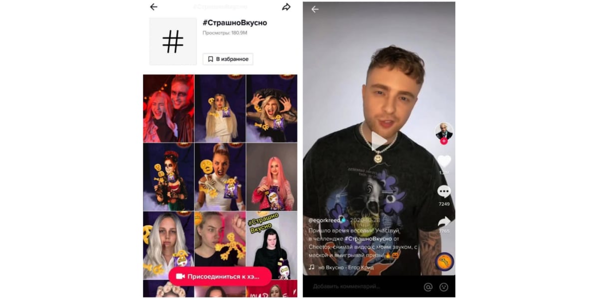
В пример можем привести тег #СтрашноВкусно от Cheetos. Он был приурочен к Хэллоуину, а видео были сняты под трек Егора Крида. Задание такое: снять видео с маской скелета под определенный звук, а в качестве атрибутики использовать снеки бренда. Мотивация для участия в челлендже — призы от компании. 

Рекомендации 

Пример рекламы-рекомендации

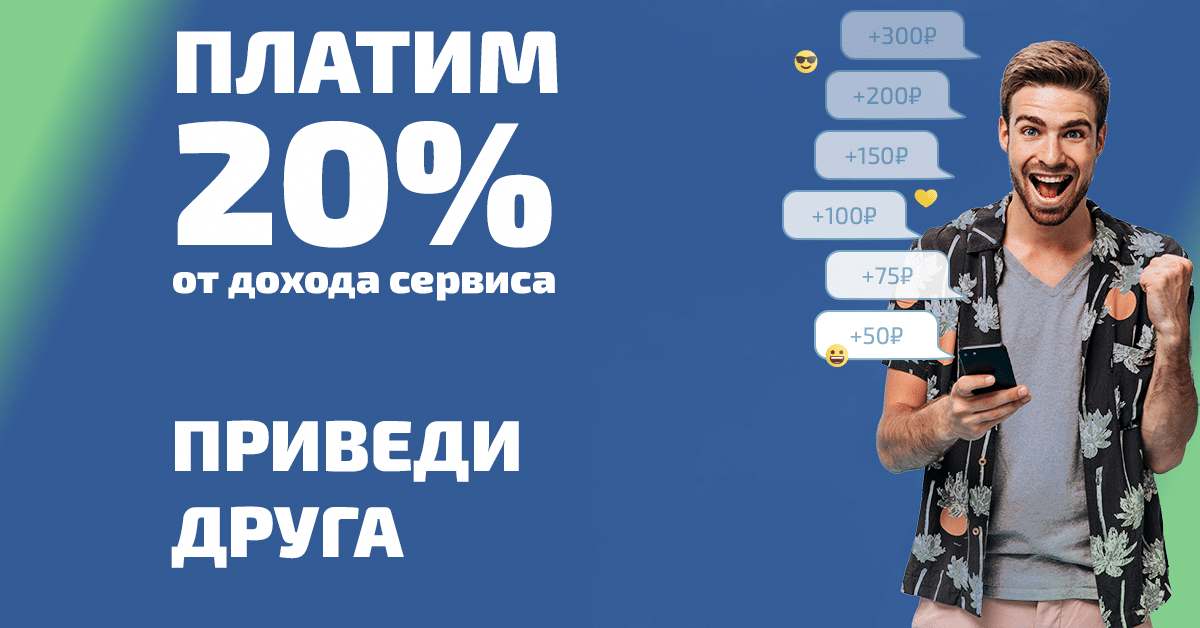
Этот маркетинговый ход используется часто. Как правило, потребители сами рекомендуют своим знакомым какое-то место или товар, если они ему понравились. Чтобы простимулировать аудиторию привлечь в компанию новых лиц, можно предлагать акции. Одна из них — «‎Приведи друга». Здесь все просто: предлагайте людям различные плюсы за то, что по их рекомендации пришли новые клиенты. Если товары или услуги им понравились, то положительные отзывы о них будут распространяться через «‎сарафанное радио». 

Кому подходит партизанский маркетинг

Первоначально этим маркетинговым ходом пользовались стартапы и малые бизнесы. Это объяснялось бюджетностью подхода, ведь многие варианты раскрутки либо дешевые, либо бесплатные. Со временем на такую возможность пиара обратили внимание средний и крупный бизнесы. Причиной тому служит креативность подхода и эффективность. 

Использовать партизанский маркетинг могут компании всех возможных направленностей с различной целевой аудиторией. Все зависит от того, умеют ли сотрудники следить за трендами и придумывать новые идеи продвижения. 

Очень важно обращать внимание на возможные трудности:

  1. СМИ. Зачастую журналисты интерпретируют информацию не так, как хотелось бы, если она неточная или может иметь несколько смыслов. Весь материал на ваш продукт должен быть несколько раз проверен и дан на освещение порционно.
  2. Законодательство. Ваша идея может быть гениальной, но если она противоречит общеустановленным правилам, то она принесет не плоды, а проблемы. Штрафы за несанкционированное размещение рекламы или постоянные проверки не принесут пользы ни стартапу, ни крупному бизнесу. 

Этапы запуска партизанского маркетинга

Грамотно разработанная стратегия позволит брендам расширить клиентскую базу. Чтобы спланировать раскрутку бренда, необходимо тщательно проработать ее этапы. 

Знакомство с аудиторией

Это первый этап при разработке плана партизанского маркетинга. Компаниям необходима подробная информация о том, кому будет интересен их продукт. Здесь важно узнать не только возраст и пол потенциальных клиентов, но и интересы, страхи, финансовые возможности. 

Эту информацию возможно добыть в отделе продаж. Она выясняет, чем привлекателен продукт, на какие особенности стоит обратить внимание, по какой причине некоторые клиенты не приобрели продукт. Также важно узнать, где люди обычно делятся своими впечатлениями, какие сайты для отзывов используют, какими соцсетями пользуются чаще всего.

Разбирайте информацию о клиентских предпочтениях порционно. Не стоит зацикливаться на большом количестве людей, на которых нацелен маркетинговых ход, ведь можно упустить из виду важные детали. 

Постановка целей

Чем абстрактнее ваши желания, тем хуже будет результат. Цель «‎привлечение клиентов» не принесет плоды. Важно учитывать количество людей, которых вы хотите привлечь, сроки выполнения этой задачи. Так называемое «‎качество аудитории» тоже играет важную роль. Определите, вы нацелены на рядовых покупателей/пользователей или планируете раскрутить бренд среди людей с высоким уровнем дохода. 

Разбейте основную цель на несколько конкретных задач и распределите их  между сотрудниками, чтобы добиться результатов. 

Конкуренты

На старте работы вы вряд ли будете монополистами. Всегда есть компании, которые уже добились результатов в вашем направлении. Оценка работы и отслеживание промежуточных и итоговых результатов конкурентов поможет в определении стратегии. Ищите информацию о компаниях, которые уже использовали партизанский маркетинг, и отсеивайте те методы, которые были менее эффективными.

Выбор метода

Особенность партизанского маркетинга в том, что он выстреливает резко и вызывает эмоции у клиентов. Чтобы рекламная кампания была эффективной, важно выбрать способ ее ведения. Иногда гениальные мысли по продвижению бренда приходят спонтанно. Их можно выдвинуть при «мозговом штурме» ( коллективном обсуждении идей). 

Последовательность действий

Выбрав метод продвижения, можно приступать к разработке плана действий. Важно учитывать, что грамотная реклама разрабатывается коллективом. Если вы берете, например, баннер, то выберите дизайн, текст, локации для его размещения и прочие детали.

Распределите обязанности, пропишите дедлайны и начинайте работу над раскруткой. Чтобы итог был максимально приближенным к ожидаемому, стоит посмотреть глазами клиента на то, что вы изготовили.

Оценка результата

Результат — это не только измеримые показатели. Если вы получили цифры, которые хотели, это еще не повод считать кампанию успешной. Для подведения итогов можно обратить внимание на следующие показатели:

  • упоминания бренда в СМИ;
  • осведомленность аудитории о рекламной кампании;
  • итоги опроса, который можно предварительно запустить для получения мнения клиентской базы.

Если при сравнении результатов рекламной кампании все показатели стали лучше, то она считается успешной. 

Заключение

Партизанский маркетинг представляет собой эффективный и оригинальный способ привлечения внимания целевой аудитории в условиях сильной конкуренции. Различные методы позволяют брендам и компаниям выделиться на рынке. Однако, важно учитывать этические и законодательные аспекты при применении подобных методов. Партизанского маркетинг требует тщательного планирования и анализа целевой аудитории, что позволит укрепить позиции бренда.

Советуем прочитать: Что такое партнерский маркетинг: основные виды и преимущества "
Ответы на популярные вопросы
Что такое партизанский маркетинг?
Зачем нужен партизанский маркетинг?
Кому подойдут методы партизанского маркетинга?
Какие виды партизанского маркетинга существуют?
Как запустить партизанский маркетинг?

Комментарии отсутствуют. Будьте первым!

в ответ kakdelakisa

user avatar