

Что такое Телеметр для Телеграм и как он используется в арбитраже трафика? Сегодня Телега — это бесплатный, безопасный мессенджер, который имеет большое количество способов продвижения. С помощью сервиса можно вести статистику Телеграм-канала и анализировать ход рекламных кампаний. Команда diasp.pro расскажет, как добавлять каналы в Телеметр, а также рассмотрит основные функции сервиса.
Что такое Телеметр
Рассмотрим показатели, которые можно проанализировать:
- Количество подписчиков. Показывает общее число активных участников группы.
- Просмотры. Отслеживает количество показов и просмотров постов.
- Источники, на которых другие группы размещали свою рекламу. Показывает список групп, где проводился самопиар.
Изучив все характеристики, владельцы могут оценить свои Телеграм-каналы, проанализировать конкурентов или купить рекламу в проверенных группах.
Основные функции
Сервис имеет ряд дополнительных функций, но чтобы получить к ним доступ, необходимо зарегистрироваться на сайте. Рассмотрим его основные функции:
- Поиск по ключевым словам. Благодаря этой функции, можно найти наиболее трафиковые темы для будущих публикаций. Инструмент подойдет для небольших площадок, которые еще не имеют своих постоянных рубрик.
- Отслеживание постов. В этом разделе можно выбрать чат и отслеживать его последние обновления. После регистрации, доступна демо-версия, в которой можно загрузить только два канала одновременно. Максимальное количество одновременно запущенных групп — 15. Чтобы получить доступ к полной версии, необходимо оплатить подписку.
- Каталог каналов. Телеметром пользуются практически все, поэтому сервис имеет большой выбор групп различных тематик. Наиболее популярные направления — IT, образование, развлечения, наука, новости, бизнес, здоровье. Можно настроить фильтрацию по различным критериям, например: название канала, количество подписчиков и упоминаний за неделю, а также настроить фильтрацию по полу аудитории.
- Управление ценами. Понятный и простой способ продвижения, с помощью которого, вы сможете устанавливать цены на рекламу с ваших чатов и привлекать больше рекламодателей. Для того, чтобы подключить свой Телеграм-чат к этой функции, нужно набрать более 200 подписчиков, авторизоваться на сайте, затем установить бот Телеметра в чат.
- Анализ рекламных кампаний. Сайт дает возможность изучить записи, с помощью которых продвигались другие каналы. Однако, эта функция платная и появляется только после оформления подписки.
Как добавить свой Telegram-канал в Телеметр
Для того, чтобы управлять своим чатом в Телеге и отслеживать метрики, вам необходимо прикрепить его к сервису. Для этого нужно выполнить несколько простых шагов:
- Зайти на сайт Телеметра, выбрать пункт “Мои каналы”, авторизоваться через Telegram и найти бота авторизации.
- В открывшемся чате нажать кнопку /start. После этого, бот отправит вам код, который нужно ввести на главной странице сайта.
- Нужно проверить имеющиеся площадки, зарегистрированные с вашего аккаунта. Если таких нет, то необходимо вставить ссылку или username чата в специальное поле на сайте. Главное условие — ресурс должен быть русскоязычным и иметь более 200 подписчиков.
- После того, как вы нашли ваш источник, необходимо добавить Telemetr-Бот Авторизации в список участников канала и назначить его администратором. (При этом, можно выдать боту любые права, даже минимальные).
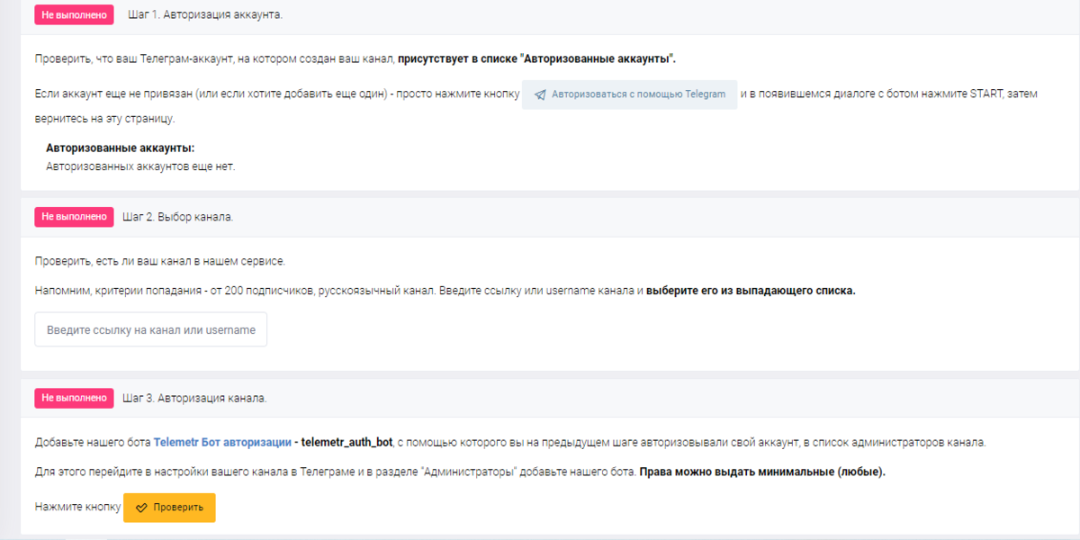
После того, как вы выполните все действия, нажмите кнопку “Проверить”. Если все сделано верно, ваша группа будет отображаться в базе Телеметра.
Как проанализировать активную аудиторию в Телеметре
После того, как вы прошли регистрацию, вы можете использовать различные инструменты для анализа аудитории вашей группы. Инструмент покажет, насколько активная аудитория на канале, также сформирует детальный отчет. (Телеметр работает как с открытыми, так и с закрытыми источниками). Рассмотрим, как узнать активную аудиторию Телеграм-чата:
- Необходимо назначить Telemetr-Бот администратором и выдать ему права на добавление админов и участников.
- После этого, нужно перейти на сайт, вставить ссылку на чат в нужное поле и нажать кнопку “Анализ”.
После этого, вы получите результаты активности ваших подписчиков , а также распределение их времени, проведенного в сети. Это позволяет понять соотношение активных пользователей и ботов. Как правило, боты не заходят повторно в Сеть после создания аккаунта.
На сайте также можно посмотреть насколько совпадает аудитория вашего канала с другими источниками. Для этого, нужно вставить ссылку второго источника в пустое поле, затем нажать кнопку “Пересечение”. (Отследить пересечение можно только при условии, что Telemetr-Бот установлен на обоих ресурсах)
В среднем, процесс анализа занимает от 5 минут до 2 часов, в зависимости от размера группы.
Что можно узнать через профиль канала в Телеметре
Кроме аналитики подписчиков, сервис дает возможность посмотреть ряд других показателей, например, общую статистику, рекламную отдачу, динамику, а также публикации и сторис в Instagram, с помощью которых рекламировалась группа. Рассмотрим подробнее каждый блок.
Общая статистика
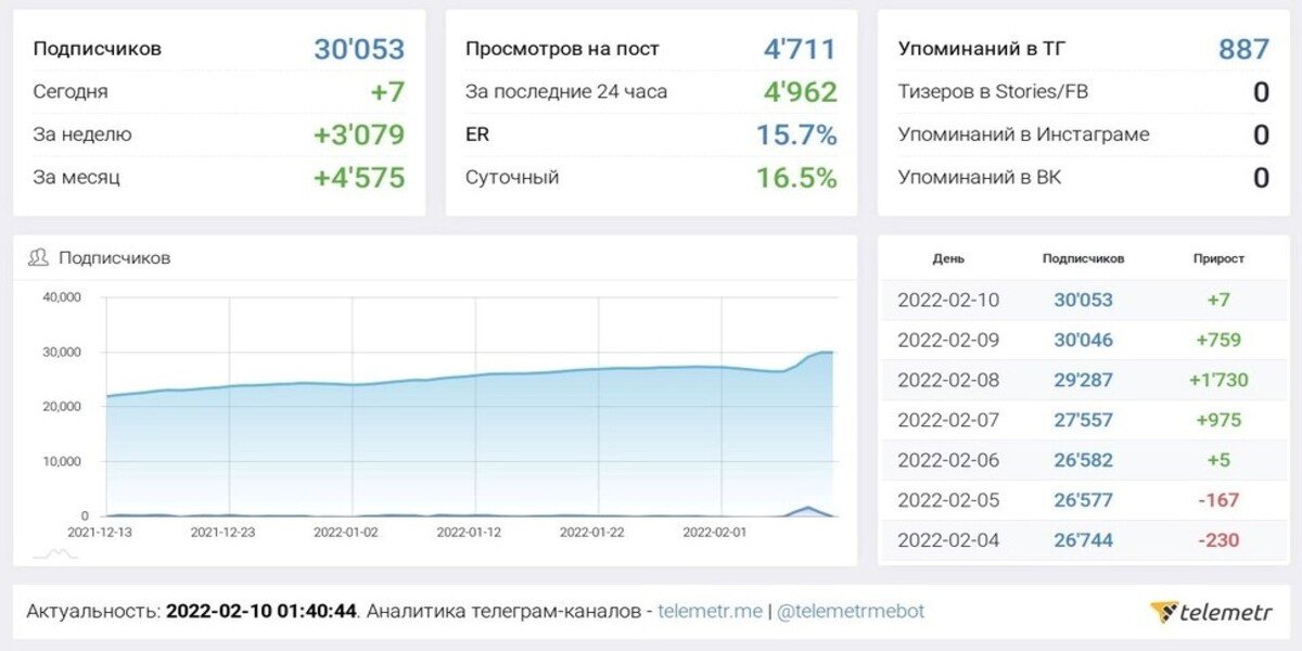
Владельцы могут посмотреть общее количество подписчиков, и число новых пользователей, пришедших ежедневно, еженедельно, ежемесячно.
Кроме того, можно узнать сколько просмотров на постах набралось за последние сутки, посмотреть число упоминаний в Telegram, а также отследить суточный ER.
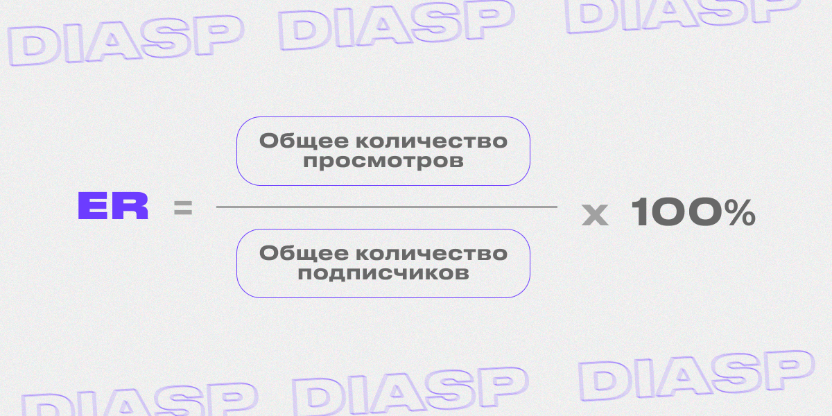
ER (Engagement rate) — это показатель, который отображает уровень вовлеченности пользователей. Чтобы вычислить ER, необходимо разделить общее количество просмотров на общее число подписчиков и умножить на 100%.
Рекламная отдача
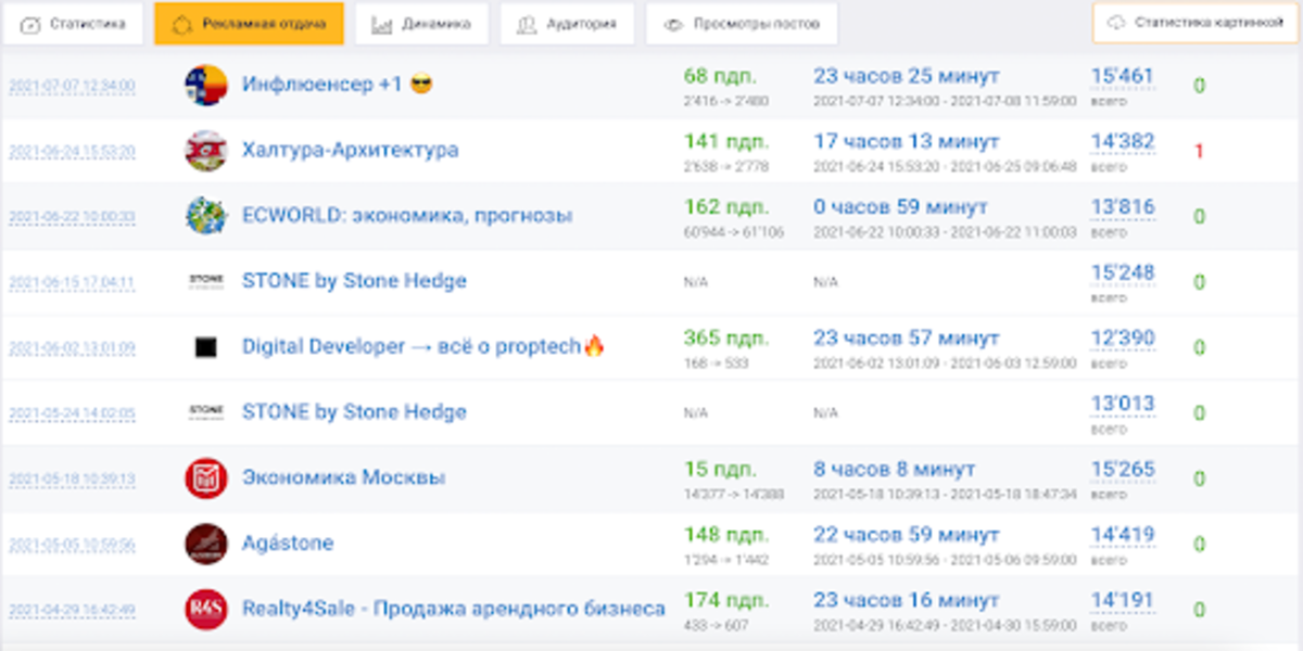
В этом блоке можно увидеть общие данные о рекламных размещениях, число постов и репостов, а также их еженедельное и ежемесячное количество.
Instagram Ads
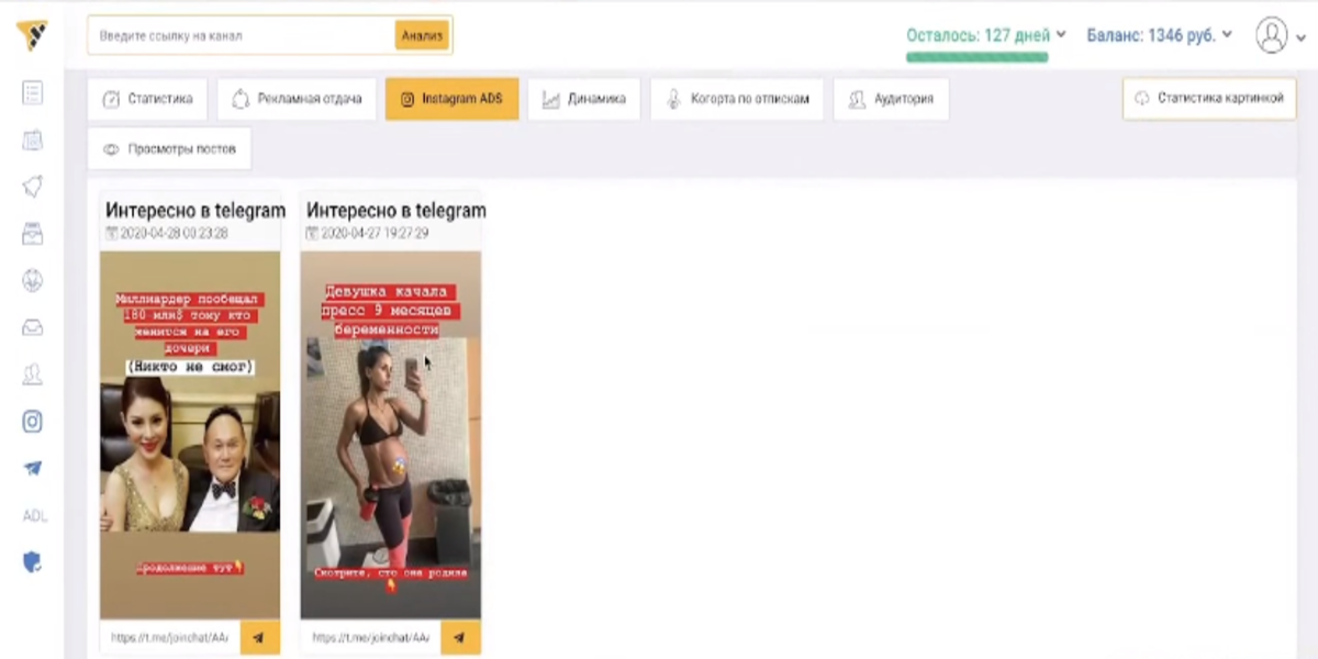
С помощью этого показателя можно рассчитать количество рекламных постов в публикациях или сторис Инстаграм, с помощью которых продвигались каналы в Телеге. Однако, функция платная и получить доступ к ней можно только при покупке платного аккаунта.
Динамика
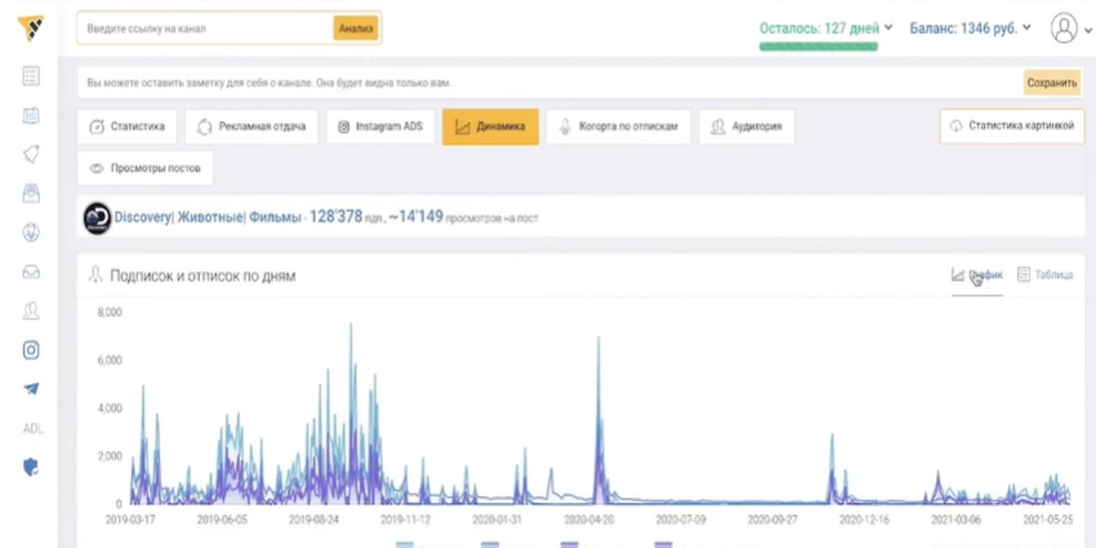
Раздел “Динамика” позволяет показать в виде графика изменения и развитие следующих метрик:
- Охват публикаций за 24 часа и число подписчиков;
- Количество публикаций и рекламных записей;
- Суточный ER и число рекламных упоминаний на других источниках.
Аудитория
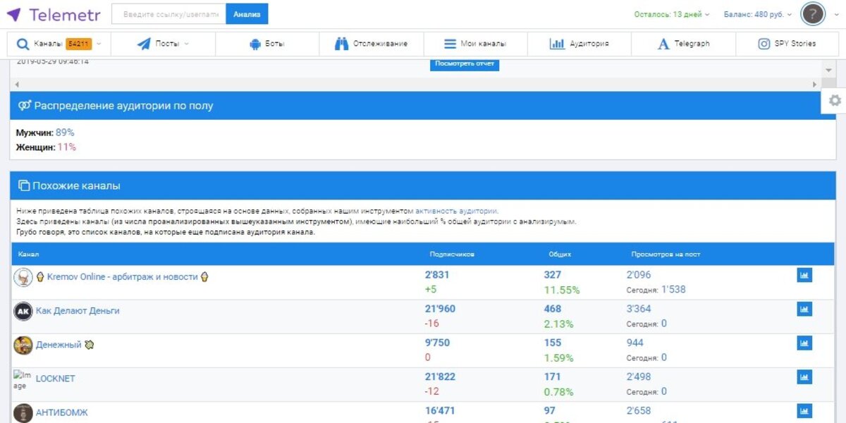
Показатель, который открывается после того, как владелец проведет анализ активных пользователей, хотя бы один раз. Если он проводился, то здесь можно узнать процент мужчин и женщин от общего числа подписчиков.
Просмотр постов
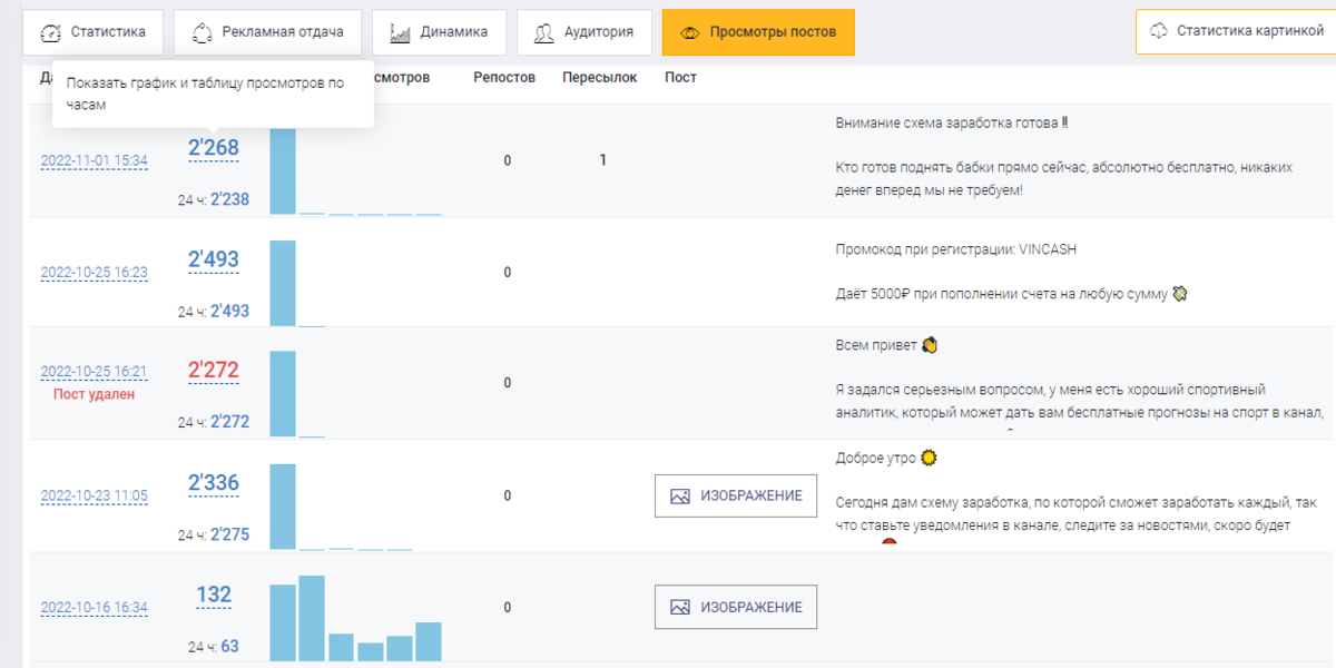
Профиль показывает динамику просмотров публикаций, а также изменения числа репостов и пересылок. В демо-версии, владельцы могут получить доступ к ограниченному количеству постов для анализа. Для снятия ограничений, необходимо выбрать тариф и оплатить подписку.
Тарифы Телеметра
Сервис предлагает различные тарифы и предоставляет платные услуги, которые открывают дополнительные возможности. Рассмотрим, какие пакеты доступны и какие преимущества они дают.
- Демо-версия. Бесплатный тариф, который имеет лимит на анализ Telegram-каналов — 15, а также лимит на анализ постов — около 20.
- Полный доступ. Тариф убирает все лимиты и предоставляет доступ к полному функционалу. Сервис имеет тариф на месяц, два месяца, три месяца и полгода. Стоимость услуг начинается от 1500 тысяч рублей и доходит до 7500 тысяч рублей.
Заключение
Таким образом, Телеметр для Телеграм — один из самых лучших сервисов для арбитражника, с помощью которого можно получить полный анализ данных, а также следить за динамикой развития канала. Здесь можно найти лучшие Telegram-каналы для продвижения рекламы, а также выявить сильные и слабые стороны вашего контента или купить готовый канал в Telegram.
Удачи и профита!